"Innovations Around": why descriptions on companies' websites are so incomprehensible, and why this is bad
The founder of Carpe Lotion, Casper Kubica, wrote an interesting article about why Internet services are not even trying to convey to the user an idea of their product and why it can destroy a startup. I prepared an adapted version of this material.

Site - representation of the company on the Internet. Sites and landings describe what a company does, in which regions it works, how to contact it and how much it costs. But it so happens that on the company's website it is incomprehensible nothing, except for the fact that “high-class specialists” work there, who “make ideas work”.
')
Here, for example, the company Meltwater , which for several thousand dollars a year provides contacts of journalists and media characters. This is a useful product, as it is not easy for young startups to find a connection with a journalist who will write the text, increase brand awareness and increase sales.
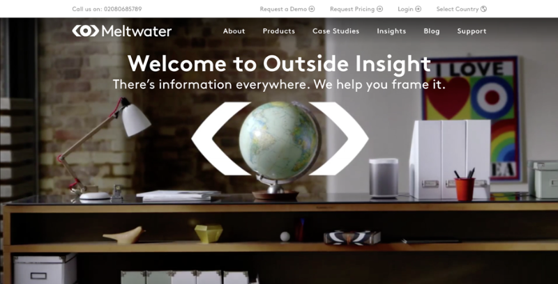
This product is in demand. The site gets people who are interested in buying. It remains only to write at the very top: “People! Click on this button, pay for the order, and the contacts of journalists are in your pocket! ”In reality, this is not so. The first thing that a potential customer sees on the page is a picture with a globe and an abstruse inscription about Outside Insight, which is not clear to anyone. If you scroll through the carousel, then, in addition to the globe, you can see a cup of coffee, a laptop and a clock.
It seems that an error has occurred and this is the site of a novice writer or philosopher. If you scroll down the page, you can learn how to use the media for business development and get a demo version. Only not very clear, the demo version of what.
This site wants to close. Because it is easier to find contacts with competitors in Google who immediately offer the product and write the cost. The only way to understand what Meltwater sells is to call the phone number listed at the top of the page. But it is a difficult and long way.
But the site of the project Optimizely:
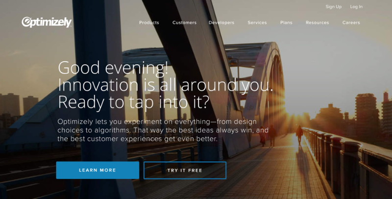
Good evening! Innovation around you! Ready to dive into them?
The first thought that arises when viewing a page is that this is a project site on Kikstarter. If you scroll further, everything gets worse:
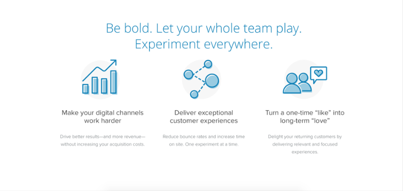
Be brave. Let the team play. Experiments are everywhere!
For some reason, they propose to be courageous, to play and experiment. And the inscriptions under the icons are completely misleading: “Make your digital channels work,” “Give customers exceptional experiences”, “Turn one-time likes into long-term love”. What is the product of this company? Is this an event agency? Or SMM services? No, just an analytics tool. And again I want to close this site and go to competitors.
Finally, take a look at the company's 84.51˚ website:

We believe that it will be easier for people to live.
You might think that this is the site of a pharmaceutical company. Laughing father and daughter suggest some kind of saving preparation. Yes, and such a strong phrase about the facilitation of life. We look further.
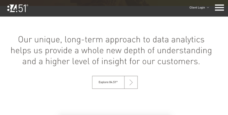
Our unique, long-term approach to data analytics helps provide a completely new depth of understanding and a higher level of insights for our clients.
It sounds good, but it is still not clear what the company offers. Below there is a section about us. Finally! Now we learn everything.
We make people's lives easier. Simple thought, yes? Not quite
Oh no. Again highly spiritual phrases. A simple thought is to tell, in the end, what you are selling. In fact, next comes the sheet of the text, which describes the company's activities in the same philosophical style. But still unclear. And the hand itself stretches to close this site.
More and more often, on the websites of companies, especially those related to B2B business, there are beautiful pictures and phrases that can now be copied to status in social networks. Pathos quotes are not written somewhere in the side, in the block "our motto" or "on high", but in the most prominent place - instead of information about the product.
And the more expensive the product or service offered by the company, the more confusing the site. If you need to register a domain, you can easily check if the address is free in a few minutes and redeem it. On the home page of the company that provides software for online cash registers, it is written: "Software for online accounting of small businesses." It's all clear.
But as soon as you need to take a step further, for example, to buy advertising on a television channel, the inscription on the main page immediately says: “Creativity. Speed. Result".
Why do huge corporations with serious products create such sites? Maybe they believe that the site does not lead customers, and make it "for show"? Of course not. These are big companies that employ smart people. And they understand that they need a website.
This is probably done so that the site visitor does not understand anything and calls the number indicated in the contacts. And then the seller in five sentences will tell you what the company is doing, and impose a more expensive tariff. If you perceive product information visually, with graphs and a detailed description of each tariff, the client will approach the purchase rationally. And if the seller in colors tells you how much better the fare is, the buyer will buy it on emotions.
Therefore, most likely, these puzzle sites are created for the client to call the call center. Of course, the company is losing some potential buyers. But these costs are included in the price of the product, and the one who eventually called pays for them.
Big companies are allowed such a tactic. They have experienced marketers in their staff who know exactly what they are doing and rarely go into the negative. The problem is that such non-informative landings are willy-nilly repeated by small young companies. An aspiring businessman needs to think immediately about a thousand things: how to legally form a firm, calculate a sales strategy, and set up accounting. And it seems that the easiest way to get ahead is to peep the nuances of work with large and successful firms. So on the sites of interesting and unusual projects there are phrases: "Our team works wonders" and "Shamelessly working conscientiously."
Unfortunately, this is a mistake. On the website of the company for setting targeted advertising, the most prominent place should read: “We set up targeted advertising”, and on the website of an online appointment with doctors - for example, “To register for a doctor online, select a hospital from this list”. It is necessary to tell people, as in person, what the company does and how much it charges for services. Simple and concise, without theatrical phrases and incredible design. This is the key to success for a start-up company. After all, no one owner of a sausage stall on the market will write on the signboard: “Alluring! Fragrant! Burning!
Site - representation of the company on the Internet. Sites and landings describe what a company does, in which regions it works, how to contact it and how much it costs. But it so happens that on the company's website it is incomprehensible nothing, except for the fact that “high-class specialists” work there, who “make ideas work”.
')
Here, for example, the company Meltwater , which for several thousand dollars a year provides contacts of journalists and media characters. This is a useful product, as it is not easy for young startups to find a connection with a journalist who will write the text, increase brand awareness and increase sales.
This product is in demand. The site gets people who are interested in buying. It remains only to write at the very top: “People! Click on this button, pay for the order, and the contacts of journalists are in your pocket! ”In reality, this is not so. The first thing that a potential customer sees on the page is a picture with a globe and an abstruse inscription about Outside Insight, which is not clear to anyone. If you scroll through the carousel, then, in addition to the globe, you can see a cup of coffee, a laptop and a clock.
It seems that an error has occurred and this is the site of a novice writer or philosopher. If you scroll down the page, you can learn how to use the media for business development and get a demo version. Only not very clear, the demo version of what.
This site wants to close. Because it is easier to find contacts with competitors in Google who immediately offer the product and write the cost. The only way to understand what Meltwater sells is to call the phone number listed at the top of the page. But it is a difficult and long way.
But the site of the project Optimizely:
Good evening! Innovation around you! Ready to dive into them?
The first thought that arises when viewing a page is that this is a project site on Kikstarter. If you scroll further, everything gets worse:
Be brave. Let the team play. Experiments are everywhere!
For some reason, they propose to be courageous, to play and experiment. And the inscriptions under the icons are completely misleading: “Make your digital channels work,” “Give customers exceptional experiences”, “Turn one-time likes into long-term love”. What is the product of this company? Is this an event agency? Or SMM services? No, just an analytics tool. And again I want to close this site and go to competitors.
Finally, take a look at the company's 84.51˚ website:
We believe that it will be easier for people to live.
You might think that this is the site of a pharmaceutical company. Laughing father and daughter suggest some kind of saving preparation. Yes, and such a strong phrase about the facilitation of life. We look further.
Our unique, long-term approach to data analytics helps provide a completely new depth of understanding and a higher level of insights for our clients.
It sounds good, but it is still not clear what the company offers. Below there is a section about us. Finally! Now we learn everything.
We make people's lives easier. Simple thought, yes? Not quite
Oh no. Again highly spiritual phrases. A simple thought is to tell, in the end, what you are selling. In fact, next comes the sheet of the text, which describes the company's activities in the same philosophical style. But still unclear. And the hand itself stretches to close this site.
Why do big companies need it
More and more often, on the websites of companies, especially those related to B2B business, there are beautiful pictures and phrases that can now be copied to status in social networks. Pathos quotes are not written somewhere in the side, in the block "our motto" or "on high", but in the most prominent place - instead of information about the product.
And the more expensive the product or service offered by the company, the more confusing the site. If you need to register a domain, you can easily check if the address is free in a few minutes and redeem it. On the home page of the company that provides software for online cash registers, it is written: "Software for online accounting of small businesses." It's all clear.
But as soon as you need to take a step further, for example, to buy advertising on a television channel, the inscription on the main page immediately says: “Creativity. Speed. Result".
Why do huge corporations with serious products create such sites? Maybe they believe that the site does not lead customers, and make it "for show"? Of course not. These are big companies that employ smart people. And they understand that they need a website.
This is probably done so that the site visitor does not understand anything and calls the number indicated in the contacts. And then the seller in five sentences will tell you what the company is doing, and impose a more expensive tariff. If you perceive product information visually, with graphs and a detailed description of each tariff, the client will approach the purchase rationally. And if the seller in colors tells you how much better the fare is, the buyer will buy it on emotions.
Therefore, most likely, these puzzle sites are created for the client to call the call center. Of course, the company is losing some potential buyers. But these costs are included in the price of the product, and the one who eventually called pays for them.
Why it does not suit startups
Big companies are allowed such a tactic. They have experienced marketers in their staff who know exactly what they are doing and rarely go into the negative. The problem is that such non-informative landings are willy-nilly repeated by small young companies. An aspiring businessman needs to think immediately about a thousand things: how to legally form a firm, calculate a sales strategy, and set up accounting. And it seems that the easiest way to get ahead is to peep the nuances of work with large and successful firms. So on the sites of interesting and unusual projects there are phrases: "Our team works wonders" and "Shamelessly working conscientiously."
Unfortunately, this is a mistake. On the website of the company for setting targeted advertising, the most prominent place should read: “We set up targeted advertising”, and on the website of an online appointment with doctors - for example, “To register for a doctor online, select a hospital from this list”. It is necessary to tell people, as in person, what the company does and how much it charges for services. Simple and concise, without theatrical phrases and incredible design. This is the key to success for a start-up company. After all, no one owner of a sausage stall on the market will write on the signboard: “Alluring! Fragrant! Burning!
Source: https://habr.com/ru/post/337814/
All Articles