Rules and prohibitions of web design

Web design is an intricate thing. When creating a website you need to take into account many details. To simplify the task, I prepared a list of rules and prohibitions that every web designer should consider. It is good that these principles are quite simple. Go!
rules

1. Design should be one, regardless of platform.
')
Your site is visited from different devices: a stationary computer or laptop, tablet, phone, audio player, or even hours. An important part of working on the UX is to provide each visitor with the same version of the site, regardless of the device.

Using your website from a mobile phone should be as convenient and comfortable as from a home computer.
2. Easy navigation.
Navigation is a key concept in user experience convenience. Remember: "no matter how good your site is if users can't figure it out." Therefore, navigation on the site should be:
- Simple - each site should have the simplest possible structure;
- Understandable - the navigation should be obvious;
- Successive - the navigation of the first and last page should be the same.
Design the navigation so that the user always understands where he is, where he needs to go and how to get there in the fewest clicks.
3. Link color
Links are a key element in the navigation process. If you do not change the color of the visited link, the user may accidentally click on it again. Understanding where the user already was and where he is now helps to decide where to go now.
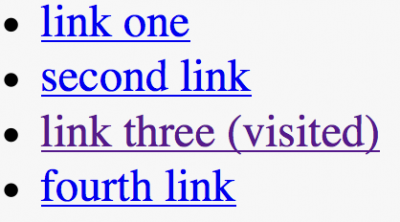
Understanding where the user has already been, frees him from wandering through the same pages.
4. Simple search through pages
For the first time browsing the site, the user just runs his eyes over the page, without reading the text. He needs to find a solution to his problem, and the designer should help him with this through the correct visual hierarchy. Visual hierarchy - placement or presentation of elements by their importance; for example, where the eye falls first, then where, etc.
Do important things — screen names, login forms, navigation parts, or other significant content — a focal point so that the visitor sees them immediately upon entry.
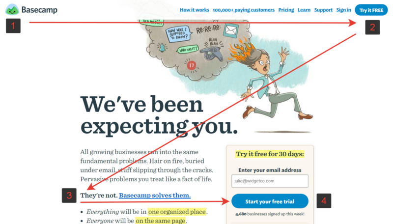
Basecamp Z-Pattern
5. Check links!
The user loses confidence in the site every time a 404 error (a non-existent page) takes off. Clicking on the link, the user waits for a solution, not an error message.

Page not found
6. Clickable elements
The user determines the properties of the object by its appearance. Underlined words without links or elements without a hyperlink easily confuse visitors. Users need to understand where the static content on the page and where dynamic, which can be viewed by clicking or clicking on the screen. Active elements must be highlighted.

Menagerie Climb: Is orange box a button? Not. Although the form and view suggests otherwise
Bans
1. Make the visitor wait for the page to load.
The margin of patience and the ability to focus the user's attention are very small. This is stated in the study NNGroup :
The maximum time of user concentration on the task - 10 seconds
If the user is forced to wait for the site to load, he loses his patience and may leave. Even the most beautiful loading indicator will not be able to hold it for a long time.

Image: Ramotion
2. Open link in new tab
This method roughly disables the use of the back button to return to the previous page.
3. Allow ads to close content
Promo and advertising on the page can overshadow the content, making it difficult for the user to complete the task. Not to mention that everything that looks like an advertisement is ignored by the user (the phenomenon of banner blindness).

4. Abduct scrolling
The abduction of scrolling, I call the reception of designers / developers, changing the behavior of the site when scrolling. Replace it with animated effects, anchor points when scrolling and a new design for the scroll slider itself. Many users do not like this, because they take control away. Therefore, when designing a website or interface, take care that the user remains in control of viewing the application or site.

On a Mac Pro page, terrible scrolling: the dots below the picture each lead to their own section of the page.
5. Autoplay video with sound
Self-made videos, music, or sounds annoy users. Media content should be used carefully and only when the user expects it.
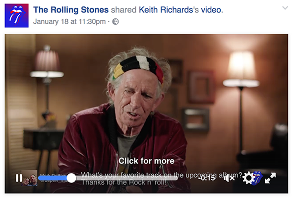
Video on Facebook is turned on automatically, but without sound, until the user confirms that he is watching the video (by clicking on it)
6. Sacrifice comfort for the sake of beauty
The design of the site or interface should not intersect with the ability to solve the user's problem. It is important to avoid confusing background behind the content, poor color schemes that complicate the reading of the site, or insufficient color contrast (as in the example below).

Non-contrast fonts are always a bad idea.
7. Use flashing text and ads.
For susceptible people, flashing content can trigger a seizure. In addition, he will surely cause discontent and will distract people.

Avoid blinking text!
Source: https://habr.com/ru/post/337758/
All Articles