CSS immersion: font metrics, line-height and vertical-align
line-height and vertical-align are simple CSS properties. So simple that most of us are sure that they understand how they work and how to use them. Unfortunately, this is not true - in fact, they are probably the most complex properties, since they play an important role in creating a little-known CSS feature called the inline formatting context.For example,
line-height can be specified as a length or a dimensionless value, but its default value is normal (standard). Good, but what does “standard” mean? Often they write that it is (usually) 1, or maybe 1.2. Even in the CSS specification there is no clear answer to this question .')
We know that the dimensionless line-height value depends on the
font-size value, but the problem is that the font-size: 100px looks different for different typefaces. In this regard, the question arises: will the line-height always be the same or may it differ? Is this value between 1 and 1.2? How does vertical-align affect line-height ?Let's delve into not the easiest CSS mechanism ...
Let's start by talking about font-size
Consider this simple HTML code with a
p tag containing three span elements, each with its own font-family : <p> <span class="a">Ba</span> <span class="b">Ba</span> <span class="c">Ba</span> </p> p { font-size: 100px } .a { font-family: Helvetica } .b { font-family: Gruppo } .c { font-family: Catamaran } When using the same
font-size in different headsets, the height is different: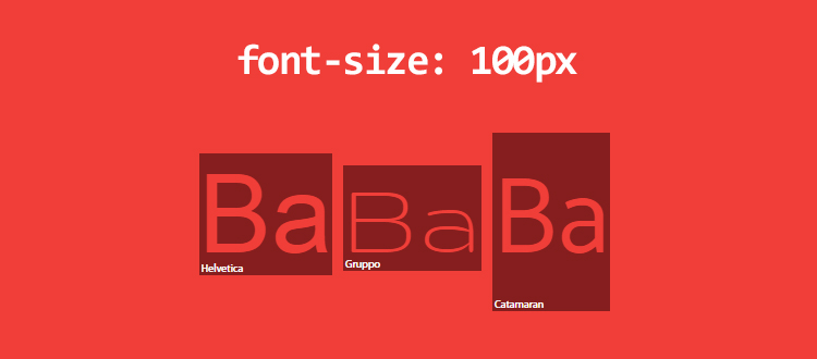
Even if we are aware of this feature, why doesn't
font-size: 100px create font-size: 100px elements? I measured these values: Helvetica - 115px, Gruppo - 97px and Catamaran - 164px.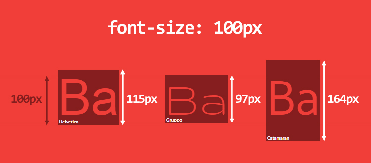
Although at first glance it looks somewhat strange, everything is quite expected - the reason is in the font itself . How it works:
- The font sets its em-square (it’s UPM, units per em - units per pin-yard) - a kind of platform within which each character will be drawn. In this square, relative units are used for measurement, and, as a rule, sizes of 1000 units are taken for it. Although there are also 1024, 2048 or other number of units.
- Depending on the number of relative units, font metrics are set, such as the height of the upper and lower drawing elements (ascender / descender), uppercase and lowercase letters. Some values may go beyond the em square.
- In the browser, relative units are scaled to the required
font-size.
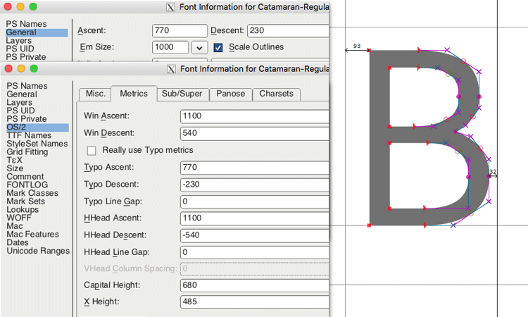
Take the Catamaran font and open it in FontForge to get the metrics:
- em square is taken as 1000 units;
- the height of the upper remote elements is 1100 units, and the lower - 540.
After several checks, it turned out that browsers on Mac OS use the values of HHead Ascent / Descent, and on Windows they use the values of Win Ascent / Descent (these values may differ). In addition, the height of capital letters Capital Height is 680 units, and lowercase X height - 485.
Thus, the Catamaran font uses 1100 + 540 units in an em square of 1000 units, and therefore with a font-size: 100px, the height is 164px. This computed height defines the content-area of the element (this term will be used hereafter). You can think of the content area as the area to which the
background property applies.You can also assume that the height of capital letters is 68px (680 units), and lowercase (x-height) - 49px (485 units). As a result, 1ex = 49px and 1em = 100px, not 164px (fortunately, em depends on the
font-size , not on the calculated height).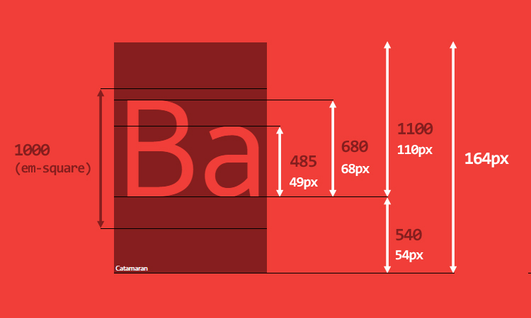
Before diving deeper, consider the main points to be faced. The
p element when displayed on the screen may consist of several lines with the appropriate width. Each line consists of one or several line elements (inline elements) (HTML tags or anonymous line elements for text content) and is called a line box (box-box). The height of the row container depends on the heights of its children . That is, the browser calculates the height of each line item, and according to it the height of the container row (from the topmost to the lowest point of its children). As a result, the height of the container line is always enough to hold all its children (by default).Each HTML element is actually a stack of string containers. If you know the height of all containers in a row, then the height of the element is also known.
If you change the above HTML code as follows:
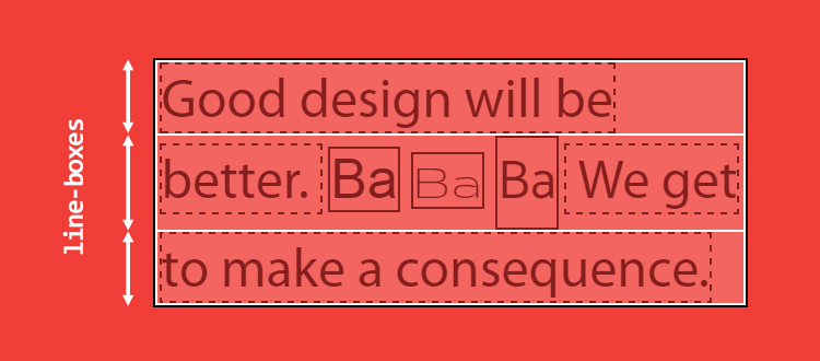
<p> Good design will be better. <span class="a">Ba</span> <span class="b">Ba</span> <span class="c">Ba</span> We get to make a consequence. </p> three row containers will be generated:
- in the first and last will be one anonymous string element (text content);
- in the second there will be two anonymous lower-case elements and 3
spanelements.
It is clearly seen that the second container of the line is larger than the rest due to the calculated content area of its child elements, more precisely, the one that uses the Catamaran font.
The tricky point in creating a string container is that, in essence, we can neither see nor manage it through CSS . Even applying a background to the
::first-line does not help display the height of the first line container.line-height: about problems and other issues
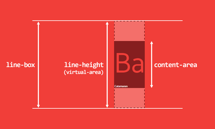
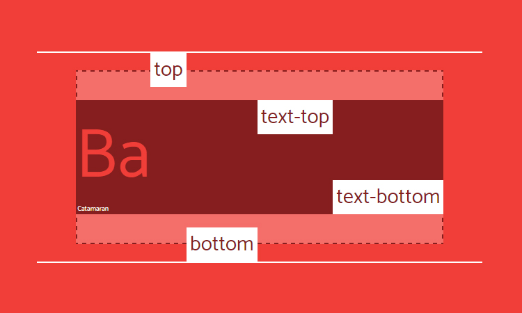
Up to this point, I introduced two concepts - the content area and the string container. If you read carefully, you noticed that the height of the container line is calculated based on the height of its children, but did not say that based on the height of the content area of its children. And this is a big difference.
Even if it may seem strange, the line element has two different heights: the height of the content area and the height of the virtual-area (I myself coined the term “virtual area” because we cannot see this height; in the specification of this term you will not find).
- The height of the content area is determined by the font metrics (as we saw earlier).
- The virtual-area
line-heightis theline-height, and this is the height that is used to calculate the height of the line container.
In addition, what has been said refutes the widespread view that
line-height is the distance between baselines. In CSS, this is not the case.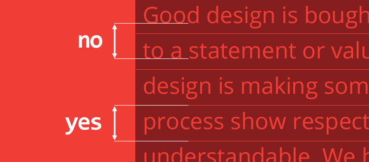
In other editorial programs this may be the distance between the baselines. For example, in Word and Photoshop this is true. The main difference is that in CSS this distance is also for the first line.
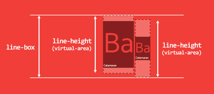
The calculated height difference between the virtual area and the content area is called leading (leading). One half of the leading is added to the top of the content area, and the second - from the bottom. Therefore, the content area is always in the center of the virtual area.
Depending on the calculated value, the
line-height (virtual area) may be equal to, greater than or less than the content area. If the virtual area is smaller, then the leading value is negative and the row container is visually smaller than its children in height.There are other types of lowercase elements:
- replaceable string elements (
img,input,svg, etc.); inline-blockand allinline-*elements;- line elements that are involved in a special formatting context (for example, in the flexbox element, all flex components are blockified).
For such special string elements, the height is calculated based on their
height , margin and border properties. If auto specified for height , line-height is applied, and the height of the content area is equal to line-height .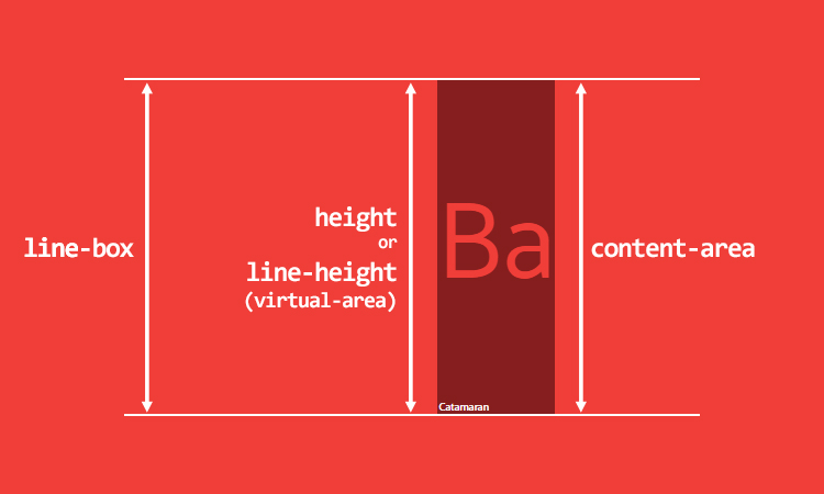
And yet the problem remains the same: what is the normal value for
line-height ? The answer to this question, as in the case of calculating the content area, must be searched among the font metrics. So back to FontForge. The size of the em square for Catamaran is 1000, but we see a lot of values for the upper and lower offset elements:- Ascent / Descent common values: the height of the top detail is 770, the bottom is 230. Used to create characters (OS / 2 table).
- Ascent / Descent metrics: the height of the top callout is 1100, the bottom is 540. Used to determine the height of the content area (the “hhea” and “OS / 2” tables).
- Line Gap metric (line spacing). Used to determine
line-height: normal, this value is added to the Ascent / Descent metrics (table "hhea").
In our case, the Catamaran font determines that the line spacing is 0 units, and thus the
line-height: normal will be equal to the content area, which is 1640 units or 1.64.As a comparison: for the Arial font, the em-square is 2048 units, the height of the outer detail element is 1854, the lower one is 434, the line spacing is 67. Thus, for
font-size: 100px the content area is 112px (1117 units), and line-height: norma l - 115px (1150 units or 1.15). All these metrics are individual for each font and are set by the font designer.Therefore, setting the
line-height: 1 ineffective. Let me remind you that dimensionless values depend on the font-size , not on the content area, but the fact that the size of the content area exceeds the size of the virtual area is the cause of many of our problems.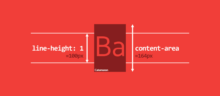
But the reason is not only in
line-height: 1 . If it comes to that, out of 1117 fonts installed on my computer (yes, I installed all the fonts from Google Web Fonts), 1059 fonts, that is, 95%, calculated line-height more than 1. In general, their calculated figure line-height ranges from 0.618 to 3.378. (It did not seem to you - 3,378!)Small details about the calculation of the
line-box :- For lowercase elements, padding and border increase the background area, but not the height of the content area (and not the height of the line container). Therefore, the content area is not always what is visible on the screen. There is no effect from
margin-topandmargin-bottom. - For replaceable string elements,
inline-blockelements and blockified string elements -padding,marginandborderincrease theheightand, therefore, the height of the content area and the row container.
vertical-align: the property that controls everything
I have not stopped in detail on the vertical-align property, although it is the main factor for calculating the height of the row container. You could even say that
vertical-align can play a leading role in the string formatting context.Its default value is
baseline . Remember these font metrics, such as the height of the upper and lower detail elements (ascender / descender)? These values determine where the baseline is and, therefore, the ratio between the upper and lower parts. Since the ratio between the upper and lower remote elements is rarely 50/50, this can lead to unexpected results, for example, with elements of the same level.Let's start with this code:
<p> <span>Ba</span> <span>Ba</span> </p> p { font-family: Catamaran; font-size: 100px; line-height: 200px; } A
p tag with two single-level span elements that inherit font-family , font-size and fixed line-height . Baselines are the same, and the height of the container line is equal to their line-height .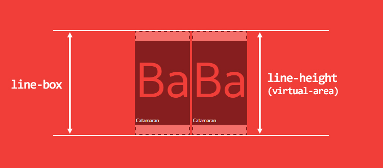
But what if the second element has a smaller
font-size ? span:last-child { font-size: 50px; } Strange as it may sound, alignment of the default baseline can lead to an increase in the height (!) Of the row container, as shown in the figure below. I remind you that the height of the container row is calculated from the topmost to the bottommost point of its children.
This could be an argument in favor of dimensionless
line-height values, but sometimes fixed values are required to create an ideal vertical rhythm. Honestly, no matter what you choose, you will always have problems aligning the string.Consider another example.
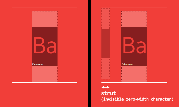
p tag with line-height: 200px , which contains a single span that inherits its line-height <p> <span>Ba</span> </p> p { line-height: 200px; } span { font-family: Catamaran; font-size: 100px; } What is the height of the container row? We could assume that 200px, but it is not. The problem is that
p has its own distinct font-family value (by default, this is a serif). The base lines of the p and span tags are in all likelihood at different heights, and therefore the height of the container row is larger than expected. This is because browsers perform a calculation, assuming that each container of the line starts with a zero-width character, which is called “strut” in the specification.Invisible symbol with a visible effect.
So, we still have the same problem as in the case of single-level elements.
With the alignment of the baseline, everything is bad, but maybe
vertical-align: middle will save us? As stated in the specification, the middle “aligns the container with the vertical midpoint (midpoint) with the baseline of the parent container plus half the x-height of the primary element.” The ratio of baselines, as well as x-heights (x-height), can be different, so you can not rely on the middle alignment. And the worst part is the fact that in most of the middle scenarios, the “center” is never truly. This is influenced by too many factors that cannot be specified via CSS (x-height, the ratio of the upper and lower outliers, etc.).In addition, there are four other values that may be useful in some cases:
vertical-align: top / bottom- alignment at the top or bottom of the container row;vertical-align: text-top / text-bottom— Aligns to the top or bottom of the content area.
But be careful: in all cases, the virtual area is aligned, that is, the invisible height. Consider a simple example using
vertical-align: top . Invisible line-height can give a strange, but expected result.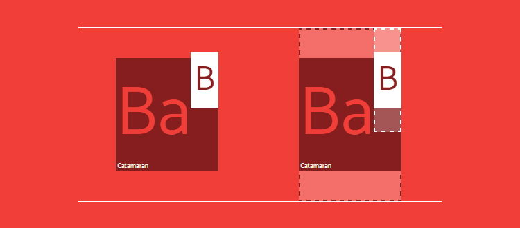
Finally,
vertical-align also accepts numeric values that shift the container above or below relative to the baseline. This last option may come in handy.CSS is awesome
We discussed the issue of
line-height and vertical-align interaction, but now the question is, can we manage font metrics through CSS? In short, no. Although I would really like this. In any case, I think it is time to have some fun. Font metrics are constant, so at least we should have something.What if, for example, we need text in the Catamaran font with a height of capital letters of exactly 100px? It seems to be doable, so let's do some calculations.
First of all, we specify all the font metrics as custom CSS properties, and then calculate the
font-size , at which the height of capital letters will be 100px. p { /* */ --font: Catamaran; --fm-capitalHeight: 0.68; --fm-descender: 0.54; --fm-ascender: 1.1; --fm-linegap: 0; /* */ --capital-height: 100; /* font-family */ font-family: var(--font); /* , */ --computedFontSize: (var(--capital-height) / var(--fm-capitalHeight)); font-size: calc(var(--computedFontSize) * 1px); } 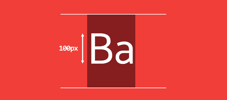
Pretty simple, isn't it? But what if we need the text to be visually centered, and the remaining space is evenly distributed above and below the letter “B”? To do this, you must calculate the
vertical-align based on the ratio between the upper and lower outweigh elements.First, we calculate the
line-height: normal and the height of the content area: p { … --lineheightNormal: (var(--fm-ascender) + var(--fm-descender) + var(--fm-linegap)); --contentArea: (var(--lineheightNormal) * var(--computedFontSize)); } Then we need:
- distance from the bottom of a capital letter to the bottom edge;
- The distance from the top of a capital letter to the top edge.
Like that:
p { … --distanceBottom: (var(--fm-descender)); --distanceTop: (var(--fm-ascender) - var(--fm-capitalHeight)); } Now we can calculate
vertical-align as the difference between these distances, multiplied by the calculated font-size value (This value should be applied to the string child element). p { … --valign: ((var(--distanceBottom) - var(--distanceTop)) * var(--computedFontSize)); } span { vertical-align: calc(var(--valign) * -1px); } And finally, we set the required value for
line-height and calculate it, keeping the vertical alignment: p { … /* */ --line-height: 3; line-height: calc(((var(--line-height) * var(--capital-height)) - var(--valign)) * 1px); } 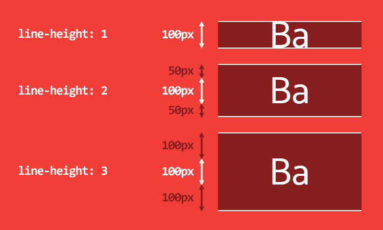
Now it’s quite simple to add a graphic element of the same height as the letter “B”:
span::before { content: ''; display: inline-block; width: calc(1px * var(--capital-height)); height: calc(1px * var(--capital-height)); margin-right: 10px; background: url('https://cdn.pbrd.co/images/yBAKn5bbv.png'); background-size: cover; } 
I remind you that this test is shown solely for demonstration, and you should not rely on its results. There are many reasons for this:
- If the font metrics are not constant, then the calculations in the browser will not be permanent. ¯ (ツ) / ¯
- If the font is not loaded, the backup font metrics are likely to be different, and working with multiple values will quickly become impossible.
Let's sum up
Working examples:
What we found out:
- Inline formatting context is really hard to understand.
- All line elements have two heights:
- the height of the content area (which depends on the font metrics);
- the height of the virtual area (
line-height); - None of them can be exactly visualized (unless you are working with development tools and decided to correct this defect, then it would be just wonderful).
line-height: normaldepends on the font metrics.- due to
line-height: nvirtual area may become smaller than the content area. - you should not rely on
vertical-align. - The height of the row container is calculated using the
line-heightandvertical-alignproperties of its children. - We can't just get or set font metrics via CSS.
But I still love CSS :)
useful links
- font metrics: FontForge , opentype.js
- calculate line-height: normal and some proportions in the browser ;
- Ahem is a special font to understand how it works.
- deeper formal explanation of line formatting context
- Future specification for this topic for help with vertical alignment: Line Grid module
- font metrics, API Level 1 , collection of interesting ideas (Houdini)
Source: https://habr.com/ru/post/337450/
All Articles