VK by design
VKontakte is a set of interfaces for different platforms. Today you will learn about how we work on these interfaces, creating the design of our products.
A little about us. The design team employs six enthusiastic creative guys aged 22-24. We are universal: the designer is not chained to one direction for centuries and can today be engaged in the mobile version, and tomorrow - some desktop service.
')
Tools and approaches
Our mobile apps consist of over 500 different screens. Plus hordes of interfaces from the web, plus m.vk.com. You need to be able to efficiently organize work with all this wealth.
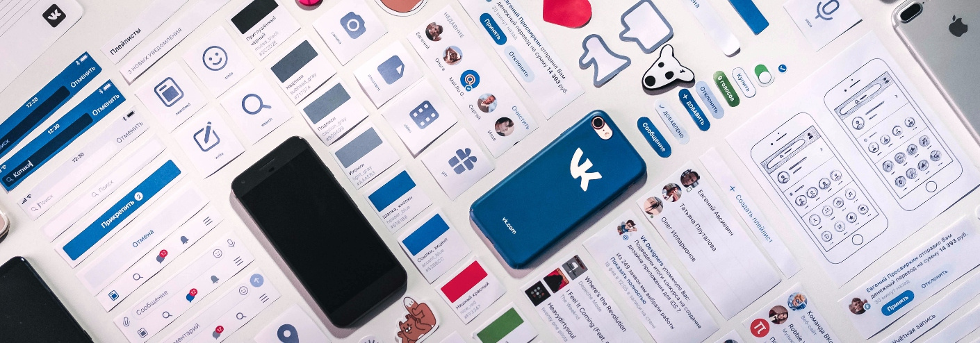
For example, with icons. There are really a lot of them. One diligent designer recently redrawn more than a hundred pieces:

Previously, on each screen of the application used their icons in different colors and sizes. For example, newsfeed_search, wall_search_gray, etc. Now we have made the icons universal and can reuse them. Only one search icon instead of five different ones.
Thanks to this approach, creating new screens has become easier: you do not need to cut the icons each time, the developer simply takes the finished ones in the required size and uses the color from the layout. The icons in the collection have intuitive names, so you can find the right one even without the help of a designer, which sometimes saves time.
All major components for each platform are collected in the collection - UI Kit. Here's what it looks like:
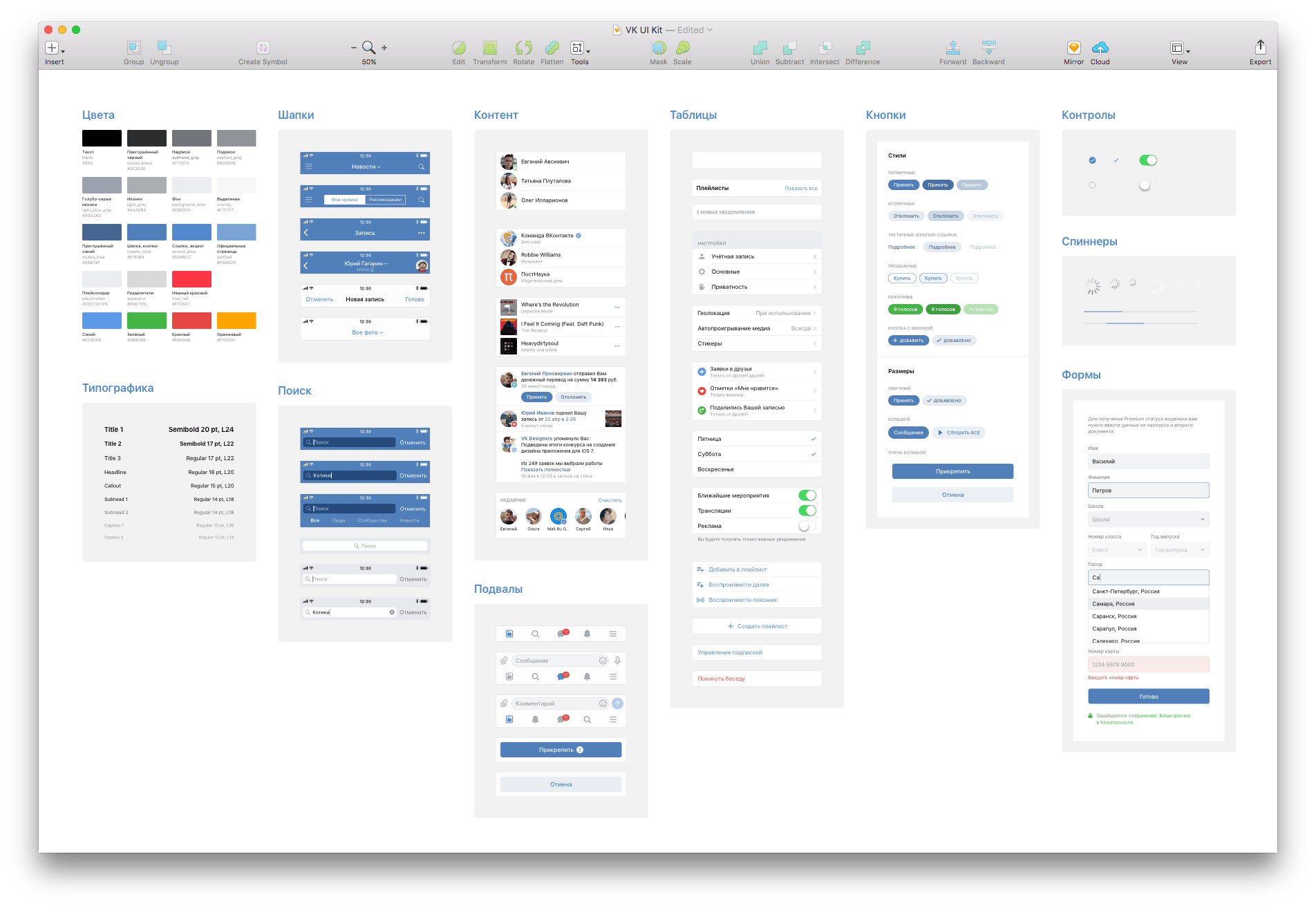
We have created our own design system that uses the same icons, buttons, and colors in applications for Android and iOS. We try to adhere to a single style on all platforms, down to the smallest details - not forgetting, however, their specific features, such as specific controls, card shadows or the presence of separators.
In 2015, we completely switched from Photoshop to Sketch to design our interfaces. We use Trello to distribute tasks, and work files are synced to Dropbox. We create prototypes in Principle, Framer and Origami, we try new tools and plugins.
Set goals
The goal of any good design is to improve the user's life. And the process always begins with the question: how can it be improved?
This requires the joint work of several teams: we study the feedback, analyze the scenarios of interaction with the product, and on the basis of this we decide what would be nice to implement.
When the task falls to the designers, the functionality of the product is already defined. We have to decide how to make this product like to be used, to be comfortable and - ultimately - to make the user's life better. The visual aesthetics of the interface is not decisive in this case, despite the widespread opinion that design is only about beauty. Convenience for us in the first place.
Using case studies from VKontakte mobile applications, we will talk about the challenges and goals the design team faces every day.
Navigation
In the VKontakte mobile application you can do almost everything the same as in the full version of the site. On the one hand, it is beautiful. On the other - we have too much of everything. Even the most destructive new feature is doomed to go unnoticed in the bins of the side menu. At the same time, the most popular sections are not allocated.
You need to simplify navigation in applications without sacrificing functionality. We did this using a tabbara at the bottom of the screen.
Tabbar itself is never new. Now this is the standard approach to navigation on Android and iOS. We once had it too:
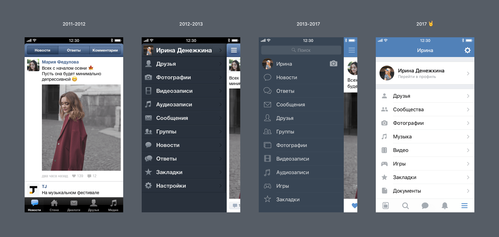
Pay attention to 2011 - everything is quite simple, if the application functionality fits into five tabs.
Then all features first of all were implemented in a web, and at the best were embodied in API much later, and even in general never. But times have changed: more and more users acquired smartphones, the Mobile First paradigm gained momentum, and applications began to be able to do much more. On the approach were new entertaining sections and services, and one bottom panel was sorely lacking.
Here our paths with tabbar diverged. In all the following versions, only the side menu was used, which contained all sections. We shuffled the points, redrawn the icons and played with the colors, but nothing radically changed. It is time to end this.
And, it seems, tabbar is ideal. In the courtyard MMXVII, tabs firmly established in the guidelines of Apple and Google. So we will solve our task - we will take out the most necessary at a distance of one tapa and save all the variety of possibilities in the usual menu.
Well, great. It remains to understand what will be in the tabs. It should be noted here that, ideologically, we almost never practice A / B testing UX on large samples of living people. Even a global redesign of the full version of the site, after rolling out some of the users, was only finished for some small details. Fundamental questions like priority of sections we solve retrospectively, planning the future on the basis of extensive experience from the past.
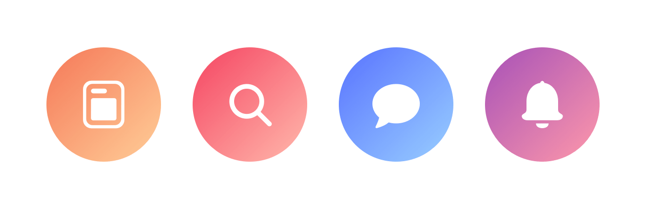
After analyzing many different statistics, we (without much, however, intrigue) chose four main sections: News, Search and Recommendations, Messages and Notifications. In the fifth tab, leave the menu, where everything else will be.
And what about the good old menu? Here we gave ourselves the will to create concepts:

But, no matter how tempting it is to take and change everything at all, we must not scare you and not lose in convenience. The classic list takes up less space, is familiar and easy to use for everyone. On that and decided.
Search and Recommendations
Our users need to constantly discover something new for themselves. I want to find interesting records, not limited to its news feed. And it should be as simple as possible.
Recommendations are an updated section with big ambitions. Now it is not hidden in the depths of the news feed, but put in a prominent place in the new navigation. Here we offer content from talented authors with topics that are of interest to you. In fact, this is such a sticky thing, where you can find something qualitative and unfamiliar, taking into account personal preferences.
From the point of view of design, the task was not trivial. You need to be able to beautifully display different types of content and fasten a global search there for all sections, so much so that one does not interfere with the other. We stopped on the cards:
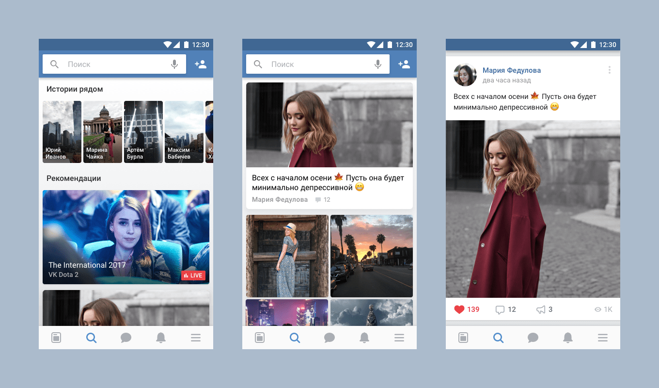
And that's why. It is convenient to flip through the ribbon from the cards - usually it’s already clear from the preview if you want to read the longrid completely or not. You do not have to spend time and scrolling huge posts for a long time before you find the one you would like to stay at. By tapu on the card, the publication opens as a whole, and if you wish, you can continue to flip through the tape in full-size mode or return to the preview mode.
With the choice of icons for this section was not easy. In the end, the friendship of a magnifying glass won: after all, recommendations are also a search, simply without a specific request.
news feed
In March, we started to show the view counter next to the records. In applications, this was also supported - but only on a separate screen with a post. In the news feed, views are not displayed, and this needs to be corrected.
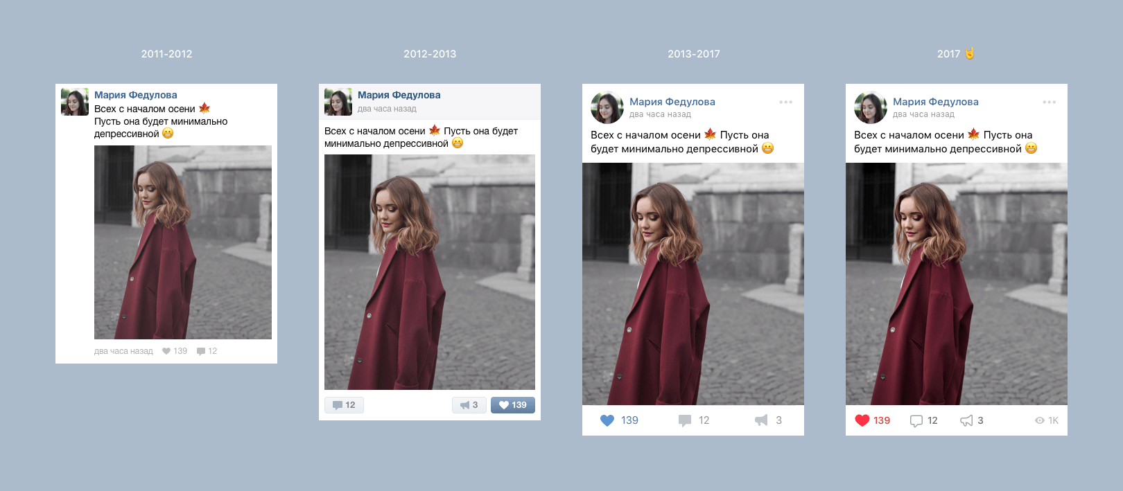
But you can not just take and add the counter. This is a new static icon, and it is important not to confuse the user. We changed the style of action icons: they became contoured because they were filled. Such icons can be made more contrast and larger, keeping the interface lightness - contour icons will not become visually “heavy”. They look aesthetically pleasing, are not perceived as inactive, and introduce an element of the game: I want to fill the “empty” icon with my action. Thanks to different styles, you can easily understand what is waiting for your tapa, and what simply informs you.
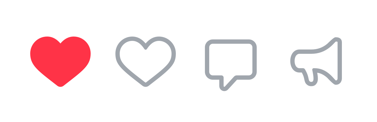
And most importantly - we painted like. Yes, now it is red (well, almost, # FF3347), juicy and noticeable. No more doubts, did you like this luxury article or are you still going. We have long gone to this. We started the first experiments with the color of the heart back in 2014, in the process of creating a new design of the web version of VKontakte.
Audio player
After the spring reform of the audio section, much has changed - we have playlists, covers of tracks and new selections in the recommendations. The player itself remains the same.
If you add to the screen all controls that the user may need, it will be like a spaceship. But I do not want to throw out anything.
It was necessary to come up with a convenient way to display a large amount of content in the player. And that's what happened with us:
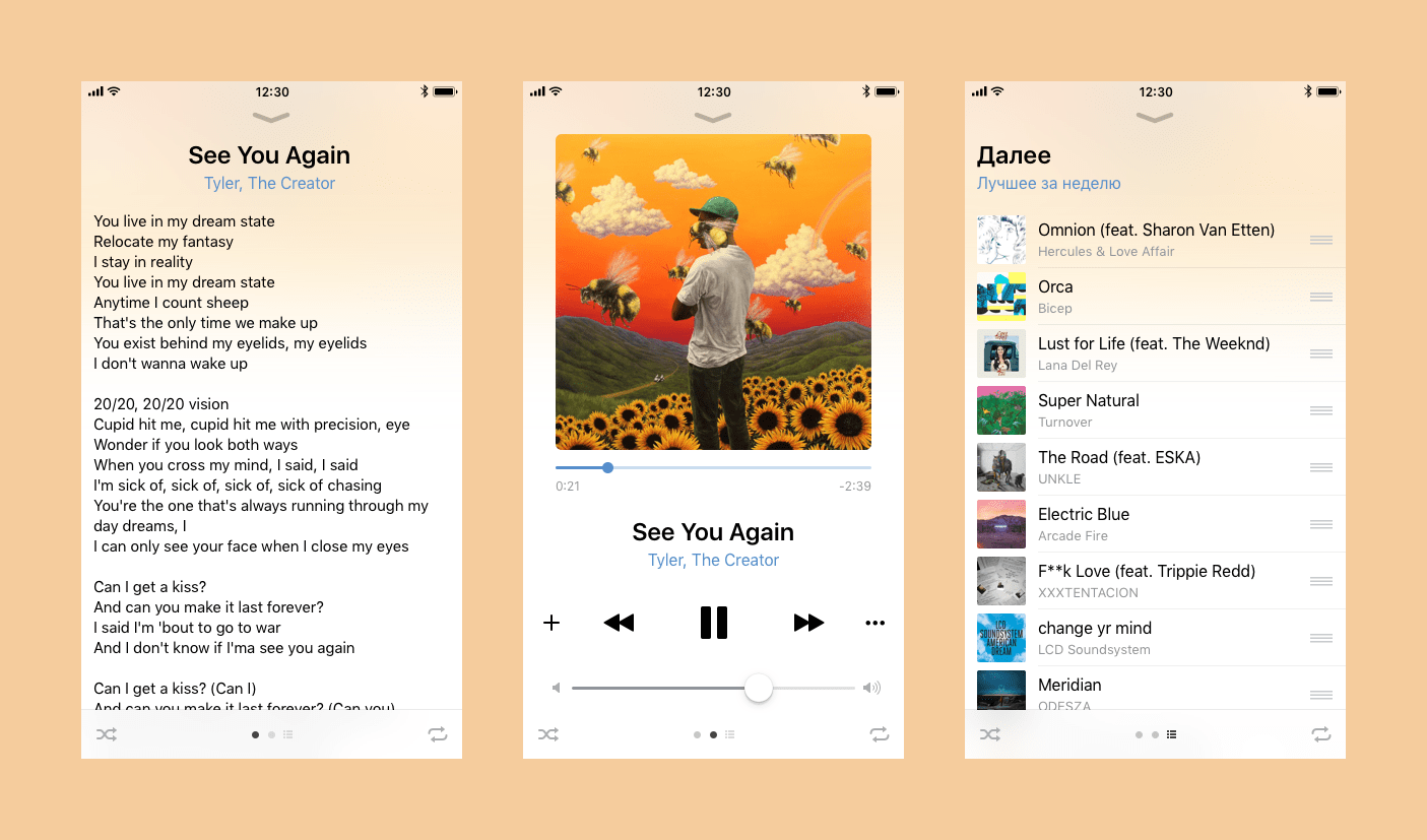
We made the screen with the current composition central, providing for the possibility to move on to the song text and playlist with a swipe. Due to this, the screens are not overloaded with controls, and the user can concentrate on exactly what he needs right now. And a separate icon of the list will not allow you to get confused in the screens - you always know where to find the playlist.
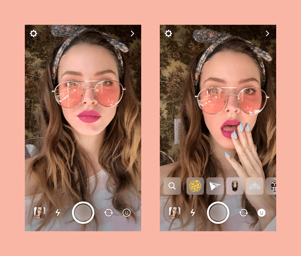
Story editor
Every week several new masks appear in the stories, and, of course, we want you to try them too. Climb for a new mask in a large detailed list of laziness. In addition, a bulky catalog takes up almost a third of the screen and covers part of the face.
We decided to try another common approach to quickly switch between masks:
Summing up
A variety of people work on the realization of design in real methods, controls and screens. One thing unites us all - we believe that we are making the lives of millions of users (including ourselves) better by thinking through every icon, every section, every service. How well we do it is to evaluate you.
Very soon, updated VKontakte apps for Android and iOS, where some of the described concepts are implemented, will be officially launched.
“Instantly notice the likes of the top Tian, write her“ hello, how are you ”and immediately return to the memes in the tape - more than ever.”
Murtol Lazvachev, an active user of VKontakte
Source: https://habr.com/ru/post/337424/
All Articles