6 fresh examples of parsing and design improvements in simple ways

Hello! In our community Vkontakte there is a heading where we give express design tips. Our heading is quick tips on what can be improved in terms of graphics, and not a full redesign or logo design. Today we are talking about useful techniques on the example of the participants in our column.
1. Peshkariki: we strengthen the image
Peshkariki is a walking courier service, so the company decided to use an association with a road sign in the logo.
The package in the hands of a person is more like a suitcase, because of this, the image of the courier is not readable. The font part argues with the sign, so there is no sense of the integrity of the logo. Our offer:
')
- Make a person look like a courier, not an office employee.
- Choose a more suitable font and move it under the sign.
- Make the green color not so bright.
Depending on the situation and location, you can use different versions of the logo.
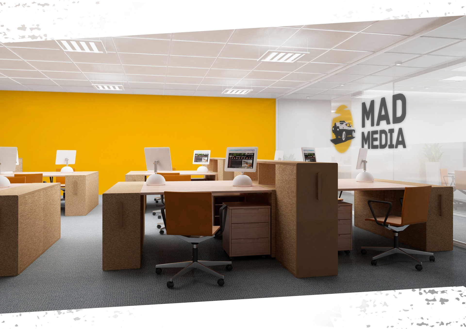
2. Mad Media: add speakers
Mad Media agency turned to us for help. The guys logo in the style of mad Max - it's cool, but the sign lacks the dynamics.

Our advice is to defuse the logo. Now there is little “air” in it, all the elements huddle together. If you separate the name, the problem with the place will disappear. Bonus, you can use the sign and font separately from each other.
Now that a place has appeared, you can think of a sign. Alternatively, to add dynamism and brutality to the car, you can change the boring angle from the side to non-standard.

We think how a similar sign would look like in life:

For example, you can arrange the office:
And so - branded notebooks and business cards:

As a result
Pros:
The logo has become more dynamic
Now you can use the sign separately from the font.
Minuses:
Above the font and flowers need to think a little longer
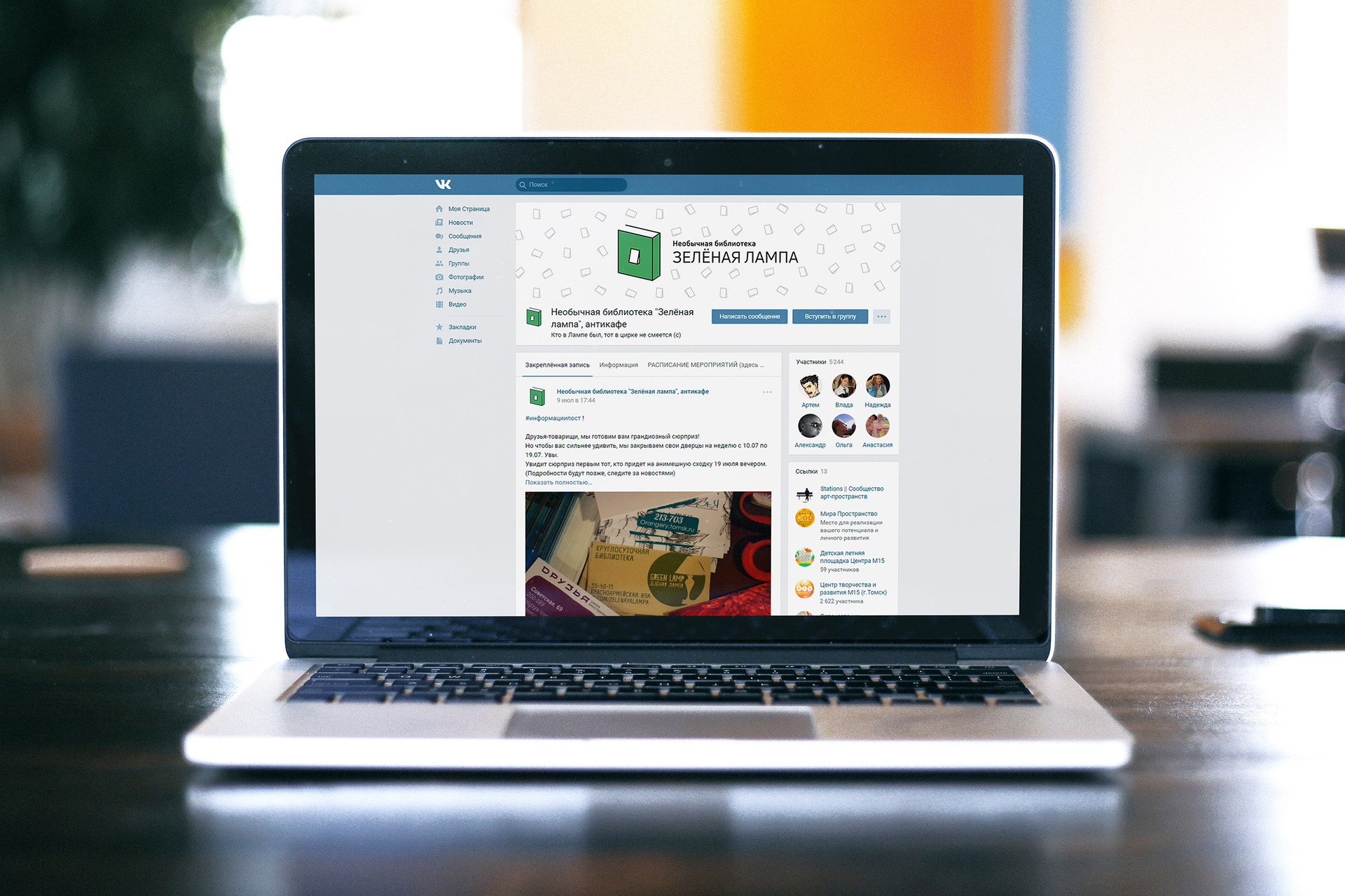
3. Green lamp: make the sign easier
The green lamp is an interesting project, a library in the anti-cafe format. In the original version, there are many details: a stroke of different thickness, nails on the body, a characteristic font. All these elements overload the logo and do not give to understand its idea.

Therefore, the advice for the library: remove unnecessary elements and make the logo more minimalist. It is possible to portray the switch itself, not its button, in the form of a book - so the idea will be read better. Stroke to make one thickness, and to calm the font part.

As always, we look at how such a logo would look on branded media:

In social networks:
Total
Pros:
The logo has become neater and clearer
Minuses:
To make the idea even better read, you can add sheets to the book.
4. Promoter 51: developing the idea
We gave a few tips to the promoter 51 advertising community. The logo is a good idea: man + place on the map = promoter, distribution point.

But the logo looks like a clipart: all the lines and distances in the sign are random. The absence of a gap in the name impairs readability, and the shadows in the sign make the logo difficult. We would recommend to remove the clipart. Combine man and geotag in one simple symbol. Line up the logo on the grid, add a space and subscript.

Such a symbol will be easy to use on the promoters form:

And other media:

You can make animations for social networks or site:
Total:
Pros:
Logo has become neater
It can be used for branded clothing, which is important for the company.
Minuses:
Geotag - a hackneyed topic
5. Smart technology: add details
The logo of the Smart Appliances store, on the contrary, is too simple. Here you can add more details and develop the idea.

Alternatively, you can use the elements of the chip, thereby making a hint of technology, so the sign will speak for itself. In this case, the sign and the font may be used separately.

In the font part we remove the capital letters and replace them with a simple, neat font. Now the logo has an idea, it began to look more collected. Logo elements can be used in different ways, for example, for the design of corporate media:


Total:
Pros:
The logo has an idea
Minuses:
Other corporate identity elements are needed to support the logo.
6. Plastilin: make it more modern
Plastilin is a décor workshop. Studio logo attracts attention, but several details do not allow it to work in full force.

For example, gradient and gradient stroke is an outdated technique. Although it is worth noting, in some cases - appropriate. But, in the case of the studio, it is better to get rid of it. We would suggest: remove the gradient, make the colors more juicy, and add plasticity to the shape of the logo - make all the letters soft, rounded and not use sharp corners. We are trying on how this version of the logo could look like in life:


On shopping bags:

Total:
Pros:
The logo began to look more modern
Minuses:
You can come up with a brighter sign for the workshop.
These were several tricks you can use to improve your design. As always, we remind - this is a defective redesign, and quick graphic tips. See you!
Read previous issues:
→ Issue №1
→ Issue №2
→ Issue №3
→ Issue №4
Prepared by Slepchevich Victoria for Log Machine
Source: https://habr.com/ru/post/336924/
All Articles