5 ways to use red in your company colors

We have already written about how to use the blue color in the design and corporate style of your company. Now it is the turn of red. You will learn the advantages of using this color in a corporate style, with what colors it combines best. The article will help you choose a brand-color and, with its help, improve your project.
Red
The associations with red are strong and contradictory - love, beauty, heat, danger, blood, prohibition and its violation. It is not surprising that the shades of red cause the most vivid emotions. It enhances perception and encourages action.

A source
')
Red color is equally popular in all areas, if you choose it, it means that you are not afraid to be in the center of attention, you have ambitions and the desire to become the best. In any case, this is how most people perceive red color. Well-known “red” brands of world renown - Coca-Cola, Colgate, Canon, Netflix, Opera and many, many others.
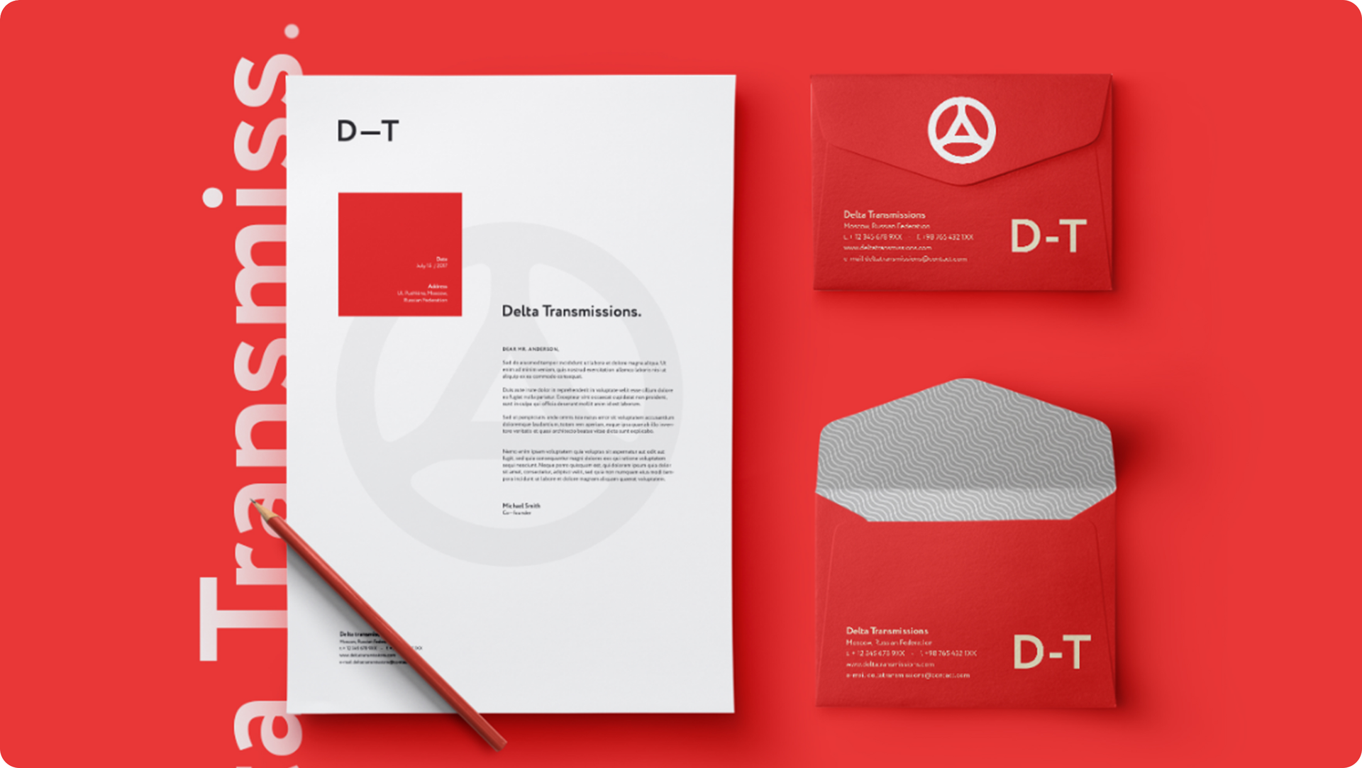
Delta Transmissions - car service from California. The task of our designers was to create a simple and recognizable corporate identity. In combination with a simple and minimalist logo - Greek “D”, inscribed in the car steering wheel, our designers chose a darker shade of red with their brand-color. So the company has kept the association with strength and friendliness, but the corporate identity began to look less aggressive.
But today, to attract attention and remember, it is no longer enough to paint your company red. The principal role is played by combinations with other colors, proportions and shades.
Red + black
A source
Black color is associated with rigor, power and authority. Using it in the corporate style, you hint at your confidence and experience. However, black is used so often that it does not attract attention by itself. A combination with red will help brighten up your black style. Together, these colors look like something dark and aggressive, creating an image of confident power and gothic romanticism and brutality. This combination will help show your confidence, add the image of masculinity.
A vivid example is the gaming lineup Republic of Gamers, from Asus. Aggressive red lines on a black background, purple neon lights and dark shades. However, this is the exception rather than the rule. The style of most companies suggests a lighter atmosphere, which is achieved with the help of white and steel shades of gray. Famous examples of black and red logos: MSI, F1, Dodge, Rosbank, etc.
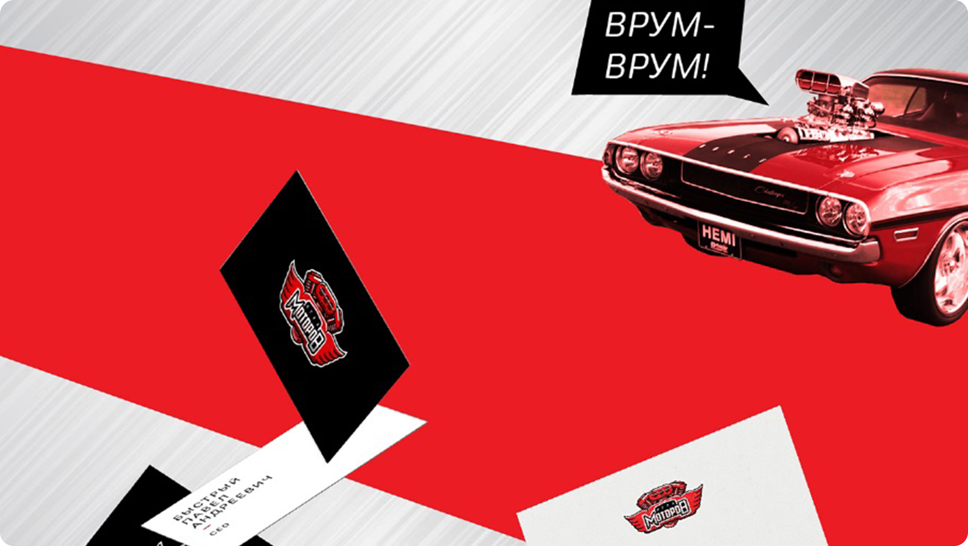
The “Battle of Motors” project is a show tuning competition on YouTube. Corporate style is based on a combination of red and black colors. As conceived by our designers, red symbolizes the competitive spirit, and black symbolizes the rigor and dedication of the competitors. In combination with the automotive stylist, corporate identity looks solid and at the same time expresses the fighting mood of the project.
The combination of red and black is perfect if you have a martial arts school, a nightclub in the Gothic style or a brand of youth clothing with an aggressive way. However, in any other field, this combination will also attract attention to you. The choice of primary colors is just the beginning of a journey to a unique corporate identity.
Red + Yellow

A source
Yellow - the color of positive, warmth and happiness. It is associated with gold, sun, light and optimism. In addition, yellow is the color of caution and increased attention. It can play the role of a background or, on the contrary, stand out against the background of a darker color. Then red comes to the rescue. The combination of yellow and red will help you draw attention to your product, create a bright, positive image.
Red and yellow in the corporate style are quite common. These are world-famous logos and corporate identity of companies: DHL, Lays, Kodak, Shell, Chupa-Chups, MC'Donalds and many others.
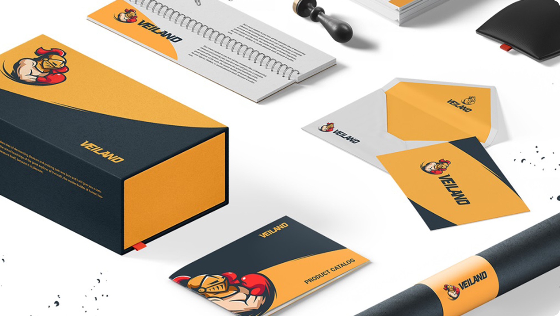
We used this combination in the corporate style of the company Veiland. The company's colors are yellow and black, with bright red elements. In combination with a dynamic logo, the image of the brand is associated with masculinity, but has a positive mood.
Red and yellow will suit everyone who wants to create an image of energy and friendliness. You can only use these colors as primary colors, or add a few others to them to create your company's unique mood.
Red + Blue
A source
Blue is the most popular color in the world. We have already talked about how you can use it in the colors of your company. Blue calms, causes a feeling of confidence, is associated with the sea and sky, with water and cold.
The contrasting combination of blue and red can be both harsh and shocking, as well as harmonious and light. The perception depends on the chosen proportion, hue and the presence of additional colors. Most often, the red-blue pair is diluted with white or yellow flowers.
Popular examples are everywhere, especially often blue with red on logos are found motorists: Esso, Mobil, Chevron, Valvoline, Saab and others. Fast food lovers will also find this pair, for example, on the Burger King and Pepsi logos.
The corporate style of the Forward Sports Center is an image of confident strength and movement towards the goal, conveying the spirit of the company. We chose a dark shade of blue as the main brand color, and the main elements were made red. Contrast created a sense of energy and dynamics, and aggressive elements of identity complement the image.
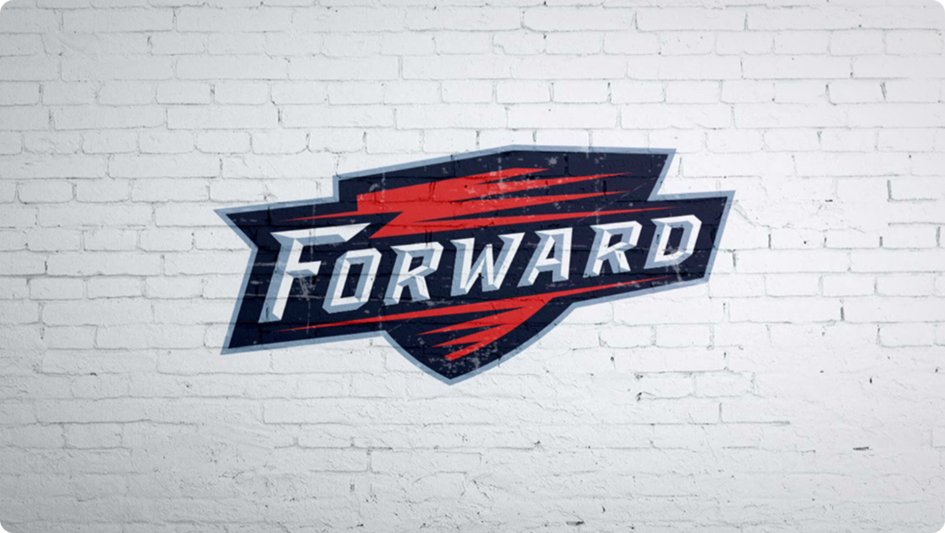
In design, the combination of blue with red is one of the most expressive. It will help if you want to demonstrate your strength and confidence, attract attention and be remembered by the buyer. This contrast is used by companies whose creators do not want to get lost in the sea just blue and just red logo.
Red + green
A source
Green is the color of life and health, renewal and freshness. It calms and gives a feeling of confidence. Associated with nature, ecology and health. Green is often used in the financial services and IT industries. Nevertheless, this color can not always attract attention, being lost among competitors due to its neutral mood. Add red to make your logo bright and recognizable.
There are many examples of such a combination, among the most famous logos are Castrol, Heineken, Mountain Dew, the previous version of the Lucky Strike logo. Most often, green plays the role of the background, and red highlights the details or the central element of the logo. The red and green style almost always has white elements.
The combination of green and red is suitable if your company is engaged in food, is associated with the environment, medicine or financial products.
Conclusion
In this article, we told you what role red plays in the corporate style, with which colors it fits, which shades are used most often. With the help of red color, you can focus attention, select the central elements of the logo and style. It can be used as a bright background and central element.
Today there are so many red “companies” that the red color itself has already become familiar, and therefore has lost its value. To become truly recognizable, use red and experiment with combinations, shades and proportions. Create a bright corporate style for which you do not have to blush!
The text was prepared by the copywriter of Logmachine - Nikolay Romanov
Source: https://habr.com/ru/post/336772/
All Articles