ggplot2: how to easily combine multiple graphs in one, part 1
This article will show step by step how to combine several ggplot graphs in one or several illustrations using the helper functions available in the R ggpubr , cowplot and gridExtra packages . We also describe how to export the resulting graphs to a file.
The standard functions R -
A simple solution is to use the R gridExtra package, which has the following features:
However, these functions do not align graphics with each other; instead, they are simply placed in the coordinate grid as is, i.e. axes use different scales.
If you need to bring the axes to the same dimension, you can use the cowplot package, which has the function
')
You will need to install ggpubr (version 0.1.3 or higher). This makes it easy to create ggplot graphics for publications.
We recommend installing the latest version from developers from github as follows:
If you didn’t manage to install from GitHub, try from CRAN , like this:
Note that installing ggpubr will also install gridExtra and cowplot , so they do not need to be installed separately.
Download ggpubr :
Data sets: ToothGrowth and mtcars .
Here, we will use ggpubr functions based on ggplot2 to create graphs. But in general, you can use any functions of ggplot2 to make graphs, and arrange them later.
We will start with 4 different graphs:
You will learn how to combine these diagrams with the help of special functions in the following sections.
Create ordered scatterplots. Change the fill color for the grouping variable “cyl”. Sort for all data, not within groups.

To combine several ggplot-graphs, we use the function

You can also use the
or the
Function R
Please note that the
A use case from practice, for example, the construction of survival curves with a risk table under the main schedule.
To illustrate this case, let's use the survminer package. First install it (
ggsurv - a list with such components:
You can arrange the survival curves and the risk table as follows:

You can see that the axes of the survival curves and the risk tables are not aligned vertically. To do this, we set the align argument:

In the next part:
The standard functions R -
par() and layout() - cannot be used to place several ggplot2 graphs on one illustration.A simple solution is to use the R gridExtra package, which has the following features:
grid.arrange()andarrangeGrob()to combine several ggplot graphs into onemarrangeGrob()to place several ggplot graphs on several illustrations
However, these functions do not align graphics with each other; instead, they are simply placed in the coordinate grid as is, i.e. axes use different scales.
If you need to bring the axes to the same dimension, you can use the cowplot package, which has the function
plot_grid() with the align argument. But this package, in turn, does not contain a solution for placing several graphs in different illustrations. To do this, we will use the ggarrange() function [in ggpubr ], a wrapper over the plot_grid() function, which can organize graphs in several illustrations. It will also help create a common legend for several graphs.')
Prerequisites
R packages
You will need to install ggpubr (version 0.1.3 or higher). This makes it easy to create ggplot graphics for publications.
We recommend installing the latest version from developers from github as follows:
if(!require(devtools)) install.packages("devtools") devtools::install_github("kassambara/ggpubr") If you didn’t manage to install from GitHub, try from CRAN , like this:
install.packages("ggpubr") Note that installing ggpubr will also install gridExtra and cowplot , so they do not need to be installed separately.
Download ggpubr :
library(ggpubr) Sample datasets
Data sets: ToothGrowth and mtcars .
# ToothGrowth data("ToothGrowth") head(ToothGrowth) len supp dose 1 4.2 VC 0.5 2 11.5 VC 0.5 3 7.3 VC 0.5 4 5.8 VC 0.5 5 6.4 VC 0.5 6 10.0 VC 0.5 # mtcars data("mtcars") mtcars$name <- rownames(mtcars) mtcars$cyl <- as.factor(mtcars$cyl) head(mtcars[, c("name", "wt", "mpg", "cyl")]) name wt mpg cyl Mazda RX4 Mazda RX4 2.620 21.0 6 Mazda RX4 Wag Mazda RX4 Wag 2.875 21.0 6 Datsun 710 Datsun 710 2.320 22.8 4 Hornet 4 Drive Hornet 4 Drive 3.215 21.4 6 Hornet Sportabout Hornet Sportabout 3.440 18.7 8 Valiant Valiant 3.460 18.1 6 Create some graphs
Here, we will use ggpubr functions based on ggplot2 to create graphs. But in general, you can use any functions of ggplot2 to make graphs, and arrange them later.
We will start with 4 different graphs:
- scatter charts and scatter charts for the ToothGrowth dataset
- scatter and scatter diagrams for mtcars dataset
You will learn how to combine these diagrams with the help of special functions in the following sections.
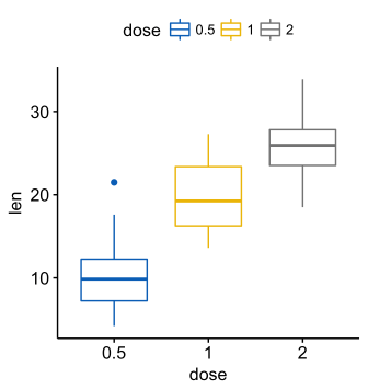
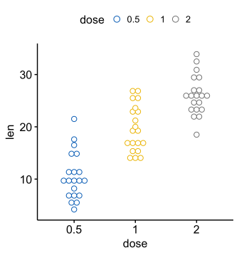
Create a scatterplot and scatterplot
# (bp) bxp <- ggboxplot(ToothGrowth, x = "dose", y = "len", color = "dose", palette = "jco") bxp # (dp) dp <- ggdotplot(ToothGrowth, x = "dose", y = "len", color = "dose", palette = "jco", binwidth = 1) dp Create ordered scatter and scatter diagrams
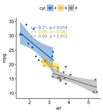
Create ordered scatterplots. Change the fill color for the grouping variable “cyl”. Sort for all data, not within groups.
# (bp) bp <- ggbarplot(mtcars, x = "name", y = "mpg", fill = "cyl", # cyl color = "white", # palette = "jco", # jco - journal color palett ( ). . ?ggpar sort.val = "asc", # sort.by.groups = TRUE, # x.text.angle = 90 # ) bp + font("x.text", size = 8) # (sp) sp <- ggscatter(mtcars, x = "wt", y = "mpg", add = "reg.line", # conf.int = TRUE, # color = "cyl", palette = "jco", # "cyl" shape = "cyl" # "cyl" )+ stat_cor(aes(color = cyl), label.x = 3) # sp Placing on one chart
To combine several ggplot-graphs, we use the function
ggarrange() [in ggpubr ], a wrapper over the plot_grid() function [in the cowplot package]. Compared to the standard plot_grid() function, ggarrange() can place several graphs in several illustrations. ggarrange(bxp, dp, bp + rremove("x.text"), labels = c("A", "B", "C"), ncol = 2, nrow = 2) You can also use the
plot_grid() function [in cowplot ]: library("cowplot") plot_grid(bxp, dp, bp + rremove("x.text"), labels = c("A", "B", "C"), ncol = 2, nrow = 2) or the
grid.arrange() function [in gridExtra ]: library("gridExtra") grid.arrange(bxp, dp, bp + rremove("x.text"), ncol = 2, nrow = 2) Let's sign the ordered schedule
Function R
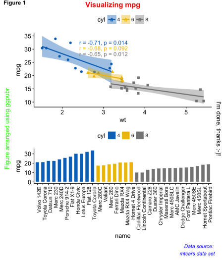
annotate_figure() [in ggpubr ]: figure <- ggarrange(sp, bp + font("x.text", size = 10), ncol = 1, nrow = 2) annotate_figure(figure, top = text_grob("Visualizing mpg", color = "red", face = "bold", size = 14), bottom = text_grob("Data source: \n mtcars data set", color = "blue", hjust = 1, x = 1, face = "italic", size = 10), left = text_grob("Figure arranged using ggpubr", color = "green", rot = 90), right = "I'm done, thanks :-)!", fig.lab = "Figure 1", fig.lab.face = "bold" ) Please note that the
annotate_figure() function supports any ggplot graphics.Align graph and data
A use case from practice, for example, the construction of survival curves with a risk table under the main schedule.
To illustrate this case, let's use the survminer package. First install it (
install.packages(“survminer”) ), and then do the following: # library(survival) fit <- survfit( Surv(time, status) ~ adhere, data = colon ) # library(survminer) ggsurv <- ggsurvplot(fit, data = colon, palette = "jco", # jco pval = TRUE, pval.coord = c(500, 0.4), # p- risk.table = TRUE # ) names(ggsurv) [1] "plot" "table" "data.survplot" "data.survtable" ggsurv - a list with such components:
- plot : survival curves
- table : chart with risk table
You can arrange the survival curves and the risk table as follows:
ggarrange(ggsurv$plot, ggsurv$table, heights = c(2, 0.7), ncol = 1, nrow = 2) You can see that the axes of the survival curves and the risk tables are not aligned vertically. To do this, we set the align argument:
ggarrange(ggsurv$plot, ggsurv$table, heights = c(2, 0.7), ncol = 1, nrow = 2, align = "v") In the next part:
- changing spacing in rows or columns using different packages
- common legend on combined ggplot graphs
Source: https://habr.com/ru/post/336492/
All Articles