App Store on iOS 11: what it will be and what it means
It didn’t seem to be summer: it seems that just yesterday everyone excitedly discussed the June presentation with WWDC, at which Apple representatives told the public about iOS 11, and now a few weeks separate us from the public release. So, it's time to refresh in memory all that has been said about the new device, and to morally prepare for the inevitable changes that await everyone who deals with mobile applications. And this concerns not only developers. In the new version, the App Store has been significantly reworked, which means marketers, content managers and designers will get it - the changed promotion environment sets new rules and priorities, thereby forcing the product to change.
In the article, we will step by step describe our experience of exploring the beta version of the updated App Store, highlight the main changes that we have noted for ourselves, and assume how to adjust the promotion strategy so as not to be caught off guard.

The first major change that catches your eye as soon as the application loads is an updated set of tabs on the bottom panel. This is not about a simple restructuring, but about a fundamentally new approach to the presentation of content.
')

IOS 10 tab bar

IOS 11 tab bar
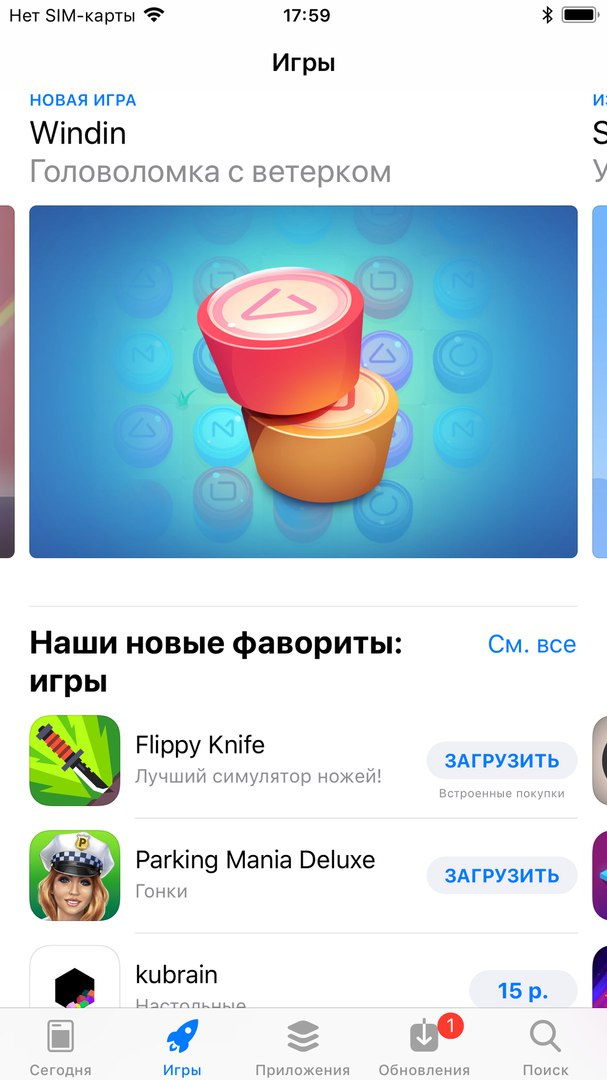
As we can see, the “Tops” tab has disappeared in principle; looking ahead, we will clarify that some of the information contained in it (for example, tops of paid and free applications) went to other tabs, and some was simply eliminated (Top grossing apps). However, there are new tabs "Games" and "Applications", as well as the mysterious section "Today". The weakening attention to the tops and the specificity of the new content suggests that Apple has adopted a new policy: the focus is shifting from the large, successful players to projects without any special regalia, but with originality and good potential. Of course, for independent developers and indie companies this is great news.
Especially promising in this regard is the “Today” section, which is entirely devoted to the latest innovations and contains a wealth of editorial materials in various formats: collections, success stories / trials and errors, interviews with teams, lifehacks, recommendations. In other words, an ordinary developer has new ways to attract attention and be on the main page - it makes sense to think about how you can effectively present, if not the product itself, then its history and its experience. However, due to more detailed and in-depth coverage, the total number of applications that hit the main page every day is reduced. On the official website, Apple encourages teams to talk about themselves in a free form, while emphasizing that preference will be given to such products that are distinguished by good design or graphics, originality and originality, versatility (localization, technical characteristics), and in the case of games, also gameplay, sound, control and well-developed history.
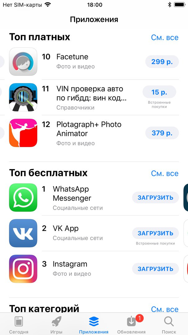
This differentiation of requirements brings us to the next point - the global separation of games and applications, which is indicated by the appearance of tabs of the same name in the panel. It is beneficial primarily for non-player utilities - according to statistics for 2016, the games accounted for about half of the total number of products, leaving all other categories far behind. The separation of such a massive layer of titles dramatically reduces competition for places in the tops and editorial selections - after all, each tab contains its own ratings.
Sections Games and Applications
These are the most significant changes in the set and composition of the presented tabs. The section "Updates" has not undergone significant changes, only changed places in the panel with the "Search". According to Apple, the search will now be carried out on applications, games, editorial materials and in-app purchases, although the beta version does not yet reflect this breadth of coverage. The request entry page retains its usual appearance - the same line, the same autocomplete and the same list of requests "in trend". But on the search results page you can see something new.
Search engine pages on iOS 10 and iOS 11
These screens are well illustrated by another trend in the new App Store design - the increasing role of graphic content. Cards of applications are located somewhat closer than in the previous version, however, in this limited area no longer two, but three vertical screenshots fit. Instead of a static image, you can use video, which is now configured to automatically play (in silent mode) when scrolling. In a word, the developer is provided with all the conditions in order to attract the user with flashy visual content. Throwing here comes to the fore - smaller screenshots and an icon should attract more attention; those few seconds the video, which the visitor will inevitably see, must be dynamic enough and intriguing to make him stop. It goes without saying that it’s not worthwhile to grind with promo-inscriptions: the user simply cannot read them and most likely does not want to. Other information about the product is cut and made out in a more restrained style, receding into the background. It is also noteworthy that the name of the company-developer disappears from this basic information - in its place is a category or a short postscript, which we will talk about later.
And one more circumstance that should be noted: the tightness of each “card” leads to the fact that it does not occupy the whole screen or even its main part. Already in the process of scrolling, your application competes for the user's attention with the one that comes next.
Now let's go to the individual page of the application and see what has changed here. This is the most information rich screen, which, quite logically, has undergone cardinal processing. The main difference is that the new version does not contain tabs - almost all information is presented in a single space. However, there are more specific changes in the location and set of blocks that must be considered when promoting a product.
Product pages on iOS 10 and iOS 11
The top of the screen contains the most basic information about the product, built in a concise and orderly form. The first page is the name of the application and the company.
The second bar - two buttons of target actions. The “Download” button has changed, perhaps, only for the better - it has become brighter and more seductive, but the redesign of the “Share” button raises some doubts in the community. The change really turned out so radical that it went to the detriment of intuitiveness: it differs sharply in appearance from similar elements on other models, does not cause the necessary associations (the ellipsis rather suggests thoughts of more detailed information) and is located where the purchase button used to be. In addition, the Share option now disappears from the visitor’s view as soon as he scrolls through the top of the screen. All this causes pessimistic forecasts that the popularity of this feature in the near future may fall sharply.
On the third lane of the top panel are indicators that can motivate the user to buy: the average score, which made a clear visual accent, the number of voters, the panel "Editor's Choice" (if any), a place in the overall rating and age limits. Important innovation: the average rating is now calculated on the basis of votes from the moment of publication of the application, and not the last update. But what about those who are not satisfied with the current result and who have high hopes for the update? For them, there is an option to "reset" the statistics, but you can resort to it no more than once a year. Such a scheme, of course, is more convenient for maintaining a good reputation than for its restoration, and this should be borne in mind.
But the opportunity to mitigate the negative reaction from users is manifested in another - now the company can leave answers to user comments to clarify the situation and, possibly, to refute criticism. This is all the more valuable because the "carousel" with fresh comments (accompanied by answers, if any) is now given directly below the description, along with more detailed information about the estimates - you don’t even need to take an extra step, changing the tab as before. In general, the new design focuses more on the user's attention on how the application was evaluated by its predecessors and encourages the developer to actively engage in dialogue.
Section iOS 11 ratings and reviews
Scrolling through the page below, you will notice that the emphasis on visual content remains here. The mini version of the icon is fixed on the top panel and is constantly left to the user in front of the eyes during the navigation process. The gallery occupies a central place on the page, and its volume in the new App Store is expanded: for one application, you can add up to five screenshots and up to three videos. Rollers can be loaded separately for each localization, adjusted to the screen width, and the first one starts playing automatically. Unlike the screen with search results, the size of the screenshots in the gallery remains comparable to the previous one. For especially distinguished titles, one more graphic component is added - a large banner at the very top of the page, which makes us recall Google Play.
Promotional banner on the application page
By the way, another impending change is associated with ratings and reviews, which is not currently advertised too much. Apple plans to force its own API to be implemented in the application pop-up windows with a proposal to leave a rating or comment, which was previously offered voluntarily. Ratings and comments left in the application will be automatically transferred to the market. There are limitations in the SKStoreReviewController: you can only invite users to share your impressions three times a year, and only if they have not yet left a review.
The text content of the page consists of the following:
The conclusion here suggests itself: Apple continues to gently but persistently eradicate the habit of developers to abuse the keys in the name and at the same time encourages those who know how to write succinctly and creatively, achieving the desired effect even on small volumes.
Next is another interesting section - “What's New”, which includes information about the latest update and a link to the full list of versions. It is interesting for its unexpectedly increased significance. This block in the new App Store becomes mobile - its location is determined by whether the application is installed on the viewer device. If not, it will occupy a modest place after reviews and ratings, if the product is already available - information about updates will be displayed immediately behind the top panel, enticing the user to try the new functionality (it works, even if the application has been removed). Accordingly, if you are interested in involving old users, do not forget that this particular section becomes your business card.
By the way, the same, and even greater, autonomy was also obtained by the Inapps. They can not only be downloaded directly from the market, without going into the application and not installing it, but they are now considered as a kind of mini-products that can be promoted as separate titles - say, they can appear in editorial collections. On the application page will be presented a full set of inaps and subscriptions - each item on a separate small plate with the name, icon and description. So you can already train to invent sonorous names and select art.

But one should not be deceived by the independence of inaps: they still remain part of the product and any problems with them turn into problems with the project as a whole. In this regard, it is indicative of a case study studio DevGame, in which the process of publishing an application was seriously delayed just because of a minor flaw in the innap — you can read more about their instructive experience here .
The changes in the remaining blocks are not so large-scale: the design of the Information section has become more convenient, there are sections dedicated to the developer and his other projects, but this has little effect on the overall presentation of the product.
A nice bonus to the developer is the new design of the channel: each developer receives a header - a collage made up of the icons of the channel's applications, where the product icon that was added or updated last is more highlighted.
In summary, we made the following conclusions about the prospects that the updated version of the App Store opens for us:
In short, the work for the next three weeks will be enough for the whole team. For the cause, and good luck after the release!
In the article, we will step by step describe our experience of exploring the beta version of the updated App Store, highlight the main changes that we have noted for ourselves, and assume how to adjust the promotion strategy so as not to be caught off guard.
Healthy competition
The first major change that catches your eye as soon as the application loads is an updated set of tabs on the bottom panel. This is not about a simple restructuring, but about a fundamentally new approach to the presentation of content.
')
IOS 10 tab bar
IOS 11 tab bar
As we can see, the “Tops” tab has disappeared in principle; looking ahead, we will clarify that some of the information contained in it (for example, tops of paid and free applications) went to other tabs, and some was simply eliminated (Top grossing apps). However, there are new tabs "Games" and "Applications", as well as the mysterious section "Today". The weakening attention to the tops and the specificity of the new content suggests that Apple has adopted a new policy: the focus is shifting from the large, successful players to projects without any special regalia, but with originality and good potential. Of course, for independent developers and indie companies this is great news.
Especially promising in this regard is the “Today” section, which is entirely devoted to the latest innovations and contains a wealth of editorial materials in various formats: collections, success stories / trials and errors, interviews with teams, lifehacks, recommendations. In other words, an ordinary developer has new ways to attract attention and be on the main page - it makes sense to think about how you can effectively present, if not the product itself, then its history and its experience. However, due to more detailed and in-depth coverage, the total number of applications that hit the main page every day is reduced. On the official website, Apple encourages teams to talk about themselves in a free form, while emphasizing that preference will be given to such products that are distinguished by good design or graphics, originality and originality, versatility (localization, technical characteristics), and in the case of games, also gameplay, sound, control and well-developed history.
This differentiation of requirements brings us to the next point - the global separation of games and applications, which is indicated by the appearance of tabs of the same name in the panel. It is beneficial primarily for non-player utilities - according to statistics for 2016, the games accounted for about half of the total number of products, leaving all other categories far behind. The separation of such a massive layer of titles dramatically reduces competition for places in the tops and editorial selections - after all, each tab contains its own ratings.
Sections Games and Applications
These are the most significant changes in the set and composition of the presented tabs. The section "Updates" has not undergone significant changes, only changed places in the panel with the "Search". According to Apple, the search will now be carried out on applications, games, editorial materials and in-app purchases, although the beta version does not yet reflect this breadth of coverage. The request entry page retains its usual appearance - the same line, the same autocomplete and the same list of requests "in trend". But on the search results page you can see something new.
Search engine pages on iOS 10 and iOS 11
Graphics first
These screens are well illustrated by another trend in the new App Store design - the increasing role of graphic content. Cards of applications are located somewhat closer than in the previous version, however, in this limited area no longer two, but three vertical screenshots fit. Instead of a static image, you can use video, which is now configured to automatically play (in silent mode) when scrolling. In a word, the developer is provided with all the conditions in order to attract the user with flashy visual content. Throwing here comes to the fore - smaller screenshots and an icon should attract more attention; those few seconds the video, which the visitor will inevitably see, must be dynamic enough and intriguing to make him stop. It goes without saying that it’s not worthwhile to grind with promo-inscriptions: the user simply cannot read them and most likely does not want to. Other information about the product is cut and made out in a more restrained style, receding into the background. It is also noteworthy that the name of the company-developer disappears from this basic information - in its place is a category or a short postscript, which we will talk about later.
And one more circumstance that should be noted: the tightness of each “card” leads to the fact that it does not occupy the whole screen or even its main part. Already in the process of scrolling, your application competes for the user's attention with the one that comes next.
Individual product pages
Now let's go to the individual page of the application and see what has changed here. This is the most information rich screen, which, quite logically, has undergone cardinal processing. The main difference is that the new version does not contain tabs - almost all information is presented in a single space. However, there are more specific changes in the location and set of blocks that must be considered when promoting a product.
Product pages on iOS 10 and iOS 11
The top of the screen contains the most basic information about the product, built in a concise and orderly form. The first page is the name of the application and the company.
The second bar - two buttons of target actions. The “Download” button has changed, perhaps, only for the better - it has become brighter and more seductive, but the redesign of the “Share” button raises some doubts in the community. The change really turned out so radical that it went to the detriment of intuitiveness: it differs sharply in appearance from similar elements on other models, does not cause the necessary associations (the ellipsis rather suggests thoughts of more detailed information) and is located where the purchase button used to be. In addition, the Share option now disappears from the visitor’s view as soon as he scrolls through the top of the screen. All this causes pessimistic forecasts that the popularity of this feature in the near future may fall sharply.
Rating and reviews
On the third lane of the top panel are indicators that can motivate the user to buy: the average score, which made a clear visual accent, the number of voters, the panel "Editor's Choice" (if any), a place in the overall rating and age limits. Important innovation: the average rating is now calculated on the basis of votes from the moment of publication of the application, and not the last update. But what about those who are not satisfied with the current result and who have high hopes for the update? For them, there is an option to "reset" the statistics, but you can resort to it no more than once a year. Such a scheme, of course, is more convenient for maintaining a good reputation than for its restoration, and this should be borne in mind.
But the opportunity to mitigate the negative reaction from users is manifested in another - now the company can leave answers to user comments to clarify the situation and, possibly, to refute criticism. This is all the more valuable because the "carousel" with fresh comments (accompanied by answers, if any) is now given directly below the description, along with more detailed information about the estimates - you don’t even need to take an extra step, changing the tab as before. In general, the new design focuses more on the user's attention on how the application was evaluated by its predecessors and encourages the developer to actively engage in dialogue.
Section iOS 11 ratings and reviews
Scrolling through the page below, you will notice that the emphasis on visual content remains here. The mini version of the icon is fixed on the top panel and is constantly left to the user in front of the eyes during the navigation process. The gallery occupies a central place on the page, and its volume in the new App Store is expanded: for one application, you can add up to five screenshots and up to three videos. Rollers can be loaded separately for each localization, adjusted to the screen width, and the first one starts playing automatically. Unlike the screen with search results, the size of the screenshots in the gallery remains comparable to the previous one. For especially distinguished titles, one more graphic component is added - a large banner at the very top of the page, which makes us recall Google Play.
Promotional banner on the application page
By the way, another impending change is associated with ratings and reviews, which is not currently advertised too much. Apple plans to force its own API to be implemented in the application pop-up windows with a proposal to leave a rating or comment, which was previously offered voluntarily. Ratings and comments left in the application will be automatically transferred to the market. There are limitations in the SKStoreReviewController: you can only invite users to share your impressions three times a year, and only if they have not yet left a review.
Description and other texts
The text content of the page consists of the following:
- The name . Its length has been reduced from 50 to 30 characters. The name, of course, is indexed by the search and is displayed both in the issue and on the individual page. You can change it when updating.
- The addition is a new field, also with a limit of 30 characters. This is a small slogan that briefly expresses the essence of the application and, ideally, awakens interest in a closer acquaintance in the reader. It is displayed on the page directly under the name and is also indexed by the search. Similarly, the postscript is replaced only when updated.
- Promotional text is another innovation, text up to 170 characters. It is displayed on the application page before the description, but it is not indexed during the search - accordingly, it is pointless to use it as a key. The meaning of the promo is to inform users of some news not related to updates - for example, to tell about some kind of action or initiative. You can edit the promo at any time when the latest information appears.
- Description . The main text describing the application is displayed on the individual application page after the gallery. As before, initially only a part of the description is visible to the user (it is fully revealed by click), and this part has decreased from five lines to three. Editing the description text is now allowed only when downloading a new version.
The conclusion here suggests itself: Apple continues to gently but persistently eradicate the habit of developers to abuse the keys in the name and at the same time encourages those who know how to write succinctly and creatively, achieving the desired effect even on small volumes.
"What's new"
Next is another interesting section - “What's New”, which includes information about the latest update and a link to the full list of versions. It is interesting for its unexpectedly increased significance. This block in the new App Store becomes mobile - its location is determined by whether the application is installed on the viewer device. If not, it will occupy a modest place after reviews and ratings, if the product is already available - information about updates will be displayed immediately behind the top panel, enticing the user to try the new functionality (it works, even if the application has been removed). Accordingly, if you are interested in involving old users, do not forget that this particular section becomes your business card.
Built-in purchases
By the way, the same, and even greater, autonomy was also obtained by the Inapps. They can not only be downloaded directly from the market, without going into the application and not installing it, but they are now considered as a kind of mini-products that can be promoted as separate titles - say, they can appear in editorial collections. On the application page will be presented a full set of inaps and subscriptions - each item on a separate small plate with the name, icon and description. So you can already train to invent sonorous names and select art.
But one should not be deceived by the independence of inaps: they still remain part of the product and any problems with them turn into problems with the project as a whole. In this regard, it is indicative of a case study studio DevGame, in which the process of publishing an application was seriously delayed just because of a minor flaw in the innap — you can read more about their instructive experience here .
The changes in the remaining blocks are not so large-scale: the design of the Information section has become more convenient, there are sections dedicated to the developer and his other projects, but this has little effect on the overall presentation of the product.
A nice bonus to the developer is the new design of the channel: each developer receives a header - a collage made up of the icons of the channel's applications, where the product icon that was added or updated last is more highlighted.
findings
In summary, we made the following conclusions about the prospects that the updated version of the App Store opens for us:
- The field of opportunities for middle-level developers is expanding: the administration is interested in fresh material for columns and offers a special communication channel for applications. Separation of games and applications also reduces the level of competition in the tops.
- User rating gains more weight by determining the rating of the application for a long time. The updated screen structure draws attention to such indicators as a place in the rating and an average rating, reviews are displayed in a prominent place.
- Developers are encouraged to engage in dialogue with users by adding their comments to reviews.
- Apple begins to more tightly control the interaction of the application with the market, introducing a special API for pop-up windows with ratings.
- High-quality visual content is the key to success. New design gives more space for images; it is sharpened by catchy, visually “catchy” images and video materials that can engage the user from the first second.
- The volume of text fields is shrinking, which indicates a new stage in the struggle of Apple with spammed names and makes new content requirements.
- The “What's New” sections, inaps and subscriptions become the “face” of the application, which forms the product image of individual user groups and requires high-quality, thoughtful design.
In short, the work for the next three weeks will be enough for the whole team. For the cause, and good luck after the release!
Source: https://habr.com/ru/post/336356/
All Articles