4 ways to stand out in the coffee market
In this article we will talk about patterns in the design of companies associated with a particular field of activity. On the example of coffee brands, we chose 4 ways to stand out from the competition, to attract attention, to be remembered by the buyer, but it does not look strange. The purpose of this article is to help create your original corporate identity.
Most coffee companies look very similar. Characteristic "coffee" features can be found in corporate colors, logos, various media and in the interior. Many simply do not want to risk and do not dare to experiment. Perhaps if you are the owner of a small coffee shop near the metro, you don’t need a corporate identity. But those who are making more ambitious plans should think about more.
A source
')
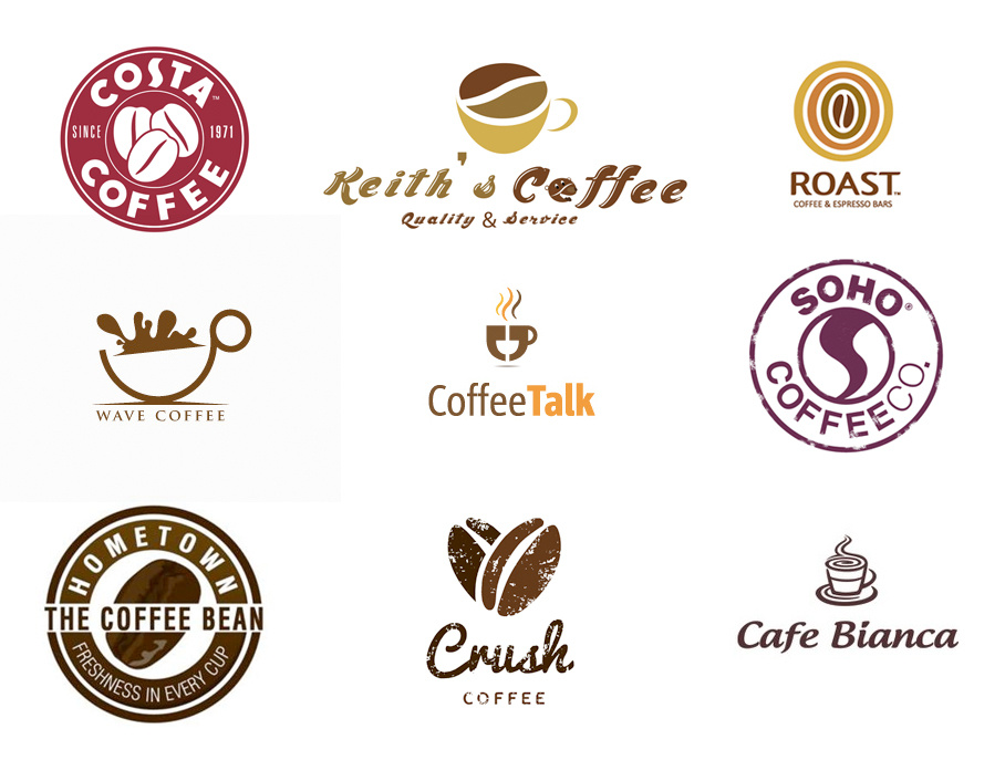
Coffee companies usually use natural, food colors. On the logos and brand carriers of almost all brands in this area - the same shades of green, yellow and brown. Brown color is associated with the coffee itself, green - shows that the product is close to nature, white - gives a feeling of purity. The most famous examples are the Coffeeshop, Coffee House, Chocolate Girl.
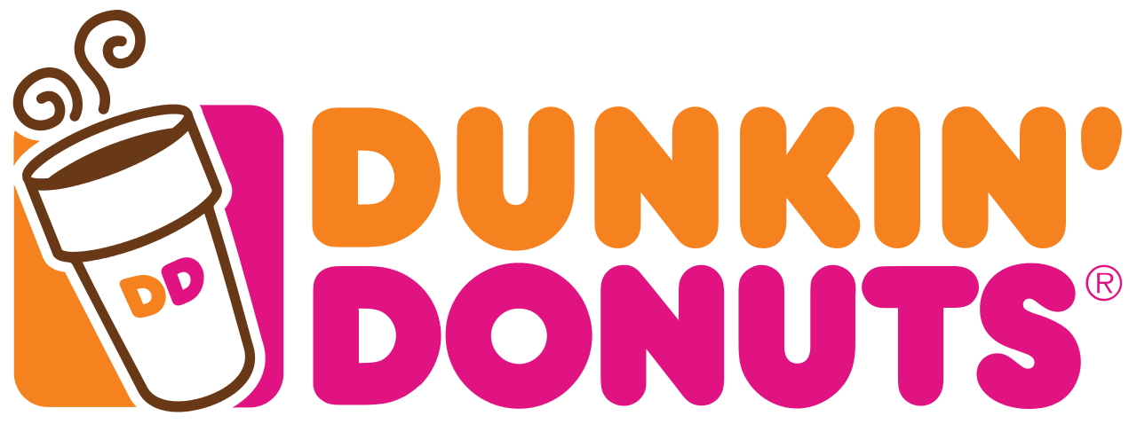
To stand out from the competition will help the choice of non-standard colors. For example, Dunkin Donuts, instead of a typical set of colors, used bright shades of pink and orange. As a result, their logo is also perceived as organic, but much brighter than its competitors. On the general background, the brand is hard to miss. Despite the fact that the company is associated more with donuts, this is a good example of an original approach to its style.
A source
One of our works is the corporate identity for the company "Coffee Maker". Designers came up with an interesting approach: use paint stains to show lightness, inspiration and freedom. Delicate shades of purple and blue, not typical for a coffee house, attract attention and are remembered by guests:


What, most often, can be seen on the emblem of a coffee company? That's right - a cup of coffee and a coffee bean. Logical approach! But companies that look like twin brothers are becoming too many.
To pay attention to you, forget about the templates and use anything:
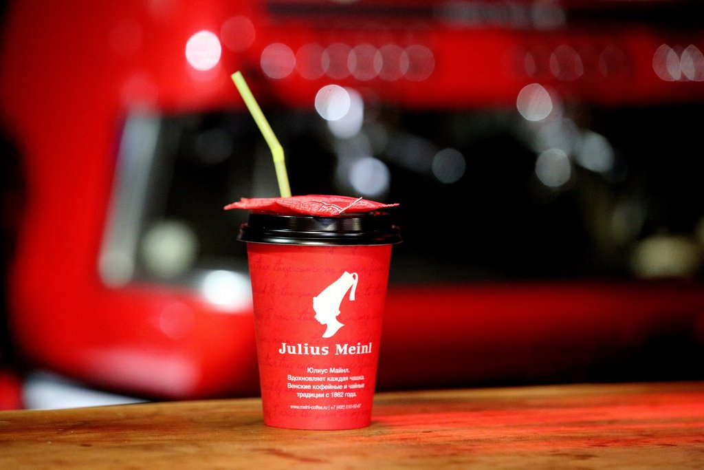
watch, rocket, train, ship, but at least Frankenstein. Starbucks mermaid, Friendly Coffee owl and the boy’s profile on the Julius Meinl logo did not prevent these companies from settling in the minds of millions, as the first association with the word “coffee”.
A source
Have you ever thought what shape most coffee logos are? If there is a form at all, then in 99% of cases it is a circle. This standard is justified - the coffee cup is round, the coffee bean is also oval.
And what if you make a coffee logo square? Would you notice him among round colleagues? Maybe use a triangular shape? What about a triacisterahedron?
Such a move is unlikely to alienate customers and is not a big risk, but you will become much more noticeable.
Use text logos, frank minimalism or heraldry, not forgetting to experiment with colors! Sometimes, just showing your attitude to a product is just as important as showing it.
Creating a corporate identity for Coffession, our designers used associations with Illuminati, astrology and alchemy. Coffee makers - like alchemists, create new, interesting combinations. Based on this idea, the Coffession corporate identity was developed:

Most coffee companies are associated either with home production or with a cozy traditional coffee house. Sometimes - this is a street, fair style, but few people go further and seriously experiment with style.
Make a bet on your image. For example, nostalgia for the USSR or e-sports, sea or superheroes. Let your logo and your entire corporate identity be permeated
a certain idea. Do not be afraid that it will limit you in the eyes of the audience, rather, on the contrary, the perception will become deeper and more trusting.

A source

A source
We used this approach in the corporate style of Techno Coffee. Company logo - a burning light in the form of a cup of coffee. Corporate pattern - the wires that are drawn to the cup. These images suggest that coffee is a charge of cheerfulness, which helps the birth of new ideas and good mood.

We hope that this article will help you create a special image of your company. We looked at 4 ways to improve your corporate identity with the help of brand colors, media design and logo. To stand out where everyone looks the same, you can choose everything at once, or any of these methods. Be original, then you will have a corporate identity, which means customer confidence.
The text was prepared by the copywriter of Logmachine - Nikolay Romanov
Most coffee companies look very similar. Characteristic "coffee" features can be found in corporate colors, logos, various media and in the interior. Many simply do not want to risk and do not dare to experiment. Perhaps if you are the owner of a small coffee shop near the metro, you don’t need a corporate identity. But those who are making more ambitious plans should think about more.
A source
')
1. Bright color scheme
Coffee companies usually use natural, food colors. On the logos and brand carriers of almost all brands in this area - the same shades of green, yellow and brown. Brown color is associated with the coffee itself, green - shows that the product is close to nature, white - gives a feeling of purity. The most famous examples are the Coffeeshop, Coffee House, Chocolate Girl.
To stand out from the competition will help the choice of non-standard colors. For example, Dunkin Donuts, instead of a typical set of colors, used bright shades of pink and orange. As a result, their logo is also perceived as organic, but much brighter than its competitors. On the general background, the brand is hard to miss. Despite the fact that the company is associated more with donuts, this is a good example of an original approach to its style.
A source
One of our works is the corporate identity for the company "Coffee Maker". Designers came up with an interesting approach: use paint stains to show lightness, inspiration and freedom. Delicate shades of purple and blue, not typical for a coffee house, attract attention and are remembered by guests:
2. Unexpected logo
What, most often, can be seen on the emblem of a coffee company? That's right - a cup of coffee and a coffee bean. Logical approach! But companies that look like twin brothers are becoming too many.
To pay attention to you, forget about the templates and use anything:
watch, rocket, train, ship, but at least Frankenstein. Starbucks mermaid, Friendly Coffee owl and the boy’s profile on the Julius Meinl logo did not prevent these companies from settling in the minds of millions, as the first association with the word “coffee”.
A source
3. Custom shapes
Have you ever thought what shape most coffee logos are? If there is a form at all, then in 99% of cases it is a circle. This standard is justified - the coffee cup is round, the coffee bean is also oval.
And what if you make a coffee logo square? Would you notice him among round colleagues? Maybe use a triangular shape? What about a triacisterahedron?
Such a move is unlikely to alienate customers and is not a big risk, but you will become much more noticeable.
Use text logos, frank minimalism or heraldry, not forgetting to experiment with colors! Sometimes, just showing your attitude to a product is just as important as showing it.
Creating a corporate identity for Coffession, our designers used associations with Illuminati, astrology and alchemy. Coffee makers - like alchemists, create new, interesting combinations. Based on this idea, the Coffession corporate identity was developed:
4. Unusual style
Most coffee companies are associated either with home production or with a cozy traditional coffee house. Sometimes - this is a street, fair style, but few people go further and seriously experiment with style.
Make a bet on your image. For example, nostalgia for the USSR or e-sports, sea or superheroes. Let your logo and your entire corporate identity be permeated
a certain idea. Do not be afraid that it will limit you in the eyes of the audience, rather, on the contrary, the perception will become deeper and more trusting.
A source
A source
We used this approach in the corporate style of Techno Coffee. Company logo - a burning light in the form of a cup of coffee. Corporate pattern - the wires that are drawn to the cup. These images suggest that coffee is a charge of cheerfulness, which helps the birth of new ideas and good mood.
Conclusion
We hope that this article will help you create a special image of your company. We looked at 4 ways to improve your corporate identity with the help of brand colors, media design and logo. To stand out where everyone looks the same, you can choose everything at once, or any of these methods. Be original, then you will have a corporate identity, which means customer confidence.
The text was prepared by the copywriter of Logmachine - Nikolay Romanov
Source: https://habr.com/ru/post/336174/
All Articles