Mobile browsers and their fluffy legs
When it became possible to browse web pages on phones, few developers thought about optimizing sites for mobile devices, and the concern of mobile browsers about user friendliness is understandable. But since then a lot of water has flowed under the bridge, and now this optimization involves fighting with the browsers themselves. About what problems can be encountered and how to solve them - read under the cut.
Cross-browser compatibility means that the site will be equally well displayed and respond to user actions on different devices and in different browsers.
Of course, in some cases, part of the visual effects can be neglected, but to a greater extent this applies to optimizing for older versions of browsers.
')
However, first of all, we would like to see the full compliance of the drawn picture with what we see on the screen and for events to work out correctly both by the mouse action and touch.
And, if the solution to the problem with touch-based events lies on the surface, then debugging graphic design is perfect for warming up before a real battle with cute and fluffy mobile browsers.
Pixel-perfect layout on the phone screen
For “big” browsers, there are add-ons that allow you to align the layout of the image, and, at first glance, except to use the responsive design mode, check and debug the layout for mobile devices will not work.
But this is only at first glance. No add-on? We will write it yourself! In fact, a hidden block is enough that is activated by a secret hash in the address.
We place in the basement a picture with absolute positioning and invert the colors, we write this script here:
<img src="/public/img/full.png" style="position:absolute;width:100%;top:0;left:0;opacity:0.8;filter:invert(100%);display:none;" id="pixel-perfect"/>

<script>

if(document.location.hash==="#pixel-perfect")
document.getElementById("pixel-perfect").style.display="block";

</script>
And we get our own pixel-perfect.

Of course, it is possible and necessary to modify the script so that the overlapping image can also be turned off and we are sure that the reader will cope with this task effortlessly. Well, or you can use the debug console.
External debug console
Although in the mobile browser of such a wonderful tool as the developer console, not yet, we can still get a fraction of its functionality.
For Android and iOS devices, there are native web debuggers and we recommend the reader to use them.
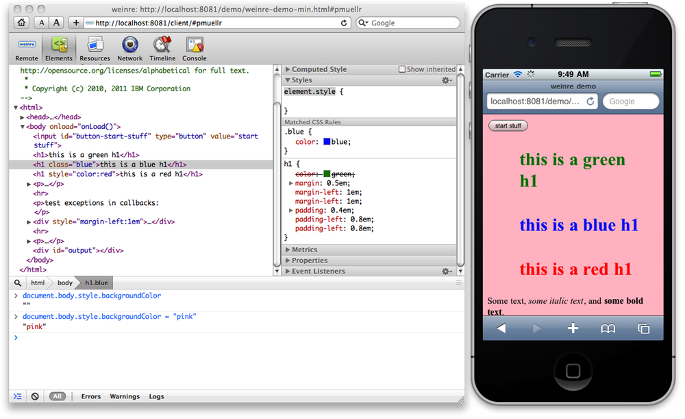
If for some reason native debugging tools are not suitable, you can use Weinre. Weinre is a bundle of client script that should be installed on the page and the server. It will not stop at setting up this utility, and the proto will show what should be the result:
Fluffy paws attack!
Now that we have a weapon, we are finally ready to fight mobile browsers in a battle for control of our page.
But let's first learn the enemy tactics.
Grandma, why do you need such big letters ?!
It should be noted that browsers are primarily concerned about the readability of the text - if the font on some element seems to the browser too small - it will shamelessly use its official position and increase it in one way or another.
Most often, the browser will simply make the page scale to the element that was in focus. Simply put, make a zoom .
And, although we really want our feedback form or order to disperse when you click on the field, cutting off the possibility of scaling in general is a bad idea.
<meta name="viewport" content="width=device-width, height=device-height, initial-scale=1.0, user-scalable=no;user-scalable=0;"/>
Some mobile browsers will indeed correctly work out such a tag and stop naughty with input fields. But after all, the user and we will cut off the opportunity to bring closer and distribute content. But we are fighting for their convenience.
Therefore, we just put a big font for the fields.
It is verified that with a font of 25-30 pixels with a field across the entire width of the screen, this problem does not occur. And the smaller the field, the larger the font needed.
Fixed content
Now, the “sticky” to the edge of the screen with a dash menu won't surprise anyone, even mobile browsers. And they work it out quite adequately for themselves, except that when scaling the plate “develops” into something incomprehensible:

Therefore, do not forget to specify the minimum width for blocks with position: fixed , if their width is set to 100%.
No, not Scroll!
When it seems to you that victory is already in your pocket, the enemy applies his most insidious trick!
So, you have a form with a constantly active “Apply” button. For the convenience of the user, you left it in plain sight - it is placed on top of the form layer and on desktop browsers has never caused problems to you or the browser.
But the mobile browser (for the convenience of the user, of course), when the field is activated, scrolls the page so that the field is visible. True, in such a situation it does this not very correctly and the button completely overlaps the active field.

The solution here is to let the browser do it and return it as it was. Simply put, half a second after the field focus, align the scrolling to the element.
Victory! The enemy is tamed!
Probably, mobile browsers still can please us a lot, but they are not out of malice! After all, they are really white and fluffy, just not everyone can yet, and sometimes they are too zealously trying to improve on already good pages.
And what pranks did you notice behind them and how did you fight?
Source: https://habr.com/ru/post/336172/
All Articles