5 fresh examples of parsing and improving the design in simple ways

Hello! We have a rubric in our community in which we give advice on improving the design. Today we will talk about useful techniques that can help you, using the example of the participants of the rubric.
1. Brow Tambow: improved geometry
Brow Tambow is an eyebrow art studio in Tambov. The company logo is a cute raccoon, which, however, has some flaws.
')

The sign has irregular geometry - we align it and correct defects with light and shadows. Also, correcting the balance of the sign / font - in the original version, the sign was too large. Our advice is to choose quieter and simpler fonts with such an active and interesting sign so that the elements do not argue with each other.
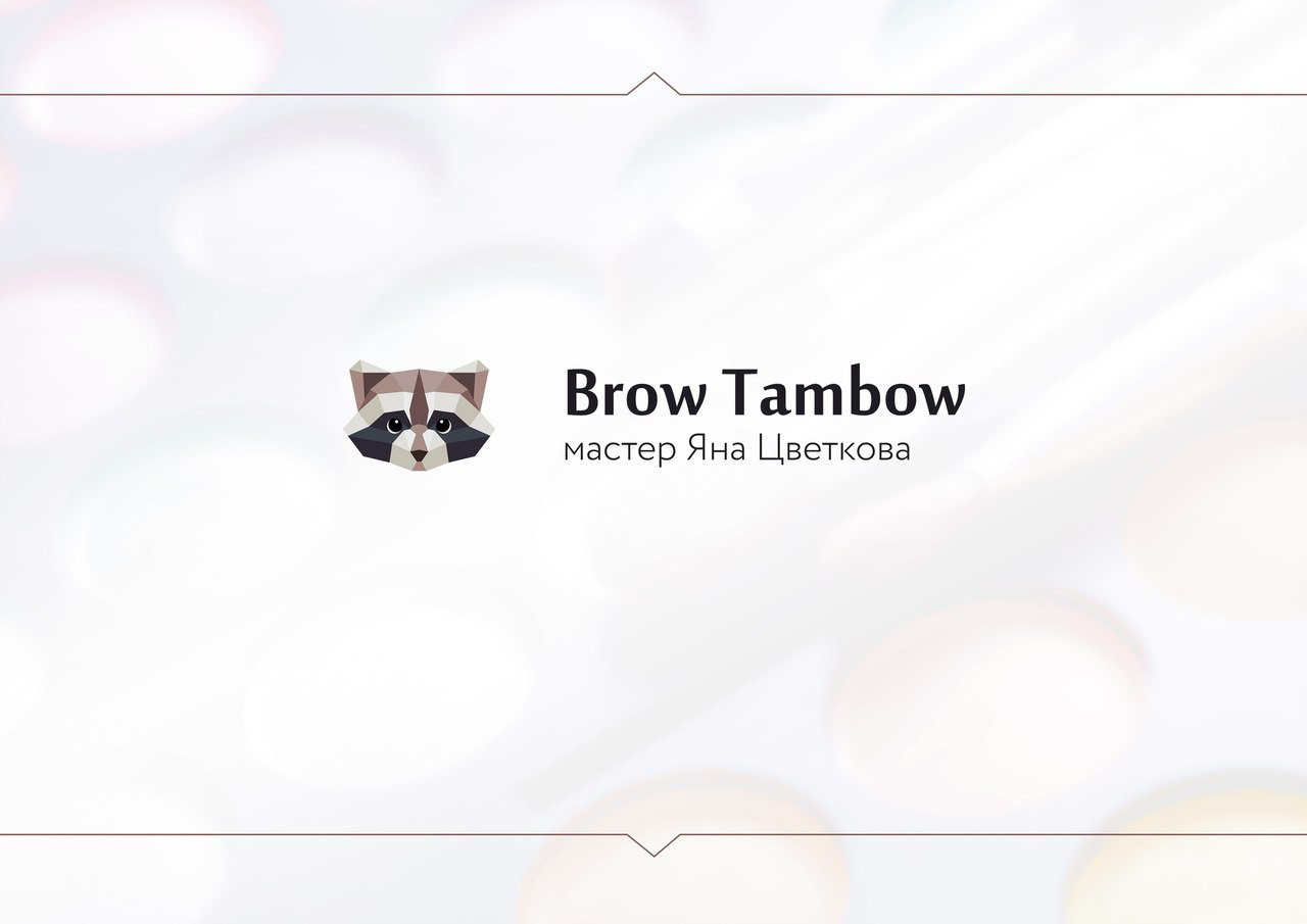
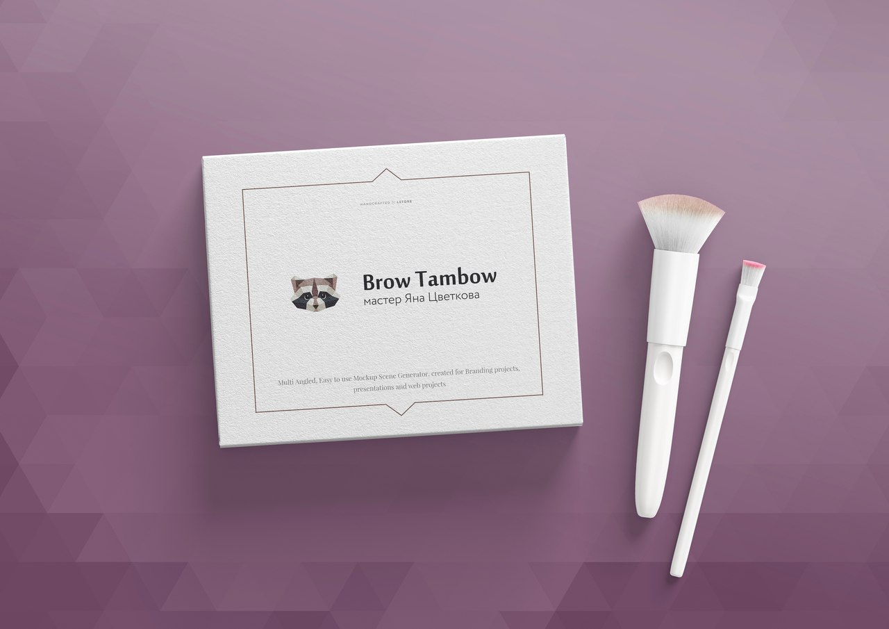
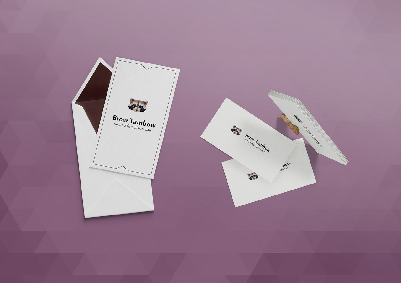
An example of how the logo after our tips will look on company carriers:
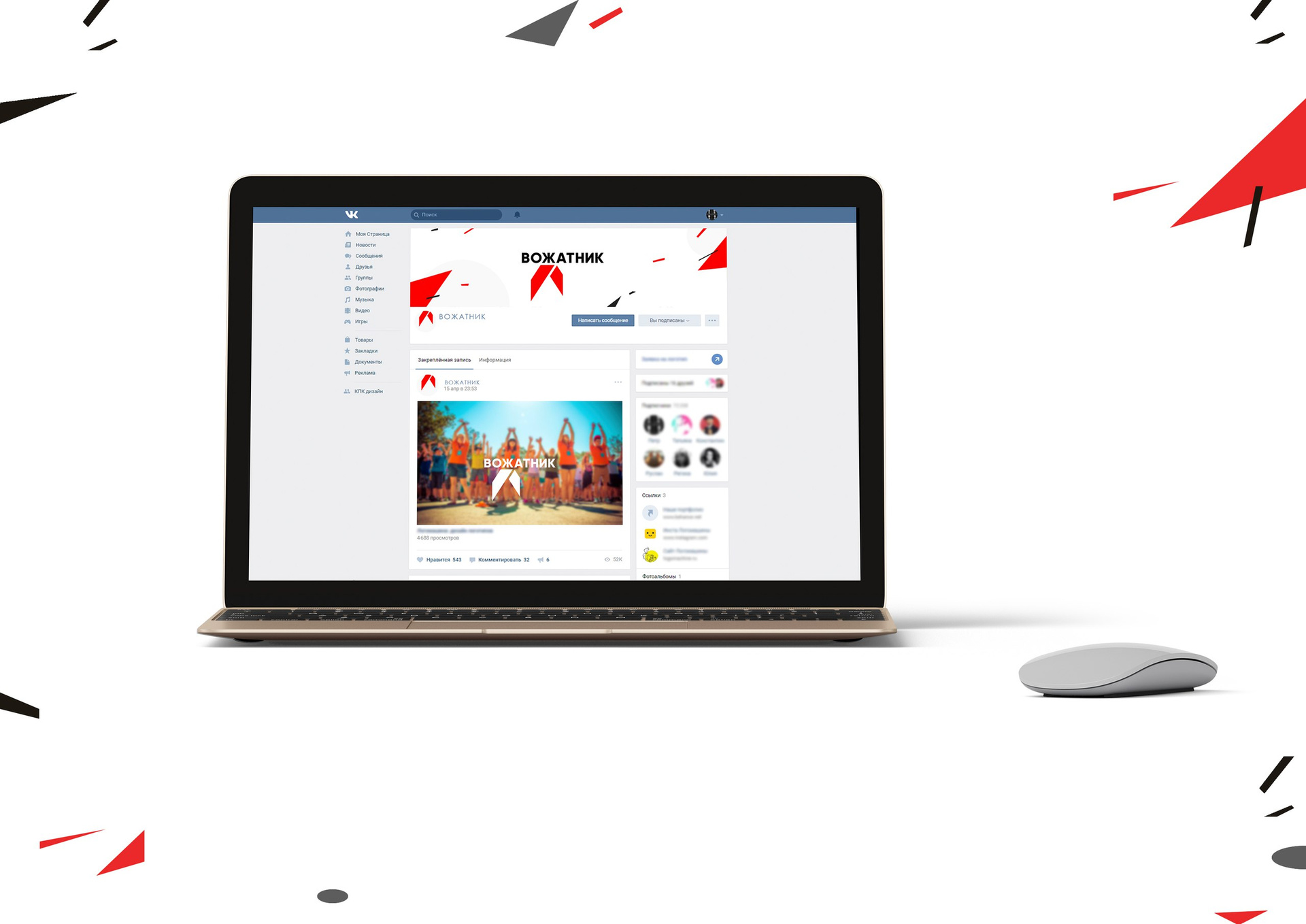
The logo on the most important medium for the studio is in the social network profile:

Total:
+ Fixed bugs in graphics
2. Leader: developing the idea
“Vozhatnik”, the All-Russian portal for counselors, turned to us for help.
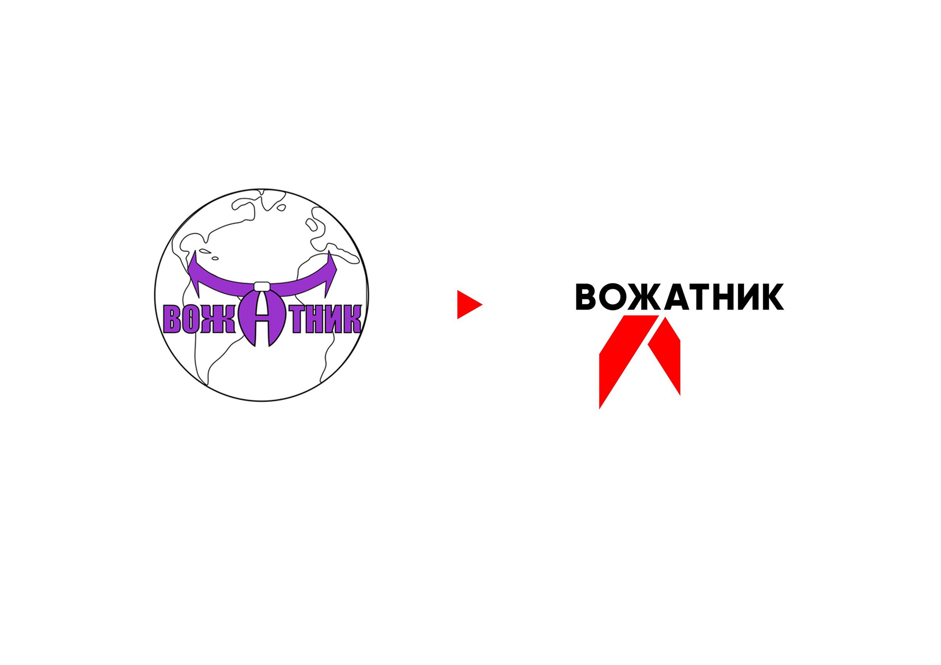
There are a lot of elements in the original logo: a stroke, a tie in the title, a planet. Eyes scatter, and it is not clear what to look at first. We would suggest in this case: pick a simple, clear font and leave the pioneer tie, as an element of counselors. The red color attracts attention and causes associations with the children's camp.
General advice - do not be afraid to get rid of the black stroke. In most cases, it can be removed, and the sign will not lose anything.
After we slightly corrected the graphics of the logo, we fantasized over the corporate style of the portal:
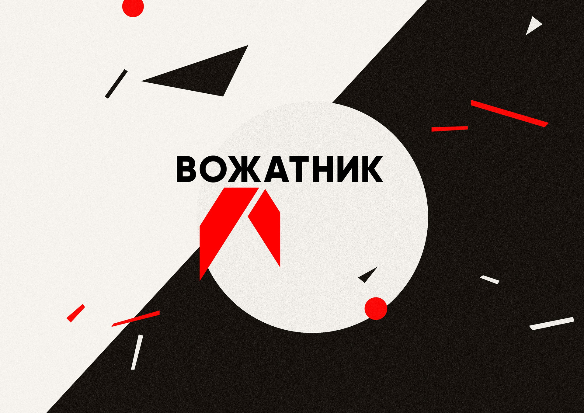
What if we use the style of Soviet posters?
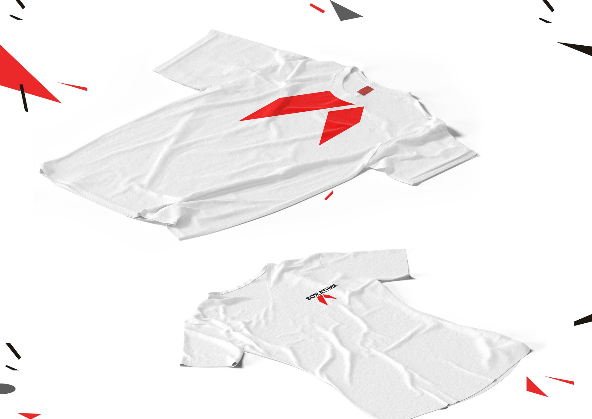
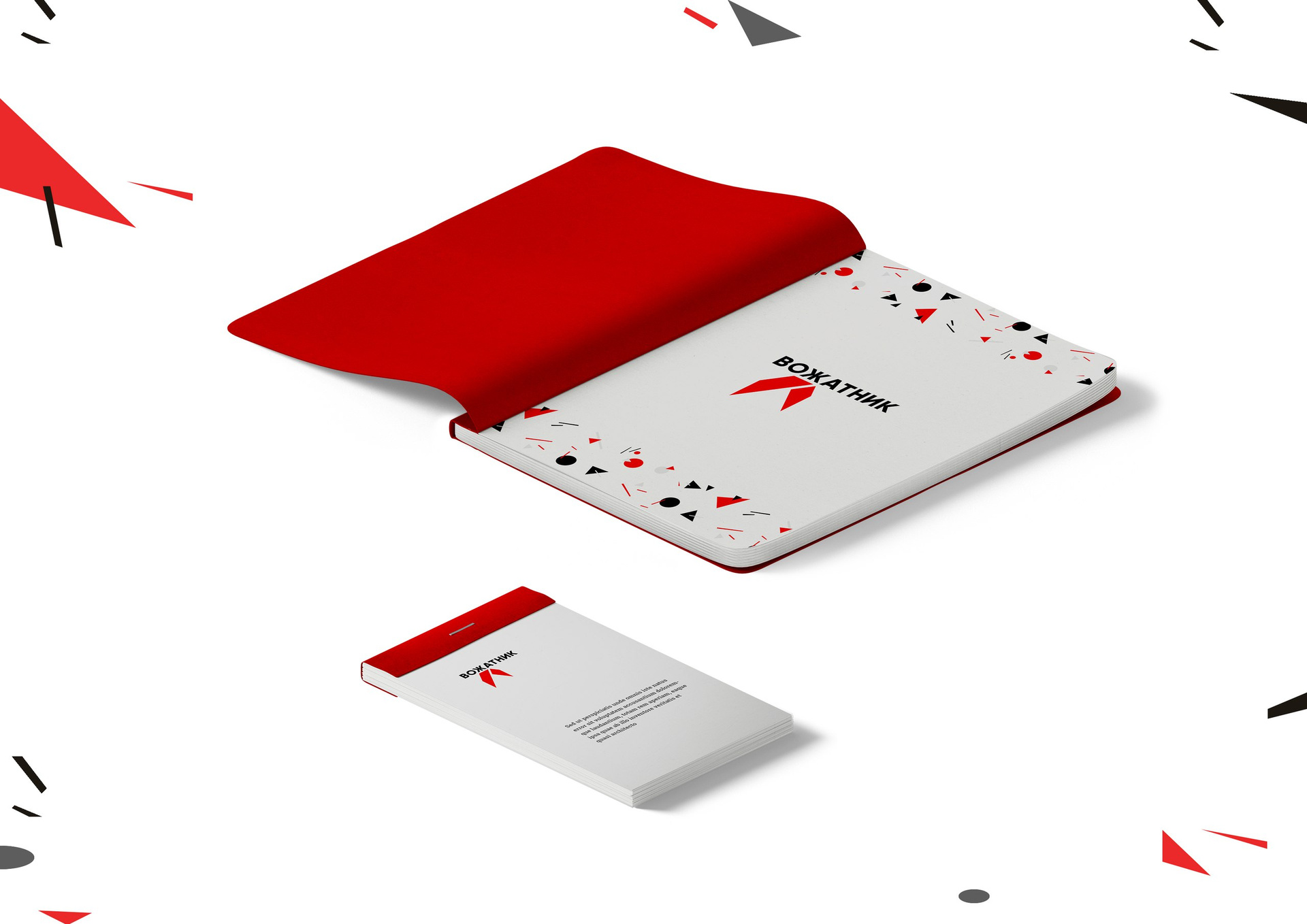
Bright elements can be used for any design:
Total:
+ Logo can be read
+ Elements of the mark can be used in the corporate style.
- The sign may cause associations with the HIV symbol.
3. Bookla: select the font
The literary portal “Buklya” uses the pen symbol in its logo and ... upper case in the title.
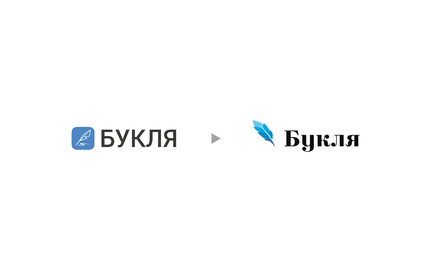
With this writing, the letters begin to behave badly - jump and become extremely restless. It is better to type the name in lower case - with a capital letter. In the case of "Bukli" you can choose the font that will emphasize the literary orientation of the portal.
In addition, the sign can be recycled - for example, remove the plate and make it graphical. So it can be used separately from the name, as a company element.
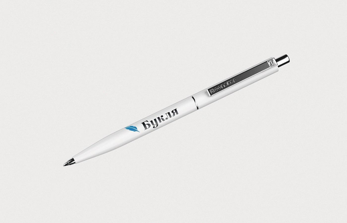
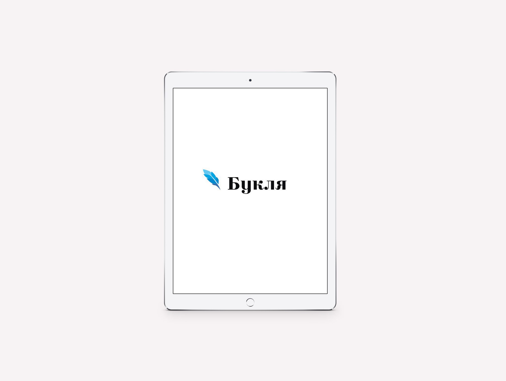
After we quickly threw out the options for graphic solutions, we figured out how “Bookla” would look on the carriers:
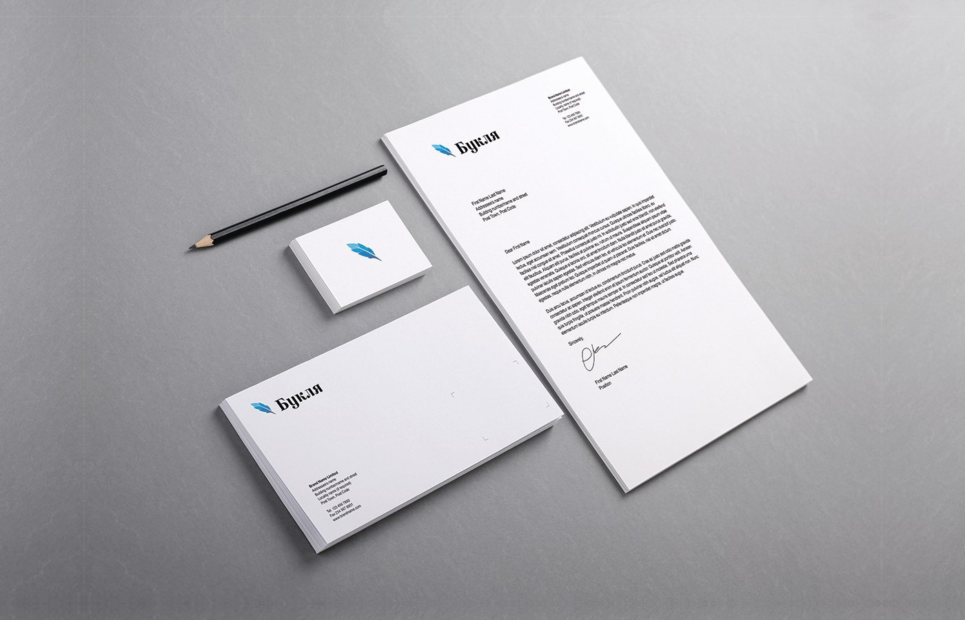
A corporate carrier, for example, can be a pen:
Or application:
As a result:
+ The logo has become clearer and more confident.
- You can come up with a more interesting idea for the sign
4. Choco: balance the mark
Choco is a chocolate workshop that makes handmade sweets. The logo of the workshop shows a piece of chocolate, we gave some tips on how to enhance the logo.
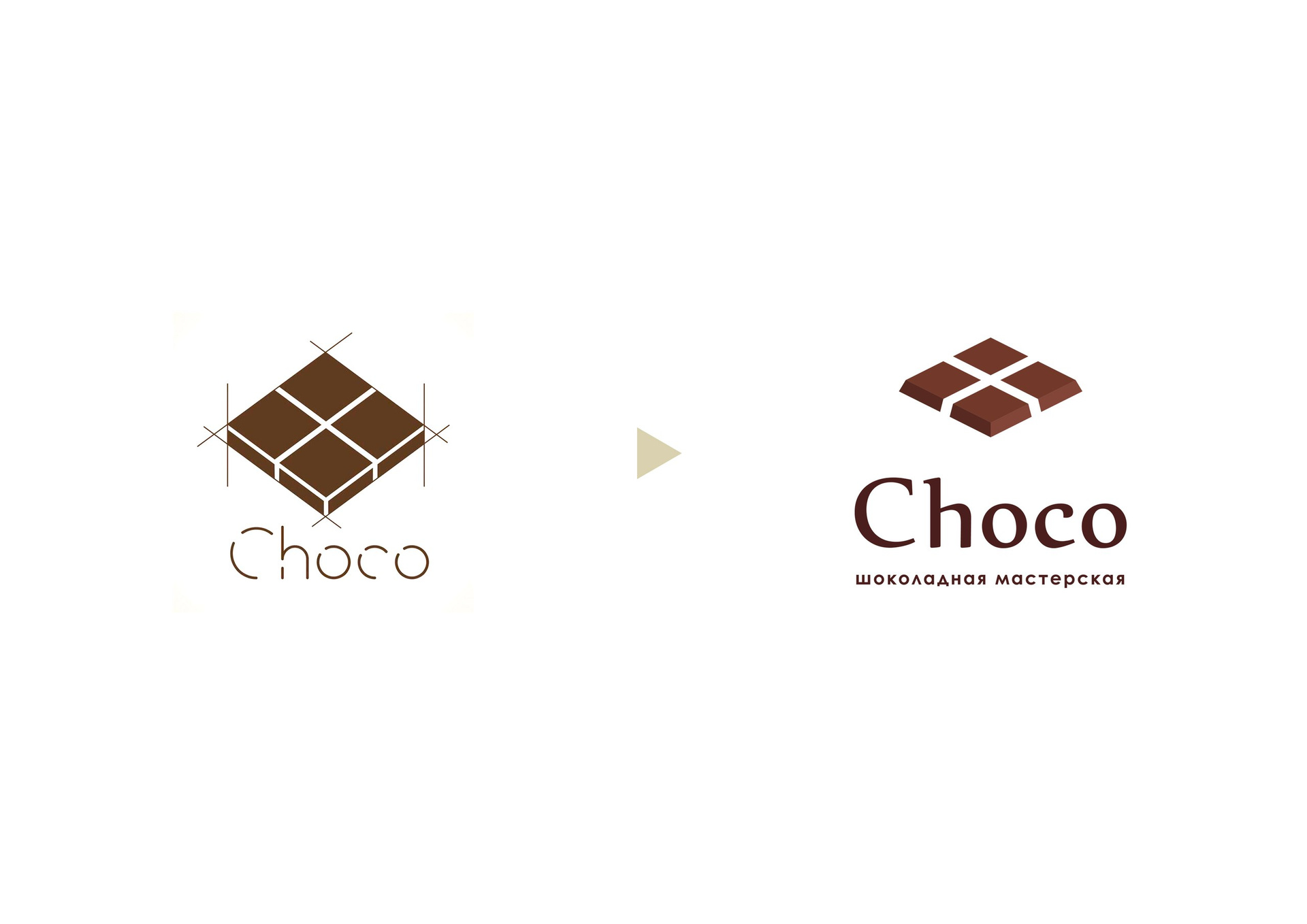
The first thing you can advise is to balance the sign and the font by making the sign smaller. In the first version, the sign interrupts the font, it is too big compared to the font.
The second tip: make a smaller angle of the chocolate bar and remove the strokes around it. They make the logo "dirty" and too loaded. You can add bevels at the corners and make the color more "chocolate". So the sign will appear the desired shape and volume.
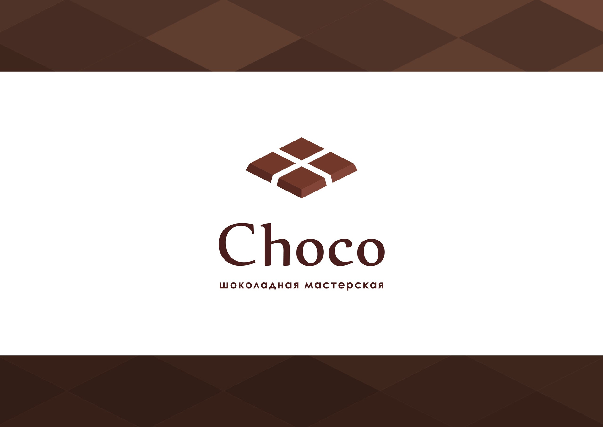
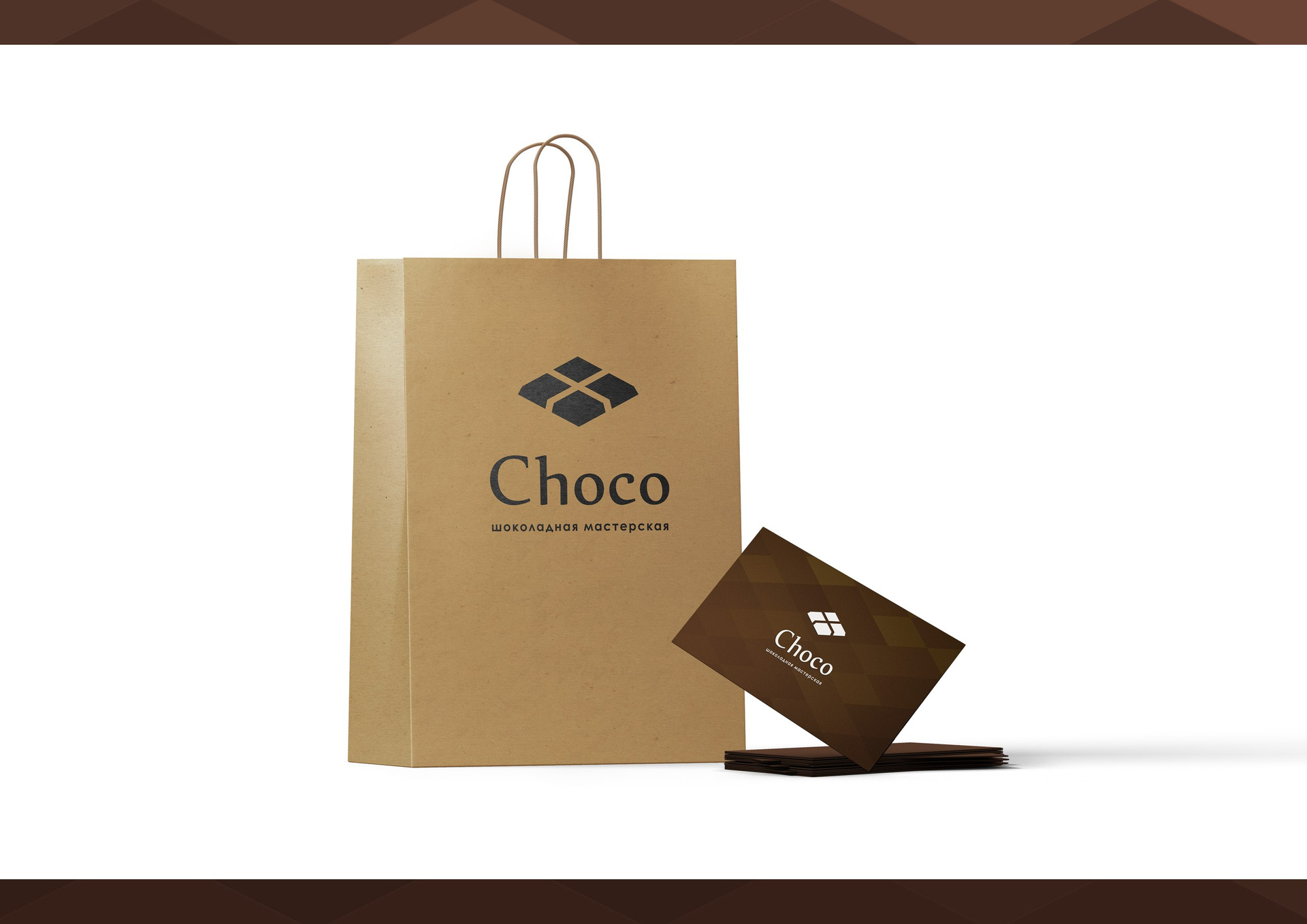
See how you can use the sign with our tips in life:
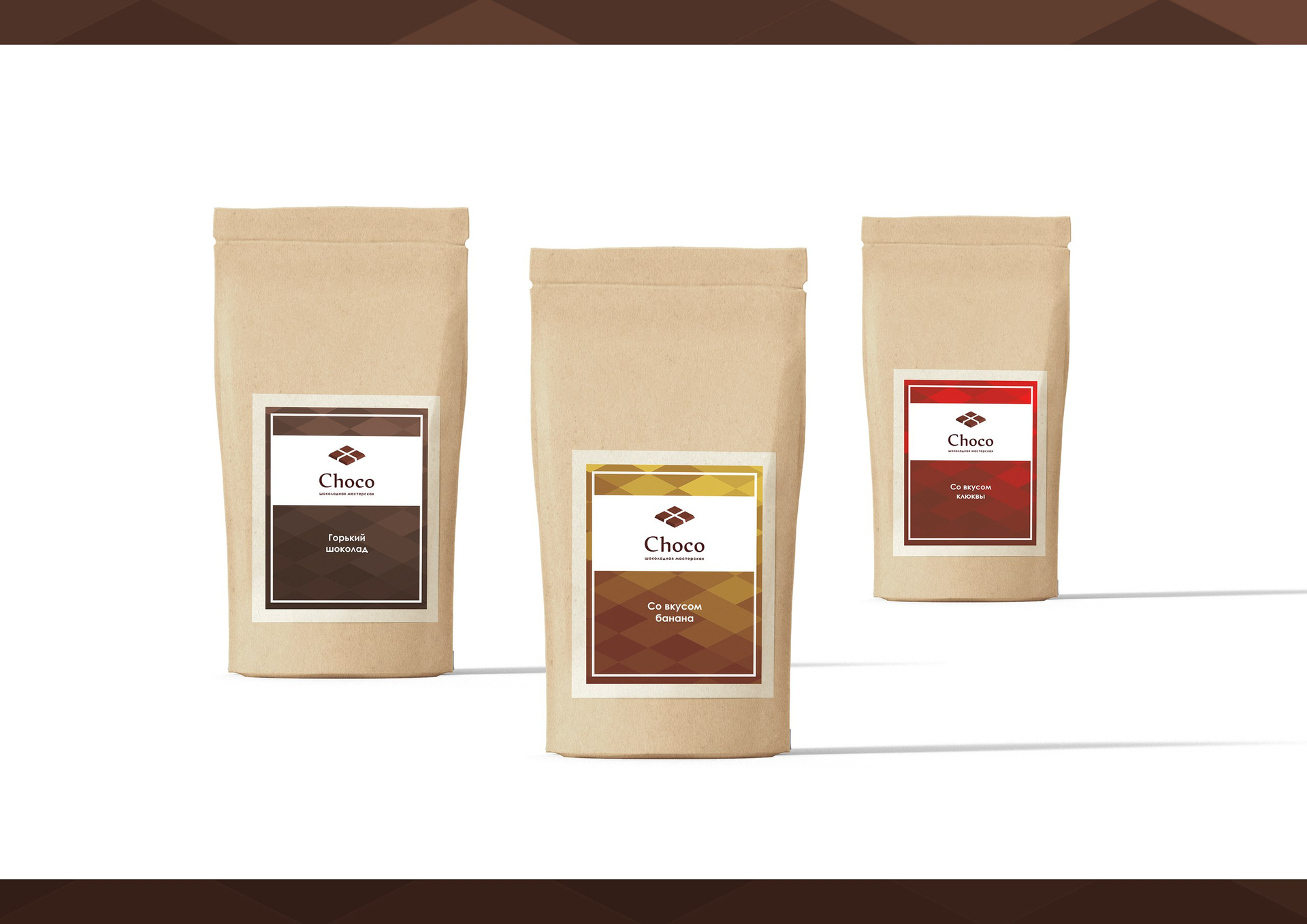
On packages for sweets:
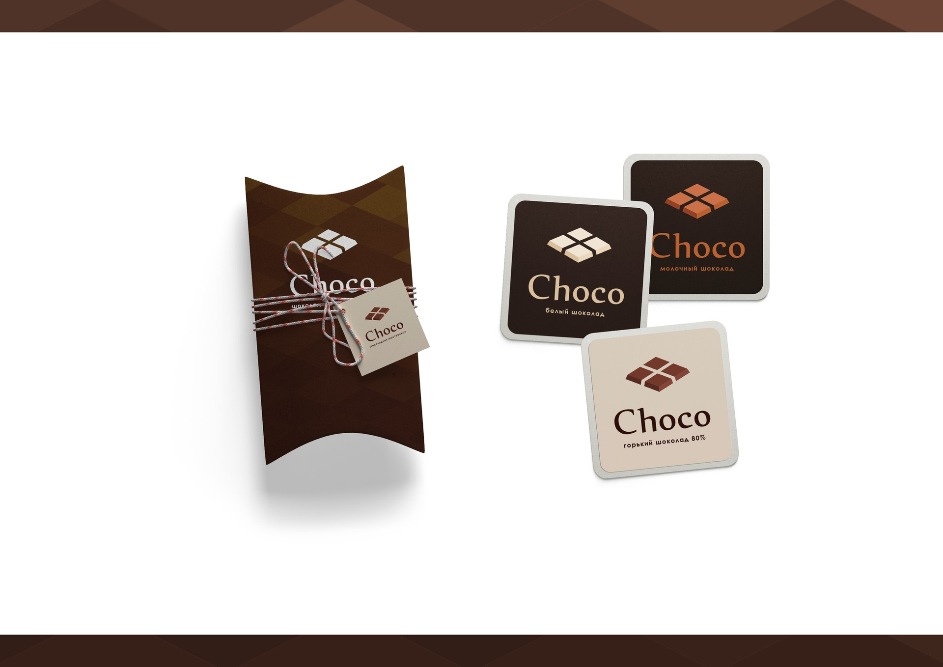
Total:
+ The logo has become more like chocolate
- Lost sweets design metaphor
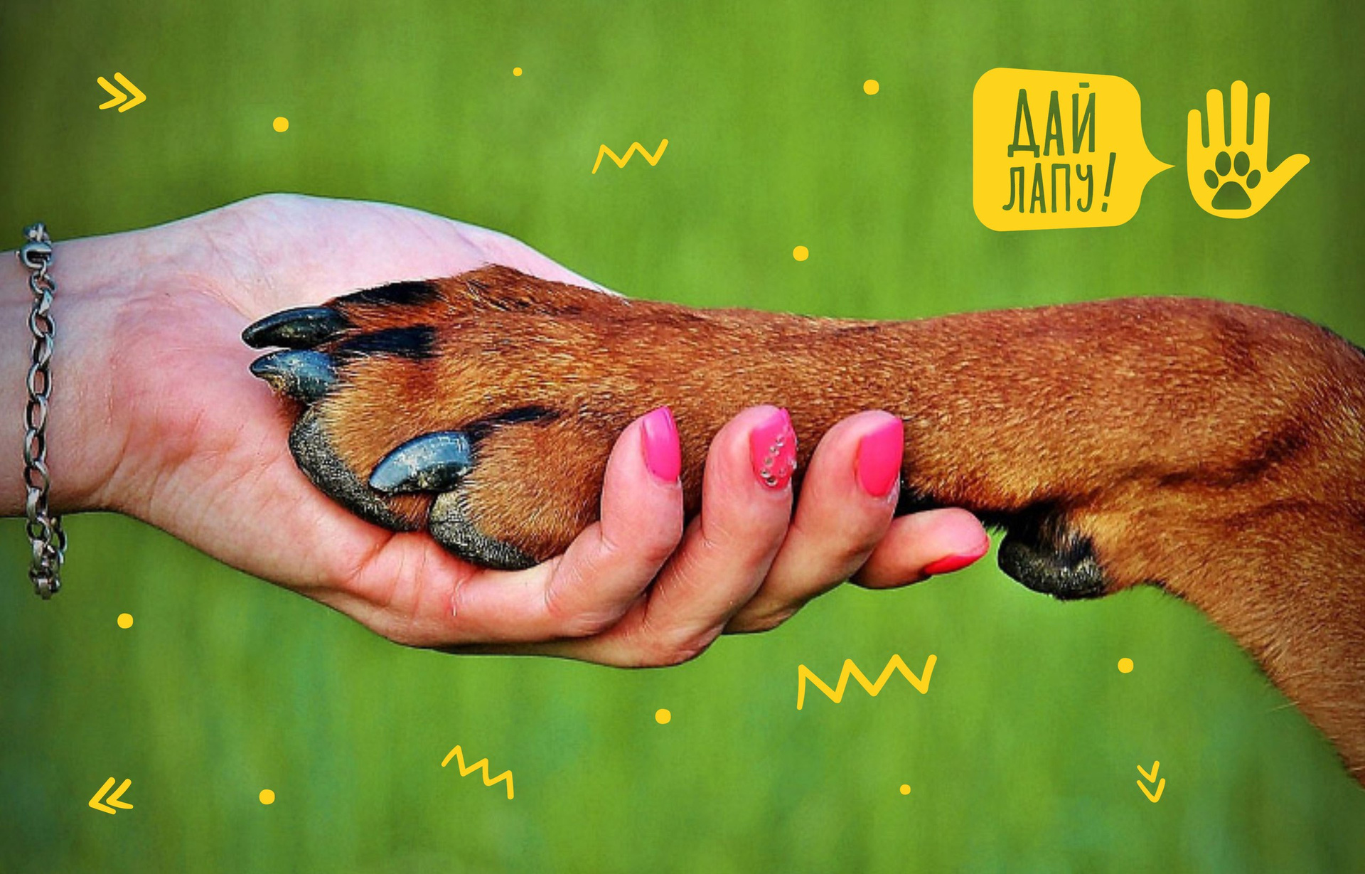
5. Give paw: improve readability
Give me a paw! - dog training club. The logo uses the illustrations of a man’s hand and a dog’s paw as a sign of friendship. Such detailed illustrativeness degrades the perception of the mark.
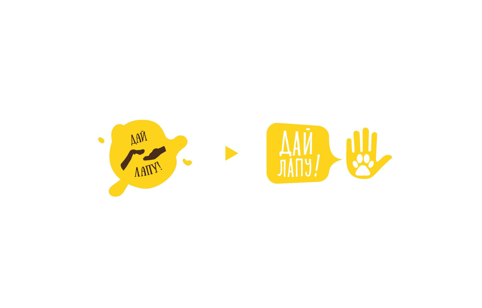
Here you can improve the readability of the mark, if you write a large name. An illustration can be made a separate element - a sign.
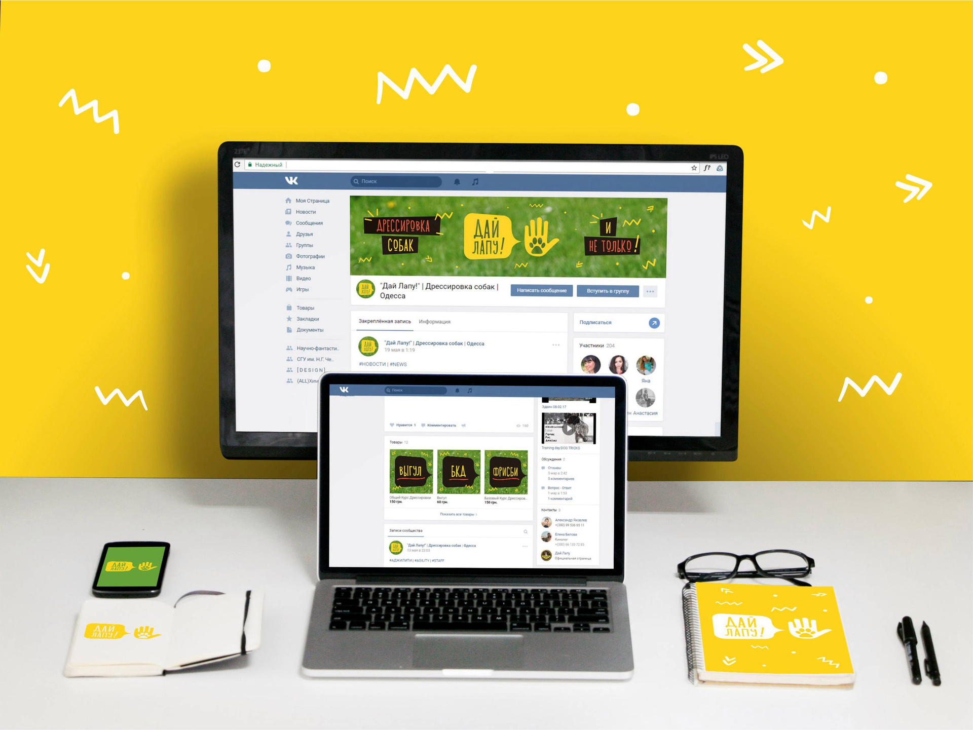
As a corporate style, you can use different curls and sticks, thus showing the cheerful nature of the club:
We talked about a few simple tricks with which you can improve your design. Do not forget - this is a defective redesign, but simply quick tips and directions that seem to us promising.
As promised, the next issue will be with the design that Habrahabr users sent us, it is being prepared and will be released at the end of the month!
Read previous issues:
→ Issue №1
→ Issue №2
→ Issue №3
Prepared by Slepchevich Victoria for Log Machine
Source: https://habr.com/ru/post/336068/
All Articles