Developing a theme manager in a UWP application
Greetings, % username% !
My name is Roman Gladkikh, I am a third-year student of the Siberian State University of Telecommunications and Informatics in the Supercomputation profile. I am also a Microsoft student partner. My old hobby is developing applications for Windows Phone and UWP in C #.
By default, UWP applications support two themes: Dark (Dark) and Light (Light). There is also a high contrast theme (HighContrast). This set is usually enough for any application, however, what if you need to quickly change the theme of the application on the fly, and there is no desire to be limited to Light and Dark?
')
In this article I will tell you how to implement your theme manager. The material is aimed at beginners, however, and professionals may be interesting. You are welcome under the cat!
UWP supports a special XAML markup extension, the purpose of which is to link to resources that can be updated at runtime. Resource resources are a collection of resources that apply different values depending on which theme of the system is active.
The difference from the {StaticResource} markup extension is that {ThemeResource} can dynamically use different dictionaries as the main search location, depending on which theme is currently being used by the system. In other words, the analysis of the values referenced by {StaticResource} occurs only once when the application is started, while {ThemeResource} at startup and with each change of the system theme.
Consider the example ResourceDictionary, which defines the user's topic resources.
In the parent ResourceDictionary in the ThemeDictionaries section, child libraries are declared, which are the resource sets for each of the topics. Each library has a brush with the same name but a different Color value.
So, if we refer to our brush with {ThemeResource}, for example, set the brush rectangle as a fill, then depending on the theme selected in the system, we get a rectangle of white, gray or black color.
Please note that the theme resources may include not only brushes, but also strings and other objects. In order for a developer to familiarize himself with all system resources of a theme, the Windows SDK includes a XAML file containing all resources. It is located in C: \ Program Files (x86) \ Windows Kits \ 10 \ DesignTime \ CommonConfiguration \ Neutral \ UAP \\ Generic \ themeresources.xaml.
After weighing all the pros and cons, we came to the conclusion that we want more, we want to change them on the fly and not depend on the system theme. How to implement it?
Since the UWP platform does not have the {DynamicResource} markup extension, which, by the way, is available in WPF, we will be content with the usual {Binding} bindings.
First, create a project for an empty UWP application with the name UwpThemeManager. The minimum version I installed was Windows 10 Anniversary Update, the target Windows 10 Creators Update.
In the project, create a folder Themes, inside two ResourceDictionary named Theme.Dark.xaml and Theme.Light.xaml.

In each file, add three brushes to the ResourceDictionary named BackgroundBrush, ForegroundBrush and ChromeBrush. The content of these files is available under spoilers.
Now we need a special class that will load the resources of our topics and notify all Binding about changes to the links on the brush. Create a sealed class ThemeManager that implements the INotifyPropertyChanged interface.
Be sure to add to the class public string constants with the path to our dictionaries with themes.
In the code of our class, we will add a private field of type ResourceDictionary - this will be a dictionary with the current values of the theme.
Next, you need to add properties of type Brush to ThemeManager class in order to avoid mistakes when binding from XAML, and the hints from Visual Studio worked. In order to avoid confusion, we will call the properties in the same way as brushes are named in those dictionaries. Also, for our convenience, we add the CurrentTheme string property, which will return the name of the current theme.
So that when you change the theme, all the {Binding} bindings know that the references to brushes have changed, you need to call the PropertyChanged event for each of the properties. Let's create a special private method for this.
In order to prevent errors in the names of properties, we use the nameof keyword, the call of which when compiled converts to a string constant with the name of the specified element.
Now there is a question about downloading dictionaries with topics. Create two methods: LoadTheme and LoadThemeFromFile. The first method loads the dictionary with the theme, located in the application package (for this, we set the DarkThemePath and LightThemePath constants above). The second method loads a theme from any file (takes StorageFile as input), not necessarily from an application package.
The implementation of the methods takes several lines.
ThemeManager is almost ready, it remains only to add a call to the designer to load a dark theme (it will be by default).
All is ready! It remains to declare an instance of our class in App.xaml in the resource section of the application and add a static link to this instance in App.xaml.cs.
The full code of ThemeManager.cs is presented under the spoiler.
Since we have completed all the necessary preparations, using the ThemeManager will be very simple. Consider a small example.
In this example, we declared a Rectangle element (rectangle) with the Fill property tied to the BackgroundBrush property from ThemeManager located in the application resources.
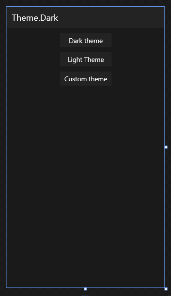
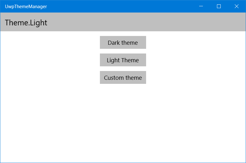
Create a simple page MainPage (in the new project already exists). The final page will be like this:
Set the buttons and other controls with the necessary bindings to our brushes. In the click event handlers for the buttons, let's load other topics.
For the first two buttons, we call the LoadTheme method in ThemeManager indicating the constant with the path to the XAML file with the theme. The last event handler (for the button with the text Custom theme) creates a file selection window, specifies a filter of the .xaml type and shows the user a standard file selection window. If the user has selected a file, then it is passed to the LoadThemeFromFile method, which we implemented in ThemeManager.
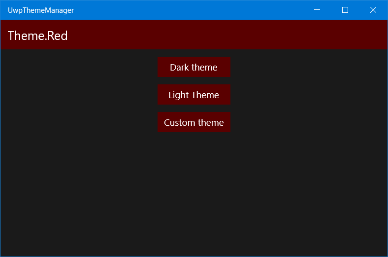
For testing, create a third theme file, and place it, for example, on the desktop. My version:
Compile and run the application. When you click on the buttons Dark theme and Light theme, the color design of the application will automatically change. Click the Custom theme button, then open the Theme.Red.xaml file. The color scheme of the application will turn red.
Full source code page markup under the spoiler.
If you set the values of Background, Foreground, etc. for the elements themselves, everything will work, but we cannot set {Binding} in the control styles. UWP bindings in Style are not supported. How to get around this? Attached DependencyProperty will help us!
You can learn more about the Attached property in the AndyD article: WPF: Using Attached Property and Behavior
We implement the Attached property for the Background and Foreground properties. These will be static classes named BackgroundBindingHelper and ForegroundBindingHelper. Let's declare static methods GetBackground (returns string) and SetBackground, as well as DependencyProperty with value type string.
Also add a private handler method BackgroundPathPropertyChanged, which will update the Binding when the Background value changes.
ForegroundBindingHelper is implemented in a similar way.
Fine! Now we can bind to our brushes even in styles. For example, create a style for the buttons on our page.
Setter.Property specifies the name of the class that AttachedProperty provides. The Value contains the property name with a brush from ThemeManager.
Set this style to the buttons on the page, and everything will work as well as with the direct indication of the Background and Foreground elements. The resulting source code markup under the spoiler.
By simple manipulations, we implemented our own theme manager, which does not depend on the system one, and can work with any number of topics, including loading third-party ones.
The full source code of the project is available on GitHub: link .
I hope you enjoyed the article. If you find any inaccuracy or error, feel free to write me a personal message.
See you in the open spaces of Habrakhabr!
My name is Roman Gladkikh, I am a third-year student of the Siberian State University of Telecommunications and Informatics in the Supercomputation profile. I am also a Microsoft student partner. My old hobby is developing applications for Windows Phone and UWP in C #.
By default, UWP applications support two themes: Dark (Dark) and Light (Light). There is also a high contrast theme (HighContrast). This set is usually enough for any application, however, what if you need to quickly change the theme of the application on the fly, and there is no desire to be limited to Light and Dark?
')
In this article I will tell you how to implement your theme manager. The material is aimed at beginners, however, and professionals may be interesting. You are welcome under the cat!
ThemeResource
UWP supports a special XAML markup extension, the purpose of which is to link to resources that can be updated at runtime. Resource resources are a collection of resources that apply different values depending on which theme of the system is active.
{ThemeResource ResourceName} The difference from the {StaticResource} markup extension is that {ThemeResource} can dynamically use different dictionaries as the main search location, depending on which theme is currently being used by the system. In other words, the analysis of the values referenced by {StaticResource} occurs only once when the application is started, while {ThemeResource} at startup and with each change of the system theme.
Consider the example ResourceDictionary, which defines the user's topic resources.
<ResourceDictionary> <ResourceDictionary.ThemeDictionaries> <ResourceDictionary x:Key="Light"> <SolidColorBrush x:Key="MyBackgroundBrush" Color="#FFFFFFFF" /> </ResourceDictionary> <ResourceDictionary x:Key="Dark"> <SolidColorBrush x:Key="MyBackgroundBrush " Color="#FF232323" /> </ResourceDictionary> <ResourceDictionary x:Key="HighContrast"> <SolidColorBrush x:Key="MyBackgroundBrush " Color="#FF000000" /> </ResourceDictionary> </ResourceDictionary.ThemeDictionaries> </ResourceDictionary> In the parent ResourceDictionary in the ThemeDictionaries section, child libraries are declared, which are the resource sets for each of the topics. Each library has a brush with the same name but a different Color value.
So, if we refer to our brush with {ThemeResource}, for example, set the brush rectangle as a fill, then depending on the theme selected in the system, we get a rectangle of white, gray or black color.
Please note that the theme resources may include not only brushes, but also strings and other objects. In order for a developer to familiarize himself with all system resources of a theme, the Windows SDK includes a XAML file containing all resources. It is located in C: \ Program Files (x86) \ Windows Kits \ 10 \ DesignTime \ CommonConfiguration \ Neutral \ UAP \\ Generic \ themeresources.xaml.
How to develop your theme manager?
After weighing all the pros and cons, we came to the conclusion that we want more, we want to change them on the fly and not depend on the system theme. How to implement it?
Since the UWP platform does not have the {DynamicResource} markup extension, which, by the way, is available in WPF, we will be content with the usual {Binding} bindings.
First, create a project for an empty UWP application with the name UwpThemeManager. The minimum version I installed was Windows 10 Anniversary Update, the target Windows 10 Creators Update.
In the project, create a folder Themes, inside two ResourceDictionary named Theme.Dark.xaml and Theme.Light.xaml.
In each file, add three brushes to the ResourceDictionary named BackgroundBrush, ForegroundBrush and ChromeBrush. The content of these files is available under spoilers.
Theme.Dark.xaml
<ResourceDictionary xmlns="http://schemas.microsoft.com/winfx/2006/xaml/presentation" xmlns:x="http://schemas.microsoft.com/winfx/2006/xaml"> <SolidColorBrush x:Key="BackgroundBrush" Color="#FF1A1A1A" /> <SolidColorBrush x:Key="ForegroundBrush" Color="White" /> <SolidColorBrush x:Key="ChromeBrush" Color="#FF232323" /> </ResourceDictionary> Theme.Light.xaml
<ResourceDictionary xmlns="http://schemas.microsoft.com/winfx/2006/xaml/presentation" xmlns:x="http://schemas.microsoft.com/winfx/2006/xaml"> <SolidColorBrush x:Key="BackgroundBrush" Color="White" /> <SolidColorBrush x:Key="ForegroundBrush" Color="Black" /> <SolidColorBrush x:Key="ChromeBrush" Color="#FFBFBFBF" /> </ResourceDictionary> Now we need a special class that will load the resources of our topics and notify all Binding about changes to the links on the brush. Create a sealed class ThemeManager that implements the INotifyPropertyChanged interface.
Implementing INotifyPropertyChanged
public sealed class ThemeManager : INotifyPropertyChanged { public event PropertyChangedEventHandler PropertyChanged; private void OnPropertyChanged(string propertyName) => PropertyChanged?.Invoke(this, new PropertyChangedEventArgs(propertyName)); } Be sure to add to the class public string constants with the path to our dictionaries with themes.
public const string DarkThemePath = "ms-appx:///Themes/Theme.Dark.xaml"; public const string LightThemePath = "ms-appx:///Themes/Theme.Light.xaml"; In the code of our class, we will add a private field of type ResourceDictionary - this will be a dictionary with the current values of the theme.
private ResourceDictionary _currentThemeDictionary; Next, you need to add properties of type Brush to ThemeManager class in order to avoid mistakes when binding from XAML, and the hints from Visual Studio worked. In order to avoid confusion, we will call the properties in the same way as brushes are named in those dictionaries. Also, for our convenience, we add the CurrentTheme string property, which will return the name of the current theme.
public string CurrentTheme { get; private set; } public Brush BackgroundBrush => _currentThemeDictionary[nameof(BackgroundBrush)] as Brush; public Brush ChromeBrush => _currentThemeDictionary[nameof(ChromeBrush)] as Brush; public Brush ForegroundBrush => _currentThemeDictionary[nameof(ForegroundBrush)] as Brush; So that when you change the theme, all the {Binding} bindings know that the references to brushes have changed, you need to call the PropertyChanged event for each of the properties. Let's create a special private method for this.
In order to prevent errors in the names of properties, we use the nameof keyword, the call of which when compiled converts to a string constant with the name of the specified element.
private void RaisePropertyChanged() { OnPropertyChanged(nameof(BackgroundBrush)); OnPropertyChanged(nameof(ChromeBrush)); OnPropertyChanged(nameof(ForegroundBrush)); OnPropertyChanged(nameof(CurrentTheme)); } Now there is a question about downloading dictionaries with topics. Create two methods: LoadTheme and LoadThemeFromFile. The first method loads the dictionary with the theme, located in the application package (for this, we set the DarkThemePath and LightThemePath constants above). The second method loads a theme from any file (takes StorageFile as input), not necessarily from an application package.
The implementation of the methods takes several lines.
public void LoadTheme(string path) { _currentThemeDictionary = new ResourceDictionary(); App.LoadComponent(_currentThemeDictionary, new Uri(path)); CurrentTheme = Path.GetFileNameWithoutExtension(path); RaisePropertyChanged(); } public async Task LoadThemeFromFile(StorageFile file) { string xaml = await FileIO.ReadTextAsync(file); _currentThemeDictionary = XamlReader.Load(xaml) as ResourceDictionary; CurrentTheme = Path.GetFileNameWithoutExtension(file.Path); RaisePropertyChanged(); } ThemeManager is almost ready, it remains only to add a call to the designer to load a dark theme (it will be by default).
public ThemeManager() { LoadTheme(DarkThemePath); } All is ready! It remains to declare an instance of our class in App.xaml in the resource section of the application and add a static link to this instance in App.xaml.cs.
<Application x:Class="UwpThemeManager.App" xmlns="http://schemas.microsoft.com/winfx/2006/xaml/presentation" xmlns:x="http://schemas.microsoft.com/winfx/2006/xaml" xmlns:local="using:UwpThemeManager"> <Application.Resources> <ResourceDictionary> <local:ThemeManager x:Key="ThemeManager" /> </ResourceDictionary> </Application.Resources> </Application> public static ThemeManager ThemeManager => (ThemeManager)App.Current.Resources["ThemeManager"]; The full code of ThemeManager.cs is presented under the spoiler.
ThemeManager.cs
using System; using System.ComponentModel; using System.IO; using System.Threading.Tasks; using Windows.Storage; using Windows.UI.Xaml; using Windows.UI.Xaml.Markup; using Windows.UI.Xaml.Media; namespace UwpThemeManager { public sealed class ThemeManager : INotifyPropertyChanged { public const string DarkThemePath = "ms-appx:///Themes/Theme.Dark.xaml"; public const string LightThemePath = "ms-appx:///Themes/Theme.Light.xaml"; public event PropertyChangedEventHandler PropertyChanged; public ThemeManager() { LoadTheme(DarkThemePath); } public string CurrentTheme { get; private set; } public Brush BackgroundBrush => _currentThemeDictionary[nameof(BackgroundBrush)] as Brush; public Brush ChromeBrush => _currentThemeDictionary[nameof(ChromeBrush)] as Brush; public Brush ForegroundBrush => _currentThemeDictionary[nameof(ForegroundBrush)] as Brush; public void LoadTheme(string path) { _currentThemeDictionary = new ResourceDictionary(); App.LoadComponent(_currentThemeDictionary, new Uri(path)); CurrentTheme = Path.GetFileNameWithoutExtension(path); RaisePropertyChanged(); } public async Task LoadThemeFromFile(StorageFile file) { string xaml = await FileIO.ReadTextAsync(file); _currentThemeDictionary = XamlReader.Load(xaml) as ResourceDictionary; CurrentTheme = Path.GetFileNameWithoutExtension(file.Path); RaisePropertyChanged(); } private void RaisePropertyChanged() { OnPropertyChanged(nameof(BackgroundBrush)); OnPropertyChanged(nameof(ChromeBrush)); OnPropertyChanged(nameof(ForegroundBrush)); OnPropertyChanged(nameof(CurrentTheme)); } private void OnPropertyChanged(string propertyName) => PropertyChanged?.Invoke(this, new PropertyChangedEventArgs(propertyName)); private ResourceDictionary _currentThemeDictionary; } } Using Theme Manager
Since we have completed all the necessary preparations, using the ThemeManager will be very simple. Consider a small example.
<Rectangle Fill="{Binding BackgroundBrush, Source={StaticResource ThemeManager}}"/> In this example, we declared a Rectangle element (rectangle) with the Fill property tied to the BackgroundBrush property from ThemeManager located in the application resources.
Create a simple page MainPage (in the new project already exists). The final page will be like this:
Set the buttons and other controls with the necessary bindings to our brushes. In the click event handlers for the buttons, let's load other topics.
private void DarkThemeButton_Click(object sender, RoutedEventArgs e) => App.ThemeManager.LoadTheme(ThemeManager.DarkThemePath); private void LightThemeButton_Click(object sender, RoutedEventArgs e) => App.ThemeManager.LoadTheme(ThemeManager.LightThemePath); private async void CustomThemeButton_Click(object sender, RoutedEventArgs e) { var picker = new FileOpenPicker(); picker.FileTypeFilter.Add(".xaml"); var file = await picker.PickSingleFileAsync(); if (file != null) { try { await App.ThemeManager.LoadThemeFromFile(file); } catch (Exception ex) { var msg = new MessageDialog(ex.ToString(), ""); await msg.ShowAsync(); } } } For the first two buttons, we call the LoadTheme method in ThemeManager indicating the constant with the path to the XAML file with the theme. The last event handler (for the button with the text Custom theme) creates a file selection window, specifies a filter of the .xaml type and shows the user a standard file selection window. If the user has selected a file, then it is passed to the LoadThemeFromFile method, which we implemented in ThemeManager.
For testing, create a third theme file, and place it, for example, on the desktop. My version:
Theme.Red.xaml
<ResourceDictionary xmlns="http://schemas.microsoft.com/winfx/2006/xaml/presentation" xmlns:x="http://schemas.microsoft.com/winfx/2006/xaml"> <SolidColorBrush x:Key="BackgroundBrush" Color="#FF1A1A1A" /> <SolidColorBrush x:Key="ForegroundBrush" Color="White" /> <SolidColorBrush x:Key="ChromeBrush" Color="#FF5A0000" /> </ResourceDictionary> Compile and run the application. When you click on the buttons Dark theme and Light theme, the color design of the application will automatically change. Click the Custom theme button, then open the Theme.Red.xaml file. The color scheme of the application will turn red.
Application screenshots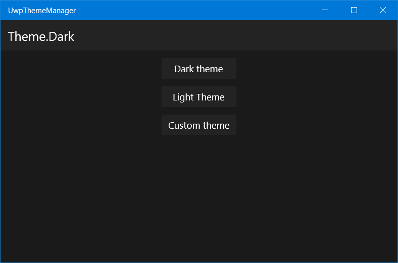
Full source code page markup under the spoiler.
MainPage.xaml - version 1
<Page x:Class="UwpThemeManager.MainPage1" xmlns="http://schemas.microsoft.com/winfx/2006/xaml/presentation" xmlns:x="http://schemas.microsoft.com/winfx/2006/xaml" xmlns:d="http://schemas.microsoft.com/expression/blend/2008" xmlns:mc="http://schemas.openxmlformats.org/markup-compatibility/2006" mc:Ignorable="d"> <Grid Background="{Binding BackgroundBrush, Source={StaticResource ThemeManager}}"> <Grid.RowDefinitions> <RowDefinition Height="48" /> <RowDefinition /> </Grid.RowDefinitions> <Border Background="{Binding ChromeBrush, Source={StaticResource ThemeManager}}"> <TextBlock Text="{Binding CurrentTheme, Source={StaticResource ThemeManager}}" Foreground="{Binding ForegroundBrush, Source={StaticResource ThemeManager}}" Style="{StaticResource SubtitleTextBlockStyle}" VerticalAlignment="Center" Margin="12,0,0,0" /> </Border> <StackPanel Grid.Row="1" HorizontalAlignment="Center"> <Button Content="Dark theme" Background="{Binding ChromeBrush, Source={StaticResource ThemeManager}}" Foreground="{Binding ForegroundBrush, Source={StaticResource ThemeManager}}" Margin="0,12,0,0" HorizontalAlignment="Stretch" Click="DarkThemeButton_Click" /> <Button Content="Light Theme" Background="{Binding ChromeBrush, Source={StaticResource ThemeManager}}" Foreground="{Binding ForegroundBrush, Source={StaticResource ThemeManager}}" Margin="0,12,0,0" HorizontalAlignment="Stretch" Click="LightThemeButton_Click" /> <Button Content="Custom theme" Background="{Binding ChromeBrush, Source={StaticResource ThemeManager}}" Foreground="{Binding ForegroundBrush, Source={StaticResource ThemeManager}}" Margin="0,12,0,0" HorizontalAlignment="Stretch" Click="CustomThemeButton_Click" /> </StackPanel> </Grid> </Page> Underwater rocks
If you set the values of Background, Foreground, etc. for the elements themselves, everything will work, but we cannot set {Binding} in the control styles. UWP bindings in Style are not supported. How to get around this? Attached DependencyProperty will help us!
Attached Property. This is Dependency Property, which is not declared in the class of the object for which it will be used, but behaves as if it were part of it. It is declared in a separate class, has getter and setter in the form of static methods. You can add a handler to the PropertyChanged event.
You can learn more about the Attached property in the AndyD article: WPF: Using Attached Property and Behavior
We implement the Attached property for the Background and Foreground properties. These will be static classes named BackgroundBindingHelper and ForegroundBindingHelper. Let's declare static methods GetBackground (returns string) and SetBackground, as well as DependencyProperty with value type string.
Visual Studio has a special preset (code snippet) for the Attached Dependency Property, which is available by typing propa and pressing Tab.
Also add a private handler method BackgroundPathPropertyChanged, which will update the Binding when the Background value changes.
ForegroundBindingHelper is implemented in a similar way.
BackgroundBindingHelper
using Windows.UI.Xaml; using Windows.UI.Xaml.Controls; using Windows.UI.Xaml.Data; namespace UwpThemeManager.BindingHelpers { public static class BackgroundBindingHelper { public static string GetBackground(DependencyObject obj) => (string)obj.GetValue(BackgroundProperty); public static void SetBackground(DependencyObject obj, string value) => obj.SetValue(BackgroundProperty, value); public static readonly DependencyProperty BackgroundProperty = DependencyProperty.RegisterAttached("Background", typeof(string), typeof(BackgroundBindingHelper), new PropertyMetadata(null, BackgroundPathPropertyChanged)); private static void BackgroundPathPropertyChanged(DependencyObject obj, DependencyPropertyChangedEventArgs e) { var propertyPath = e.NewValue as string; if (propertyPath != null) { var backgroundproperty = Control.BackgroundProperty; BindingOperations.SetBinding(obj, backgroundproperty, new Binding { Path = new PropertyPath(propertyPath), Source = App.ThemeManager }); } } } } ForegroundBindingHelper
using Windows.UI.Xaml; using Windows.UI.Xaml.Controls; using Windows.UI.Xaml.Data; namespace UwpThemeManager.BindingHelpers { public static class ForegroundBindingHelper { public static string GetForeground(DependencyObject obj) => (string)obj.GetValue(ForegroundProperty); public static void SetForeground(DependencyObject obj, string value) => obj.SetValue(ForegroundProperty, value); public static readonly DependencyProperty ForegroundProperty = DependencyProperty.RegisterAttached("Foreground", typeof(string), typeof(ForegroundBindingHelper), new PropertyMetadata(null, ForegroundPathPropertyChanged)); private static void ForegroundPathPropertyChanged(DependencyObject obj, DependencyPropertyChangedEventArgs e) { var propertyPath = e.NewValue as string; if (propertyPath != null) { var backgroundproperty = Control.ForegroundProperty; BindingOperations.SetBinding(obj, backgroundproperty, new Binding { Path = new PropertyPath(propertyPath), Source = App.ThemeManager }); } } } } Fine! Now we can bind to our brushes even in styles. For example, create a style for the buttons on our page.
<Page.Resources> <Style x:Key="ButtonStyle" TargetType="Button"> <Setter Property="binding:BackgroundBindingHelper.Background" Value="ChromeBrush" /> <Setter Property="binding:ForegroundBindingHelper.Foreground" Value="ForegroundBrush" /> <Setter Property="Margin" Value="0,12,0,0" /> <Setter Property="HorizontalAlignment" Value="Stretch"/> </Style> </Page.Resources> Setter.Property specifies the name of the class that AttachedProperty provides. The Value contains the property name with a brush from ThemeManager.
Set this style to the buttons on the page, and everything will work as well as with the direct indication of the Background and Foreground elements. The resulting source code markup under the spoiler.
MainPage.xaml - version 2
<Page x:Class="UwpThemeManager.MainPage" xmlns="http://schemas.microsoft.com/winfx/2006/xaml/presentation" xmlns:x="http://schemas.microsoft.com/winfx/2006/xaml" xmlns:d="http://schemas.microsoft.com/expression/blend/2008" xmlns:mc="http://schemas.openxmlformats.org/markup-compatibility/2006" xmlns:binding="using:UwpThemeManager.BindingHelpers" mc:Ignorable="d"> <Page.Resources> <Style x:Key="ButtonStyle" TargetType="Button"> <Setter Property="binding:BackgroundBindingHelper.Background" Value="ChromeBrush" /> <Setter Property="binding:ForegroundBindingHelper.Foreground" Value="ForegroundBrush" /> <Setter Property="Margin" Value="0,12,0,0" /> <Setter Property="HorizontalAlignment" Value="Stretch"/> </Style> </Page.Resources> <Grid Background="{Binding BackgroundBrush, Source={StaticResource ThemeManager}}"> <Grid.RowDefinitions> <RowDefinition Height="48" /> <RowDefinition /> </Grid.RowDefinitions> <Border Background="{Binding ChromeBrush, Source={StaticResource ThemeManager}}"> <TextBlock Text="{Binding CurrentTheme, Source={StaticResource ThemeManager}}" Foreground="{Binding ForegroundBrush, Source={StaticResource ThemeManager}}" Style="{StaticResource SubtitleTextBlockStyle}" VerticalAlignment="Center" Margin="12,0,0,0" /> </Border> <StackPanel Grid.Row="1" HorizontalAlignment="Center"> <Button Content="Dark theme" Style="{StaticResource ButtonStyle}" Click="DarkThemeButton_Click" /> <Button Content="Light Theme" Style="{StaticResource ButtonStyle}" Click="LightThemeButton_Click" /> <Button Content="Custom theme" Style="{StaticResource ButtonStyle}" Click="CustomThemeButton_Click" /> </StackPanel> </Grid> </Page> Let's sum up
By simple manipulations, we implemented our own theme manager, which does not depend on the system one, and can work with any number of topics, including loading third-party ones.
The full source code of the project is available on GitHub: link .
I hope you enjoyed the article. If you find any inaccuracy or error, feel free to write me a personal message.
See you in the open spaces of Habrakhabr!
Source: https://habr.com/ru/post/336054/
All Articles