How to create a map with the voices of fans for the Olympics. Lecture in Yandex
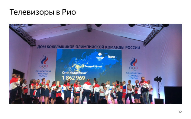
For the 2016 Summer Olympics in Rio de Janeiro, Yandex prepared several projects at once . Including - " Fan Card ". You could mark your city on the map, which was displayed on the main page of Yandex. The more marks we received from city residents, the brighter his light burned.
At one of the Ya.Subbotnikov, the head of a group of interfaces on the Yandex main page, Ivan Karev, explained how this map was created.
- My name is Ivan Karev. In Yandex, I make the main page and various special projects. I want to talk about one of them. This is such a story from the life of developers - about what else is the work.
')
Special projects on Yandex, maybe you saw. You can go to the main page, click on the logo, then something will open in full screen and will be beautifully displayed. They work on desktops, tachas, tablets in different ways, something can immediately appear. They are specific. Someone saw a special project for the Olympics map in Rio? Has anyone seen the special project about Gagarin? Not much. The story will be about that.
Last summer, they came to us and said that we want to do in support of our national team map, where people who go to Yandex could somehow send rays of support. And there should be some kind of interactive map, where you can see who voted how much and so that each person could share his or her voice.
About her, nothing was clear, it was a concept. About him it was known that he should be beautiful, whatever the word was invested. In addition, he had to display real data of people - it could have been done differently, but we wanted to do well. And he had to work on desktops, tachas, tablets, different devices. Perhaps even with different logic.
The first question was that we do not know what we want to do. It should be beautiful, it should be a map with support. Usually, when you bring a layout, you look at, roughly evaluate the functionality and think how it can be done. And here is the opposite: designers came to us and said: “What can you do?”. We said: "If you want it, you can do this." We threw the ball back and forth, watched various demos for a long time, showed that we can do what can be done quickly, which is not fast. Communicated, asked for some time agreed.
What could we offer designers as an implementation? We have all sorts of cartographic engines. Yandex.Maps - generally about cards engine. There are engines where something can be drawn on the map. There are a lot of them, I brought Carto, because here he was mentioned and considered by someone.
Or there is just a JS library where you can manually draw whatever you want. Essentially svg / canvas - depending on the design, you could choose one or the other. There are a lot of ready-made solutions, a lot of demos. We roughly watched what could be taken. There was quite an interesting job, but unfortunately, there was not very much time, I had to pack.
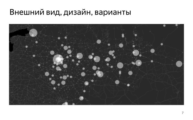
What did you get in the end? There was such a concept. Here is a map, it seems to be flat, it has circles of different size and transparency. Here it is possible to realize this with the help of various things.
Then there was this concept. On the Carto engine, a Real Madrid football fans card is implemented, showing how they vote on Twitter. Also a flat map, there are much more points here, some gradients with transparency. It seems like a canvas, maybe svg, while also not very clear.
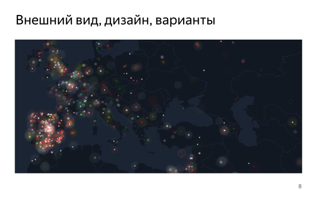
Let's go see what we have on Yandex.Maps. They have a module Heatmap, even such a demo was assembled, also a map with a substrate, there are many points on it, they are of different colors. Something, it seems, can also be done from this.
Then there was this design. There are much more points here, they have some kind of transparency. It was also at the level of the concept.
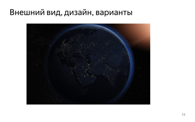
They even found such a thing, a cool demo from the Proper GL lessons (the name may be inaccurate - Ed.), Where you can take the real Earth with all sorts of textures, beautiful shaders, it rotates sharply. I also wanted very beautiful. Everyone really liked it, but we convinced everyone that no, we showed it, but we will not do it - not all computers can withstand it at all, a hard thing.

As a result, something like this was born, one of such concepts. A flat map, where there is a special colored substrate and there is a bubbling in the form of dots, they are multi-colored, iridescent into each other. At that moment, it came to be understood that before us it was probably not svg, but canvas.
From the cards here, the fact that the current location point of the person was tied to this map. It is shown where you are, and where someone else is.
In the end, we decided to do it on Yandex.Maps using the Heatmap module. Mapa, which was already ready in the demos of this, of course, did not know how to do, but we communicated with the developers and realized that this was possible. Began to cut further.
Here is the beginning. We had to make a substrate.
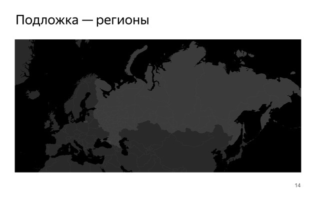
In fact, this is a creative activity. The substrate also can be different. Here it is flat, only two colors. Russia is highlighted in one color. There are territorial borders of states in Yandex.Maps, there is a module of the regions that draws this substrate in the form of svg. There you can select the level of detail, depending on which svg will weigh more or less. At the same time, it is drawn for quite a long time, and each time it was rather strange to load it, considering that the substrate is the same. Plus, we decided that not all zoom levels are needed, but only some of the upper ones. So we suddenly did the same thing, but only on tiles. Gray Russia map on a black background.
You can take the module of polygons, the module of regions, make a large screenshot, and through a simple Image Magic cut everything into tiles, which will be displayed in the same way.
The most interesting question was with the data. We had to take the voices of the people. We really wanted to show them in real time - so that the total number of points that people click on would change over time, so that progress could be seen, it was clear that something was happening.
Maybe I'm a paranoiac, but the first question that came to my mind was: if we give out some piece that can take coordinates and draw something on them, then in about half an hour we will have some kind of map across the entire map. Something the word "Hello" written with the help of geo-coordinates. This is easily done. And this idea stuck, and I wanted to do everything so that we did not need to manually watch everything that happens on this map. Therefore, the question arose of how to do moderation, and there was not much time. Of course, I did not want to re-raise something and track at night what was happening there. It was hard.
We also wanted the appearance of the map to be predictable and understandable. It was necessary to figure out what might even be there. People may vote in different places, but we would roughly understand in which and how it will look.
As a result, after some deliberation, we have the following architecture. We decided to take a large list of points, called it a whitelist. We are talking about those places where people can vote in principle. We will only include some points. The only question is how to take them. Naturally, there should be a lot of them, but we do not include anything else. Each click on the map searches for the nearest point from the whitelist, and some counter increases. There was a large base with all possible coordinates of points. We increased the counters and, in order to draw on the map, we showed it in a simple logarithmic scale. So some cheating and drops were not visible.
The question is how to make a white list of points. We have the same people on the main page, and so they come in - let's look at these visits and take from them those geolocations and coordination that are in the listed requests.
There are two types of coordinates. The coordinates of the first type are calculated by IP with reference to cities. We can take all the calls, coordinates, choose a certain level, for example, everything up to the city level, and then for each city, by its name and ID, take the corresponding geographical coordinates, geocode them and get the list in advance. He is not very big. We have cities in Russia and the district not millions, but thousands, tens of thousands.
The second is the most interesting. It was required to take real coordinates from users. The fact that a person is allowed as geolocation. You can try to collect this data, somehow structured and grouped. With clicks, when a person said that he wanted to support the national team, we asked the phone for geolocation - it is almost everywhere on the mobile phone - and the requests were sent already with the correct location. It is already relatively accurate, and it could happen anywhere: in the open field, along the roads, in the cottages.
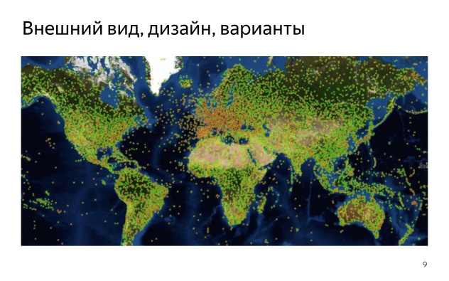
Here is what we got for geocoding. If someone remembers geography and can roughly estimate where Russia ends, then it ends exactly where the yellow dots begin. In fact, Europe is highlighted here. It so happened that in Russia the density of cities is less than in Europe. Here we took the coordinates accurate to the city. And all points have a single radius. It turns out that there is no place to vote in Russia, and some people in Europe and in Turkey - we suddenly have a place there too - as if they will start to make up most of our electorate. Not a very correct picture. Therefore, all hopes were that the coordinates will give us something good.
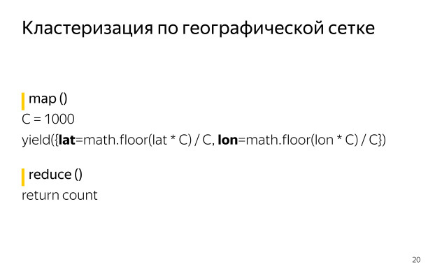
So we got the coordinates on a geographic grid. There are coordinates, we round them up to any decimal point - we can take the grid one degree, half a degree, one tenth degree. Here is a simple code on MapReduce, which adds coordinates to a cluster. This is his charm. No matter how many coordinates you have, you can group them together and get them using simple parallel calculations. You have a square, you squeeze all the squares in one corner, and the number of points in this area increases depending on how many points there are in this square. It turns out the grid. The question is which step for the grid you take. You can take up to a degree, up to one tenth of a degree, etc.
The more accurate the coordinates you get, the more points you have.
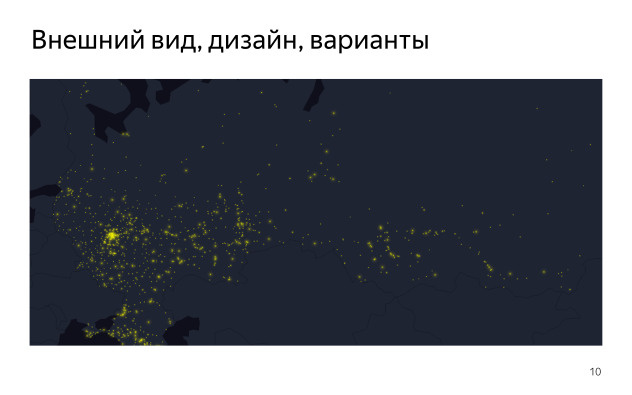
It turned out something similar to what is in Russia. Here you can see a cloud of points somewhere in the central part, near Moscow, near Moscow. Sochi is very long. And further along Siberia, Peter and a little Europe. Already more like the truth.
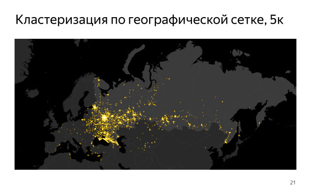
This picture is obtained by clustering one degree. There are a lot of points, and all points cannot be displayed on the map at once. We decided to choose a threshold. Cut off so that the total number of remaining points was about 5000.
We lost quite a lot of information, simply dropping a certain number of points that have one or two values in brightness.
If you take more points, you get the following picture.
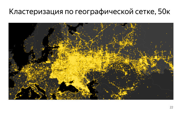
Here with the help of Heatmap a map is drawn. The grouping is the same, but 50 thousand points are already displayed. It can be seen that the picture is more lively, there are a lot of things in it, that’s all our people, that they are exactly all over Russia. Everything is great - except for two problems. First of all, we have 50 thousand points. Not every browser will cope with such a load, and having received such a beautiful picture, we would not give it to everyone. Plus it is some decent amount of data transmitted over the network.
The second. The picture was obtained by clustering on the grid, and this grid is visible. We will not get rid of it in any way. We can reduce this grid, but then there will be even more points. It turns out unsolvable dilemma. It is clear that this thing cannot be used in its pure form.
As a result, came to a different scheme. We used not one approach, but their combination, clustering. Took a large number of points, about a billion. This is just visits to the main page, from where we took only the coordinates. There's nothing. We just needed the facts of visits in pieces.
Then applied clustering on the grid, received from the billions only hundreds of thousands. It could have been more or less, not fundamentally. Then they had to be grouped in a cluster using some tricky algorithm. There is a whole theory, clustering, I will not talk in detail. There are algorithms that allow you to select clusters, cluster centers by arrays of points with coordinates. But they have many different restrictions, they are not ready to digest too many points. This can be done using local data, rather than distributed computing. These algorithms could not be found for distributed pieces, and we didn’t want to do them again either. Therefore, we chose the one that could do it: MiniBatchKMeans. This is the method of the nearest neighbors with modifications, which makes it possible to achieve clustering up to some quantity at hundreds of thousands of points in a given time, which we can basically show on the client. We chose about 10 thousand points.
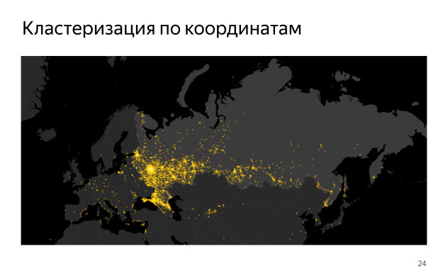
Here it is already clear that we got a picture in which, at any zoom, there are no traces of the grid. They are grouped in clusters, but without the listed disadvantages. There are quite a few points, and it turns out quite an interesting picture. So in the end, and decided to do.
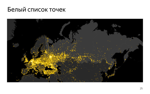
As a result, we first got a list of coordinates, and then, combining it with a list of cities, a large picture in common. Here are the differences. These are all possible points where a person could, in principle, vote. We expected that people who will vote from the main page of Yandex, and so are on it. We just took a long period of time and went over all the possible options. It is unlikely there would be someone new. There were even in Rio itself, in America, in Australia. It was just that they were few. At least we got all the single points on the white list, and then the question was how people would vote.
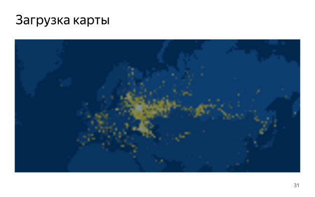
The next task is to make the points beautifully displayed on the map. Heatmap is not directly intended for this. It is for other things - to show heat maps. There the weight of the points affects the color. We needed a little bit more. Plus, we wanted to do more and less points, depending on their weight. We also received a huge number of wishes from designers about how this should look like in terms of gradients, color transfusions. In fact, this was not solved by any Heatmap settings. We just took the raw sources and went to rule them. It took several days to enter, figure out, change everything you can, rewrite, comment out, rewrite back with different side effects for different browsers. I will not tell. If anyone is interested, I gave a link to the source. Of the big things we did only that the brush, which paints the gradient itself, increased depending on the weight. Plus the gradient was with slightly different settings.
The result was a slightly different picture. Previously, the points were the same size, but now they have become a little brighter, their radius changes, there is a transfusion from white to yellow - in general, the designers did it.
To launch, we needed to make sure that the map really could work for people. We tried it on a different number of devices, mainly on tablets, because there were major problems, and on desktops. They took some approximate approximation, that on desktops you can show no more than 5000 points, on tablets - no more than 3000, and on tachi - no more than 1000. Approximately this was the plan, it gave an acceptable result. It is clear that the plan is not the best, but it worked, and there was not much to do with it.
It was important for us that the map worked for everyone, so that we could do any degradation depending on the current page load. But we did not do that.
We constantly remembered about it. The problem was especially noticeable on the cars, on the phones. The point is that the map immediately appeared on the page, not per click. People who scrolled literally one or two screens, saw the map, and it turned out that they saw it quite often, at each of their visits. And if there was a big lag, and he was there, then they would see an empty place. Then the pictures with the background would be loaded, then the dots themselves, then the map module, then the dots would draw Heatmap. In general, a lot of time. Plus, these points were not very many, and the picture there turned out pretty scanty.
The only thing that we came up with: filter the data, somehow rank it in the place where we prepare it. We had a large base, once every ten minutes we prepared JSON from it with dots where there were voices. Where there was data, we could do something. The problem was that the code was written in Perl. Our backend is written in Perl, and in our case it was about Heatmap on JS on the client. Somehow it didn’t dock at all until one of our colleagues overwrote Perl's Heatmap overnight. Having come once in the morning, we were surprised to find that we already have a ready-made version. It took a day or two to polish it, set up an update, download, roll across servers.
We got the opportunity to generate Tayliki server with pictures on the server. We got pictures that we could give to the cars. In them we could give any number of points, and not only that - we could give them even without the Maps API. It was enough for us to draw, conditionally, only six maps and position the current coordinate relative to them. Mathematics is not very complicated. It was possible to tear out a piece of cards, copy it and do it. In fact, we removed two extra steps: with downloading a large amount of data and with the work of some of the scripts on the phone.
It also gave us the exact same tile, just stretched across the screen. When the map was loaded on the desktop, we showed the background, then loaded the data, Maps API, drew Heatmap. In general, it was quite long and ugly. Instead, we just took a zero tile, stretched it to fit the size of the card. It was kind of smeared, but when the map was loaded, it seemed to make the image a bit more sharp, everything appeared there, and the transition was smoother, more user friendly.
: , , .
. , . . , , . : , . . : , DPI . . , GET- , , , . , , . , .
What happened? . , , . 1000 — - . . 20 . , 3–5 . , 2 , - . , . 10 . , , . .
- . . , , WebGL, . , , , . .
At one of the Ya.Subbotnikov, the head of a group of interfaces on the Yandex main page, Ivan Karev, explained how this map was created.
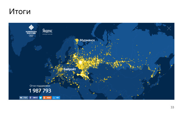
What happened? As a result, we launched a map the night before. With fear, but launched, and she gradually began to live their lives. We poured about 1000 points without votes into it - just to have some sort of initial state. Then people slowly began to vote. At the beginning, the pace was about 20 thousand votes per hour, and this was 3-5 days. Then it gradually decreased, and by the end of the Olympics there were about 2 million votes, some likes in social networks. We did nothing more with her, she worked and that was all. There was a regeneration procedure every 10 minutes. She laid out, and we did not do anything, just watched. Success.
- My name is Ivan Karev. In Yandex, I make the main page and various special projects. I want to talk about one of them. This is such a story from the life of developers - about what else is the work.
')
Special projects on Yandex, maybe you saw. You can go to the main page, click on the logo, then something will open in full screen and will be beautifully displayed. They work on desktops, tachas, tablets in different ways, something can immediately appear. They are specific. Someone saw a special project for the Olympics map in Rio? Has anyone seen the special project about Gagarin? Not much. The story will be about that.
Last summer, they came to us and said that we want to do in support of our national team map, where people who go to Yandex could somehow send rays of support. And there should be some kind of interactive map, where you can see who voted how much and so that each person could share his or her voice.
About her, nothing was clear, it was a concept. About him it was known that he should be beautiful, whatever the word was invested. In addition, he had to display real data of people - it could have been done differently, but we wanted to do well. And he had to work on desktops, tachas, tablets, different devices. Perhaps even with different logic.
The first question was that we do not know what we want to do. It should be beautiful, it should be a map with support. Usually, when you bring a layout, you look at, roughly evaluate the functionality and think how it can be done. And here is the opposite: designers came to us and said: “What can you do?”. We said: "If you want it, you can do this." We threw the ball back and forth, watched various demos for a long time, showed that we can do what can be done quickly, which is not fast. Communicated, asked for some time agreed.
What could we offer designers as an implementation? We have all sorts of cartographic engines. Yandex.Maps - generally about cards engine. There are engines where something can be drawn on the map. There are a lot of them, I brought Carto, because here he was mentioned and considered by someone.
Or there is just a JS library where you can manually draw whatever you want. Essentially svg / canvas - depending on the design, you could choose one or the other. There are a lot of ready-made solutions, a lot of demos. We roughly watched what could be taken. There was quite an interesting job, but unfortunately, there was not very much time, I had to pack.
What did you get in the end? There was such a concept. Here is a map, it seems to be flat, it has circles of different size and transparency. Here it is possible to realize this with the help of various things.
Then there was this concept. On the Carto engine, a Real Madrid football fans card is implemented, showing how they vote on Twitter. Also a flat map, there are much more points here, some gradients with transparency. It seems like a canvas, maybe svg, while also not very clear.
Let's go see what we have on Yandex.Maps. They have a module Heatmap, even such a demo was assembled, also a map with a substrate, there are many points on it, they are of different colors. Something, it seems, can also be done from this.
Then there was this design. There are much more points here, they have some kind of transparency. It was also at the level of the concept.
They even found such a thing, a cool demo from the Proper GL lessons (the name may be inaccurate - Ed.), Where you can take the real Earth with all sorts of textures, beautiful shaders, it rotates sharply. I also wanted very beautiful. Everyone really liked it, but we convinced everyone that no, we showed it, but we will not do it - not all computers can withstand it at all, a hard thing.
As a result, something like this was born, one of such concepts. A flat map, where there is a special colored substrate and there is a bubbling in the form of dots, they are multi-colored, iridescent into each other. At that moment, it came to be understood that before us it was probably not svg, but canvas.
From the cards here, the fact that the current location point of the person was tied to this map. It is shown where you are, and where someone else is.
In the end, we decided to do it on Yandex.Maps using the Heatmap module. Mapa, which was already ready in the demos of this, of course, did not know how to do, but we communicated with the developers and realized that this was possible. Began to cut further.
Here is the beginning. We had to make a substrate.
In fact, this is a creative activity. The substrate also can be different. Here it is flat, only two colors. Russia is highlighted in one color. There are territorial borders of states in Yandex.Maps, there is a module of the regions that draws this substrate in the form of svg. There you can select the level of detail, depending on which svg will weigh more or less. At the same time, it is drawn for quite a long time, and each time it was rather strange to load it, considering that the substrate is the same. Plus, we decided that not all zoom levels are needed, but only some of the upper ones. So we suddenly did the same thing, but only on tiles. Gray Russia map on a black background.
You can take the module of polygons, the module of regions, make a large screenshot, and through a simple Image Magic cut everything into tiles, which will be displayed in the same way.
The most interesting question was with the data. We had to take the voices of the people. We really wanted to show them in real time - so that the total number of points that people click on would change over time, so that progress could be seen, it was clear that something was happening.
Maybe I'm a paranoiac, but the first question that came to my mind was: if we give out some piece that can take coordinates and draw something on them, then in about half an hour we will have some kind of map across the entire map. Something the word "Hello" written with the help of geo-coordinates. This is easily done. And this idea stuck, and I wanted to do everything so that we did not need to manually watch everything that happens on this map. Therefore, the question arose of how to do moderation, and there was not much time. Of course, I did not want to re-raise something and track at night what was happening there. It was hard.
We also wanted the appearance of the map to be predictable and understandable. It was necessary to figure out what might even be there. People may vote in different places, but we would roughly understand in which and how it will look.
As a result, after some deliberation, we have the following architecture. We decided to take a large list of points, called it a whitelist. We are talking about those places where people can vote in principle. We will only include some points. The only question is how to take them. Naturally, there should be a lot of them, but we do not include anything else. Each click on the map searches for the nearest point from the whitelist, and some counter increases. There was a large base with all possible coordinates of points. We increased the counters and, in order to draw on the map, we showed it in a simple logarithmic scale. So some cheating and drops were not visible.
The question is how to make a white list of points. We have the same people on the main page, and so they come in - let's look at these visits and take from them those geolocations and coordination that are in the listed requests.
There are two types of coordinates. The coordinates of the first type are calculated by IP with reference to cities. We can take all the calls, coordinates, choose a certain level, for example, everything up to the city level, and then for each city, by its name and ID, take the corresponding geographical coordinates, geocode them and get the list in advance. He is not very big. We have cities in Russia and the district not millions, but thousands, tens of thousands.
The second is the most interesting. It was required to take real coordinates from users. The fact that a person is allowed as geolocation. You can try to collect this data, somehow structured and grouped. With clicks, when a person said that he wanted to support the national team, we asked the phone for geolocation - it is almost everywhere on the mobile phone - and the requests were sent already with the correct location. It is already relatively accurate, and it could happen anywhere: in the open field, along the roads, in the cottages.
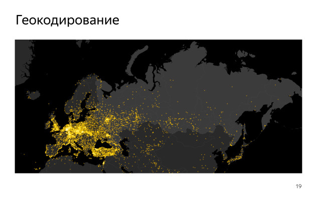
Here is what we got for geocoding. If someone remembers geography and can roughly estimate where Russia ends, then it ends exactly where the yellow dots begin. In fact, Europe is highlighted here. It so happened that in Russia the density of cities is less than in Europe. Here we took the coordinates accurate to the city. And all points have a single radius. It turns out that there is no place to vote in Russia, and some people in Europe and in Turkey - we suddenly have a place there too - as if they will start to make up most of our electorate. Not a very correct picture. Therefore, all hopes were that the coordinates will give us something good.
So we got the coordinates on a geographic grid. There are coordinates, we round them up to any decimal point - we can take the grid one degree, half a degree, one tenth degree. Here is a simple code on MapReduce, which adds coordinates to a cluster. This is his charm. No matter how many coordinates you have, you can group them together and get them using simple parallel calculations. You have a square, you squeeze all the squares in one corner, and the number of points in this area increases depending on how many points there are in this square. It turns out the grid. The question is which step for the grid you take. You can take up to a degree, up to one tenth of a degree, etc.
The more accurate the coordinates you get, the more points you have.
It turned out something similar to what is in Russia. Here you can see a cloud of points somewhere in the central part, near Moscow, near Moscow. Sochi is very long. And further along Siberia, Peter and a little Europe. Already more like the truth.
This picture is obtained by clustering one degree. There are a lot of points, and all points cannot be displayed on the map at once. We decided to choose a threshold. Cut off so that the total number of remaining points was about 5000.
We lost quite a lot of information, simply dropping a certain number of points that have one or two values in brightness.
If you take more points, you get the following picture.
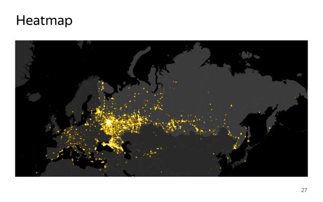
Here with the help of Heatmap a map is drawn. The grouping is the same, but 50 thousand points are already displayed. It can be seen that the picture is more lively, there are a lot of things in it, that’s all our people, that they are exactly all over Russia. Everything is great - except for two problems. First of all, we have 50 thousand points. Not every browser will cope with such a load, and having received such a beautiful picture, we would not give it to everyone. Plus it is some decent amount of data transmitted over the network.
The second. The picture was obtained by clustering on the grid, and this grid is visible. We will not get rid of it in any way. We can reduce this grid, but then there will be even more points. It turns out unsolvable dilemma. It is clear that this thing cannot be used in its pure form.
As a result, came to a different scheme. We used not one approach, but their combination, clustering. Took a large number of points, about a billion. This is just visits to the main page, from where we took only the coordinates. There's nothing. We just needed the facts of visits in pieces.
Then applied clustering on the grid, received from the billions only hundreds of thousands. It could have been more or less, not fundamentally. Then they had to be grouped in a cluster using some tricky algorithm. There is a whole theory, clustering, I will not talk in detail. There are algorithms that allow you to select clusters, cluster centers by arrays of points with coordinates. But they have many different restrictions, they are not ready to digest too many points. This can be done using local data, rather than distributed computing. These algorithms could not be found for distributed pieces, and we didn’t want to do them again either. Therefore, we chose the one that could do it: MiniBatchKMeans. This is the method of the nearest neighbors with modifications, which makes it possible to achieve clustering up to some quantity at hundreds of thousands of points in a given time, which we can basically show on the client. We chose about 10 thousand points.
Here it is already clear that we got a picture in which, at any zoom, there are no traces of the grid. They are grouped in clusters, but without the listed disadvantages. There are quite a few points, and it turns out quite an interesting picture. So in the end, and decided to do.
As a result, we first got a list of coordinates, and then, combining it with a list of cities, a large picture in common. Here are the differences. These are all possible points where a person could, in principle, vote. We expected that people who will vote from the main page of Yandex, and so are on it. We just took a long period of time and went over all the possible options. It is unlikely there would be someone new. There were even in Rio itself, in America, in Australia. It was just that they were few. At least we got all the single points on the white list, and then the question was how people would vote.
The next task is to make the points beautifully displayed on the map. Heatmap is not directly intended for this. It is for other things - to show heat maps. There the weight of the points affects the color. We needed a little bit more. Plus, we wanted to do more and less points, depending on their weight. We also received a huge number of wishes from designers about how this should look like in terms of gradients, color transfusions. In fact, this was not solved by any Heatmap settings. We just took the raw sources and went to rule them. It took several days to enter, figure out, change everything you can, rewrite, comment out, rewrite back with different side effects for different browsers. I will not tell. If anyone is interested, I gave a link to the source. Of the big things we did only that the brush, which paints the gradient itself, increased depending on the weight. Plus the gradient was with slightly different settings.
The result was a slightly different picture. Previously, the points were the same size, but now they have become a little brighter, their radius changes, there is a transfusion from white to yellow - in general, the designers did it.
To launch, we needed to make sure that the map really could work for people. We tried it on a different number of devices, mainly on tablets, because there were major problems, and on desktops. They took some approximate approximation, that on desktops you can show no more than 5000 points, on tablets - no more than 3000, and on tachi - no more than 1000. Approximately this was the plan, it gave an acceptable result. It is clear that the plan is not the best, but it worked, and there was not much to do with it.
It was important for us that the map worked for everyone, so that we could do any degradation depending on the current page load. But we did not do that.
We constantly remembered about it. The problem was especially noticeable on the cars, on the phones. The point is that the map immediately appeared on the page, not per click. People who scrolled literally one or two screens, saw the map, and it turned out that they saw it quite often, at each of their visits. And if there was a big lag, and he was there, then they would see an empty place. Then the pictures with the background would be loaded, then the dots themselves, then the map module, then the dots would draw Heatmap. In general, a lot of time. Plus, these points were not very many, and the picture there turned out pretty scanty.
The only thing that we came up with: filter the data, somehow rank it in the place where we prepare it. We had a large base, once every ten minutes we prepared JSON from it with dots where there were voices. Where there was data, we could do something. The problem was that the code was written in Perl. Our backend is written in Perl, and in our case it was about Heatmap on JS on the client. Somehow it didn’t dock at all until one of our colleagues overwrote Perl's Heatmap overnight. Having come once in the morning, we were surprised to find that we already have a ready-made version. It took a day or two to polish it, set up an update, download, roll across servers.
We got the opportunity to generate Tayliki server with pictures on the server. We got pictures that we could give to the cars. In them we could give any number of points, and not only that - we could give them even without the Maps API. It was enough for us to draw, conditionally, only six maps and position the current coordinate relative to them. Mathematics is not very complicated. It was possible to tear out a piece of cards, copy it and do it. In fact, we removed two extra steps: with downloading a large amount of data and with the work of some of the scripts on the phone.
It also gave us the exact same tile, just stretched across the screen. When the map was loaded on the desktop, we showed the background, then loaded the data, Maps API, drew Heatmap. In general, it was quite long and ugly. Instead, we just took a zero tile, stretched it to fit the size of the card. It was kind of smeared, but when the map was loaded, it seemed to make the image a bit more sharp, everything appeared there, and the transition was smoother, more user friendly.
: , , .
. , . . , , . : , . . : , DPI . . , GET- , , , . , , . , .
What happened? . , , . 1000 — - . . 20 . , 3–5 . , 2 , - . , . 10 . , , . .
- . . , , WebGL, . , , , . .
Source: https://habr.com/ru/post/335982/
All Articles