10 free and cool fonts
Today we talk about fonts that are often used by our designers - they are all free, minimalistic and easy to use. We hope our selection will be useful to you when choosing fonts.
Font - part of the corporate identity, which can not be neglected. The shape and shape of the letters is the basis of the readability and mood of the brand. The text surrounds us everywhere: the name of the company, a slogan or an advertisement in a magazine. Meet on clothes. The attractiveness of the text depends on whether the eye catches on the pleasant outlines of the letters or excessive squiggles cause the reader to be rejected. Creating fonts is a science, but the worldwide network offers an inexhaustible source of public families from typography gurus.
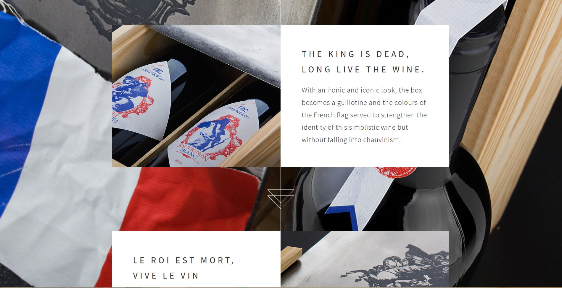
Usage example:
')
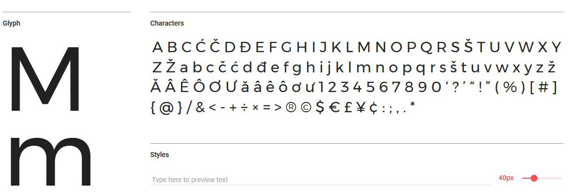
Designer: Steve Matteson is a passionate designer from the state of Colorado. For more than 25 years, Mattison has been developing fonts, the largest projects have become designs for Android, Citrix, Microsoft, Nextel and Xbox.
Types: Light; Light Italic; Regular; Regular Italic; Semi-Bold; Semi-Bold Italic; Bold; Bold Italic; Extra-Bold; Extra-Bold Italic.
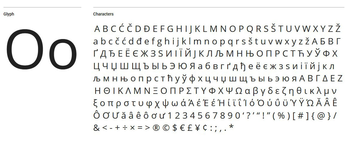
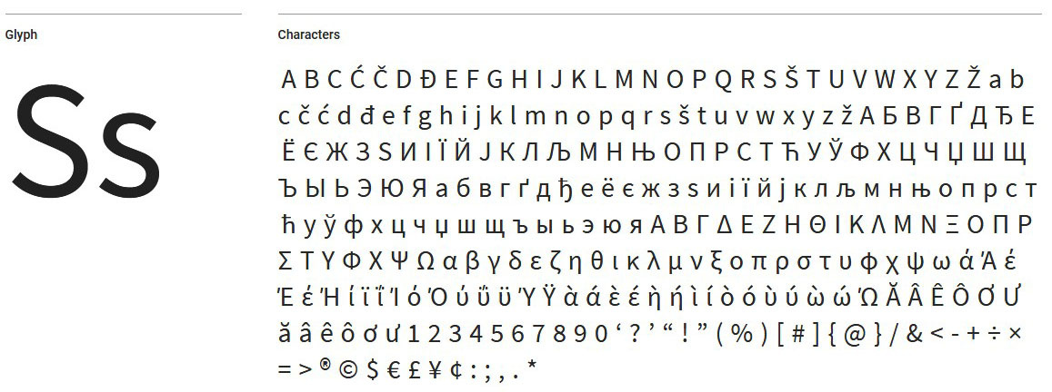
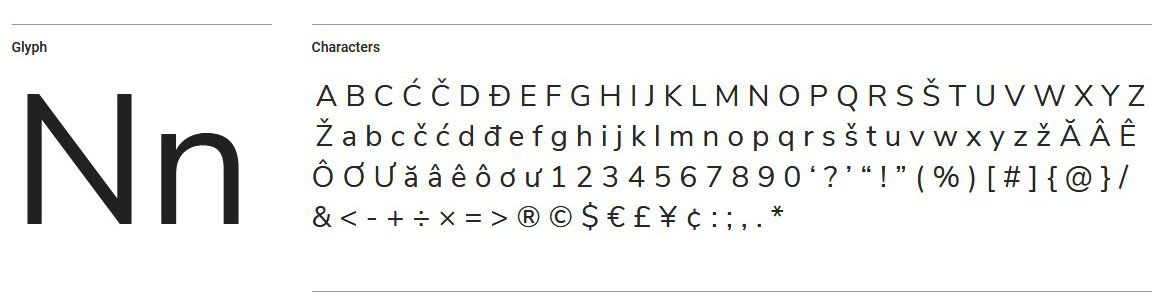
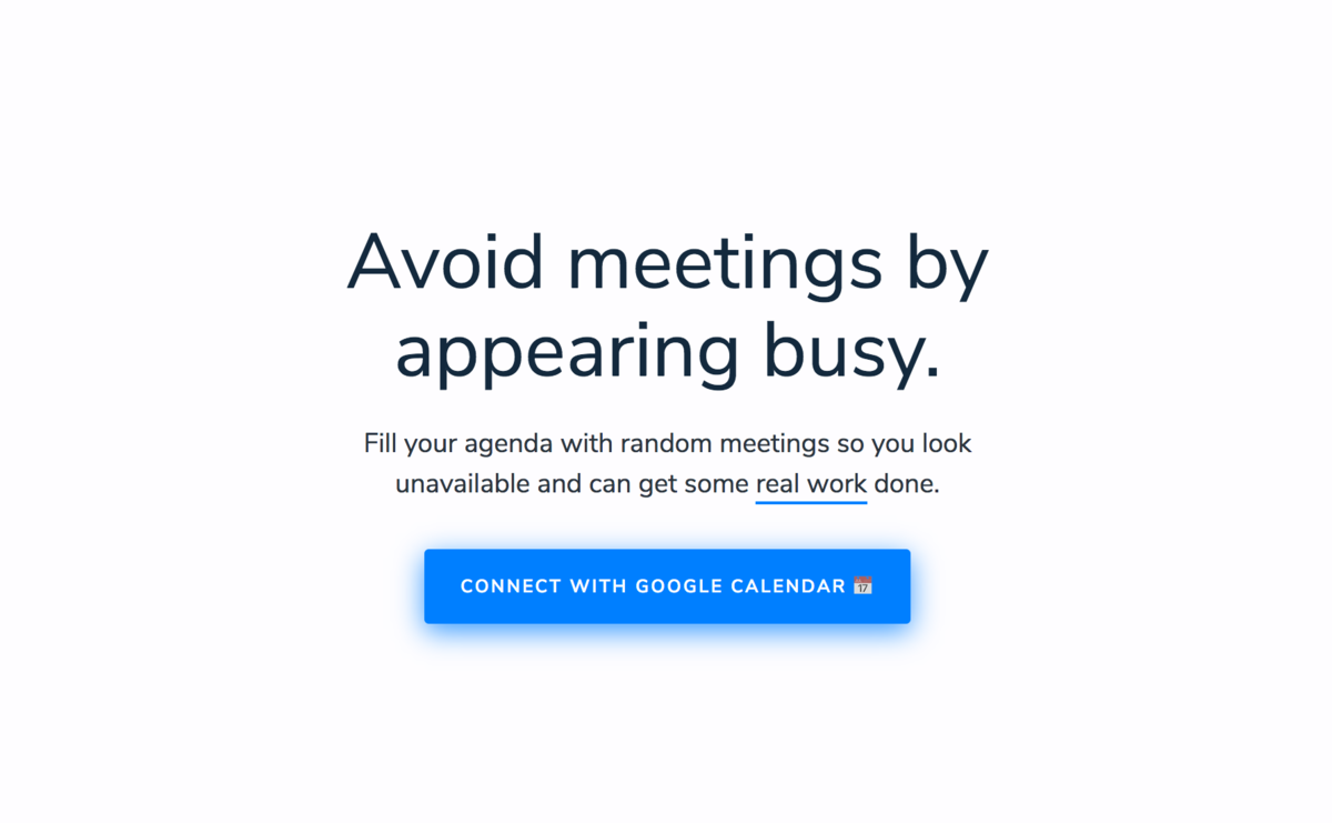
Open Sans is a nice readable font with simple sans serif shapes. The lettering is smooth and wide. Thanks to its neutral look, the font is perfect for both headings and body copy. The font will contain a full set of characters: Latin, Greek and Cyrillic. A nice addition is that the package is optimized for print, web and mobile interfaces.
Usage example:
Designer: Another popular font from Steve Mattheson.
Types: Regular; Bold.
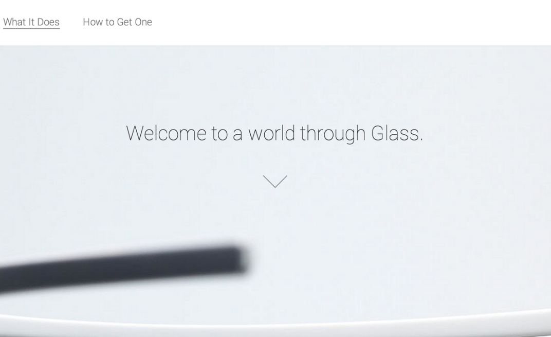
Steve Matteson designed the Droid Sans for the sole purpose of reading convenience on a mobile phone. Unlike the previous fellow, Droid Sans has a more elongated shape, the interval between letters has decreased, the lines become fatter. The font looks bright and not massive, suitable for use in applications, browsers and smartphones menus.
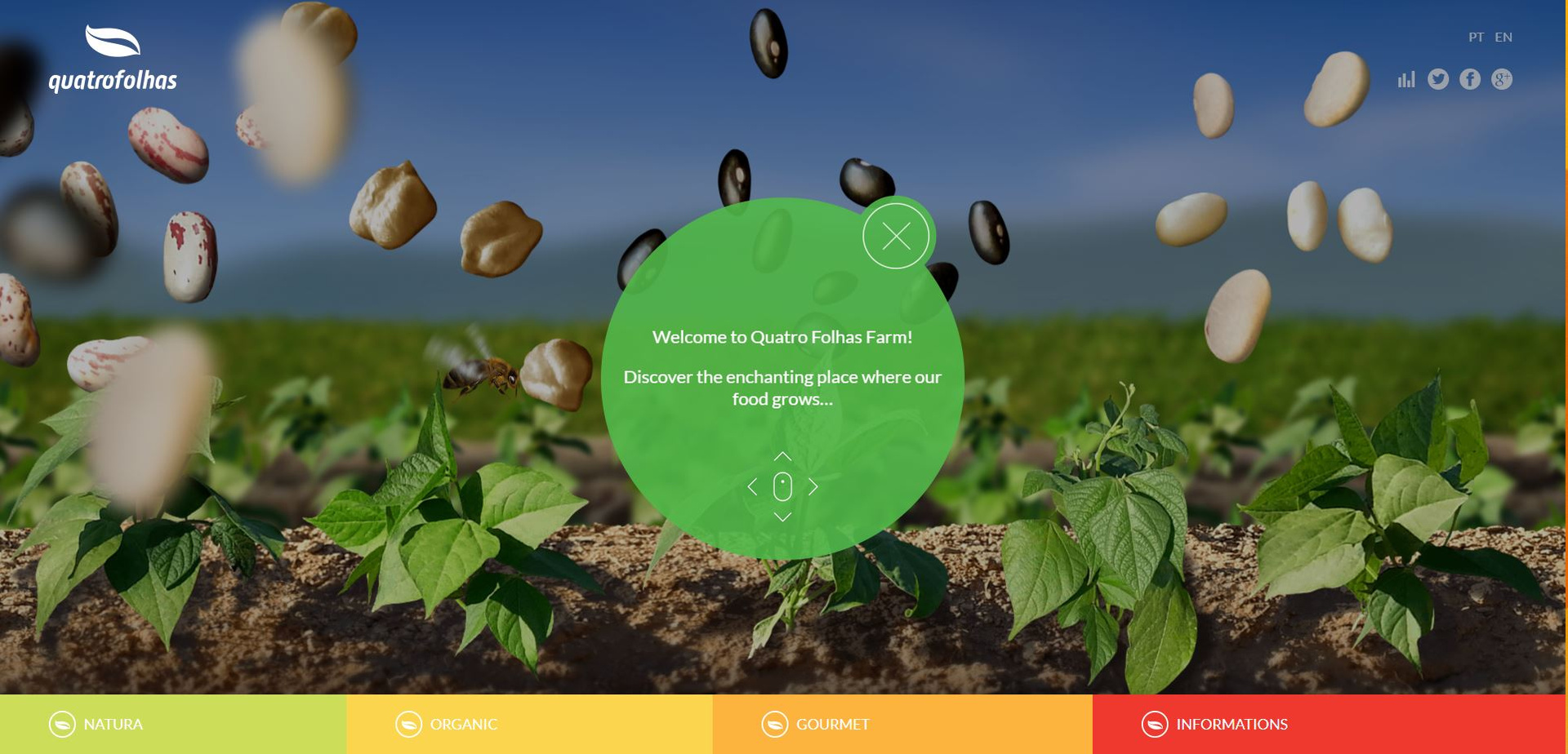
Usage example:
A source
Designer: Paul D. Hunt
Types: Extra-Light; Extra-Light Italic; Light; Light Italic; Regular; Regular Italic; Semi-Bold; Semi-Bold Italic; Bold; Bold Italic; Black; Black Italic.
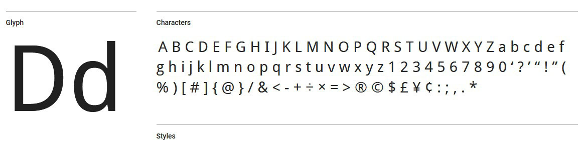
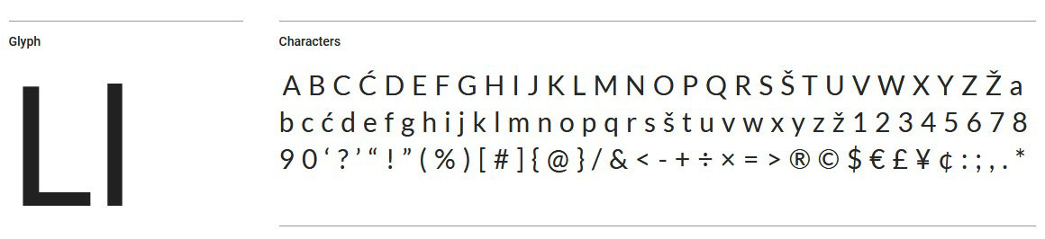
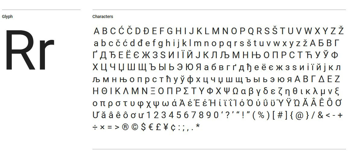
Source Sans Pro is a font family that Paul D. Hunt developed for Adobe Systems.
Font class grotesque, refers to the style of "sans serif." The designer made the drawing of letters smooth and wide. Symbols are suitable for headings, highlighting interesting points in the main text. The headset is designed to work in user interfaces and has an open license. From pluses: symbols for Latin, Cyrillic and some Asian languages are worked out.
Usage example:
A source
Designer: Lukas Dziedzich - a designer from Warsaw, who worked on the creation of fonts for the largest retail chain in Poland, and in 2010 he began work on the open-source font family Lato.
Types: Thin, Thin Italic, Light, Light Italic, Regular, Regular Italic, Bold, Bold Italic, Black, Black Italic.
Lato - summer in Polish. The designer chose a name to convey the mood of the font: the rounded shapes of the letters convey a feeling of warmth. Initially, Luka Dziedzich drew the font on the order of a large commercial company, but later the management changed the style, so the developer made the family public. A distinctive feature is that the font is similar to others in the body of the text, but when used in headings, it acquires original features.
Usage example:
A source
Designer: Juliet Ulanovskaya is a graphic designer and owner of a studio that has existed for about 30 years. The woman lives in Montserrat, Buenos Aires.
Types: Thin, Thin Italic, Extra-Light, Extra-Light Italic, Light, Light Italic, Regular, Regular Italic, Medium, Medium Italic, Semi-Bold, Semi-Bold Italic, Bold, Bold Italic, Extra-Bold, Extra -Bold Italic, Black, Black Italic.
Montserrat is not a commercial order, but a project with soul and history. Old signs and posters in the city of Montserrat inspired Juliet Ulanovskaya to create this text style. According to the designer, the new trends in the world of printing can not make the city look as beautiful and special. Juliet's goal was to preserve the cultural heritage, therefore, the font is free. The letters are wide and simple in style, and have a friendly look. The headset blends well with other fonts of the classic look. The family has two sisters Alternates and Subrayada, which differ in unusual forms.
Usage example:
A source
Designer: Giovanni Lemonnad - Russian designer Ivan Gladkikh, with an unusual pseudonym, works not only on commercial projects, but also creates free font families.
Types: Regular
Numans - saturated wide-letter font, without serifs. Similar fonts are classified as incidental and are used for headings or highlighting short text fragments. The style is modern grotesque. The letters have open, flowing features.
Despite the fact that the designer is Russian, the font is in Latin.
Usage example:
A source
Designer: Vernon Adams, Jacques Le Bile
Types: Extra-Light, Extra-Light Italic, Light, Light Italic, Regular, Regular Italic, Semi-Bold, Semi-Bold Italic, Bold, Bold Italic, Extra-Bold, Extra-Bold Italic, Black, Black Italic
Nunito Sans is a sans-serif family that has two versions. Initially, Vernon Adams worked on the project, creating rounded sans-serif shapes for the print shop. Jacques Le Bailey expanded the font to a full set of scales. Short letters have classic proportions and look good in the main text.
Usage example:
A source
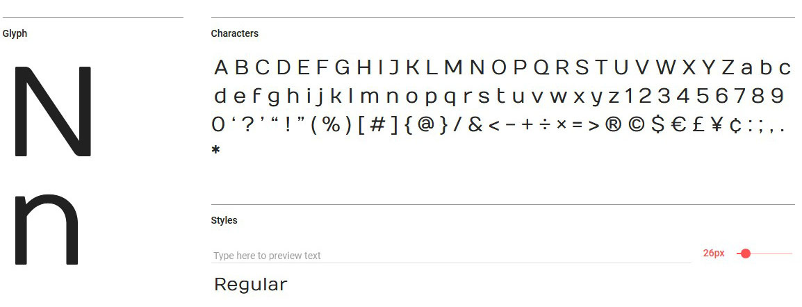
Designer: Christian Robertson is a Google interface designer.
Types: Thin, Thin Italic, Light, Light Italic, Regular, Regular Italic, Medium, Medium Italic, Bold, Bold Italic, Black, Black Italic
Roboto default font in the Android operating system, and since 2013 - Google services, has a geometric shape and a mechanical skeleton. It can be called a dualist font. The letters have the usual proportions, not distorted. This simplifies the process of reading, makes the font pleasing to the eye. The family is convenient to use with other headsets Roboto. The font is presented in various languages, including Russian.
Usage example:
A source
Designer: Christian Robertson
Types: Thin, Light, Regular, Bold.
Roboto Slab - font with bar serifs. The designer has developed it as more strict and official. Unlike its fellow does not have an inclined version. Serifs make letters more recognizable and readable. Roboto Slab is convenient to use as the main text font, combining with the rest of the Roboto families.
Usage example:
A source
Designer: Matt McInerney, Pablo Impallari and Rodrigo Fuenzalid.
Types: Thin, Thin Italic, Extra-Light, Extra-Light Italic, Light, Light Italic, Regular, Regular Italic, Medium, Medium Italic, Semi-Bold, Semi-Bold Italic, Bold, Bold Italic, Extra-Bold, Extra -Bold Italic, Black, Black Italic.
Raleway is another representative fonts for use in headings. The family has the support of European and Cyrillic languages. There are more than 150 of them. The letters have unusual round shapes. When used with a large kegel look catchy and interesting.
The compilation was prepared by a copywriter of Logmachine - Alena Kovalenko.
Font - part of the corporate identity, which can not be neglected. The shape and shape of the letters is the basis of the readability and mood of the brand. The text surrounds us everywhere: the name of the company, a slogan or an advertisement in a magazine. Meet on clothes. The attractiveness of the text depends on whether the eye catches on the pleasant outlines of the letters or excessive squiggles cause the reader to be rejected. Creating fonts is a science, but the worldwide network offers an inexhaustible source of public families from typography gurus.
1. Open Sans
Usage example:
')
Designer: Steve Matteson is a passionate designer from the state of Colorado. For more than 25 years, Mattison has been developing fonts, the largest projects have become designs for Android, Citrix, Microsoft, Nextel and Xbox.
Types: Light; Light Italic; Regular; Regular Italic; Semi-Bold; Semi-Bold Italic; Bold; Bold Italic; Extra-Bold; Extra-Bold Italic.
Open Sans is a nice readable font with simple sans serif shapes. The lettering is smooth and wide. Thanks to its neutral look, the font is perfect for both headings and body copy. The font will contain a full set of characters: Latin, Greek and Cyrillic. A nice addition is that the package is optimized for print, web and mobile interfaces.
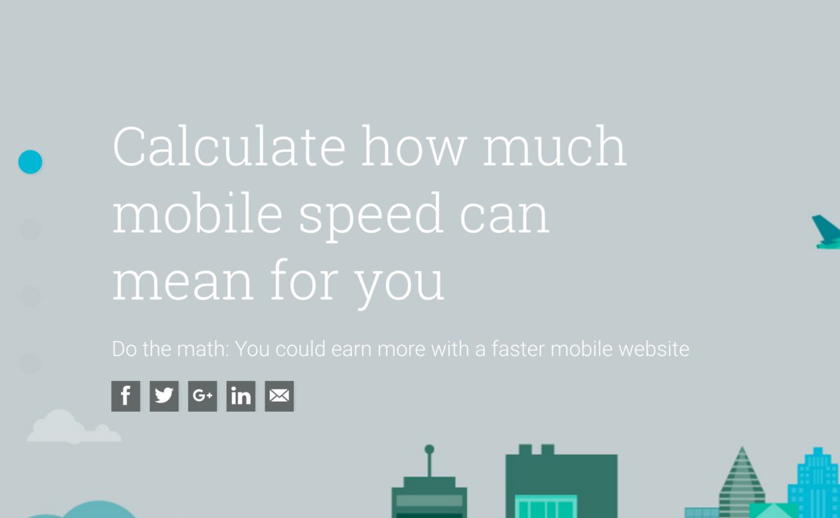
2. Droid Sans
Usage example:
Designer: Another popular font from Steve Mattheson.
Types: Regular; Bold.
Steve Matteson designed the Droid Sans for the sole purpose of reading convenience on a mobile phone. Unlike the previous fellow, Droid Sans has a more elongated shape, the interval between letters has decreased, the lines become fatter. The font looks bright and not massive, suitable for use in applications, browsers and smartphones menus.
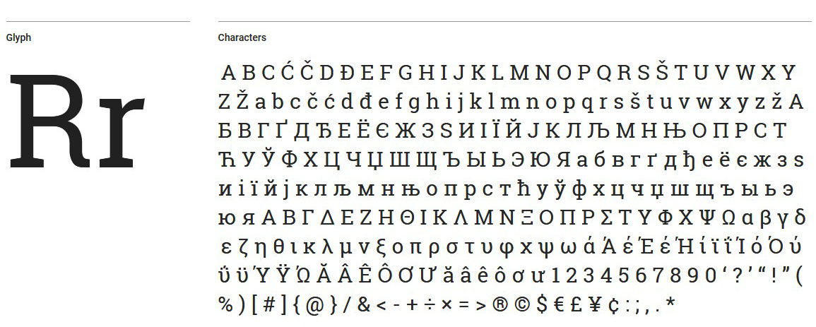
3. Source Sans Pro
Usage example:
A source
Designer: Paul D. Hunt
Types: Extra-Light; Extra-Light Italic; Light; Light Italic; Regular; Regular Italic; Semi-Bold; Semi-Bold Italic; Bold; Bold Italic; Black; Black Italic.
Source Sans Pro is a font family that Paul D. Hunt developed for Adobe Systems.
Font class grotesque, refers to the style of "sans serif." The designer made the drawing of letters smooth and wide. Symbols are suitable for headings, highlighting interesting points in the main text. The headset is designed to work in user interfaces and has an open license. From pluses: symbols for Latin, Cyrillic and some Asian languages are worked out.
4. Lato
Usage example:
A source
Designer: Lukas Dziedzich - a designer from Warsaw, who worked on the creation of fonts for the largest retail chain in Poland, and in 2010 he began work on the open-source font family Lato.
Types: Thin, Thin Italic, Light, Light Italic, Regular, Regular Italic, Bold, Bold Italic, Black, Black Italic.
Lato - summer in Polish. The designer chose a name to convey the mood of the font: the rounded shapes of the letters convey a feeling of warmth. Initially, Luka Dziedzich drew the font on the order of a large commercial company, but later the management changed the style, so the developer made the family public. A distinctive feature is that the font is similar to others in the body of the text, but when used in headings, it acquires original features.
5. Montserrat
Usage example:
A source
Designer: Juliet Ulanovskaya is a graphic designer and owner of a studio that has existed for about 30 years. The woman lives in Montserrat, Buenos Aires.
Types: Thin, Thin Italic, Extra-Light, Extra-Light Italic, Light, Light Italic, Regular, Regular Italic, Medium, Medium Italic, Semi-Bold, Semi-Bold Italic, Bold, Bold Italic, Extra-Bold, Extra -Bold Italic, Black, Black Italic.
Montserrat is not a commercial order, but a project with soul and history. Old signs and posters in the city of Montserrat inspired Juliet Ulanovskaya to create this text style. According to the designer, the new trends in the world of printing can not make the city look as beautiful and special. Juliet's goal was to preserve the cultural heritage, therefore, the font is free. The letters are wide and simple in style, and have a friendly look. The headset blends well with other fonts of the classic look. The family has two sisters Alternates and Subrayada, which differ in unusual forms.
6. Numans
Usage example:
A source
Designer: Giovanni Lemonnad - Russian designer Ivan Gladkikh, with an unusual pseudonym, works not only on commercial projects, but also creates free font families.
Types: Regular
Numans - saturated wide-letter font, without serifs. Similar fonts are classified as incidental and are used for headings or highlighting short text fragments. The style is modern grotesque. The letters have open, flowing features.
Despite the fact that the designer is Russian, the font is in Latin.
7. Nunito Sans
Usage example:
A source
Designer: Vernon Adams, Jacques Le Bile
Types: Extra-Light, Extra-Light Italic, Light, Light Italic, Regular, Regular Italic, Semi-Bold, Semi-Bold Italic, Bold, Bold Italic, Extra-Bold, Extra-Bold Italic, Black, Black Italic
Nunito Sans is a sans-serif family that has two versions. Initially, Vernon Adams worked on the project, creating rounded sans-serif shapes for the print shop. Jacques Le Bailey expanded the font to a full set of scales. Short letters have classic proportions and look good in the main text.
8. Roboto
Usage example:
A source
Designer: Christian Robertson is a Google interface designer.
Types: Thin, Thin Italic, Light, Light Italic, Regular, Regular Italic, Medium, Medium Italic, Bold, Bold Italic, Black, Black Italic
Roboto default font in the Android operating system, and since 2013 - Google services, has a geometric shape and a mechanical skeleton. It can be called a dualist font. The letters have the usual proportions, not distorted. This simplifies the process of reading, makes the font pleasing to the eye. The family is convenient to use with other headsets Roboto. The font is presented in various languages, including Russian.
9. Roboto Slab
Usage example:
A source
Designer: Christian Robertson
Types: Thin, Light, Regular, Bold.
Roboto Slab - font with bar serifs. The designer has developed it as more strict and official. Unlike its fellow does not have an inclined version. Serifs make letters more recognizable and readable. Roboto Slab is convenient to use as the main text font, combining with the rest of the Roboto families.
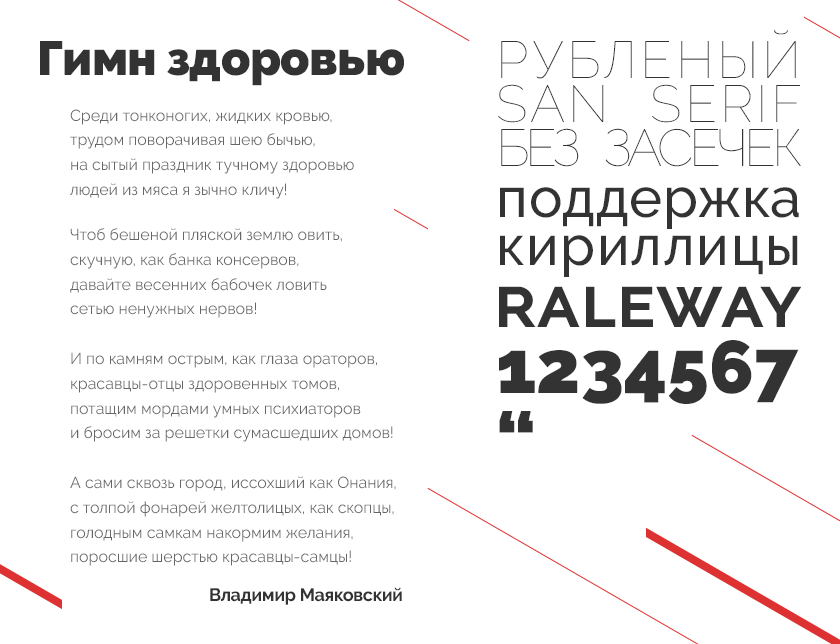
10. Raleway
Usage example:
A source
Designer: Matt McInerney, Pablo Impallari and Rodrigo Fuenzalid.
Types: Thin, Thin Italic, Extra-Light, Extra-Light Italic, Light, Light Italic, Regular, Regular Italic, Medium, Medium Italic, Semi-Bold, Semi-Bold Italic, Bold, Bold Italic, Extra-Bold, Extra -Bold Italic, Black, Black Italic.
Raleway is another representative fonts for use in headings. The family has the support of European and Cyrillic languages. There are more than 150 of them. The letters have unusual round shapes. When used with a large kegel look catchy and interesting.
The compilation was prepared by a copywriter of Logmachine - Alena Kovalenko.
Source: https://habr.com/ru/post/335790/
All Articles