As we increased the application load by 14% with the help of the new icon design
This is another case on how we conducted the A / B tests of application icons on Google Play. We have proven that only one new icon design can increase organic downloads of the application by 14%. But before that, we had the opportunity to spend 16 stages of testing, change 6 concepts, face a depressing error and derive our formula for successful A / B tests.
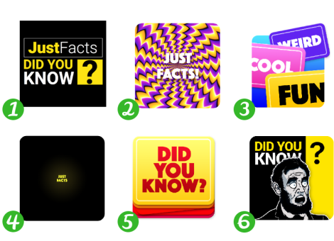
And for starters, try to guess the winner icon:
“Just Facts: Did You Know?” Is an application that with the help of slides tells about interesting facts from different fields of science and the world around.
The primary target audience was young men from India, the United States, the Philippines, Pakistan and South Africa.
')
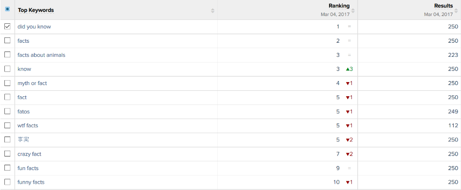
The majority of users found the application using the keywords “did you know” or “facts”
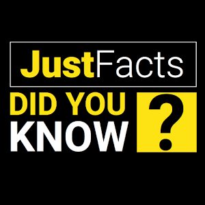
This is how the application icon itself looked like before contacting us.
Immediately 2 key queries on it
We studied competitors in order to understand which images should be avoided and how to stand out among other icons.

The most commonly used images: books, light bulbs and all sorts of abstraction
The customer also said that he already had an attempt to change the application icon.
He conducted several experiments:
The first icon brought fewer downloads, and the second icon was tested on a similar quotes application, but it did not work either.
According to the customer, the icons did not work, because they were more abstract and did not convey the idea of what the application, unlike the current icon, which contained in its design keywords. We still had to check these guesses, so we did not accept them as a fact. Moreover, the customer himself asked to do something radically new.
Objectives and wishes of the customer:
When the technical task was compiled, we had to create several variants of icons at once, in order to proceed to A / B testing.
As requested by the customer himself, we decided to start working on completely different options than the current one.
And here are some ideas we came up with:
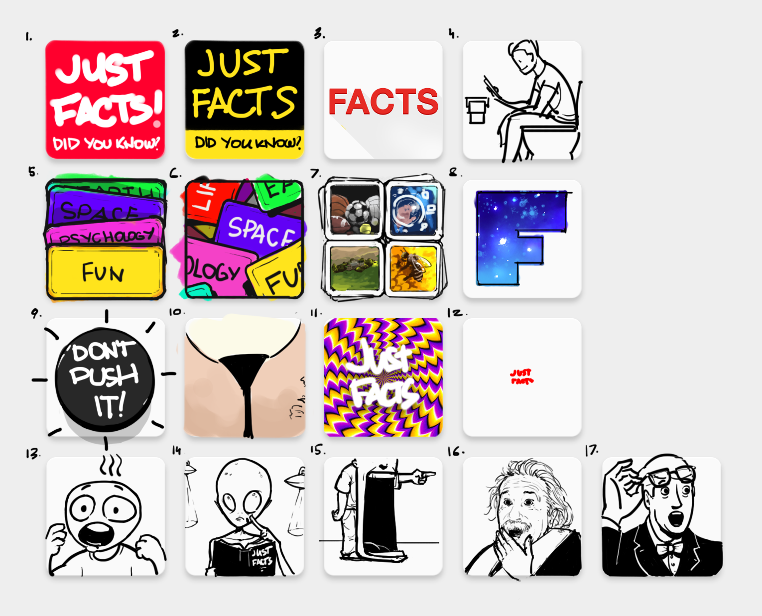
Simple designs that attract attention:
- Sketches number 1 and 2 - a larger spelling of the name. Bid on the main key requests.
- Sketch number 3 - an icon in the style of the American scientific and educational channel TED. So we wanted to reach the US audience.
- Sketch 4 - the guy on the toilet looks at the mobile screen. A little shocking and attracts attention.
Entertainment Designs:
- Sketches number 5, 6, 7 - cards with themes of facts or with pictures from different fields of knowledge, like those used in American quizzes or television shows.
- Sketch number 8 - the letter "F" from the word "facts", inside which is an infinite universe.
Designs - psychological tricks:
- Sketch number 9 - the button with the inscription in English "Do not press", which will instinctively want to click.
- Sketch number 10 - a popular picture with a girl who looks like a floor lamp.
- Sketch number 11 - an optical illusion that attracts attention. It should actually look like an animated icon.
- Sketch number 12 - a very small name of the application. A reception that should attract attention because a person will not be able to read right away what is written on the icon, and he will have to take a better look.
Designs expressing emotion:
- Sketch number 13 - a stylized character that conveys the emotion of strong surprise.
- Sketch number 14 - a surprised stranger.
- Sketch №15 - a person with a jaw dropped to the floor, from the English idiom “someone's jaw drops”, which means a very strong surprise.
- Sketch number 16 - surprised Einstein or another person known in the United States.
- Sketch number 17 - a more classic character, looking in the direction of the name of the application in the store with astonishment on his face. Thus, we will force the user to pay attention to the name of the application.
During discussions with the customer, we selected 5 ideas, each of which was developed in several designs and colors.
Here is what we created as a result before conducting the A / B tests:
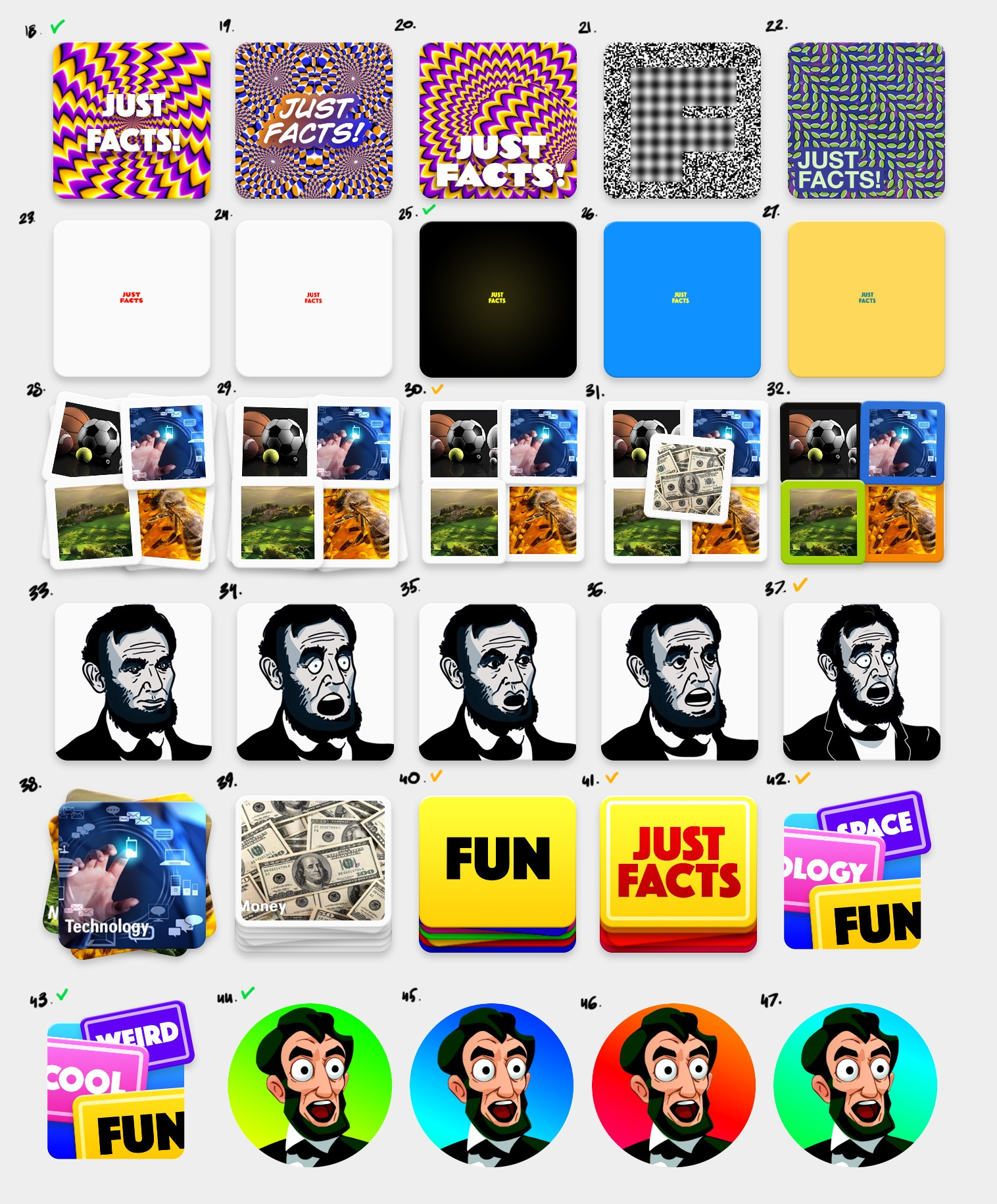
New concepts selected for A / B testing
Well, then it turned out not so simple, and the test results are completely unexpected.
During the first testing, all the icons worked worse than the current one. In addition, in the A / B testing settings, the customer left the current icon with 25% of the traffic, and allocated 75% for experiments.
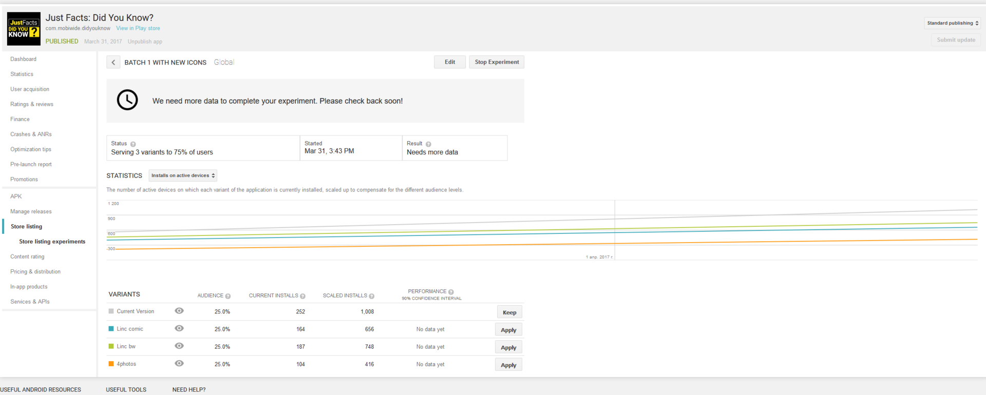
Downloads sagged
We launched the second A / B-eats. At this time, the current icon, we have allocated 70%, and the three test - 10%. But the result was again unexpected.
When we first saw the old application icon, it was spinning in my head: “Yes, we can easily draw better!”. And here the second test shows that high-quality visual graphics work 2 times worse than the previous icon; (
Most alarmed by the similarity of the results of new options. All of them showed a decrease in downloads in the range of 60-50%. All the time pursued the idea that we missed something.
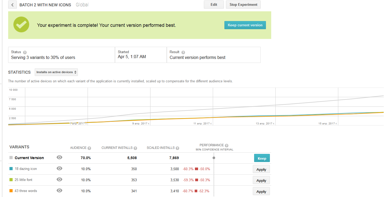
After the first A / B test, when the downloads sagged, the customer no longer wanted to take risks and allocated only 30% of the traffic to the experiments, i.e. each of the icons - 10%. The logic is clear: why allocate more traffic if Google scales the result.
The so-called scaled installs (scalable installations), on which we focus, are the number of installations during the experiment, divided by the audience share.
Those. it seems to be how you distribute traffic less, and the result should be the same. But what about the error?
We decided to conduct a so-called AAB test to calculate the error. The essence of such a test is to test it along with the current icon, as a new version and another alternative icon.
We conducted several AAB tests and found that with 7-day testing and distribution of traffic by 25% for alternative icons, the error is from -0.2 to + 10.1% with downloads of 1.5-3K.
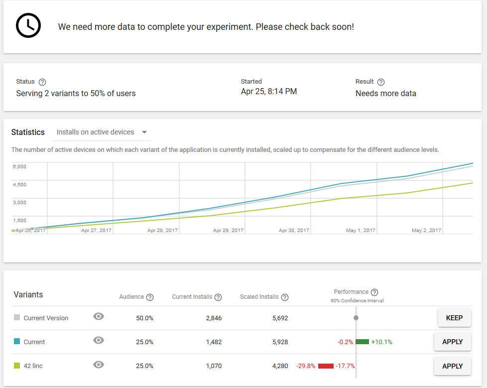
Google says that the experiment has been completed and conclusions can be drawn: the current icon defeated the current icon and increased downloads by 4.95% (on average) :)
This is why the AAB test is useful. We have identified a depressing error.
However, even with the average error of 4.95%, alternative icons worked worse. We knew that the error would be less if we performed the test longer. But we did not see any reason to wait, because it was absolutely clear that the chosen concepts did not work.
Finally, we paid attention to an important nuance, which was not given proper value from the beginning. No matter how much the customer wants the cardinally new versions of the icons, we have come to the conclusion that this cannot be done, and here is why.
The guesses of the customer, which he expressed at the beginning of his work, that the text on the icon works much better than any abstraction, now looked quite reasonable.
All these observations led us to the conclusion that the design of the old icon should be refined, rather than creating a radically new one.
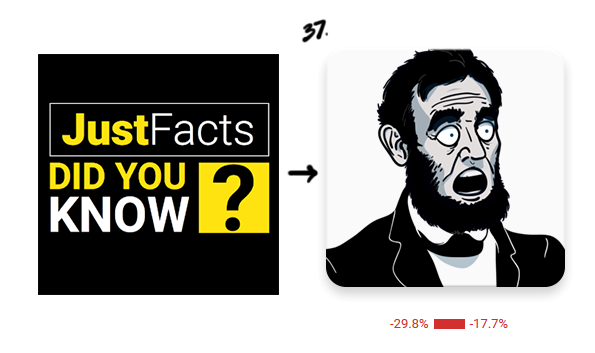
We looked at the icons we tested. The icon with a black and white surprised Lincoln did not work, but its result was the best among the alternatives. In addition, this image fits perfectly into the old design.
The task was to link the old icon design with the image of the surprised Lincoln. But what came out of it:

Tests began to give positive results.
So a new concept appeared - to create a new icon, based on the old design.
The designer has created several new options to test this idea.

Various options for integrating old and new design
We re-started testing various options. Now it was absolutely clear that we were not mistaken. The image of Lincoln attracted attention, and elements of the old design helped convey the essence of the application.
The results of the latest tests began to please.
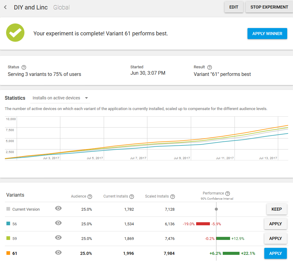
Finally, we decided to stop when the average conversion was + 14.15%.
Here it is - the winner icon:

This is how the application icon on Google Play looks today.
It was with her that the number of downloads during the A / B test was increased by 6.2% - 22.1% . And even taking into account the average error of 4.95%, this result suited us quite well, since We consider our work completed if the average conversion increased by 10%. The result is achieved. But, by and large, the experiment could still continue. This is probably the way to perfection - an endless process.
With each new A / B testing, we get new experience and useful information that we share with you. We have already written to you about the case when the inscription “Free” in an unpredictable way affected the number of downloads of the application. This time we fixed a fact that goes against the generally accepted opinion of designers that the text on the application icon is taboo. Here is a vivid example of how the text on the icon in the new design worked only as a plus and increased the load by 14.15%. So that you should not blindly follow the rules and standards in the design of icons. Who knows, maybe your case will be the exception. Better follow the rules that are confirmed by practical experience:
And the main conclusion that can be drawn from this case: the icon is a powerful tool that can significantly affect the conversion of your application.
And for starters, try to guess the winner icon:
What the customer came to us with
“Just Facts: Did You Know?” Is an application that with the help of slides tells about interesting facts from different fields of science and the world around.
The primary target audience was young men from India, the United States, the Philippines, Pakistan and South Africa.
')
The majority of users found the application using the keywords “did you know” or “facts”
This is how the application icon itself looked like before contacting us.
Immediately 2 key queries on it
We studied competitors in order to understand which images should be avoided and how to stand out among other icons.
The most commonly used images: books, light bulbs and all sorts of abstraction
The customer also said that he already had an attempt to change the application icon.
He conducted several experiments:
The first icon brought fewer downloads, and the second icon was tested on a similar quotes application, but it did not work either.
According to the customer, the icons did not work, because they were more abstract and did not convey the idea of what the application, unlike the current icon, which contained in its design keywords. We still had to check these guesses, so we did not accept them as a fact. Moreover, the customer himself asked to do something radically new.
Objectives and wishes of the customer:
- increase the number of downloads of the application;
- test radically different concepts;
- icon design to make color, volumetric, positive;
- make a universal icon, which, by slightly changing, can be used for another application on the same subject.
When the technical task was compiled, we had to create several variants of icons at once, in order to proceed to A / B testing.
How We Developed New Design Concepts Icons
As requested by the customer himself, we decided to start working on completely different options than the current one.
And here are some ideas we came up with:
Simple designs that attract attention:
- Sketches number 1 and 2 - a larger spelling of the name. Bid on the main key requests.
- Sketch number 3 - an icon in the style of the American scientific and educational channel TED. So we wanted to reach the US audience.
- Sketch 4 - the guy on the toilet looks at the mobile screen. A little shocking and attracts attention.
Entertainment Designs:
- Sketches number 5, 6, 7 - cards with themes of facts or with pictures from different fields of knowledge, like those used in American quizzes or television shows.
- Sketch number 8 - the letter "F" from the word "facts", inside which is an infinite universe.
Designs - psychological tricks:
- Sketch number 9 - the button with the inscription in English "Do not press", which will instinctively want to click.
- Sketch number 10 - a popular picture with a girl who looks like a floor lamp.
- Sketch number 11 - an optical illusion that attracts attention. It should actually look like an animated icon.
- Sketch number 12 - a very small name of the application. A reception that should attract attention because a person will not be able to read right away what is written on the icon, and he will have to take a better look.
Designs expressing emotion:
- Sketch number 13 - a stylized character that conveys the emotion of strong surprise.
- Sketch number 14 - a surprised stranger.
- Sketch №15 - a person with a jaw dropped to the floor, from the English idiom “someone's jaw drops”, which means a very strong surprise.
- Sketch number 16 - surprised Einstein or another person known in the United States.
- Sketch number 17 - a more classic character, looking in the direction of the name of the application in the store with astonishment on his face. Thus, we will force the user to pay attention to the name of the application.
During discussions with the customer, we selected 5 ideas, each of which was developed in several designs and colors.
Here is what we created as a result before conducting the A / B tests:
New concepts selected for A / B testing
Well, then it turned out not so simple, and the test results are completely unexpected.
How we conducted the first A / B tests of icons
During the first testing, all the icons worked worse than the current one. In addition, in the A / B testing settings, the customer left the current icon with 25% of the traffic, and allocated 75% for experiments.
Downloads sagged
We launched the second A / B-eats. At this time, the current icon, we have allocated 70%, and the three test - 10%. But the result was again unexpected.
When we first saw the old application icon, it was spinning in my head: “Yes, we can easily draw better!”. And here the second test shows that high-quality visual graphics work 2 times worse than the previous icon; (
Most alarmed by the similarity of the results of new options. All of them showed a decrease in downloads in the range of 60-50%. All the time pursued the idea that we missed something.
How we faced the error of A / B testing
After the first A / B test, when the downloads sagged, the customer no longer wanted to take risks and allocated only 30% of the traffic to the experiments, i.e. each of the icons - 10%. The logic is clear: why allocate more traffic if Google scales the result.
The so-called scaled installs (scalable installations), on which we focus, are the number of installations during the experiment, divided by the audience share.
Those. it seems to be how you distribute traffic less, and the result should be the same. But what about the error?
We decided to conduct a so-called AAB test to calculate the error. The essence of such a test is to test it along with the current icon, as a new version and another alternative icon.
We conducted several AAB tests and found that with 7-day testing and distribution of traffic by 25% for alternative icons, the error is from -0.2 to + 10.1% with downloads of 1.5-3K.
Google says that the experiment has been completed and conclusions can be drawn: the current icon defeated the current icon and increased downloads by 4.95% (on average) :)
This is why the AAB test is useful. We have identified a depressing error.
However, even with the average error of 4.95%, alternative icons worked worse. We knew that the error would be less if we performed the test longer. But we did not see any reason to wait, because it was absolutely clear that the chosen concepts did not work.
How we found what we missed
Finally, we paid attention to an important nuance, which was not given proper value from the beginning. No matter how much the customer wants the cardinally new versions of the icons, we have come to the conclusion that this cannot be done, and here is why.
- The icon with the text is much better conveyed the essence of the application. It was hard to admit, because the presence of words in the design of the icon is considered unacceptable , except for exceptions. Well, maybe we just got to this exception.
- The text on the old icon contained keywords according to which users usually found the application. So why clean them, if that's what they are looking for?
- In addition, our designer drew attention to the fact that searching by name on Google shows a preview of the old application icon, and already in the store - a new one. This means that the user may get confused and close the tab.
The guesses of the customer, which he expressed at the beginning of his work, that the text on the icon works much better than any abstraction, now looked quite reasonable.
All these observations led us to the conclusion that the design of the old icon should be refined, rather than creating a radically new one.
We looked at the icons we tested. The icon with a black and white surprised Lincoln did not work, but its result was the best among the alternatives. In addition, this image fits perfectly into the old design.
The task was to link the old icon design with the image of the surprised Lincoln. But what came out of it:
Tests began to give positive results.
So a new concept appeared - to create a new icon, based on the old design.
The designer has created several new options to test this idea.
Various options for integrating old and new design
We re-started testing various options. Now it was absolutely clear that we were not mistaken. The image of Lincoln attracted attention, and elements of the old design helped convey the essence of the application.
The results of the latest tests began to please.
Finally, we decided to stop when the average conversion was + 14.15%.
Here it is - the winner icon:
This is how the application icon on Google Play looks today.
It was with her that the number of downloads during the A / B test was increased by 6.2% - 22.1% . And even taking into account the average error of 4.95%, this result suited us quite well, since We consider our work completed if the average conversion increased by 10%. The result is achieved. But, by and large, the experiment could still continue. This is probably the way to perfection - an endless process.
Conclusions on testing application icons
With each new A / B testing, we get new experience and useful information that we share with you. We have already written to you about the case when the inscription “Free” in an unpredictable way affected the number of downloads of the application. This time we fixed a fact that goes against the generally accepted opinion of designers that the text on the application icon is taboo. Here is a vivid example of how the text on the icon in the new design worked only as a plus and increased the load by 14.15%. So that you should not blindly follow the rules and standards in the design of icons. Who knows, maybe your case will be the exception. Better follow the rules that are confirmed by practical experience:
- The clearer the application icon conveys its essence, the better it works.
- When choosing an icon design, rely better on A / B tests than on your own opinion, trends or generally accepted rules.
- A radically new design, even with better graphics, does not guarantee you a sharp jump in conversion upwards. Small improvements in small steps - this is a closer path to the goal.
- Do not blindly rely on A / B test results. Consider inaccuracy using AAB tests and reduce it by changing the factors that affect it.
- Remember the recommendations of Google that the longer the A / B test is conducted, the more accurate the data you will receive.
And the main conclusion that can be drawn from this case: the icon is a powerful tool that can significantly affect the conversion of your application.
Source: https://habr.com/ru/post/335748/
All Articles