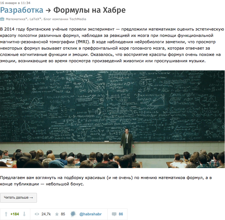
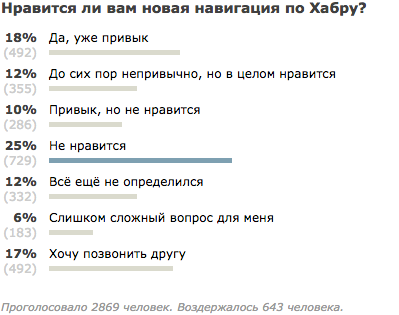
Redesign Habrahabra and Hiktayms. Finish line
We bring to your attention the next publication about the redesign of Habrahabr and Hiktimes. Surely someone has already thought to himself: “ Hmm, they are there like a tile in Moscow or something they shift - is the third or fourth publication about redesign, and what was the site like that?! ”And it will be partially right: it’s difficult to“ change the tile ”on the whole site at once, so we decided to do it in small iterations. So that you can get used to it, and we - in time to respond to your feedback.

Today we will talk about the finishing and, perhaps, the key iteration: redesign of the tape, publications and comments. Worried!
We have updated the view of the “dokatnoy” part of the publication, and as a result, the whole tape has changed.
')
Work on this part of the redesign is somewhat reminiscent of the “tag” game: each publication has a dozen mandatory elements (title, author, date, stream, hubs and / or company blog, metrics, checkboxes, several admin buttons) and relatively little space for maneuver. Every attempt to intervene in this fragment of the site has to weigh all the pros and cons: what element should be in the first place, which in the second, in the third, etc. Brainstorm looked like this:
In general, there were more questions than answers. The situation is complicated by the fact that the text to kata can be large (also with a picture) and some of the information may simply not fit on the screen.
Scrolling through various scenarios and options, looking at hundreds of materials, we reassembled the display of the publication in the ribbon, changing the location of some of the usual elements. Here's how it was:
And as it became:
Since a date has already been placed above the headings, why not try inserting information about the author? Then the space will be free from the bottom. We tried, measured it - everything fits, even there is still a place to indicate the stream that was removed from the publication header. The location of the flags (“Translation”, “From the sandbox”, “Recovery mode”, “Tutorial”, etc.) constantly depended on the length of the title, up to ridiculous transfers (especially if there are several flags at once). Now they don’t draw attention to themselves, but neatly arranged in one row, as if being the boundary between “system information” and the beginning of publication.
It was:

It became:

Simply put, we tried to maximally painlessly refresh and regroup all the main components of the preview of the publication in the tape, without damaging the old experience and patterns of user behavior (that is, all that is called user experience).
A magic wand passed by what is under the cut:
- New fonts. As with many resources, fonts on the site are loaded depending on the user's operating system:
— . , , , -, . , , +110%.
— . «» «» ( ), , . , . , H1 — , H2 H3.
— , , , ( ), source ( ), abbr/sub/sup . :
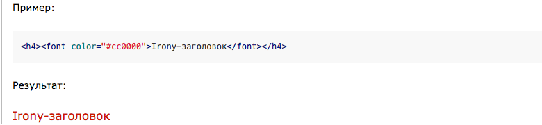
:
— . , . :
:
:
:

, — , — .
, « » — , , «» . :

:
:
:

, , :
 , ( ).
 , .
, .
, . , , . — .
, ( !) . ( - ), .
P.S. «»: ( ..) . !
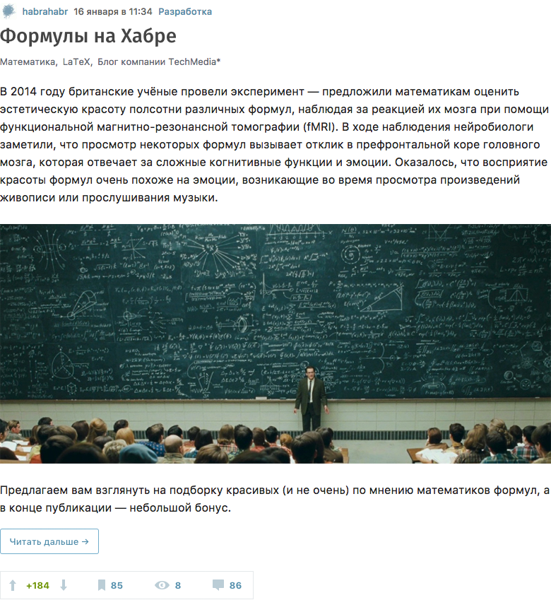
Today we will talk about the finishing and, perhaps, the key iteration: redesign of the tape, publications and comments. Worried!
Tape
We have updated the view of the “dokatnoy” part of the publication, and as a result, the whole tape has changed.
')
Work on this part of the redesign is somewhat reminiscent of the “tag” game: each publication has a dozen mandatory elements (title, author, date, stream, hubs and / or company blog, metrics, checkboxes, several admin buttons) and relatively little space for maneuver. Every attempt to intervene in this fragment of the site has to weigh all the pros and cons: what element should be in the first place, which in the second, in the third, etc. Brainstorm looked like this:
- In theory, the very first should be the heading, after reading which the user understands what will be discussed next and makes a decision whether to read further or not.
- Hmm, and if the title is incomprehensible, for example, “Recall All” - it is either about backups, or about memory development - maybe then first display a list of hubs so that the user can understand from which area the publication?
- Or maybe to first display the user's nickname, because there are quite a few authors whose articles are read without looking at the headlines?
- So, what if the publication came from the search - because then you have to understand, is it fresh or old?
- We would also need to let readers understand that the article is from a corporate blog and there may be material including advertising in it.
- Or maybe users generally began to look first at the publication rating and, if it is high, automatically climb under the cat?
In general, there were more questions than answers. The situation is complicated by the fact that the text to kata can be large (also with a picture) and some of the information may simply not fit on the screen.
Scrolling through various scenarios and options, looking at hundreds of materials, we reassembled the display of the publication in the ribbon, changing the location of some of the usual elements. Here's how it was:
And as it became:
Since a date has already been placed above the headings, why not try inserting information about the author? Then the space will be free from the bottom. We tried, measured it - everything fits, even there is still a place to indicate the stream that was removed from the publication header. The location of the flags (“Translation”, “From the sandbox”, “Recovery mode”, “Tutorial”, etc.) constantly depended on the length of the title, up to ridiculous transfers (especially if there are several flags at once). Now they don’t draw attention to themselves, but neatly arranged in one row, as if being the boundary between “system information” and the beginning of publication.
It was:
It became:
Simply put, we tried to maximally painlessly refresh and regroup all the main components of the preview of the publication in the tape, without damaging the old experience and patterns of user behavior (that is, all that is called user experience).
Publish Page
A magic wand passed by what is under the cut:
- New fonts. As with many resources, fonts on the site are loaded depending on the user's operating system:
font-family: -apple-system,BlinkMacSystemFont,"Segoe UI","Roboto","Oxygen","Ubuntu","Cantarell","Fira Sans","Droid Sans","Helvetica Neue",sans-serif;— . , , , -, . , , +110%.
— . «» «» ( ), , . , . , H1 — , H2 H3.
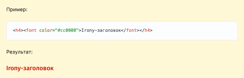
— , , , ( ), source ( ), abbr/sub/sup . :
:
— . , . :
:
:
- : , , ;
- : , ; - ;
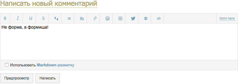
- , «» :
:
, — , — .
, « » — , , «» . :
:
:
:
, , :
, ( ). , ., . , , . — .
, ( !) . ( - ), .
P.S. «»: ( ..) . !
Source: https://habr.com/ru/post/335642/
All Articles