The cost of real estate on heat maps
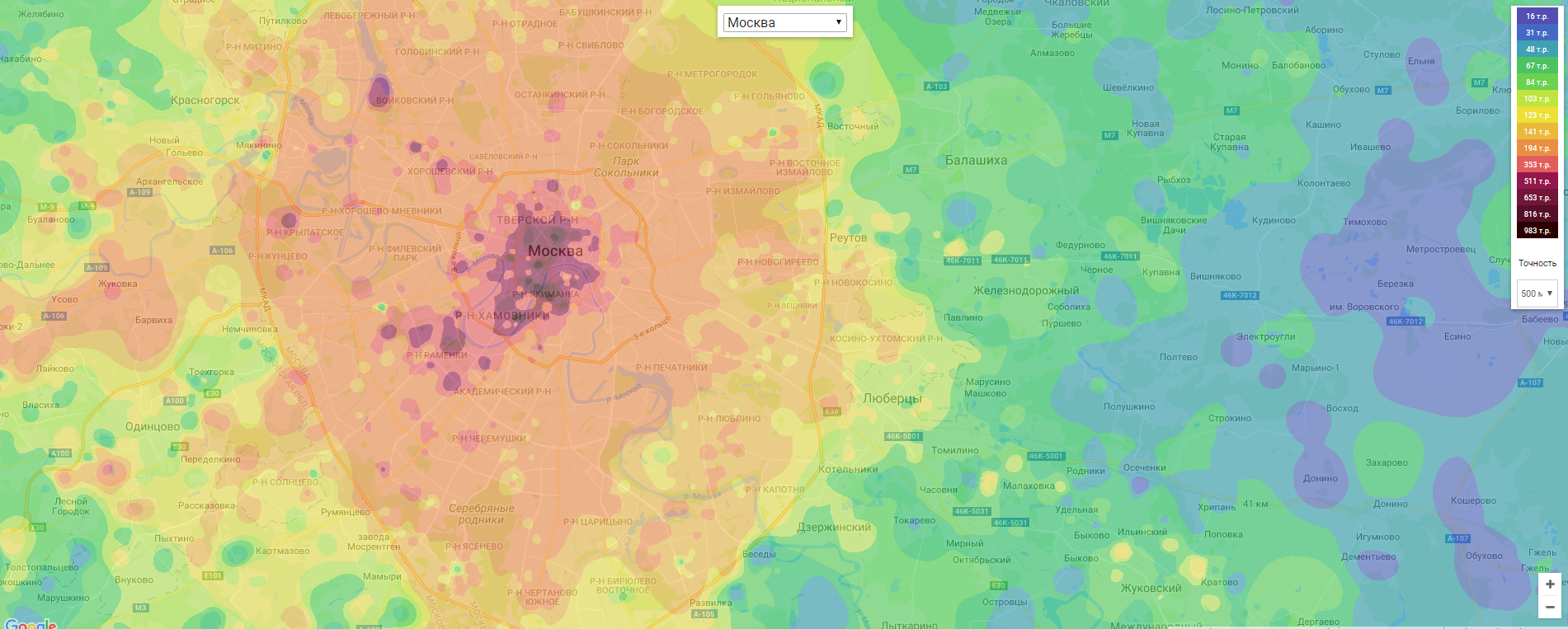
The article describes the process of creating a heat price map for the sale of real estate for Moscow and St. Petersburg.
My name is Dmitry, I am a programmer from St. Petersburg and I have a hobby - this is the real estate portal I have been doing in my free time for almost 5 years now. The site is authoring, and it gives a sufficient level of freedom to experiment and implement any ideas on it. And one of the old ideas was to create a heat price map.
If you are too lazy to read the article, then you can touch the finished result here .
With an abundance of sites dedicated to real estate, in RuNet there is no normal price map. There are some not very clear maps where the areas are painted in a different color, but this is all wrong. The average price for the district says little, there are areas in which prices differ by an order of magnitude, or even more. The idea of making a heat map has been visiting me for a long time, but in anticipation of the difficulty of undertaking it, I didn’t want to - I didn’t have enough inspiration.
As usual, I accidentally stumbled upon an article about the statistics of real estate prices in Saratov . The author describes exactly what I wanted to do: the map I imagined. Actually it inspired me.
Instruments
The article has a link to the source code, but I don’t understand in Python (or in python), and I didn’t have a goal to learn a new language, so I decided to look for if not a ready-made component, then at least something that I can rewrite myself under .Net.
As the first component to generate an image, I tried what Google offers .
It turned out not at all what you need. There is probably an intensity map - they would be suitable for visualizing the density of objects on the map, but not for displaying prices. In addition, when the map is scaled, the points merge to become more intense - this is no good at all.

There is one Belarusian site where the price map is implemented using this method. You can see here .

Looking at this map, who can tell where it is more expensive, and where it is cheaper? I cant. In general, this is ... three out of ten.
The search continued, and I ended up on the stack with the following: a person asks exactly the question that interested me, namely, how to make a heat map and not an intensity map. And in the answers there is a link to the JS-library which does the right thing. For calculations using Inverse Distance Weighting . JS is certainly not Sharp, but closer, so I was very happy. Especially after I “felt” all this on jsfiddle and made sure that the result was valid . A few hours later I already had a working code in C # (which was later heavily refined). Here is a link to GitHab , if anyone needs it.
Data
During the work of the portal, I have accumulated more than 20 million objects throughout Russia (archival objects remain forever).
How to process raw data is not an obvious question. To begin with, filters: sales objects, new buildings and secondary housing, and only apartments and houses, because they can accurately calculate the cost per square meter, and I was going to show exactly the cost of a meter on the map as the most objective indicator. I do not like rent because there is a lot of garbage. Prices are highly distorted, lots of bogus ads, etc. On sale, too, it's all there, but on a smaller scale. In addition, rental prices directly depend on the cost of selling apartments, so the final map is quite suitable for visualizing the overall picture, if not tied to the values in the legend.
Any commerce, plots and parking lots had to be excluded, but for each of these categories it would also be interesting to see the result, but this somehow later. Plus, it probably does not make sense to include old objects there, prices change. It was decided that in six months and the volume will be normal and prices are relevant. It turned out about 40,000 objects for Moscow and 30,000 for St. Petersburg.
I could not decide on the optimal step for arranging objects to the starting point on the map. I tried different options from 100 meters to 5 km. I decided to leave at the discretion of users the three most interesting options: 250, 500 and 1000 meters.
Points are generated as follows: the area is recursively divided into 4 rectangular sections until the section size coincides or slightly exceeds the minimum, or until there are no less objects in the area than the minimum allowable number (for example, 3). For sections in which less than three objects, the final point is not created - they distort the overall picture and create excessive “leakyness”, since such single objects often differ in price from those around them.

Inside each resulting section is considered the average price of objects and set the final point. Coordinates are not set at the center of the section, but the average value is calculated from the coordinates of all objects.
For each of the steps (250, 500, 1000) its own set of points is generated. For each point, the list of used objects is stored for display by clicking on the map.
The coordinates of points in the database are stored in the form of geographic data, so before transferring them to work, the coordinates must be brought to world, and then to pixel data on the final bitmap. What is the world coordinates can be read here . If in a nutshell, geographic coordinates imply placement on a sphere, and in order to display them on a plane they need to be converted in a certain way. From here I took the code to get the world and pixel coordinates.
I decided that I would limit the zoom on the map from 8 to 14, because taking into account the minimum grid step with values of 250 meters, it makes no sense to look closer.
Tiles
At first I thought it was better to make one big bitmap, and then break it into small fragments. But, as a result, I did the opposite - small fragments are generated - tiles (tile), after which they are assembled for each of the zooms.
Now, to display everything on the map, you must attach them to the corresponding coordinates. The first thing I found in the search - Ground Overlays .
After several hours of work, I got quite a visual result, but with one problem - terrible brakes when navigating the map. Obviously, working with a large number of fragments is not what this mechanism is for.
Began to google further and found Tile Overlays - it turned out in the end what you need. The bottom line is this: for each of the zoom levels of the map (zoom index), the resulting image is composed of 256 pixels by 256 pixels, for each of which you can overlay your own image. When navigating the map, only those tiles are loaded that fall into the visible area and correspond to the value of zoom index.
Region Borders
I have always had the coordinates of the borders of the regions, so this made the work a little easier. When generating each of the tiles, it is checked whether it is necessary to cut it, and if necessary, I cut it, making the non-falling region transparent.
Seeing the result, I thought that users are not interested in official borders, and perhaps it would be more useful for them to see nearby areas too. I had to draw my borders for maps exciting both the cities themselves (Moscow and St. Petersburg) and the nearest regions. The number of objects has increased several times. Now there are about 140 and 50 thousand for Moscow and St. Petersburg, respectively.
Moscow:

St. Petersburg:

For drawing borders and getting their coordinates, I used someone’s ready-made code in codepen.io with minor changes. Here is a link for Moscow and St. Petersburg . After changing any of the points on the map, the list of geographical coordinates is inserted into the window in the form of a convenient for inserting into the database.
Later, such a problem emerged: there are situations when areas with different price categories are located so close that they fall into one segment and the average price is considered for them. For example, in St. Petersburg there are Kamenny and Krestovsky Islands, where only elite real estate is sold, and across a river 300 meters wide, there is an ordinary area with Khrushchev houses. The difference in price is more than an order of magnitude (98 tr. Versus 1200 tr.).
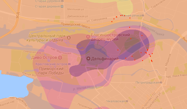
In the figure, Stone Island, and red dots indicate objects on both sides of it that fell into the final section at a step of 1000 meters. This greatly affects the average price in a position and distorts the overall picture.
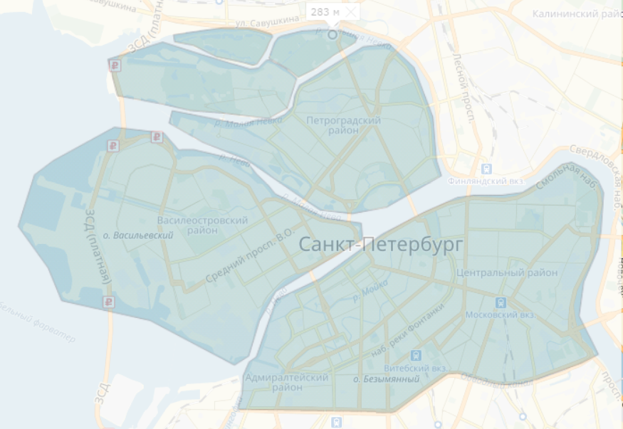
The solution was this: select some sections and when assembling objects, objects that fell into the section should not be mixed with objects that were not broken or that fell into another section. For Peter, I also singled out the islands.
Accuracy is not important here. The main thing is that there are no intersections between the regions.
Choice of colors
I made it customizable to generate a heat map so that you can choose colors, adjust the number of levels, etc.
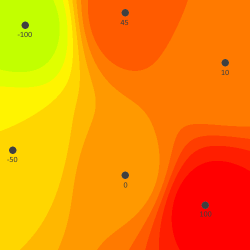
For example, for an area of 500 by 500 pixels with 6 points set with values from -100 to 100, you can get such options.
Test points with values:

The same data on the map with levels:
Without color restrictions and by level:

With color restriction and no levels:

With manually defined colors:

After long and painful experiments, preference was given to their own set of flowers (borrowed here ) which are hardcoded to the class as the default set.
The result at a step of 500 meters looks like this:
Performance
To generate a map only for Moscow with parallel 6 streams (on an eight-core server of 3.2 GHz) it took more than a day. This is completely unacceptable, because in the future there will be more regions and the launch should take place on a schedule at least once a week.
The bottleneck in the algorithm is calculating the color for each pixel in the tile. It is necessary to sort all points by distance from this pixel. That is, an array of 6000 points had to be sorted 256x256 times. A waste of resources. It is obvious that all points are not needed, and we can limit ourselves to the closest ones. The simplest solution is to take, for example, the top 100 points sorted by distance from the center of the tile. But there may be a situation when the nearest 100 points are in a group, for example, from one side only. Those. we need not just the 100 nearest, but so that they are also located around. Here is what I did: from the middle of the tile in every direction in 10-degree increments, rays each extend one third of the entire map. Each beam grows until it has at least 5 points, or it does not reach the limit in length. Thus, guaranteed in the final list will be approximately 150 points from all sides.
It looks like this (the green dots - which were selected, the red ones - all the others. The red square in the middle is the tile itself):

Beautiful, interesting and sticky, but absolutely useless. Bicycle, in its classic manifestation. I spent a whole day experimenting with parameters: the number of rays, their length, the number of points in each beam, etc. And I always got errors on the map.
They look like this:

These are angularities on areas of which borders should always be rounded. These errors always appear in places with a low concentration of data.
As a result, this whole mechanism had to be thrown out. The easiest and most obvious way works best - the 100 nearest points without taking into account those that are in the tile itself. Although the errors remained on the map, they are in places that, I hope, are of little interest to people, because there is almost nothing for sale.
The speed of work has increased significantly. It takes about 3 hours to Moscow, about an hour from them only for data processing, the rest is directly to drawing.
View objects
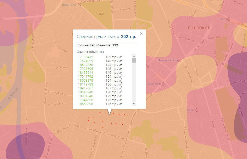
When clicking on the map, the point closest to the location of the click is selected, and summary information is displayed for it: the average price per meter and the list of objects used for the calculation. Also, the red dots on the map show the coordinates of these objects. Under the link you can go to the card for each more detailed information. Many objects are archival, so that they may not be displayed photos and contacts of the seller, but otherwise - all the information corresponds to the original.
Conclusion
In the near future I plan to increase the number of objects on the map, because most of them in the database do not have geographical coordinates. To do this, you need to make a geolocation module that will run daily on such objects by receiving coordinates for them via Google or Yandex services.
I also plan to supplement the map with some statistical information in the form of tabular data. Breakdown by price categories, average prices, etc.
Links
Just in case duplicate links here in the same order in which they are listed in the article.
https://habrahabr.ru/post/324596/
https://developers.google.com/maps/documentation/javascript/examples/layer-heatmap
https://resta.by/karta-cen
https://stackoverflow.com/questions/30073977/create-custom-temperature-map-with-front-end-javascript
https://github.com/optimisme/javascript-temperatureMap
https://en.wikipedia.org/wiki/Inverse_distance_weighting
https://jsfiddle.net/mertk/y9gcuf65/
https://github.com/d-sky/HeatMap
https://developers.google.com/maps/documentation/javascript/maptypes?hl=en#MapCoordinates
https://developers.google.com/maps/documentation/javascript/examples/map-coordinates
https://developers.google.com/maps/documentation/javascript/examples/groundoverlay-simple
https://developers.google.com/maps/documentation/android-api/tileoverlay
https://codepen.io/d-sky/pen/JJqpYe
https://codepen.io/d-sky/pen/PKJzoO
https://www.ventusky.com/?p=9;71;1&l=temperature
https://kvartiri-domiki.ru/karta-cen
PS
When you navigate around the map, now there is a small freeze about once every 10-15 seconds, this is not on my website a bug, this is how the new Web Metric WebVisor behaves. I have already written to Yandex - they said that they need time to figure it out. So, soon, I hope to fix it.
')
Source: https://habr.com/ru/post/335638/
All Articles