A practical guide to using CSS Modules in React applications
Hi Habr! I offer you a free translation of the article “Practical Guide to React and CSS Modules” by Tatu Tamminen .
In the past, web developers spent a lot of time and effort creating reusable components. A special problem was the CSS and the nature of its cascades. For example, if a developer creates a component to display a tree structure, how can he ensure that the CSS class (for example, .leaf ) used in this component does not lead to side effects in other parts of the application? Various methodologies and agreements have been created to cope with selector problems. BEM and SMACSS are widely used methodologies that perform their tasks well, but are far from perfect. This article discusses the shortcomings of such methodologies based on naming conventions, what CSS Modules are, and how these modules can be used in a React application.
Let's create a reusable select component as an example to illustrate the problems of global styles. Styling a <select> element directly is a bad decision, because in other parts of the site we may need either the original non-stylized element or a completely different styling of it. Instead, you can use the BEM syntax to define classes:
If the new item class were created without the select__ prefix, then the whole team could have problems if someone wanted to use the same name, item . It doesn’t matter whether the developer writes CSS or some utility generates it. Using BEM helps solve this problem by entering a context for the select element.
')
The BEM syntax is a step forward towards the components, since “B” in BEM stands for “Block”, and the blocks can be interpreted as lightweight components. Select is a component that has various states ( select - loading ) and descendants ( select__item ).
Unfortunately, the use of naming conventions and thinking in terms of components does not solve all the problems of selectors. Collisions of names are still not guaranteed, and semantic redundancy of names increases the risk of typos and requires a disciplined command, where everyone understands the agreements with one hundred percent. Typos include the use of one hyphen instead of two, confusion between the modifier (-) and block (__) and so on.
"CSS module" is defined as follows:
The key idea here is local scope .
To illustrate this concept, let's create a JavaScript and CSS component files.
This is a simple example, which, however, contains a lot of what is happening behind the scenes.
Now the CSS file contains much less noise than in the BEM version, because it no longer contains prefixes and special characters that set the context. Why is it possible to remove the prefix .select-- without creating problems?
The import statement in a JavaScript file loads the CSS file and converts it into an object. In the next section, we will look at how to set up a working environment that allows you to import CSS files.
Each class name from a CSS file is an object property. In the example above, it is styles.select , styles.icon , etc.
If the property name is a class name, then what is the value of this property? This is a unique class name, and uniqueness ensures that styles do not “flow” into other components. Here is an example of a hashed class name: _header__1OUvt .
You might think, “What a mess!” What is the point of changing the meaningful name of a class to an incomprehensible hash? The main reason is that such an identifier is guaranteed to be unique in a global context. Later in this tutorial, we will change the mechanism for creating identifiers, so that they will have a more meaningful appearance, but they will remain unique.
Here are the key benefits of using CSS with local scope:
The disadvantages include the following:
CSS Modules require a project build, but this is not a problem, since various collectors support CSS Modules for JavaScript on both the client and the server. CSS Modules can also be used with most UI libraries.
For simplicity in this article, we will focus on the Webpack module builder and the React library.
To quickly create an application, you can use the Create React App .
Following the instructions in the documentation, we will create and launch a new project almost instantly.
Voila , and we have a working React app:

The start page tells us to edit the App.js file.
Are CSS Modules used in the Create React App? You can find this out by looking at the App.js file. The CSS file is imported but not assigned to any variable, with all className attributes using strings instead of dynamic values.
From this point of view, the Create React App does not support CSS Modules, so you need to change the configuration to enable this support.
To gain access to the hidden configuration of the assembly, you need to run the eject command. Attention: if you have done this, then you will not be able to go back.
Now you can open the folder with configs for webpack:

The Create React App uses webpack for building, so webpack.config.dev.js is the same file that needs to be changed ( as well as webpack.config.prod.js for production settings - translator's comment ).
Let's find a section that defines what to do with CSS files ( in the original article, the old syntax of webpack configs is used, here I used a new - comment of the translator ):
When we change this section, as shown below, this will momentarily destroy the styling of the site, since support for CSS Modules will be included, but more changes are required in the component itself. If you change the webpack config, you can change the rule for naming CSS classes so that they contain both a readable part and a hash to ensure uniqueness:
What are these loaders loaders doing? In the webpack.config file there is a commented section describing style and CSS loaders:
The modules: true option in the css-loader settings includes support for CSS Modules. The localIdentName parameter modifies the class name pattern so that it includes the name of the React component, the class name, and the unique hash identifier. This will make debugging much easier, because all components can be easily identified.
You can verify that the configuration works by adding a console.log call after the import statement.
Replacing import './App.css'; on
we get the following output in the browser console:
Now classes are unique, but they are not used in React components. Two more steps are needed to apply styles to React components. First, you need to change the class names according to camelCase notation. Secondly, you need to change the className attributes so that they use the imported classes.
Using camelCase notation is optional, but when accessing classes from JavaScript, it is easier to write styles.componentName than styles ["component-name"] .
The source style file looks like this:
There is no longer a need for App prefixes, so now is a good moment to remove them too. The modified CSS will look like this:
The next step is to change the use of classes in the component. The result will be as follows:
Now our component uses CSS Modules.
The approach described in the previous section is central to React projects, but developers usually quickly find that they need a way to select and use common styles. In this context, “generic” means only that the component must inherit something from the base styles.
This general information can be represented by variables (colors, font sizes, etc.), helpers (SASS mixins), or utility classes.
CSS Modules enable composition using the from keyword. Composition is also possible between classes from different files.
In the following example, there are two files: one for the basic button styles and the second for implementing the Submit button. We can say that the submitButton class should be presented through the composition of the basic button styles and some additional properties.
If you need to use variables, you can use either a preprocessor, for example, SASS or Less, or customize the support of variables in the webpack .
An example from the webpack variable documentation in CSS:
This example can be modified using custom variable names. This is because redefining standard values, such as blue , makes the CSS file less understandable, since it is no longer possible to be sure whether any value was redefined or not.
Changed example:
In this tutorial, we began by looking at the problems of global CSS, then we saw how CSS Modules improve the situation by introducing CSS scope and making us think in terms of components. We also looked at how easy it is to start experimenting with CSS Modules using the React Starter Kit.
CSS Modules are used in conjunction with the assembly of the entire frontend, that is, with support in the browser there are no problems. Browsers receive regular CSS from the server, so there is no way to “break down” the site using CSS Modules. On the contrary, at the same time, we only increase its reliability by reducing the number of potential bugs. Webpacks with loaders configured to support CSS Modules do not pose any problems, so no doubt this tool can be recommended for use.
If you have used CSS Modules in your projects, I ( that is, the author of the original article - comment of the translator ) would like to hear about your experience!
→ Publication - free translation of the article “Practical Guide to React and CSS Modules” . The author of the article Tatu Tamminen
→ Source code can be found in react-cssmodules-demo
→ Also noteworthy is CSS Modules Webpack Demo
In the past, web developers spent a lot of time and effort creating reusable components. A special problem was the CSS and the nature of its cascades. For example, if a developer creates a component to display a tree structure, how can he ensure that the CSS class (for example, .leaf ) used in this component does not lead to side effects in other parts of the application? Various methodologies and agreements have been created to cope with selector problems. BEM and SMACSS are widely used methodologies that perform their tasks well, but are far from perfect. This article discusses the shortcomings of such methodologies based on naming conventions, what CSS Modules are, and how these modules can be used in a React application.
Problem with cascades
Let's create a reusable select component as an example to illustrate the problems of global styles. Styling a <select> element directly is a bad decision, because in other parts of the site we may need either the original non-stylized element or a completely different styling of it. Instead, you can use the BEM syntax to define classes:
.select {} .select__item {} .select__item__icon {} .select--loading {} If the new item class were created without the select__ prefix, then the whole team could have problems if someone wanted to use the same name, item . It doesn’t matter whether the developer writes CSS or some utility generates it. Using BEM helps solve this problem by entering a context for the select element.
')
The BEM syntax is a step forward towards the components, since “B” in BEM stands for “Block”, and the blocks can be interpreted as lightweight components. Select is a component that has various states ( select - loading ) and descendants ( select__item ).
Unfortunately, the use of naming conventions and thinking in terms of components does not solve all the problems of selectors. Collisions of names are still not guaranteed, and semantic redundancy of names increases the risk of typos and requires a disciplined command, where everyone understands the agreements with one hundred percent. Typos include the use of one hyphen instead of two, confusion between the modifier (-) and block (__) and so on.
CSS Modules to the rescue
"CSS module" is defined as follows:
A CSS module is a CSS file in which all class names and animations have a local default scope.
The key idea here is local scope .
To illustrate this concept, let's create a JavaScript and CSS component files.
/* select.css */ .select {} .loading {} .item {} .icon {} /* select.js */ import styles from "./select.css"; console.log(styles.select, styles.loading); This is a simple example, which, however, contains a lot of what is happening behind the scenes.
Now the CSS file contains much less noise than in the BEM version, because it no longer contains prefixes and special characters that set the context. Why is it possible to remove the prefix .select-- without creating problems?
The import statement in a JavaScript file loads the CSS file and converts it into an object. In the next section, we will look at how to set up a working environment that allows you to import CSS files.
Each class name from a CSS file is an object property. In the example above, it is styles.select , styles.icon , etc.
If the property name is a class name, then what is the value of this property? This is a unique class name, and uniqueness ensures that styles do not “flow” into other components. Here is an example of a hashed class name: _header__1OUvt .
You might think, “What a mess!” What is the point of changing the meaningful name of a class to an incomprehensible hash? The main reason is that such an identifier is guaranteed to be unique in a global context. Later in this tutorial, we will change the mechanism for creating identifiers, so that they will have a more meaningful appearance, but they will remain unique.
Here are the key benefits of using CSS with local scope:
- a step forward towards modular and reusable components without side effects,
- cleaner css
- avoidance of monolithic CSS files, since each component will have its own file with styles.
The disadvantages include the following:
- harder to read and understand DOM,
- it takes some initial environment setup to make it all work.
CSS Modules require a project build, but this is not a problem, since various collectors support CSS Modules for JavaScript on both the client and the server. CSS Modules can also be used with most UI libraries.
For simplicity in this article, we will focus on the Webpack module builder and the React library.
React, Webpack and CSS Modules
To quickly create an application, you can use the Create React App .
Following the instructions in the documentation, we will create and launch a new project almost instantly.
npm install -g create-react-app create-react-app css-modules cd css-modules/ npm start Voila , and we have a working React app:
The start page tells us to edit the App.js file.
import React, { Component } from 'react'; import logo from './logo.svg'; import './App.css'; class App extends Component { render() { return ( <div className="App"> <div className="App-header"> <img src={logo} className="App-logo" alt="logo" /> <h2>Welcome to React</h2> </div> <p className="App-intro"> To get started, edit {gfm-js-extract-pre-1} and save to reload. </p> </div> ); } } export default App; Are CSS Modules used in the Create React App? You can find this out by looking at the App.js file. The CSS file is imported but not assigned to any variable, with all className attributes using strings instead of dynamic values.
From this point of view, the Create React App does not support CSS Modules, so you need to change the configuration to enable this support.
Configure the Create React App to support CSS Modules
To gain access to the hidden configuration of the assembly, you need to run the eject command. Attention: if you have done this, then you will not be able to go back.
npm run eject Now you can open the folder with configs for webpack:
The Create React App uses webpack for building, so webpack.config.dev.js is the same file that needs to be changed ( as well as webpack.config.prod.js for production settings - translator's comment ).
Let's find a section that defines what to do with CSS files ( in the original article, the old syntax of webpack configs is used, here I used a new - comment of the translator ):
{ test: /\.css$/, use: [ require.resolve('style-loader'), { loader: require.resolve('css-loader'), options: { importLoaders: 1, }, }, { loader: require.resolve('postcss-loader'), options: { // Necessary for external CSS imports to work // https://github.com/facebookincubator/create-react-app/issues/2677 ident: 'postcss', plugins: () => [ require('postcss-flexbugs-fixes'), autoprefixer({ browsers: [ '>1%', 'last 4 versions', 'Firefox ESR', 'not ie < 9', // React doesn't support IE8 anyway ], flexbox: 'no-2009', }), ], }, }, ], }, When we change this section, as shown below, this will momentarily destroy the styling of the site, since support for CSS Modules will be included, but more changes are required in the component itself. If you change the webpack config, you can change the rule for naming CSS classes so that they contain both a readable part and a hash to ensure uniqueness:
{ test: /\.css$/, use: [ require.resolve('style-loader'), { loader: require.resolve('css-loader'), options: { importLoaders: 1, modules: true, localIdentName: "[name]__[local]___[hash:base64:5]" }, }, { loader: require.resolve('postcss-loader'), options: { // Necessary for external CSS imports to work // https://github.com/facebookincubator/create-react-app/issues/2677 ident: 'postcss', plugins: () => [ require('postcss-flexbugs-fixes'), autoprefixer({ browsers: [ '>1%', 'last 4 versions', 'Firefox ESR', 'not ie < 9', // React doesn't support IE8 anyway ], flexbox: 'no-2009', }), require('postcss-modules-values'), ], }, }, ], }, What are these loaders loaders doing? In the webpack.config file there is a commented section describing style and CSS loaders:
The postcss-loader applies autoprefixer to CSS.
style-loader translates CSS into JS modules that inject <style> tags.
The css-loader resolves paths in CSS and adds resources as necessary dependencies.
The modules: true option in the css-loader settings includes support for CSS Modules. The localIdentName parameter modifies the class name pattern so that it includes the name of the React component, the class name, and the unique hash identifier. This will make debugging much easier, because all components can be easily identified.
Using CSS Modules in React
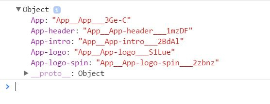
You can verify that the configuration works by adding a console.log call after the import statement.
Replacing import './App.css'; on
import styles from './App.css'; console.log(styles); we get the following output in the browser console:
Now classes are unique, but they are not used in React components. Two more steps are needed to apply styles to React components. First, you need to change the class names according to camelCase notation. Secondly, you need to change the className attributes so that they use the imported classes.
Using camelCase notation is optional, but when accessing classes from JavaScript, it is easier to write styles.componentName than styles ["component-name"] .
The source style file looks like this:
.App { text-align: center; } .App-logo { animation: App-logo-spin infinite 20s linear; height: 80px; } .App-header { background-color: #222; height: 150px; padding: 20px; color: white; } .App-intro { font-size: large; } @keyframes App-logo-spin { from { transform: rotate(0deg); } to { transform: rotate(360deg); } } There is no longer a need for App prefixes, so now is a good moment to remove them too. The modified CSS will look like this:
.app { text-align: center; } .logo { animation: logoSpin infinite 20s linear; height: 80px; } .header { background-color: #222; height: 150px; padding: 20px; color: white; } .intro { font-size: large; } @keyframes logoSpin { from { transform: rotate(0deg); } to { transform: rotate(360deg); } } The next step is to change the use of classes in the component. The result will be as follows:
import React, { Component } from 'react'; import logo from './logo.svg'; import styles from './App.css'; class App extends Component { render() { return ( <div className={ styles.app }> <div className={ styles.header }> <img src={logo} className={ styles.logo } alt="logo" /> <h2>Welcome to React</h2> </div> <p className={ styles.intro }> To get started, edit {gfm-js-extract-pre-2} and save to reload. </p> </div> ); } } export default App; Now our component uses CSS Modules.
How to break the boundaries of the CSS module when necessary
The approach described in the previous section is central to React projects, but developers usually quickly find that they need a way to select and use common styles. In this context, “generic” means only that the component must inherit something from the base styles.
This general information can be represented by variables (colors, font sizes, etc.), helpers (SASS mixins), or utility classes.
CSS Modules enable composition using the from keyword. Composition is also possible between classes from different files.
In the following example, there are two files: one for the basic button styles and the second for implementing the Submit button. We can say that the submitButton class should be presented through the composition of the basic button styles and some additional properties.
/* base_button.css */ .baseButton { border: 2px solid darkgray; background-color: gray; } /* submit_button.css */ .submitButton { composes: baseButton from "./base_button.css"; background-color: blue; } If you need to use variables, you can use either a preprocessor, for example, SASS or Less, or customize the support of variables in the webpack .
An example from the webpack variable documentation in CSS:
/* variables.css */ @value blue: #0c77f8; @value red: #ff0000; @value green: #aaf200; /* demo.css */ /* import your colors... */ @value colors: "./variables.css"; @value blue, red, green from colors; .button { color: blue; display: inline-block; } This example can be modified using custom variable names. This is because redefining standard values, such as blue , makes the CSS file less understandable, since it is no longer possible to be sure whether any value was redefined or not.
Changed example:
/* variables.css */ @value customBlue: #0c77f8; @value customRed: #ff0000; @value customGreen: #aaf200; /* demo.css */ /* import your colors... */ @value colors: "./variables.css"; @value customBlue, customRed, customGreen from colors; .button { color: customBlue; display: inline-block; } Conclusion
In this tutorial, we began by looking at the problems of global CSS, then we saw how CSS Modules improve the situation by introducing CSS scope and making us think in terms of components. We also looked at how easy it is to start experimenting with CSS Modules using the React Starter Kit.
CSS Modules are used in conjunction with the assembly of the entire frontend, that is, with support in the browser there are no problems. Browsers receive regular CSS from the server, so there is no way to “break down” the site using CSS Modules. On the contrary, at the same time, we only increase its reliability by reducing the number of potential bugs. Webpacks with loaders configured to support CSS Modules do not pose any problems, so no doubt this tool can be recommended for use.
If you have used CSS Modules in your projects, I ( that is, the author of the original article - comment of the translator ) would like to hear about your experience!
→ Publication - free translation of the article “Practical Guide to React and CSS Modules” . The author of the article Tatu Tamminen
→ Source code can be found in react-cssmodules-demo
→ Also noteworthy is CSS Modules Webpack Demo
Source: https://habr.com/ru/post/335244/
All Articles