Extending, modifying, and creating controls on the UWP platform. Part 3

After reviewing the means of expanding and modifying existing controls in the previous sections, we come to the most interesting topic of this series of articles - the creation of new controls.
Part 3. Creating New Controls
Through Attached Properties and Behaviors, we have the ability to extend existing controls without interfering with their internal structure. Having the layout of their templates, we can also change their appearance and the work of visual states ( VisualState ). However, if you want to change or expand the logic of an existing control, or create a new control altogether, then we need to go down to the code level ( ControlName.cs ).
')
Creating a new control based on an existing one
This item is a smooth transition from the theme of modifying control templates, discussed in detail in the previous part , to the topic of creating your own controls. As part of it, we will use the previously reviewed material as well as expand the logic of the existing control.
Expansion of logic is achieved by creating a new control based on an existing one. This allows you to fully adopt the already implemented logic of working with all the properties of dependencies, which saves us from the need to recreate the functionality available in this control element.
Suppose we need to develop a registration input field with an input validation function. To solve this problem, the TextBox control is perfect for us.
Expand it as follows:
- The functional of valadicia according to a given Regex pattern
- Visual indicator reporting validation status
- A visual indicator informs whether the input field is mandatory.
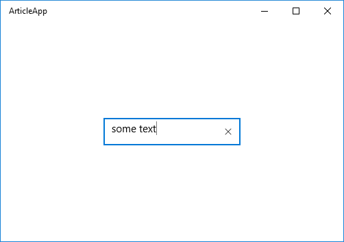
As a result, we get the following control
ExtendedTextBox control
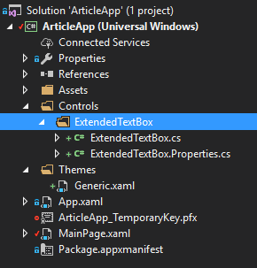
So let's get started. Create a new control. For convenience, it is proposed to place them in the project along the following path “... / Controls / ControlName / ControlName.cs” .

Placing a new control in the project
Add a new project item as Templated Control . Despite the fact that this template is not very different from the new empty class, the main thing is that it automatically creates an empty stub of the markup template in the Generi.xaml file for the new control. And in the absence of this file creates it. It is in this default file that the search for a custom control markup template is performed.

Creating a new project item using the Templated Control pattern
<ResourceDictionary xmlns="http://schemas.microsoft.com/winfx/2006/xaml/presentation" xmlns:x="http://schemas.microsoft.com/winfx/2006/xaml"> <Style xmlns:local2="using:ArticleApp.Controls.ExtendedTextBox" TargetType="local2:ExtendedTextBox"> <Setter Property="Template"> <Setter.Value> <ControlTemplate TargetType="local2:ExtendedTextBox"> <Border Background="{TemplateBinding Background}" BorderBrush="{TemplateBinding BorderBrush}" BorderThickness="{TemplateBinding BorderThickness}"> </Border> </ControlTemplate> </Setter.Value> </Setter> </Style> </ResourceDictionary> The layout of the new control by default
In this case, the namespace for all new controls is recommended to specify a common, to simplify working with them from XAML. And also change the base class to the one we are going to take as a basis. In this case, TextBox .
Then make some edits to the default markup template.

Change namespace and base class
<ResourceDictionary xmlns="http://schemas.microsoft.com/winfx/2006/xaml/presentation" xmlns:x="http://schemas.microsoft.com/winfx/2006/xaml" xmlns:controls="using:ArticleApp.Controls"> <Style TargetType="controls:ExtendedTextBox"> <Setter Property="Template"> <Setter.Value> <ControlTemplate TargetType="controls:ExtendedTextBox"> <Border Background="{TemplateBinding Background}" BorderBrush="{TemplateBinding BorderBrush}" BorderThickness="{TemplateBinding BorderThickness}"> </Border> </ControlTemplate> </Setter.Value> </Setter> </Style> </ResourceDictionary> Corrected control layout pattern
After which the new control can be used. At the moment, it completely copies the functionality of the TextBox control and has a markup consisting of the Border element.
<Page x:Class="ArticleApp.MainPage" xmlns="http://schemas.microsoft.com/winfx/2006/xaml/presentation" xmlns:x="http://schemas.microsoft.com/winfx/2006/xaml" xmlns:controls="using:ArticleApp.Controls"> <Grid Background="{ThemeResource ApplicationPageBackgroundThemeBrush}"> <controls:ExtendedTextBox HorizontalAlignment="Center" VerticalAlignment="Center" Width="200" Height="40" BorderBrush="Red" BorderThickness="2"/> </Grid> </Page> Use new control

Appearance of new control
The next step is to reuse the markup template of the TextBox control (we wrote about this in detail in the previous section ).
Having received it, we replace with it the template of the new control ExtendedTextBox . Do not forget to change in the right places the values of the attributes TargetType from TextBox to ExtendedTextBox .

Corrected new control markup
Now the ExtendedTextBox control is an exact copy of the TeBox control, repeating both its appearance and functionality.
New control repeats the appearance of the TextBox
We proceed to the expansion of the functional.
1. Add a visual indicator indicating whether the input field is required.
We find in the markup template the part of the corresponding Header and change it as follows:
<StackPanel Grid.Row="0" Grid.ColumnSpan="2" Orientation="Horizontal" Margin="0,0,0,8"> <ContentPresenter x:Name="HeaderContentPresenter" x:DeferLoadStrategy="Lazy" Visibility="Collapsed" Foreground="{ThemeResource SystemControlForegroundBaseHighBrush}" Content="{TemplateBinding Header}" ContentTemplate="{TemplateBinding HeaderTemplate}" FontWeight="Normal" /> <TextBlock x:Name="NecessityIndicatorTextBlock" Text="*" FontSize="{TemplateBinding FontSize}" Foreground="Red" Visibility="{TemplateBinding IsNecessarily}"/> </StackPanel> Introduction to the markup indicator "*"
In parallel with this, we make the following changes in the ExtendedTextBox.cs file.
public sealed class ExtendedTextBox : TextBox { private TextBlock _necessityIndicatorTextBlock; public ExtendedTextBox() { this.DefaultStyleKey = typeof(ExtendedTextBox); } protected override void OnApplyTemplate() { base.OnApplyTemplate(); _necessityIndicatorTextBlock = GetTemplateChild("NecessityIndicatorTextBlock") as TextBlock; UpdateControl(); } public bool IsNecessarily { get => (bool)GetValue(IsNecessarilyProperty); set => SetValue(IsNecessarilyProperty, value); } public static readonly DependencyProperty IsNecessarilyProperty = DependencyProperty.Register("IsNecessarily", typeof(bool), typeof(ExtendedTextBox), new PropertyMetadata(false, IsNecessarilyPropertyChanged)); private static void IsNecessarilyPropertyChanged(DependencyObject d, DependencyPropertyChangedEventArgs e) { var textbox = d as ExtendedTextBox; if (textbox == null || !(e.NewValue is bool)) { return; } textbox.UpdateNecessityIndicator(); } private void UpdateControl() { UpdateNecessityIndicator(); } private void UpdateNecessityIndicator() { if (_necessityIndicatorTextBlock != null) { _necessityIndicatorTextBlock.Visibility = IsNecessarily ? Visibility.Visible : Visibility.Collapsed; } } } ExtendedTextBox class state
Here we pay attention to the following:
- Override the OnApplyTemplate () method and find references to markup elements given by x: Name for further work with them.
- We define the IsNecessarily dependency property , which determines whether this input field is required, and its PropertyChangedCallback IsNecessarilyPropertyChanged in the body of which updates the visibility of this indicator.
Is important . It is worth paying attention to the fact that during initialization of the PropertyChangedCallback control, functions can be executed before OnApplyTemplate () is called. Because of this, we get a situation when at the moment of executing these functions the element tree is not yet loaded and target objects are not found. For this reason, it is necessary at the end of the OnApplyTemplate () method to bring the state of the control to the correct one. Here it executes the UpdateControl () method.
Now, if we set the value of the IsNecessarily property to true, we get the following result.

Required Indicator ExtendedTextBox
2. Let us deal with the logic of validation of the entered data for a given Regex template.
Define the following:
- Dependency property RegexPattern and its CallBack function RegexPatternPropertyChanged
- Property of dependence IsValid with private set-accessor.
- The ValidateTextBox () method called when the RegexPattern or Text properties change.
And make a few more changes to the code of the class as a result of which it will look like this
public sealed class ExtendedTextBox : TextBox { private TextBlock _necessityIndicatorTextBlock; public ExtendedTextBox() ... protected override void OnApplyTemplate() { base.OnApplyTemplate(); this.TextChanged -= ExtendedTextBoxTextChanged; _necessityIndicatorTextBlock = GetTemplateChild("NecessityIndicatorTextBlock") as TextBlock; this.TextChanged += ExtendedTextBoxTextChanged; UpdateControl(); } private void ExtendedTextBoxTextChanged(object sender, TextChangedEventArgs e) { ValidateTextBox(); } //public bool IsNecessarily ... //public static readonly DependencyProperty IsNecessarilyProperty = ... //private static void IsNecessarilyPropertyChanged(DependencyObject d, DependencyPropertyChangedEventArgs e) ... public string RegexPattern { get { return (string)GetValue(RegexPatternProperty); } set { SetValue(RegexPatternProperty, value); } } public static readonly DependencyProperty RegexPatternProperty = DependencyProperty.Register("RegexPattern", typeof(string), typeof(ExtendedTextBox), new PropertyMetadata(string.Empty, RegexPatternPropertyChanged)); private static void RegexPatternPropertyChanged(DependencyObject d, DependencyPropertyChangedEventArgs e) { var textbox = d as ExtendedTextBox; if (textbox == null || !(e.NewValue is string)) { return; } textbox.ValidateTextBox(); } private void ValidateTextBox() { IsValid = Regex.IsMatch(Text, RegexPattern); if (this.Text.Length == 0 || !this.IsValid.HasValue) { VisualStateManager.GoToState(this, "Indeterminate", true); return; } VisualStateManager.GoToState(this, this.IsValid.Value ? "Valid" : "Invalid", true); } public bool? IsValid { get { return (bool?)GetValue(IsValidProperty); } private set { SetValue(IsValidProperty, value); } } public static readonly DependencyProperty IsValidProperty = DependencyProperty.Register("IsValid", typeof(bool?), typeof(ExtendedTextBox), new PropertyMetadata(default(bool?))); private void UpdateControl() { UpdateNecessityIndicator(); ValidateTextBox(); } //private void UpdateNecessityIndicator() ... } Status of the ExtendedTextBox class after adding validation logic
Important. Due to the fact that it is possible to change the control template during execution, it is necessary to be cautious when subscribing to events in the OnApplyTemplate () method. So, one of the practices of eliminating unnecessary listening of property changes when changing templates is to unsubscribe from events with subsequent resignation in the body of this method.
Also pay attention to the body of the ValidateTextBox () method, which, depending on the state of validity, calls the class method VisualStateManager which translates the visual state of the control into one of the three states we refer to, but have not yet defined in the template markup.
First, let's expand the layout of the control structure.
<Grid> <Grid.ColumnDefinitions> <ColumnDefinition Width="*" /> <ColumnDefinition Width="Auto" /> <ColumnDefinition Width="5" /> <ColumnDefinition Width="16" /> </Grid.ColumnDefinitions> <Grid.RowDefinitions> <RowDefinition Height="Auto" /> <RowDefinition Height="*" /> </Grid.RowDefinitions> <Border x:Name="BackgroundElement"/> <Border x:Name="BorderElement"/> <StackPanel Grid.Row="0" Grid.ColumnSpan="2" Orientation="Horizontal" Margin="0,0,0,8"> <ContentPresenter x:Name="HeaderContentPresenter"/> <TextBlock x:Name="NecessityIndicatorTextBlock"/> </StackPanel> <ScrollViewer x:Name="ContentElement"/> <ContentControl x:Name="PlaceholderTextContentPresenter"/> <Button x:Name="DeleteButton"/> <Image x:Name="ValidationStatusImage" Grid.Row="1" Grid.Column="3"/> </Grid> Expansion of the Grid and adding a picture indicator of validity
And add the necessary visual states with a description of their logic.
<VisualStateGroup x:Name="ValidStates"> <VisualState x:Name="Indeterminate"/> <VisualState x:Name="Valid"> <Storyboard> <ObjectAnimationUsingKeyFrames Storyboard.TargetName="ValidationStatusImage" Storyboard.TargetProperty="Source"> <DiscreteObjectKeyFrame KeyTime="0" Value="Assets/Icons/validState.png" /> </ObjectAnimationUsingKeyFrames> </Storyboard> </VisualState> <VisualState x:Name="Invalid"> <Storyboard> <ObjectAnimationUsingKeyFrames Storyboard.TargetName="ValidationStatusImage" Storyboard.TargetProperty="Source"> <DiscreteObjectKeyFrame KeyTime="0" Value="Assets/Icons/invalidState.png" /> </ObjectAnimationUsingKeyFrames> </Storyboard> </VisualState> </VisualStateGroup> New visual group ValidStates
Now we can create the next data entry page.

Data entry page
In conclusion of this example, we note that the amount of code in the ExtendedTextBox.cs file, although not very large, but in the future, in the case of a further expansion of the control logic, can cause certain inconveniences in targeting the file.
In order to minimize such inconveniences, we suggest using partial ( partial ) classes and creating additional files with class structure declarations at our discretion.
For example, as follows:
The structure of the project in the separation of declarations of controls on the partial
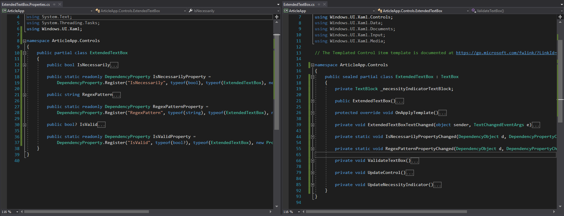
View of files containing partial declarations of the control
This completes the work with this control. Similarly, we can extend the logic, appearance, add additional dependency properties for better parameterization (for example, with the ValidImageSource and InvalidImageSource properties )
Creating a new control
In this section, we will look at the process of creating a new control from scratch. In principle, this process is no different from what we did in the previous paragraph.
As an example, consider the Expander control that is useful but not included in the UWP distribution .
public partial class Expander { public static readonly DependencyProperty HeaderProperty = DependencyProperty.Register(nameof(Header), typeof(string), typeof(Expander), new PropertyMetadata(null)); public static readonly DependencyProperty IsExpandedProperty = DependencyProperty.Register(nameof(IsExpanded), typeof(bool), typeof(Expander), new PropertyMetadata(false, OnIsExpandedPropertyChanged)); public string Header { get { return (string)GetValue(HeaderProperty); } set { SetValue(HeaderProperty, value); } } public bool IsExpanded { get { return (bool)GetValue(IsExpandedProperty); } set { SetValue(IsExpandedProperty, value); } } } Expander Control Dependency Properties
public sealed partial class Expander : ContentControl { public Expander() { this.DefaultStyleKey = typeof(Expander); } protected override void OnApplyTemplate() { base.OnApplyTemplate(); if (IsExpanded) { VisualStateManager.GoToState(this, "Expanded", true); } } private void ExpandControl() { VisualStateManager.GoToState(this, "Expanded", true); } private void CollapseControl() { VisualStateManager.GoToState(this, "Collapsed", true); } private static void OnIsExpandedPropertyChanged(DependencyObject d, DependencyPropertyChangedEventArgs e) { var expander = d as Expander; bool isExpanded = (bool)e.NewValue; if (isExpanded) { expander.ExpandControl(); } else { expander.CollapseControl(); } } } Expander control main part
Here we draw attention to the fact that Expander assumes the presence of content that can be anything. Because of this, it makes sense to inherit it not from the Control class, but from the ContentControl class that extends it in order to immediately get the functionality to work with the Content property.
<Style TargetType="controls:Expander"> <Setter Property="Template"> <Setter.Value> <ControlTemplate TargetType="controls:Expander"> <Grid> <VisualStateManager.VisualStateGroups> <VisualStateGroup x:Name="ExpandedStates"> <VisualState x:Name="Expanded"> <VisualState.Setters> <Setter Target="MainContent.Visibility" Value="Visible" /> </VisualState.Setters> </VisualState> <VisualState x:Name="Collapsed" /> </VisualStateGroup> </VisualStateManager.VisualStateGroups> <Grid> <Grid.RowDefinitions> <RowDefinition Height="Auto" /> <RowDefinition Height="Auto" /> </Grid.RowDefinitions> <ToggleButton x:Name="ExpanderToggleButton" Height="40" HorizontalContentAlignment="Left" HorizontalAlignment="Stretch" Foreground="{TemplateBinding Foreground}" Content="{TemplateBinding Header}" IsChecked="{Binding IsExpanded, Mode=TwoWay, RelativeSource={RelativeSource TemplatedParent}}" /> <ContentPresenter Grid.Row="1" x:Name="MainContent" Background="{TemplateBinding Background}" HorizontalAlignment="{TemplateBinding HorizontalContentAlignment}" HorizontalContentAlignment="Stretch" VerticalAlignment="{TemplateBinding VerticalContentAlignment}" Visibility="Collapsed" /> </Grid> </Grid> </ControlTemplate> </Setter.Value> </Setter> </Style> Expander Control Markup Template
An interesting place in this markup is the IsChecked property of the ToggleButton control, namely how we bind it to the IsExpanded property of the parent element. This binding method is due to the fact that the TemplateBinding does not provide the Mode property which, when set to the TwoWay value , should affect the Expander state.
In these articles, we discussed in detail the means of extending , modifying, and creating controls on the UWP platform. We hope that the materials seemed interesting and useful to you.
In the following articles we will discuss the optimization of the UWP development process.
If something was in your opinion not covered in sufficient detail - we will be happy to answer all questions in the comments!
Yang Moroz, Senior .NET Developer
Source: https://habr.com/ru/post/335240/
All Articles