Usability card product. Scenario profitable for business
What is the conversation going?
Today we will talk about usability optimization product cards. Take a real online store and try to improve the UX of the existing functionality. Let us look at the inefficiencies in the current interface, knowing in advance several actual problems in the product.
What is the action plan?
The appearance of the components do not change, i.e. staying within the current UI. But you can influence the typography: the size and density of the text can be changed. We will use Axure to create the most realistic picture. That is, in the arsenal there will be all available methods of interactive prototyping: interface animation, changing states, changing text within tags, dynamic hiding / showing objects, etc. Each admission will be discussed separately below. It is allowed to manipulate a little bit to encourage the user to take the necessary actions that are required by the business.
By the way, if you use Figma , I recommend paying attention to our ready-made design systems . They help freelancers complete more orders per month, programmers can create beautiful applications on their own, and the Timlids run sprints faster using ready-made design systems for teamwork.
')
And if you have a serious project, our team is ready to deploy a design system within the organization based on our developments and tailor it to specific tasks using Figma. Web / desktop, and any mobile. We are also familiar with React / React Native. Write to T: @kamushken
What are all the actual problems?
For the online store Adverti , which sells corporate souvenirs and gifts, it is very important to focus on the application. This is when you print your identity on a T-shirt, pen, calendar, etc.
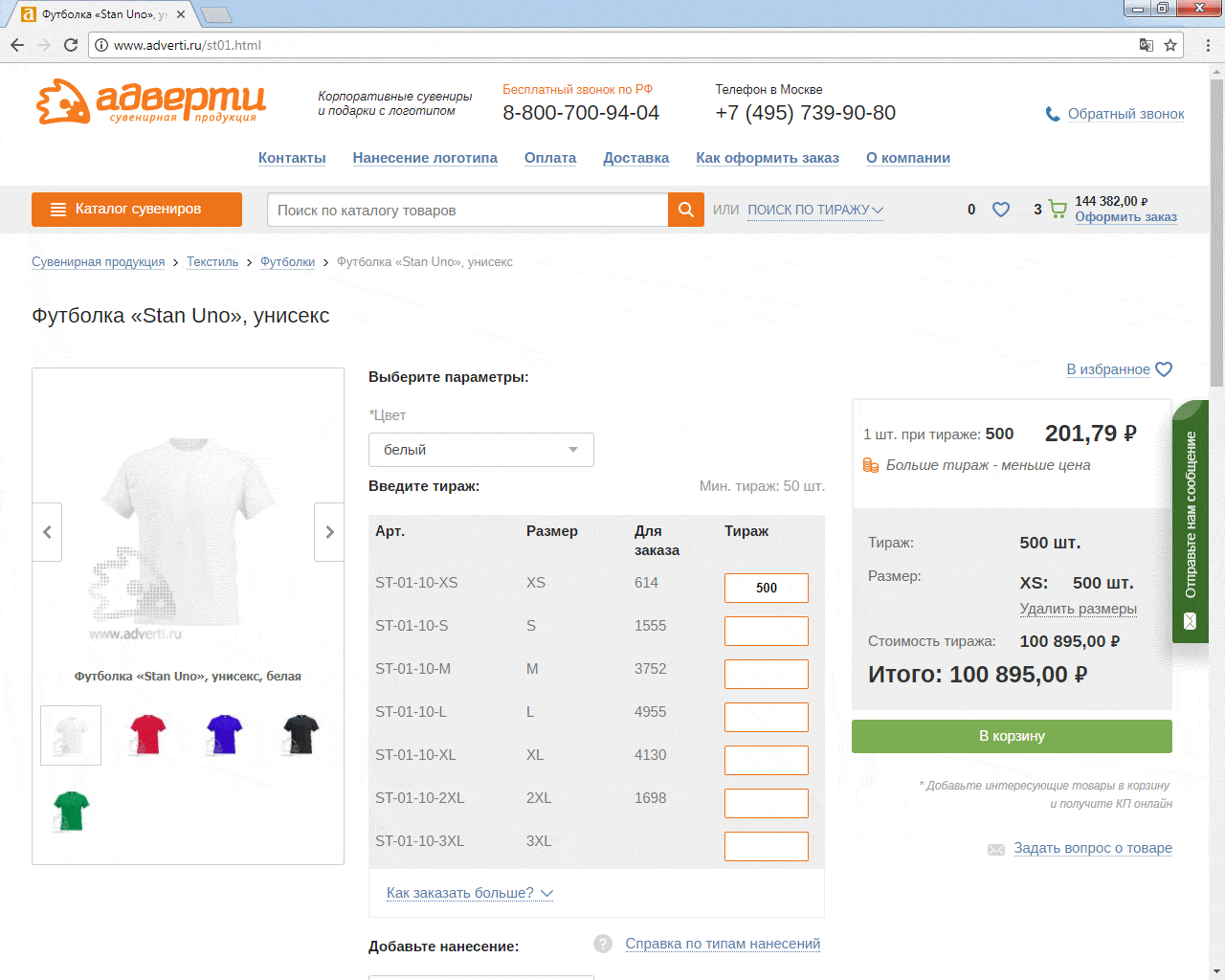
If you look at the current version of the T-shirt product card , a number of problems pop up:
- the application functional is hidden so far that its value is not obvious to the client (read: the client does not see)
- for some products there are many options available that are hidden in drop-down lists and require a lot of extra clicks
- in the block of the basket on the right there are a lot of numbers and values arranged almost chaotically and therefore they are muddled
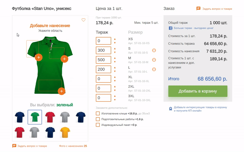
Is it possible to combine application functionality and a photo?
Sounds like the best option. In the photo - the goods and for him we offer to choose the application for him. Logical connection. The concept of a simple constructor fits in well here: mark up the area available for application and make it clickable. The area will correspond to the future location of application. Last time I often use dynamics in the text, i.e. It turns out a hint similar to the new event. Therefore, by moving the cursor, you will notice how the tooltip changes from the top, improving accessibility:
In addition, in the future it is planned to develop a designer. There will be more functionality for choosing multiple applications on different sides of the same T-shirt or jersey. Therefore, this “markup” laid down for the future.
What about the animation?
Using the simplest dynamic resize of the substrate under the photo improves the understanding of the connection between the new functionality and the object. Therefore, the background expands to the right, always with non-linear animation. It looks like a T-shirt has generated new components. We hide everything superfluous at this moment: the choice of color in this sub-scenario is prohibited. The purest example of animation in the name of UX. And in order to win some space again - we write instead of the price in the label'e a new heading - “Application Designer”. Of course, the same color as the color of the frame of the substrate of the designer to enhance the generality. It seems a trifle, but important.

Noticed how after confirming jumped the application area on the right shoulder? Another living example of how animation we give visual feedback. This small positive attention manipulation focuses the client a little more aggressively on the fact that two applications have been successfully selected.
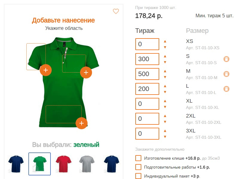
What changes will be in the central column?
In the current version in the first place is the general article! If I just need 500 pens with my logo and only, then the article is the last thing that worries me. Add arrows ▲ ▼ to the inputs to give you the opportunity to wind up a larger circulation without resorting to the keyboard:

Of course, more, because the step at the arrows do 100 units. Immediately + 5% to sales! And of course we warn of such a move immediately on onhover. Because of this feature, the input had to be shifted to the left, but it seems to me that these elements also managed to increase the priority. Now the entire ordering functionality is concentrated in one area:
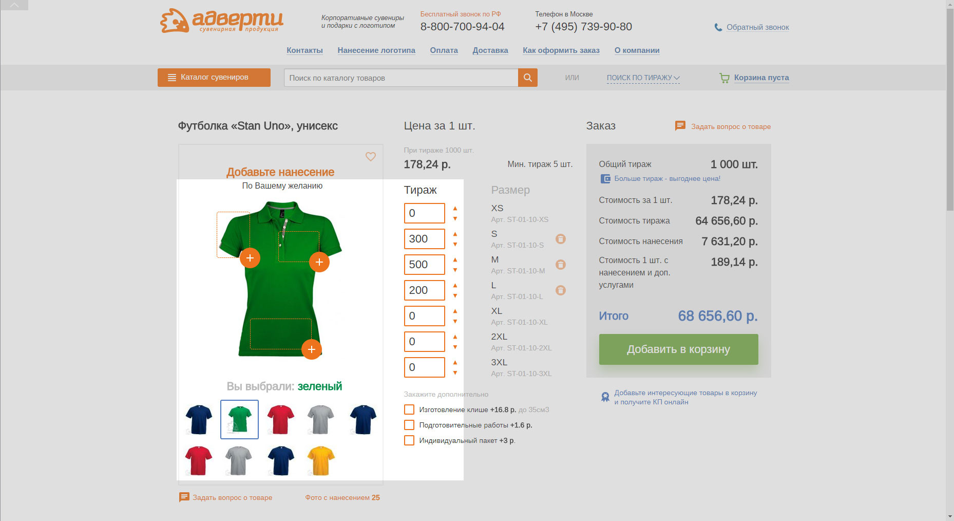
What will change in the right order block?
There are a lot of numbers in this block and nothing can be done about it. I'm still sure that one or two numbers are definitely superfluous there, but the client claims that all these numbers are important for the business. It remains only to improve the typography and align the data according to the classical principles of organizing the data in the table.
And if drawing only on one zone?
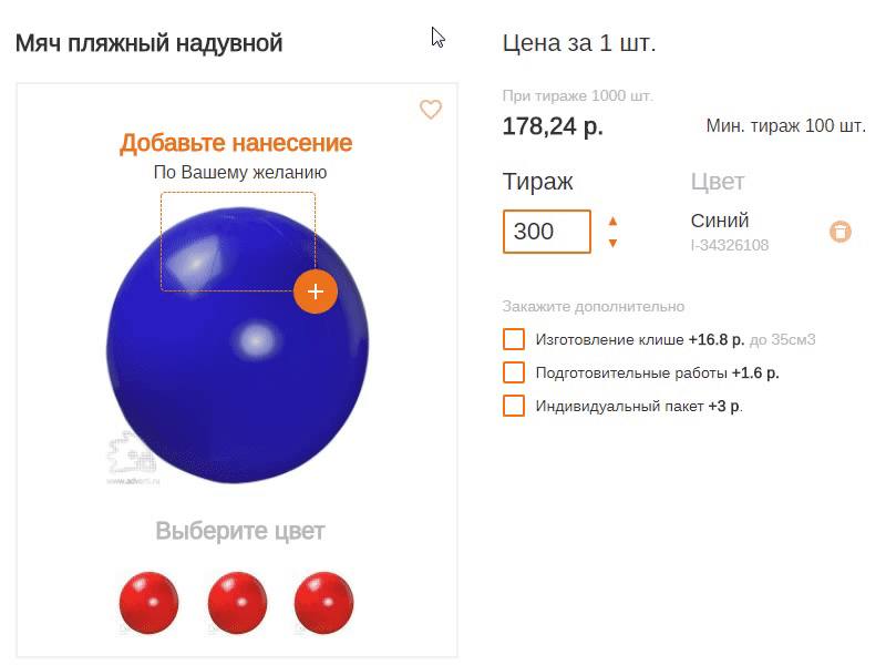
There are a lot of such products in assortment. For example, in the case of an inflatable ball, there is only one application area, which means that it is optimal to take everything to the 1st level from the drop-down list (instead of dropouts) . And the cost dynamically appears instead of the label “Add application”. That is, once again we use the already existing element for the new goal in the framework of the current scenario:
And if for the goods a lot of parameters?
There are products in the store for which more than 3 application parameters are available. Now they are all hidden in drop-down lists. There are two main disadvantages: all the options are hidden behind the click on the dropout; extra clicks total have to do a lot. I had to create a new UI component, but I managed to bring everything to the first level and reduce the number of clicks for this product.
It was:

It became:

As a conclusion
Visual feedback, tooltips in the context of certain events and the simplest interface animation help business to guide clients in a profitable way. Nowadays, these techniques are not even a tribute to fashion and technology - but a necessity to be one step ahead of the competing product. Due to such a simple but necessary approach, the risk of failure is reduced; the availability of the product increases and, as a result, an increase in conversion can be expected in the future.
PS
You can click on the interactive prototype , but do not be zealous. Some functionality is missing for obvious reasons. The cap and footer are simply sent from the current version of the site and made with pictures.
Source: https://habr.com/ru/post/334996/
All Articles