5 easy ways to mess up a font
In this article, I will show the most popular mistakes that are made when working with fonts, and teach you how to avoid them. The article will be useful not only for novice designers, but also for everyone who wants to know the basic rules for working with text.
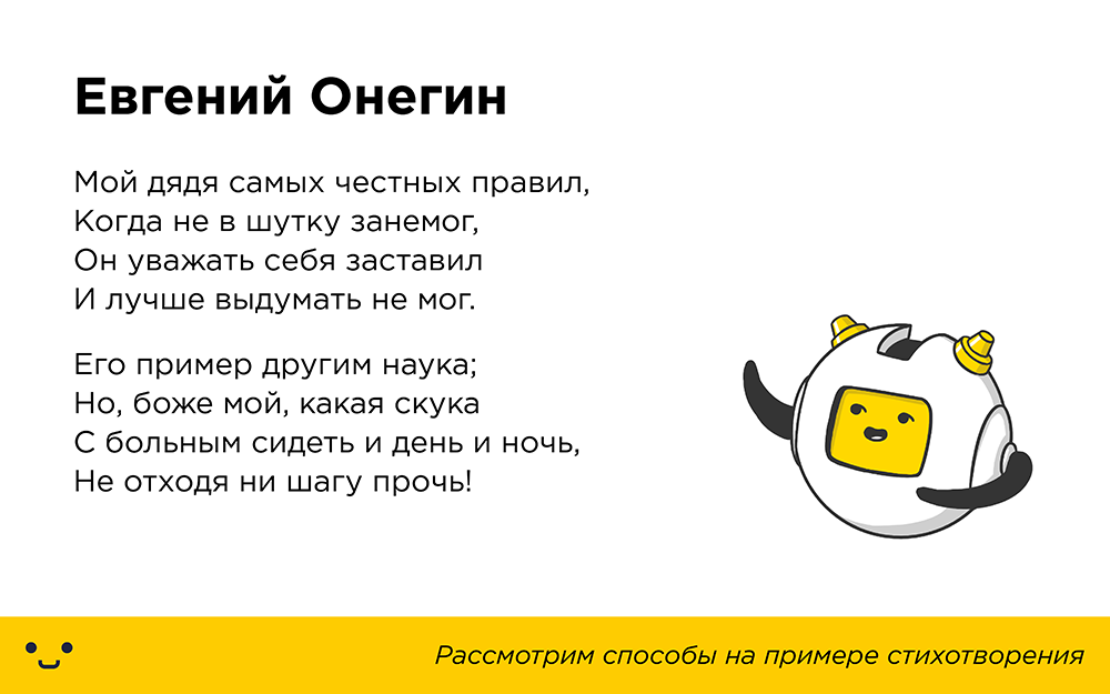
When working with a font you need to remember: the letters should look like they are intended. Artificial stretching of the text in width or height will disfigure it and reduce readability. If you really need wide or tall letters, better pick a suitable font.
Even minor deformations are noticeable. As per height:
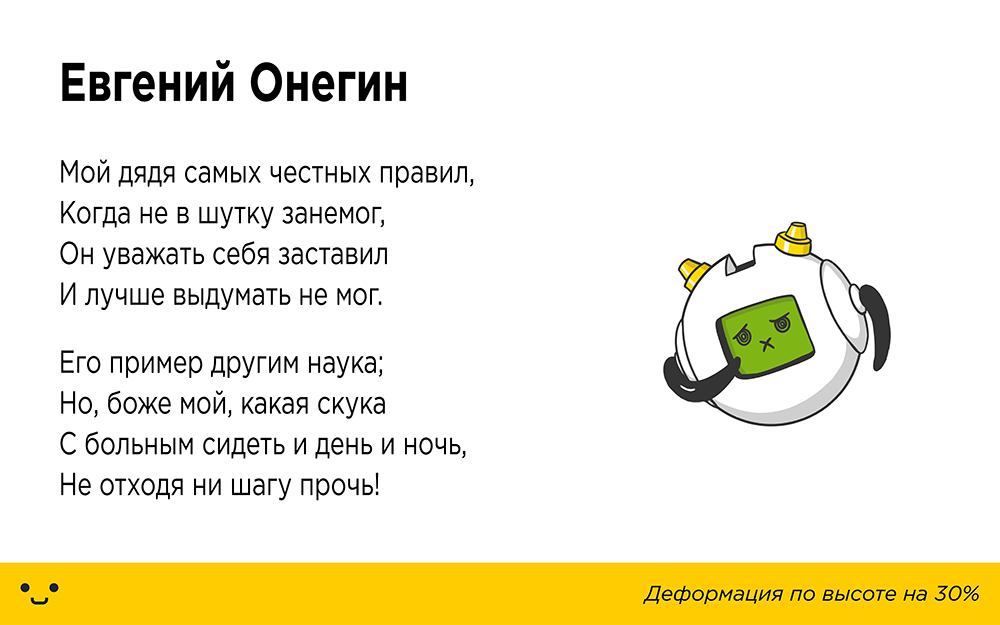
')
So in width:
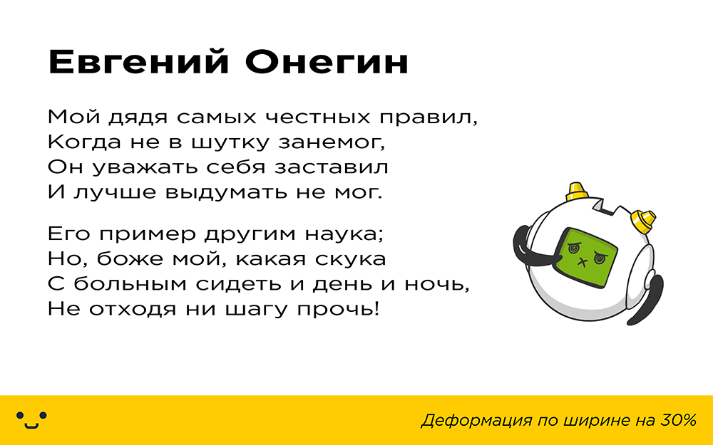
Many people think: "Yes, no one will even notice!". Consciously maybe not, but our brain more precisely the eye notices such discrepancies. Because of this, the perception of the text deteriorates markedly.
Life example:

Effects to fonts are not applicable, with rare exceptions. Again, we start from the goal: “To make the information as accessible as possible.”
Effects such as shadows, 3D imitation and textures make it difficult to perceive the text:

Life example:

An “excellent” way to spoil the interaction with the text is to place it on the background, from which it will be impossible to read something. Consider the examples:

The problem is solved, however sometimes it is not enough to limit one color change:

The solution may be a die under the text:

But the best thing is to find a suitable background:

Life example:

4. Incorrect spacing
Attention to indents plays a big role in the perception of the text. The easiest way is to spoil the text if you sculpt it into one heap (or, conversely, overdo it with the distance between letters), and also not to indent from the edges or between the lines. In this case, the text will merge into one mass, and it will be very uncomfortable to read it:

Life example:

The fact is that the text written in capital letters has a monotonous structure, which makes reading very difficult. There is nothing for the reader’s eye to catch on and the lines of text turn into a solid “noise”, while the lowercase letters have remote elements that help us to perceive the letters better:
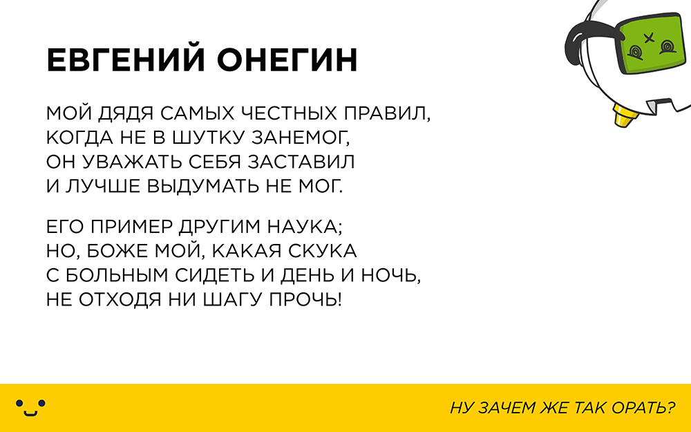
Life example:

Prepared Danil Baranov for Log Machine
If you liked this article - read about "4 popular mistakes in the design of business cards"

1. Font Warp
When working with a font you need to remember: the letters should look like they are intended. Artificial stretching of the text in width or height will disfigure it and reduce readability. If you really need wide or tall letters, better pick a suitable font.
Even minor deformations are noticeable. As per height:

')
So in width:

Many people think: "Yes, no one will even notice!". Consciously maybe not, but our brain more precisely the eye notices such discrepancies. Because of this, the perception of the text deteriorates markedly.
Life example:

2. Apply effects
Effects to fonts are not applicable, with rare exceptions. Again, we start from the goal: “To make the information as accessible as possible.”
Effects such as shadows, 3D imitation and textures make it difficult to perceive the text:

Life example:

3. Poor text and background mix.
An “excellent” way to spoil the interaction with the text is to place it on the background, from which it will be impossible to read something. Consider the examples:

The problem is solved, however sometimes it is not enough to limit one color change:

The solution may be a die under the text:

But the best thing is to find a suitable background:

Life example:

4. Incorrect spacing
Attention to indents plays a big role in the perception of the text. The easiest way is to spoil the text if you sculpt it into one heap (or, conversely, overdo it with the distance between letters), and also not to indent from the edges or between the lines. In this case, the text will merge into one mass, and it will be very uncomfortable to read it:

By the way, we wrote about this in the article "Theory of Intimacy"
Life example:

5. Use only capital letters
The fact is that the text written in capital letters has a monotonous structure, which makes reading very difficult. There is nothing for the reader’s eye to catch on and the lines of text turn into a solid “noise”, while the lowercase letters have remote elements that help us to perceive the letters better:

Life example:

Prepared Danil Baranov for Log Machine
If you liked this article - read about "4 popular mistakes in the design of business cards"
Source: https://habr.com/ru/post/334750/
All Articles