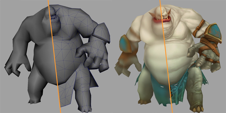
Character development for the game "Allods Online"
Many emerging artists are eager to draw characters for games. But often, the enthusiasm quickly dies away, because character creation is a responsible business that cannot be dealt with in isolation from the work of the whole team. Therefore, we wrote a guide for you on how to create game characters, using the example of Allods Online.
Everything that is said in the rules is based on a huge development experience. Here each letter matters, and if it seemed to you that somewhere there is an error or incompleteness, then it is better to ask again seven times than to do it anyhow. Below are the rules for successful work in the gaming industry. If you do not comply with them, then your work will be either short or unsuccessful, or painful both for you and for the customer. And if you begin to create characters in full accordance with this guide, then you will succeed!
1 Basics
2 Modeling
3 Mapping
4 Textures, basic requirements
5 How to speed up your work
6 Examples and Guides
The basics
Do not do it anyhow, at random, "and so it will come down . " You are expected to have the highest quality work. Everything should be done in full compliance with the requirements, so that from time to time there will be less and less edits and not to give the same meaning to each new model. And it is even more unacceptable to ignore any moments from the feedback, because “I forgot”, “it seems to me that this is better”, etc.
')
Before sending the model, check it again on all items , it will save a lot of time and nerves. The same applies to feedbacks: if it seems that you have corrected everything, re-read feedback and make sure that everything is done that way.
Few people are able to comply with all requirements , do not forget about them and constantly improve. Most companies are willing to work with such people for a long time and, if necessary, train them. Of course, not from scratch, but from a certain level, which you are fully capable of achieving yourself, relying on this guide.
Everything that you do should be beautiful, logical and rational. It is important to develop an artist in yourself , regardless of what you will do - model, texture or animate. You can not achieve success, mechanically transferring the concept in 3D: there will be a lot of mistakes that torment you and the customer. It is necessary to constantly develop the FEELING OF BEAUTIFUL, to watch the works of successful artists, to delve into them, to understand how this is done. Art education will be a good help. Without it, of course, more difficult, but only because people with education have these difficulties behind. There are many examples where people without artistic education, but with a strong desire to learn how to draw cool, spending on self-study even less time. Understanding everything independently is more difficult, no one will answer the questions, everything will have to be found by ourselves. It requires a lot of patience and ingenuity, the brain will work to its fullest, and not just perceive ready-made recipes. But you will understand how not to do it, and this is an important experience. In general, train and mind, and patience!

Some pictures are clickable, like this one.
To learn faster, get rid of all the distractions . Do not read the news, do not watch TV, immerse yourself in the topic you want to study, absorb it only, think only about it, change your thinking and habits, set priorities. “If you want to get what you never had, you need to do something you never did.” You should like what you do to make it truly quality. In this case, it is necessary to clarify whether it is necessary for the customer. Even if you don't like it at all, try to make it like it. This is another important, necessary, and for many difficult to achieve skill that will give you a great advantage in work: when something is to your liking, it is done better and faster. Do not do what you do not like, in the world a lot of different activities for every taste.
It must be remembered that you are not doing a spherical character in a vacuum, but a part of the game that has to fit organically into the whole. Do not forget that it is impossible to accurately and perfectly convey all the details of the concept in the form in which they were conceived, due to limitations on the number of polygons, the resolution of textures and the allotted time. Therefore, most often it is necessary to seek a compromise.
In any incomprehensible situation ASK QUESTIONS! Any, even the most illogical, which will come to your mind. It is impossible to tell everything about everything in one document.
Now let's talk more specifically on the example of our requirements. All items are arranged in order of importance, that is, if the previous item is not fulfilled, then all subsequent ones do not matter.
Modelling
- We accept models in * .ma format for Maya 2012 version or lower . We have a licensed Maya, and you can not just put a new version, you need to buy it for
ohuliardsMany Thousand Dollars. To do this every year is too expensive. In addition, converting from OBJ or FBX involves a lot of routine operations: leading to the necessary transformations, creating and assigning materials. It takes a lot of time and effort, especially if you have to convert the same model several times a day.- We recommend to configure Maya as follows . The units are centimeters, the up axis is Z, the frame rate is 30 FPS (this is more for animations).

- Character height must be adequate . Usually, on the concepts of “Allods Online”, a man 1.8 meters tall is schematically drawn, and one must proceed from its size. On average, bosses are not higher than 15 meters and not lower than 3.
- We recommend to configure Maya as follows . The units are centimeters, the up axis is Z, the frame rate is 30 FPS (this is more for animations).
- The model should convey the feeling created by the concept . The most important thing is to observe the proportions of the elements on the concept, the angles of the faces relative to each other, the radii of curvature, the location of some elements relative to others. Everything should be as close as possible to the concept from at least one angle. If a model is sent with a task and it is indicated that it is an “example of detailing”, then it serves as the source material from which you need to assemble your model, similar to the concept. The sample serves to speed up the start of work, it is not recommended to leave everything as it is (“well, you yourself gave it to me”). Check the proportions, putting the model next to the concept in one perspective, bringing the right areas, comparing and looking for differences.


- Keep exaggerated dynamic forms provided by the artist and the style of the project . It is not necessary to average and straighten everything.

If it seems to you that the character or object is crooked, the contours on the concept are deliberately distorted, then you need to convey it this way, maybe even exaggerate a little. If the concept depicts a geometrically correct object, you do not need to make gag, model exactly and accurately. - Represent the character in the game when thinking about the details and modeling elements . Analyze which elements should be modeled and this will be noticeable, and which ones it is enough to draw on the texture, taking into account not only the maximum number of polygons, but also the requirements for topology. Try to imagine how the texture will look on the elements, whether it will be possible to transfer the concept idea. Feel free to ask. It’s better not to model some little things than to do too much. Save time and polygons, but without fanaticism!
- Consider the position in which the model will be represented in the game most of the time . For example, if characters' hands are mostly hanging down, not stretched up or to the sides, baggy sleeves and similar clothing items should “hang” in the palm, not perpendicular to the arm, and not be inflated in the middle of the sleeve, as if the arm is raised .

- Make the model neatly, everything should be in place, be logical, understandable and constructive . Frequently, newcomers have problems with joints, joints, hinges, etc. Nothing should hang in the air, unless it is provided for on the concept.
- Use the reference to model the angles of the character that are not shown on the concept . It happens that on the concept of some element is not drawn or blocked by another. How to model it? In such cases, you need to be guided by logic, your own experience, and best of all - to find a reference from the real world. If you are not sure of the choice of a solution, then be sure to SPECIFY what should be done. For example, ask for examples of such assets. If the costume doesn’t have a reverse side painted on it, then most often it’s necessary to display the same thing as the front, but in a slightly different way. Here are some examples.
- Using a real beetle as a reference, it is recommended to add some similar element to the belly so that the beetle does not look like a loaf.

- There is a full ahtung on the face view: this is not a dragon, but a demonic dog-snapper, so it is not necessary to do so.

- The lion's head on the concept is not drawn full face, but it’s enough to google it and take the most suitable reference.

- Using a real beetle as a reference, it is recommended to add some similar element to the belly so that the beetle does not look like a loaf.
- Be sure to follow the ELEMENTARY rules of low-poly modeling for game projects .
- Each polygon should set the volume or correct the mapping tightness.

This mainly refers to solid non-deformable objects. On flexible objects, additional segments need to be made, so that everything animates more smoothly during animation.
- Model and mapping should be made symmetrical wherever possible, unless otherwise specified. For example, you can simulate one element, decompose it mapping and multiply. So we at least halve the time spent working on the texture, save the size of the texture and memory consumption, increase the detail, etc. But, observing symmetry, pay attention to whether you can make the right lighting on the element. If so, then we make the figure symmetrical, not only to the right and left, but also to the back and front. So you get fourfold saving of time and resources!


- All the fur and hair make alpha , volumetric elements, it is advisable to transfer only large curls or braids.


The same applies to fine detail. For example, this element is hanging from a character on a belt and about the size of a palm.
- It is better to make dies for alpha wide enough so that you can draw an interesting silhouette on them. But if they become too wide, the texture space will be lost.
- Remove invisible polygons if they are not visible during the animation. Also, in no case should there be double polygons , that is, located in the same place and with equally directed normals. Such polygons occur by chance, with careless work. Just in case, check if they are using special scripts.
- Any projection should be noticeable against the background of the rest of the model's relief — or it is better to get rid of it altogether. Avoid right angles between the faces of the protruding elements , because the volume is better read. In general, the angles between the faces of 90 degrees and less are recommended only at the joints of materials or at very strong fractures . The fact is that in the game, the light on such ribs “breaks”; it looks disgusting, like an unfused texture stitch. If an absolutely smooth ring is drawn on the concept, then it doesn’t matter how many polygons you have in section, all faces must be smooth / soft or have one smoothing group.

- Do not try to make your life easier, model visible elements that define the volume , and do not draw them on the textures.

- Each polygon should set the volume or correct the mapping tightness.
- Important requirements for mesh topology .
- The grid should be convenient for the setup . No need to try to optimize a couple of polygons, on which the shape of the object will depend during the animation.

- Be sure to monitor the topology of closely spaced deformable surfaces . If it is not as close as possible, then at deformation one surface may go under the other.

- To simplify further work on the setup and animation, model in the form of a line or a plane a rope, raincoat, chain — anything that can hang and fly . And simulate one of the global axes / planes, that is, clearly down, or back, or forward. Of course, unless otherwise specified in the assignment.
- In order not to complicate the skinning of the model, it is recommended to make raincoats, hoods, etc., without an internal volume . It still looks the same.

- To facilitate snapping, the segments of the curving parts should lie in a plane perpendicular to the bones of the intended skeleton .

- For cylindrical elements, make the number of faces in a section a multiple of two, and preferably four . A small cylindrical elements enough no more than eight faces.

- At the folds / joints of the arms / legs / toes, etc., make three polygons outside the fold and two inside . If you make one segment, then when bent more than 90 degrees, the entire volume will flatten, and it will look very unnatural.

- With a small intersection of several elements, it is better not to stitch them together into one , provided that they are opaque and rigid. If you leave the intersection, then both modeling time and polygons are saved, and nothing much is lost in the texture, since the intersection is small. The same can be said about the small elements protruding from others, such as spikes, stuck arrows. Do not embed them into each other, unless otherwise specified. It is better to just drown them a little in the main element.


When crossing large elements that will be deformed, it is better to make them a single mesh . Otherwise, at the joints, ugly seams may appear. In general, it is recommended to make deformable elements with a sufficient number of polygons so that you can sew them without any special problems.- If the elements depicted on the concept close to each other do not need separate animation, then it is better to make them simple with a single volume . Of course, under the conditions that this volume will draw all these elements on the texture with sufficient detail and without artifacts.

- If the elements depicted on the concept close to each other do not need separate animation, then it is better to make them simple with a single volume . Of course, under the conditions that this volume will draw all these elements on the texture with sufficient detail and without artifacts.
- The density of the grid of neighboring elements should be comparable , and the elements themselves should be approximately in the same detail for polygons in order to look harmonious from different angles. For example, a ball:

A bunch of snow at the door:
Belt-hanging container: - Elements that pass over the surface of a larger element should be squeezed out of it rather than modeled with a new layer . This recommendation is valid unless the animation of the element should not differ from the animation of the base surface. This is, for example, a belt on a belt. If the element is flat or its volume is relatively small, then it is better to just draw it on the texture . So we get rid of intersections during the animation and save texture space. If the belt is asymmetrical, then it must also be squeezed out, but spread out on the mapping in its place, and not on the body. The body is decomposed symmetrically, leaving a void in place of the belt.

- Try to make the edge inside the plane go along the shortest diagonal . So the mappings will be more uniform.

- Try to avoid elongated polygons , make the grid more or less uniform, otherwise the game lighting breaks. Of course, this does not apply to transitional polygons between large and small.
- The grid should be convenient for the setup . No need to try to optimize a couple of polygons, on which the shape of the object will depend during the animation.
- The design of some elements sometimes requires animation, so first be sure to specify what exactly will be animated . Of course, the model needs to be made so that you can animate all the necessary elements and so that textures can be drawn on the hidden parts of the model if they become visible in any animations.
- When making changes to feedback, you should first study the concept again . For example, if you need to add a facet on the verge, then you should not make it too wide: most likely, it is enough to make it just more visible on the model, nothing more.

But do not make the chamfer too shallow, when it is almost invisible, let it be better a little wider, by 15-30%, and not by 200-300% as in the example above.
The main problem with modeling is incorrect proportions and lack of knowledge of anatomy . It is most difficult to learn to observe the proportions and anatomical features, and this is the first thing that artists begin learning from!
Mapping
- The main rule is saving texture space due to duplication of elements . This helps to increase the detail and reduce the amount of work on textures. All the same or almost the same elements when mapping must be decomposed into the same place. Even if the model of the element will be slightly different, the texture will still be very similar.


The same can be said about elements of the same texture: they should be laid out on one section of the texture. - Identical elements with different lighting should be laid out on different places of the texture, otherwise you will not be able to draw lighting different .

- Semicircular elements, branches, ribbons - everything that is curved, it is recommended to mend in a line, so as not to waste the textural space. The texture will be pulled, but its density will be higher and the seams will be less.

- On relatively large, easily visible squares, one should by all means avoid strong draws. Otherwise, the texture drawn there will look ugly, and it will be more difficult to draw it. In such cases, you can not do without seams, and in the most prominent places, but this, I repeat, applies only to large areas!


- On small, low-detail elements, the draws are perfectly acceptable if they are used to correct more important problems, for example, to get rid of the seam or to simplify the drawing of the texture. The rest of the hood must be corrected.

- Checking mapping is best with this checker:

- On small, low-detail elements, the draws are perfectly acceptable if they are used to correct more important problems, for example, to get rid of the seam or to simplify the drawing of the texture. The rest of the hood must be corrected.
- As far as possible, make all seams on the inner parts of the elements or where they will be less noticeable. For example, it is better to make a seam on the hand on the side adjacent to the body, the seams on the fingers are in the places where the fingers fit each other, the seam on the palm is on the end opposite to the thumb, that is, if the hand is hanging, the seam will be in the back. Some seams are difficult to avoid, for example on the shoulder, where the arm is separated from the body. If you refuse it, then there will be an extra seam on the torso from the side. From the seams of symmetry in the center of the model, there is no way to go at all, but it is not difficult to reduce them to texture.
- Try to minimize the number of stitches . If possible, sew all small parts with larger parts, do not scatter all over the texture. There may be draws, but this is better than a bunch of stitches, if, of course, the draws are not critical, that is, they allow you to draw the necessary detail.

- . , , . , , . , :

(, ), , .

- , . - . , , , , . .

, . , . , , ! - . 1.3-1.4 , — 1.1 — 1.2 , , . , , , , .
- , , 0,7-0.8 . — 0,8—0,9 . , .
- . , .
- , . - . , , , , . .
- 3—8 . , , .
- , . , , .
- . , 1: 2, 1: 4 1: 8. , , . , , , , ( ).
- .


- 60 (unwrap) .

- , .

. , , ! , . . , , .
, . , . , , , , , , , , , , . , .
- : — , . . , Unsharp Mask.
- . , , . : , , .

- , , , , . , , . . For example:

:
, - , . - , . , . , ( ) , , , . , , .


- , — , . , , . : , , , , . . , , . , :

, , , , , . .
- . , , , .
- . : ( ! !), . , . , — . , . , — . . . .
- «» . «» , , . . . -.

, , , . , TermiteQueen.
. , , :
- , . , : , , . , : , , , , , , , . . , . , , , . .

- , . , «» , / , , — . , , , .
- : . , . , .


- , , . :

. , . - , , . , — . , — , .

, , .


Lighting
- One of the most common problems with textures faced by beginners is incorrect lighting , lack of separation of differently oriented planes and materials.
- It makes sense to focus on the concept only in terms of ideas, materials, colors and shapes. Lighting usually has to be built independently . Usually, concepts are only focused on a particular area in order to increase the artistic value of the concept. And on the texture lighting is recommended to do from all sides at an angle of 45 degrees.

That is, upturned planes should be brighter than inclined. The darkest planes are those that are turned down, but the ratio of dark / light brightness should remain approximately within the limits of that part of the gradient that this part of the character’s body occupies. For example, do not make too dark a section from the chin to the neck, it should be a little darker than the shoulders. And the shoulders are slightly darker than the crown, etc.

- In general, the texture should be very similar to the concept, but with different lighting.


- It makes sense to focus on the concept only in terms of ideas, materials, colors and shapes. Lighting usually has to be built independently . Usually, concepts are only focused on a particular area in order to increase the artistic value of the concept. And on the texture lighting is recommended to do from all sides at an angle of 45 degrees.
- General illumination is desirable to do not sharp, but it should be well read and emphasize the shape of the object.

- It is advisable to break the illumination of elements according to the plans : front and back. Surfaces in the depths of the model, i.e. in the background, should be darker than those outside.
- Surfaces located at different angles should differ noticeably in tone , i.e., in the intensity of illumination by the light source. In this example, the top surface should be brighter than the side ones, since the main light comes from above, besides, we need to emphasize the geometry, and not hide it, lighting everything in one tone.

- Materials must be clearly read . To do this, they must be separated by tone and saturation. It is important to understand the peculiarities of this or that material: it is expensive, carefully processed or simple, with traces of rough forging, new or old, polished or matte, etc.

- Do not forget about the vertical gradient in brightness and saturation . In the real world, objects are illuminated from the top down by the sun, and our brain perceives it as natural light. Therefore, the model should be lit from above brighter and darker below. The same with saturation.

- It is important to consider in which position the model is represented in the game most of the time . As in the case of modeling clothes, the pose is also important for character lighting. For example, the hands of the characters are mostly lowered, not extended upwards or sideways. When lighting it is necessary to take this into account - stretch marks for brightness and saturation should stretch along the arms, towards the palms.
- It is recommended to avoid black shadows and white highlights . Games can have their own lighting, which will brighten the light areas, so the brightness values in the texture should be kept between 40 and 230. In other words, the textures should be created with such brightness as on a bright cloudy day.
- Sometimes the volume and lighting on the concept are not drawn on all elements , but only on the main ones. In this case, the volume on the other elements should be built independently.
- Try to make the contrast maximum at the “points of interest” rather than uniform throughout the model . In creatures and characters (as a rule) such points are the head and the top / front of the torso (although not always, you need to analyze the concept in order to understand what the artist wanted to emphasize). At the feet, the contrast and overall tone of the texture should be reduced.

- Do not neglect reflexes - reflections of light from adjacent surfaces . Speech is not about glare from light sources, they must be present by themselves, but about reflected light from surfaces illuminated by some source and because of this also turned into peculiar sources, but less bright.

- Need to work carefully with highlights . Excessive amount creates a feeling of porridge. Incorrect location breaks the shape and feeling of light on the object. The same goes for reflexes.

- When drawing feathers and fur, you should not evenly fill the entire surface with identical feathers or strands of wool , be carried away by drawing small individual hairs. It is recommended to comply with the general lighting, do not break it with contrasting small details.

Gradients, alternation of more or less contrasting and developed areas, combining them into a total mass help to dilute the uniformity of fur and feathers. Here is a good example of working with materials:
Detailing
- The task of the texture worker is to create the illusion of volume, the illusion of a large number of polygons in their absence .

- Detailing in the centers of composition and interest is better to do higher than in less important places. But this does not mean that you can do everything with fillings in other places and leave unnecessarily empty areas without any texture or folds, so the model will look unfinished. It is recommended to lay out more detailed places on the mapping with a higher texture density.
- In “Allods” the style of the game excludes photorealism , therefore the texture of the surfaces is achieved with the help of color spots. Often, textures can be used, but only in addition to the main detail, after the general lighting and color are determined.

- Concepts are not a standard, so the artifacts inherent in them — inaccurate brush strokes, step transitions — need to be transformed into neat texture and light gradients, and not thoughtlessly transferred to the model.

- The main reference for detailing is the size of the texture . If he allows, then the detail should be increased. Avoid blurring the texture if its resolution allows you to do better.

- Detailing should not be too small or too uniform . Be sure to attend large, medium and fine detail. It is best to work from the general to the particular, from the large detail to the medium, and then to the fine. It is not necessary to proceed to drawing the folds before the basic color and tonal relationships are resolved.

- Avoid excessive contrast of details, so that they do not break the overall shape , do not affect the overall brightness and saturation of the elements, do not "soiled" colors. Soot, patina, scuffs, scratches and other traces of time enliven the texture, but their excess leads to an inaccurate, dirty picture.

- The type of detail should be prompted by logic . For fabric, for example, it can be stitches, folds, scuffs, patches. For metal, potholes, scratches, flayed paint, dull or polished areas, etc.

- Next to the axis of symmetry of the character is to be careful with the detail , so that the symmetry does not catch the eye.
- When working with alpha, you first need to create an interesting silhouette , you should not cut it evenly finely.
- To avoid unwanted edges around the details cut out on the alpha , it is recommended to fill the unused space with a color close to the texture color of opaque elements.
- The size of the common elements (peeling, rivets) should not “walk”. . Barriers / borders in most cases should be the same thickness throughout the element. Repetitive elements should be the same in size, but can be in hue and / or shape, the monotony looks dull and often unnatural. However, the different size of buttons looks ridiculous, unless of course it is not originally intended.

Technical nuances and requirements
- To make it convenient to work with the texture in the future, it is better to do it in PSD format divided into several layers : separate layers with each material, a layer with bodywork shadows on the body, a layer with detail / texture. Splitting allows you to adjust the layers individually, if necessary, correct something or make something new from this texture. The rule is not mandatory, but more often it’s enough not to merge several layers before sending the texture. If you draw everything at once in one layer, then this is a reason to reconsider your approach, since the same edits will be made faster if the texture is divided into layers.

- When using Maya to correctly display the model, it is recommended to set the following viewport settings :

- It is better to make the bottom layer a background, otherwise the alpha will not be exported to the game.

- Transparency is advisable to draw in the alpha channel :

- With regard to models of mounts and suits, you need to remember that most of the time they look at them from behind , so this kind of attention should be paid no less than the rest.
- The seams of elements that logically merge into each other, it is recommended to reduce . Do not do this:

It is better to add a shadow on the face and highlight the hair:
- It is desirable that most of the pixels are in the middle of the brightness range , about 60% of the histogram. The peak of the histogram for darker objects will shift to the left, for lighter objects to the right.
- Make sure that when viewing the model there are no texture artifacts when the size of one meter in Maya is no more than 1/3 of the screen.
- Hidden parts of elements and planes, too, do not forget to texture , if they will be shown during animations.
- At the intersection of the legs and skirt, pants are best painted with the same color as the skirt , to avoid sudden transitions when the foot crawls through the skirt.
How to draw faster
- I highly recommend using a tablet , if you don’t know how - learn, even the simplest tablet allows you to draw much faster than with a mouse.
- A good monitor is a must have , with an IPS matrix or better. He will allow you to see more nuances in colors, you will notice the difference between beautiful and “not very”.
- Use hotkeys instead of clicking buttons on the screen and dragging the sliders. This saves you time twice: first, instantly select the desired tool or setting, and second, you do not have to rest from fussing with the cursor on the screen. Count how many times you need to at least change the transparency of the brush, and this is done simply by numbers on the keyboard.
- ALWAYS SEARCH FOR A REFERENCE . Drawing from a sample is much faster than inventing anything. At the same time you replenish your visual library. With references you learn to draw and earn money! Today it is difficult to invent something new, and most likely, it has already been invented and improved. So you have to spend a lot of time to do the same. I recommend to first look at what has been invented before us, and then try to invent something new, combining this knowledge and using fantasy.
- Colors can and should be taken directly from the concept , using them for texture.
- If you project a concept on a model in ZBrush, 3DCoat or other similar programs, and then refine it, this will significantly speed up the start of work.
- Split the texture into layers with different materials , it will help to make edits faster (change the hue or brightness), do not have to highlight this material throughout the texture. Not the most complete example, but still:
- It is better to work simultaneously on two different Assets , periodically moving from one to another, when you feel that the eye has become blurred and it is not clear what to do next. If the second task is not, then you can just walk or exercise.
Examples and tutorials
Our internal
- Examples of feedbacks for our characters. In each there is a layer with overprint, you can flip it and quickly understand the difference.
- Our basic documents on art.
- Examples of solutions for the implementation of fabric, metal and degree of detail.
- A small video tutorial on the use of 3D-Coat for drawing textures.
Public lessons
- General recommendations on art from Paul Richards, in translation, you will immediately find many other interesting articles.
- How to draw a piece of wood from Arthur Gemaldinova.
- How to draw an oscilloscope from Ivan Smirnov
- Texture the bust of the character of the first and second from Vadim Bakhlychev.
- Fine-tuning Maya , from Dmitry Astapkovich.
Various resources for inspiration and with examples, "as it should"
- Art station
- Deviant art
- Polycount
- Google - on request "draw a face texture" we find a bunch of guides.
Artists whose work and lessons should be taken as a basis for your further education Feel free to drive these names into Google - you will find a lot of interesting things!
- Sam Nielson and His Video Jitters
- Michael Vicente
- Tyson murphy
- Arthur Gimaldinov and his page on VKontakte
- Vadim Bakhlychev
- Laurel d austin
- Devon cady-lee
- Jesper Ejsing
- Ruan jia
P. S.
When you see cool work, it seems that doing it is also very difficult, almost impossible. And yes and no . It is difficult to restructure your mind and approach, but then everything becomes simple and clear. For a better understanding of the work disassemble it into parts, individual elements, areas, gradients. Then just take the desired color, paint in the right place the spot / line / pattern with the desired brush with the desired transparency the necessary number of times, bringing it to the desired look. Experiment, gain experience in the selection and mixing of colors, achieving elegance of lines, the formation of volume. Finally, just memorize the established techniques and images.
Take care of your memory, bad memory is the main problem of the majority. Good memory is the key to success in any business or discussion. To remember something with a bad memory, you have to do the same thing several times or even several dozen times! You spend a lot of your short life.
A good memory is the good blood circulation of pure blood through healthy vessels and the absence of distracting factors, such as informational garbage, noise and diseases. For this you need a complete immersion in the subject, headphones and health. Protect yourself from junk news and stupid TV shows, often stay alone with yourself, communicate with people who are passionate about the same thing, at least virtually, but better live.
Live away from the gassy streets, breathe fresh air. Drink clean, ideally, melt water, but not from the streets, but pre-frozen in your freezer.
Eat more plant foods - do not abuse meat, sugar and flour products, do not smoke - take care of brain vessels, do not consume alcohol and other drugs. In general, do not let the temptations kill yourself ahead of time :)
Get rid of bad habits, which include not only the obvious - smoking, alcohol and drugs, but for example, low mobility and overeating. Walk / run 5-10 km every day for fresh air. Take at least 10-15 minutes a day to exercise, sleep 7-8 hours a day. Harden - it really helps!
Take care of yourself physically, serious injuries such as fractures are associated with the arrival of anesthesia, which harms the brain much more than bad habits, along with strong drugs, even without addiction.
If you regularly get enough sleep, it is enough to move and follow at least half of the other recommendations, memory and activity will improve significantly . Unless, of course, you have done this before. And while walking, there are new ideas and solutions! These are useful habits, they need to love how to love to live, and then any business will be a joy.
Be sure to distract from work , doing something unrelated to it, let the brain digest new information and be motivated for new achievements.
Laziness is the engine of progress , look for, invent new techniques and ways to draw better and faster! And not only to draw, this applies to all activities! Studying new or combining old functions in new versions of familiar programs allows you to do familiar things many times faster. Search, study, experiment, try non-standard approaches, sort out what works at the level of elementary components, pixels and numbers, then you will understand how this is done and that nothing is impossible.
The combination of completely different areas of knowledge, can give amazing results, push for new ideas. For example, fractal patterns are surprisingly interesting and diverse, who would have thought that we owe this to mathematics. Chemistry, physics, biology, history, can throw a lot of ideas and solutions, it is impossible to know everything, but you always need to know where to learn something new. No wonder there were so many different subjects in the Soviet school. Being a schoolboy you do not understand why you need it, 90 percent of what you learn in school you will never need, but you really need those neural connections that arose and trained at the same time.
In general, broaden your horizons, learn new things - live interestingly!
Source: https://habr.com/ru/post/334712/
All Articles