Unified Style Language
In recent years, we have seen CSS-in-JS flourish, mainly developed by the React community. Of course, the process was accompanied by controversy. Many, especially those already familiar with CSS, looked at this initiative with bewilderment.
“Why would anyone write CSS in JS?
Of course, this is a terrible idea!
They would just learn CSS! ”
If this was your reaction, read on. We’ll talk about why writing your styles in JavaScript is not a terrible idea after all, and why it’s advisable to watch the rapid development of this technology.

Community misunderstandings
React-community often does not understand the CSS-community, and vice versa. This situation interests me especially since I was caught between two worlds. I started learning HTML in the late 1990s, and worked professionally with CSS since the dark times of table-based layouts. Inspired by CSS Zen Garden , I was at the forefront of the migration of code bases toward semantic markup and cascading style sheets. Soon, I became obsessed with sharing work, using unobtrusive JavaScript to decorate the markup made on the server with actions on the client. A small but turbulent community has developed around this approach, and we became the first generation of front-end developers who tried to give the browser platform deserved respect.
So you understand that with such experience in web development, I was a zealous critic of the HTML-in-JS React-model, which, it seemed, was in defiance of the principles guarded by us. But in fact everything turned out to be the opposite. In my experience, the component model of React, combined with its ability to render on the server, finally allowed us to create complex one-page applications in large quantities, providing users with fast, affordable and progressive products.
So you can consider it a sign of reconciliation of one community with another. Let's see together what the trend of combining CSS with JS means. Perhaps the result is not perfect, it may not be suitable for use in your products. But at least deserves your attention.
Why do you need CSS-in-js?
If you are familiar with my recent work with React and CSS modules , then you are probably surprised that I protect CSS-in-JS.

In the end, CSS modules are usually chosen by those developers who want to get styles in the local scope (locally scoped styles) without having to believe in CSS-in-JS. In fact, I do not even use CSS-in-JS in my work. Despite this, I have a genuine interest in the CSS-in-JS-community, I closely follow the innovations that they constantly offer. Moreover, I believe that this is in the interests of the entire CSS community. But why? So that you understand why people prefer to write their styles in JavaScript, let's look at the practical benefits of this approach.
I broke the article into five main parts:
- Styles in scope (Scoped styles)
- Critical CSS
- More competent optimization
- Package management
- Extra-browser style application
1. Styles in scope (Scoped styles)
It is no secret that it is extremely difficult to effectively build a large CSS architecture. When a developer joins a project that has been existing for a long time, for often the most difficult job for him becomes a trial with CSS. To reduce the problem, the CSS community has put a lot of effort into improving the maintainability of styles by developing approaches such as OOCSS and SMACSS . But the most popular solution today is BEM , or Block Element Modifier.
In essence, BEM (applied to pure CSS) is just a naming convention that limits styles to classes that follow the .Block__element--modifier pattern. In any code base using BEM, developers should always follow the rules of this agreement. With strict adherence to BEM works well. But why such a fundamental thing as scoping is left to the discretion of the agreement ? It doesn’t matter whether they speak about it explicitly or not, but most CSS-in-JS libraries follow the thinking of BEM, trying to apply styles to individual interface elements, but implement it in completely different ways. How does it look in practice? For example, in the case of glamor :
import { css } from 'glamor' const title = css({ fontSize: '1.8em', fontFamily: 'Comic Sans MS', color: 'blue' }) console.log(title) // → 'css-1pyvz' As you can see, there is no CSS class anywhere in the code . This is no longer a hard-coded reference to a class defined somewhere in the system. Now it is automatically generated for us by the library. You no longer need to worry about selectors that conflict in the global scope, which means we no longer need to manually prefix them.
The scoping for this selector follows the scoping rules in the surrounding code. If you want to make this rule available to the entire application, then you need to turn it into a JS module and import it where it should be used. In terms of the maintainability of our code bases, this is an extremely powerful solution, allowing you to be sure that the source of each style can be easily tracked, like any other code .
Moving from a simple agreement to applying default styles in the local scope, we thereby improve the basic quality of our styles. BEM is now an integrated, not an optional solution.
Before proceeding further, you need to discuss an extremely important point. This is the generation of real CSS, not inline styles. Most of the early CSS-to-JS libraries attached styles directly to each element. But the critical disadvantage of this model is that the 'style' attributes cannot do everything that CSS can. Many new libraries now focus on dynamic style sheets , inserting and deleting rules from the global style set during execution.
As an example, let's take a look at JSS , one of the early CSS-to-JS libraries for generating real CSS .

When using JSS, you can take advantage of standard CSS features, such as hover styles and media queries, which are directly projected onto equivalent CSS rules.
const styles = { button: { padding: '10px', '&:hover': { background: 'blue' } }, '@media (min-width: 1024px)': { button: { padding: '20px' } } } When you insert these styles into a document, the automatically generated classes are provided to you.
const { classes } = jss.createStyleSheet(styles).attach() These generated classes can be used instead of hard-coded class strings when generating markup in JavaScript. This pattern works regardless of whether you use a full-fledged framework or something simple, like innerHTML .
document.body.innerHTML = ` <h1 class="${classes.heading}">Hello World!</h1> ` Such style management in itself has little value - it is usually used in conjunction with some component library. Therefore in the majority of popular libraries there are binding. For example, JSS can react by using react-jss to React components, embedding small sets of styles into each component, thereby controlling its global life cycle.
import injectSheet from 'react-jss' const Button = ({ classes, children }) => ( <button className={classes.button}> <span className={classes.label}> {children} </span> </button> ) export default injectSheet(styles)(Button) By centering our styles around components, integrating them more closely at the code level, we effectively bring BEM to its logical conclusion. So much so that many members of the CSS-in-JS-community believe that throughout this template style binding code, the importance of extracting, naming, and reusing components has been lost.
A completely new approach to this problem was presented in the styled-components of Glen Maddern and Max Stoiber .
Instead of creating styles that are then manually attached to the components, we create the components directly.
import styled from 'styled-components' const Title = styled.h1` font-family: Comic Sans MS; color: blue; ` By applying such styles, we do not attach a class to an existing element. We simply draw the generated component.
<Title>Hello World!</Title> While styled-components use traditional CSS syntax through tagged template literals, others prefer to work with data structures. An interesting alternative is Glamorous .

Glamorous offers the same component-first API as styled-components, but operates with objects rather than strings , so you can not include a CSS parser in the library - this reduces the size of the library and the impact on performance.
import glamorous from 'glamorous' const Title = glamorous.h1({ fontFamily: 'Comic Sans MS', color: 'blue' }) Whatever syntax you choose to describe your styles, they are no longer in the same area of view as components — they are inseparable from them . When using libraries like React, components are basic building blocks, and now our styles form the bulk of the architecture. If we describe everything in our application as components, then why not describe the same style?
For seasoned BEM veterans, this may look like a relatively minor improvement, given the importance of the change in the system. In fact, CSS modules allow you to achieve this without losing comfort from using the ecosystem of CSS tools. So many projects use CSS modules because they successfully solve most problems with writing large amounts of CSS without having to sacrifice familiar familiar CSS.
But when we start building further on the basis of these basic concepts, everything becomes much more interesting.
Chapter 2. Critical CSS
Inlining critical styles in a document header has recently become the best technique that reduces the initial loading time by providing only those styles that are needed to draw the current page. This contrasts sharply with the way we usually loaded styles: forced the browser to download all possible styles for an application before even one pixel was drawn on the screen.
Although there are tools for extracting and inlining critical CSS, such as critical , in fact, they do not alter the fact that critical CSS is difficult to maintain and automate. This is a tricky, purely optional performance optimization, so most projects seem to forget about it.
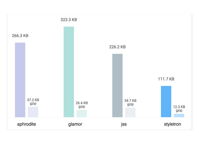
A completely different thing is CSS-in-JS. When working with an application that is rendered on the server, extracting critical CSS is not just optimization — CSS-in-JS on the server a priori requires that critical CSS be used first. For example, when using Aphrodite, the system keeps track of which styles are used in a single draw pass using its css function, which is called inline when classes are applied to your elements.
import { StyleSheet, css } from 'aphrodite' const styles = StyleSheet.create({ title: { ... } }) const Heading = ({ children }) => ( <h1 className={css(styles.heading)}>{ children }</h1> ) Even though all our styles are defined in JavaScript, you can easily extract styles for the current page into static CSS strings that can be inserted into the document header when drawing on the server.
import { StyleSheetServer } from 'aphrodite'; const { html, css } = StyleSheetServer.renderStatic(() => { return ReactDOMServer.renderToString(<App/>); }); CSS-: const criticalCSS = ` <style data-aphrodite> ${css.content} </style> `; If you looked into the React server rendering model, then this pattern might seem very familiar to you. In React, your components define their markup in JavaScript, but they can be drawn on the server as a regular HTML string. If you create your application with regard to the progressive extension, despite the fact that it is written entirely in JavaScript, then the client may not need JavaScript at all. Anyway, client-side JavaScript-delivery includes the code necessary for loading your one-page application, which is unexpectedly called and from that moment drawn on the server.
Since the rendering of your HTML and CSS on the server is done simultaneously, libraries like Aphrodite often help us organize the generation of critical CSS and HTML rendering on the server in one call, as we saw in the previous example. Now we can similarly draw React components in static HTML.
const appHtml = ` <div id="root"> ${html} </div> ` Using CSS-in-JS on the server not only allows our one-page application to continue working without JavaScript, but can even speed up its rendering . As in the case of defining the scope for our selectors, the best technique for rendering critical CSS is now not used by default, but by default.
Chapter 3. More competent optimization
Recently, we have seen the emergence of new ways of structuring CSS — for example, Atomic CSS and Tachyons — which eschew “semantic classes” in favor of small, specialized classes. For example, when using Atomic CSS, you use classes with syntax like functions, which can therefore be used to generate the corresponding style sheet.
<div class="Bgc(#0280ae.5) C(#fff) P(20px)"> Atomic CSS </div> The goal is to keep our CSS package as compact as possible by maximizing class reuse, treating classes as inline styles. This benefits the file size, and the effect on the code base and the members of your team is completely insignificant. The very nature of these optimizations involves changing both CSS and markup at the same time, which makes them more important from an architectural point of view. As already mentioned, when using CSS-in-JS or CSS-modules, you no longer need to hard-write in the markup class strings. Instead, it uses dynamic references to JavaScript values that are automatically generated by the library or build tool.
Instead of this:
<aside className="sidebar" /> We write this:
<aside className={styles.sidebar} /> It may look like a very superficial change, but in fact it’s a monumental shift in how we manage the relationships between markup and styles. By giving the CSS toolkit the ability to transform not just the styles, but the final classes that we apply to the elements , we thereby opened up a completely new class of style sheet optimizations.
In the previous example, 'styles.sidebar' calculated into a string, but nothing restricts it to a single class. As far as is known, this can be a string from more than a dozen classes.
<aside className={styles.sidebar} /> // Could easily resolve to this: <aside className={'class1 class2 class3 class4'} /> If you can optimize our styles by generating several classes for each set of styles, you can do some really interesting things.
My favorite example is Styletron .

Just as CSS-in-JS and CSS-modules automate the process of adding prefixes a la BEM to classes, so Styletron does the same for Atomic CSS. The main API is tailored to one task: determining specific CSS rules for each combination of property, value, and media query, which the auto-generated class then returns.
import styletron from 'styletron'; styletron.injectDeclaration({ prop: 'color', val: 'red', media: '(min-width: 800px)' }); // → 'a' Of course, Styletron provides higher-level APIs, such as the injectStyle function, which allows you to simultaneously define several rules.
import { injectStyle } from 'styletron-utils'; injectStyle(styletron, { color: 'red', display: 'inline-block' }); // → 'ad' injectStyle(styletron, { color: 'red', fontSize: '1.6em' }); // → 'a e' Of particular note is the commonality between the two sets of class names generated above. By rejecting low-level control over the classes themselves, defining only the desired set of styles, we allow the library to generate an optimal set of atomic (atomic) classes on our behalf.
Manual optimizations — usually finding the most efficient way to split styles into reusable classes — can now be fully automated. This trend you might notice here. Atomic CSS is the default, not optional.
Chapter 4. Package Management
First, ask yourself a deceptively simple question:
How do we share CSS with each other?
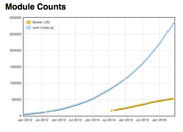
We migrated from manually downloading CSS files to special server-side package managers like Bower , and then through npm to tools like Browserify and webpack . Even though some of the tools automated the process of incorporating CSS from external packages, the front-end community for the most part adhered to manually including CSS dependencies.
At the same time, there is one thing for which CSS dependencies are not too good: dependency on other CSS dependencies. As many of you remember, we observed a similar effect with JavaScript modules between Bower and npm. Bower was not associated with any particular format of modules, while the modules published in npm used the CommonJS format . This has had a major impact on many of the packages published on each platform.
Complex trees of small, nested dependencies were well perceived in npm, while Bower was prone to large, monolithic dependencies, which could have two or three - plus several plug-ins, of course. Since dependencies did not have a modular system that could be relied on, packages could not simply use their own dependencies, so they had to integrate manually, and by the consumers themselves.
As a result, the number of packages per npm grew exponentially, while Bower had almost linear growth. Of course, there were various reasons for this, but honestly, for the most part this was a result of how both platforms allowed (or did not allow) packages to depend on each other in the process of implementation.
Unfortunately for the CSS community, this all looks very familiar. We also observed relatively slow growth of monolithic packages compared to JavaScript packages at npm. What if we wanted to match the exponential growth of npm? What if we wanted to be able to depend on complex hierarchies of packages of different sizes, without focusing on large, all-inclusive frameworks? For this, we not only needed a package manager who would perform the task, we also needed the appropriate format of modules.
Does this mean that we needed a package manager designed specifically for CSS? For preprocessors like Sass and Less? What is really interesting is that we have already gone through a similar implementation in HTML. If you ask the same question in relation to how we share markup with each other, you will quickly notice that we almost never directly share pure HTML - we share HTML-in-JS. This is done through jQuery plugins , Angular directives and React components . We collect large components from small ones, each with its own HTML, each independently published in npm. As HTML, this is not strong enough, but by embedding HTML into a fully-formed programming language, we were able to easily get around this limitation.
But what if, as with HTML, we would share CSS — and the logic it generates — via JavaScript? What if instead of mixins we would use functions returning objects and strings ? If instead of extending classes, we simply merged objects with Object.assign, or used a new object spread operator ?
const styles = { ...rules, ...moreRules, fontFamily: 'Comic Sans MS', color: 'blue' } Having started writing styles in a similar way, we can now combine and share style codes in the same way as any other application code, using the same patterns, the same tools, the same infrastructure, the same ecosystem . As it begins to pay off, it is beautifully reflected in libraries such as Polished .
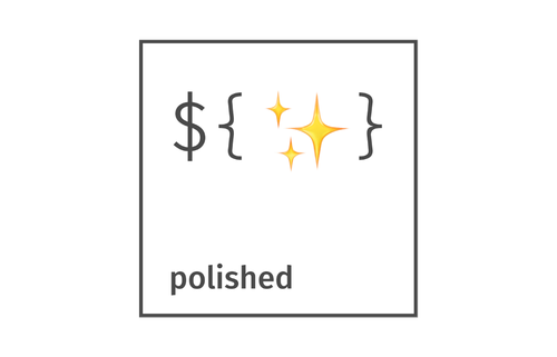
Polished is essentially Lodash in the world of CSS-in-JS. It provides a complex set of mixins, color functions, abbreviations, and so on, making the process of authoring styles in JavaScript much more familiar to those developers who come from languages like Sass . The key difference is that now this code is much more convenient for combining, testing and transferring to others; it is able to use the entire ecosystem of javascript packages.
Returning to CSS, how do we achieve the same level of opensource activity characteristic of npm by combining large collections of styles from small, reusable opensource packages? Oddly enough, we can finally come to this by embedding CSS in another language and fully embracing JavaScript modules.
Chapter 5. Non-browser styling
So far, all the points considered - which are much simpler when writing CSS in JavaScript - are by no means impossible when using regular CSS. Therefore, I left the most interesting thing in the end. Something that does not necessarily play a huge role in the current CSS-in-JS-community, it is quite possible in the future may become the foundation in design . Something that influences not only developers, but also designers, radically changing the interaction of these two disciplines. But first, let's take a brief excursion into React.
The model used in React is tied to components that render an immediate representation of the final result. When working in the browser, instead of directly manipulating DOM elements, we build complex virtual DOM trees. Interestingly, drawing in the DOM is not part of the main React library, it is provided by react-dom .
import { render } from 'react-dom' Although React was first created for DOM, and is still mostly used in this environment, the model itself still allows React to be used in a variety of environments simply by introducing new renderers.
JSX is not just a virtual DOM, it's virtual anything . , React Native , JavaScript - , . div span View Text . CSS, React Native , StyleSheet API :
var styles = StyleSheet.create({ container: { borderRadius: 4, borderWidth: 0.5, borderColor: '#d6d7da', }, title: { fontSize: 19, fontWeight: 'bold', }, activeTitle: { color: 'red', } }) , , . UI-. , .
var styles = StyleSheet.create({ container: { display: 'flex' } }) , , React Native flexbox . JavaScript- css-layout , flexbox JavaScript ( ). . , — Yoga .

Yoga CSS- , CSS-. «Yoga , CSS». , CSS-, , CSS .
Yoga , flexbox. , , opensource-, .
React Native for Web react-native. (bundler) Webpack .
module: { alias: { 'react-native': 'react-native-web' } } React Native for Web React Native , React Native StyleSheet API .
, react-primitives , , .
Microsoft ReactXP , , - , .
, , , . , — react-sketchapp .

, , . , , , , , — « » (living style) . , , — Sketch — . react-sketchapp.
JavaScript API , Sketch, React , react-sketchapp React- Sketch-.

, . , , , , — . Sketch React , , . , React- .
. , , Relay Apollo , . , . , — . .
, , — , . , , , , , opensource-. , , , , -.
, , — -.
, SEEK « » , , . , . , — , , production.
import { PageBlock, Card, Text } from 'seek-style-guide/react' const App = () => ( <PageBlock> <Card> <Text heading>Hello World!</Text> </Card> </PageBlock> ) React, Webpack CSS-, , , CSS--JS. , . - , . , CSS--JS, , .
CSS--JS , , . , . - — , CSS , CSS- -. CSS-. , , CSS . , - , CSS- . , . , — , .
CSS-, JS- , - , -. , , .
, , . , CSS--JS , , , - .
, , . , CSS- -, . , , , — — .
')
Source: https://habr.com/ru/post/334704/
All Articles