5 fresh examples of parsing and improving the design in simple ways

Hello! In the VKontakte community there is a rubric in which we give subscribers design tips. We show what can be changed in graphics to make the design look neater and clearer. Today, on the example of the participants in our column, consider what techniques can refresh your design. We will select the following participants from comments on Habré - throw your design and questions directly in the comments on this article.
Stop Cheating: separating elements

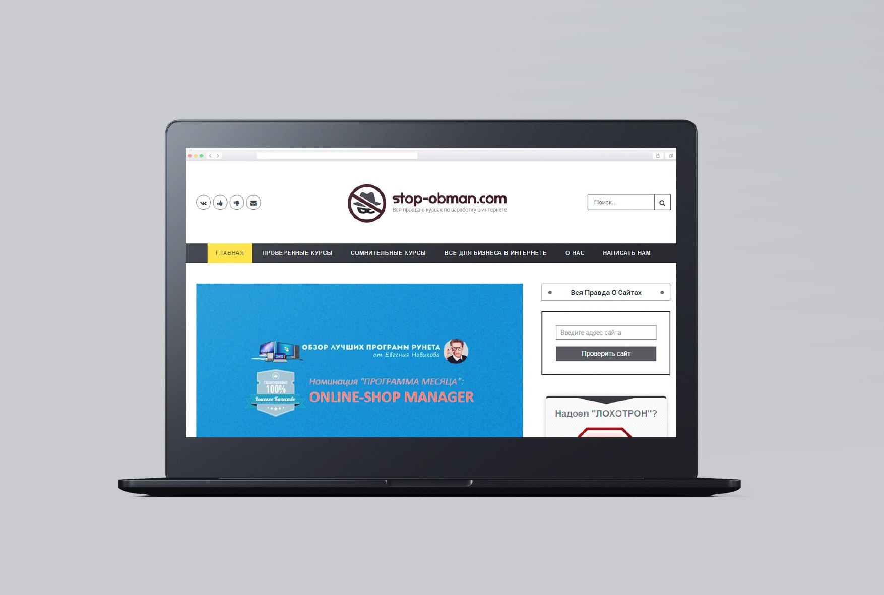
This logo was sent to us by Stop Cheating - a team of enthusiasts who are exposing fraudulent online courses.
')
The sign is not bad, but it has one drawback - it is hard to read, small details merge.
To improve readability, we simplify the sign - we leave only the hat and glasses from the character and separate all the elements from each other.
Check how it looks in a small format and with blur:
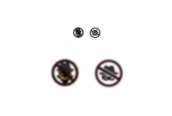
Separate elements do not merge into a dark spot, as it was in the old version of the logo.
Let's try a logo on stickers of different formats:

Let's fantasize about the logo and its application in life:
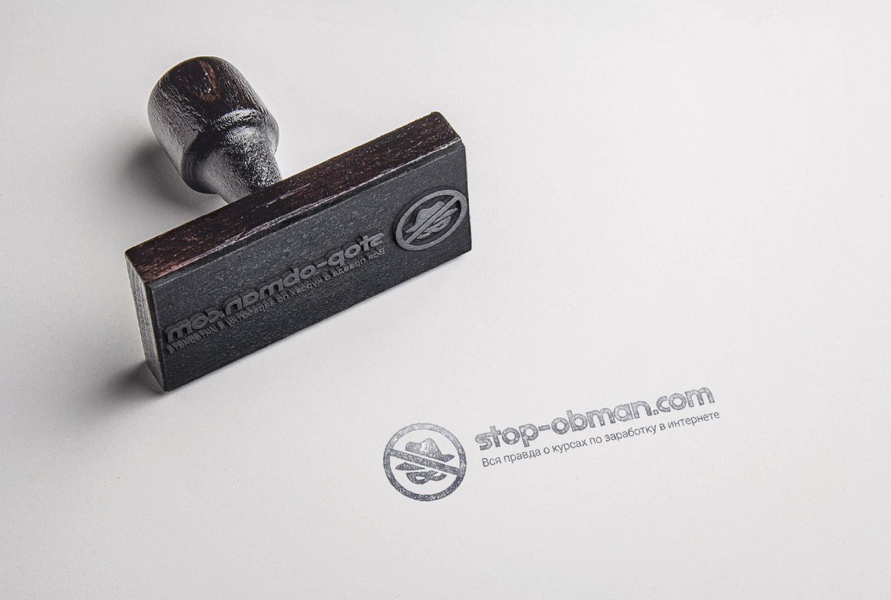
As a result:
+ The sign is better read
- A hat and a mask are not always associated with a criminal. It may be similar to the incognito mode.
Internet hosting center: calm composition
We were sent the following logo:

Here, each word looks different, they have different letter spacing and thickness of letters. Therefore, it is worth reassuring the font part - type the name in a neat font.
You can play with the colors of the mark too - in the initial version there are a lot of black blocks. You can use 3 primary colors and shades.
Total:
+ The composition has become more confident
- The idea itself is pretty boring.
3. SOHO: improve readability and add expression
SOHO is developing websites. The initial logo looks interesting, but reading the name is not so simple, and the shape of the letter “S” may be associated with a coffee bean.
If the readability of the name is not important, you can go further and make it more expressive and minimalist. Remove the association with coffee and add elements similar to a digital clock:

Such a logo will stand out and attract attention, but it is absolutely unreadable.

If you want the name to be read, it is better to choose a more classical form of letters. For example, letters with a large area. They can be used as a basis for different patterns:
Applicable to SOHO:

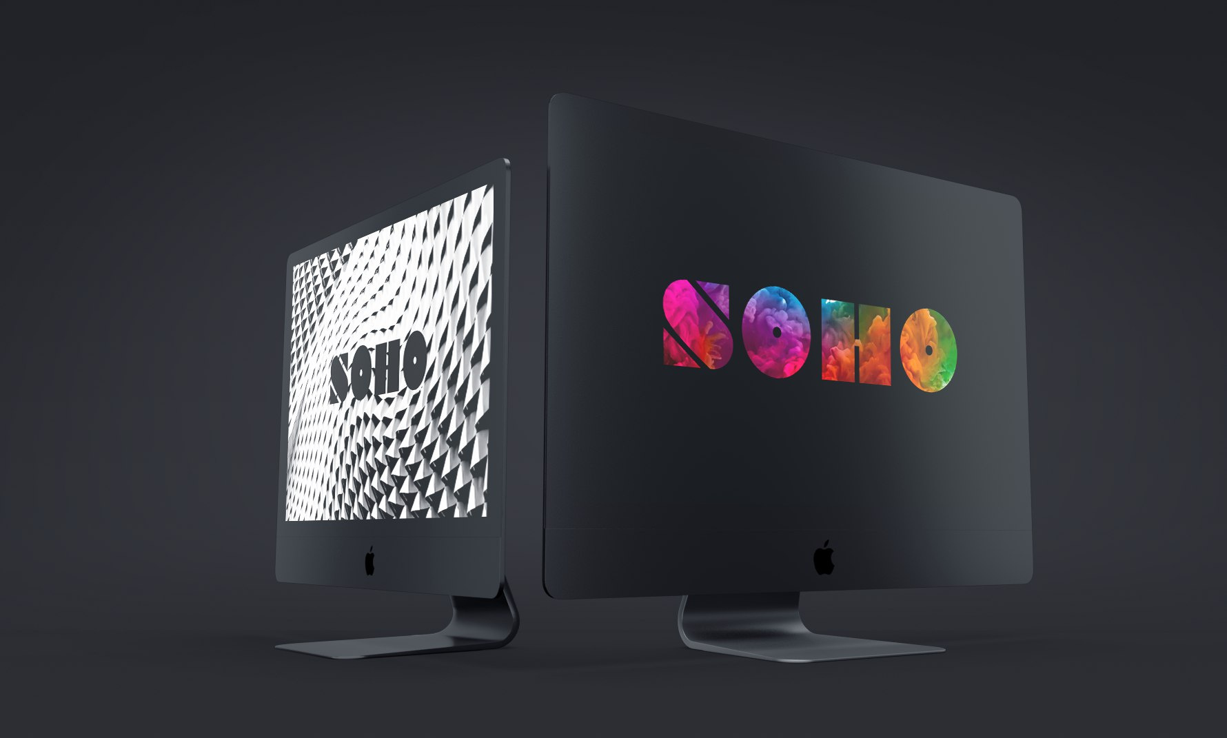
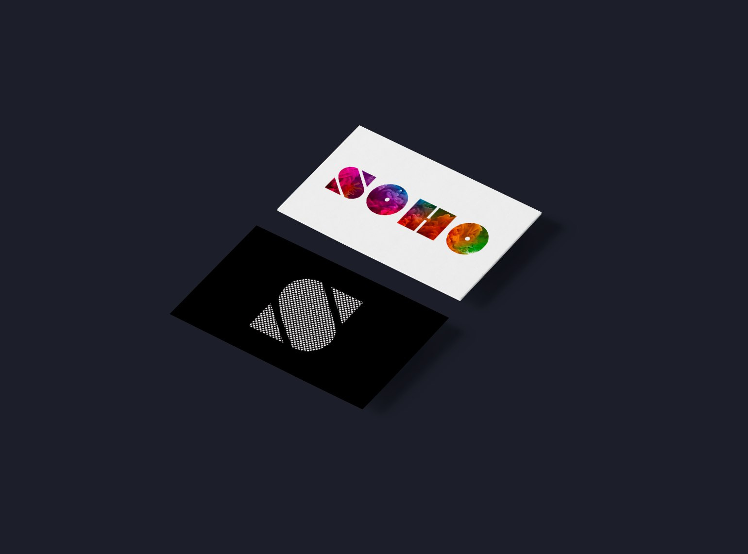
And the letter “S” with the corporate pattern can be used as a separate sign.
Total:
+ Name can be read
+ No association with coffee
- There is no association with something computer, and this may be important.
Glitch: strengthen the idea
Glitch is an animation lab, the guys are crazy creatives and they displayed it in the logo.
Here you can advise to maximize the logo. “Glitch” - means failure, interference, glitch, so let's add this to the maximum!

For cases where you can not use the full version of the logo, you can use it more relaxed version - on the plate.

Social networks, you can also make them crazy!

As a result:
+ Now the logo idea is read immediately.
- Such a logo is difficult to use on media
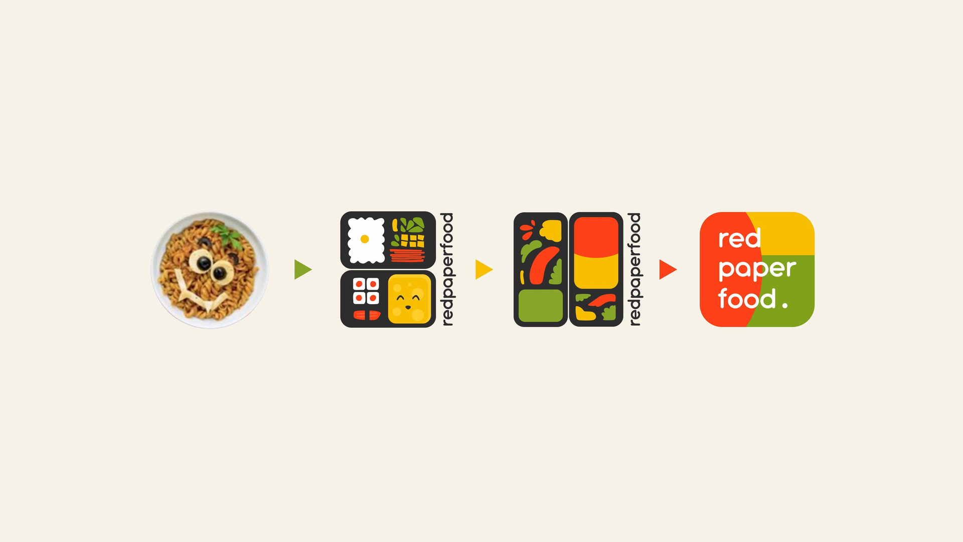
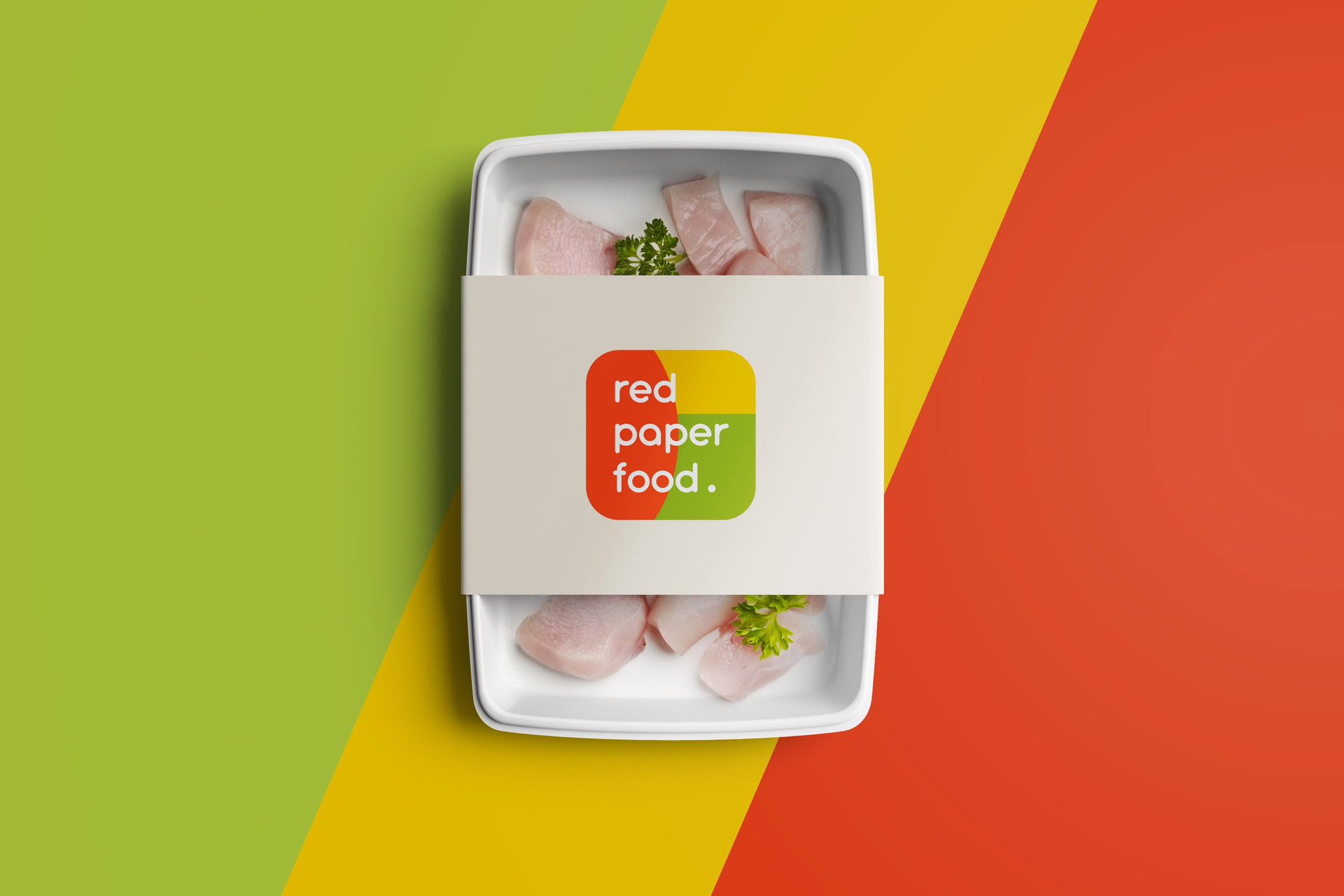
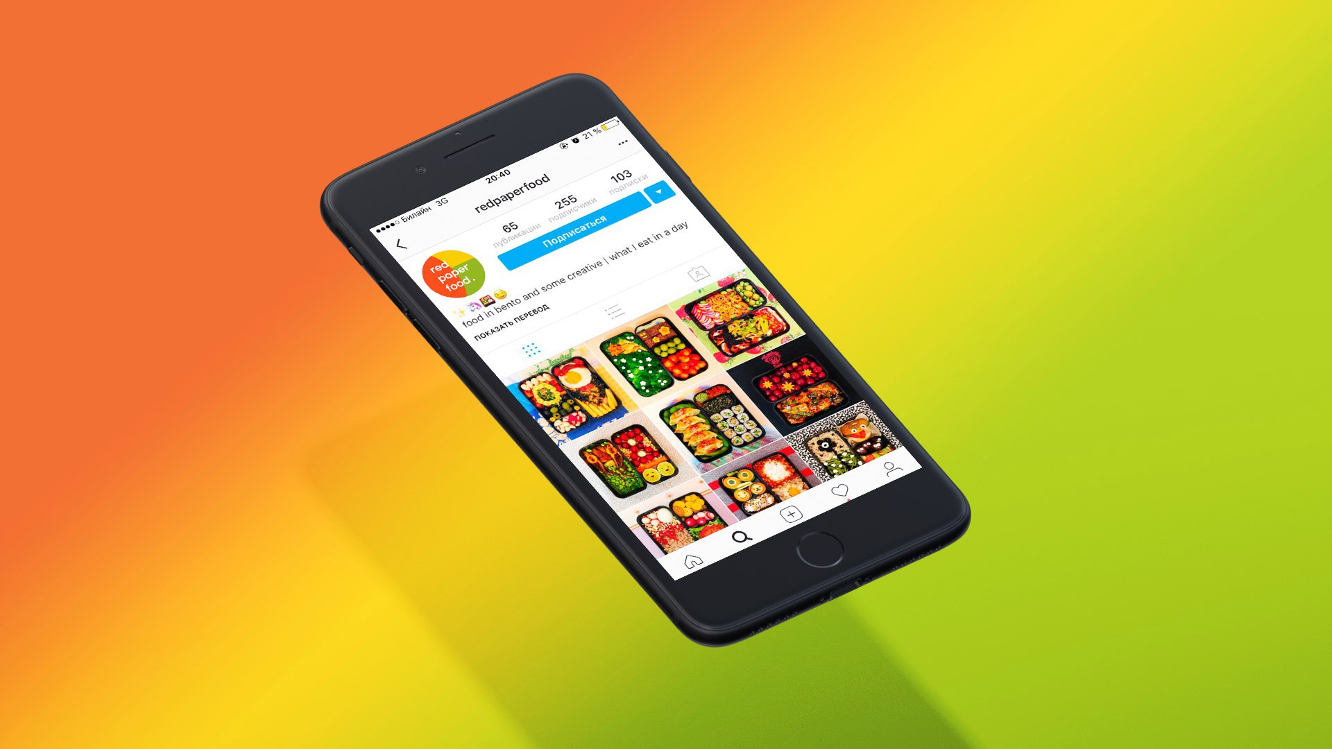
Red Paper Food: developing the idea
Red Paper Food is a very interesting project. This is a programmer's instagram account in which the author places photos of his bento lunches. It looks bright and incredibly tasty!
On the avatar as a logo, a photo of a smiling plate with noodles was used. The idea of this photo was very popular with our participant, so we offered several options for rethinking the idea, from more complex to simple.
The main thing is that the channel will have a proprietary combination of colors that will help it become recognizable.

Let's summarize:
We talked about a few simple tricks with which you can improve your design. Do not forget - this is a defective redesign, but simply quick tips and directions that seem to us promising.
And now attention! For Habrahabr users, it is possible to easily get into the next issue. Post your design and questions in the comments under this post, tell us a little about the project, and the next time we will select participants from the comments.
We will help with graphic advice, source codes can be picked up for free - of course.
You can read previous issues on the links:
→ First release
→ Second Edition
See you, and of course, successful design of your projects!
Prepared by Victoria Slepchevich for Log Machine
Source: https://habr.com/ru/post/334656/
All Articles