7 ways to use blue in your company colors
This article is about how to use blue in the logo and corporate style. We have collected the most popular shades and combinations of blue, you will know where they are used most often and what effect can be achieved with their help. This article will be useful to anyone who uses blue in the design of their project or still thinks what color to choose.
Classic blue
A source
A source
')
A source
The role of classic blue is a good guy. He is conservative, looks clean, tidy, soothes and inspires confidence. The main associations with blue are sky and water, cold and calm. Blue color goes well with white, it is convenient to use it as a background.
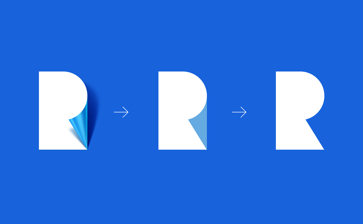
This is the favorite color of IT industry and social networks, electronics manufacturers, automotive giants and banks. The illustrations are the world famous companies: Twitter, Ford, Intel, Yota, Vkontakte, Windows 8, 10 logos and many, many, many others.
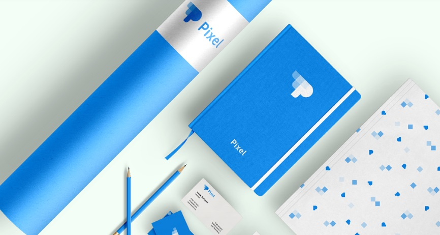
The logo machine, for example, used classic blue to create a light, airy style for Pixel. We relied on belonging to the industry, openness and professionalism of the project. Simple rounded elements at a great distance from each other and a warm shade of blue gave the desired effect.
A source
Classic blue does not cause rejection. It is suitable if you position your project as a reliable partner you can trust.
It is a symbol of creativity, openness and novelty. The designer uses the lightness of the shade to show the mood of the company - Ford uses a darker, Twitter, on the contrary - lighter, lighter.
Blue + red
A source
A source
A source
Designers love to use shades of blue in combination with bright, active colors. The most popular symbiosis is a pair of blue + red. This contrasting combination draws attention against the background of single-color competitors.
Famous examples are easily found in the motor oil industry: Mobil, Chevron, Valvoline. Love the two-color and automakers. The most popular example of a combination of blue and red is PEPSI. In this case, red in second place. Packaging and Pepsi advertising banners are a combination of blue and white.
Blue and red can be used in different proportions, depending on the emotions you want to evoke. For example, a red background with a blue sign can shock and cut eyes. Blue background and red sign - on the contrary, it calms, only hints at aggressive mood. Corporate identity built on a combination of these colors is like a man in a classic suit, who put on a tie with Mickey Mouse.
Menthol
A source
A source
A source
Menthol is located on the border between green and blue. So called shades, from aquamarine to aqua. It creates a feeling of freshness, lightness, tenderness and purity. The most popular associations with it are mint and the tropical sea.
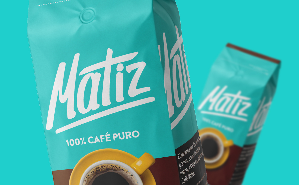
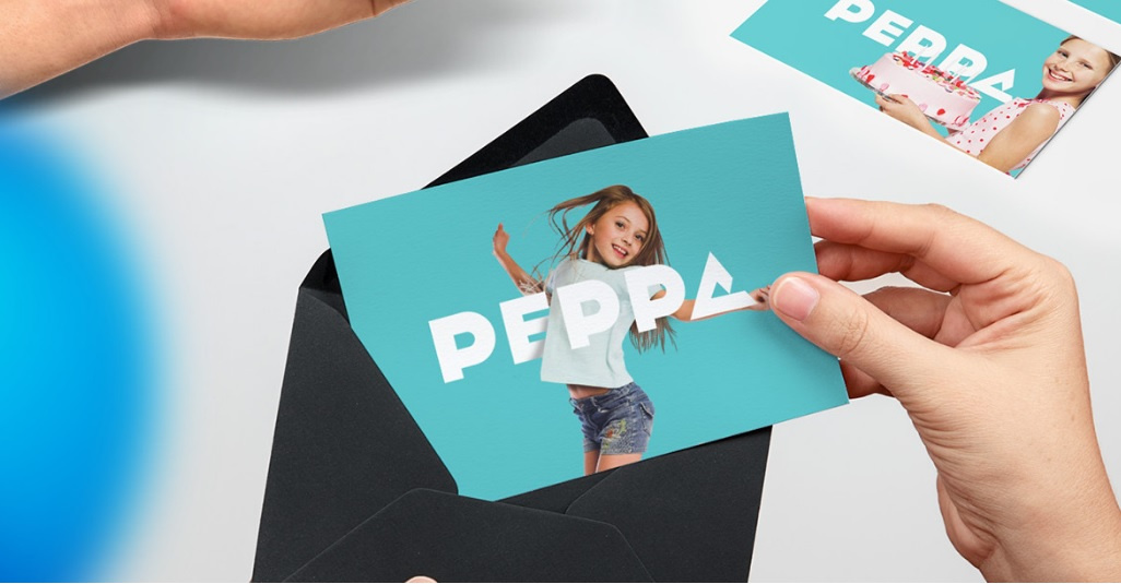
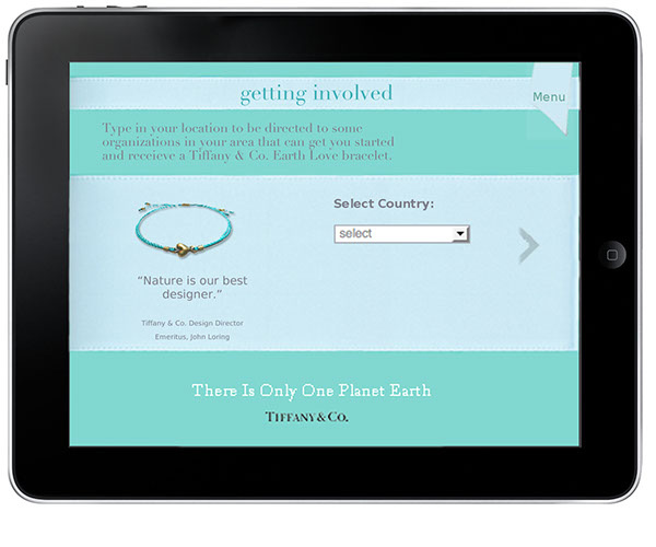
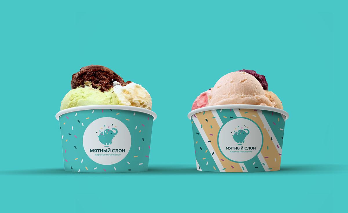
Coffee brand Matiz uses menthol as the main color, in combination with yellow, brown, red and purple - depending on the type of coffee. The manufacturer of natural cosmetics - 2b (Bio & Beauty) has built a corporate style on the combination of menthol and dark gray. Melez Tea, Made Coffee, the creators of user interfaces Blank - use it as a background. For American jewelers Tiffany & Co, menthol became a real cult. Our designers also chose a menthol color, creating a corporate identity for the Mint Elephant ice cream vendors. Associations with ease, freshness and closeness to nature approached companies best. Menthol is complemented with straw and white colors, as well as small multi-colored elements.
A source
Menthol is suitable for those who produce food or open a cafe, creative agencies, interior designers, lingerie sellers. It will help the project to become recognizable in any other field.
Ultramarine
A source
A source
A source
Color provocateur. The last twenty years it has been associated with the DOS computer screen, which is why it is sometimes called “computer blue”. Today, this is an allusion to the relationship with the industry's past ai-ti and its basics. Imagine a girl who came in an evening dress and, for example, sneakers - it is a provocation or an act of protest that attracts attention and is remembered.
Computer blue is a cold and austere color, with it often use a chopped sans serif font that has a common size for all letters of the alphabet, it is easy to read and is called grotesque.
Computer blue is slightly darker than classic, unnatural and very rich.
It is rarely used by large companies, only Western Digital comes to mind, but small creative teams or agencies that organize concerts, the creators of websites and software stand out against the general background with their bright blue “screens”.
When we developed corporate identity for Digital Motion, we used cool blue in combination with white and blue hues. The image is complemented by colorful "system" fonts, creating an association with the Windows interface.
A source
Computer blue - a risky move, which primarily speaks of your originality. Not everyone likes it, but it is a great way to stand out from the competition. This is color for projects with a narrow target audience, for example, manufacturers of subcultural clothing or exhibitions of contemporary art.
In any other area, it can also be used to destroy patterns. Ultramarine performs its task, if you, firstly, want to show that you are doing something special, and secondly, that you have a taste.
Blue is the base for other colors.
A source

A source
A popular technique that is used to create a feeling of brightness and diversity.
Publishers and software manufacturers choose dark blue as their primary color. Travel companies, cafes and clothing manufacturers - more pastel colors, emphasizing the lightness and attitude to the product, as to something made with their own hands. Both methods cause many people to trust, create a positive mood.
Based on this combination, travel companies Eccentric Travels, Sankeo, animation studio Gotham Pro Animated, financiers Open View and many others build their corporate identity. Interesting for our designers was the work on the corporate style of Crowd Back, a platform for creating polls and polls. The image was built on the association with direct speech and a pie chart, a hint of a variety of existing opinions. The letter “C” stylized as a graphic icon of direct speech became the central element of the style.

A source
Combining basic blue with many other colors is a good way to draw attention to your brand. Use motley decorated banners, posters and other media. Reception is suitable for large companies that have a wide choice of offers for the client - it can be wholesalers, online stores or an advertising agency with thousands of creative solutions.
Noble blue
A source
A source
A source
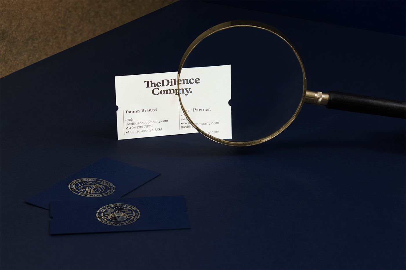
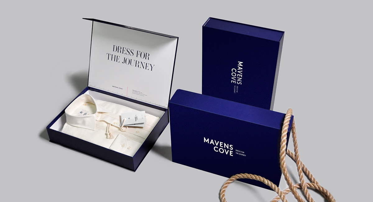
For many people, dark blue is associated with wealth and a privileged position. This is a great base for white, silver or gold and in this role dark blue successfully replaces black. The elements painted in silver, white or gold color stand out well against its background. It is easily combined with other shades of blue.
Dark blue is used by brands whose image is based on product quality or initially high status. Royal Blue is popular with government agencies, banks, law firms, luxury hotels and restaurants. Images of elitism, rigor and justified conservatism that bears a dark blue color are used as a “show of force”. The most famous examples are: GAP, Nivea, Maserati.
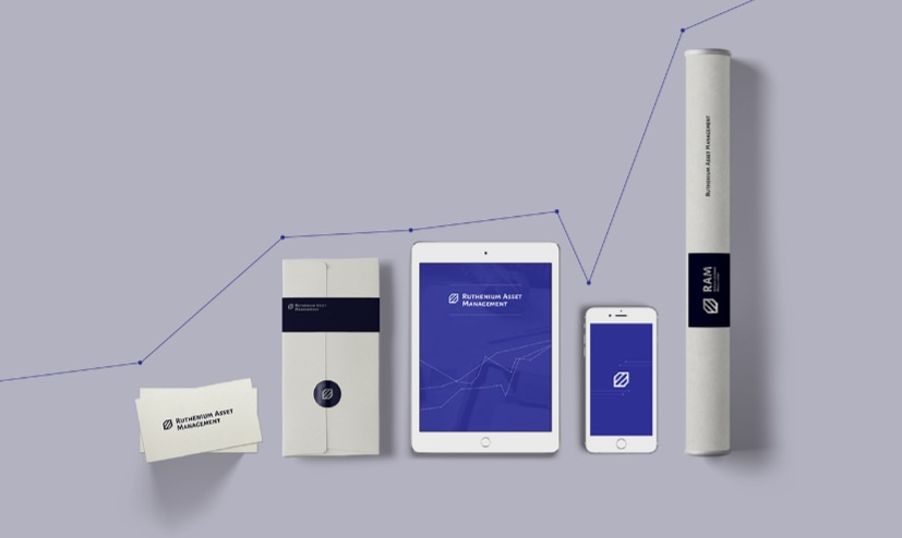
Ruthenium Asset Managment - we ordered a corporate identity, the core of which should have been the high status of the company, their special relationship to the product and the buyer. As a result - strict fonts and straight lines, the carriers are decorated in a combination of steel gray and noble blue.
A source
“I take what I do as seriously as possible” - this is the main message of this shade.
Under the dark blue flag you can sell elite spirits or caviar, provide legal services, sew custom-made classic suits. Royal blue - does not scream, does not invite and does not sell. But if you want to look and be a serious, responsible partner who deserves a special customer relationship - this is a big step towards creating such an image.
Conclusion
Using blue color, you tell about yourself the main thing, it remains to choose the method that suits you the most. You have a lot of opportunities to create a memorable and recognizable corporate identity.
Source: https://habr.com/ru/post/334566/
All Articles