Unexpected Kotlin poll results: a small investigation
JetBrains recently conducted research among users of the Kotlin language. A simple survey about the expected new features gave unexpected results. Together with the organizer of the survey, we decided to investigate why this could happen.
The result was a story about statistics, tweets, conformity, suggestion and discounts on clothes.
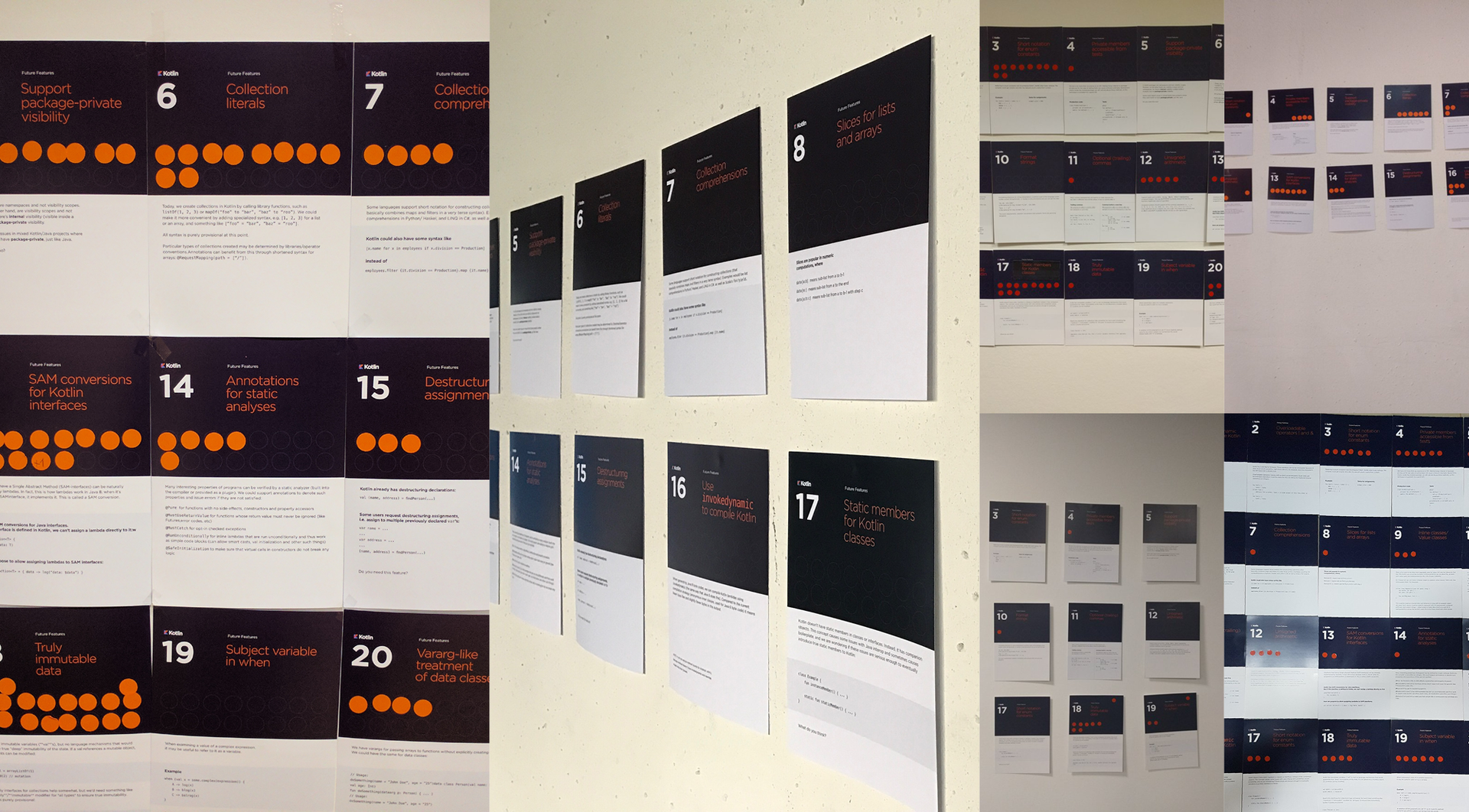
Figure 1. Photos from the survey results
')
The article may be of interest to those engaged in surveys and user research.
So, in the spring, international polls of Kotlin language users about the features they would like to see in the next release took place. Later in the blog Kotlin appeared post with the results of the study and a link to raw data .
The study was conducted in 2 stages. Some users of the language voted on the Kotlin 1.1 meetings, the second part filled in on-line questionnaires. The result was 2 ratings with 3 clear favorites in each (Fig. 2). And the favorites did not match.

Figure 2. Ratings of expected new features in Kotlin 1.2: results of off-line and on-line surveys
Why are the results of the two surveys so different from each other?
The organizers offered 2 explanations:
1. Differences groups. Participants of mitapov differ from other users of Kotlin.
2. Bias. On the off-line voting, participants saw what function others were voting for, and this could affect their opinion.
Let's try to understand in more detail why the results are different. We will conduct a small investigation and answer the questions:
1. Are there any differences between the participants of the meetings and other users?
2. Did the opinion of colleagues really affect the voices of the participants of the meetings?
3. Did the mitap participants and other users equally perceive the voting conditions?
4. Why did the top three get more votes than other functions in the on-line voting rating?
For a start, let's restore how the study went.
The survey consisted of 2 parts.
The off-line part was filled in by the participants of the meetings. Most of the meetings took place at the same time, on March 23, in 21 countries of the world (a total of 30 meetings). Their participants watched the live broadcast of the demonstration of Kotlin 1.1 functions, and then they could vote for the appearance of new functions. Some mitapas voted before the demonstration (Fig. 3). To do this, they were given 3 round orange stickers, which had to be attached to cards with a description of functions. It was possible to use 1 sticker for each function, or to vote with two, or all three stickers for one function. Now it is impossible to recover how many people participated in the voting in each mitap, since each community called the survey organizers only rating: the total number of stickers left for each function. 22 communities passed their ratings.
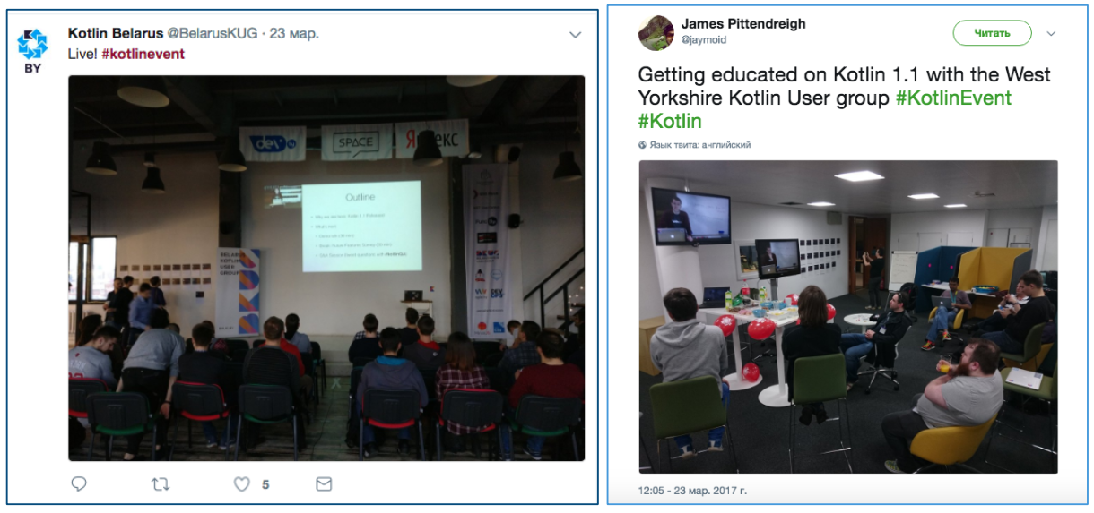
Figure 3: Photos from the Kotlin community tweets (there are voting cards on the walls)
On-line part of the survey passed after the off-line part. The Kotlin blog has an article with a video recording of the broadcast and a story about a survey conducted in communities. The article was written that the survey attracted a lot of attention, and now the creators offer to go on-line to everyone and "express their opinion about the future of Kotlin".
Participants were offered an on-line questionnaire with the same seemingly questions - about the expected functions of the language. At the end of the questionnaire were attached the same cards with the description of each function, which were used after the meetings. Additionally, a question about the most undesirable function was added to the questionnaire. 851 responses were received on the online questionnaire.
The data from both surveys were processed by simple summation. As a result, there were 2 lists - on-line and off-line ratings with 3 clear favorites in each (Fig. 2), the favorites did not match.
Only function # 18 “Truly immutable data” hit the top three at the same time in both polls. The first six more or less coincided with a mixed order, with the exception of two functions: function # 4 “Private members accessible from tests” in the on-line survey was only on the 12th line and scored maximum votes against, and function # 9 “Inline classes / Value classes ”in the off-line survey was on the 17th line.
So, leaders in both polls are:
# 18 Truly immutable data
# 1: Multi-catch
# 13: SAM conversions for Kotlin interfaces
# 6: Collection literals
# 8: Slices for lists and arrays
1. Are there really any differences?
The differences are clearly visible on the diagrams. But this is the first trap warned by researchers: the conclusion about the differences between groups is not made by simply counting the averages, or frequencies. There should be a joke about “hospital average”. The photo of off-line voting cards shows that opinion leaders turned out to have different functions at different meetings. And suddenly, participants' opinions differed greatly, and the resulting ratings are simply the result of random fluctuations?
Check the hypothesis
Such guesses are checked by statistics. But in our case, we got 2 different types of raw data: nominal data in on-line voting and quantitative data in off-line voting. Therefore, we will try to look simply at the correlations of the final lists. If it turns out that the correlation between the two lists is stronger than the correlation between the lists of mitaps, this will mean that there is less agreement among the participants of different mitaps than between all the participants of the mitap and the participants of on-line voting. And this will mean that it is impossible to conclude that the participants of the meetings and the participants of on-line voting are two essentially different groups.
Spearman's correlation coefficient between on-line and off-line voting turned out to be: r = 0.680, p = 0.001. In J. Cohen's classification for social studies, this is a rather high correlation indicator (> 0.5 is a significant correlation).
Now let's see how the assessments of mitaps correlate with each other. It turned out that there is not a single correlation between the lists of mitaps that exceeds the value of 0.680. The strongest correlation (0.618) was found between Belgium and Berlin. Moreover, there were even negative correlations (for example, -0.454 between Lima and Budapest: it would be interesting to find out if there is an explanation for these differences).
In other words, participants of meetings in different countries are less likely to agree with each other than they generally agree with on-line users.
Like, global differences between groups now can not talk. But the question remains: why are the results distributed exactly this way, why are there any clear favorites in the ratings, who have gained significantly more votes? What else could affect the voices of the participants?
2. Did participants influence each other?
According to the organizers of the study, a joint vote at the meeting could affect the answers of participants, change their opinion.
If this were the case, the answers within the groups would be distributed crowded, with a small spread (in the groups everyone would have voted about the same).
Check the hypothesis
Let's try to restore how the voting took place. Look for Twitter. Here, under the hashtags #kotlin and #kotlinevent you can find many photos of meetings and polls (Fig. 4). Indeed, the photo shows that participants voted together and, possibly, discussed their ratings.

Figure 4. Tweets of participants of mitaps with voting photos
Let's display in one voting diagram the mitaps (Fig. 5). It is difficult to visually evaluate how each mitp voted, but it is clearly seen how the assessments were differently distributed (this distribution once again confirms our hypothesis of a weak relationship between the groups).
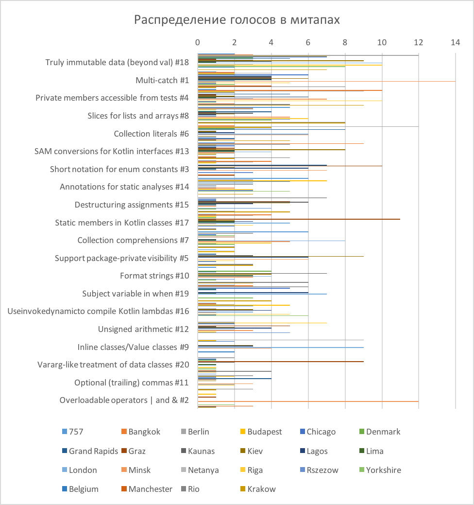
Figure 5. The distribution of votes in mitapah
The diagram shows that the mark "1" was put more often than others. That is, in all groups, with the exception of Berlin and Belgium, there were functions for which one person voted with one sticker. In Belgium, only 6 votes participated (they were distributed by 2 votes for 3 functions), and in Berlin there were just a lot of participants (90 votes). So, in almost all communities there were participants whose opinions did not coincide with the majority.
To check the unanimity of the participants in each community, we estimate the variation of the estimates in the groups. Due to the specific data type, the standard deviation inside the groups will not work. But it turns out to see how many ratings other than 0 were put in each group. This way we will find out in which groups the participants voted for approximately the same functions, and in which groups for the different ones (Table 1).
Table 1. The number of functions and the total number of votes in the voting mitapov.
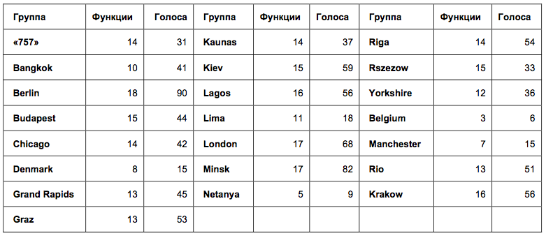
In the table of names of mitaps, the numbers mean: the number of functions for which votes were cast, and the total number of votes from the mitap. The larger the first digit, the less agreement there was between the participants. It turned out that in all groups except the 3 smallest, the votes were given for more than 10 different functions. Such a scatter of ratings suggests that the participants voted quite independently. If they imitated each other, the votes would be given, for example, for 3 identical functions.
So, according to the distribution of votes, it is possible to draw a conclusion about the independent voting of the participants of the meetings. And at first I readily made such a conclusion. But then, having discussed my conclusion with the organizers of the study, I received a logical question: did the choice in the group of 10 functions out of 20 (that is, only half of the proposed ones) indicate a large dispersion of votes? Is this data sufficient to conclude that the voting of the participants was not consistent?
To check this, look at the data in a different way. The diagram shows that there were emissions in many meetings: some functions received significantly more points than others, the majority of participants voted for them. Check the normality of the distribution of estimates in mitapah using the Kolmogorov-Smirnov criterion. When using the Kolmogorov-Smirnov criterion, the deviation from the normal distribution is considered significant if the p value is <0.05.
So, the distribution of assessments turned out to be close to normal only in the groups of Laos, London, Minsk, Rio and Krakow (at the border, p = 0.047). In the remaining groups, the estimates have shifted significantly. To get a better look at these emissions, I calculated how many participants in the mitap allegedly voted for one function.
If we assume that each participant voted with one sticker for one function, then we can approximately calculate the percentage of participants who chose the same function:
Now let's see what percentage of the participants voted for the most popular function in each mitap (Table 2).
Table 2. Maximum estimates and shares of participants in mitapov who voted for them *.
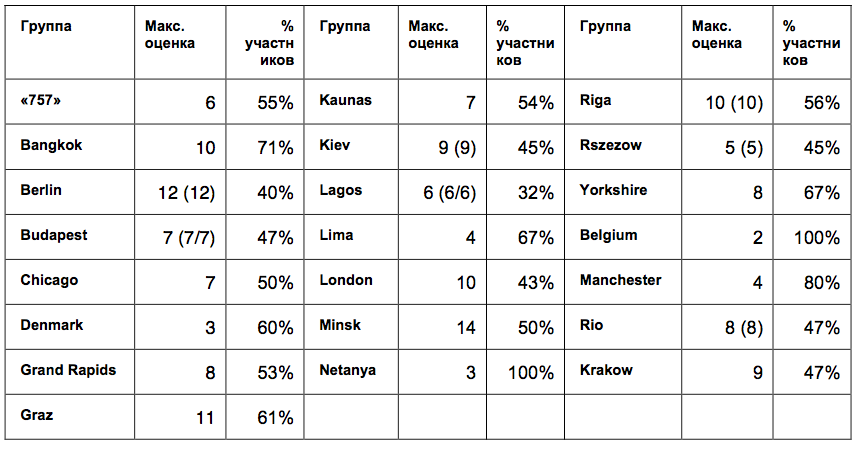
* In parentheses are duplicate values if the highest score was given to several functions.
It turns out that in almost all groups more than half of the participants voted for the same function. In the smallest groups, the proportion of unanimous participants reached the highest values: Bangkok - 71% of 14 participants; Manchester - 80% of 5 participants, Netanya - 100% of 3 participants; Belgium - 100% of 3 participants. And in large groups, on the contrary, consistency was lower: Berlin - 40% of 30 participants; London - 43% of the 23 participants; Laos - 32% of 19 participants, but against them, Minsk turned out to be quite coordinated with a large group - 50% of 28 participants.
It turns out that the answers of more than half of the participants in each meeting were coordinated, but at the same time they differed between meetings, which excludes the possibility of preference for a single function by all Kotlin users. And this suggests that inside the mitap, users still focused on some common point of view about the functions. And the smaller the group was, the more similar were the responses of its members.
So, there is reason to believe that community members expressed a consensus. And the consistency of the answers was the higher, the smaller the group was. But these calculations are approximate, since we assumed that each participant voted once for each function. Participants saw how others vote. What else could it affect? Probably, participants could copy not only the answers, but also the manner of voting.
If, for example, in some communities, the first responders used 2, or 3 stickers for one function, such a voting pattern could be repeated by others, which would affect the distribution of answers. Let's discuss this in more detail.
3. Were the study conditions the same?
This is a more interesting question from the point of view of research methodology. Two distributions have 3 clear favorites. Why did they stand out if the scatter of estimates was large? How similar were the conditions of both groups? And was this one study, or two completely different studies?
Imagine how the vote went.
When the participants of the meetings were given 3 round orange stickers, they had the opportunity to use them as coins: vote with two or three stickers for one function. And the conditions of on-line research could be perceived differently. Although it was written in the manual that one function can be selected twice or three times, the wording of the questions (“The most expected feature 1”, “The most expected feature 2”, “The most expected feature 3”) seemed more likely to be a desire to choose in each question a new function (first, second, third).
Check the hypothesis
In the raw data of the on-line survey, it is clear that only 10 people voted for one function twice, and 8 people out of 851 three times. At the same time, 11 participants did not use all voting opportunities, answering only 2 questions out of 3.
What was off-line voting? We can only draw indirect conclusions from raw data. For example, out of 22 meetings in 10, the total number of votes is not a multiple of 3. That is, in 10 meetings (at least) one or several participants also used not all stickers when voting.
Further, in the rankings of mitaps, it is clear that in 20 mitapes of 22 there are functions with 1 vote (one participant voted for them with one sticker). So, there were also people at the mitapas who did not give all their votes for one function. But how many such people were compared with on-line voting is difficult to understand from the data.
We asked several mitaps how often the participants voted for one function with two or three stickers, and received answers so far only from Kiev and Minsk. The organizers said that participants rarely pasted a few stickers for the function. Usually voted with one sticker for one function.
So, while it is impossible to confirm or refute the hypothesis that the participants of the meetings and the participants of the on-line survey did not understand the voting instructions in a different way. So far, the arguments indicate that in both cases, participants more often voted for three different functions, regardless of the method of voting.
4. "Three - seven - ace." Or maybe there was a suggestion?
The question does not leave me: why did such leaders stand out in on-line voting: # 6 (with a margin) - # 13 - # 18?
128 people from 851 were chosen as the first function, 98 people as the second and 60 - the third. Of these, only two chose feature # 6 twice. 15 people voted for her as unwanted. That is, 284 participants voted positively for feature # 6, or every third participant voted.
At the same time, in the off-line voting in half of the groups no one, or almost no one, voted: in 10 groups, function # 6 received 0, or 1 vote. However, in group 1, she received the most votes and in the other two groups she shared first place with function # 18. The total number of votes cast for # 6 in off-line voting turned out to be 60 out of 941. This means that a maximum of 19% of the participants in off-line voting chose function # 6. In fact, there were fewer of them, since not everyone used 3 votes each, and some could vote again for the function.
Why did the on-line vote exactly for # 6, if in off-line surveys it was only in 6th place in the overall rating? Maybe something else influenced the answers of the participants?
Check the hypothesis
For a start, let's check if the nature of the on-line rating is different from off-line? Visually, the distribution of ratings in the off-line rating seems smoother. Let us compare the distribution of estimates with the normal distribution using the statistical Kolmogorov-Smirnov criterion.
Indeed, the deviation error from the normal distribution in the off-line rating is p = 0.087, while in the on-line rating the error is much smaller, p = 0.016. This means that the estimates in the off-line survey were distributed normally, and in the on-line survey, 3 functions were rated significantly higher. The visual assessment is not let down.
So, it remains to understand why these functions: # 6 - # 13 - # 18 won the vote by a margin.
Let us evaluate once again the conditions of the on-line survey.
The Kotlin blog post is published in which it is written that the off-line survey attracted a lot of attention . Then readers are also invited to vote and post a link to an on-line survey.
Let's look again at how the Kotlin blog post was designed. But before that, I’ll ask you to remember whether you’ve reviewed the first picture of the article you are reading now? Did you notice which cards had the most orange stickers on them? If you are familiar with the Kotlin language and are concerned about which features will be added in v.1.2, these cards probably mean something to you. If I were a developer, I would consider them precisely and try to understand why people voted for them.
So, I specifically chose the same picture collage that was posted on the Kotlin blog right above the invitation to take part in the survey as the title picture for the article. Let us consider it in more detail (Fig. 6). It turns out that on the very first (left) and the largest picture it is clearly visible that the most votes are for functions # 6, # 13 and # 18. Cards are placed in that order, card # 6 is visible better than others and is read first.
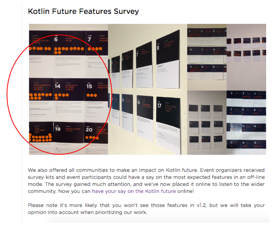
Figure 6. Fragment of a Kotlin blog post inviting on-line testing
Thus, a photograph with the results of the survey could have an impact on the participants' ratings (perceived, or unconscious) and change the distribution of votes. This is similar to the effect of the "binding effect", the effect of which on personal research I wrote in one of the past articles .
It is hard to believe that programmers working with the Kotlin language imitated the answers they saw in a random photo. On the other hand, the influence of the “binding effect” on answers in questionnaires has long been described in science and the picture was not so random. So, it can be assumed that photography could have an impact on some participants. In any case, this hypothesis will remain untested, since additional evidence would have to be organized to prove it.
Answer the questions posed at the beginning of the article:
1. Are there any differences between the participants of the meetings and other users? - Such a conclusion cannot be made, since there were more differences in the voting of the participants of the mitap than between the votes of all the participants of the mitap and other users.
2. Did the opinion of colleagues really affect the voices of the participants of the meetings? - Under certain assumptions, it can be concluded that the participants in the mitapas voted in concert. And the consistency of the answers was the higher, the smaller the group size was.
3. Did the mitap participants and other users equally perceive the voting conditions? - Different research conditions could lead to different voting patterns, which is why double and triple votes for the bottom function were more often given in meetings, and not during on-line voting. In order to prove it, not enough data. On the contrary, indirect arguments indicate that the majority of participants preferred to vote for 3 different functions.
4. Why did the top three get more votes than the others in the on-line voting rating? - Three functions in the on-line voting rating (# 6 - # 13 - # 18) are, indeed, significantly higher rated by participants. Perhaps this is due to the effect of “anchoring effect” due to the publication in the invitation to an on-line survey of a photograph in which cards with such numbers were rated higher than others.
So far this is all that I have been able to detect. If you have other ideas, or recommendations on the choice of statistical methods, I will be glad to see them in the comments.
If you have a case study of users, or employees, causing questions, please send: we will investigate.
I am grateful to Alina Dolgikh for the materials provided and critical discussion of the article, as well as to the participants of the “Statistics and Data Analysis” facebook community for their willingness to help in the choice of statistical methods.
The result was a story about statistics, tweets, conformity, suggestion and discounts on clothes.
Figure 1. Photos from the survey results
')
The article may be of interest to those engaged in surveys and user research.
So, in the spring, international polls of Kotlin language users about the features they would like to see in the next release took place. Later in the blog Kotlin appeared post with the results of the study and a link to raw data .
The study was conducted in 2 stages. Some users of the language voted on the Kotlin 1.1 meetings, the second part filled in on-line questionnaires. The result was 2 ratings with 3 clear favorites in each (Fig. 2). And the favorites did not match.
Figure 2. Ratings of expected new features in Kotlin 1.2: results of off-line and on-line surveys
Why are the results of the two surveys so different from each other?
The organizers offered 2 explanations:
1. Differences groups. Participants of mitapov differ from other users of Kotlin.
2. Bias. On the off-line voting, participants saw what function others were voting for, and this could affect their opinion.
Let's try to understand in more detail why the results are different. We will conduct a small investigation and answer the questions:
1. Are there any differences between the participants of the meetings and other users?
2. Did the opinion of colleagues really affect the voices of the participants of the meetings?
3. Did the mitap participants and other users equally perceive the voting conditions?
4. Why did the top three get more votes than other functions in the on-line voting rating?
For a start, let's restore how the study went.
Study procedure
The survey consisted of 2 parts.
The off-line part was filled in by the participants of the meetings. Most of the meetings took place at the same time, on March 23, in 21 countries of the world (a total of 30 meetings). Their participants watched the live broadcast of the demonstration of Kotlin 1.1 functions, and then they could vote for the appearance of new functions. Some mitapas voted before the demonstration (Fig. 3). To do this, they were given 3 round orange stickers, which had to be attached to cards with a description of functions. It was possible to use 1 sticker for each function, or to vote with two, or all three stickers for one function. Now it is impossible to recover how many people participated in the voting in each mitap, since each community called the survey organizers only rating: the total number of stickers left for each function. 22 communities passed their ratings.
Figure 3: Photos from the Kotlin community tweets (there are voting cards on the walls)
On-line part of the survey passed after the off-line part. The Kotlin blog has an article with a video recording of the broadcast and a story about a survey conducted in communities. The article was written that the survey attracted a lot of attention, and now the creators offer to go on-line to everyone and "express their opinion about the future of Kotlin".
Participants were offered an on-line questionnaire with the same seemingly questions - about the expected functions of the language. At the end of the questionnaire were attached the same cards with the description of each function, which were used after the meetings. Additionally, a question about the most undesirable function was added to the questionnaire. 851 responses were received on the online questionnaire.
Research results
The data from both surveys were processed by simple summation. As a result, there were 2 lists - on-line and off-line ratings with 3 clear favorites in each (Fig. 2), the favorites did not match.
Only function # 18 “Truly immutable data” hit the top three at the same time in both polls. The first six more or less coincided with a mixed order, with the exception of two functions: function # 4 “Private members accessible from tests” in the on-line survey was only on the 12th line and scored maximum votes against, and function # 9 “Inline classes / Value classes ”in the off-line survey was on the 17th line.
So, leaders in both polls are:
# 18 Truly immutable data
# 1: Multi-catch
# 13: SAM conversions for Kotlin interfaces
# 6: Collection literals
# 8: Slices for lists and arrays
Discussion
1. Are there really any differences?
The differences are clearly visible on the diagrams. But this is the first trap warned by researchers: the conclusion about the differences between groups is not made by simply counting the averages, or frequencies. There should be a joke about “hospital average”. The photo of off-line voting cards shows that opinion leaders turned out to have different functions at different meetings. And suddenly, participants' opinions differed greatly, and the resulting ratings are simply the result of random fluctuations?
Check the hypothesis
Such guesses are checked by statistics. But in our case, we got 2 different types of raw data: nominal data in on-line voting and quantitative data in off-line voting. Therefore, we will try to look simply at the correlations of the final lists. If it turns out that the correlation between the two lists is stronger than the correlation between the lists of mitaps, this will mean that there is less agreement among the participants of different mitaps than between all the participants of the mitap and the participants of on-line voting. And this will mean that it is impossible to conclude that the participants of the meetings and the participants of on-line voting are two essentially different groups.
Spearman's correlation coefficient between on-line and off-line voting turned out to be: r = 0.680, p = 0.001. In J. Cohen's classification for social studies, this is a rather high correlation indicator (> 0.5 is a significant correlation).
Now let's see how the assessments of mitaps correlate with each other. It turned out that there is not a single correlation between the lists of mitaps that exceeds the value of 0.680. The strongest correlation (0.618) was found between Belgium and Berlin. Moreover, there were even negative correlations (for example, -0.454 between Lima and Budapest: it would be interesting to find out if there is an explanation for these differences).
In other words, participants of meetings in different countries are less likely to agree with each other than they generally agree with on-line users.
There is an interesting example from social psychology about this effect.
Despite traditional ideas, scientific studies show that differences between groups (between men and women) are often less significant than differences within gender groups (for example, only between women).
Thus, in different countries, studies of mathematical abilities in boys and girls were conducted. In some countries, boys did better, in other countries - girls. Everywhere differences were statistically significant. And if we only knew about one such study, it could form our understanding of the mathematical abilities of men and women. But scientists conducted a meta-study and checked for variations within groups. In most countries, the differences between boys and girls turned out to be less than the differences within groups of boys and girls ( D. Baker, D. Jones, 1993 ).
Often, groups that seem to be obviously different to us have even more variation inside. It is especially interesting to learn about such studies within racial groups ( Zuckerman, 1990 ).
Like, global differences between groups now can not talk. But the question remains: why are the results distributed exactly this way, why are there any clear favorites in the ratings, who have gained significantly more votes? What else could affect the voices of the participants?
2. Did participants influence each other?
According to the organizers of the study, a joint vote at the meeting could affect the answers of participants, change their opinion.
If this were the case, the answers within the groups would be distributed crowded, with a small spread (in the groups everyone would have voted about the same).
Check the hypothesis
Let's try to restore how the voting took place. Look for Twitter. Here, under the hashtags #kotlin and #kotlinevent you can find many photos of meetings and polls (Fig. 4). Indeed, the photo shows that participants voted together and, possibly, discussed their ratings.
Figure 4. Tweets of participants of mitaps with voting photos
Let's display in one voting diagram the mitaps (Fig. 5). It is difficult to visually evaluate how each mitp voted, but it is clearly seen how the assessments were differently distributed (this distribution once again confirms our hypothesis of a weak relationship between the groups).
Figure 5. The distribution of votes in mitapah
The diagram shows that the mark "1" was put more often than others. That is, in all groups, with the exception of Berlin and Belgium, there were functions for which one person voted with one sticker. In Belgium, only 6 votes participated (they were distributed by 2 votes for 3 functions), and in Berlin there were just a lot of participants (90 votes). So, in almost all communities there were participants whose opinions did not coincide with the majority.
To check the unanimity of the participants in each community, we estimate the variation of the estimates in the groups. Due to the specific data type, the standard deviation inside the groups will not work. But it turns out to see how many ratings other than 0 were put in each group. This way we will find out in which groups the participants voted for approximately the same functions, and in which groups for the different ones (Table 1).
Table 1. The number of functions and the total number of votes in the voting mitapov.
In the table of names of mitaps, the numbers mean: the number of functions for which votes were cast, and the total number of votes from the mitap. The larger the first digit, the less agreement there was between the participants. It turned out that in all groups except the 3 smallest, the votes were given for more than 10 different functions. Such a scatter of ratings suggests that the participants voted quite independently. If they imitated each other, the votes would be given, for example, for 3 identical functions.
So, according to the distribution of votes, it is possible to draw a conclusion about the independent voting of the participants of the meetings. And at first I readily made such a conclusion. But then, having discussed my conclusion with the organizers of the study, I received a logical question: did the choice in the group of 10 functions out of 20 (that is, only half of the proposed ones) indicate a large dispersion of votes? Is this data sufficient to conclude that the voting of the participants was not consistent?
To check this, look at the data in a different way. The diagram shows that there were emissions in many meetings: some functions received significantly more points than others, the majority of participants voted for them. Check the normality of the distribution of estimates in mitapah using the Kolmogorov-Smirnov criterion. When using the Kolmogorov-Smirnov criterion, the deviation from the normal distribution is considered significant if the p value is <0.05.
So, the distribution of assessments turned out to be close to normal only in the groups of Laos, London, Minsk, Rio and Krakow (at the border, p = 0.047). In the remaining groups, the estimates have shifted significantly. To get a better look at these emissions, I calculated how many participants in the mitap allegedly voted for one function.
If we assume that each participant voted with one sticker for one function, then we can approximately calculate the percentage of participants who chose the same function:
Now let's see what percentage of the participants voted for the most popular function in each mitap (Table 2).
Table 2. Maximum estimates and shares of participants in mitapov who voted for them *.
* In parentheses are duplicate values if the highest score was given to several functions.
It turns out that in almost all groups more than half of the participants voted for the same function. In the smallest groups, the proportion of unanimous participants reached the highest values: Bangkok - 71% of 14 participants; Manchester - 80% of 5 participants, Netanya - 100% of 3 participants; Belgium - 100% of 3 participants. And in large groups, on the contrary, consistency was lower: Berlin - 40% of 30 participants; London - 43% of the 23 participants; Laos - 32% of 19 participants, but against them, Minsk turned out to be quite coordinated with a large group - 50% of 28 participants.
It turns out that the answers of more than half of the participants in each meeting were coordinated, but at the same time they differed between meetings, which excludes the possibility of preference for a single function by all Kotlin users. And this suggests that inside the mitap, users still focused on some common point of view about the functions. And the smaller the group was, the more similar were the responses of its members.
The behavior of others, indeed, has an impact on adult sensible people. This is described by many conformance experiments. But there are cases when not only group pressure, but also just a pattern of behavior of other people changes the actions of a person.
In the experiment of S. Milgram on the busy street of New York the accomplices of the experimenter stopped and began to look at one point, lifting their heads. It turned out that the number of passers-by joined them as the group grew. Ordinary people also stopped and started to look up, not knowing where the others were looking. The experiment was conducted with a different number of accomplices. The more there were (from 1 to 5), the more imitators they attracted. But after the size of the group of accomplices exceeded 5 people, the growth of imitators stopped. The group got bigger, but there were no more imitators.
In other studies, Gerard (1968) and Rosenberg (1961) , it was also shown that an increase in the group over 5 people leads to a decrease in conformity.
So, there is reason to believe that community members expressed a consensus. And the consistency of the answers was the higher, the smaller the group was. But these calculations are approximate, since we assumed that each participant voted once for each function. Participants saw how others vote. What else could it affect? Probably, participants could copy not only the answers, but also the manner of voting.
If, for example, in some communities, the first responders used 2, or 3 stickers for one function, such a voting pattern could be repeated by others, which would affect the distribution of answers. Let's discuss this in more detail.
3. Were the study conditions the same?
This is a more interesting question from the point of view of research methodology. Two distributions have 3 clear favorites. Why did they stand out if the scatter of estimates was large? How similar were the conditions of both groups? And was this one study, or two completely different studies?
Imagine how the vote went.
When the participants of the meetings were given 3 round orange stickers, they had the opportunity to use them as coins: vote with two or three stickers for one function. And the conditions of on-line research could be perceived differently. Although it was written in the manual that one function can be selected twice or three times, the wording of the questions (“The most expected feature 1”, “The most expected feature 2”, “The most expected feature 3”) seemed more likely to be a desire to choose in each question a new function (first, second, third).
Check the hypothesis
In the raw data of the on-line survey, it is clear that only 10 people voted for one function twice, and 8 people out of 851 three times. At the same time, 11 participants did not use all voting opportunities, answering only 2 questions out of 3.
What was off-line voting? We can only draw indirect conclusions from raw data. For example, out of 22 meetings in 10, the total number of votes is not a multiple of 3. That is, in 10 meetings (at least) one or several participants also used not all stickers when voting.
Further, in the rankings of mitaps, it is clear that in 20 mitapes of 22 there are functions with 1 vote (one participant voted for them with one sticker). So, there were also people at the mitapas who did not give all their votes for one function. But how many such people were compared with on-line voting is difficult to understand from the data.
We asked several mitaps how often the participants voted for one function with two or three stickers, and received answers so far only from Kiev and Minsk. The organizers said that participants rarely pasted a few stickers for the function. Usually voted with one sticker for one function.
So, while it is impossible to confirm or refute the hypothesis that the participants of the meetings and the participants of the on-line survey did not understand the voting instructions in a different way. So far, the arguments indicate that in both cases, participants more often voted for three different functions, regardless of the method of voting.
4. "Three - seven - ace." Or maybe there was a suggestion?
The question does not leave me: why did such leaders stand out in on-line voting: # 6 (with a margin) - # 13 - # 18?
128 people from 851 were chosen as the first function, 98 people as the second and 60 - the third. Of these, only two chose feature # 6 twice. 15 people voted for her as unwanted. That is, 284 participants voted positively for feature # 6, or every third participant voted.
At the same time, in the off-line voting in half of the groups no one, or almost no one, voted: in 10 groups, function # 6 received 0, or 1 vote. However, in group 1, she received the most votes and in the other two groups she shared first place with function # 18. The total number of votes cast for # 6 in off-line voting turned out to be 60 out of 941. This means that a maximum of 19% of the participants in off-line voting chose function # 6. In fact, there were fewer of them, since not everyone used 3 votes each, and some could vote again for the function.
Why did the on-line vote exactly for # 6, if in off-line surveys it was only in 6th place in the overall rating? Maybe something else influenced the answers of the participants?
Check the hypothesis
For a start, let's check if the nature of the on-line rating is different from off-line? Visually, the distribution of ratings in the off-line rating seems smoother. Let us compare the distribution of estimates with the normal distribution using the statistical Kolmogorov-Smirnov criterion.
Indeed, the deviation error from the normal distribution in the off-line rating is p = 0.087, while in the on-line rating the error is much smaller, p = 0.016. This means that the estimates in the off-line survey were distributed normally, and in the on-line survey, 3 functions were rated significantly higher. The visual assessment is not let down.
So, it remains to understand why these functions: # 6 - # 13 - # 18 won the vote by a margin.
Let us evaluate once again the conditions of the on-line survey.
The Kotlin blog post is published in which it is written that the off-line survey attracted a lot of attention . Then readers are also invited to vote and post a link to an on-line survey.
Let's look again at how the Kotlin blog post was designed. But before that, I’ll ask you to remember whether you’ve reviewed the first picture of the article you are reading now? Did you notice which cards had the most orange stickers on them? If you are familiar with the Kotlin language and are concerned about which features will be added in v.1.2, these cards probably mean something to you. If I were a developer, I would consider them precisely and try to understand why people voted for them.
So, I specifically chose the same picture collage that was posted on the Kotlin blog right above the invitation to take part in the survey as the title picture for the article. Let us consider it in more detail (Fig. 6). It turns out that on the very first (left) and the largest picture it is clearly visible that the most votes are for functions # 6, # 13 and # 18. Cards are placed in that order, card # 6 is visible better than others and is read first.
Figure 6. Fragment of a Kotlin blog post inviting on-line testing
Thus, a photograph with the results of the survey could have an impact on the participants' ratings (perceived, or unconscious) and change the distribution of votes. This is similar to the effect of the "binding effect", the effect of which on personal research I wrote in one of the past articles .
The “binding effect” was described in one of D. Kahneman’s studies. If one group of subjects asked: “Did Gandhi live to be 114 years old? At what age did he die? ”And another:“ Did Gandhi live to 35 years? At what age did he die? ”, Then the first group will evaluate the life of Gandhi as much longer than the second.
Most often, the binding effect is used in trade, when the lowest price is written in the group of goods without specifying that the other goods are more expensive (Fig. 7). Or, on the contrary, when the most expensive goods are first exhibited, so that discounts on other goods are perceived as more significant.
Figure 7. The binding effect is often used in clothing stores, indicating the lowest price above the bar, or the biggest discount, which is not, however, appropriate for all things hanging on the bar.
Interestingly, in studies it was proved that the effect of binding continues to act, even if a person knows about it.

It is hard to believe that programmers working with the Kotlin language imitated the answers they saw in a random photo. On the other hand, the influence of the “binding effect” on answers in questionnaires has long been described in science and the picture was not so random. So, it can be assumed that photography could have an impact on some participants. In any case, this hypothesis will remain untested, since additional evidence would have to be organized to prove it.
findings
Answer the questions posed at the beginning of the article:
1. Are there any differences between the participants of the meetings and other users? - Such a conclusion cannot be made, since there were more differences in the voting of the participants of the mitap than between the votes of all the participants of the mitap and other users.
2. Did the opinion of colleagues really affect the voices of the participants of the meetings? - Under certain assumptions, it can be concluded that the participants in the mitapas voted in concert. And the consistency of the answers was the higher, the smaller the group size was.
3. Did the mitap participants and other users equally perceive the voting conditions? - Different research conditions could lead to different voting patterns, which is why double and triple votes for the bottom function were more often given in meetings, and not during on-line voting. In order to prove it, not enough data. On the contrary, indirect arguments indicate that the majority of participants preferred to vote for 3 different functions.
4. Why did the top three get more votes than the others in the on-line voting rating? - Three functions in the on-line voting rating (# 6 - # 13 - # 18) are, indeed, significantly higher rated by participants. Perhaps this is due to the effect of “anchoring effect” due to the publication in the invitation to an on-line survey of a photograph in which cards with such numbers were rated higher than others.
So far this is all that I have been able to detect. If you have other ideas, or recommendations on the choice of statistical methods, I will be glad to see them in the comments.
If you have a case study of users, or employees, causing questions, please send: we will investigate.
I am grateful to Alina Dolgikh for the materials provided and critical discussion of the article, as well as to the participants of the “Statistics and Data Analysis” facebook community for their willingness to help in the choice of statistical methods.
Source: https://habr.com/ru/post/334262/
All Articles