The power of minimalism in UX design
Simply - does not mean primitive. Little does not mean incomprehensible. In short, much can be expressed. Free space is not the same as emptiness. Today we talk about minimalism.
As Joshua Becker said in his book The More of Less:
Active discussions of a minimalistic approach to different aspects of life and the workflow are currently underway, and various design directions are no exception. Let's look at its advantages and the nuances that need to be borne in mind.
')
In general, minimalism is a broad concept that is used in various spheres of human activity. In the Merriam-Webster dictionary, it is defined as “style or technique (in music, literature, or design) that is characterized by an extremely small number of elements and simplicity.” To whatever areas the concept is applied, it retains its basic distinguishing features: simplicity and semantic richness.
Minimalism as a trend in art gained particular popularity in New York in the 1960s, when artists of both the young and older generation began to lean toward a geometrically abstract style in painting and sculpture. The ideas of this movement are reflected in the works of representatives of the Bauhaus School, the society De Stiyl, such artistic direction as constructivism, and so on. In many areas of the visual arts, the key principle of minimalism is to leave only the most necessary elements, thereby focusing the viewer's attention and creating a general sense of elegance. Lines, shapes, points, colors, empty space, composition - everything should serve a specific purpose and be carefully organized. Today we can meet a minimalist approach in various spheres of life: architecture, painting, photography, various types of design, and even serving food.
“Shape, volume, color, surface are all separate entities. You should not hide them as part of a significantly different whole. Forms and materials should not be modified under the influence of context, ”said Donald Judd, an American artist who is classified as a minimalist. Designers who work in this style tend to make the interfaces simple, but rich, stylish, but not overloaded. Usually they use empty space, eye-catching colors and combinations of fonts, as well as multifunctional details to give elegance to simplicity. Crossing the line between simple and primitive is very simple. That is why many designers do not take the risk and refuse this style: to someone it seems too slender, someone cannot think of how to express everything that is necessary with a small number of elements.
Architecture Blog
The main features that mark designers, speaking of minimalism, include:
Of course, this list can be continued, but these points are enough to conclude: minimalism gives the impression of a trend that makes the interfaces more convenient for the user. If you use it wisely, you can point the user to the most significant elements and make his path intuitive and meaningful. In addition, minimalist interfaces usually look very elegant and neat, delivering aesthetic pleasure to the viewer - and this is one of the most key factors that bring appeal to the UX.

Landing Dance Academy
Now minimalism has become one of the most common trends in web design and mobile application design. The main points to keep in mind can be summarized by describing the following practices:
As we said in one of the previous articles , in modern digital products, flat design significantly supports minimalism. The most striking feature of this direction is that instead of realistic, detailed skeuomorphic images, flat, two-dimensional visual details are used. Flat images are usually simpler in structure, they can be dispensed with glare, shadows, gradients and textures. This approach allows you to create images, buttons, icons and illustrations that will look good in different resolutions and sizes. Thus, designers are able to maintain usability and visual harmony between the interface elements at a high level.
However, the concepts of "flat" and "minimalistic" should not replace each other, as is often the case. These are different things. When we say flat, we are talking about the style of icons, illustrations, buttons, and other visual interface elements in terms of gradients, textures, shadows, and the like. The word “minimalistic” has a much broader meaning and describes the layout as a whole: composition, color gamut, contrast, and all the visual presentation techniques used in it. Accordingly, the plane can be called one of the techniques that is used with a minimalist approach to creating interfaces.

Cafe Coupon app
Color is an aspect in the design of interfaces that has great potential, since it can contribute to the establishment of both an emotional connection and information exchange between the product and the user. Designers working in a minimalist style usually try to extract the maximum from the chosen palette and in most cases are limited to shades of gray or a minimal set of colors. Such a gamut enhances the effect that the selected colors produce and does not distract users with excessive variegation. This scheme is especially effective for those interfaces where the user's attention should be focused on a specific action: purchase, subscription, donation, installation. In addition, from the point of view of psychology, colors usually convey to users certain associations and emotions, so that a small number of colors in the palette reinforces the effect also in this respect.
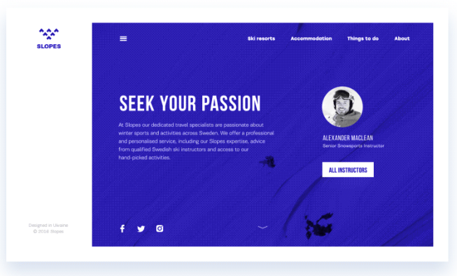
Slopes site
Typography in a minimalist design is considered as one of the basic visual elements, which not only informs users about content, but also sets the style and contributes to the visual presentation. When making a choice in favor of accurate, well-thought-out solutions, designers usually pay great attention to the selection of fonts and take the time to try out various sizes and combinations. Like color, font and style are considered important components of graphics that help make the design elegant and create the desired emotional message. On the other hand, readability and legibility remain important factors influencing the choice.
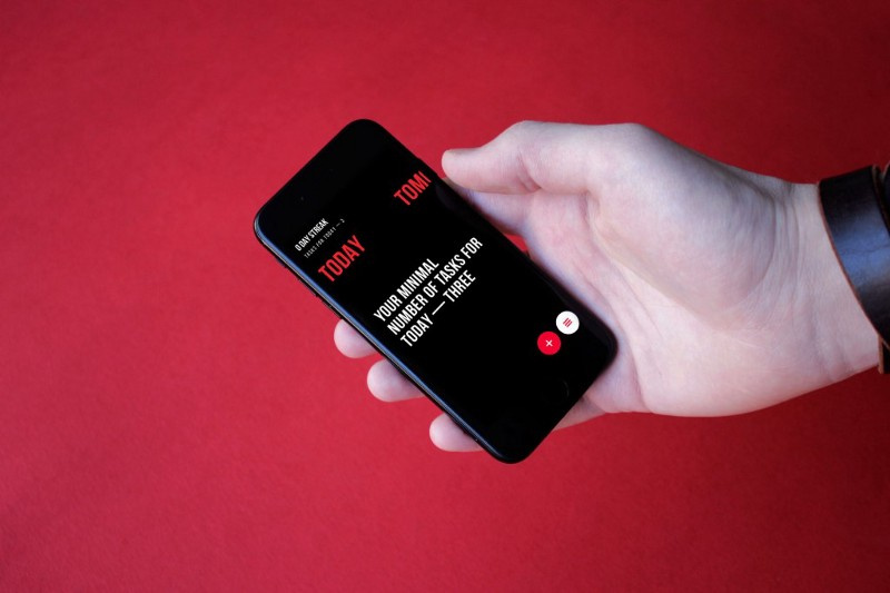
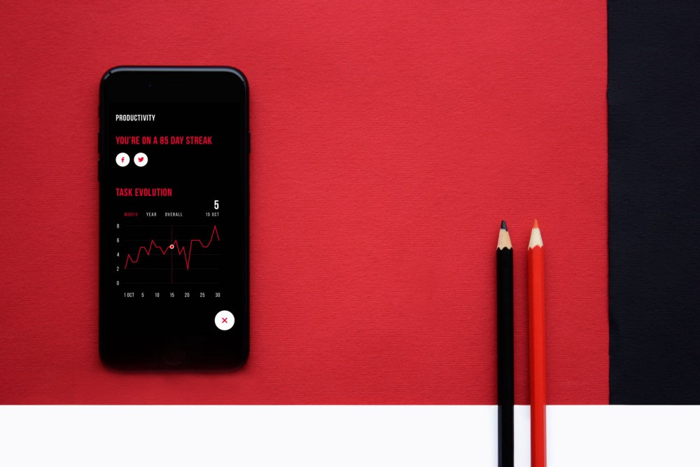
Upper application
One of the main advantages of minimalism in interfaces is the high concentration of user attention. When functionality and simplicity come to the fore, pages and screens made in this style usually do not overload the user's perception with decorative elements, shadows, colors, details, animation - therefore, his attention does not dissipate and he can quickly orient himself on the website or in the application and solve your problem.
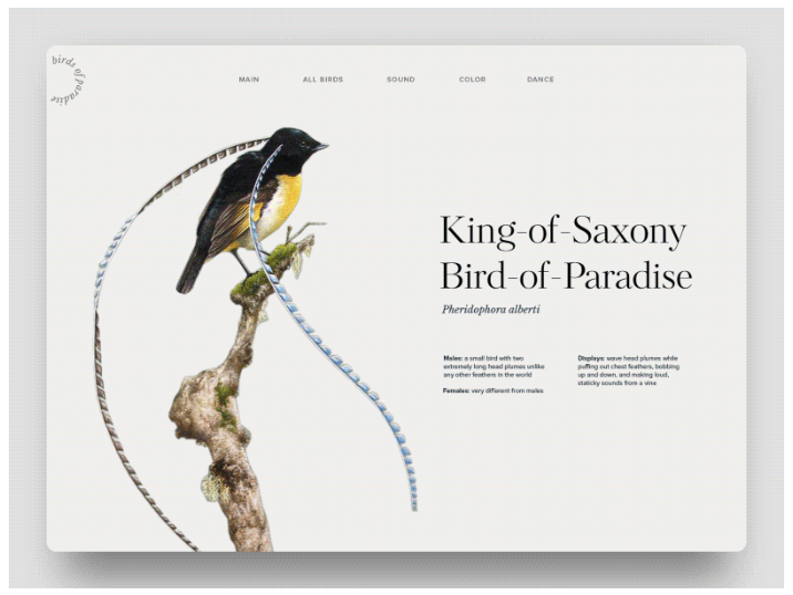
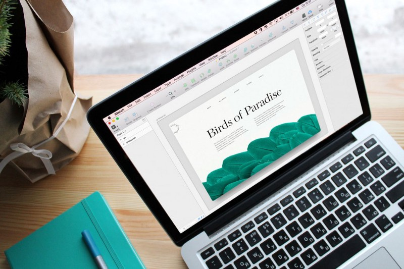
Encyclopedia "Birds of Paradise"
When working on a minimalist interface, designers do not use a lot of images, but those that go into action are always very catchy and informative. Such an approach requires a long and careful selection of the “one” picture that will meet all these requirements and immediately create the right mood. In the photograph or illustration itself, the principles of minimalism must also be respected - an image that does not conform to the general style may violate the integrity of the layout.
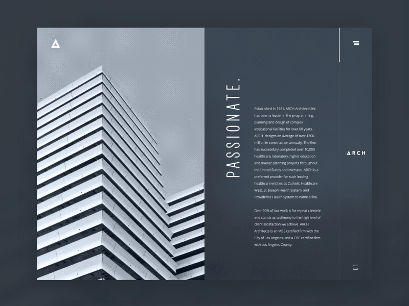
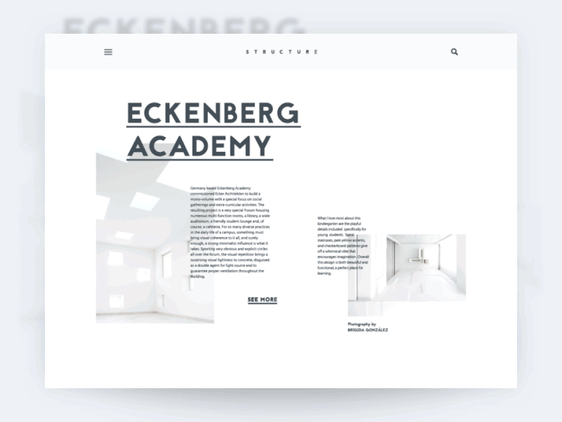
Architectural company
Navigating through minimalistic interfaces poses another problem for designers: they have to set priorities rigidly in order to display only the elements of paramount importance. There are various techniques to hide part of the navigation, but when using them it is essential to make sure that it will be easy for users to find what they came for. This is one of the most powerful reasons for criticism of minimalism in design: after all, decisions such as menu-hamburgers or hidden elements of the layout, if not thoroughly tested or poorly implemented, can lead to the user getting lost on the site. Needless to say, there is no need to talk about positive experience in this case, therefore, when working on any navigation solutions, one should adhere to the philosophy of “measure seven times, one cut”.
Free, or empty, space in digital design is associated more with the concept of space than color. In minimalism, this is one of the most effective ways to make a design more elegant and highlight key elements. In addition, when it comes to the interface in shades of gray or with a minimum of colors, empty space plays a big role in creating contrast and makes the text easier to read.

Ice site
The grid system in minimalistic interfaces helps to give the page a structured look, especially on it presents a lot of homogeneous content. Another advantage of nets is that they are well suited for responsive design.
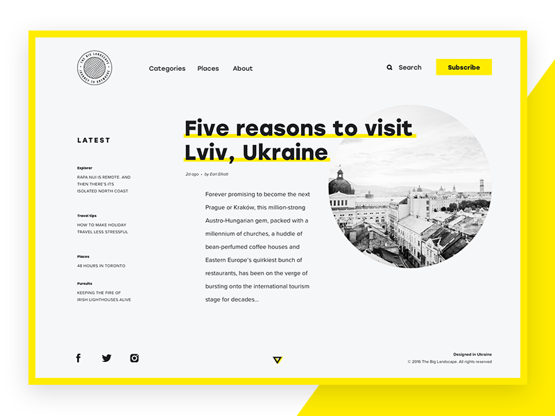
The big landscape
Adhering to the philosophy of simplicity and limitations, minimalism largely relies on contrast as a tool for optimizing the visual presentation. The selection of colors, shapes and positions of elements is often based on contrast, which acts as a fundamental principle.

Bjorn website
So, from all this, it is clear that minimalism offers many advantages and represents a reasonable approach to creating user-friendly interfaces. However, this does not mean that it should be used wherever possible: for each purpose there are different means. But one can say with certainty: the more minimalist the design, the more time and effort the designer must invest to make it transparent and functional. The beauty and elegance of the interface should support the global goal - to provide the user with a positive experience.
Here are a few articles to familiarize yourself with the topic:
→ The Characteristics of Minimalism in Web Design
→ The How and Why of Minimalism
→ 6 Steps to Perfecting Minimalism in Web Design
→ Functional Minimalism for Web Design
As Joshua Becker said in his book The More of Less:
"You need no more empty space, but less than anything else."
Active discussions of a minimalistic approach to different aspects of life and the workflow are currently underway, and various design directions are no exception. Let's look at its advantages and the nuances that need to be borne in mind.
')
What is minimalism?
In general, minimalism is a broad concept that is used in various spheres of human activity. In the Merriam-Webster dictionary, it is defined as “style or technique (in music, literature, or design) that is characterized by an extremely small number of elements and simplicity.” To whatever areas the concept is applied, it retains its basic distinguishing features: simplicity and semantic richness.
Minimalism as a trend in art gained particular popularity in New York in the 1960s, when artists of both the young and older generation began to lean toward a geometrically abstract style in painting and sculpture. The ideas of this movement are reflected in the works of representatives of the Bauhaus School, the society De Stiyl, such artistic direction as constructivism, and so on. In many areas of the visual arts, the key principle of minimalism is to leave only the most necessary elements, thereby focusing the viewer's attention and creating a general sense of elegance. Lines, shapes, points, colors, empty space, composition - everything should serve a specific purpose and be carefully organized. Today we can meet a minimalist approach in various spheres of life: architecture, painting, photography, various types of design, and even serving food.
“Shape, volume, color, surface are all separate entities. You should not hide them as part of a significantly different whole. Forms and materials should not be modified under the influence of context, ”said Donald Judd, an American artist who is classified as a minimalist. Designers who work in this style tend to make the interfaces simple, but rich, stylish, but not overloaded. Usually they use empty space, eye-catching colors and combinations of fonts, as well as multifunctional details to give elegance to simplicity. Crossing the line between simple and primitive is very simple. That is why many designers do not take the risk and refuse this style: to someone it seems too slender, someone cannot think of how to express everything that is necessary with a small number of elements.
Architecture Blog
Characteristics of minimalism
The main features that mark designers, speaking of minimalism, include:
- Simplicity
- Clarity
- Pronounced visual hierarchy
- Great attention to proportions and composition
- The functionality of each element
- A lot of empty space
- Less details and more attention to each
- Typography as an important design element.
- Refusal of non-functional decorative elements
Of course, this list can be continued, but these points are enough to conclude: minimalism gives the impression of a trend that makes the interfaces more convenient for the user. If you use it wisely, you can point the user to the most significant elements and make his path intuitive and meaningful. In addition, minimalist interfaces usually look very elegant and neat, delivering aesthetic pleasure to the viewer - and this is one of the most key factors that bring appeal to the UX.
Landing Dance Academy
Minimalism Practices in Digital Design
Now minimalism has become one of the most common trends in web design and mobile application design. The main points to keep in mind can be summarized by describing the following practices:
Flat design
As we said in one of the previous articles , in modern digital products, flat design significantly supports minimalism. The most striking feature of this direction is that instead of realistic, detailed skeuomorphic images, flat, two-dimensional visual details are used. Flat images are usually simpler in structure, they can be dispensed with glare, shadows, gradients and textures. This approach allows you to create images, buttons, icons and illustrations that will look good in different resolutions and sizes. Thus, designers are able to maintain usability and visual harmony between the interface elements at a high level.
However, the concepts of "flat" and "minimalistic" should not replace each other, as is often the case. These are different things. When we say flat, we are talking about the style of icons, illustrations, buttons, and other visual interface elements in terms of gradients, textures, shadows, and the like. The word “minimalistic” has a much broader meaning and describes the layout as a whole: composition, color gamut, contrast, and all the visual presentation techniques used in it. Accordingly, the plane can be called one of the techniques that is used with a minimalist approach to creating interfaces.
Cafe Coupon app
Palette in shades of gray or with a minimum of colors
Color is an aspect in the design of interfaces that has great potential, since it can contribute to the establishment of both an emotional connection and information exchange between the product and the user. Designers working in a minimalist style usually try to extract the maximum from the chosen palette and in most cases are limited to shades of gray or a minimal set of colors. Such a gamut enhances the effect that the selected colors produce and does not distract users with excessive variegation. This scheme is especially effective for those interfaces where the user's attention should be focused on a specific action: purchase, subscription, donation, installation. In addition, from the point of view of psychology, colors usually convey to users certain associations and emotions, so that a small number of colors in the palette reinforces the effect also in this respect.
Slopes site
Bright, expressive typography
Typography in a minimalist design is considered as one of the basic visual elements, which not only informs users about content, but also sets the style and contributes to the visual presentation. When making a choice in favor of accurate, well-thought-out solutions, designers usually pay great attention to the selection of fonts and take the time to try out various sizes and combinations. Like color, font and style are considered important components of graphics that help make the design elegant and create the desired emotional message. On the other hand, readability and legibility remain important factors influencing the choice.
Upper application
Limited choice
One of the main advantages of minimalism in interfaces is the high concentration of user attention. When functionality and simplicity come to the fore, pages and screens made in this style usually do not overload the user's perception with decorative elements, shadows, colors, details, animation - therefore, his attention does not dissipate and he can quickly orient himself on the website or in the application and solve your problem.
Encyclopedia "Birds of Paradise"
Thematic visual elements that attract the eye
When working on a minimalist interface, designers do not use a lot of images, but those that go into action are always very catchy and informative. Such an approach requires a long and careful selection of the “one” picture that will meet all these requirements and immediately create the right mood. In the photograph or illustration itself, the principles of minimalism must also be respected - an image that does not conform to the general style may violate the integrity of the layout.
Architectural company
Laconic and intuitive navigation
Navigating through minimalistic interfaces poses another problem for designers: they have to set priorities rigidly in order to display only the elements of paramount importance. There are various techniques to hide part of the navigation, but when using them it is essential to make sure that it will be easy for users to find what they came for. This is one of the most powerful reasons for criticism of minimalism in design: after all, decisions such as menu-hamburgers or hidden elements of the layout, if not thoroughly tested or poorly implemented, can lead to the user getting lost on the site. Needless to say, there is no need to talk about positive experience in this case, therefore, when working on any navigation solutions, one should adhere to the philosophy of “measure seven times, one cut”.
Free space
Free, or empty, space in digital design is associated more with the concept of space than color. In minimalism, this is one of the most effective ways to make a design more elegant and highlight key elements. In addition, when it comes to the interface in shades of gray or with a minimum of colors, empty space plays a big role in creating contrast and makes the text easier to read.
Ice site
Nets
The grid system in minimalistic interfaces helps to give the page a structured look, especially on it presents a lot of homogeneous content. Another advantage of nets is that they are well suited for responsive design.
The big landscape
Contrast
Adhering to the philosophy of simplicity and limitations, minimalism largely relies on contrast as a tool for optimizing the visual presentation. The selection of colors, shapes and positions of elements is often based on contrast, which acts as a fundamental principle.
Bjorn website
So, from all this, it is clear that minimalism offers many advantages and represents a reasonable approach to creating user-friendly interfaces. However, this does not mean that it should be used wherever possible: for each purpose there are different means. But one can say with certainty: the more minimalist the design, the more time and effort the designer must invest to make it transparent and functional. The beauty and elegance of the interface should support the global goal - to provide the user with a positive experience.
I recommend reading
Here are a few articles to familiarize yourself with the topic:
→ The Characteristics of Minimalism in Web Design
→ The How and Why of Minimalism
→ 6 Steps to Perfecting Minimalism in Web Design
→ Functional Minimalism for Web Design
Source: https://habr.com/ru/post/334058/
All Articles