What happened to the font?
Those who visit the site of Artemy Lebedev’s studio every day know that “a font can be squeezed by 1-2% without serious damage to perception”.
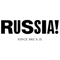
However, looking at the logo of the magazine "Rush!", It seems that it consists entirely of stretched and compressed letters.
But it is also true that in design there are no universal rules that could be applied in any situation.
')
Therefore, the logo "Rush!" Moreover, the magazine is new, fashionable, "in a glossy cover" - hence its need for non-standard.
For me, this logo is cute. It "jumps", but the same spacing between letters is maintained. He is funny, he makes you pay attention to yourself, slowly but cheerfully read: “R and - sh and.”
I have no doubt that many designers loved him. However, let's be honest: if such a logo was made by an unknown studio, there would hardly be a lot of positive feedback.
Source: https://habr.com/ru/post/3340/
All Articles