Optical alignment and user interfaces
Hi, my name is Ivan Grekov, I work in the Badoo frontend team, I am engaged in imposition of user interfaces on the company's projects.
In working with interface layouts, I use graphic editors such as Adobe Photoshop and Sketch. In them, all layers by default are rectangular containers. When we align one layer in the center relative to another, the centers of rectangular containers are used for alignment. Such an approach is extremely inconvenient when working with icons, since the figures to be leveled may differ greatly from rectangular containers. And the more an asymmetric figure differs in area and in points of coordinates from the rectangle in whose borders it is inscribed, the more noticeable is the difference between the centers of the figure and its container. This leads to an imbalance of the composition in the interface icons.
This situation is well known to specialists in the field of design, it is usually solved manually, which requires certain knowledge and skills. That is why it can create difficulties for designers and developers who solve this problem with tools at hand.
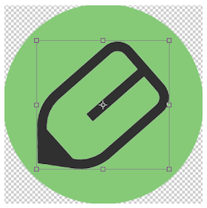
I will give an example. Let's make an icon in a graphic editor - a diamond inscribed in a circle. The illustration shows that the bottom of the diamond is inferior in size to the top. It seems that the diamond is shifted upwards relative to the center of the image, although it is not.

This is the imbalance of which I spoke above. It becomes noticeable at the stage of layout of user interface elements. In order to identify the problem in advance, when accepting a design and evaluating the quality of the layouts, it is necessary to pay attention to how visually the figures in the icons are aligned. If inside the icons they do not look balanced (as in our example), they will need optical compensation.
Optical compensation is the distance that the shape should be moved to achieve visual balance relative to other layers. To do this, we change the coordinates of the center of the container so that they correspond to the coordinates of the center of the shape, and then by aligning the shape relative to the new center.
The search for the coordinates of the center of the shape and the subsequent alignment of the layers in this post I will call optical alignment. This term is used by graphic designers to indicate the balancing of the size of letters and the distances between them in fonts. However, in the articles on Medium ( article 1 and article 2 ) it is mentioned that this method is suitable for aligning the figures within the group of layers.
Optical alignment can also be done "by eye": designers with a lot of experience and a developed sense of balance can do it. In this approach, there are no strict criteria for the allowable distances and dimensions of the figures: the designer independently determines how many percent should move the figure or change its size to achieve an optical balance on the screen. But this approach often leads to subjectivism: the designer's opinion may not coincide with the opinion of users or the customer. How to determine that in one case the image is visually aligned, and this should not cause doubts, and in the other - the center of the figure has an error of 5–10% due to the work “by eye”, and there is a shift inside the icon? In graphic design, the grid, distance, alignment, and padding are defined by a brand book or guideline, which describes the design style and design elements. This helps in resolving element alignment disputes. For user interfaces, such solutions, alas, are not common practice.
If the project has no documentation for user interfaces, design systems are not applied, alignment is the responsibility of the designers. It is important for designers and developers to discuss such issues with designers. However, it is not always possible to do this, for various reasons: the project timeline has already been designated, there is no time for redesign, designers are loaded with other tasks, a design project has been made on an outsourcing and so on. I have met many situations with such introductory ones: a “ready” design is provided in the file, and it needs to be implemented well and quickly. In this vein, we will talk about what you need to know about the optical alignment of icons to layout designers and developers so that the tasks of developing new user interfaces are performed qualitatively and without losing development speed.
To begin, let's try to understand the existing solutions. Let's get acquainted with the fact that they wrote about optical alignment earlier. In 2015, Habré published a translation of one of the two previously mentioned articles from Medium ( Article 1 ). There were examples of simple icons and it was proposed to align their layers in two ways: by inscribing a figure in a circle or turning it around its axis. The main advantage of these methods is ease of use. And I decided to try it - the benefit of different projects, there are at least one hundred variations of different icons.
Optical alignment instructions
What does the alignment of icons with the methods mentioned above and the process of drawing an owl have in common? The fact that the most interesting in both cases remains “behind the scenes”. If we talk about icons, then with automatic alignment out of focus, the question of determining the center of the figure appears. Translated articles often mention that the positioning of figures is done “manually” at the discretion of the reader.
By default, the center of the layer with the shape is set in advance as the center point of the rectangular container containing the shape. This approach does not provide for the possibility of finding the center of the figure. And if the coordinates of the center of the container are determined automatically, then the coordinates of the center of the figure can be found through the optical alignment. We find the center of the shape and relative alignment.
If you try to create an instruction, then in order to apply optical alignment in your daily work you will need to complete only three simple steps:
- determine what shape the figure in front of us;
- find the center of the figure;
- perform alignment.
The approach is slightly different for simple and composite shapes in the second step.
So, at the first stage we need to determine the type of each shape. Let's try to sort out the steps in detail so that after the first application the developer will immediately have an understanding of how optical alignment works.
Simple figure.
Step 1
The graphical editor initially defines the center of any shape as the center of its rectangular container. This is a prerequisite for understanding what kind of figure is in front of us. When we are dealing with a relatively simple figure, its center can be found in a special form of definition of the barycenter. There are separate formulas for triangles, parallelepipeds and other non-composite figures; they help to find the point relative to which the icons should be centered.
We fit the shape into the borders of the circle, and its center can be aligned relative to the container. This approach works fine if the figure has symmetry in at least one plane.
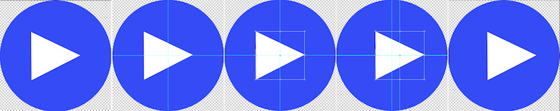
Let us examine an example with the video playback icon. It is quite primitive and is often a typical example of optical imbalance. Let's try to reproduce this situation: open any graphics editor, create a triangle and a circle. And now we try to align two figures automatically. Let's see what happened:

In the icon, something is definitely wrong. Let's try to figure out what causes the optical imbalance:
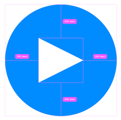
Simple figure. Step 2
The illustration shows that on the left circle a triangle is uniformly inscribed in a rectangle, or rather, in a square. The geometric center of the triangle does not coincide with the center of its square layer.
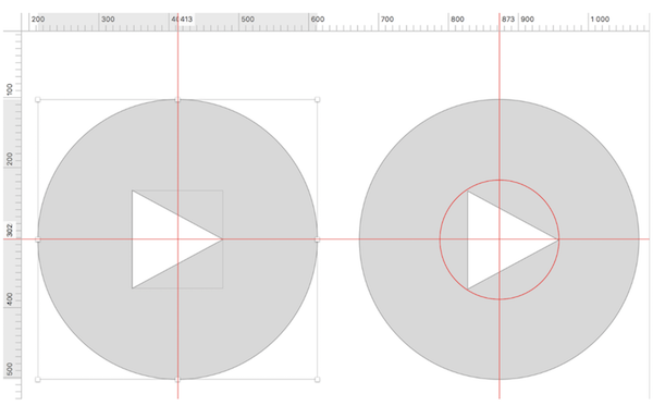
Fix this: add a third shape - a circle, as in the illustration to the right. Let's enter a triangle in this circle and group them. Then this group of elements must be aligned with the background circle.

Check the location of the figures:
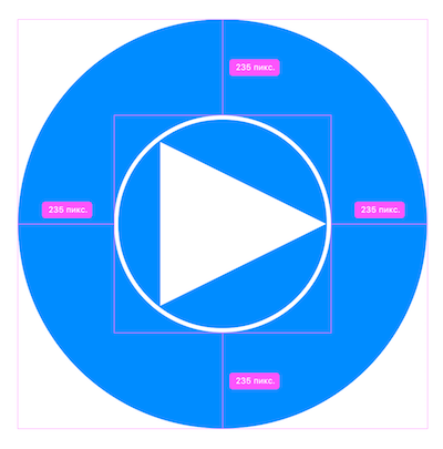
Now the figures are optically aligned with each other. Let's try to compare the icons, removing the circular container for clarity:

The right icon looks neat, as it is optically aligned. We got a quick fix for simple shapes.
Difficult figure.
Step 1
If we have a complex figure (for example, a composite one), we need to perform another action to align it. This approach is required when working with figures without pronounced symmetry, such as company logos or social networks.
Let's try to understand by the example of the Hot or Not application icon.
For a complex shape, it is necessary to determine the required minimum radius of a circle (it must fully contain all the details of the shape being aligned). As with working with a simple figure, we first fit the figure into a circular container. Then, for a complex shape, the required radius is determined by rotating the shape around its axis relative to its center.
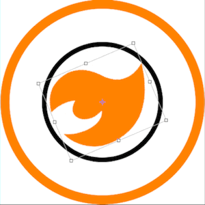
When turning the figure should not go beyond the boundaries of the circle. Once this happens, you need to increase the radius of the circle. A circular container of such figures is always larger than that of simple figures of approximately the same area.
Difficult figure. Step 2

In the second step, we align the circular shape container with the element “parent”. Now the icon should be aligned, let's see this:
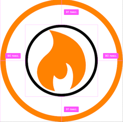


Inside each container, the figure is in the center, at one distance from the container borders. This is a good way to check the alignment of complex icons.
When working with certain icons, these methods allow you to align figures quickly and efficiently. However, checking them with the example of a large number of icons for the desktop version of the Badoo site, I discovered this:
- The articles do not specify the criteria for determining the method of finding a center for different shapes (which method is ideal for a triangle, and which one is suitable for a polygon logo?);
- these methods indicate different coordinates, and subsequently the check is done “by eye”;
- There are no descriptions how the methods listed in the articles work (they work, but not for all icons);
- there is no clear list of figures and their signs for which any of the described methods of optical alignment work (in some cases, both methods will not work).
It is unlikely that someone will use a cone or polygon inscribed in a circle without a definite meaning as an icon for the interface. But still I would like to understand how to make different icons aligned, and this is not in doubt. The above methods are not a panacea and are time consuming if you are not a graphic design guru. Let's try to apply one of the ways to illustrate all of the above.
Let's continue the example with the diamond icon. Below are two options for alignment inside the icon: the figure on the left is inscribed in a rectangle, the figure on the right is inscribed in a circle, both containers are centered with respect to the purple circle.
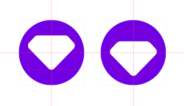
As you can see, both options are far from solving the task of aligning the figures in the center. I want to place the left icon below, and the right one - above. It turns out that the approach with the circle is not optimal here. I also tried the approach with the rotation of the icon, and it gave the third result. In all three cases, additional optical compensation actions will be required, and this will have to be done "by eye".
But not everyone has an innate sense of vertical rhythm and a sense of golden section; It means that instead of aligning “by eye”, it is necessary to proceed from a universal, maximum abstract algorithm that allows you to find the center of any shape. Ideally, this optical alignment process should be automated. But to automate the process, you need to understand it. Therefore, I decided to go beyond the boundaries of graphic design and studied the existing solutions and theory in order to perform optical alignment with minimal time and effort.
Some theory
I consider the optical alignment of icons as a solution from the field of geometry. For alignment it is necessary to find the center point of the geometric figure. In geometry, this is called the task of searching for a barycenter, a geometric center of a figure, or a centroid in English-language sources. In Wikipedia, they write that in physics and geometry, a barycenter is the intersection point of the medians. It acts as the geometric center of any two-dimensional region.
The barycenter can be represented as the arithmetic average of the positions of all points of the figure. The center of mass, the center of gravity, the barycenter will be considered as one point of the figure for us. This assumption is possible, as we work with user interfaces. If we search for the center of a 3D object model or the center of a geographical perimeter through the definition of a barycenter, then we will need to separate the above concepts and add many exceptions to the general rules. But in this post we are talking only about the optical alignment of user interface icons.
The definition of the barycenter extends to any object in n-dimensional space — the barycenter is the average position of all points of the figure in all coordinate directions. Roughly speaking, this is the equilibrium point of the figure. For user interfaces, it is important to use the formula for determining the barycenter to find the correct point for aligning shapes.
The search for a barycenter begins with determining which figure is in front of us. For a number of icons, the task is trivial:
- the barycentre of the square, rectangle and parallelogram is at the intersection of the diagonals, and graphic editors, when working with these figures, set the correct coordinates by default, optical alignment is not required;
- the barycentre of the circle, the ring and the hexagon is located at the center point of these figures; the graphic editors again cope with the alignment of the layers;
- The barycenter of the ellipse lies at the intersection point of the axes, the automatic alignment also works correctly.
Conclusion: if the icon has a center of symmetry, then its barycenter coincides with the center of symmetry. In the illustration below, the circle and the square have one barycenter. A pencil is not.
Many shapes, such as a pencil shape, require additional calculations:
- the barycenter of the triangle lies at the intersection point of the medians (the triangles are different, so it is necessary to apply optical alignment after calculating the barycenter;
- the barycenter of the semicircle is determined by the formula (4 Radius) / 3 π. (relative to this point, we can apply optical compensation to the figure);
- the trapezium barycenter lies on the straight line connecting the centers of the bases.
Barycenters of more complex or compound figures require additional calculations. For example, if a figure can be divided into equal parts, like a diamond in the examples above, then the following barycenter search rule applies to it:
- if the icon has an axis of symmetry, then its center of gravity lies on this axis.
The list of formulas for different figures can be found on the Wikipedia page (it is slightly different in Russian and in English ).
So we can determine the degree of alignment of the figure on one of the axes. This is almost half the battle. But what if the figure is asymmetric?
Let us analyze three ways to search for the barycenter, applicable to most of the figures, regardless of symmetry: the method of geometric decomposition, the method of integration and the search for barycenter for a finite set of points.
In the first method, we break a complex shape into simpler forms, and then apply this formula to search for coordinates:

where the coordinates of the barycenters of simple figures are denoted by Gi (respectively for the X and Y axes), and the areas of the figures are denoted by Ai.
However, since we use graphic editors and plan to automate the solution to this problem, we can refuse to split the figure into primitives, ignore the symmetry and calculate the barycenter of the figure. To do this, you can use the integration method:

In this case, g is a characteristic function of a subset that takes 1 inside X and 0 outside of it. From this formula, we obtain the coordinates along the X and Y axes:

We can further simplify the task for automation, since we always know the coordinates of the points of the alignment points and their number. We find the coordinates of the geometric center of the figure in the following way: each coordinate of the center is the sum of all quantities divided by the number of coordinates of the figure along this axis (this approach is most convenient for automation). At this stage, there is a basis for the process of automation of optical alignment and to create a technical solution. For irregular use can be limited to the method of optical alignment "by eye". However, when you have to deal with large volumes of icons and user interface elements, it makes sense to think about automation.
Automate it
Studying solutions on the Internet , I found a solution for Adobe Illustrator CS3 based on JavaScript:
/* JET_Centroid.jsx A Javascript for Adobe Illustrator CS3. Purpose: Finds the centroid (center of gravity) of selected triangles and other straight-sided multigon paths and draws a user-defined circle at that location. To Use: Make a selection which includes normal paths. Call the script. */ var docRef = activeDocument; var markerSize = prompt("How large (in points) do you want the centroid marker to be?", 6); for(s = 0; s < docRef.selection.length; s++){ if(docRef.selection[s].typename == "PathItem"){ var currPath = docRef.selection[s]; var xTotal = 0; var yTotal = 0; for (p = 0; p < currPath.pathPoints.length; p++){ var currPoint = currPath.pathPoints[p]; xTotal += currPoint.anchor[0]; yTotal += currPoint.anchor[1]; } //end if for loop var centroidX = xTotal / currPath.pathPoints.length; var centroidY = yTotal / currPath.pathPoints.length; var marker = docRef.pathItems.ellipse(centroidY + (markerSize / 2),centroidX - (markerSize / 2), markerSize, markerSize, 0, 0); marker.strokeColor = docRef.swatches.getByName("Black").color; marker.filled = false; }//end if }//end for loop Having studied the solution, I decided to modify it under Adobe Photoshop - and I got this sequence of steps to determine the geometric center:
- In Photoshop, align the shapes in the center automatically.
- Select a layer with curves in the layers palette (Path).
- Open the "Scripts" menu.
- Select "Browse".
- Run GetCentroid.jsx.
- The point of intersection of the two guides is a guideline for alignment, the center of the figure should be placed on top of its coordinates.
The "under the hood" script performs the following steps:
- Resets all coordinates to pixels.
- Finds selected layers containing curves.
- On each layer, in each curve, the coordinates of the points are collected to create for each curve its own object with coordinates.
- Finds the area for each object.
- Finds the centroid coordinates for each object.
- As values for guides, it applies the difference between the width of the page and the value along the X axis, the height and the value along the Y axis.
- Build guides inversely for each coordinate axis.
This allows you to estimate the required amount of optical compensation before alignment.
An example of alignment using a script.
The script code can be viewed (and downloaded) in my repository on GitHub .
This script can be used in other programs. JS-library D3 already contains such a mechanism. This means that if you wish, you can implement a similar procedure in the assembly system or in the design system of the company. Or use the plugin for Sketch. Or write your own. It is not necessary to use a manual solution to align all the icons on the project. There are plug-ins and solutions for graphic editors, for example, the Optically paid plugin for Sketch.
If you have not yet applied such optical alignment solutions in your work, it makes sense to look at the user interfaces being developed: most likely, you will need to correct the alignment of some of their elements.
When to use optical alignment?
The answer to this question depends on the organization of work. If possible, you can give it to the designers. In theory, this is possible, but in practice the design should be checked at the design and layout stages, as user interface elements may require adjustments.
In Badoo, when preparing icons for user interfaces, all images are pre-optimized: lines in SVG are combined into a single Path, and it is aligned relative to the container. Some of these actions are automated. The developer aligns the shapes using a graphical editor. When working with some icons, this can lead to a shift of the centers of the figures relative to each other. At this stage, optical alignment should be applied to avoid image distortion.
Application practice and features
Badoo's user interfaces use many different icons: actions, statuses and settings icons. And often they are placed in a row, so it is important that they are all aligned. Using optical alignment, we improve the quality of user interfaces while maintaining the speed of layout and development.
Optical alignment allows you to maintain a balance within the composition for individual icons, rows of icons of the same type and one size. Suppose we have three icons arranged in a row. When they have the same background, size and alignment of the figures inside, they will look harmonious. Optical alignment will help correct design flaws, but is not a panacea for violating the basic rules of UI design - this is a completely different story, which is worked out exclusively by designers (talking about the violation of vertical page rhythms and individual blocks, image quality, etc.).
As for the optical alignment, there are certain limitations and difficulties that can be encountered.
For example, anti-aliasing icons in different browsers. SVG icons contain vector graphics, point coordinates and other information about shapes and layers. In Badoo, we create icons with specific canvas sizes depending on the type - 16 or 22 pixels. If a figure inside such an icon contains points with odd coordinates, then the alignment in the center will notice a loss in the sharpness of the SVG image. In this case, changes in the size of the icon and its elements are allowed.
In addition, there are features when using optical alignment:
- thin or remote elements of the shape in certain conditions do not affect the centering of the image (this situation is usually handled by the script);
- different figures of the same color, located side by side, will appear in different shades on the monitor screen;
- figures of the same color and with the same width / height, but of different shapes will appear not aligned with each other. For example, any circle will visually appear smaller next to a square of the same size, so the circle must be increased in size.
The first restriction can be circumvented by the developer. The remaining issues are in the competence of the designer, but the developer when working with user interfaces should also pay attention to these points - this will avoid additional burden in the future when working on the introduction of new interface designs.
Aligning icons relative to other elements on a page is often perceived as a limitation. Suppose an icon is single-layered, aligned with its container. We insert it on a page where there can be any context and surrounding elements with different heights and alignment. So it should not be.
In most cases, the placement of elements is preceded by the design of the user interface, where the position of the objects is indicated, the visual alignment is performed and the vertical rhythm of the elements is observed. Preparing a full page design will help to avoid such questions and inaccuracies when developing user interfaces: the developer gets a clear idea of the context of the layout of elements on the page and their display, and he just needs to follow the approved design.
Why is this remark important for optical alignment of icons? Many companies have libraries of items. The library of elements is individual parts of user interfaces outside the context of the pages; its presence allows for faster development when using its elements in layout. However, when new page designs or design prototypes do not take into account dimensional grids, positioning of library elements, this advantage stops working. Therefore, it is important that a systematic approach is present in working with the design and library of elements:
- Based on the primary design, a library of elements is created with information about the sizes and variations of user interface elements.
- The subsequent design of the pages is repelled by the library of elements.
- The alignment in the design and the size of the lines should not contradict the options existing in the library of elements (otherwise, adjustments should be made to the library).
- Layout of icons and user interfaces should correspond to the design and library of elements.
How to apply the optical alignment in the work?
Optical alignment helps correct user interface flaws regardless of whether an error was made in the design or in the layout. This method acts as a litmus test for user interfaces: it allows you to evaluate in practice how the work with the icons. It is worth paying attention to it both in the design and layout process, and in the process of evaluating the implementation of the finished user interface.
When colleagues in general told me about this approach, I began to actively use their recommendations in my work. To use optical alignment, it is important to understand the principles of its operation. I can judge this by different projects with which I worked before joining Badoo: not all layout designers and developers adhere to the Pixel Perfect approach when creating templates and compare a ready-made template with a design. Therefore, when you work in a team, it is important to agree with its members on the unity of the approaches used, and the new team members need to talk about them in a simple and understandable language.
Instead of conclusion
A good user interface is the result of the work of each specialist team. It is created in the process of building the visual harmony of the elements on the user's screen. Such harmony can be achieved by applying interdisciplinary knowledge and skills. For example, competent application of approaches and methods of geometry in design and development. In our case, this approach is optical alignment - it helps to improve the quality of user interfaces at the output.
PS An attentive reader will notice that the diamond-shaped icon still remains unlined. Curiously, this is one of those forms that is difficult to align using geometric formulas. But you can always refer to fellow designers and come to a consensus.
PPS If you make the corners of the diamond sharp, then the alignment script shows a good result.

')
Source: https://habr.com/ru/post/333992/
All Articles