How to explain the design of four years?
Recently, I came with a proposal to a local primary school. I wanted to talk with children about my work, to tell them some basics of design, perhaps, to teach something.
I planned to talk with the older guys, tell what I thought was really cool in my work, share some interesting experience, but in the end I was asked to conduct a lesson with students of the preparatory group (approximately 4-5 years). Despite the fact that at first I was rather disappointed, it turned out to be a very interesting task!
')
The main feature of working with children of this age is that you cannot tell anything about the brands with which you worked. Four-year-olds will not enthusiastically respond to stories about working for Channel 4, BBC and Disel. “I received BRIT awards, and even developed a website on which I received an imdb entry!” - children will not understand what I’m talking about. Therefore, it was necessary in the simplest terms to explain what I did and why it is so important. I thought: it would be great to show the children design in all its forms.
What I've done?
I have long formed the idea that all forms of design are effectively connected with communication - whether it is user interface design, industrial design or clothing design. I came to the conclusion: design is something that is easy to use and easy to read.
Then I explained that there are different designers: there are those who decide
how to increase the number of rooms and where to arrange the doors and windows, there are designers,
who create the books you read. There are still game designers who decide
how to make the game Angry Birds fun, and where to position the buttons so that we were comfortable to play. Furniture designers, they determine what size the chairs will be,
and how to make them comfortable.
I also noted the importance of toilet design - we all use toilets every day, and they should be the right size and comfortable to sit on; besides, we should be able to easily get to the paper. In response, I heard a lot of giggling and muttering the word "toilet", want to get feedback and get the attention of 4-year-olds? Talk to them about toilets.
After that, we performed the yes / no exercise. I had a list of different things
and the children had to answer, did the designers do this thing or not? We have begun:
- Puddle (“nooo!”)
- The book ("yeah!")
- Squirrel (“nooo!”)
- The car ("yeah!")
… and so on.
Now that the children have learned what design is, I need to explain to them what graphic design is.
I wondered how to make my explanation easy to understand. And after a while I came to a simple conclusion - you need to use colors, letters, and drawings to help people understand something that they don’t know. Phew! After a long career, in which I had to start from comments about “coloring” and “creating things that look good,” I finally managed to get to the point. This formulation turned out to be beautiful in its clarity
I could even quote it on my business cards.
I began by asking the class: What color helps us understand that we have a hot water faucet in front of us?
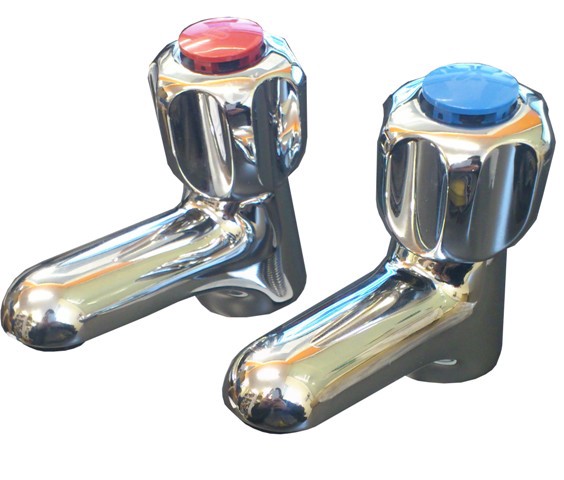
After one child successfully said “red,” I asked them: why do we think that red means “hot”? Why is “hot” the color of red? Among the answers the kids flashed very good for their age: “Fire”, “Sun”, “Lava”. We found out that people use red to mean “hot,” because it is associated with hot things. The same thing happens with blue:
- “Children, what is blue and cold?”
- “Ice!”
“Yes, sometimes ice can look blue and cold, which is why Elsa’s dress is from a frosty-blue cartoon.”
It's time to talk about the main thing! I myself am the father of two children, so I know that children at that age will not sit long. My partner (an elementary school teacher), made several small books with color samples to distribute to their children, and asked the class to choose colors based on the questions.
- Choose a color that reminds you of the night.
- Choose a color that makes you think about fruits.
- Choose a color that reminds you of Gruffalo! *
* The character of the book of the English writer Julia Donaldson is a shaggy and fanged forest dweller.
The last question the children answered differently - most chose brown, but some children stopped at orange (the color of Gruffalo's eyes), black (the color of his tongue) or purple (the color of his spines). So children began to realize that often there are many answers to questions related to design, and how color helps to feel different objects and things.
Then, we conducted another exercise, during which I gave the children a list of words that needed to be colored in a certain color. So they were able to demonstrate their knowledge in practice. The results were great!
A lot of red - for the word "angry", bright colors - for "sweets", green - for "grass". Then I asked the children why they chose these particular colors? And he received very convincing answers! Of course, sometimes they chose the color “because I like it,” but this is also true :)
Typography
When we finished with the color, I went over to what the words themselves look like. I told the children how the signs talk about important things and that the words should be easy to read. As an example, I showed the class the word printed on the sheet and asked the children - what can I do with this word to make it clearer?
The children answered that they needed to make it larger. I showed them the word larger and we agreed that it makes the word more important and it becomes visible from afar.
I told the guys about what you can do with whole texts and single words so that they are easier to read. We talked about their favorite books and about the fact that words are always and everywhere used to tell stories and convey important information. As an example, I showed them a simple sentence that we all read together:

And then he showed the same sentence, but with the word “big” highlighted:
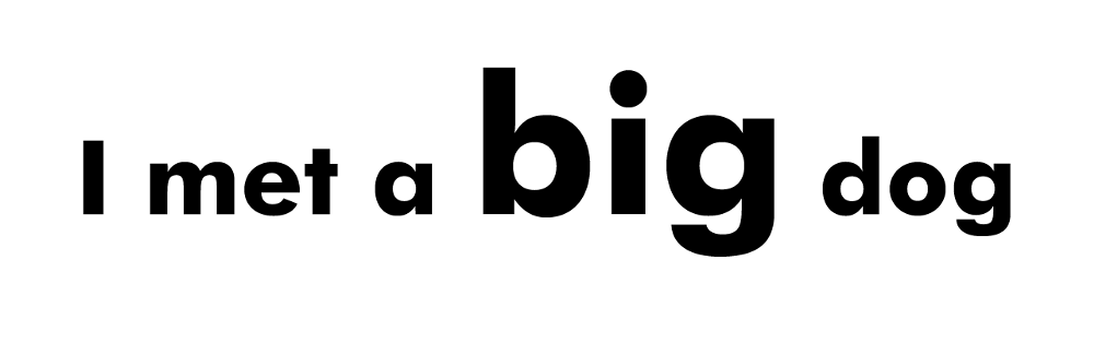
The children agreed that this made the offer more exciting. We pronounce the highlighted word differently than the last time and begin to wonder how great was this dog from this sentence?
In addition, I showed how you can make a series of changes in a simple word in order to feel its meaning again. I showed all the following iterations in turn:

Each time the children agreed that the new word was felt faster than the one named before.
Unfortunately, by this time we didn’t have enough time. Although the plans were still exercises, in order to “design” the word using interesting color combinations and some visual tricks: for example, to make the word “holiday” using things that help children feel festive - caps, ice cream, cotton candy and so Further.
I was surprised by two things: how easily most children understood what design was and that they easily managed to express themselves with it. This experience is also useful for those who specialize in explaining something to an unprepared audience. I needed to talk to the children in their language, explaining the value of my profession in clear terms and look at what I do from the outside.
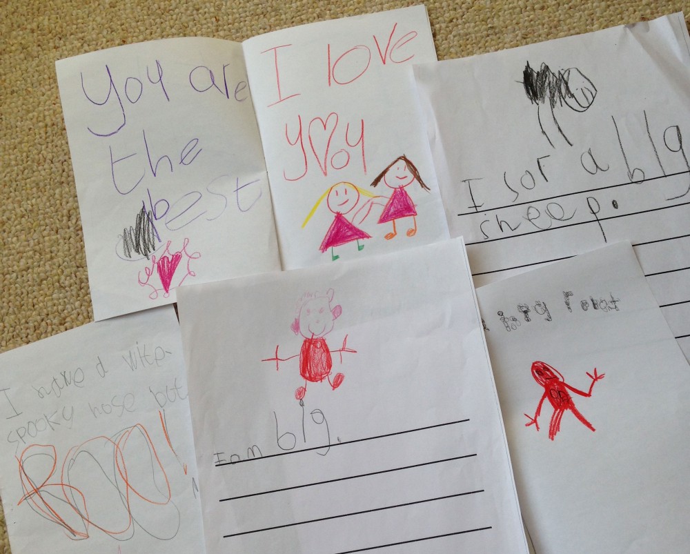
A week later, I gladly received the lesson material on topics that we touched on last time. Most of the children were satisfied.
Source: https://habr.com/ru/post/333888/
All Articles