You don't know a damn thing in colors

It's all pink
I think many people have come up against the situation, the girls are trying to convince us that it is completely obvious that the color of her underwear is not at all black, but obviously onyx or obsidian-smoky. Given that there is clearly # 000000ff or maximum # 080808d5, if the laundry is slightly transparent. Or suddenly the same girl suddenly decides to repaint the walls and dreamily begins to describe all the beauty of the shades that she would like to receive. And you are immersed with it in the wonderful world of lavender walls and trying to figure out the curtains. Whether the color of foaming sea wave, or coral-turquoise. Somewhere in this stage, you begin to look at the wall wistfully, thinking about what color your brain will give it after a good run.
')
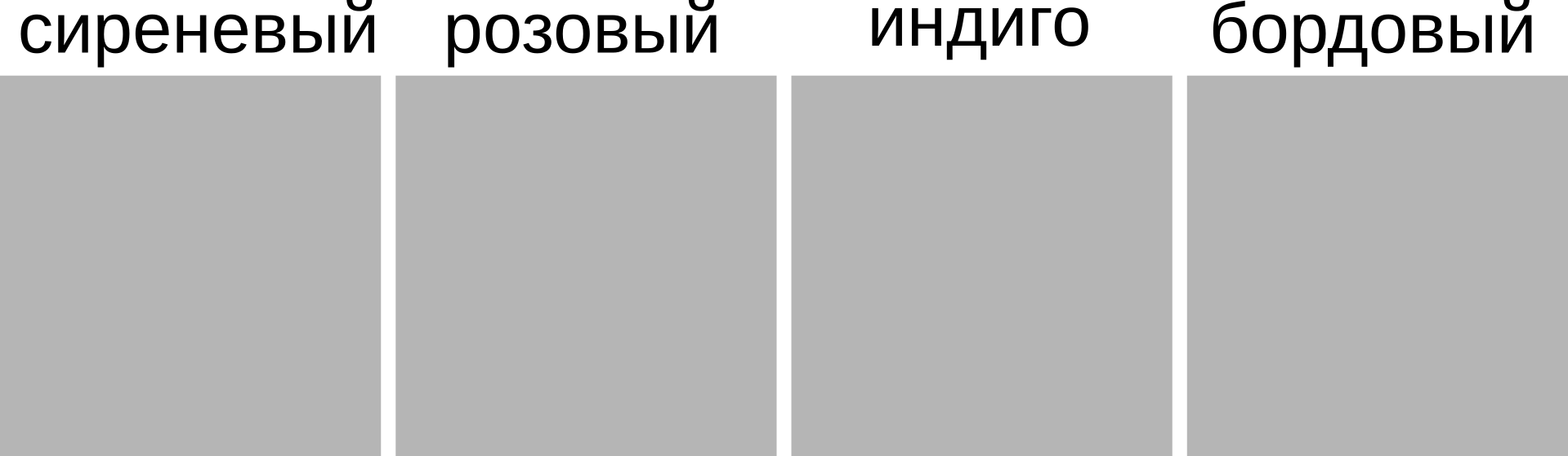
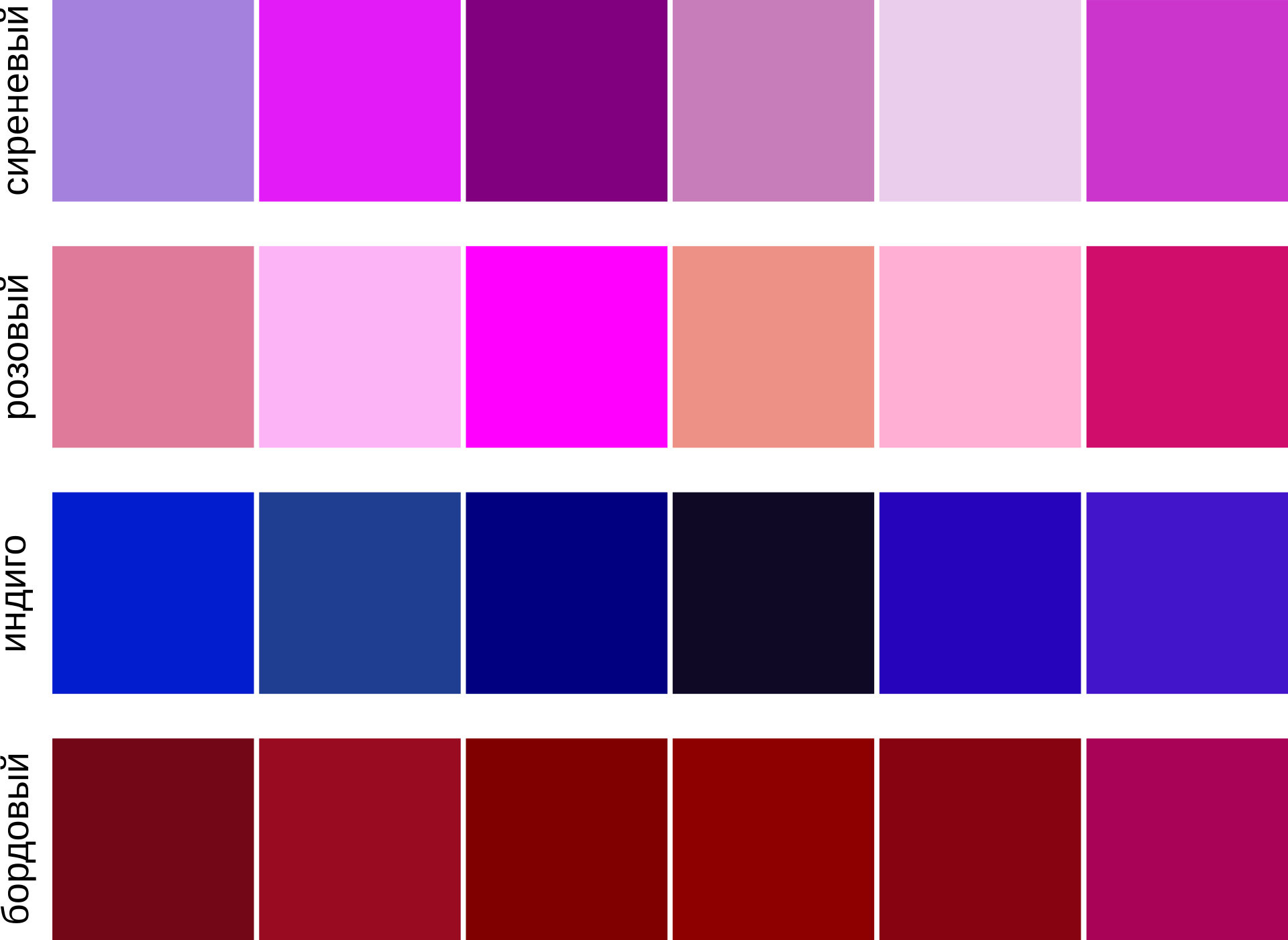
I decided to figure out what strange pictures are swarming in the minds of others when we pronounce “soft green” or “golden-lime”. Naturally, all this resulted in inhuman experiments on living people, to whom I issued Inkscape, the picture above and asked to fill in the squares with colors.
How we colleagues argued
We discussed the colors. My timid attempts to designate colors in the likeness of an HSL-color space were perceived as meaningless. What for? After all, and so it is clear to all that such a red, burgundy and, say, purple. It always seemed to me that people have only an illusion of mutual understanding. In fact, the whole trouble is that we cannot directly look into the brain of another person. The feeling that arises in response to some abstract concepts, including the names of colors is absolutely unique for everyone. But this in most cases goes unnoticed. "I bought lilac nail polish." In the head of the three present, a picture of completely different shades appeared. But they cannot tell each other about this. And everyone is happy.
The problem lies in the color standards . These are the shades that have been imprinted in our memory since childhood with the phrase “Look, a grandmother with purple hair. No, she's normal, she just likes the color. ” And that's all. Imprinting on the color is ready. Even if the hair was not purple, but purple or pink. Special trouble with flowers that are tied to real objects, plants or natural phenomena. I will give examples:

Lilac is like lilac, right?
Celadon is so obvious.
So everyone lives in their own matrix, with their own standards of shades. And even if you are a designer who knows the entire Pantone table by heart, this will not help you. Just because your interlocutor will have other standards and your dialogue will be like trying to describe a blind rainbow.
How to describe the color
For myself, I decided that the most correct binding of a color name is something related to a digital reference. RGB is not suitable for this at all because of its counterintuitiveness.
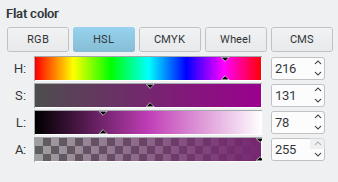
But the HSL color space (Hue, Saturation, Lightness) Looks the most attractive. The same “lilac” is described as a hue of purple (Hue) of medium saturation (Saturation) and rather dark in lightness (Lightness). You can even clarify that Lightness in the region of one-third. It’s enough for a person to be able to see these sliders at least once in a graphic editor. If people still insist that I describe the color of paint on the wall of my kitchen as something “simpler”, then I usually answer something like “the color of rotten salmon”. The person falls into a deep prostration, trying to imagine it, and the questions somehow disappear by themselves.
Experiment
At the beginning of the publication, I talked about the fact that I decided, together with my colleagues, to blindly compare their color standards. It seems to me that the picture is very eloquent.
UPD
Video about colors in different cultures from Pantone (thanks to Stalker_RED )
Source: https://habr.com/ru/post/333552/
All Articles