Paradigm - Mail.Ru Group design system, part 1: visual language
Authors of the article: Yuri Vetrov, Artem Gladkov, Evgeny Dolgov and Andrey Sundiyev
For several years, the portal design team Mail.Ru Group has been engaged in updating and unifying products. We have formed a design system on which media projects work, a mobile web and partially productivity services (other products are gradually connected), a style of pictograms and illustrations has been formed, promotional letters and promotional sites are standardized. Of course, not all services are good yet, but somewhere the first redesign did not solve all the problems, but it is difficult not to notice a huge leap over the years. To speed up the update process and make our work public, we open out part of our Paradigm design system .
')
We made many approaches to the “shell” - we wrote specifications, collected a single source (UI Kit), made libraries of elements, etc. But in 2012, they realized that this was a dead-end direction - the design is often “twisted” on the way from layouts to implementation, so you need to rethink the inefficient chain “guideline → layout → layout → implementation”.
If you "marry" the design and technology, i.e. move the design to the level of technical implementation, it turns out that “guideline = layout = layout → implementation” and we will get rid of a heap of hemorrhoids on the introduction, improvement and support of products. Thus began the work on the design system in its proper sense: single components on the layout, into which the design is “sewn”.
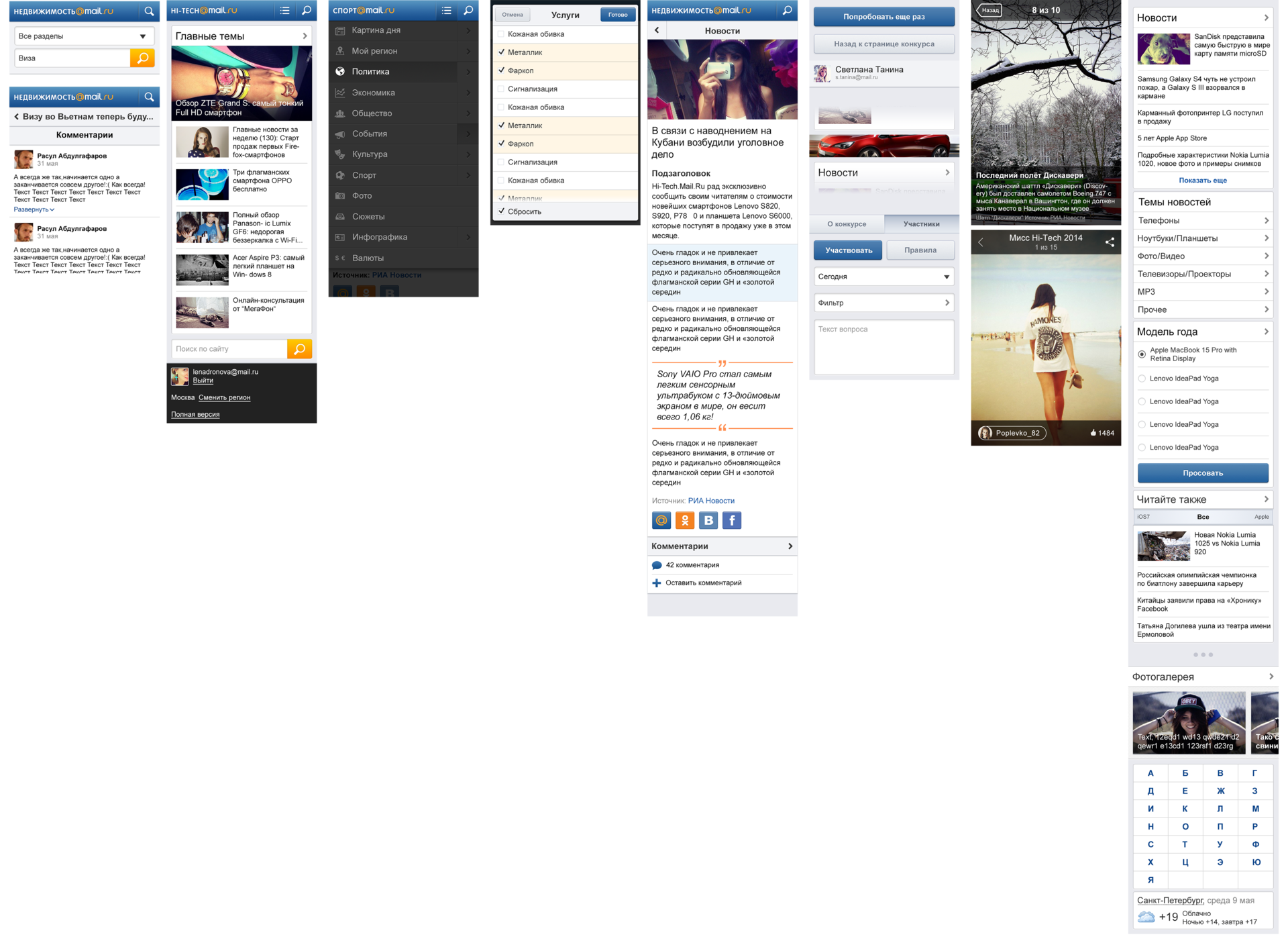
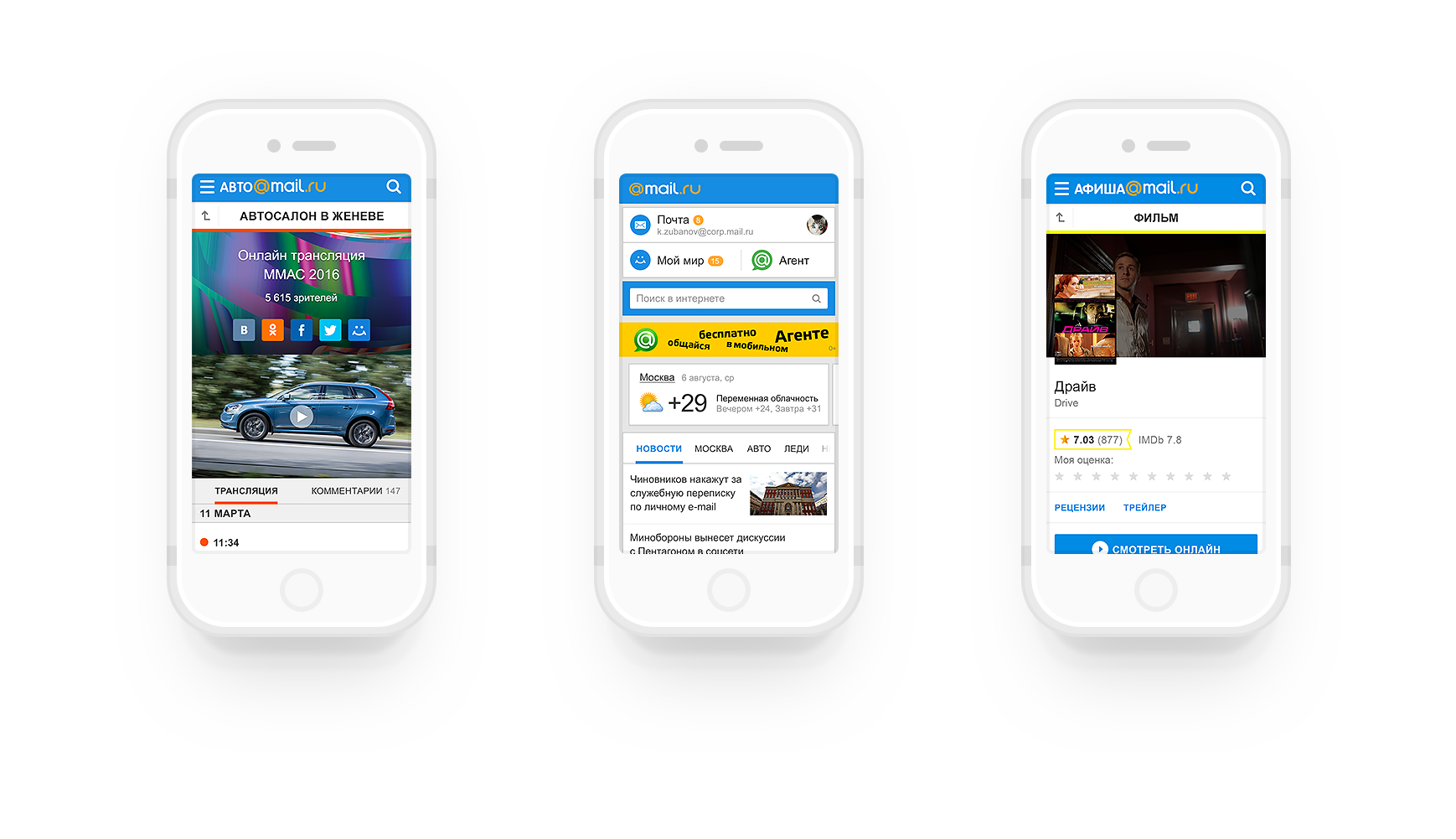
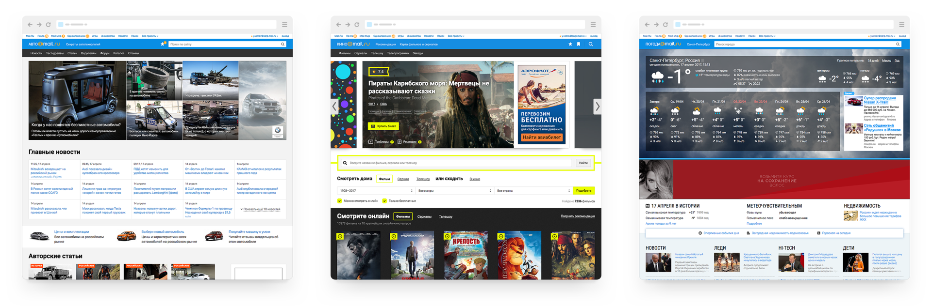
There are about 20 products in our “Mail and Portal” division - productivity (Mail, Cloud, Calendar, Mail.Ru for business), media projects (Auto, Horoscopes, Children, Welcome, Health, Lady, Cinema, Mediator, Real Estate, News, Weather , Sport, TV, Hi-Tech, SEOSan), Beepcar, Answers, mobile products (myMail, Artisto), the main page and general portal rules for Mail.Ru, support for the style of the My.com brand.
Requirements and context are great across the entire range. For example, in media projects it is important to show the main content juicy, and the model of news consumption is quite simple. At the same time, in productivity-services there is a high information density and intensity of interaction with the interface, so there is less space for visual expressiveness — everything goes to the main content and tools for interacting with it. And there are some completely different My.com and Beepcar, which are not related to the Mail.Ru brand, but they will also benefit from the use of general developments.
In other divisions, the tasks are no less diverse - in the company they make social networks, games, e-commerce, intranets, and a lot of other services. Although they are independent and at the current stage we make a design system for the tasks of our department, it is important that these developments are useful and applicable to all.
How to make a design system scalable? Our path was rather winding.
In 2012, we started processing the mobile web - we had to update and run 12 services from scratch. First of all, we began to use the guidelines and the UI Kit, but already in the course of working on the second project we realized that we would not go far at such a rate - we’ll draw the same models all year round.

Together with the developers came to the idea of distributed components into which the design was sewn. Thus, our first framework and the basis for the design system were born, and we completed the task of redrawing 12 mobile sites in just 2.5 months - we have not set such speed records yet.
In the same year, the redesign of web versions of media projects began . The first approach to unification did not scale well, but at the end of 2012 we tried the “burger” approach (a series of “belts”, “lines”, “inserts” or “containers” that are actively used in modern promotional sites). Combining this interface ideology with the framework created for mobile sites, in 2014 we launched the first products based on a modified design system. Now there are already 12 of them and the speed of release of new versions on the market has become much higher - about six months from the beginning of the study to the launch, instead of a year earlier.
In 2014, we conducted a large hakaton for one of the products on a single visual language that would allow to combine not only different products, but also web, mobile web, mobile and tablet applications. Before that, we were moving in approximately the same direction, but this was rather a general feeling, rather than understandable principles. But it was here that the idea of a parametric design system was finally formed, which, due to several “layers of abstraction” (common parameters → common components → specific screens) became quite flexible and powerful. A couple of months after the start of this process, Material Design was announced, where we saw the implementation of many of our ideas in practice - we were moving in the right direction.

We described the current vision of the holistic design system in 2015 and since then we have been gradually implementing it.
What is a design system in our understanding?
Key principles of our design systems that help to achieve scaling:
We will tell about these principles with concrete examples.
Playing with a set of parameters, we can quickly get any element. For example, let's try building a simple button:

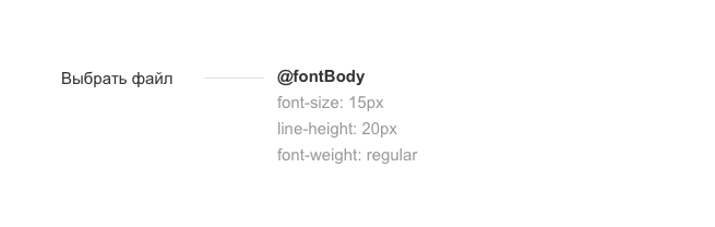
All the sizes and styles of fonts we store in variables that we use in the right situations. There are several large groups: these are headings, typesetting, captions. For our button, we will use the mixin @fontBody, which contains the basic style of the text for productivity services. This is a set of: font size, outline, line spacing. If necessary, specify the color and interparagraph distance.
Each element of the design system is built on modules in 4dp (density independent pixels). This means that all dimensions of the interface elements and the indents between them should be divided into four without remainder. This is an additional “skeleton”, which, together with the main grid for the screen layout, gives harmony in the behavior of the elements, plus imposes some restrictions on the work. Which means less chance of making a mistake. This is also convenient when working with mobile interfaces, because a similar modular 8-pixel grid is used in Google Material Design.
To form indents in our button, we will use a combination of several variables: $ sizeControlHeight (element height) and $ paddingControlButton (internal indents inside the button).

Everyone who worked on the unification of design, they know - it is unrealistic to make a minimal set of gray colors. And if you need decorative solutions like boundaries, write is gone - the set of variables will constantly grow. How to create a fixed and small set of colors, but at the same time to solve a variety of grocery problems?
Not only variables come to help, but also slightly more complex functions (mixin), as well as working with the property of transparency.
The first problem is the strokes and borders of the interface elements. If you use the usual variables, then to get the strokes and states for different accent colors you need to register even more parameters. It also comes to the aid of elementary transparency of individual elements. For example, separators in projects are defined precisely by transparency - it looks equally good on any background, while using the same parameter.
For our button, we will set the stroke style, which just uses 0.12 transparency and 1px line thickness. The stroke color will be mixed with the main background without having to enter a new color; variable - $ colorBorder. Also add a button the radius of the rounding using the variable $ sizeBorderRadius.

The second problem with the states of the elements: the normal state, pointing and pressing suggest additional fill colors of the object in our approach. Given the variety of accent colors on media projects, the number of variables can grow endlessly. We decided to fix the colors only for the normal state, and the rest are formed by the function (mixin), which takes the main color of the block, mixes it with black or white for a certain percentage - we get a new color.
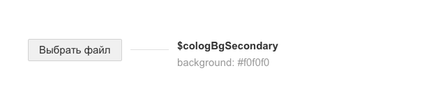
For the background of the button, we set the main fill in gray due to the variable $ colorBgSecondary.
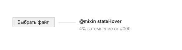
Then use mixin, which will dim our hover button by 4%.
To get the style of the pressed button, mixin is also applicable - it will darken the main background by 8% of the standard. We also need to move the button to another plane (z-index: −1) - for this we remove the shadow below and add inside.
We use this approach for any blocks: a button, a separate icon, a complex list item, and even an unusual layout card. So we closed the huge question of the dynamics of all the elements and did not paint a lot of colors.
On the z-axis, we have four element positions:

In our button, we apply the $ zIndex1 parameter.
normal:
hover:
active:
disabled:
We have a wide variety of services, the requirements of which must be met without prejudice to the design system - do not produce crutches. Without the parametric principles described above, this task would not be feasible. With them, it turns into a fairly simple exercise.
For example, take the simple button used in Mail.Ru Mail:
By changing the parameter for the background, we can easily get the main button with Mail.Ru accent color.
What parameters we change:
On media projects we use our accent color for everyone, different typography and slightly increased block size. To get a button for media projects from it, we simply substitute other variables and get the desired result.
What parameters we change:
The same button after substituting other variables on the My.com project looks like this:
What parameters we change:
For mobile versions of sites, the button becomes even larger so that it is easy to get into it with your finger.
What parameters we change:
As a result, by controlling the parameters, we generate new system solutions, avoiding crutches and quickly adapting to the expanding product line. And from the elements of simple interface elements (buttons, form fields, etc.), more complex components (for example, the photo viewer) are collected, which also benefit from scalability.
Having started the implementation of the design system in 2012, in 2015 we formed its holistic vision. It assumes a single source of truth, which will clearly spell out all the rules necessary for creating interfaces. Principles, recommendations, specific guidelines - all this should be stored in a single place and be 100% relevant.
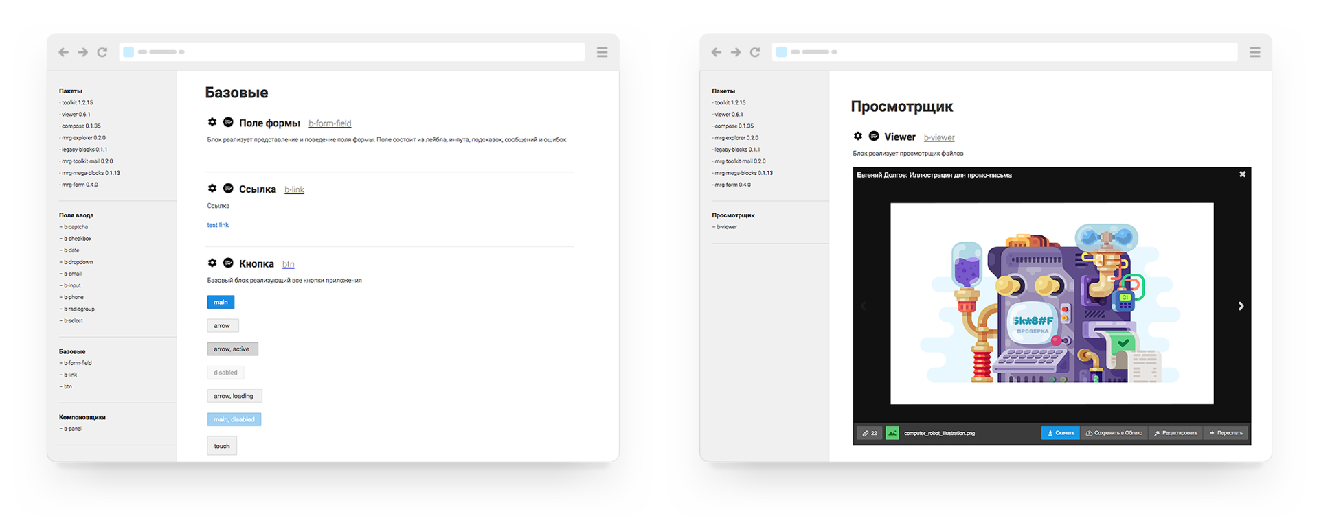
The main source of truth is a live guide, which shows the components used on real products. He declares the general rules of building interfaces and shows them by living examples. We have real living guidelines, but so far it has not been possible to bring them to the public state. At the same time, describing guidelines by screenshots is a dead-end direction (they instantly become obsolete and do not have even the simplest interaction), and considering the UI Kit design system in Sketch or Photoshop is self-deception.
At the same time, we needed to record the decisions made on the visual language, without waiting for these live guidelines to come to mind. As a result, we chose a compromise solution - static versions of our interface elements were built on which our design system is built.
In the course of work, we had the opportunity to roll in our principles in practice and look at the system from the standpoint of the developer. If earlier we created “pictures” for which we traced states, now these were “living” elements that required much more thorough study.
This experience allowed us to really work with the principle of parametricity, and the result was the emergence of mixins and service variables, which we would never reach, continuing to draw "picture-based" interface elements in a graphical editor.
The resulting set of elements has become a model, which we refer to in the process of updating the components library developers. As this update progresses, we will replace the static elements and components with real ones (taken from the library used on the layout) and the guideline will become completely alive.
We still have to go to the ideal vision, but with each stage of implementation we get more and more return from the design system:
And most importantly - the transition from large redesigns every few years to the constant maintenance of the relevance of the interface. The restarts take a lot of energy and lose thousands of small developments bolted to the design for a long time of its development.
The publication of current developments is a pleasant milestone in the development of the design system. But there is a lot of work ahead:
In the meantime, you can see our current developments. If you have ideas on how to improve them, we will be glad to hear your advice.

The team that worked on the design system:
For several years, the portal design team Mail.Ru Group has been engaged in updating and unifying products. We have formed a design system on which media projects work, a mobile web and partially productivity services (other products are gradually connected), a style of pictograms and illustrations has been formed, promotional letters and promotional sites are standardized. Of course, not all services are good yet, but somewhere the first redesign did not solve all the problems, but it is difficult not to notice a huge leap over the years. To speed up the update process and make our work public, we open out part of our Paradigm design system .
')
Prehistory
We made many approaches to the “shell” - we wrote specifications, collected a single source (UI Kit), made libraries of elements, etc. But in 2012, they realized that this was a dead-end direction - the design is often “twisted” on the way from layouts to implementation, so you need to rethink the inefficient chain “guideline → layout → layout → implementation”.
If you "marry" the design and technology, i.e. move the design to the level of technical implementation, it turns out that “guideline = layout = layout → implementation” and we will get rid of a heap of hemorrhoids on the introduction, improvement and support of products. Thus began the work on the design system in its proper sense: single components on the layout, into which the design is “sewn”.
Context
There are about 20 products in our “Mail and Portal” division - productivity (Mail, Cloud, Calendar, Mail.Ru for business), media projects (Auto, Horoscopes, Children, Welcome, Health, Lady, Cinema, Mediator, Real Estate, News, Weather , Sport, TV, Hi-Tech, SEOSan), Beepcar, Answers, mobile products (myMail, Artisto), the main page and general portal rules for Mail.Ru, support for the style of the My.com brand.
Requirements and context are great across the entire range. For example, in media projects it is important to show the main content juicy, and the model of news consumption is quite simple. At the same time, in productivity-services there is a high information density and intensity of interaction with the interface, so there is less space for visual expressiveness — everything goes to the main content and tools for interacting with it. And there are some completely different My.com and Beepcar, which are not related to the Mail.Ru brand, but they will also benefit from the use of general developments.
In other divisions, the tasks are no less diverse - in the company they make social networks, games, e-commerce, intranets, and a lot of other services. Although they are independent and at the current stage we make a design system for the tasks of our department, it is important that these developments are useful and applicable to all.
How to make a design system scalable? Our path was rather winding.
In 2012, we started processing the mobile web - we had to update and run 12 services from scratch. First of all, we began to use the guidelines and the UI Kit, but already in the course of working on the second project we realized that we would not go far at such a rate - we’ll draw the same models all year round.
Together with the developers came to the idea of distributed components into which the design was sewn. Thus, our first framework and the basis for the design system were born, and we completed the task of redrawing 12 mobile sites in just 2.5 months - we have not set such speed records yet.
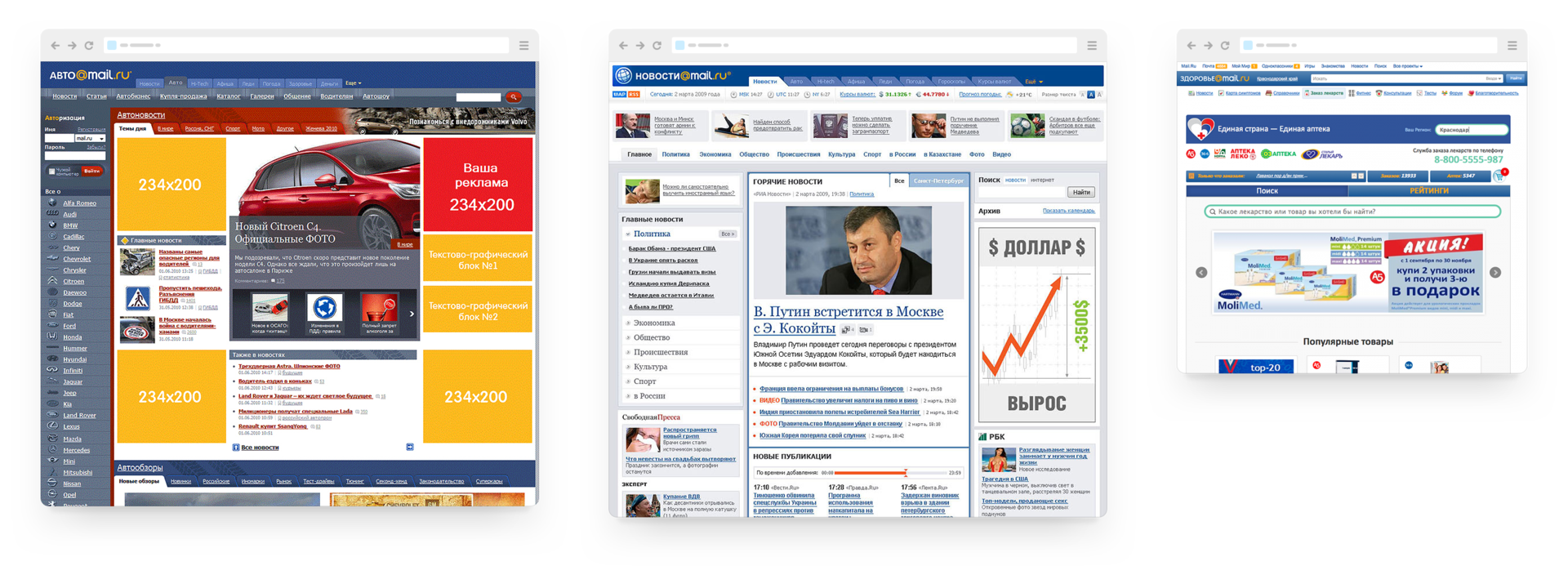
In the same year, the redesign of web versions of media projects began . The first approach to unification did not scale well, but at the end of 2012 we tried the “burger” approach (a series of “belts”, “lines”, “inserts” or “containers” that are actively used in modern promotional sites). Combining this interface ideology with the framework created for mobile sites, in 2014 we launched the first products based on a modified design system. Now there are already 12 of them and the speed of release of new versions on the market has become much higher - about six months from the beginning of the study to the launch, instead of a year earlier.
In 2014, we conducted a large hakaton for one of the products on a single visual language that would allow to combine not only different products, but also web, mobile web, mobile and tablet applications. Before that, we were moving in approximately the same direction, but this was rather a general feeling, rather than understandable principles. But it was here that the idea of a parametric design system was finally formed, which, due to several “layers of abstraction” (common parameters → common components → specific screens) became quite flexible and powerful. A couple of months after the start of this process, Material Design was announced, where we saw the implementation of many of our ideas in practice - we were moving in the right direction.
We described the current vision of the holistic design system in 2015 and since then we have been gradually implementing it.
Current state
What is a design system in our understanding?
- Visual language - defines how we create product interfaces. As in ordinary language, we have the alphabet (variables), words (interface elements), sentences (components), and whole texts (screens and products). The alphabet is unchanged, the vocabulary gradually changes over time, but the sentences and texts of them are always different. It is shown on design.mail.ru/paradigm .
- Uniform components at the technological level - the only source of truth. The design is “stitched” into them, services are received and updated from a single repository. Products under the Mail.Ru brand that use them in practice: media projects, mobile web, part of productivity services. They are still available only within the company.
- Templates for designer tools - a way to quickly show an idea, just high-level sketches. In an ideal situation, layouts are not made up, but assembled from single components. We wrote about them at the beginning of the year .
Key principles of our design systems that help to achieve scaling:
- Modularity - makes it relatively easy to manage a large number of products. The interface is built on the principle of abstraction layers: “variables → basic interface elements → components for the implementation of specific tasks → product screens”.
- Parametric - changing the specific parameters from which the interface elements are built, allows achieving scalability for products of different types. For this we use variables and mixins.
- A minimum of crutches - collect interface elements from already existing variables, and components - from already existing elements. Any decisions we make must fit into the system, live by its rules, and potentially be ready for use on any of our products.
- 4dp - the so-called "super-pixel." The cornerstone of the system, it builds the entire system of dimensions. We think only in numbers that are multiples of 4th. From the outside, the idea of dividing even the transparency values by 4 will seem like a heresy, but this significantly reduces the number of disputes and discrepancies in any variables. In the font part there are possible deviations related to the rendering of fonts in Windows (sizes 13, 15 and 17), but we hope to overcome this with time.
- Adaptation for mobile (small screens) and touch screens (finger control, no mouse). Any of our decisions a priori should be touch-friendly - this concerns the size of the elements, hover actions, etc. The boundaries between the devices are blurred and familiar desktop computers have touch screens. All interfaces must be either adaptive or have a mobile version.
We will tell about these principles with concrete examples.
Parametricity
Playing with a set of parameters, we can quickly get any element. For example, let's try building a simple button:
Typography
All the sizes and styles of fonts we store in variables that we use in the right situations. There are several large groups: these are headings, typesetting, captions. For our button, we will use the mixin @fontBody, which contains the basic style of the text for productivity services. This is a set of: font size, outline, line spacing. If necessary, specify the color and interparagraph distance.
Grid and 4dp padding
Each element of the design system is built on modules in 4dp (density independent pixels). This means that all dimensions of the interface elements and the indents between them should be divided into four without remainder. This is an additional “skeleton”, which, together with the main grid for the screen layout, gives harmony in the behavior of the elements, plus imposes some restrictions on the work. Which means less chance of making a mistake. This is also convenient when working with mobile interfaces, because a similar modular 8-pixel grid is used in Google Material Design.
To form indents in our button, we will use a combination of several variables: $ sizeControlHeight (element height) and $ paddingControlButton (internal indents inside the button).
Primary color and border
Everyone who worked on the unification of design, they know - it is unrealistic to make a minimal set of gray colors. And if you need decorative solutions like boundaries, write is gone - the set of variables will constantly grow. How to create a fixed and small set of colors, but at the same time to solve a variety of grocery problems?
Not only variables come to help, but also slightly more complex functions (mixin), as well as working with the property of transparency.
The first problem is the strokes and borders of the interface elements. If you use the usual variables, then to get the strokes and states for different accent colors you need to register even more parameters. It also comes to the aid of elementary transparency of individual elements. For example, separators in projects are defined precisely by transparency - it looks equally good on any background, while using the same parameter.
For our button, we will set the stroke style, which just uses 0.12 transparency and 1px line thickness. The stroke color will be mixed with the main background without having to enter a new color; variable - $ colorBorder. Also add a button the radius of the rounding using the variable $ sizeBorderRadius.
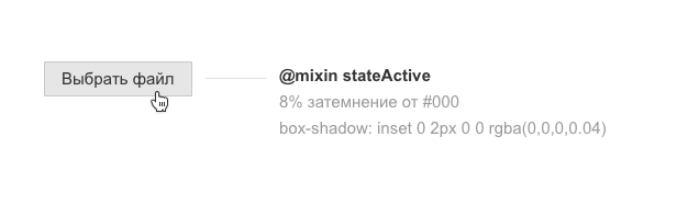
The second problem with the states of the elements: the normal state, pointing and pressing suggest additional fill colors of the object in our approach. Given the variety of accent colors on media projects, the number of variables can grow endlessly. We decided to fix the colors only for the normal state, and the rest are formed by the function (mixin), which takes the main color of the block, mixes it with black or white for a certain percentage - we get a new color.
For the background of the button, we set the main fill in gray due to the variable $ colorBgSecondary.
Then use mixin, which will dim our hover button by 4%.
@mixin stateHover ($colorBgSecondary) { background: mix($colorBgSecondary, $colorAccent, 4%); } To get the style of the pressed button, mixin is also applicable - it will darken the main background by 8% of the standard. We also need to move the button to another plane (z-index: −1) - for this we remove the shadow below and add inside.
@mixin stateActive ($colorBgSecondary) { background: mix($colorBgSecondary, $colorAccent, 8%); box-shadow: $zIndex-1; } We use this approach for any blocks: a button, a separate icon, a complex list item, and even an unusual layout card. So we closed the huge question of the dynamics of all the elements and did not paint a lot of colors.
Z-axis position with shadow
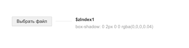
On the z-axis, we have four element positions:
- an element below the base level (for example, a pressed button) is depressed.
- element at the basic level (main content: text, photos and illustrations) - lies on the main plane.
- the element is raised above the base level (buttons, cards) - part of the layout or additional information to the main content.
- An element at a separate level (popup, tooltip, menu) is a way to show additional context without leaving the main one.
In our button, we apply the $ zIndex1 parameter.
What is the result
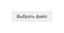
normal:
height: $sizeControlHeight; // 32px padding: 0 $paddingControlButton; // 0 16px background-color: $colorBgSecondary; // #f0f0f0 border-radius: $sizeBorderRadius; // 2px border: $sizeBorderWidth solid $colorBorder; // 1px solid rgba(0,0,0,.12) box-shadow: $zIndex1; // 0 2px 0 0 rgba(0,0,0,.04) color: $colorBody; // #333333 font-size: $fontBody; // 15px line-height: $fontBodyLine; // 20px hover:
@include stateHover ($colorBgSecondary); active:
@include stateActive ($colorBgSecondary); disabled:
opacity: .48; Scalability
We have a wide variety of services, the requirements of which must be met without prejudice to the design system - do not produce crutches. Without the parametric principles described above, this task would not be feasible. With them, it turns into a fairly simple exercise.
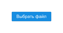
For example, take the simple button used in Mail.Ru Mail:
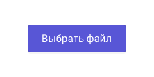
By changing the parameter for the background, we can easily get the main button with Mail.Ru accent color.
What parameters we change:
background-color: $colorAccent; // #168de2 color: $colorBody; // #ffffff On media projects we use our accent color for everyone, different typography and slightly increased block size. To get a button for media projects from it, we simply substitute other variables and get the desired result.
What parameters we change:
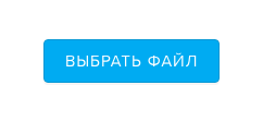
height: $sizeControlHeight; // 40px padding: 0 $paddingControlButton; // 0 20px background-color: $colorAccent; // #5856d6 color: $colorBody; // #333333 border-radius: $sizeBorderRadius; // 4px font-size: $fontBody; // 17px line-height: $fontBodyLine; // 24px The same button after substituting other variables on the My.com project looks like this:
What parameters we change:
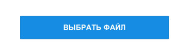
height: $sizeControlHeight; // 40px padding: 0 $paddingControlButton; // 0 20px background-color: $colorAccent; // #00abf2 color: $colorBody; // #333333 border-radius: $sizeBorderRadius; // 4px font-size: $fontBody; // 17px line-height: $fontBodyLine; // 24px text-transform: $fontBodyCase // uppercase For mobile versions of sites, the button becomes even larger so that it is easy to get into it with your finger.
What parameters we change:
height: $sizeControlHeight; // 48px padding: 0 $paddingControlButton; // 0 20px background-color: $colorAccent; // #168de2 color: $colorBody; // #333333 border-radius: $sizeBorderRadius; // 2px font-size: $fontBody; // 15px line-height: $fontBodyLine; // 20px text-transform: $fontBodyCase // uppercase As a result, by controlling the parameters, we generate new system solutions, avoiding crutches and quickly adapting to the expanding product line. And from the elements of simple interface elements (buttons, form fields, etc.), more complex components (for example, the photo viewer) are collected, which also benefit from scalability.
Paradigm
Having started the implementation of the design system in 2012, in 2015 we formed its holistic vision. It assumes a single source of truth, which will clearly spell out all the rules necessary for creating interfaces. Principles, recommendations, specific guidelines - all this should be stored in a single place and be 100% relevant.
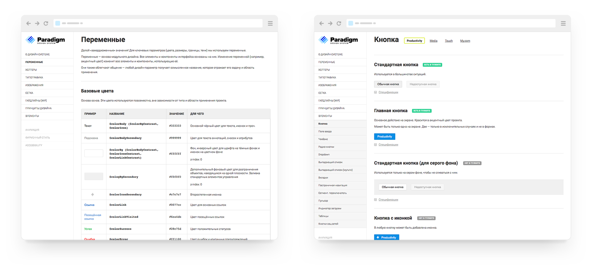
The main source of truth is a live guide, which shows the components used on real products. He declares the general rules of building interfaces and shows them by living examples. We have real living guidelines, but so far it has not been possible to bring them to the public state. At the same time, describing guidelines by screenshots is a dead-end direction (they instantly become obsolete and do not have even the simplest interaction), and considering the UI Kit design system in Sketch or Photoshop is self-deception.
At the same time, we needed to record the decisions made on the visual language, without waiting for these live guidelines to come to mind. As a result, we chose a compromise solution - static versions of our interface elements were built on which our design system is built.
In the course of work, we had the opportunity to roll in our principles in practice and look at the system from the standpoint of the developer. If earlier we created “pictures” for which we traced states, now these were “living” elements that required much more thorough study.
This experience allowed us to really work with the principle of parametricity, and the result was the emergence of mixins and service variables, which we would never reach, continuing to draw "picture-based" interface elements in a graphical editor.
The resulting set of elements has become a model, which we refer to in the process of updating the components library developers. As this update progresses, we will replace the static elements and components with real ones (taken from the library used on the layout) and the guideline will become completely alive.
We still have to go to the ideal vision, but with each stage of implementation we get more and more return from the design system:
- Higher speed of assembling layouts and products - you can pay more attention to the product itself, and not just drawing screens. In the framework, there are more and more necessary blocks and components for all occasions, which allows you to quickly build a new interface. It is convenient for the user - a group of similar products works in the same clear and familiar way. And also good for the brand - the entire line of services looks complete.
- Better product quality — controlling a large pool of projects is easier when they are the same. Instead of hundreds of individual projects, you follow a pair of guidelines.
- The cumulative effect of successful product solutions - for example, by raising the viewing depth on one of the services, it is easy to apply these improvements to the others.
- It is easier to interact with other teams - outsourcers make better projects, other products do not reinvent the wheel.
And most importantly - the transition from large redesigns every few years to the constant maintenance of the relevance of the interface. The restarts take a lot of energy and lose thousands of small developments bolted to the design for a long time of its development.
Future
The publication of current developments is a pleasant milestone in the development of the design system. But there is a lot of work ahead:
- Transfer the remaining products to the design system.
- Replace the pseudo-live guideline with a real live guideline that displays the components used on the products. They are, but still damp for publication.
- Synchronize the base elements of the interface and components - some of them are only in the visual language, technology framework or design templates.
- Supplement the live guideline with general principles of interaction, accessibility, animation, voice & tone.
- Designers prototype based on real elements and components in order to update the design system and collect layouts from actual parts.
In the meantime, you can see our current developments. If you have ideas on how to improve them, we will be glad to hear your advice.
PS
The team that worked on the design system:
- Alexander Kirov - the first UI Kit for mobile.
- Anton Eprev - the implementation of the first prototype of the component system, the framework of the component system fest.
- Evgeny Belyaev - the mobile web, the basis of the guideline for Android.
- Dmitry Osadchuk - guidelines for the comprehensive redesign of media projects, which became the basis of the system.
- Alexey Sergeev - basics of guidelines, product line synchronization.
- Pavel Skripkin - the ideology and the basis of a scalable system, the basis for the Android and iOS guidelines, portal navigation.
- Gevorg Glechyan - the basis of burger design, bringing the design system to scalability.
- Artem Gladkov is the basis and development for productivity-services, bringing the design system to scalability.
- Evgeny Dolgov - the basis of burger design, visual style (illustrations, icons, promotional sites, promotional letters), bringing the design system to scalability.
- Andrey Sundiev - ideology and bringing the system to scalability, layout and development of the Paradigm site, development for productivity-services.
- Yuri Vetrov - the ideology and the basis of a scalable system, the basis of guidelines for product lines and their synchronization.
- Konstantin Lebedev - feast component system framework.
- Konstantin Zubanov - the first generation of the mobile web.
- Maria Bobrova - development of productivity services.
- Slava Yashkov - the basis of the guideline for iOS.
- Svetlana Solovyov - a new generation of mobile web.
- Evgeny Ferulev - development of media projects.
- Alexey Kandaurov - the basis for productivity-services, the development of media projects.
- Development of media projects and mobile web: Alexander Bekbulatov, Dmitry Belyaev, Vitaly Vasin, Pavel Vdovtsev, Konstantin Vorozheikin, Evgeny Ivanov, Andrey Kusimov, Stanislav Mikhalsky, Sergey Nozhkin, Anton Poleshchuk, Boris Rebrov, Pavel Rybin, Maxim Trusov, Arstan Toregozhin, Pavel Scherbinin .
- Development of productivity services: Ilya Burlak, Artyom Mezin, Stanislav Tugovikov, Arthur Udalov, Yegor Utrobin.
- Alexey Sudilovsky - advice and support on the technical side of the issue.
Source: https://habr.com/ru/post/333510/
All Articles