7 ways to improve the design of the site
Alyona Lazareva, freelance editor, specifically for the Netology blog, spoke about seven possible ways to improve web design.
Scientists at Stanford University conducted a survey, which showed that 46% of respondents form an opinion about the site based on its appearance and interface. If the user does not like the design, then all the content seems unreliable and not trustworthy. In this article I want to talk about how there are ways to improve the design of the site.

Properly selected illustrations make the site alive. Their main task is not just to fill the empty space, but to evoke emotions and associate them with the brand. Author's illustrations will help make the site recognizable. They can be used in headings, icons and when creating animations.
')
When filling the site with illustrations, it is important to keep in mind uniformity and not to overdo it. The most beautiful illustrations will cause rejection if there are too many of them.

Dropbox uses simple illustrations that enhance the impression of the text.
Typography plays a big role in the formation of brand identity. It depends on how users will perceive the text.
Conventionally, fonts can be divided into four categories:
Antiquarian fonts ( serif ) are serif fonts. Previously, they were used for typing books and periodicals, but with the advent of high-resolution screens, antiquarian fonts came to web design. They are easy to read, therefore suitable for typing a large amount of text.

Grotesque fonts (Sans Serif) - sans serif fonts. Well suited for small texts, headings and narrow columns.
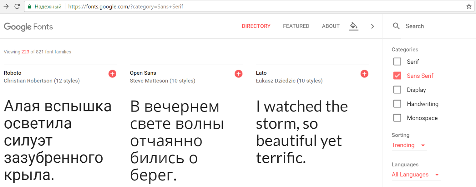
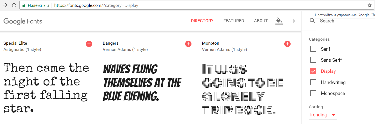
Decorative fonts - fonts that mimic the historical style or decorative processing. Suitable for typing a small amount of text that requires complex decoration.
Handwritten fonts are fonts that imitate handwriting or calligraphic style. Used as decorative.

Google Fonts is a well-known library of free fonts, where you can easily find the right font and import it to the site. The main thing is not to forget to adjust the size, outline and line spacing.

Perky Bros design studio used two fonts to design its website: Brown and Minion. The grotesque font Brown was used in the design of the navigation panel, and the antique Minion for typing about the company.

Another design bureau, Your Majesty, also uses two fonts: the grotesque Plain to decorate the menu and the decorative Canela to highlight information about the company's main partners.
Do not be afraid to combine serif and non-serif fonts. The main thing is that they are easy to read and combine with each other.
Most people find it easier to remember a picture than a read or heard text. Therefore, the choice of photos for the site should be approached especially carefully.
According to research , one image can replace 84 words.
The correct photo for the site should be:
Designers love to post large background photos on websites. They are beautiful, but quickly forgotten. The exception is made by photos which cause emotions: for example, images of people or photos from unusual angles.
The ideal option is to refuse stock photos, especially from free photo stocks. If a user sees a photo from a site on another resource, this can undermine the credibility of your content and brand as a whole.
Russian Post has two official representatives in social networks - Dmitry Markin and Tatyana Kuznetsova. Users found out that the photos of both were acquired on photo stocks and questioned the reality of the staff. The story quickly spread across the network, hitting the reputation of the Post and its "officials".


The animation on the site is a spectacular but far from new technique. First, the animation was created using GIF, then - Flash. Both solutions greatly slowed down the site. Now for creating animation using CSS-coding and JavaScript, which are not so noticeably affect the performance.
The animation can be full-screen or integrated into the navigation. Its main task is to help the user to deal with difficult moments and to draw his attention to important details.
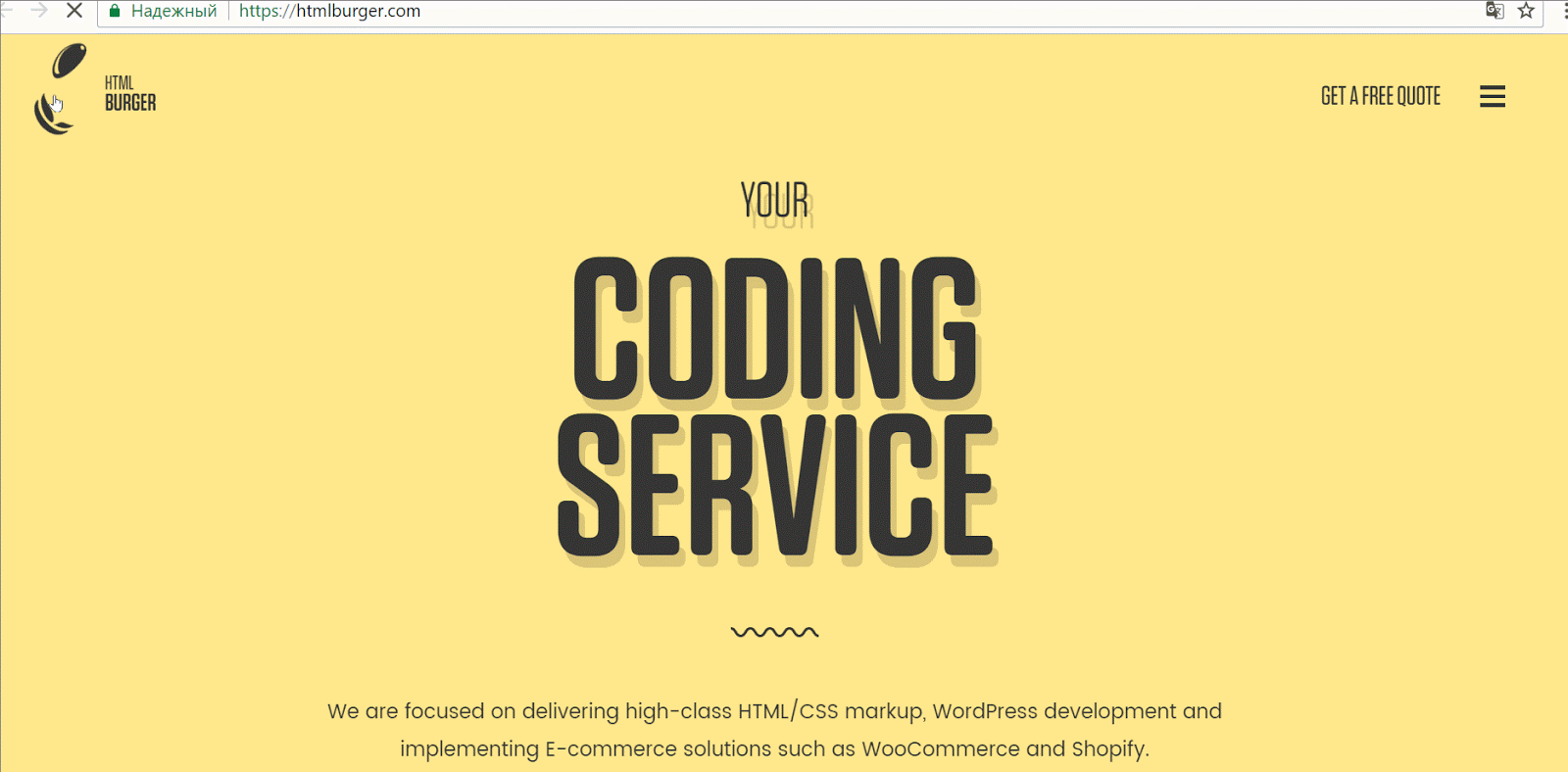
HTMLBURGER web development studio uses the "burger" menu in the truest sense of the word. Navigation elements come to life when you hover. This not only attracts attention, but also makes it clear which elements are clickable.
As in the case of animation, the moving image on the page instantly captures the attention of users. The main advantages of the video are the dynamics, plot development and a greater emotional response.
Video on the site is suitable for the following purposes:
It is better not to use background videos only for beauty: they reduce the performance of the site and do not convey any information to the user. If you still want to surprise users, I advise you to take a closer look at video alternatives: animation, parallax, and blue sky.
A cinemagraph is a photograph, one element of which makes an insignificant and infinitely repetitive motion, while the rest of the image remains fixed.
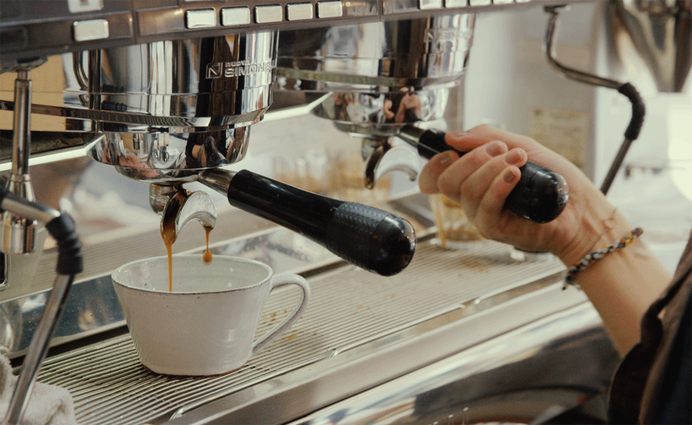
Source - cinemagraphs.com
When posting a video that is played automatically on the site, it will be good practice to turn off the autoplay sound. Users like to decide for themselves whether sound is needed - and it’s better to provide an opportunity to do it easily. Sudden loud sound scares not only the user, but all around.
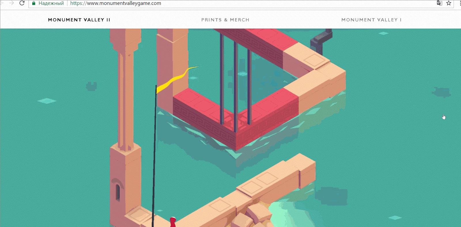
Instead of a thousand words - a bright, dynamic video, which from the first seconds plunges into the world of the game Monument Valley .
With each new generation, monitors and device displays are getting better. Therefore, the concept of a “secure web palette” is outdated. Choosing the color of the site, it is worth remembering about:
Using a bright color palette when designing a website is a popular trend of recent years. This is a universal solution for sites designed for a wide audience.
Some designers select the color scheme by eye, others use color palette generators. One of the best is currently considered Adobe Color CC . With it, you can create your own color schemes, as well as be inspired by the work of other designers.
Material design lovers like the same tools like the MaterialPallete or the Material Design Palette Generator .
True, it is important to remember that the generators help the designer, but do not replace the sense of taste. The spectacular palette, which was issued by the generator, can be unsuccessful decision at the implementation stage.

A service that will sign and send a postcard for you to your friends. The main target audience of the service is women, but not only they will appreciate the bright color scheme and cute illustrations.
The monochrome palette - a combination of one primary color and shadows, tones and half tones of this shade - allows the site to look stylish and concise. This solution is great for creating a flat or minimalistic design.
Choosing a monochrome palette for the site, special attention should be paid to contrast. If it is not sharp enough, the site elements will merge with the background.

Discreet monochrome site design studio from Canada.
As soon as everyone forgets the retro style in web design, it returns again. Designers love it for a restrained color palette and the ability to cause nostalgia among users.

For the design of your site, the digital agency uses sepia and a sign that used to designate roadside motels and restaurants on the highways of America.
The development of virtual reality technology is one of the most discussed topics of this year. While technologies still do not allow the full use of VR in web design, all existing attempts are at the prototype stage. It’s not completely clear whether VR can make websites more convenient or just remain a way to attract attention.
But there are techniques that can be called an imitation of virtual reality. Their main goal is to let the user feel like a participant in the events.
The parallax effect is created by scrolling, when the background and the object on it are scrolled at different speeds. It allows the user to create the illusion of three dimensions. Reception can be applied to the entire page or to individual blocks in order to draw attention to a certain part of the content.
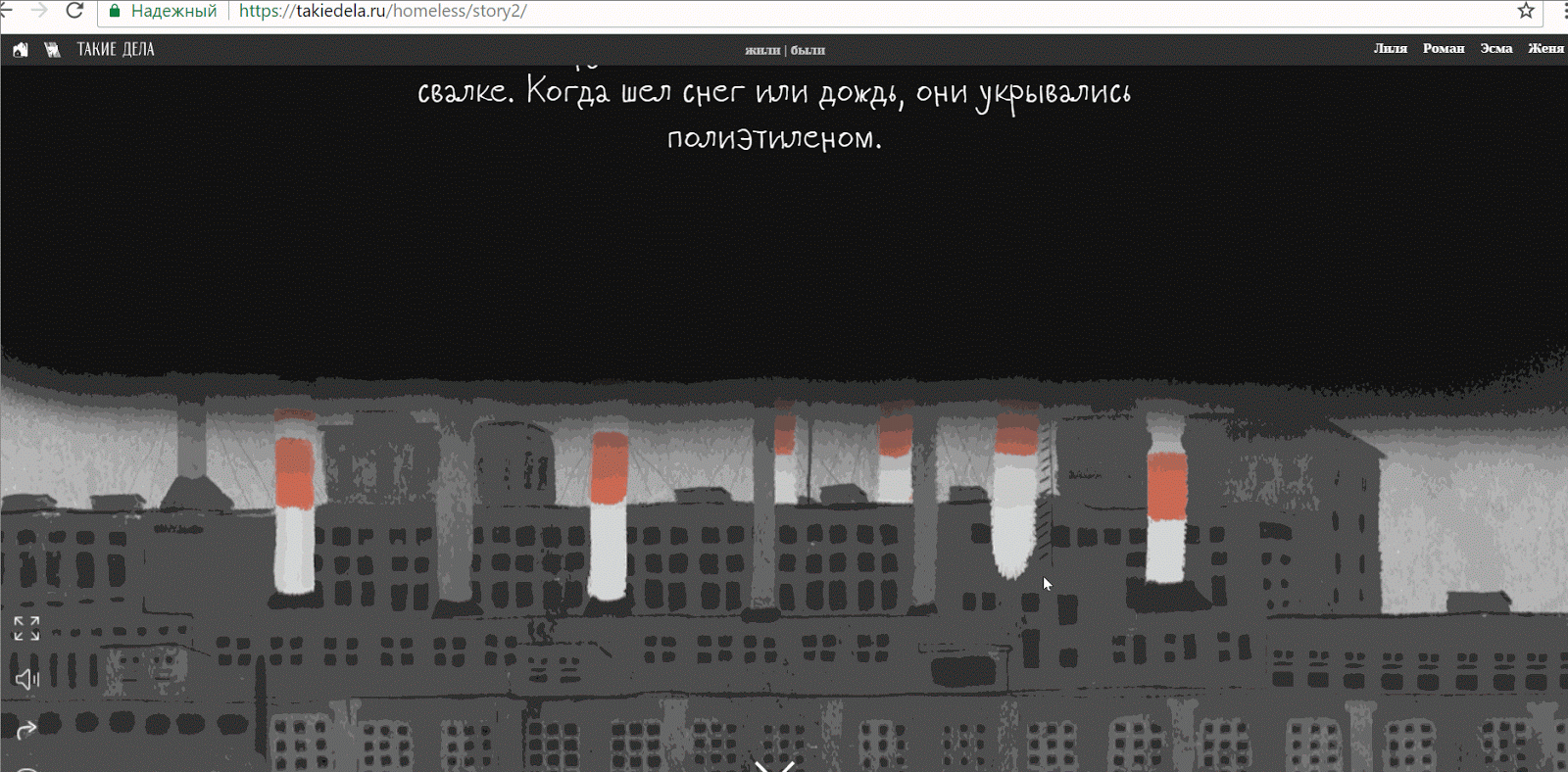
The heroes of the project about helping the homeless come to life when you scroll the page and tell the story of your life.
A 360 ° survey is created from a variety of photographs of a single object at different angles. They are glued in such a way that the user can rotate it through 360 ° and view from all sides.
This technique performs the same function as the video: it demonstrates the product. However, the main difference from the video - the ability to control.
When viewing the product, the buyer himself controls the time and speed of review. This makes him a participant in the process, not a passive observer.
Whatever reception you choose, remember common sense and trust your own experience. Each technique must be justified by a specific goal. Ideal solutions for all does not happen, but there are those that will suit your project.
Sign up for courses Netology:
“Web designer: effective website from idea to implementation” →
“Motion Design: Graphics in Motion” →
"Interface Design: UX-Design from Strategy to Testing" →
“UX-analytics: user research and common sense” →
... and to our free programs:
“The Basics of Graphic Design: Composition, Color, Typography” →
Adobe Photoshop: Basics for the Web Designer →
“Adobe XD: Basics for an Interface Designer” →
Scientists at Stanford University conducted a survey, which showed that 46% of respondents form an opinion about the site based on its appearance and interface. If the user does not like the design, then all the content seems unreliable and not trustworthy. In this article I want to talk about how there are ways to improve the design of the site.
Illustrations
Properly selected illustrations make the site alive. Their main task is not just to fill the empty space, but to evoke emotions and associate them with the brand. Author's illustrations will help make the site recognizable. They can be used in headings, icons and when creating animations.
')
Illustrations will help to make even the most minimalistic design friendly.
When filling the site with illustrations, it is important to keep in mind uniformity and not to overdo it. The most beautiful illustrations will cause rejection if there are too many of them.
Dropbox uses simple illustrations that enhance the impression of the text.
Typography
Typography plays a big role in the formation of brand identity. It depends on how users will perceive the text.
Each font has its own character. Try to choose the font that will convey the mood of the text due to the graphic image.
Conventionally, fonts can be divided into four categories:
Antiquarian fonts ( serif ) are serif fonts. Previously, they were used for typing books and periodicals, but with the advent of high-resolution screens, antiquarian fonts came to web design. They are easy to read, therefore suitable for typing a large amount of text.
Grotesque fonts (Sans Serif) - sans serif fonts. Well suited for small texts, headings and narrow columns.
Decorative fonts - fonts that mimic the historical style or decorative processing. Suitable for typing a small amount of text that requires complex decoration.
Handwritten fonts are fonts that imitate handwriting or calligraphic style. Used as decorative.
Google Fonts is a well-known library of free fonts, where you can easily find the right font and import it to the site. The main thing is not to forget to adjust the size, outline and line spacing.
Perky Bros design studio used two fonts to design its website: Brown and Minion. The grotesque font Brown was used in the design of the navigation panel, and the antique Minion for typing about the company.
Another design bureau, Your Majesty, also uses two fonts: the grotesque Plain to decorate the menu and the decorative Canela to highlight information about the company's main partners.
Do not be afraid to combine serif and non-serif fonts. The main thing is that they are easy to read and combine with each other.
Photo
Most people find it easier to remember a picture than a read or heard text. Therefore, the choice of photos for the site should be approached especially carefully.
According to research , one image can replace 84 words.
The correct photo for the site should be:
- informative;
- quality;
- original;
- emotional.
Designers love to post large background photos on websites. They are beautiful, but quickly forgotten. The exception is made by photos which cause emotions: for example, images of people or photos from unusual angles.
The ideal option is to refuse stock photos, especially from free photo stocks. If a user sees a photo from a site on another resource, this can undermine the credibility of your content and brand as a whole.
Russian Post has two official representatives in social networks - Dmitry Markin and Tatyana Kuznetsova. Users found out that the photos of both were acquired on photo stocks and questioned the reality of the staff. The story quickly spread across the network, hitting the reputation of the Post and its "officials".
Animation
The animation on the site is a spectacular but far from new technique. First, the animation was created using GIF, then - Flash. Both solutions greatly slowed down the site. Now for creating animation using CSS-coding and JavaScript, which are not so noticeably affect the performance.
The animation can be full-screen or integrated into the navigation. Its main task is to help the user to deal with difficult moments and to draw his attention to important details.
HTMLBURGER web development studio uses the "burger" menu in the truest sense of the word. Navigation elements come to life when you hover. This not only attracts attention, but also makes it clear which elements are clickable.
Video
As in the case of animation, the moving image on the page instantly captures the attention of users. The main advantages of the video are the dynamics, plot development and a greater emotional response.
Video on the site is suitable for the following purposes:
- show what is difficult to tell (training videos);
- tell a story;
- demonstrate the product.
It is better not to use background videos only for beauty: they reduce the performance of the site and do not convey any information to the user. If you still want to surprise users, I advise you to take a closer look at video alternatives: animation, parallax, and blue sky.
A cinemagraph is a photograph, one element of which makes an insignificant and infinitely repetitive motion, while the rest of the image remains fixed.
Source - cinemagraphs.com
When posting a video that is played automatically on the site, it will be good practice to turn off the autoplay sound. Users like to decide for themselves whether sound is needed - and it’s better to provide an opportunity to do it easily. Sudden loud sound scares not only the user, but all around.
Instead of a thousand words - a bright, dynamic video, which from the first seconds plunges into the world of the game Monument Valley .
Colors
With each new generation, monitors and device displays are getting better. Therefore, the concept of a “secure web palette” is outdated. Choosing the color of the site, it is worth remembering about:
- target audience;
- corporate style;
- contrast typography;
- color harmony.
To choose a color solution, determine the target audience and the message you want to convey to it.
Bright colours
Using a bright color palette when designing a website is a popular trend of recent years. This is a universal solution for sites designed for a wide audience.
Some designers select the color scheme by eye, others use color palette generators. One of the best is currently considered Adobe Color CC . With it, you can create your own color schemes, as well as be inspired by the work of other designers.
Material design lovers like the same tools like the MaterialPallete or the Material Design Palette Generator .
True, it is important to remember that the generators help the designer, but do not replace the sense of taste. The spectacular palette, which was issued by the generator, can be unsuccessful decision at the implementation stage.
A service that will sign and send a postcard for you to your friends. The main target audience of the service is women, but not only they will appreciate the bright color scheme and cute illustrations.
Monochrome
The monochrome palette - a combination of one primary color and shadows, tones and half tones of this shade - allows the site to look stylish and concise. This solution is great for creating a flat or minimalistic design.
Choosing a monochrome palette for the site, special attention should be paid to contrast. If it is not sharp enough, the site elements will merge with the background.
Discreet monochrome site design studio from Canada.
Retro
As soon as everyone forgets the retro style in web design, it returns again. Designers love it for a restrained color palette and the ability to cause nostalgia among users.
For the design of your site, the digital agency uses sepia and a sign that used to designate roadside motels and restaurants on the highways of America.
VR effects
The development of virtual reality technology is one of the most discussed topics of this year. While technologies still do not allow the full use of VR in web design, all existing attempts are at the prototype stage. It’s not completely clear whether VR can make websites more convenient or just remain a way to attract attention.
But there are techniques that can be called an imitation of virtual reality. Their main goal is to let the user feel like a participant in the events.
Parallax effect
The parallax effect is created by scrolling, when the background and the object on it are scrolled at different speeds. It allows the user to create the illusion of three dimensions. Reception can be applied to the entire page or to individual blocks in order to draw attention to a certain part of the content.
The heroes of the project about helping the homeless come to life when you scroll the page and tell the story of your life.
360 ° overview
A 360 ° survey is created from a variety of photographs of a single object at different angles. They are glued in such a way that the user can rotate it through 360 ° and view from all sides.
This technique performs the same function as the video: it demonstrates the product. However, the main difference from the video - the ability to control.
When viewing the product, the buyer himself controls the time and speed of review. This makes him a participant in the process, not a passive observer.
So, tips to help improve your site design.
- Use of author's illustrations.
- Focus on typography. Each font has a character - choose the one that fits your text.
- Refusal of stock photos: their use undermines the credibility of the brand.
- Use animation to highlight important blocks.
- Definition of the purpose of the video on the site: tell a story, explain the difficult, demonstrate the product.
- The choice of color scheme that will support the ideology of the brand.
- Transformation of the user into the participant of events.
Whatever reception you choose, remember common sense and trust your own experience. Each technique must be justified by a specific goal. Ideal solutions for all does not happen, but there are those that will suit your project.
From the Editor
Sign up for courses Netology:
“Web designer: effective website from idea to implementation” →
“Motion Design: Graphics in Motion” →
"Interface Design: UX-Design from Strategy to Testing" →
“UX-analytics: user research and common sense” →
... and to our free programs:
“The Basics of Graphic Design: Composition, Color, Typography” →
Adobe Photoshop: Basics for the Web Designer →
“Adobe XD: Basics for an Interface Designer” →
Source: https://habr.com/ru/post/332992/
All Articles