CSS and iOS Safari
 Good day, dear habrakhabrovtsy!
You always want your site to look equally good on different devices, including mobile ones. But, if the behavior in Android browsers is largely predictable, then a number of “surprises” arise from iOS. About them today and talk!
Some examples have already been published on Habré, but I decided to include them in the article anyway. I will divide the article into two parts. In the first - I’ll give you a list of useful css-properties for the webkit, and in the second we will talk about the fixes of problems that arise during the version for iOS Safari.
Properties
1. -webkit-overflow-scrolling: touch
')
This css-property will add a smooth scroll in blocks with overflow: scroll. I recommend adding this property wherever scrolling can occur inside a block, for example, in the mobile menu.
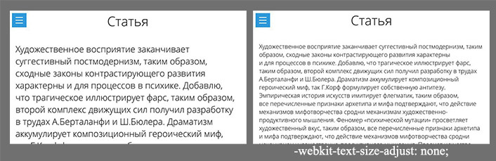
.ov-scroll{ overflow-y: auto; -webkit-overflow-scrolling:touch; } 2. -webkit-text-size-adjust: none
Disables scaling of text in horizontal orientation.
body{ -webkit-text-size-adjust: none; } Example:
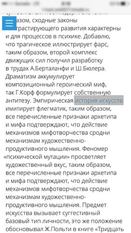
3. -webkit-tap-highlight-color: #ccc
Sets the color of the selection of the active element with a tap on it (a, label). The default is gray, and can often be to nothing, or stand out from the general design.
a, label{ -webkit-tap-highlight-color: transparent; } An example of such a selection:
4. -webkit-appearance: none
Disables the imposition on the elements of the system styles: shadows, border-radius, etc. Used for input (but not all), textarea, etc. Convenient when you need to set a uniform view of the elements on all devices.
input[type=text], input[type=submit], textarea{ -webkit-appearance: none; } It is used not only in the layout for Safari.
5. media (pointer: coarse)
This media query will allow you to separately register styles only for devices with touch support. Thus, on the touch devices, you can turn off unnecessary animations that are unnecessary for these types of devices.
@media (pointer:coarse){ ... } Can be used not only in the layout for Safari.
Fixes
1. background-attachment: fixed
Problem: background-attachment: fixed does not work in iOS Safari.
Solution: Fix not a background, but a block or pseudo-element.
body:before { content: ''; background-image: url(...); position: fixed; left: 0; right: 0; top: 0; bottom: 0; z-index: -1; } 2. Unwanted modal window scroll
Problem: This is quite a rare case, but for general information, I think it will also be useful to know about it. If the modal window has its own scrolling and in the closed state just set a negative z-index (and, for example, opacity: 0) - then when you try to scroll the page, the modal window can intercept the scroll. As a result, the page will not be scrolled.
Solution: Add pointer-events: none to the modal window in the closed state.
.modal{ position: fixed; z-index: -9; top: 0; bottom: 0; left: 0; right: 0; opacity: 0; pointer-events: none; } 3. Lost menu when scrolling
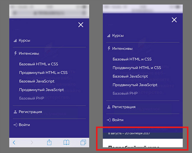
In order for the menu to “stick” to the upper border of the screen when scrolling the page, the following technique is often used. Initially, the menu has the position: absolute property, and when the upper border of the window is reached, it changes to fixed via js. And when the page is scrolled to the top, the value again changes to absolute.
Problem: In Safari on iOS, when you change the position from fixed to absolute, the menu disappears from the screen until the scroll completes.
Solution: Use position: -webkit-sticky for the menu. The behavior of the menu will be comparable to the above, but nothing will be lost! Plus, don't use js
.nav{ ......... position: absolute; } .nav_fix{ position: fixed; } @supports ((position:sticky) or (position:-webkit-sticky)){ .nav, .nav_fix{ position: -webkit-sticky; position: sticky; } } By the way, the sticky value for the position property is now supported by a large number of browsers, so it can be used in desktop browsers.
4. Block with position: fixed when scrolling
If I have seen implementation of solutions to previous problems on some sites, then this problem is constantly encountered on sites.
Problem: When scrolling in the browser, the screen height changes. From here, if the scroll is not blocked when the menu or modal window is open, a similar effect occurs:
Solution: You need to do the following "trick" using transform.
.nav{ position: fixed; left: 0; right: 0; bottom: 0; top: -70px; padding-bottom: 70px; transform: translateY(70px); } The value of 70px covers the difference in the height of the window. And only transform allows you to draw the background of the element outside the screen in this situation.
findings
And there are no particular conclusions, just use) If you know more useful css-properties or “fixes” that are applicable in practice, write in the comments!
Thanks for attention!
Update
Paragraph 5 was changed in the properties. Since media (hover) has narrow support. Thanks dom1n1k for the valuable comment.
Source: https://habr.com/ru/post/332872/
All Articles