Pathfinder: how we make the interface for CRPG

Hi, Habr! In our company for about a year there is a direction of experimental game development, and today we want to tell about one of them. We are Owlcat Games, and within the framework of the kick-start company we are developing the game Pathfinder: Kingmaker is a single-player CRPG with isometric graphics (hello, old school!). In this post we will tell about how we make the interface for our game.
Interfaces are a very big part of the CRPG games. In such games there are characters, skills, abilities, spells, characteristics - and this is a small part of what requires the attention of the player. High saturation of information is inevitable, and our task is to make the tables of numbers, formulas and endless columns of text take on an easy and understandable form. We constantly balance between the information content and how it looks and how convenient it is to use it. Therefore, in the work on each interface, we are guided by two basic principles: convenience and immersion. And at the very beginning of the way we decided to give preference to immersion where these two principles will conflict and at the same time there is no good compromise.
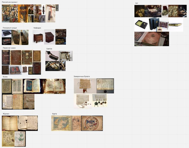
To implement the principle of "immersion" before starting work on the design of interfaces, we look at the real things of the era that comes closest to Pathfinder: Kingmaker. It can be old books, scrolls, chests, belt wallets and books, writing tools and chairs, maps and hiking journals. All this is reflected in the interfaces.
- The NeverEnding Story (1984) - IMDb
- Scroll of the Masters (Fate Reforged) - Gatherer - Magic: The Gathering
- Deepwater Metal Coins (60) - The Broken Token
- Art of Cornelis Norbertus Gysbrechts
- Dragon Age - The World of Thedas Volume 02 Limited Edition HC (Hardcover Book)
- Medieval Books and Maps
- Wallace family prayer book. Page 1. Copyright Richard Wallace
- Voynich manuscript
- Hp lovecraft art
- Art of Gabriel Mälesskircher
- The Temptation of St. Anthony
- Roger van der weyden
- Une rose pour loyer by Ellis Peters
For the implementation of the principle of "convenience" we are helped by UX-research and a properly constructed production pipeline.
So let's talk about how we do our work. Each interface - from large, saturated windows to small tooltips - goes through several stages and iterations.
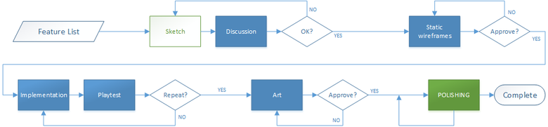
We adhere to the following scheme of work. First, we carefully analyze future content and make first sketches that we present to the team. Next, we develop interaction schemes and on the basis of this we create the first static wireframes, i.e., the interface “drawing”, in order to understand how it will look, evaluate the information content and layout of the elements. As a rule, this is followed by a heated discussion. For example, our game designer wants to see more numbers, EVERYWHERE, the more numbers the better. At the same time, the technical artist stubbornly insists that the interface be as atmospheric as possible, and with the information - how it goes. And it is difficult to refuse him. In general, maneuvering between opinions, like Odysseus between Scylla and Charybdis, we find a satisfying balance. Then - the implementation of the functional, art and playtests, after them - again the refinement of the functional and art. And so on until the result does not satisfy the whole team and players on focus and UX tests.
Inside the team it is sometimes difficult to evaluate the result of work. Especially for this, we conduct UX-studies in our UX-lab, attracting both active members of the Pathfinder Society community, and people who just love games in general and CRPG in particular. Research helps us to implement the principle of "convenience." For the first testing in early March of this year, we invited our colleagues and friends, partly - to boast, partly - for peer review. And although the version was rather crude and incomplete, we were able to get a lot of material for analysis.
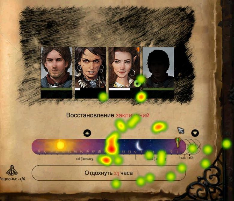
Rest interface heat map
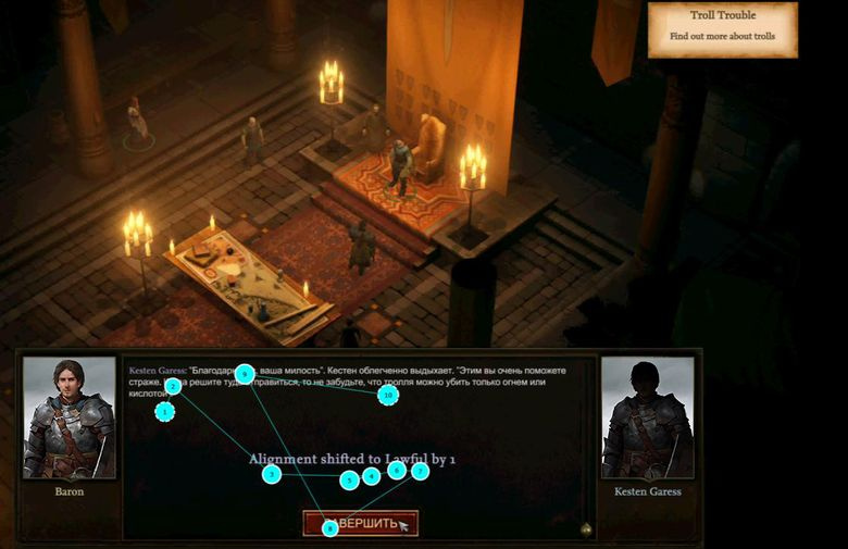
Eye tracking in dialogue
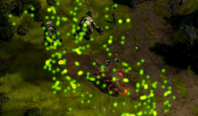
Heat map boevki
According to the results of the last study, a report was compiled on 66 pages. When parsing, more than a hundred unique tasks appeared. Some of them revealed obvious problems, and some showed that our solutions do not always work as we expected. For example, when analyzing the Rest interface, we found the following problems (see the Rest interface heat map ). Respondents did not understand:
- that you can hover your mouse over the status icon and get a hint;
- how to rest until full recovery of health;
- how much food is required to fully restore the characters' health;
- how much real time will be spent on recovery.
Soon we will conduct the following research, we want to focus not on the interface, but on the passage and the sensations that the player is experiencing in this case.
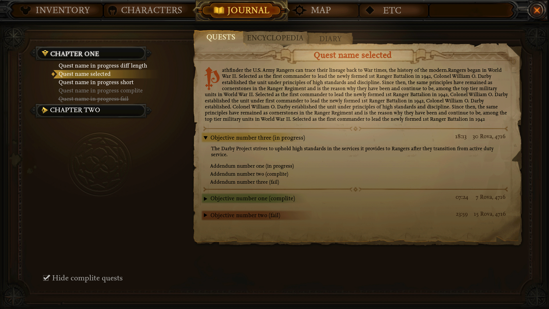
One of our first interfaces was the task log. In it, we experimented with both form and content. And if with the content everything turned out to be more or less clear (the list of tasks, their description, etc.), then the form was not so simple.
Sketch Magazine
Search
As a result, we have come to the next option, which we will develop in the future.
Thanks to the task log interface, we created the concept of a full-screen interface for system windows and found our own style.
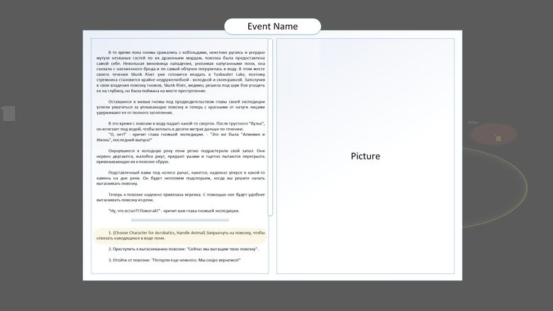
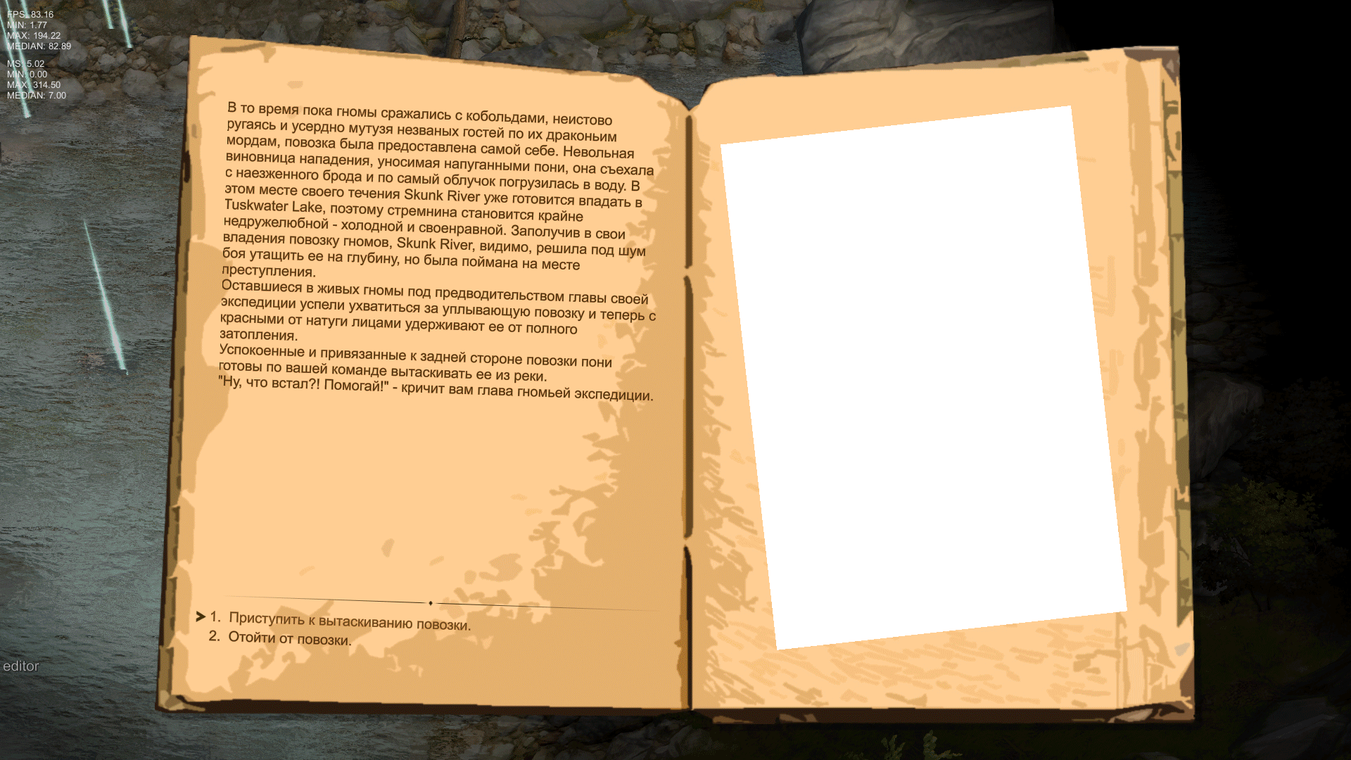
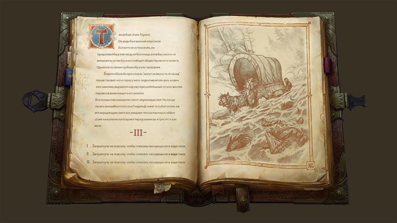
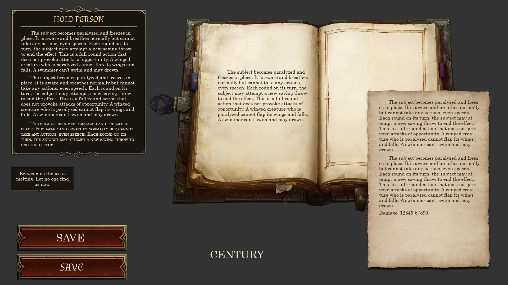
The next big interface that I want to talk about is the text event interface, which we call BookEvent inside the studio. It looks simple: text, answer options, a picture.
But in fact, everything turned out to be somewhat more complicated. Searches were long and difficult.
In the end, finding the form, we began to experiment with the content.
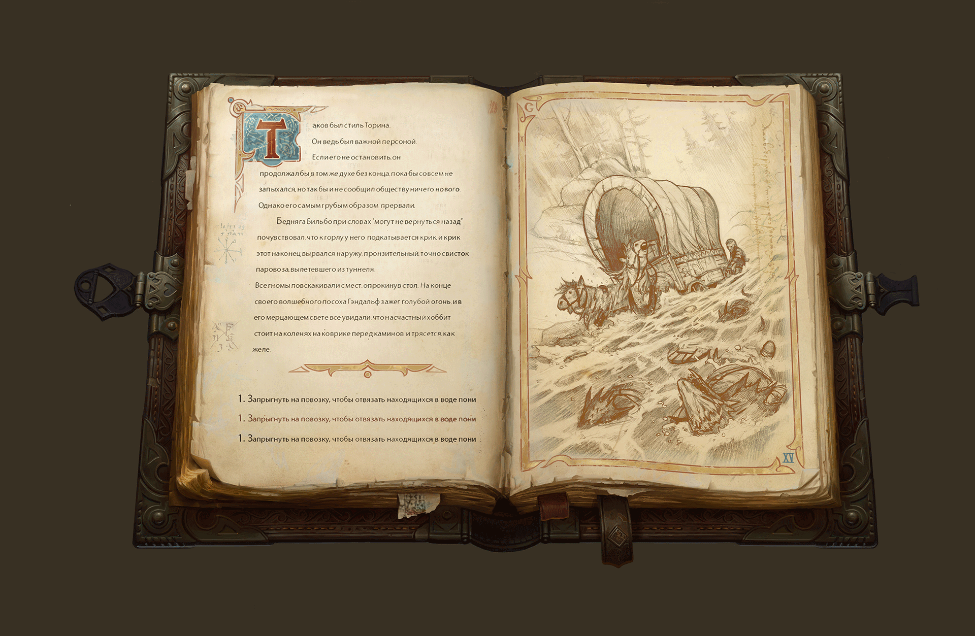
And that's what happened at the end. It seems nice.
But the work never ends, there is always the opportunity to improve both art and UX as a whole.
And finally. A separate challenge was the main font. We arranged a whole match, with finalists and prize places. The selection criteria were support for different language groups, variants of the style, readability (lower case and capital), capacity, numbers and, most importantly, the font suits our game or not. Can he convey the spirit of travel and adventure?
As a result, we stopped at Book Antiqua. It seemed to us a compromise between all requirements.

We want our game to show with all its sides that we know and love Pathfinder. And the interface like no other part of the game helps us in this.
')
Source: https://habr.com/ru/post/332802/
All Articles