Additive color spaces in colorimetry
Today we will talk about color.
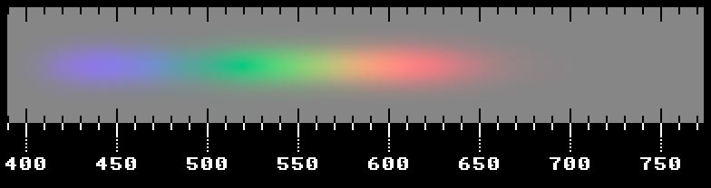
This is a spectrum of visible light, built in the sRGB color space using the prototype of my colorimetric engine. The wavelength in nanometers is signed below. It is the sRGB space that is today the standard for the Internet, since it is supported by the vast majority of displays. But in truth, its color coverage is small (only 36% of the colors visible to the eye); it is very poorly transmitted shades of green. For this reason, a gray background is superimposed on the depicted spectrum, reducing the saturation of colors to that which can be displayed on a standard monitor. About the same, what patterns underlie the formation of color, and how color is represented in digital technology, let this article tell.
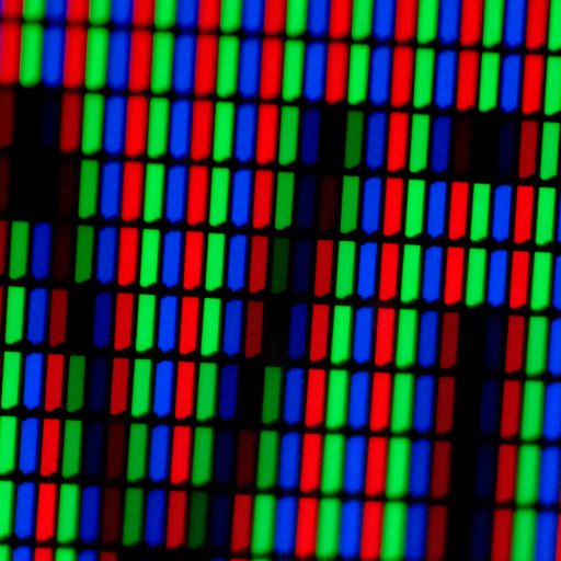
It is well known that a color image contains three color components. At the dawn of color photography, even before the appearance of color photographic film, the Russian photographer SM Prokudin-Gorsky combined three exposures, successively taken using red, green and blue light filters, and produced amazing shots with fairly reliable colors. Subsequently, in a color film began to apply three layers of emulsion. With the advent of color television, a raster of three different phosphors was used in television, emitting red, green or blue light when bombarded with electrons. By choosing the right amount of each color, you can get all the other colors - this is the so-called additive color model. For now, let's leave alone the subtractive model that is used in the printing industry. Also, we will not affect the features of the analog signal transmission in color television.
')
The key word here is additive. That is, the color is created by adding the three main components. But what are these primary colors? Their choice can pursue different goals. In the case of mathematical abstractions, these colors may even be physically impossible. In television, they were determined by the properties of the applied phosphors. What color is emitted is the main one. Each type of phosphor is characterized by its emission spectrum. These are far from pure monochromatic colors, but their spectral band is narrow enough so that they can be used to reproduce most of the colors encountered in life.
The additive color model is also valid for LCD displays, despite the fact that the liquid crystal absorbs the “extra” energy coming from the backlight (backlight), so that the required tone is obtained from white, and the special light filter absorbs the unnecessary spectral components. , green or blue subpixel:
The features of human perception of color and its transfer by technical means are dealt with by the science of colorimetry. Even in the XVII century, Isaac Newton was able to decompose white light into a spectrum using a prism, showing that each color is the sum of a set of elementary colors. Later it became clear that, despite the continuity of the spectrum of visible light, only three primary colors are a sufficient minimum. The fact is that normal human vision is trichromatic - as in all higher primates, formed by three types of cones (not taking into account the little-studied mesopic conditions, when the sticks are also included in the work in parallel). Most mammals have two types of cones (including cats and dogs), many species of animals can boast four, and as many as five have been found in a pigeon!
The light-sensitive cells of the retina have different sensitivity curves, which are functions of the light wavelength. Types of cones are denoted by the letters L , M and S (from the English. Long, medium, short). Their normalized sensitivity to each wavelength looks like this:

It would be natural to use the excitation levels of each of the types of cones as primary colors, wouldn’t it? This color space is called LMS . The difficulty is that the sensitivity curves shown above are slightly different for each person even with normal color vision, not to mention all kinds of anomalies. In addition, as it is easy to see on the charts, there is no such light stimulus that would selectively excite only one type of cones. This is not a Bayer filter on a digital camera sensor that contains only RGB cells! Any light that catches a type L or S cone will be perceived to some extent by type M cones. In this regard, the LMS system contains a large number of impossible colors and looks somewhat redundant, although it is indispensable in modeling visual impairment - it is enough to equate L = M or M = L to reliably imitate color blindness.
In 1931, the CIE XYZ color space was created experimentally, which conveniently accommodates all physically reproducible colors. CIE - in French, the "International Commission on Illumination" (commission internationale de l'éclairage). To this day, the space it has developed serves as a reference system for any color space used by the industry, including sRGB. The Y component is practically the brightness perceived by the eye, thanks to which the xyY representation has also become widespread , where x and y (in lower case letters) are nothing more than X and Y values in relation to the sum X + Y + Z, which means they are not depend on the brightness, lie in the range from 0.0 to 1.0 and determine only the color itself. Thus, we can separately operate with brightness and chromaticity, which in some cases is very convenient:
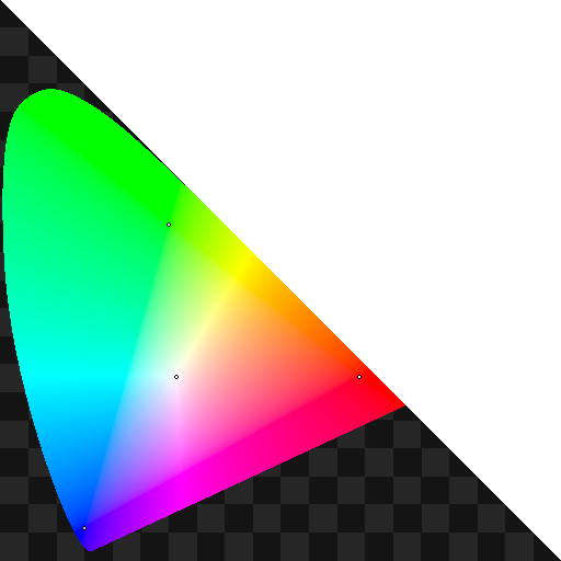
Before us is a CIE XYZ color chart. If we turn to the space xyY, then along the horizontal the coordinate x is here just plotted, vertically y . The diagram is triangular, since x + y cannot be greater than one, otherwise Z will be negative. One can imagine that we are looking at the base of a triangular pyramid (an inclined equilateral triangle), and the z axis "looks" directly at us. But even within this triangle, a significant part of the colors is imaginary and painted in a 0.05-sized cell. We are also interested in a figure, inside of which all physically realizable colors lie. Its horseshoe-curved border is all monochromatic colors ranging from violet to red. The reason is precisely this form in the nature of the visual perception of spectral colors.
The bottom line connecting purple with red is the so-called magenta line (in my diagram it is not quite exactly located). This line contains colors that are not monochromatic, but have a maximum saturation. It is difficult to obtain such colors: it is required to mix two monochromatic colors that stand at the very edges of the visible spectrum, and the eye's sensitivity to such light is very small. In fact, one can only asymptotically approach this line.
The dots in the diagram indicate the three primary colors sRGB and white color corresponding to a color temperature of 6500 K (this is also important). All colors outside the triangle of the primary colors cannot be displayed by this space and shown approximately. But do not be confused by the huge area of inaccessible shades of turquoise - the visual difference between the colors is unevenly distributed across the diagram and in this area the color differences are not too large (google ellipses of Macadam). By the way, the presence of such irregularities in the perception of color nuances makes it particularly difficult to accurately measure the degree of difference between two colors in colorimetry. A simple Euclidean metric is not enough here!
Directly in the XYZ space to work is difficult because of its tendency to the appearance of "imaginary" colors, which will be physically impossible to obtain. The XYZ space does not take into account some features of our vision. In addition, a large number of imaginary colors means that we are wasting bits of the discharge grid. If you look at the above color chart, you can see that a significant part of it is occupied by such impossible colors. In theory, they can be seen by directly acting on the cells of the retina, but this is beyond display technology. But there is good news: the color perception of the eye in a wide range of brightness is linear, and in any linear color space each of the values of R, G and B will be a linear combination of X, Y and Z values. Thus, using the methods of linear algebra, we can go from one space to another using ordinary 3x3 matrices!
Attention, the question: how to create a display with a color gamut, striving for 100% of the theoretically possible? Because of such a complex shape of an area of colors available to the eye, it is impossible to display all possible colors into a space with only three physically possible primary colors — in the diagram it will always have the shape of a triangle. With imaginary colors, everything would be simple, but imaginary colors are a mathematical abstraction; you cannot create them on the screen. In fact, after switching to monochromatic primary colors, the only way to further expand the color coverage of the device is to increase the number of these same colors. Apply more than three primary colors to create a hyperspectral color space, up to the ability of each individual pixel to radiate in a completely arbitrary spectrum, but such displays have not been created (since the potential of even three colors has not yet been realized). Hyperspectral images are used except for scientific purposes for satellite imagery, with no relation to colorimetry.
The CIE L * a * b * model (the Hunter Lab model without asterisks has significant differences and is not so common), where XYZ space is transformed by nonlinear (containing cubic roots) functions into something reflecting our subjective color sensations along the axes of yellow-blue and red-green . However, for use in an additive color model, the space must be linear.
It should be noted here that the actual color space (profile) is characterized not only by the primary colors and white point, but also by the gamma correction curve (transfer function), the specificity of which lies in the field of photometry. When only 8 bits are allocated to each number (as in 24-bit color), these bits should be used to the maximum. And the main task of gamma correction is to evenly distribute all 256 possible gradations according to the change in perceived brightness, in order to optimize the use of the discharge grid and make the signal quantization not so noticeable. A linear, photometrically accurate scale from 0 to 255 will have noticeable steps in the dark area. What can be used as a transfer function? The main requirement is that the function monotonously increase over the entire range of input values: this will make it bijective, unambiguously matching one value to another, which means that the inverse transformation will be possible. An ordinary power function of the form , where γ - and there will be an indicator of gamma correction. And to restore the original number, it suffices to replace the degree with 1 / γ. Due to the presence of the transfer function, the color spaces used in practice are most often non-linear.
Initially, the gamma curve also reflected the nature of the response of the phosphor to a change in the modulating voltage (the CRT monitor had a gamut of 2.2 in a natural way). Moreover, all operations on flowers should be carried out only in their linear representation. To save computing resources in games and interfaces, sometimes they draw semi-transparent surfaces without taking into account gamma curves (in the pre-HDR era of the recent past, this was a ubiquitous phenomenon), but this leads to noticeably distorted results. Therefore, before all colorimetric transformations, rgb values are necessarily returned to a linear scale.
After that, the CIE XYZ space serves as an intermediary for conversions between different color profiles. Thus, the transfer of color from one RGB space to another is carried out in four simple stages:
Using the properties of linear algebra, the two stages in the middle can be combined by simply multiplying the matrices. In addition to RGB, there are many other color models, but they cannot be obtained from XYZ by a simple linear transformation.
We are all familiar with the white balance setting when taking photos and videos. The color of the plot will directly depend on the light of the plot. But our perception to some extent is able to compensate for this effect, and electronic devices perceive the whole world as it is, along with the coloring brought by the lighting. Everything would be fine, but after the post-processing, increasing the contrast, saturation and other “improvements” the colors are distorted, and even when printed, a strong white balance shift will look bad. Objects will look quite different in the light of the flame of a candle and blue sky due to the strong differences in their spectra. In the same way, all the colors reproduced on the monitor screen will depend not only on the choice of primary colors, but also on the shade that will be obtained in white after adding all three colors taken at maximum brightness. Somewhere it may turn out to be yellower, somewhere it will obviously give a blueness or even be greenish. This is the point of white, which must be considered when calculating. Therefore, the white point is an integral characteristic of the color space, although it is possible to change it by simply scaling the R, G and B components.
It turns out that light that has a completely even spectrum, that is, all wavelengths of which contain the same energy (in mathematics such a spectrum is called white noise), will look not white, but brownish-pink compared to the daylight we are used to. The fact is that in nature there is a thermal radiation of an absolutely black body (AChT), and its spectrum always has a peak at a certain wavelength dependent on temperature and smoothly decreases in both directions. According to the laws of physics, the hotter an object is, the further the peak of its radiation shifts to the violet region of the spectrum.
Of course, real-world bodies do not absorb all the light and are not completely black, but this model is successfully applied, adjusted for an arbitrary absorption spectrum: where it is absorbed, it is emitted there. An “absolutely white” body cannot radiate anything by itself. The bodies of room temperature emit only far infrared light, the body with a temperature of 800 K barely glows red, the yellow filament is red-hot to 2800 K (infrared still prevails in the spectrum), and the surface of the Sun has an effective temperature of as much as 5778 K and is almost white, since the maximum radiation moved to the visible area. A hypothetical body with an infinitely large temperature will burn blue:

A man created a lot of various light sources that have a very different spectrum, often even visually completely different from the emission of ACHT. To eliminate confusion, standard light sources were introduced, which were assigned letter letters to vitamins. So, the white point D65 means that the white color in this space has a color temperature of 6500 K, which is typical for diffused daylight. This is the most commonly used value for displays today. But other standard sources:
The light of the most ordinary incandescent lamp with a color temperature of 2856 K.
It was a simulator of direct sunlight with a color temperature of 4874 K. It was recognized as obsolete with the advent of series D.
Daylight simulator with a temperature of 6774 K. It is also outdated, replaced by D65.
Different types of daylight. The numbers denote the color temperature in hundreds of kelvins. Sources D50, D55, D65 and D75 are canonical, sometimes you can find D93.
E means equal energy. The same gray-brown-crimson source with a flat spectrum.
From the word fluorescent. Sources from F1 to F12 correspond to different fluorescent lamps with a rather linear spectrum.
Not yet published a list of standard sources containing our favorite LEDs.

Obtained during the experiments of the 1920s, this space served as the basis for CIE XYZ. Primary colors are pure spectral - 700 nm (or so), 546 nm and 436 nm. Illuminant E is considered a white point. Gamma correction does not affect this standard. On the diagram, the coverage looks excellent in the area from red to green, which cannot be said about the shades of blue and turquoise - after all, the light with a length of 436 nm is almost purple.
This standard has been adopted for use in high definition television (HDTV). And the sRGB space is based on it. Primary colors are the colors of the phosphors of the kinescope. Therefore, such consumer level monitors can adequately reproduce such RGB. Covers as much as 36% of the visible color to the eye. Green is not particularly green here, more likely lime, and red is not so healthy. But the cathode ray tubes were pretty good blue. White reference usually D65.
It is believed that the gamma correction rate is 2.2, and on average this is the case, but near the black a small linear section was made in the transfer function (in order to avoid rupture of the derivative at the black point), which is not always remembered.
The same sRGB with a modified green color, thanks to which the transfer of shades of green has significantly improved, and the coverage of L * a * b * has been increased to 52%. In addition, the stupid linear portion of the gamut in the shadows was removed, thanks to which its index is always 2.2. In this space, there are expensive professional monitors. However, here you will not see real red. It is widely used in photography and, as a rule, is supported by SLR cameras.
Designed by Adobe Systems with a truly wide color space. Introduced pure spectral primary colors - 700 nm, 525 nm and 450 nm. There is a gamma 2.2 without a linear plot. The white point has become the D50. The color gamut is really very wide (78%, after all), only a simple blue color sRGB still sticks out of it as a little harmful burr.
Developed by Kodak, as the name suggests, for working with photos. Very wide color gamut, however green and blue are imaginary. D50 white point. A gamma value of about 1.8 with a linear plot in the lower range of values.
Also called Rec. 2020. The standard is recommended for future ultra-high definition television systems (UHDTV) and is gradually being implemented. Primary colors are replaced by monochromatic - the colors of lasers with wavelengths of 630 nm, 532 nm, and 467 nm. Unlike Adobe Wide Gamut RGB, the entire sRGB space fits here entirely. The gamma curve is the same as that of sRGB, white is also D65. Newer Rec. The 2100 introduces two more transfer functions for images with a wide dynamic range.
Despite clear progress, the color gamut of most modern displays is still quite far from the theoretical limit. In the coming years, it is expected the proliferation of displays with extended color gamut using OLED technology and laser projection. There are still a lot of unsolved problems in colorimetry. The features of the interaction of our night and day vision, individual differences in color perception remain little studied. It is possible that some people are tetrahromat. And if a person removes the lens of the eye, he begins to see near ultraviolet light as white-blue.
With the advent of HDR displays, immersive effects in movies and games will intensify, and dynamic scenes will become even more exciting and reliable, but new transfer functions, such as hybrid log-gamma and Perceptual Quantizer, will be required to accommodate the advanced 256 levels in the same 256 levels. range. BT.2100 is intended to standardize these enhancements.
I developed a color space similar to Rec. 2020, also using monochromatic primary colors, specially selected to provide wide color coverage with a white D65 point. In addition, I used a gamma value of 2.0. The use of such a gamut means that in order to obtain a linear representation of RGB, the color components simply need to be squared, which greatly simplifies the calculations while maintaining the accuracy of color reproduction. This has a physical meaning - the amplitude of the signal is proportional to the square of the power, and the rgb values in this case just encode the amplitudes. As an alternative to HDR images, I am experimenting with a fully logarithmic transfer function with an exponential characteristic, which allows replacing multiplication with addition when calculating the lighting.
This is a spectrum of visible light, built in the sRGB color space using the prototype of my colorimetric engine. The wavelength in nanometers is signed below. It is the sRGB space that is today the standard for the Internet, since it is supported by the vast majority of displays. But in truth, its color coverage is small (only 36% of the colors visible to the eye); it is very poorly transmitted shades of green. For this reason, a gray background is superimposed on the depicted spectrum, reducing the saturation of colors to that which can be displayed on a standard monitor. About the same, what patterns underlie the formation of color, and how color is represented in digital technology, let this article tell.
Creating a color image
It is well known that a color image contains three color components. At the dawn of color photography, even before the appearance of color photographic film, the Russian photographer SM Prokudin-Gorsky combined three exposures, successively taken using red, green and blue light filters, and produced amazing shots with fairly reliable colors. Subsequently, in a color film began to apply three layers of emulsion. With the advent of color television, a raster of three different phosphors was used in television, emitting red, green or blue light when bombarded with electrons. By choosing the right amount of each color, you can get all the other colors - this is the so-called additive color model. For now, let's leave alone the subtractive model that is used in the printing industry. Also, we will not affect the features of the analog signal transmission in color television.
')
The key word here is additive. That is, the color is created by adding the three main components. But what are these primary colors? Their choice can pursue different goals. In the case of mathematical abstractions, these colors may even be physically impossible. In television, they were determined by the properties of the applied phosphors. What color is emitted is the main one. Each type of phosphor is characterized by its emission spectrum. These are far from pure monochromatic colors, but their spectral band is narrow enough so that they can be used to reproduce most of the colors encountered in life.
The additive color model is also valid for LCD displays, despite the fact that the liquid crystal absorbs the “extra” energy coming from the backlight (backlight), so that the required tone is obtained from white, and the special light filter absorbs the unnecessary spectral components. , green or blue subpixel:
Introduction to Colorimetry
The features of human perception of color and its transfer by technical means are dealt with by the science of colorimetry. Even in the XVII century, Isaac Newton was able to decompose white light into a spectrum using a prism, showing that each color is the sum of a set of elementary colors. Later it became clear that, despite the continuity of the spectrum of visible light, only three primary colors are a sufficient minimum. The fact is that normal human vision is trichromatic - as in all higher primates, formed by three types of cones (not taking into account the little-studied mesopic conditions, when the sticks are also included in the work in parallel). Most mammals have two types of cones (including cats and dogs), many species of animals can boast four, and as many as five have been found in a pigeon!
The light-sensitive cells of the retina have different sensitivity curves, which are functions of the light wavelength. Types of cones are denoted by the letters L , M and S (from the English. Long, medium, short). Their normalized sensitivity to each wavelength looks like this:
It would be natural to use the excitation levels of each of the types of cones as primary colors, wouldn’t it? This color space is called LMS . The difficulty is that the sensitivity curves shown above are slightly different for each person even with normal color vision, not to mention all kinds of anomalies. In addition, as it is easy to see on the charts, there is no such light stimulus that would selectively excite only one type of cones. This is not a Bayer filter on a digital camera sensor that contains only RGB cells! Any light that catches a type L or S cone will be perceived to some extent by type M cones. In this regard, the LMS system contains a large number of impossible colors and looks somewhat redundant, although it is indispensable in modeling visual impairment - it is enough to equate L = M or M = L to reliably imitate color blindness.
In 1931, the CIE XYZ color space was created experimentally, which conveniently accommodates all physically reproducible colors. CIE - in French, the "International Commission on Illumination" (commission internationale de l'éclairage). To this day, the space it has developed serves as a reference system for any color space used by the industry, including sRGB. The Y component is practically the brightness perceived by the eye, thanks to which the xyY representation has also become widespread , where x and y (in lower case letters) are nothing more than X and Y values in relation to the sum X + Y + Z, which means they are not depend on the brightness, lie in the range from 0.0 to 1.0 and determine only the color itself. Thus, we can separately operate with brightness and chromaticity, which in some cases is very convenient:
Before us is a CIE XYZ color chart. If we turn to the space xyY, then along the horizontal the coordinate x is here just plotted, vertically y . The diagram is triangular, since x + y cannot be greater than one, otherwise Z will be negative. One can imagine that we are looking at the base of a triangular pyramid (an inclined equilateral triangle), and the z axis "looks" directly at us. But even within this triangle, a significant part of the colors is imaginary and painted in a 0.05-sized cell. We are also interested in a figure, inside of which all physically realizable colors lie. Its horseshoe-curved border is all monochromatic colors ranging from violet to red. The reason is precisely this form in the nature of the visual perception of spectral colors.
The bottom line connecting purple with red is the so-called magenta line (in my diagram it is not quite exactly located). This line contains colors that are not monochromatic, but have a maximum saturation. It is difficult to obtain such colors: it is required to mix two monochromatic colors that stand at the very edges of the visible spectrum, and the eye's sensitivity to such light is very small. In fact, one can only asymptotically approach this line.
The dots in the diagram indicate the three primary colors sRGB and white color corresponding to a color temperature of 6500 K (this is also important). All colors outside the triangle of the primary colors cannot be displayed by this space and shown approximately. But do not be confused by the huge area of inaccessible shades of turquoise - the visual difference between the colors is unevenly distributed across the diagram and in this area the color differences are not too large (google ellipses of Macadam). By the way, the presence of such irregularities in the perception of color nuances makes it particularly difficult to accurately measure the degree of difference between two colors in colorimetry. A simple Euclidean metric is not enough here!
Conversion between color spaces
Directly in the XYZ space to work is difficult because of its tendency to the appearance of "imaginary" colors, which will be physically impossible to obtain. The XYZ space does not take into account some features of our vision. In addition, a large number of imaginary colors means that we are wasting bits of the discharge grid. If you look at the above color chart, you can see that a significant part of it is occupied by such impossible colors. In theory, they can be seen by directly acting on the cells of the retina, but this is beyond display technology. But there is good news: the color perception of the eye in a wide range of brightness is linear, and in any linear color space each of the values of R, G and B will be a linear combination of X, Y and Z values. Thus, using the methods of linear algebra, we can go from one space to another using ordinary 3x3 matrices!
Attention, the question: how to create a display with a color gamut, striving for 100% of the theoretically possible? Because of such a complex shape of an area of colors available to the eye, it is impossible to display all possible colors into a space with only three physically possible primary colors — in the diagram it will always have the shape of a triangle. With imaginary colors, everything would be simple, but imaginary colors are a mathematical abstraction; you cannot create them on the screen. In fact, after switching to monochromatic primary colors, the only way to further expand the color coverage of the device is to increase the number of these same colors. Apply more than three primary colors to create a hyperspectral color space, up to the ability of each individual pixel to radiate in a completely arbitrary spectrum, but such displays have not been created (since the potential of even three colors has not yet been realized). Hyperspectral images are used except for scientific purposes for satellite imagery, with no relation to colorimetry.
The CIE L * a * b * model (the Hunter Lab model without asterisks has significant differences and is not so common), where XYZ space is transformed by nonlinear (containing cubic roots) functions into something reflecting our subjective color sensations along the axes of yellow-blue and red-green . However, for use in an additive color model, the space must be linear.
It should be noted here that the actual color space (profile) is characterized not only by the primary colors and white point, but also by the gamma correction curve (transfer function), the specificity of which lies in the field of photometry. When only 8 bits are allocated to each number (as in 24-bit color), these bits should be used to the maximum. And the main task of gamma correction is to evenly distribute all 256 possible gradations according to the change in perceived brightness, in order to optimize the use of the discharge grid and make the signal quantization not so noticeable. A linear, photometrically accurate scale from 0 to 255 will have noticeable steps in the dark area. What can be used as a transfer function? The main requirement is that the function monotonously increase over the entire range of input values: this will make it bijective, unambiguously matching one value to another, which means that the inverse transformation will be possible. An ordinary power function of the form , where γ - and there will be an indicator of gamma correction. And to restore the original number, it suffices to replace the degree with 1 / γ. Due to the presence of the transfer function, the color spaces used in practice are most often non-linear.
Initially, the gamma curve also reflected the nature of the response of the phosphor to a change in the modulating voltage (the CRT monitor had a gamut of 2.2 in a natural way). Moreover, all operations on flowers should be carried out only in their linear representation. To save computing resources in games and interfaces, sometimes they draw semi-transparent surfaces without taking into account gamma curves (in the pre-HDR era of the recent past, this was a ubiquitous phenomenon), but this leads to noticeably distorted results. Therefore, before all colorimetric transformations, rgb values are necessarily returned to a linear scale.
After that, the CIE XYZ space serves as an intermediary for conversions between different color profiles. Thus, the transfer of color from one RGB space to another is carried out in four simple stages:
- Transition from the original rgb representation to linear RGB (gamma expansion)
- Transition from linear RGB to linear XYZ
- Transition from linear XYZ to new R'G'B'-space
- Gamma Correction - transition from linear R'G'B 'to r'g'b' of the final color space (gamma compression)
Using the properties of linear algebra, the two stages in the middle can be combined by simply multiplying the matrices. In addition to RGB, there are many other color models, but they cannot be obtained from XYZ by a simple linear transformation.
About white points
We are all familiar with the white balance setting when taking photos and videos. The color of the plot will directly depend on the light of the plot. But our perception to some extent is able to compensate for this effect, and electronic devices perceive the whole world as it is, along with the coloring brought by the lighting. Everything would be fine, but after the post-processing, increasing the contrast, saturation and other “improvements” the colors are distorted, and even when printed, a strong white balance shift will look bad. Objects will look quite different in the light of the flame of a candle and blue sky due to the strong differences in their spectra. In the same way, all the colors reproduced on the monitor screen will depend not only on the choice of primary colors, but also on the shade that will be obtained in white after adding all three colors taken at maximum brightness. Somewhere it may turn out to be yellower, somewhere it will obviously give a blueness or even be greenish. This is the point of white, which must be considered when calculating. Therefore, the white point is an integral characteristic of the color space, although it is possible to change it by simply scaling the R, G and B components.
It turns out that light that has a completely even spectrum, that is, all wavelengths of which contain the same energy (in mathematics such a spectrum is called white noise), will look not white, but brownish-pink compared to the daylight we are used to. The fact is that in nature there is a thermal radiation of an absolutely black body (AChT), and its spectrum always has a peak at a certain wavelength dependent on temperature and smoothly decreases in both directions. According to the laws of physics, the hotter an object is, the further the peak of its radiation shifts to the violet region of the spectrum.
Of course, real-world bodies do not absorb all the light and are not completely black, but this model is successfully applied, adjusted for an arbitrary absorption spectrum: where it is absorbed, it is emitted there. An “absolutely white” body cannot radiate anything by itself. The bodies of room temperature emit only far infrared light, the body with a temperature of 800 K barely glows red, the yellow filament is red-hot to 2800 K (infrared still prevails in the spectrum), and the surface of the Sun has an effective temperature of as much as 5778 K and is almost white, since the maximum radiation moved to the visible area. A hypothetical body with an infinitely large temperature will burn blue:
A man created a lot of various light sources that have a very different spectrum, often even visually completely different from the emission of ACHT. To eliminate confusion, standard light sources were introduced, which were assigned letter letters to vitamins. So, the white point D65 means that the white color in this space has a color temperature of 6500 K, which is typical for diffused daylight. This is the most commonly used value for displays today. But other standard sources:
Illuminant A
The light of the most ordinary incandescent lamp with a color temperature of 2856 K.
Illuminant B
It was a simulator of direct sunlight with a color temperature of 4874 K. It was recognized as obsolete with the advent of series D.
Illuminant C
Daylight simulator with a temperature of 6774 K. It is also outdated, replaced by D65.
D series
Different types of daylight. The numbers denote the color temperature in hundreds of kelvins. Sources D50, D55, D65 and D75 are canonical, sometimes you can find D93.
Illuminant E
E means equal energy. The same gray-brown-crimson source with a flat spectrum.
F Series
From the word fluorescent. Sources from F1 to F12 correspond to different fluorescent lamps with a rather linear spectrum.
L series
Not yet published a list of standard sources containing our favorite LEDs.
Brief description of some common RGB color spaces
CIE RGB
Obtained during the experiments of the 1920s, this space served as the basis for CIE XYZ. Primary colors are pure spectral - 700 nm (or so), 546 nm and 436 nm. Illuminant E is considered a white point. Gamma correction does not affect this standard. On the diagram, the coverage looks excellent in the area from red to green, which cannot be said about the shades of blue and turquoise - after all, the light with a length of 436 nm is almost purple.
ITU-R BT.709
This standard has been adopted for use in high definition television (HDTV). And the sRGB space is based on it. Primary colors are the colors of the phosphors of the kinescope. Therefore, such consumer level monitors can adequately reproduce such RGB. Covers as much as 36% of the visible color to the eye. Green is not particularly green here, more likely lime, and red is not so healthy. But the cathode ray tubes were pretty good blue. White reference usually D65.
It is believed that the gamma correction rate is 2.2, and on average this is the case, but near the black a small linear section was made in the transfer function (in order to avoid rupture of the derivative at the black point), which is not always remembered.
Adobe RGB '98
The same sRGB with a modified green color, thanks to which the transfer of shades of green has significantly improved, and the coverage of L * a * b * has been increased to 52%. In addition, the stupid linear portion of the gamut in the shadows was removed, thanks to which its index is always 2.2. In this space, there are expensive professional monitors. However, here you will not see real red. It is widely used in photography and, as a rule, is supported by SLR cameras.
Adobe Wide Gamut RGB
Designed by Adobe Systems with a truly wide color space. Introduced pure spectral primary colors - 700 nm, 525 nm and 450 nm. There is a gamma 2.2 without a linear plot. The white point has become the D50. The color gamut is really very wide (78%, after all), only a simple blue color sRGB still sticks out of it as a little harmful burr.
ProPhoto RGB
Developed by Kodak, as the name suggests, for working with photos. Very wide color gamut, however green and blue are imaginary. D50 white point. A gamma value of about 1.8 with a linear plot in the lower range of values.
ITU-R BT.2020
Also called Rec. 2020. The standard is recommended for future ultra-high definition television systems (UHDTV) and is gradually being implemented. Primary colors are replaced by monochromatic - the colors of lasers with wavelengths of 630 nm, 532 nm, and 467 nm. Unlike Adobe Wide Gamut RGB, the entire sRGB space fits here entirely. The gamma curve is the same as that of sRGB, white is also D65. Newer Rec. The 2100 introduces two more transfer functions for images with a wide dynamic range.
Conclusion
Despite clear progress, the color gamut of most modern displays is still quite far from the theoretical limit. In the coming years, it is expected the proliferation of displays with extended color gamut using OLED technology and laser projection. There are still a lot of unsolved problems in colorimetry. The features of the interaction of our night and day vision, individual differences in color perception remain little studied. It is possible that some people are tetrahromat. And if a person removes the lens of the eye, he begins to see near ultraviolet light as white-blue.
With the advent of HDR displays, immersive effects in movies and games will intensify, and dynamic scenes will become even more exciting and reliable, but new transfer functions, such as hybrid log-gamma and Perceptual Quantizer, will be required to accommodate the advanced 256 levels in the same 256 levels. range. BT.2100 is intended to standardize these enhancements.
I developed a color space similar to Rec. 2020, also using monochromatic primary colors, specially selected to provide wide color coverage with a white D65 point. In addition, I used a gamma value of 2.0. The use of such a gamut means that in order to obtain a linear representation of RGB, the color components simply need to be squared, which greatly simplifies the calculations while maintaining the accuracy of color reproduction. This has a physical meaning - the amplitude of the signal is proportional to the square of the power, and the rgb values in this case just encode the amplitudes. As an alternative to HDR images, I am experimenting with a fully logarithmic transfer function with an exponential characteristic, which allows replacing multiplication with addition when calculating the lighting.
Useful pages on colorimetry (in English)
www.brucelindbloom.com/index.html?Eqn_RGB_XYZ_Matrix.html
www.babelcolor.com/index_htm_files/A%20review%20of%20RGB%20color%20spaces.pdf
ninedegreesbelow.com/photography/xyz-rgb.html
www.ncbi.nlm.nih.gov/pmc/articles/PMC4302711
www.rit.edu/cos/colorscience/resources.php
www.konicaminolta.eu/fileadmin/content/eu/Measuring_Instruments/4_Learning_Centre/L_D/The_language_of_Light/language_of_light.pdf
Source: https://habr.com/ru/post/332776/
All Articles