Simple ingredients for a better UX.
One of the key objectives of the Unified Frontal System Program is to create a unified user experience. Any interfaces, any screens that a client or employee sees in a mobile application, ATM or behind a workplace in a bank branch should work according to uniform and understandable scenarios.
In this article, we will dwell in more detail on the working interfaces of employees, explain why this is important for us, and how we create them.

We are the largest bank in the country with the largest branch network. Despite the general trend of digitalization of services, customers still have an urgent need to go to offices, call the contact center. Every day, thousands of bank employees are located across the front-line office across Russia. The goal of the Unified Frontal System is to help the bank employee in his work, and not just change the color of the lower right button.
')
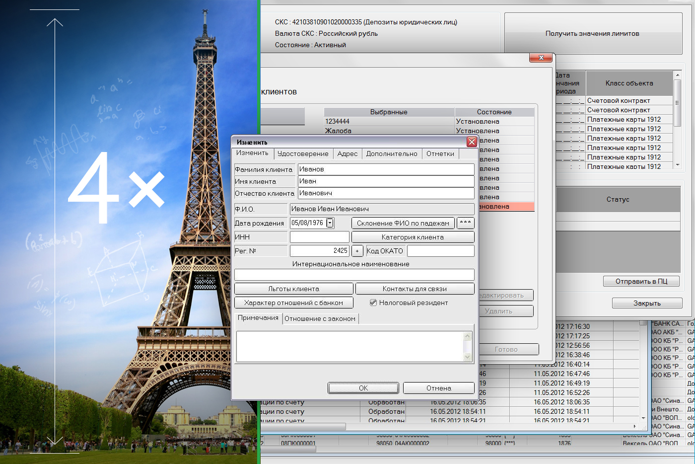
What do you think, how many screens does a bank employee see? If the screens that the maintenance manager sees per day are stacked on top of each other, then you will get four Eiffel towers. Why so much? Because in the largest bank in the country there are a lot of processes, a huge amount of products. In this case, the reliability of the system is 99.99%. This level of reliability allows the grandmother to get a pension in time in the department, and her mother to pay for a loan or utilities without delay.
The team of the ESF Program has an important task: without compromising the quality and reliability, to make the system convenient and understandable for each employee. Earlier we shared the secrets of integration , so we will not go into the technical details, but talk about the difficulties of the business units.
As a result, it turns out that employees of different grocery departments are eager to do something good, but they do not always have time to agree. And this is a problem of many large companies. As a result, when they begin to introduce a product, a piece that was made by another team is not connected to it. And then such a story happens, the client comes to the bank branch for a card, and the employee solves the problem in a very complicated way: first goes into one system, writes data on a piece of paper, then goes to another system, in which he also finds the client and draws up the products, then in the third system. And we are changing it.
Began to change the system with the simplest. We agreed with the product teams that we have a single model of customer service: when he comes to us, we only find him once in the system, determine his need and carry out the necessary operations. The EFS platform allows you to combine all processes into a single consistent chain. About 100 teams work on support and development of such a chain in the Program, where some develop cross-platform processes (common to a number of operations and services), while others are involved in real product magic.
For coordinated work of teams, we use agile development techniques. There is no secret knowledge in theory, but how can you synchronize so many people in practice to work effectively on one task? After all, each of the teams works not only on their product, but also on the whole process as a whole. For example, about five teams are involved in the development of an operation for processing a new client card.
Through trial and error, constant teamwork, we developed our recipe:
We tell on the example of one of the real tasks of the sprint, the data of the presented interfaces are test.
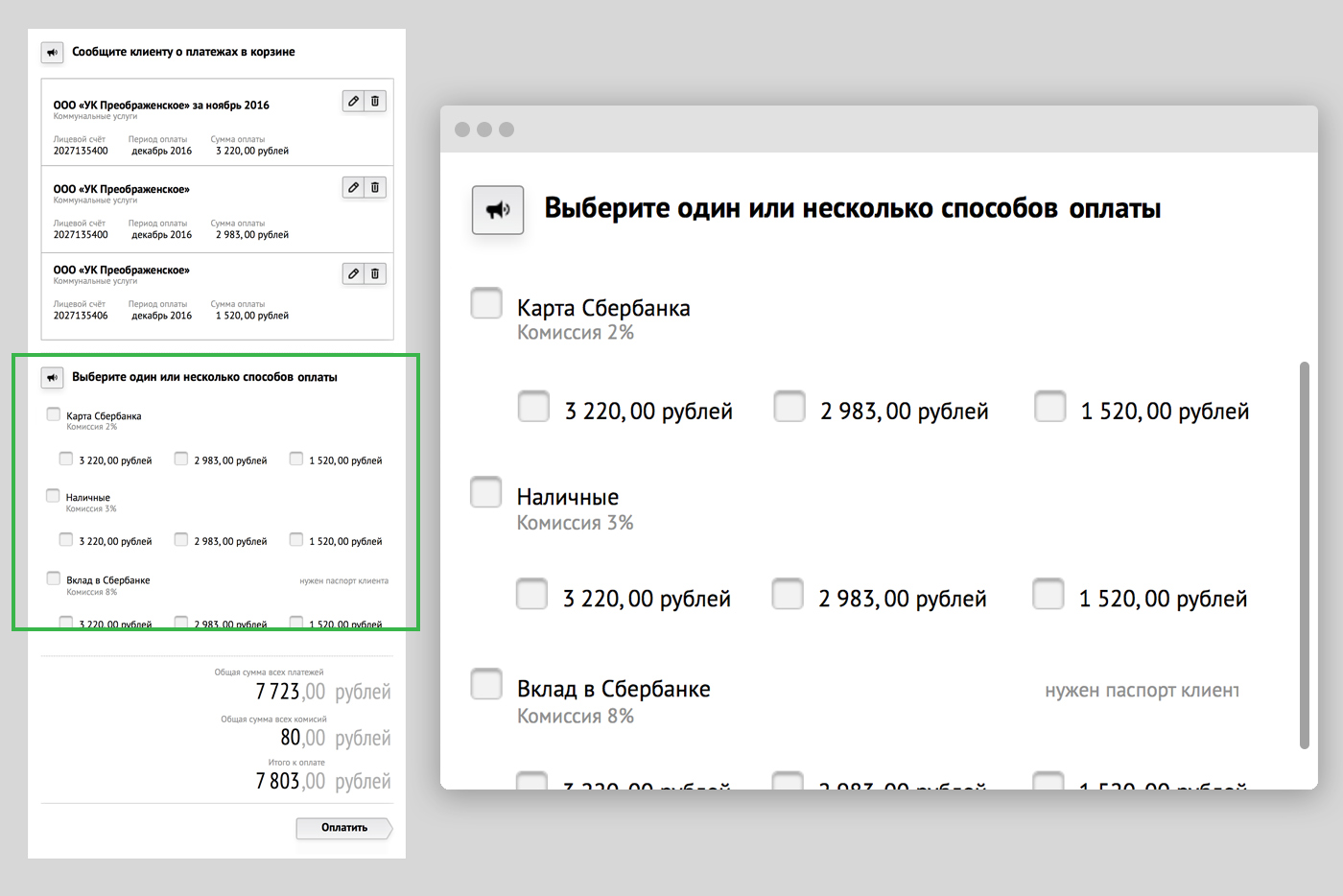
You come to the bank with receipts to pay for gas, electricity and telephone. Previously, the employee spent each payment separately in the bank, but the business customer decided to create a basket with which you can pay for the receipt with a bundle. The developers have assembled in the existing interface the first version of the basket before the start of development in the Unified Frontal System. Customers asked us to preserve this basket option as much as possible and add the ability to pay in several ways (as in a store, if you did not have enough cash and you decided to pay part of the amount with a card).
We designed the first version of the basket, as close as possible to the customer's requirements, in order to see whether the employee copes or not.
In the solution, the screen was divided into 3 parts: the list of payments, the choice of payment method, the total cost. Testing showed that on the last screen the employee no longer remembers what he was going to pay. No employee coped with the task, the level of UX-criticality was defined as high.
In UX testing, we evaluate two important metrics:
Attempt number two. We brought the payment method up. They proposed to divide the payment method into a single and multiple. Cut the screen height. Testing results showed that already three out of five employees coped with the task, but the level of criticality was still high.
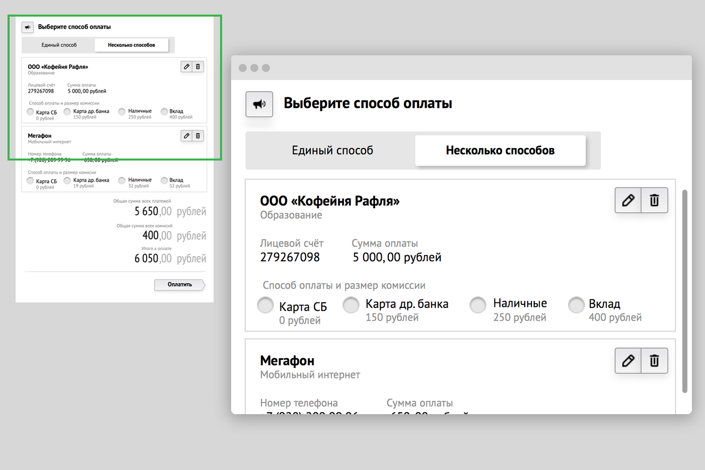
Attempt number three. Changed the method of selection of payment. Wrote in detail how to pay. Here all the respondents have coped with the task, the optimal solution has been found.

In the program, we constantly try out new practices and share cases: in this article we will talk about the pilot with a new UX tool, and in the attachment you can watch the latest UX presentation for employees.
The reason that prompted us to conduct this pilot is as follows: when conducting high-quality UX-studies (3-5 people), we often identify deviations from the ideal process of user interaction with our digital products. And in order to make a decision on improvements, we need to very quickly confirm / deny the criticality of these deviations for the general mass of clients. To solve this problem, we tried the method of remote non-moderated testing, which allows us to obtain the necessary quantitative data (50-100 people *) for 1-2 days.
For the pilot, the cloud tool for conducting remote usability tests Fabuse from Fabrika Usability was chosen, which, by the way, is used by many large Russian companies to solve such problems.
Task for the pilot
Clients needed to pay rent for a bank client from another region (for an elderly relative) in the bank’s mobile application.
Respondents: working men and women (50/50) from 25 to 45 years old not from the banking sector and not from the marketing sphere. Of these, 50% are active users of the bank’s mobile application, 50% are inactive (they perform operations once a month or less). Respondents had to live in two specified regions: Moscow and Novosibirsk.
Hypotheses that we tested:
• it is not obvious to the user how to change the region in the application;
• it is not obvious to the user that by changing the region for payment he changes the region in his profile.
Well, the terms, of course, were very short.
For verification, we collected a prototype, in which it was assumed that the user must pay in the mobile application a bill for a relative from another region.
Then a special questionnaire was created in the system (it took 2 hours), which included: screening questions (gender, age, geography, etc.); tasks for participants that they had to perform in the prototype of the application on their own phone; difficulty scores and open questions about the difficulties they faced.
After that, the link to the questionnaire was automatically sent to the study participants from Moscow and Novosibirsk. Participants followed the link, answered questions, completed assignments, gave ratings and comments. During the study, the tool collected data that, in real-time mode, fell into online reports and aggregated:
• Video recordings of the mobile phone screen of participants with visualization of gestures
• Ratings and comments from participants regarding issues
• Move participants between prototype pages
• Test results (handled / failed / failed)
• Test run time
• Places and number of clicks
And so on.
During the day, 57 respondents from Moscow and Novosibirsk passed the payment scenario on the prototype. After analyzing the data on these participants (the analysis took about 8 hours), we obtained the following results:
• 60% of respondents could not quickly complete / execute this task due to the features of the interface implemented in the prototype, which was confirmed by our hypotheses.
• Several popular routes were identified that were found by users to solve problems, which will greatly help us in finalizing the prototype and designing the UX.
• Additionally, we received several insights, for example: users perceive payment for another client as a transfer, cannot find in the profile the opportunity to change the region, etc.
In the comments we will be happy to discuss your suggestions, answer questions and exchange practices.
And here is the promised video presentation from the conference "Promotion".
In this article, we will dwell in more detail on the working interfaces of employees, explain why this is important for us, and how we create them.
So why is this important to us?
We are the largest bank in the country with the largest branch network. Despite the general trend of digitalization of services, customers still have an urgent need to go to offices, call the contact center. Every day, thousands of bank employees are located across the front-line office across Russia. The goal of the Unified Frontal System is to help the bank employee in his work, and not just change the color of the lower right button.
')
What do you think, how many screens does a bank employee see? If the screens that the maintenance manager sees per day are stacked on top of each other, then you will get four Eiffel towers. Why so much? Because in the largest bank in the country there are a lot of processes, a huge amount of products. In this case, the reliability of the system is 99.99%. This level of reliability allows the grandmother to get a pension in time in the department, and her mother to pay for a loan or utilities without delay.
The team of the ESF Program has an important task: without compromising the quality and reliability, to make the system convenient and understandable for each employee. Earlier we shared the secrets of integration , so we will not go into the technical details, but talk about the difficulties of the business units.
As a result, it turns out that employees of different grocery departments are eager to do something good, but they do not always have time to agree. And this is a problem of many large companies. As a result, when they begin to introduce a product, a piece that was made by another team is not connected to it. And then such a story happens, the client comes to the bank branch for a card, and the employee solves the problem in a very complicated way: first goes into one system, writes data on a piece of paper, then goes to another system, in which he also finds the client and draws up the products, then in the third system. And we are changing it.
How to start?
Began to change the system with the simplest. We agreed with the product teams that we have a single model of customer service: when he comes to us, we only find him once in the system, determine his need and carry out the necessary operations. The EFS platform allows you to combine all processes into a single consistent chain. About 100 teams work on support and development of such a chain in the Program, where some develop cross-platform processes (common to a number of operations and services), while others are involved in real product magic.
How do we manage to simultaneously support the work of 100 teams?
For coordinated work of teams, we use agile development techniques. There is no secret knowledge in theory, but how can you synchronize so many people in practice to work effectively on one task? After all, each of the teams works not only on their product, but also on the whole process as a whole. For example, about five teams are involved in the development of an operation for processing a new client card.
Through trial and error, constant teamwork, we developed our recipe:
- Ceremonies
We hold various ceremonies, during which we discuss plans and retrospectives, demonstrate current developments, argue and negotiate with related units. Depending on the ceremony, its tasks and participants, a calendar of meetings is planned. One of the biggest ceremonies is joint planning tasks for the quarter. The planning of the calendar of meetings is more influenced by intrabank procedures and releases, the rules that need to be followed are due to the high reliability of all systems, which we spoke about at the very beginning.
So, once every three months, all teams whose development is included in a future release gather and agree on tasks for the quarter. The number of the last such meeting exceeded 400 participants. The tasks of teams are divided into backlog, split into sprints, and then sprints are necessarily synchronized. It is important that in the course of the discussion the participants are working out the risks and simply “white” zones that they have not thought of or planned before. The scenario of such a ceremony is calculated per minute, and in addition to team planning, the program includes communication with architects, designers and other related experts who, at an early planning stage, help teams work through the bottlenecks of the process as a whole.
This approach allows you to exclude a situation in which an employee at a certain point simply cannot complete an operation. - Ux testing
We test a lot. During the two-week sprints, all teams spend about 200 UX-testing on grocery and "through" processes, according to their results up to 1000 changes are made to the products. As a result, we can be sure that we have found a compromise between improvement and the power of habit, and our interface solutions are convenient and understandable to every employee. - Design
The design block in the ESF Program is divided into two parts: application and conceptual. Conceptual designers are developing a general concept of how employees' workplaces should look, they are developing an ESF design system. Our design system is built on the principle of Atomic Design and consists of components, guides, grids and patterns.
The application designer works directly in the project, communicates daily with the Product Owner, analysts, programmers, understands the process and implements the concept developed by conceptual designers.
What actually gives all this to a bank employee?
We tell on the example of one of the real tasks of the sprint, the data of the presented interfaces are test.
You come to the bank with receipts to pay for gas, electricity and telephone. Previously, the employee spent each payment separately in the bank, but the business customer decided to create a basket with which you can pay for the receipt with a bundle. The developers have assembled in the existing interface the first version of the basket before the start of development in the Unified Frontal System. Customers asked us to preserve this basket option as much as possible and add the ability to pay in several ways (as in a store, if you did not have enough cash and you decided to pay part of the amount with a card).
We designed the first version of the basket, as close as possible to the customer's requirements, in order to see whether the employee copes or not.
In the solution, the screen was divided into 3 parts: the list of payments, the choice of payment method, the total cost. Testing showed that on the last screen the employee no longer remembers what he was going to pay. No employee coped with the task, the level of UX-criticality was defined as high.
In UX testing, we evaluate two important metrics:
- the number of employees who have coped with the task;
- level of criticality comments. The level of criticality can be high, medium and low. High - the employee cannot complete the operation; medium - can perform, but with errors; low - performs, but with minor deviations.
Attempt number two. We brought the payment method up. They proposed to divide the payment method into a single and multiple. Cut the screen height. Testing results showed that already three out of five employees coped with the task, but the level of criticality was still high.
Attempt number three. Changed the method of selection of payment. Wrote in detail how to pay. Here all the respondents have coped with the task, the optimal solution has been found.
In the program, we constantly try out new practices and share cases: in this article we will talk about the pilot with a new UX tool, and in the attachment you can watch the latest UX presentation for employees.
The reason that prompted us to conduct this pilot is as follows: when conducting high-quality UX-studies (3-5 people), we often identify deviations from the ideal process of user interaction with our digital products. And in order to make a decision on improvements, we need to very quickly confirm / deny the criticality of these deviations for the general mass of clients. To solve this problem, we tried the method of remote non-moderated testing, which allows us to obtain the necessary quantitative data (50-100 people *) for 1-2 days.
For the pilot, the cloud tool for conducting remote usability tests Fabuse from Fabrika Usability was chosen, which, by the way, is used by many large Russian companies to solve such problems.
Task for the pilot
Clients needed to pay rent for a bank client from another region (for an elderly relative) in the bank’s mobile application.
Respondents: working men and women (50/50) from 25 to 45 years old not from the banking sector and not from the marketing sphere. Of these, 50% are active users of the bank’s mobile application, 50% are inactive (they perform operations once a month or less). Respondents had to live in two specified regions: Moscow and Novosibirsk.
Hypotheses that we tested:
• it is not obvious to the user how to change the region in the application;
• it is not obvious to the user that by changing the region for payment he changes the region in his profile.
Well, the terms, of course, were very short.
For verification, we collected a prototype, in which it was assumed that the user must pay in the mobile application a bill for a relative from another region.
Then a special questionnaire was created in the system (it took 2 hours), which included: screening questions (gender, age, geography, etc.); tasks for participants that they had to perform in the prototype of the application on their own phone; difficulty scores and open questions about the difficulties they faced.
After that, the link to the questionnaire was automatically sent to the study participants from Moscow and Novosibirsk. Participants followed the link, answered questions, completed assignments, gave ratings and comments. During the study, the tool collected data that, in real-time mode, fell into online reports and aggregated:
• Video recordings of the mobile phone screen of participants with visualization of gestures
• Ratings and comments from participants regarding issues
• Move participants between prototype pages
• Test results (handled / failed / failed)
• Test run time
• Places and number of clicks
And so on.
During the day, 57 respondents from Moscow and Novosibirsk passed the payment scenario on the prototype. After analyzing the data on these participants (the analysis took about 8 hours), we obtained the following results:
• 60% of respondents could not quickly complete / execute this task due to the features of the interface implemented in the prototype, which was confirmed by our hypotheses.
• Several popular routes were identified that were found by users to solve problems, which will greatly help us in finalizing the prototype and designing the UX.
• Additionally, we received several insights, for example: users perceive payment for another client as a transfer, cannot find in the profile the opportunity to change the region, etc.
In the comments we will be happy to discuss your suggestions, answer questions and exchange practices.
And here is the promised video presentation from the conference "Promotion".
Source: https://habr.com/ru/post/332550/
All Articles