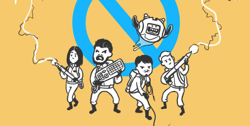
5 fresh examples of parsing and improving the design in simple ways
Hello! We are a design studio and we have a rubric in public in which we give advice on improving the design to everyone. Today we want to talk about some of the techniques that can help you, on the example of the participants in our column. We hope that our advice will help you to better understand the design!
FotoFast is a small photo studio from St. Petersburg. They turned to us so we would suggest tricks to improve for their logo. We pretend that we can do:
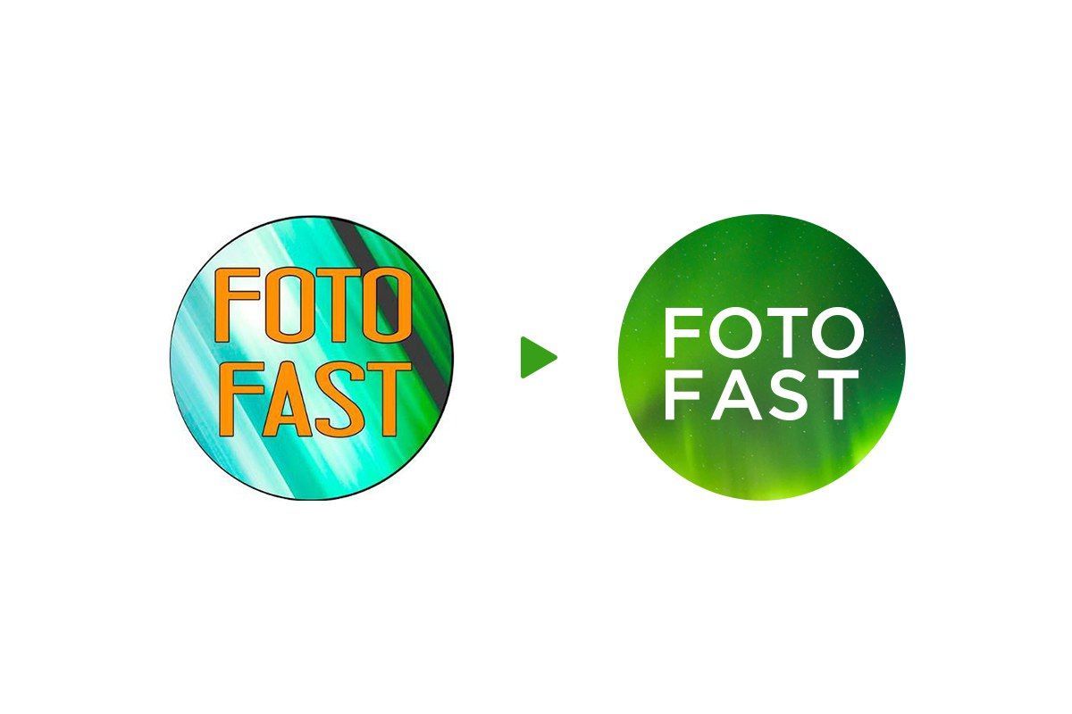
We remove the heavy, black stroke and select contrasting colors - white and green. Now there is no need for a stroke, the colors do the work for it. We would suggest FotoFast to use such a technique as a dynamic identity:
')
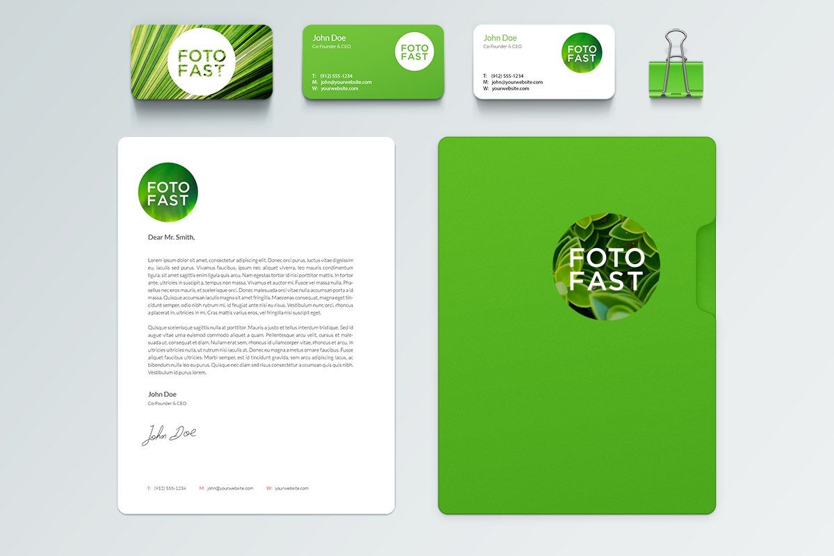
So, the sign “FotoFast” could look like during the day and at night:

Total
Pros:
+ The logo began to look modern, the company name is easy to read.
Minuses:
- Perhaps too fashionable for a photo studio
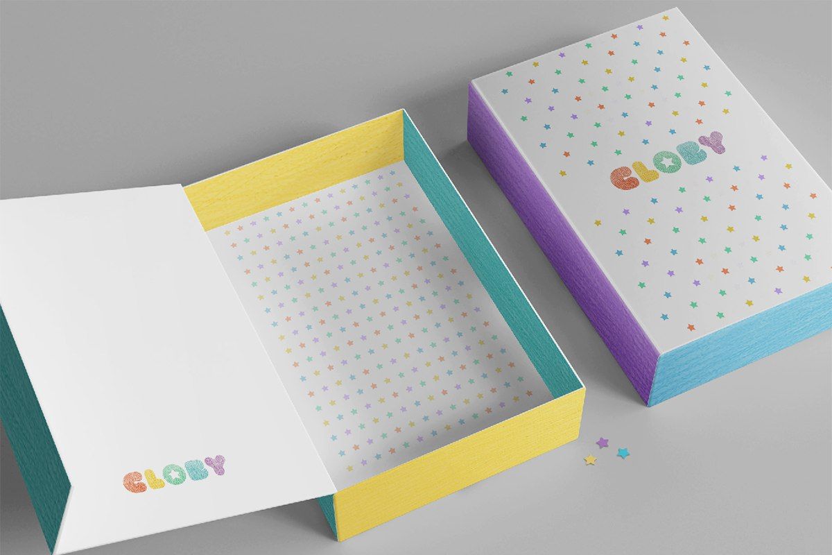
Cloby: add softness
Cloby is an atelier that sews children's drawings.
Here is the same problem as “FotoFast” - a black stroke, which adds nothing to the logo, but only hinders. If the company wants to look cozy and friendly, then it is better to get rid of the stroke in this case.
We removed the stroke, enhanced the effect of the freehand drawing inside the letters and added delicate pastel colors:

One of the main branded carriers for “Clobby” is a box for packing ready-made clothes. We are trying on a new logo on it:
The asterisk can be used as an element that will make any carrier, from small to large, branded. For example, like here:
Summarize
pros
+ The logo has become softer, appeared "playfulness"
Minuses
- The letter “B” in this font causes mixed associations, it is better to replace it
- Without a stroke, the logo has become worse read
In the case of Orion, the logo can be made more modern if you get rid of the outdated technique - using a massive sign instead of a letter.
We liked the idea of the original sign - in the original version CMYK colors are used, from which all other colors are obtained when printing. We applied it in a new logo, putting colors on each other. This creates an optical effect - in a small size, the colors of the logo change to green-red-purple.
Now, it is convenient to place a mark on branded carriers, for example, like this:
Total
pros
+ The logo has become easier and more modern
Minuses
- The sign turned out to be atypical for the printing house
- It became like Rosnano :)
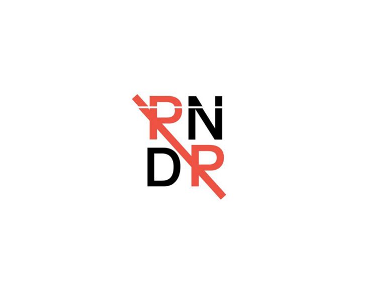
They sent us such a sign, and it turned out that it was not read by PNDP but by RNDR.
Let's try to fix the font so that you can read correctly:
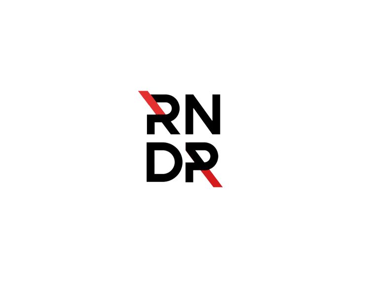
The last “R” is still poorly read. To improve readability, you can use this technique:
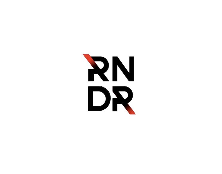
Total
+ Now the name can be read.
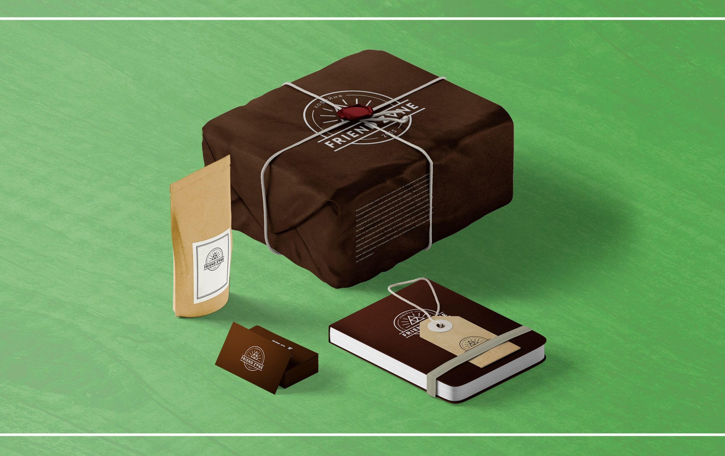
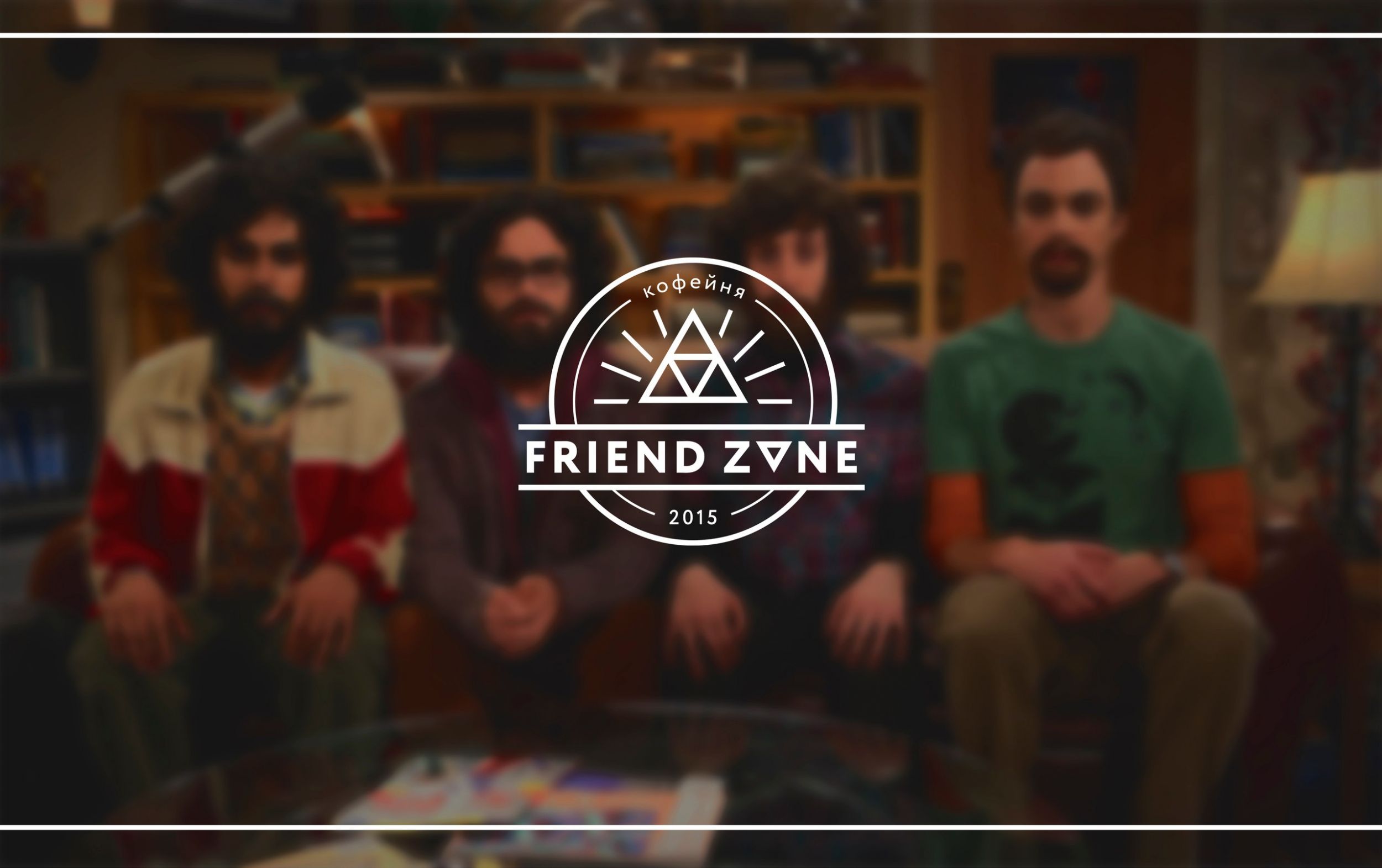
Friend Zone - a small city coffee shop, the owners really like geek themes, which is why they used trifors in their logo.
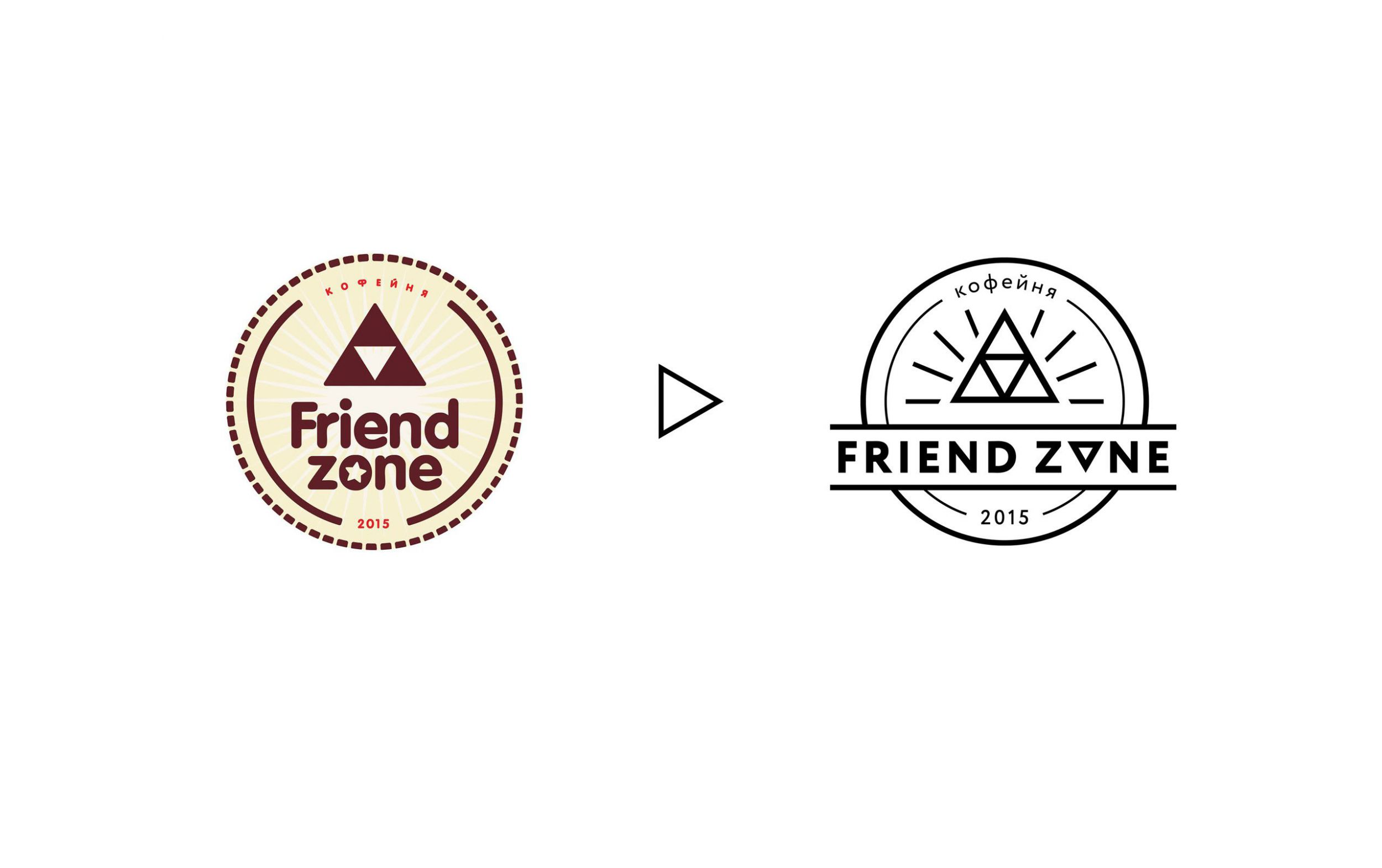
The font in the logo does not match the sign - it is too soft compared to the triforse to correct it - you can make it sharper. If you replace the standard coffee-yellow palette with something unusual, it will be easier to stand out from the competition :)
We pretend how Friend Zone will look like in life:
In social networks:
Summarize
+ The sign has become cleaner
+ With such a logo, it is easier to stand out from other coffee shops.
- Hipster subjects are already pretty fed up.
- The logo turned out sharper and tougher, which badly matches the name “Friend Zone”.
We have shown just a few ways in which you can improve your design. All of these are examples of how to simplify graphics to improve perception. Most of our participants have taken away for free the options that we have offered.
If you need advice on your project, leave a message with the hashtag #logomachine_help in social networks - we follow it and select candidates for redesign. And, as always, good design for your projects!
Prepared by Slepchevich Victoria for Log Machine
FotoFast: remove the stroke
FotoFast is a small photo studio from St. Petersburg. They turned to us so we would suggest tricks to improve for their logo. We pretend that we can do:
We remove the heavy, black stroke and select contrasting colors - white and green. Now there is no need for a stroke, the colors do the work for it. We would suggest FotoFast to use such a technique as a dynamic identity:
')
So, the sign “FotoFast” could look like during the day and at night:
Total
Pros:
+ The logo began to look modern, the company name is easy to read.
Minuses:
- Perhaps too fashionable for a photo studio
Cloby: add softness
Cloby is an atelier that sews children's drawings.
Here is the same problem as “FotoFast” - a black stroke, which adds nothing to the logo, but only hinders. If the company wants to look cozy and friendly, then it is better to get rid of the stroke in this case.
We removed the stroke, enhanced the effect of the freehand drawing inside the letters and added delicate pastel colors:
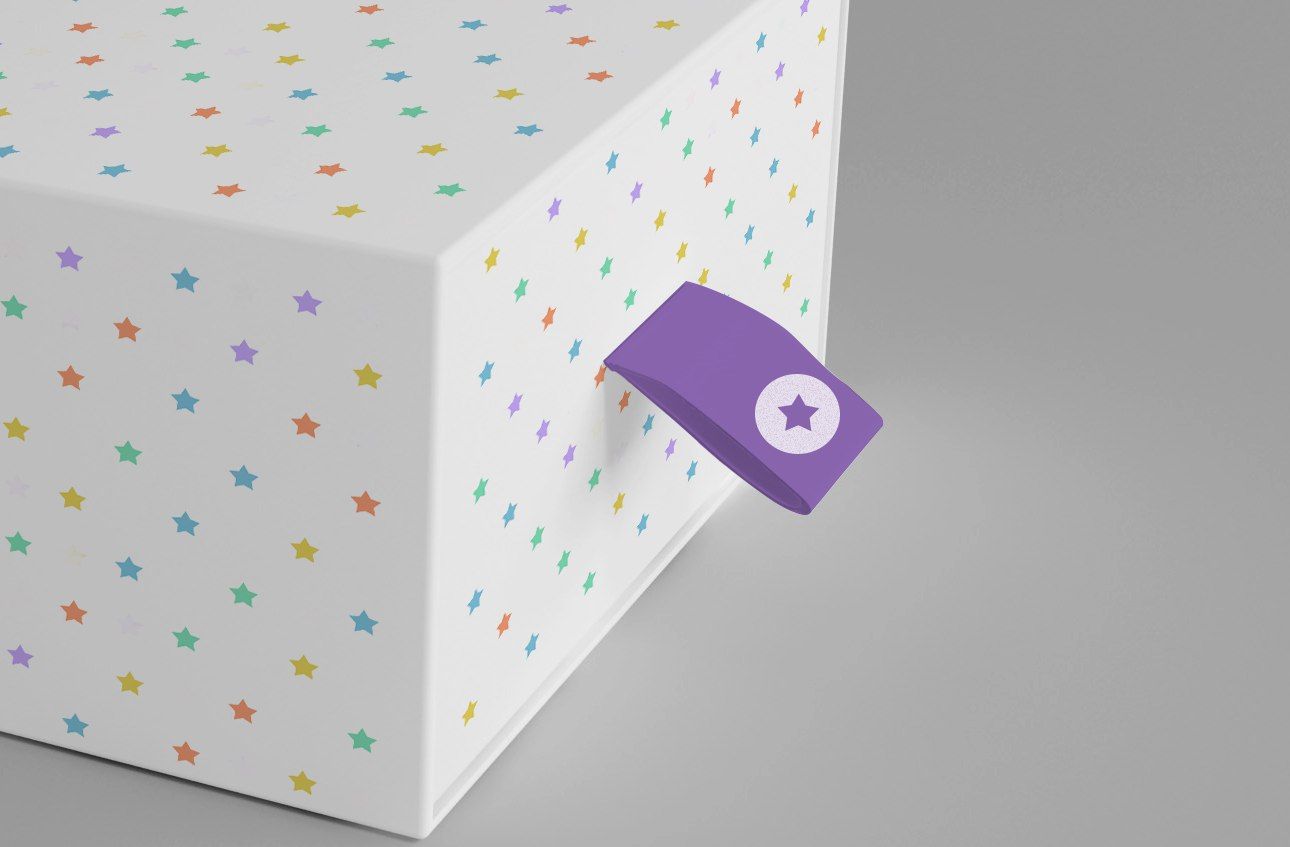
One of the main branded carriers for “Clobby” is a box for packing ready-made clothes. We are trying on a new logo on it:
The asterisk can be used as an element that will make any carrier, from small to large, branded. For example, like here:
Summarize
pros
+ The logo has become softer, appeared "playfulness"
Minuses
- The letter “B” in this font causes mixed associations, it is better to replace it
- Without a stroke, the logo has become worse read
Orion: making it more modern
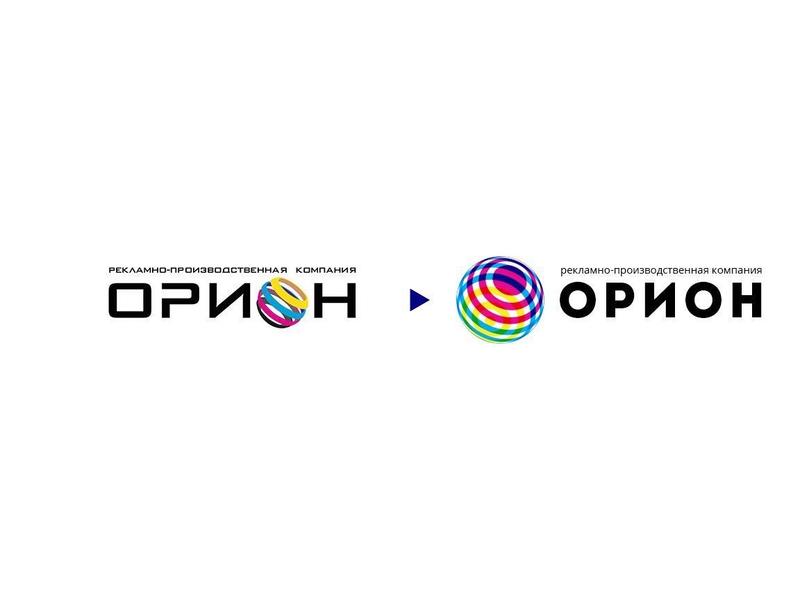
In the case of Orion, the logo can be made more modern if you get rid of the outdated technique - using a massive sign instead of a letter.
We liked the idea of the original sign - in the original version CMYK colors are used, from which all other colors are obtained when printing. We applied it in a new logo, putting colors on each other. This creates an optical effect - in a small size, the colors of the logo change to green-red-purple.
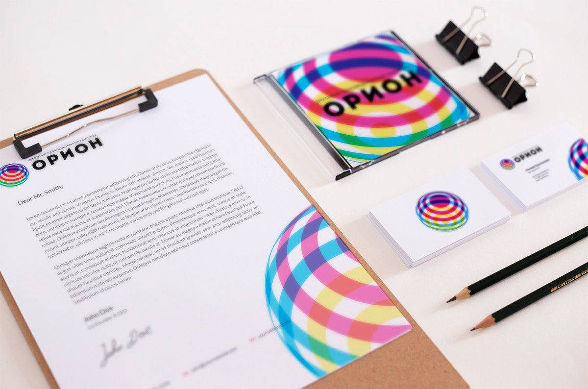
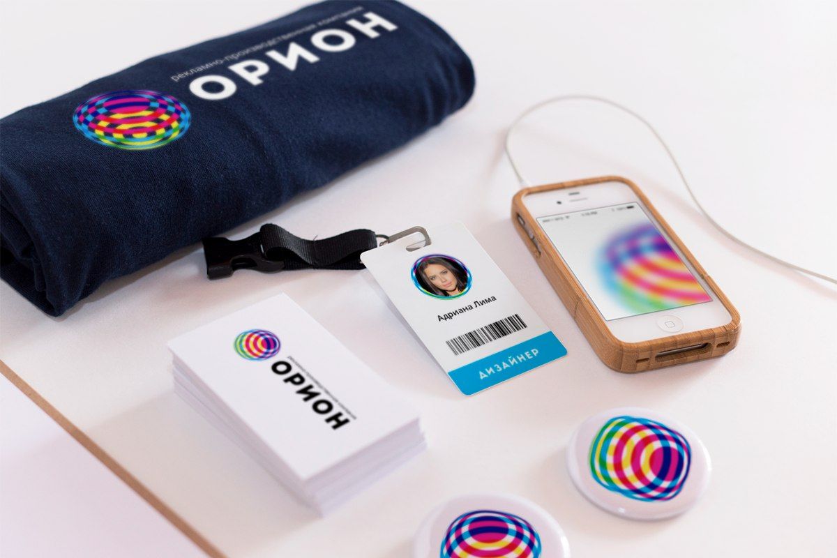
Now, it is convenient to place a mark on branded carriers, for example, like this:
Total
pros
+ The logo has become easier and more modern
Minuses
- The sign turned out to be atypical for the printing house
- It became like Rosnano :)
RNDR: improve readability
They sent us such a sign, and it turned out that it was not read by PNDP but by RNDR.
Let's try to fix the font so that you can read correctly:
The last “R” is still poorly read. To improve readability, you can use this technique:
Total
+ Now the name can be read.
Friend Zone: make the mark clearer
Friend Zone - a small city coffee shop, the owners really like geek themes, which is why they used trifors in their logo.
The font in the logo does not match the sign - it is too soft compared to the triforse to correct it - you can make it sharper. If you replace the standard coffee-yellow palette with something unusual, it will be easier to stand out from the competition :)
We pretend how Friend Zone will look like in life:
In social networks:
Summarize
+ The sign has become cleaner
+ With such a logo, it is easier to stand out from other coffee shops.
- Hipster subjects are already pretty fed up.
- The logo turned out sharper and tougher, which badly matches the name “Friend Zone”.
The overall result
We have shown just a few ways in which you can improve your design. All of these are examples of how to simplify graphics to improve perception. Most of our participants have taken away for free the options that we have offered.
If you need advice on your project, leave a message with the hashtag #logomachine_help in social networks - we follow it and select candidates for redesign. And, as always, good design for your projects!
Prepared by Slepchevich Victoria for Log Machine
Source: https://habr.com/ru/post/332540/
All Articles