LibGDX + Scene2d (we program on Kotlin). Part 1
Hello again. According to the results of the last publication, I came to the conclusion that I am again making mistakes. The high pace of publication is inconvenient to me or you. And I’ll try to shorten the theory, but give more code examples.
A small lyrical digression. LibGDX in large part is a simple wrapper over OpenGL. Just work with textures. All we do is specify the order and method of drawing the textures. The basic texture drawing tool is Drawable.
Drawable, this is such a thing, which is found in Scene2d literally at every step. Pictures, buttons, backgrounds of elements, all sorts of elements of sliders, scrollbars, etc. - they all use Drawable to display themselves on the screen. From a practical point of view, we are not very concerned about how it works inside. Because we will work with three specific implementations of Drawable. These are TextureRegionDrawable, TiledDrawable, and NinePatchDrawable. Here is the texture we want to draw on the screen:
The first option is TextureRegionDrawable. It simply stretches the texture under the given coordinates. The second option is TiledDrawable. The texture is repeated many times, while the scale does not change. And the third option is 9-Box or 9-Patch. What is it good for and when should it be used?
')
9-Patch stores the external elements as they are defined, regardless of the size of the central object. Widely used for buttons, dialog boxes, panels, etc. Imagine if one panel had an outer frame 2 times thicker or thinner than the next.
As I mentioned yesterday, a scene is a hierarchical set of elements (descendants of the Actor class). All actors are divided into two groups - Widget and WidgetGroup. A widget is a tree leaf that cannot contain children. WidgetGroup are nodes. That is, their whole difference lies in the fact that the WidgetGroup can “decompose” the child elements in a certain order. All training Scene2d comes down to the ability to combine these objects. For example, the button in LibGDX is WidgetGroup, the heir to Table. It can contain both text and image. Well, any other layout like any other table.
The code uses Atlas Textures / Skins to improve readability. How to configure a better look in the repository. Describing the principles of their work is a whole separate article.
What we see in the code:
Everything inside .apply applies to the object on which the apply was invoked. The setFillParent (true) method is correctly used only once when a root element is added to the scene. Since it is used very rarely, I constantly forget about it and do not immediately understand why my scene is empty.
The most common mistake: forget to add setFillParent (true) to the root element
Same java example
The most important difference is the lack of code formatting according to the logic of the attachment. The whole footcloth of the element is left aligned and very easy to get confused, because Most methods are common at the Widget / WidgetGroup level.
In Kotlin'e, I applied to the row () the function of hiding the visibility .let, which I have never seen to use as a function of hiding the visibility. The most common use is null check. Inside the let field will be available as it and guaranteed non-null.

add - adds a cell to the row. Returns a Cell to which modifiers can be applied.
row - adds row. Returns the default Cell for the row. Modifiers applied to default Cell will automatically be applied to all cells in this row.
Expand / expandX / expandY - "springs". Change the size of the cells (but not the content). By default, the cell contents are located in the center.
width / height - sets the size of the cell is fixed or in percentage.
fill / fillX / fillY - forces the contents of the cell to take the size of the cell
left / right / top / bottom - if the cell content is smaller, indicates the alignment method
Make the layout of the first screen:
I made a set of icons that explain the applied modifiers to the cells
Springs - expand / expandX / expandY (push the cell)
Arrows - fill / fillX / fillY (cell contents fill the cell)
Channel - fixed width / height (captures cell dimensions in width / height)
A container can have only one Widget. Has a drawable background. Therefore, we will use it to draw a header and footer on the screen (resource panel / command panel).
Let's try to approach the layout of the boot screen in the same way:
Code example:
It seems to even work. But it does not work as we would like. The problem is that devices with different aspect ratios will flatten or stretch the texture. How will it be right?
Let's say this is an option. We use the image, and we say that we need to scale it while keeping the proportions until the lower side rests on the edge. In this case, the big side will be cut off. Another option is Scaling.fit. Scaling will go until a large part hits the edge, a smaller part will have blank areas (letterbox).
But what if we, for example, want to place the Progress Bar somewhere in 20% of the space below and so that it occupies 60% of the screen. Nobody forbids adding a few top-level actors to the scene. It will be like this:
That's all for today. Please leave comments that you would like to see in more detail and / or suggestions on how to improve the presentation.
PS On the final screen there is a command panel with 4 buttons. Using the material from this article you can independently implement it. The answer is in the repository . Next article in a week.
A small lyrical digression. LibGDX in large part is a simple wrapper over OpenGL. Just work with textures. All we do is specify the order and method of drawing the textures. The basic texture drawing tool is Drawable.
Drawable
Drawable, this is such a thing, which is found in Scene2d literally at every step. Pictures, buttons, backgrounds of elements, all sorts of elements of sliders, scrollbars, etc. - they all use Drawable to display themselves on the screen. From a practical point of view, we are not very concerned about how it works inside. Because we will work with three specific implementations of Drawable. These are TextureRegionDrawable, TiledDrawable, and NinePatchDrawable. Here is the texture we want to draw on the screen:
And here are three Drawable options based on this texture.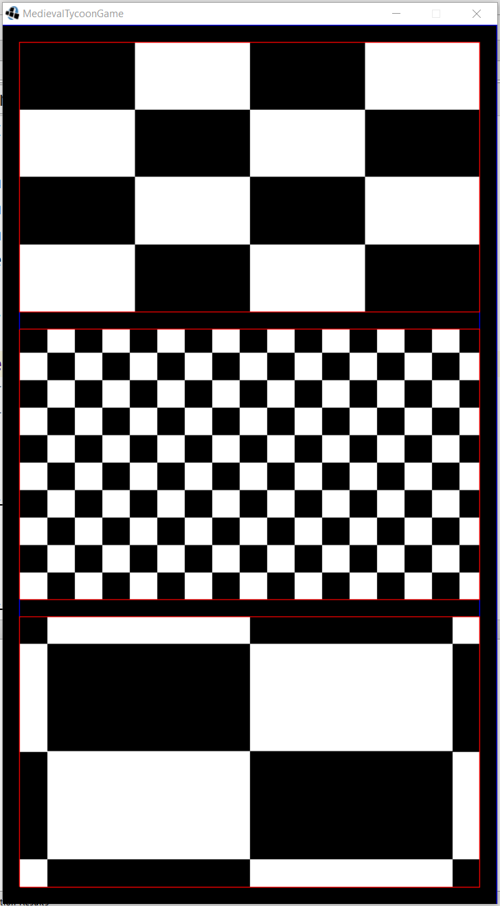
The first option is TextureRegionDrawable. It simply stretches the texture under the given coordinates. The second option is TiledDrawable. The texture is repeated many times, while the scale does not change. And the third option is 9-Box or 9-Patch. What is it good for and when should it be used?
')
9-patch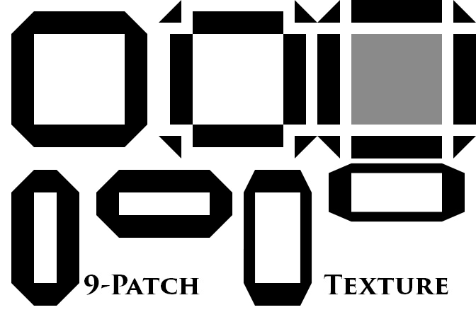
9-Patch stores the external elements as they are defined, regardless of the size of the central object. Widely used for buttons, dialog boxes, panels, etc. Imagine if one panel had an outer frame 2 times thicker or thinner than the next.
Table layout
As I mentioned yesterday, a scene is a hierarchical set of elements (descendants of the Actor class). All actors are divided into two groups - Widget and WidgetGroup. A widget is a tree leaf that cannot contain children. WidgetGroup are nodes. That is, their whole difference lies in the fact that the WidgetGroup can “decompose” the child elements in a certain order. All training Scene2d comes down to the ability to combine these objects. For example, the button in LibGDX is WidgetGroup, the heir to Table. It can contain both text and image. Well, any other layout like any other table.
Picture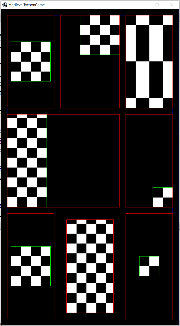
Kotlin
class TableStage : Stage() { init { val stageLayout = Table() addActor(stageLayout.apply { debugAll() setFillParent(true) pad(AppConstants.PADDING) defaults().expand().space(AppConstants.PADDING) row().let { add(Image(uiSkin.getDrawable("sample"))) add(Image(uiSkin.getDrawable("sample"))).top().right() add(Image(uiSkin.getDrawable("sample"))).fill() } row().let { add(Image(uiSkin.getTiledDrawable("sample"))).fillY().left().colspan(2) add(Image(uiSkin.getTiledDrawable("sample"))).width(64f).height(64f).right().bottom() } row().let { add(Image(uiSkin.getDrawable("sample"))) add(Image(uiSkin.getTiledDrawable("sample"))).fill().pad(AppConstants.PADDING) add(Image(uiSkin.getDrawable("sample"))).width(64f).height(64f) } }) } } The code uses Atlas Textures / Skins to improve readability. How to configure a better look in the repository. Describing the principles of their work is a whole separate article.
What we see in the code:
... val stageLayout = Table() addActor(stageLayout.apply { // debugAll() // setFillParent(true) // pad(AppConstants.PADDING) defaults().expand().space(AppConstants.PADDING) row().let { add(Image(uiSkin.getDrawable("sample"))) add(Image(uiSkin.getDrawable("sample"))).top().right() add(Image(uiSkin.getDrawable("sample"))).fill() } Everything inside .apply applies to the object on which the apply was invoked. The setFillParent (true) method is correctly used only once when a root element is added to the scene. Since it is used very rarely, I constantly forget about it and do not immediately understand why my scene is empty.
The most common mistake: forget to add setFillParent (true) to the root element
Same java example
... Table stageLayout = new Table(); stageLayout.debugAll(); stageLayout.setFillParent(true); stageLayout.pad(AppConstants.PADDING); stageLayout.defaults().expand().space(AppConstants.PADDING); stageLayout.row(); stageLayout.add(Image(uiSkin.getDrawable("sample"))); stageLayout.add(Image(uiSkin.getDrawable("sample"))).top().right(); stageLayout.add(Image(uiSkin.getDrawable("sample"))).fill(); addActor(stageLayout); The most important difference is the lack of code formatting according to the logic of the attachment. The whole footcloth of the element is left aligned and very easy to get confused, because Most methods are common at the Widget / WidgetGroup level.
In Kotlin'e, I applied to the row () the function of hiding the visibility .let, which I have never seen to use as a function of hiding the visibility. The most common use is null check. Inside the let field will be available as it and guaranteed non-null.
var name: String? = ... name?.let { if (it == "Alex") ... } Table layout methods
add - adds a cell to the row. Returns a Cell to which modifiers can be applied.
row - adds row. Returns the default Cell for the row. Modifiers applied to default Cell will automatically be applied to all cells in this row.
Expand / expandX / expandY - "springs". Change the size of the cells (but not the content). By default, the cell contents are located in the center.
width / height - sets the size of the cell is fixed or in percentage.
.width(40f) .width(Value.percentWidth(.4f, stageLayout) fill / fillX / fillY - forces the contents of the cell to take the size of the cell
left / right / top / bottom - if the cell content is smaller, indicates the alignment method
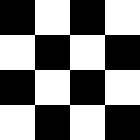
Make the layout of the first screen:
I made a set of icons that explain the applied modifiers to the cells
Springs - expand / expandX / expandY (push the cell)
Arrows - fill / fillX / fillY (cell contents fill the cell)
Channel - fixed width / height (captures cell dimensions in width / height)
Container <> Layout
A container can have only one Widget. Has a drawable background. Therefore, we will use it to draw a header and footer on the screen (resource panel / command panel).
val stageLayout = Table() addActor(stageLayout.apply { ... row().let { val headerContainer = Container<WidgetGroup>() add(headerContainer.apply { background = TextureRegionDrawable(TextureRegion(Texture("images/status-bar-background.png"))) // }).height(100f).expandX() } Full code of the main scene
val stageLayout = Table() addActor(stageLayout.apply { setFillParent(true) defaults().fill() row().let { val headerContainer = Container<WidgetGroup>() add(headerContainer.apply { background = TextureRegionDrawable(TextureRegion(Texture("images/status-bar-background.png"))) }).height(100f).expandX() } row().let { add(Image(Texture("backgrounds/main-screen-background.png")).apply { setScaling(Scaling.fill) }).expand() } row().let { val footerContainer = Container<WidgetGroup>() add(footerContainer.apply { background = TextureRegionDrawable(TextureRegion(Texture("images/status-bar-background.png"))) fill() actor = CommandPanel() }).height(160f).expandX() } }) Layout Loading Screen
Let's try to approach the layout of the boot screen in the same way:
Layout Prototype
Code example:
val stageLayout = Table() addActor(stageLayout.apply { setFillParent(true) background = TextureRegionDrawable(TextureRegion(Texture("backgrounds/loading-logo.png"))) }) It seems to even work. But it does not work as we would like. The problem is that devices with different aspect ratios will flatten or stretch the texture. How will it be right?
val stageLayout = Table() val backgroundImage = Image(Texture("backgrounds/loading-logo.png")) addActor(backgroundImage.apply { setFillParent(true) setScaling(Scaling.fill) }) Let's say this is an option. We use the image, and we say that we need to scale it while keeping the proportions until the lower side rests on the edge. In this case, the big side will be cut off. Another option is Scaling.fit. Scaling will go until a large part hits the edge, a smaller part will have blank areas (letterbox).
But what if we, for example, want to place the Progress Bar somewhere in 20% of the space below and so that it occupies 60% of the screen. Nobody forbids adding a few top-level actors to the scene. It will be like this:
Screen
Code
init { val backgroundImage = Image(Texture("backgrounds/loading-logo.png")) addActor(backgroundImage.apply { setFillParent(true) setScaling(Scaling.fill) }) val stageLayout = Table() addActor(stageLayout.apply { setFillParent(true) row().let { add().width(Value.percentWidth(.6f, stageLayout)).height(Value.percentHeight(.8f, stageLayout)) } row().let { add(progressBar).height(40f).fill() // progressBar } }) } That's all for today. Please leave comments that you would like to see in more detail and / or suggestions on how to improve the presentation.
PS On the final screen there is a command panel with 4 buttons. Using the material from this article you can independently implement it. The answer is in the repository . Next article in a week.
Result of part 1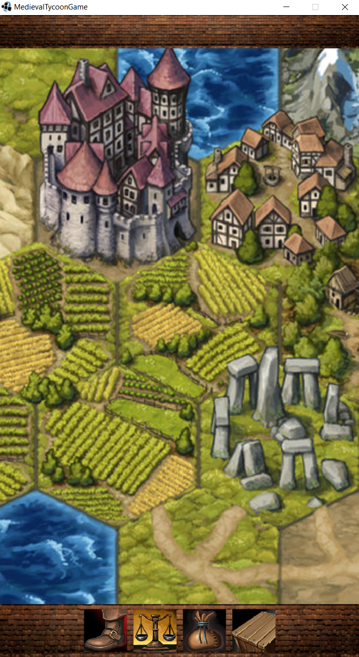
Source: https://habr.com/ru/post/332298/
All Articles