4 popular mistakes in business card design
In this article, we will visually examine the most common mistakes that are made when creating business cards, and teach you how to avoid them. This article will be useful not only to designers, but also to those who are planning to start or already have their own business cards.
The task of typesetting is to correctly place accents on a business card. In the case of a bad layout, the recipient will not understand where to look and what to read first.
In addition, without a “grid”, blocks of text are often too close to each other or to the edges, which is why the text lacks “air” and it simply “sticks together”, and it becomes difficult to read it.
')
Here is a brief list of principles that can be followed when working with fonts:

In pursuit of the number of "DESIGN" per square centimeter on the business card should not be used as much as possible available in Photoshop effects.
Shadows, imitation of 3D and various textures make it difficult to convey information as simply and clearly as possible. Do not forget that a business card is essentially a thin sheet of paper, and you should not imitate a three-dimensional image or texture on it with the help of effects - the best solution is to invest more in the material.

Under the final point, common errors at the stage of filling a business card are combined:
1. Making links. First of all, get rid of "https: //". This part is optional for input and looks like rubbish on the way to useful information. Also try to make the “id” of your communities and pages look like “/ logomachine”, and not “/ id32754081”;
2. Making a phone number. Mobile have the format "8 911 123 44 55", and urban - "111 22 33". Only optional numbers are written in brackets (city code, for example);
3. Registration of mail. Mail to @ rambler.ru, as well as “zaychik777” as a login, is a bad idea (or “under ban”). The best thing is to use mail on your company's domain;
4. Using your own photo on a business card is considered bad form if you are a famous person (entrepreneur, head of a company, etc.). The exception may be managers, whose photograph on a business card will help distinguish them from other managers of the company;
5. A business card in two languages from two sides indicates a desire to save on a batch of business cards for foreign customers.


Of course, there are exceptions to the rule, but following these simple tips you will learn not to make the most common mistakes when creating a business card.
Prepared Danil Baranov for Log Machine
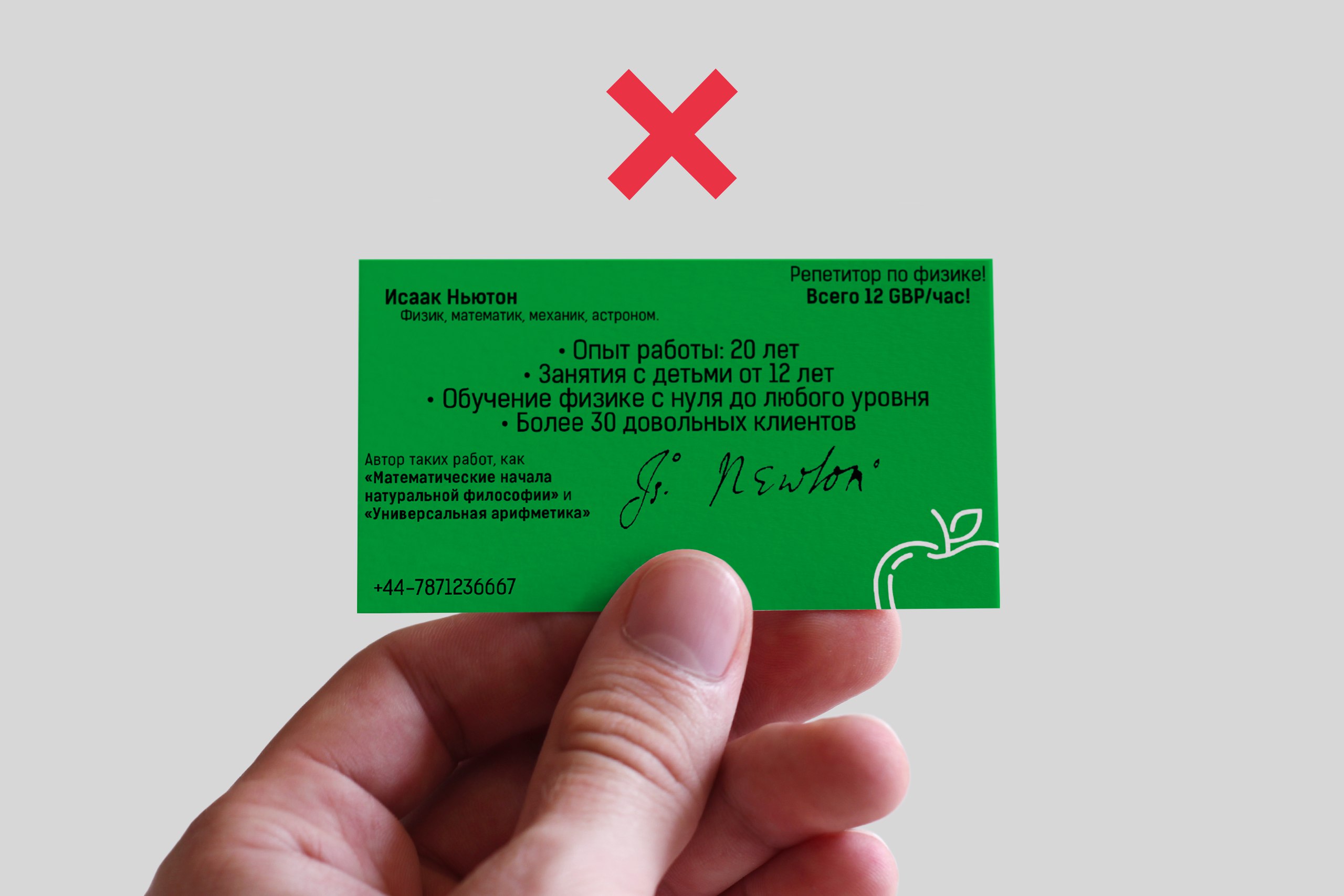
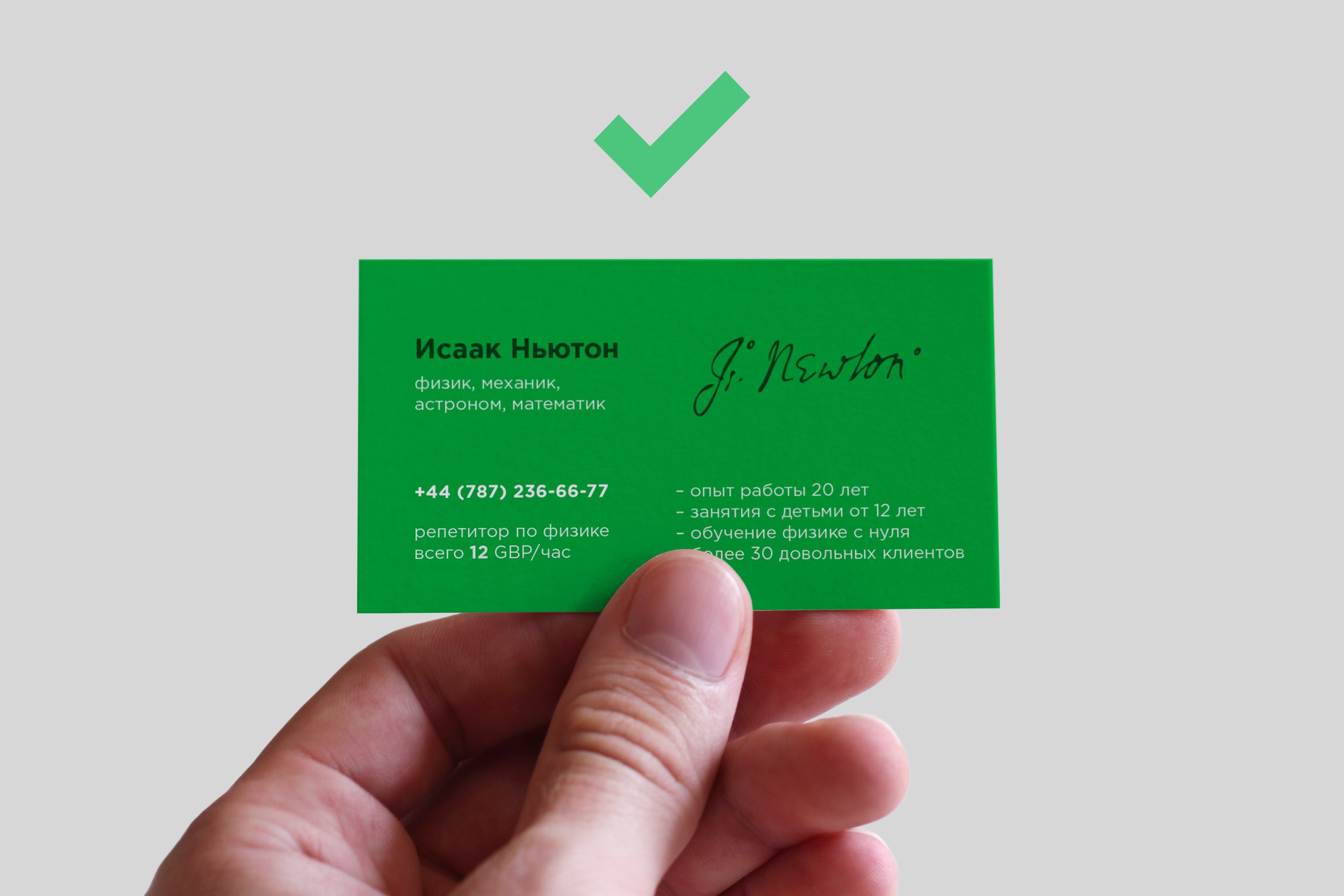
Problems with layout
The task of typesetting is to correctly place accents on a business card. In the case of a bad layout, the recipient will not understand where to look and what to read first.
In addition, without a “grid”, blocks of text are often too close to each other or to the edges, which is why the text lacks “air” and it simply “sticks together”, and it becomes difficult to read it.
')
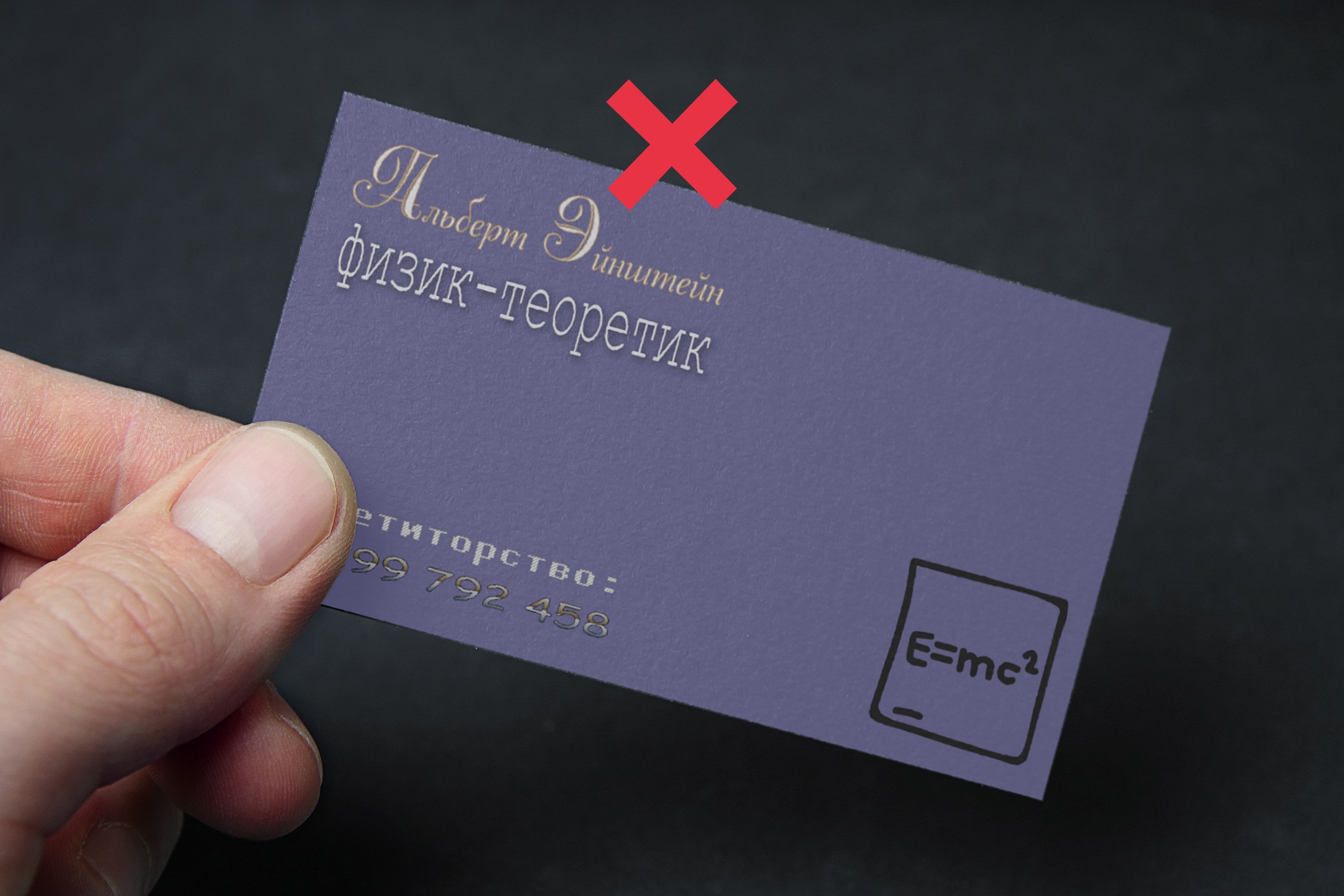
Mistreatment of fonts
Here is a brief list of principles that can be followed when working with fonts:
- It is important to choose the right fonts, so it’s better not to use more than two fonts on one business card - less chance to miss;
- Effects to fonts are not applicable (with very few exceptions);
- To deform (stretch) the font can not be - the letters should look like they are intended.
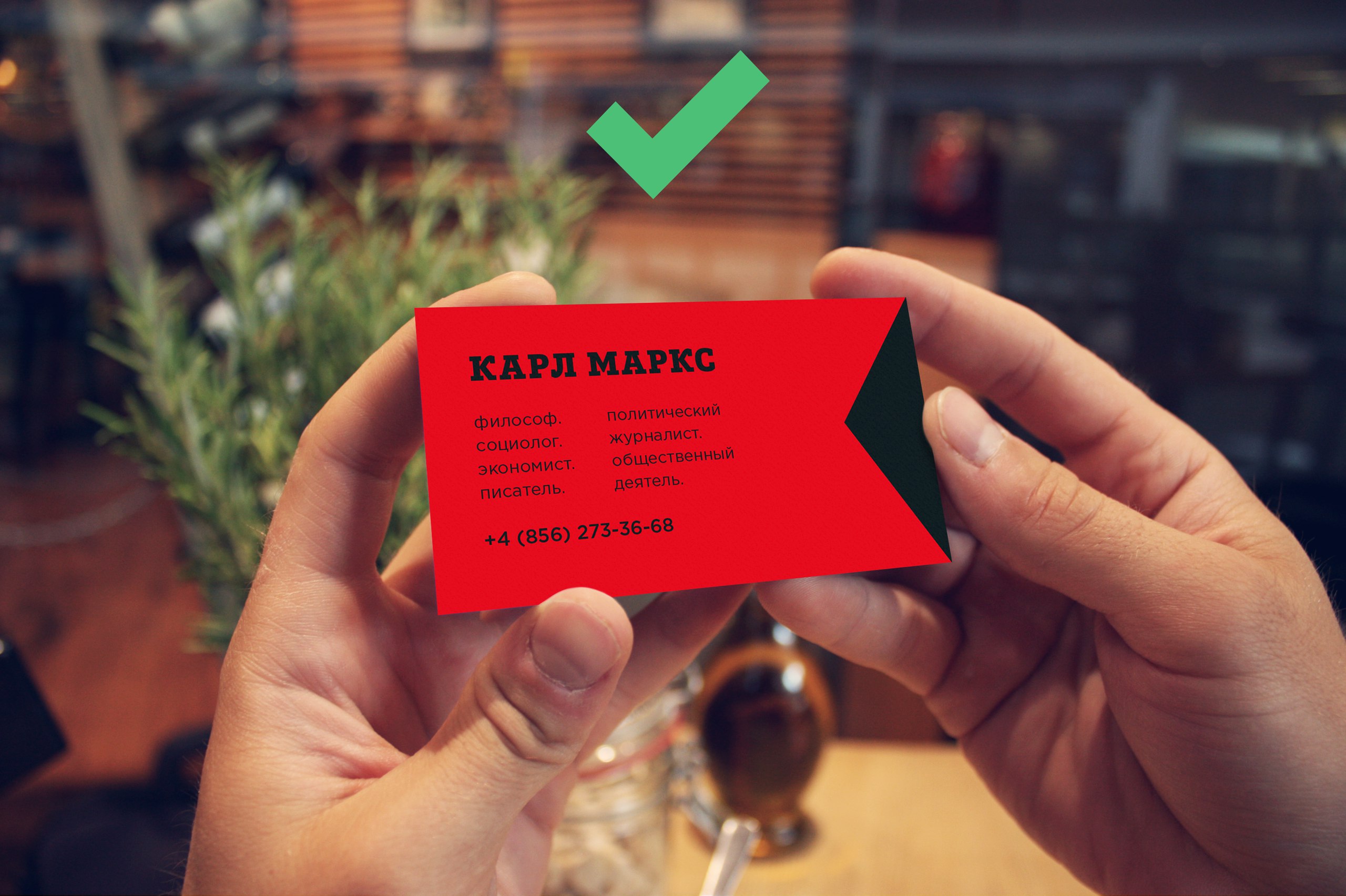
Readability problems
In pursuit of the number of "DESIGN" per square centimeter on the business card should not be used as much as possible available in Photoshop effects.
Shadows, imitation of 3D and various textures make it difficult to convey information as simply and clearly as possible. Do not forget that a business card is essentially a thin sheet of paper, and you should not imitate a three-dimensional image or texture on it with the help of effects - the best solution is to invest more in the material.
Incorrect design business cards
Under the final point, common errors at the stage of filling a business card are combined:
1. Making links. First of all, get rid of "https: //". This part is optional for input and looks like rubbish on the way to useful information. Also try to make the “id” of your communities and pages look like “/ logomachine”, and not “/ id32754081”;
2. Making a phone number. Mobile have the format "8 911 123 44 55", and urban - "111 22 33". Only optional numbers are written in brackets (city code, for example);
3. Registration of mail. Mail to @ rambler.ru, as well as “zaychik777” as a login, is a bad idea (or “under ban”). The best thing is to use mail on your company's domain;
4. Using your own photo on a business card is considered bad form if you are a famous person (entrepreneur, head of a company, etc.). The exception may be managers, whose photograph on a business card will help distinguish them from other managers of the company;
5. A business card in two languages from two sides indicates a desire to save on a batch of business cards for foreign customers.
As a result:
Of course, there are exceptions to the rule, but following these simple tips you will learn not to make the most common mistakes when creating a business card.
Prepared Danil Baranov for Log Machine
Source: https://habr.com/ru/post/332186/
All Articles