Benefits of interactive prototyping
Designers have always sought to show beautiful pictures to customers. They added stylish effects to images, found cool pictures in photobanks, cast unthinkable shadows from objects (sometimes against the laws of real-world physics) and resorted to other tricks. Perhaps they often didn’t care how realistic it is in a working product. Pictures in such a beautiful wrapper were then sent to the client or manager and the designer was getting ready to skim the cream ...
So it was before and it worked. I myself have resorted to such tricks repeatedly. However, the world around is changing rapidly. A modern product is so complex that one picture will not give an understanding and answers to the question “How does it work?”. Schematic or wireframe prototyping is also gradually fading away in the sunset, since the black and white lines and rectangles do not give the client a complete understanding. More and more people are looking to see a living prototype today, and not a series of pictures ...
An interactive or high fidelity prototype is the golden mean because It is not a static picture and engages in interaction. Buttons can be clicked, forms can be filled out, events can be received and confirmation of the experience of interaction in any scenario. If you make more effort, you can develop a prototype that can be immediately transferred to the usability testing department. As a result, the product has a higher chance of success, because it was possible to correctly debug all the scenarios on the prototype and then pass the baton to the developers. Moreover, they will quickly grasp the essence of the task, having such a prototype before their eyes. This is more productive than dealing with screenshots from the TK, trying to establish the relationship between them.
')
By the way, if you use Figma , I recommend paying attention to our ready-made design systems . They help freelancers complete more orders per month, programmers can create beautiful applications on their own, and the Timlids run sprints faster using ready-made design systems for teamwork.
And if you have a serious project, our team is ready to deploy a design system within the organization based on our developments and tailor it to specific tasks using Figma. Web / desktop, and any mobile. We are also familiar with React / React Native. Write to T: @kamushken
Fictional design
I want to look at the interactive prototyping process using my conceptual design development as an example. This is a fictional case. This prototype, although it will be available for download below and free use, but is unlikely to have a standard business style. It was created in the process of research and study of a new tool for design. Somehow there were some free evenings that I decided to devote to creativity and outlook expansion. I’ve been tinkering with Axure for some time and realized that it has everything you need for a full-fledged graphical editor. It only remained to conduct an experiment for self-study — to deal with some functions, events, styles, and interrelations between elements. I did not limit the flight of my imagination, so the style will be appropriate :)
Style concept
All the most trendy designer tricks are always on the surface. You open Dribbble, sort the best for the month and please: blurry shadows, gradients, huge headlines, tinsel around the layout from the memphis style - all this will be at the very top of the issue. So if you need to collect likes in design communities, then you need to use all the current techniques. Therefore, I approached creatively, because Today I am my own client and master. What colors wanted - such and used. Similarly, about fonts, buttons and styles in general. Therefore, I will continue to work in the “full blue”, remember the dotted borders, I will write both white and black text on the same background, and cast strongly blurred shadows. And for dessert, give all kinds of animation right in the browser. Nevertheless, it will still be like an abstract designer tool. Or even something from the gaming ...
Color spectrum
Statistics claim that the blue sites prevail. Therefore, the gamma will be basically the same. And there will be several shades: one is monochrome for visual separation and hierarchy, and the second is contrasting, close to analog, so that you don’t miss something important. Below I will write more about it. Working with the color wheel can generate very interesting and juicy color combinations. And this almost green I will assign a secondary color. Here are the shades all this will be later:

Typography
Now in the trend typography and games with fonts. An interesting font couple will help to convey the conditional message of the product and convey the mood. For example, the title can be written with serif text, and a paragraph of text with some consistently relevant Roboto. However, the opposite combinations are often found. Although a serif font gives away something printed or book, but there are examples with a successful combination in IT solutions. My prototype has a slightly different mood, so I took both the Montserrat sans-serif fonts (for headings and buttons) and Roboto (for “body” and the rest):

Header
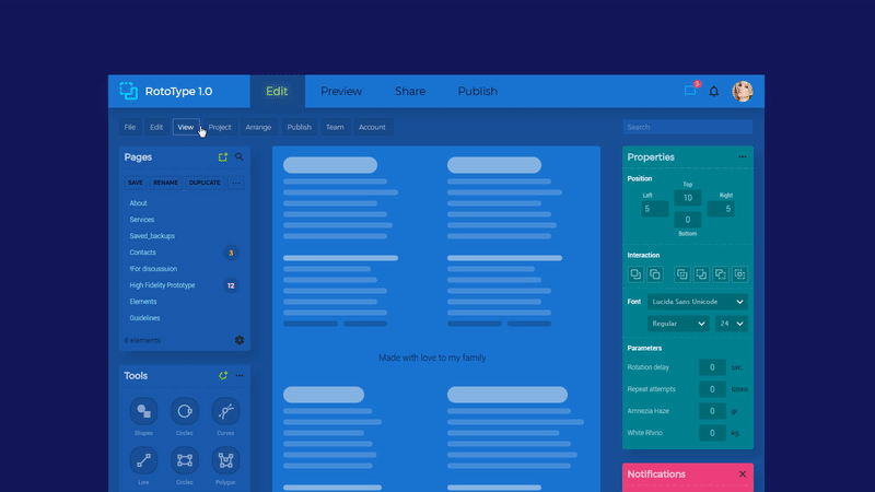
I will begin the description of all elements and their essence right above. The cap was rich in fiction, so I will try to describe with some structure.
Tabs: main navigation
The essence of this implementation is to show that you can achieve the effect of "off light" for the text of an inactive tab. I chose colors in such a way that something similar would turn out, and when I clicked, “light” would turn on. Therefore, if you look closely, then when you hover and click on the tab, a small glow comes from the text. A very old and annoying reception from the 2000s. But if you apply it almost imperceptibly, you can achieve an interesting effect. Programmatically, there is just a group selection for 4 tabs and using Set selected = true in the onClick event. Yes, in general, almost all of the prototype is based on this simple method: grouping into a sample and status change on click.
Submenu: additional navigation
This additional menu is analogous to the standard menu in most software: File, Edit, View, etc. The text is white with transparency of 60%, and when you hover the mouse, it becomes 100%. This was supposed to produce a highlight effect. I agree, nothing new; But designers rarely remember the dotted border. I repent, it would cost me to finish the turn on the click. But I was afraid of excessive perfectionism, because in the sub-menu spread I would have to think about the expansion of additional sections to the right ...
User's controls: user icons and avatar
In the upper right corner, my basic fantasies of animation are concentrated in this concept. If you hover on the message icon, the red circle will turn and the event counter will count +1 new. A quick idea after I dealt with the Rotate effect: you can move the center of rotation away from the center of intersection of the object axes and teach it to write out at least eight on the monitor. The figure changes at the time of maximum acceleration, so it is not noticeable to your eye. By the way, such micro-iteration can increase the importance of new events in any interface, but only if the business requires it. Clicking on the userpic will spin it around its axis, which will cause the appearance of a round (!) Submenu. This is a continuation of experiments with the rotate effect. I agree that few products will require such pop-ups and such animation.
However, such “interface gamification” can be used, for example, in promotional products or gaming systems. By the way, click Logout to minimize the submenu and it will collapse similarly to the appearance. I note that such a complex animation in the prototype works quickly, does not slow down and does not interrupt the acquisition of the rest of the experience. The whole secret is only in the correct timings and non-linearity of what is happening. In short, there are two basic rules: the object disappears faster than it appears and the speed can not be linear .
Left column
Vertical navigation: pages or categories
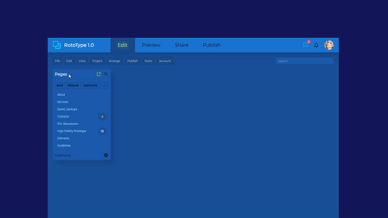
Suitable for any components with a dynamic number of elements inside. You know, in fact, it was very difficult to invent a non-existent interface: there are no scenarios, and there is no problem — there is nothing to solve. I sketched where I designed, so I took a panel with abstract pages that you can create. I continue to play boldly with color and for icons: creating a new one is the most important thing, so it’s bright green. The search is generally tertiary, so the icon is black. It turns out that the search functionality is almost not noticeable, but if you urgently need to find a conditional page - you will have the motivation to find a magnifying glass. And you make it fast! The Save / Rename / Duplicate controls are executed in the same way. They have the lowest feed priority and very contrasting lights when hovering. The scroll bar leaving on the right is a reminder to yourself how well to hide the excess from the interface until the right moment.
Tools: toolbar
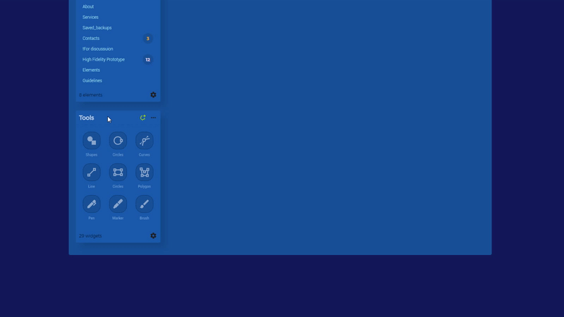
In this widget of my concept, I dealt with state changes for a group of objects. You need to trigger all state styles for it at once (Properties> Trigger Mouse Interaction Styles).
Therefore, the activation effect when clicking is triggered at once for all elements: the icon, the substrate, the signature. It turned out to be much more difficult to do onhover not immediately for the whole group, but in turn. Suppose some element is on top of a larger one, and you need to activate its state first and then for the smaller one. Accordingly, when the cursor is formally over both objects, then both should “burn”. And as soon as we partially move the cursor away, only the smaller object goes out. In my concept, there was no such task, but there are cases in practice when required. Suppose an online store item card + “add” button. You want the shadow to appear when you hover over a card, and then the button style changes when the cursor is formally over both objects. So, the standard MouseOver for two objects in the group will not work anymore - as soon as you move the mouse over the card, both objects are highlighted at once. I bypassed this problem through the JS onMouseHover / Out function - as soon as the button is triggered, it receives the Selected state and changes its appearance via CSS (example from another project) :
Right column
Properties: or element properties
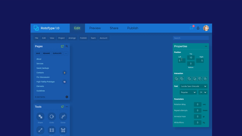
The right side of this conceptual interface should have answered the question “How far can I go in the design of inputs, with the condition that text entry should work?”. It was not possible to go far with the usual HTML input and its design. But you can cheat if you turn off the border to it, and create the entire design on the rectangle below it. Then, when focusing on the input, we will only have to change the styles for the underlay: for the onHover and onFocus events. Few people will notice this in the work until it gets into the code. By the way, the code is machine and climbing is not recommended, especially if you have just had lunch. I complicated each input to a dynamic panel with different states. This allowed me to achieve the softness of their shift fade effect. You move the cursor over the input - a dotted border appears smoothly. Make a click - it gently extinguishes, and the input gradually darkens. It looks like trifles, but to realize this, without knowing coding, I had to tinker a little. In the Interaction subsection, I played with the SetText action: when you hover over the icon, a hint appears. Of course I would like to add animations there, but all the effects had to be removed. If you simultaneously hold the cursor over the entire row of icons, the whole animation continued to repeat with a lag, even when the mouse was already far away. With drop-down lists, the approach is quite standard - I often met micro-iteration for an anchor when clicking on a list. It only remained to learn how to reproduce it in the environment of Axure.
Notifications: very important popup
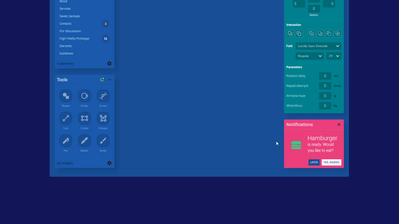
Important means noticeable, therefore such a color. I play again with the color wheel. I really wanted the popup to disappear in the direction from which the “close” click was made. Basically it will be the upper right corner, and I send all the available tools there a bright window with a green burger (!). To do this, I reduce the size of the popup to 0x0 with the approximation point at the top right (Set Size action). And with the same timing at 300ms and ease in effect I reduce the transparency to zero. It turns out two effects simultaneously, which together give an acceptable result.
Center
In order not to leave much into perfectionism, I did not bother much in the center. Just once again reminded myself - there should be no “empty” places in the product. If the user starts with a clean slate in your system, then you do not need to show this sheet to him. Literally. We need to encourage him to action . Therefore, in the center I do simple onboarding in the general style + a noticeable Create button, pressing which will roll out the placeholder.
This concludes the prototype. I found answers to many of my questions during this study.
As a conclusion
I sometimes heard about the teams in which the animation for the web product was thought up by the developers after the designers. So it should not be! We, the designers, should invent the logic and rules for moving objects on the screen. A good designer should know the rules for using animation. I am looking for inspiration among objects in the real world. After all, if the animation in the interface seems real - it does not cause dissonance and contributes to improving the quality of your product. Finally, I will say that I do not stop practicing in order to feel the correct timings for events, depending on the specific scenario.
Thank you for taking the time to have a non-existent interface! Now you can click on this link yourself and download it if you want ...
The source code for Axure RP 8 can be purchased for $ 12 via Gumroad via this link.
PS:
The question of really understandable and convenient export of animation specifications is still open on the tools market. I have not heard of any editor that would allow optimal transfer of the parameters of all effects, timings and objects associated with them. It remains to transfer on the fingers of the developers all the nuances.
I really want to export the semantically correct code to Axure. Then the development will proceed more optimally. It would be desirable, so that mobile prototyping should not be forgotten. And now of course it is possible, but not as perfect as in any instrument in which it was not forgotten. I want it to not insert the PNG crutches where you can use pure CSS (for example, the color of the shadow and dashed-border). And in order to make a normal export of specifications, there is already a lot of software on the market that brings together a cool UI kit. Moreover, indents between objects in the source code should not be a serious problem. Now, low fidelity prototyping is already at sunset, and if the Akshura team does not reconsider priorities, they will soon go with things to the exit ...
Here are some of the free evenings stood out ...
A couple of good articles about animation in interfaces on the Medium:
EN: 6 Animation Guidelines for UX Design
EN: Creating Usability with Motion: The UX in Motion Manifesto
Source: https://habr.com/ru/post/331972/
All Articles