Guide: how to use Python for algorithmic trading on the exchange. Part 2

We continue to publish an adaptation of the DataCamp manual on using Python to develop financial applications. The first part of the material was about the structure of financial markets, stocks and trading strategies, these time series, as well as what is needed to start developing.
Now that you already know more about the data requirements, understand the concept of time series and become familiar with pandas, it's time to dive deeper into the topic of financial analysis, which is necessary to create a trading strategy.
')
Jupyter notebook of this manual can be downloaded here .
General financial analysis: profit calculation
With a simple calculation of the daily percentage change , for example, dividends and other factors are not taken into account - the percentage change in the price of the acquired shares is simply noted compared to the previous trading day. It is easy to calculate such changes using the pct_change () function included in the Pandas package.
# Import `numpy` as `np` import numpy as np # Assign `Adj Close` to `daily_close` daily_close = aapl[['Adj Close']] # Daily returns daily_pct_change = daily_close.pct_change() # Replace NA values with 0 daily_pct_change.fillna(0, inplace=True) # Inspect daily returns print(daily_pct_change) # Daily log returns daily_log_returns = np.log(daily_close.pct_change()+1) # Print daily log returns print(daily_log_returns) Revenue will be calculated on a logarithmic scale - this allows you to more clearly track changes over time.
Knowing the profit per day is good, but what if we need to calculate this figure for a month or even a quarter? In such cases, you can use the resample () function, which we discussed in the last part of the manual:
# Resample `aapl` to business months, take last observation as value monthly = aapl.resample('BM').apply(lambda x: x[-1]) # Calculate the monthly percentage change monthly.pct_change() # Resample `aapl` to quarters, take the mean as value per quarter quarter = aapl.resample("4M").mean() # Calculate the quarterly percentage change quarter.pct_change() Using pct_change () is convenient, but in this case it is difficult to understand exactly how the daily income is calculated. Therefore, as an alternative, you can use the Pandas function called shift (). Then you need to divide the daily_close values by daily_close.shift (1) -1. When using this function, the NA values will be at the beginning of the resulting data frame.
For reference, the calculation of the daily change in the value of shares is calculated by the formula:
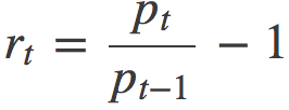 ,
,Where p is the price, t is the time (in our case, the day), and r is the income. You can create a daily_pct_change distribution schedule:
# Import matplotlib import matplotlib.pyplot as plt # Plot the distribution of `daily_pct_c` daily_pct_change.hist(bins=50) # Show the plot plt.show() # Pull up summary statistics print(daily_pct_change.describe()) 
The result looks symmetrical and normally distributed: the daily price change is around bin 0.00. It should be understood that to correctly interpret the results of the histogram, use the describe () function applied to daily_pct_c. In this case, it will be seen that the average value is also close to bin 0.00, and the standard deviation is 0.02. You also need to examine the percentiles in order to understand how much data goes beyond the boundaries of -0.010672, 0.001677 and 0.014306.
The indicator of the total daily rate of return is useful for determining the value of investments on regular segments. You can calculate the total daily rate of return using the values of daily changes in asset prices as a percentage, adding 1 to them and calculating the final values:
# Calculate the cumulative daily returns cum_daily_return = (1 + daily_pct_change).cumprod() # Print `cum_daily_return` print(cum_daily_return) Here again, you can use Matplotlib to quickly draw cum_daily_return. It is only necessary to add the function plot () and, optionally, determine the size of the graphic using figsize.
# Import matplotlib import matplotlib.pyplot as plt # Plot the cumulative daily returns cum_daily_return.plot(figsize=(12,8)) # Show the plot plt.show() 
It's pretty simple. Now, if you want to analyze not daily income, but monthly, you should return to the resample () function - with its help you can bring cum_daily_return to monthly values:
# Resample the cumulative daily return to cumulative monthly return cum_monthly_return = cum_daily_return.resample("M").mean() # Print the `cum_monthly_return` print(cum_monthly_return) Knowing how to calculate income is a useful skill, but in practice these values rarely carry valuable information unless you compare them with other stocks. That is why in different examples two or more actions are often compared.
To do this too, you first need to upload more data - in our case, from Yahoo! Finance. To do this, you can create a function that will use the ticker of the stock, as well as the start and end dates of the trading period. In the example below, the data () function takes a ticker to receive data, starting from startdate to enddate, and returns the result of the get () function. The data is laid out using the correct ticker (ticker), the result is a data frame containing this information.
In the code below, Apple, Microsoft, IBM, and Google share data are loaded into one common data frame:
def get(tickers, startdate, enddate): def data(ticker): return (pdr.get_data_yahoo(ticker, start=startdate, end=enddate)) datas = map (data, tickers) return(pd.concat(datas, keys=tickers, names=['Ticker', 'Date'])) tickers = ['AAPL', 'MSFT', 'IBM', 'GOOG'] all_data = get(tickers, datetime.datetime(2006, 10, 1), datetime.datetime(2012, 1, 1)) Note : this code was also used in the Pandas use guide for the financial industry , it was later finalized. Also, since there are currently problems with loading data from Yahoo! Finance, for correct operation, you may have to download the fix_yahoo_finance package — installation instructions can be found here or in the Jupyter notebook of this guide .
Here is the result of executing this code:

This large data frame can be used to draw interesting graphs:
# Import matplotlib import matplotlib.pyplot as plt # Isolate the `Adj Close` values and transform the DataFrame daily_close_px = all_data[['Adj Close']].reset_index().pivot('Date', 'Ticker', 'Adj Close') # Calculate the daily percentage change for `daily_close_px` daily_pct_change = daily_close_px.pct_change() # Plot the distributions daily_pct_change.hist(bins=50, sharex=True, figsize=(12,8)) # Show the resulting plot plt.show() 
Another useful graph for financial analysis is the scattering matrix. You can get it using the pandas library. It will be necessary to add the function scatter_matrix () to the code. As arguments, the daily_pct_change is passed, and the diagonal is set to an optional value so as to obtain a graph of the core density estimation (Kernel Density Estimate, KDE). Also, using the alpha argument, you can set the transparency, and using figsize to change the size of the graph.
# Import matplotlib import matplotlib.pyplot as plt # Plot a scatter matrix with the `daily_pct_change` data pd.scatter_matrix(daily_pct_change, diagonal='kde', alpha=0.1,figsize=(12,12)) # Show the plot plt.show() 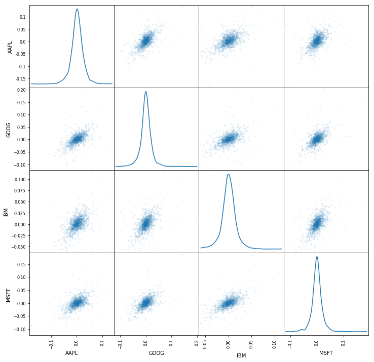
In the case of local work, the plotting module (i.e., pd.plotting.scatter_matrix ()) may be needed to build the scattering matrix.
The next part of the guide will discuss the use of sliding windows for financial analysis, the calculation of volatility and the application of the usual least squares regression.
To be continued…..
Other materials on finance and stock market from ITinvest :
- ITinvest educational resources
- Analytics and market reviews
- How HFT works: 3 simple explanations
- What could be a stack of technologies for high-frequency trading
- Infrastructure and trading robots: What programming languages are used in finance
- Experiment: Is it possible to create an effective trading strategy using machine learning and historical data
Source: https://habr.com/ru/post/331940/
All Articles