Sizes of raster images: pixels, DPI, PPI, centimeters - you do not confuse anything?
I greet the respected community Habra! I am writing this small note as an important educational program for all those who work with raster images. Usually, the question of what to measure the image arises from beginners, but confused terms and experienced professionals.

Let's start with the main thing: raster images consist of pixels . This could have been the end of this article, but not all of this is enough, so let's talk about the delusions and myths that I met in practice.
The most common misconception is the use of units of DPI (dots per inch - dots per inch) and PPI (pixels per inch - pixels per inch). In fact, these units relate to printers and scanners, respectively. They can also be used in the characteristics of the screens. In fact, these are coefficients for the translation between the physical dimensions in the analog (in centimeters or inches) and the dimensions in pixels for the digital image.
')
For example, an image of 100 pixels printed at 100 DPI will have a size of 1 inch. Everything is simple and clear.
However, when resizing in graphic editors, we are offered to specify dimensions in convenient measurements, including in DPI. This is where the confusion begins.
In fact, the physical dimensions of the image (in centimeters, inches, etc.) and the DPI value are just meta-information in the file properties. But the editor can use these values as a means of specifying the required dimensions in pixels.
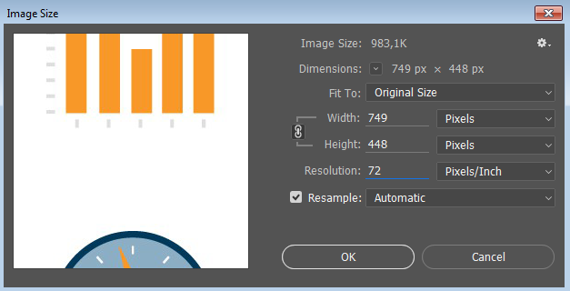
Suppose we have an image of 3000 pixels (square), which has a value of 300 DPI. We get: 3000 pixels / 300 DPI = 10 inches. Now go to the editor (Photoshop) and change the DPI value to 600. What do we get? And it depends on the “Resample” jackdaw. If it costs, we get upsampling (increase) the image up to 6000 pixels. If not, then the size in inches will be 5 instead of 10 .
Thus, for web development, all values of physical dimensions (DPI, centimeters, inches, etc.) can be safely ignored and look solely at the dimensions in pixels.
Here we come to the issue of resolution and pixel density of screens. Correctly, this density is referred to as PPI (pixels per inch) and indicates how many pixels can be displayed on one inch of the screen.
Here the mythical 72 and 96 PPI often arise, which should show the “standard” pixel density for screens. They are useless for displaying graphics on the web. At the same time, the actual pixel density of the screen may be quite different: typically something around 120 PPI (you can measure and count for your screen).
But we remember that raster images are measured only in pixels and nothing else. Why do we even talk about PPI screens? Because there are "Retina" or "HiDPI" screens.
Such displays are widely distributed in mobile devices and expensive laptops. In fact, this is a quantitative increase in pixels while maintaining the physical size of the screen (for example, 5 inches diagonally and 330 PPI).
For us, as web developers, this means the appearance of different pixels in the browser: CSS pixels (which we usually specify in the size of the elements) and physical pixels (real pixels on the screen). The formula is as follows: Physical pixels = CSS pixels * DPR.
DPR is the device pixel ratio - the ratio of CSS-pixels to physical.
When placing a picture, we can write an img tag with dimensions of 20px, and the picture will be 40 pixels. At the same time on the screen with DPR = 2.0 we will see all the pixels of the picture. But in this situation, we are absolutely not worried about the actual values of the PPI screen.
At the same time, we can use pictures with high pixel density and for ordinary screens, the browser will scale the image itself. And again, DPI and PPI have nothing to do with it, but the pictures are measured in pixels . How to show them will decide the browser, which already has two kinds of pixels.
That's the whole story, although I certainly did not say anything about adaptive pictures, how to optimize their performance and client hints. But that's another story.
Let's start with the main thing: raster images consist of pixels . This could have been the end of this article, but not all of this is enough, so let's talk about the delusions and myths that I met in practice.
DPI, PPI and resizing
The most common misconception is the use of units of DPI (dots per inch - dots per inch) and PPI (pixels per inch - pixels per inch). In fact, these units relate to printers and scanners, respectively. They can also be used in the characteristics of the screens. In fact, these are coefficients for the translation between the physical dimensions in the analog (in centimeters or inches) and the dimensions in pixels for the digital image.
')
For example, an image of 100 pixels printed at 100 DPI will have a size of 1 inch. Everything is simple and clear.
However, when resizing in graphic editors, we are offered to specify dimensions in convenient measurements, including in DPI. This is where the confusion begins.
In fact, the physical dimensions of the image (in centimeters, inches, etc.) and the DPI value are just meta-information in the file properties. But the editor can use these values as a means of specifying the required dimensions in pixels.
Suppose we have an image of 3000 pixels (square), which has a value of 300 DPI. We get: 3000 pixels / 300 DPI = 10 inches. Now go to the editor (Photoshop) and change the DPI value to 600. What do we get? And it depends on the “Resample” jackdaw. If it costs, we get upsampling (increase) the image up to 6000 pixels. If not, then the size in inches will be 5 instead of 10 .
Thus, for web development, all values of physical dimensions (DPI, centimeters, inches, etc.) can be safely ignored and look solely at the dimensions in pixels.
DPI / PPI screens
Here we come to the issue of resolution and pixel density of screens. Correctly, this density is referred to as PPI (pixels per inch) and indicates how many pixels can be displayed on one inch of the screen.
Here the mythical 72 and 96 PPI often arise, which should show the “standard” pixel density for screens. They are useless for displaying graphics on the web. At the same time, the actual pixel density of the screen may be quite different: typically something around 120 PPI (you can measure and count for your screen).
But we remember that raster images are measured only in pixels and nothing else. Why do we even talk about PPI screens? Because there are "Retina" or "HiDPI" screens.
Retina and HiDPI screens
Such displays are widely distributed in mobile devices and expensive laptops. In fact, this is a quantitative increase in pixels while maintaining the physical size of the screen (for example, 5 inches diagonally and 330 PPI).
For us, as web developers, this means the appearance of different pixels in the browser: CSS pixels (which we usually specify in the size of the elements) and physical pixels (real pixels on the screen). The formula is as follows: Physical pixels = CSS pixels * DPR.
DPR is the device pixel ratio - the ratio of CSS-pixels to physical.
When placing a picture, we can write an img tag with dimensions of 20px, and the picture will be 40 pixels. At the same time on the screen with DPR = 2.0 we will see all the pixels of the picture. But in this situation, we are absolutely not worried about the actual values of the PPI screen.
At the same time, we can use pictures with high pixel density and for ordinary screens, the browser will scale the image itself. And again, DPI and PPI have nothing to do with it, but the pictures are measured in pixels . How to show them will decide the browser, which already has two kinds of pixels.
That's the whole story, although I certainly did not say anything about adaptive pictures, how to optimize their performance and client hints. But that's another story.
Source: https://habr.com/ru/post/331864/
All Articles