Connect: Modern Frontend Tips
We recently released a new and improved version of Connect , our toolkit for platforms and stores. The Stripe design team has worked a lot to create unique landing pages that tell a story for our main products. We have prepared a Connect landing page for the release to reflect these intricate, advanced features, but at the same time without losing clarity and simplicity of presentation.
In this article, we describe how several of the next-generation web technologies were used to launch Connect, and go over some of the small technical details of our front-end travel.
Earlier this year, three major browsers (Firefox, Chrome and Safari) almost simultaneously rolled out their implementations of the new CSS Grid Layout module. These specifications give developers a two-dimensional layout system that is easy to use and incredibly powerful. The Connect landing page relies on CSS grids almost everywhere, which makes some seemingly tricky design solutions simple to implement. As an example, let's hide the contents of the header and focus on the background:

')
Historically, we created such background stripes (stripes) using absolute positioning to precisely place each strip on the page. This method works, but fragile positioning often leads to small problems: for example, due to rounding errors, a gap of 1 px may form. Style sheets also swell up quickly and are harder to maintain because media queries are complicated to account for differences in background on different screen sizes.
CSS Grid eliminates almost all these problems. We simply define a flexible grid and place the stripes in the appropriate cells. Firefox has a handy grid inspector that visualizes the structure of your layout. Let's see what it looks like:
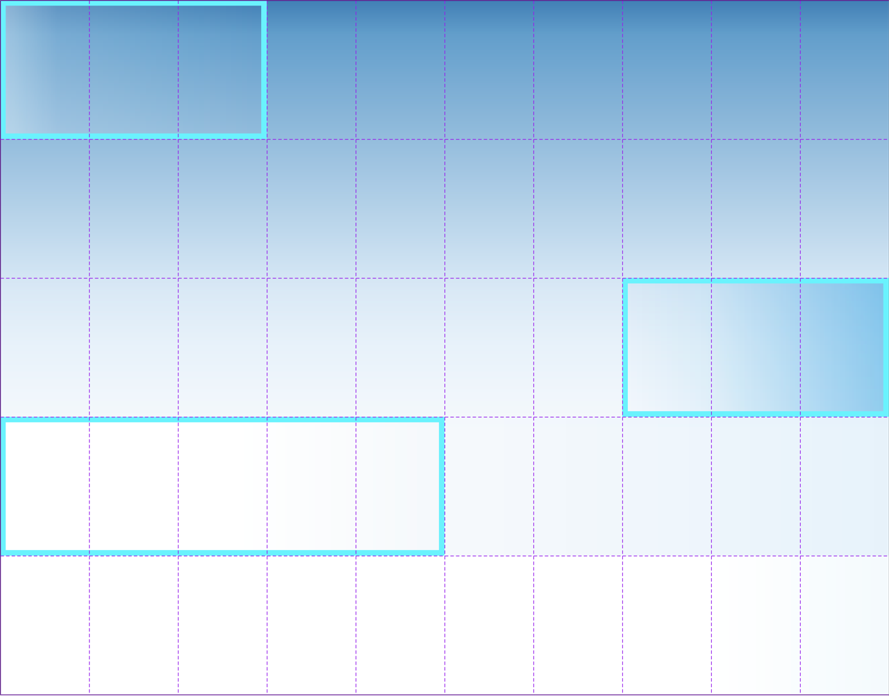
We selected three stripes and removed the tilt effect for clarity. Here is what the corresponding CSS code will look like:
Then we can simply transform the entire
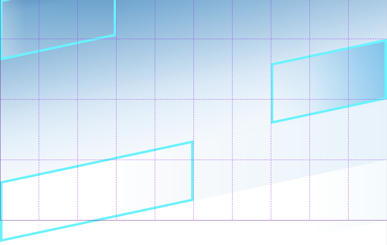
And voila! The CSS Grid may scare at first sight, as it is accompanied by an unusual syntax and many new properties and values, but the mental model is actually very simple. And if you are familiar with Flexbox, you already know the Box Alignment module, which means you can also use familiar properties that you like so much, such as
The title page shows several cubes as a visual metaphor of the building blocks that make up Connect. These flying cubes rotate in 3D at random speeds (in a certain range) and are illuminated by a single light source that dynamically highlights the corresponding surfaces of the video: cubes.mp4

These cubes are simple DOM elements that are generated and animated by JavaScript. Each of them is confirmed by one HTML
Nothing complicated. Now we can quite easily convert these clean and empty elements into three-dimensional form. Thanks to 3D transformations, adding perspective and moving sides along z-axes is quite natural:
Although CSS makes it trivial to model a cube, it does not provide advanced animation features, such as dynamic shading. Instead, the cube animation relies on
There are other considerations that need to be taken into account (for example, performance improvements using
We can calculate the visibility and transformation for each side by continuously monitoring their states and updating them using simple mathematical operations. When using pure ES2015 functions and features, such as template literals , everything becomes even easier. Here are two short javascript code snippets for computing and defining the current transformation:
The most difficult piece of the puzzle is how to correctly calculate the shading for each side of the cube. To simulate a virtual light source in the center of the scene, we can gradually increase the effect of lighting each side as it approaches the center point - on all axes. Specifically, this means that we need to calculate the brightness and color for each side. We will perform this calculation in each frame, interpolating the base color and the current shading factor.
Whew! Fortunately, the rest of the code is much simpler and consists mainly of template code, DOM-helpers and other elementary abstractions. The last detail to be mentioned is the technique that makes the animation less intrusive, depending on the user's settings: video .
Click to view video
On macOS, when Reduce Motion mode is enabled in the settings, the trigger on the new media request
Throughout the site, we use custom 3D computer devices as a showcase for Stripe customers and available applications. In our endless quest to reduce file size and load time, we considered several options for how to achieve a three-dimensional view with a small file size and resolution independence. Drawing devices directly into CSS met our requirements. Here is a CSS laptop:

Defining an object in CSS is definitely less convenient than exporting a bitmap, but it's worth it. The laptop at the top takes less than one kilobyte and is easy to configure. We can add hardware acceleration, animate any part, make it interactive without loss of image quality, and precisely position DOM elements (for example, other images) on the laptop display. This flexibility does not mean that you need to give up clean code - the markup remains clean, concise and visual:
Laptop styling includes a mixture of gradients, shadows and transformations. In many ways, this is a simple translation of the workflow and concepts that you know and use in your graphical tools. For example, here is the CSS code for the cover:
Choosing the right tool for the job is not always obvious - the choice between CSS, SVG, Canvas, WebGL and images is not as clear as it should be. It is easy to abandon CSS as an exclusive format for presenting documents, but it’s just as easy to go beyond and over-use its visual capabilities. No matter which technology you choose, optimize it for the user! So pay close attention to client-side performance, availability, and rollback options for older browsers.
 The Onboarding & Verification section features a demo of Express , a new adaptation system for novice Connect users. All the animation is entirely based on the program code and mainly relies on the new Web Animations API .
The Web Animations API provides
Nice and easy! Web Animations APIs cover the absolute majority of typical UI animations that can be needed without third-party dependencies (as a result, all Express animation takes about 5 KB, including everything: scripts, images, etc.). It must be said that this is not a complete replacement for
No matter what technique you use, here are some simple tips that you can always use to make your animation look much better:
Express animation begins playing automatically as soon as it appears in the field of view (you can experience this by scrolling through the page ). Usually this is accompanied by observation of scrolling, which works as a trigger, but historically it has been implemented through resource-intensive event listeners, which led to verbose and inefficient code.
The Connect landing page uses the new Intersection Observer API , which provides a much, much more reliable and productive way to determine element visibility. Here is how we begin to play the Express animation:
The helper
All these new and brilliant software interfaces are very nice, but unfortunately, they are not yet universally available. A typical workaround is the use of a polyfill, which checks for the presence of a feature for a specific API and is executed only if that API is not present. An obvious disadvantage of this approach is that it takes resources from everyone and always , forcing everyone to download a polyfill, regardless of whether it is used or not. We chose another solution.
For JavaScript APIs, the Connect landing page performs a test on whether a polyfill is needed and can dynamically load it onto the page. The scripts are dynamically created and added to the document, they are asynchronous by default, that is, the order of execution is not guaranteed. Obviously, this is a problem, since this script can be executed earlier than the expected polyfill. Fortunately, this can be corrected by explicitly indicating that our scripts are not asynchronous and therefore are lazily loaded only when necessary:
For CSS, the problem and solutions are in many ways the same as for JavaScript polyfills. A typical way to use modern CSS features is to write a rollback first, and then overlap it, if possible:
CSS function requests are simple, robust, and most likely they should be used first. However, they are not suitable for our audience, because about 90% of our visitors already use a Grid-compatible browser. In our case, it makes no sense to penalize the absolute majority of visitors with hundreds of rollback rules for a small and decreasing share of browsers. Given this statistic, we chose to dynamically create and insert a style sheet with rollback when necessary:
We hope you enjoyed (and perhaps benefited) from these frontend tips! Modern browsers give us powerful tools for creating rich, fast and attractive interfaces, allowing you to be creative. If you are just as excited about the opportunities as we are, we probably should experiment together .
In this article, we describe how several of the next-generation web technologies were used to launch Connect, and go over some of the small technical details of our front-end travel.
CSS grid layout
Earlier this year, three major browsers (Firefox, Chrome and Safari) almost simultaneously rolled out their implementations of the new CSS Grid Layout module. These specifications give developers a two-dimensional layout system that is easy to use and incredibly powerful. The Connect landing page relies on CSS grids almost everywhere, which makes some seemingly tricky design solutions simple to implement. As an example, let's hide the contents of the header and focus on the background:
')
Historically, we created such background stripes (stripes) using absolute positioning to precisely place each strip on the page. This method works, but fragile positioning often leads to small problems: for example, due to rounding errors, a gap of 1 px may form. Style sheets also swell up quickly and are harder to maintain because media queries are complicated to account for differences in background on different screen sizes.
CSS Grid eliminates almost all these problems. We simply define a flexible grid and place the stripes in the appropriate cells. Firefox has a handy grid inspector that visualizes the structure of your layout. Let's see what it looks like:
We selected three stripes and removed the tilt effect for clarity. Here is what the corresponding CSS code will look like:
header .stripes { display: grid; grid: repeat(5, 200px) / repeat(10, 1fr); } header .stripes :nth-child(1) { grid-column: span 3; } header .stripes :nth-child(2) { grid-area: 3 / span 3 / auto / -1; } header .stripes :nth-child(3) { grid-row: 4; grid-column: span 5; } Then we can simply transform the entire
.stripes container to get a tilt effect: header .stripes { transform: skewY(-12deg); transform-origin: 0; } And voila! The CSS Grid may scare at first sight, as it is accompanied by an unusual syntax and many new properties and values, but the mental model is actually very simple. And if you are familiar with Flexbox, you already know the Box Alignment module, which means you can also use familiar properties that you like so much, such as
justify-content and align-items .CSS 3D
The title page shows several cubes as a visual metaphor of the building blocks that make up Connect. These flying cubes rotate in 3D at random speeds (in a certain range) and are illuminated by a single light source that dynamically highlights the corresponding surfaces of the video: cubes.mp4
These cubes are simple DOM elements that are generated and animated by JavaScript. Each of them is confirmed by one HTML
template : <!-- HTML --> <template id="cube-template"> <div class="cube"> <div class="shadow"></div> <div class="sides"> <div class="back"></div> <div class="top"></div> <div class="left"></div> <div class="front"></div> <div class="right"></div> <div class="bottom"></div> </div> </div> </template> // JavaScript const createCube = () => { const template = document.getElementById("cube-template"); const fragment = document.importNode(template.content, true); return fragment; }; Nothing complicated. Now we can quite easily convert these clean and empty elements into three-dimensional form. Thanks to 3D transformations, adding perspective and moving sides along z-axes is quite natural:
.cube, .cube * { position: absolute; width: 100px; height: 100px } .sides { transform-style: preserve-3d; perspective: 600px } .front { transform: rotateY(0deg) translateZ(50px) } .back { transform: rotateY(-180deg) translateZ(50px) } .left { transform: rotateY(-90deg) translateZ(50px) } .right { transform: rotateY(90deg) translateZ(50px) } .top { transform: rotateX(90deg) translateZ(50px) } .bottom { transform: rotateX(-90deg) translateZ(50px) } Although CSS makes it trivial to model a cube, it does not provide advanced animation features, such as dynamic shading. Instead, the cube animation relies on
requestAnimationFrame to calculate and update each side at any point of rotation. In each frame, you need to define three things:- Visibility At any given time, no more than three sides are visible, so that unnecessary calculations and resource-intensive repainting on hidden sides can be avoided.
- Transformation Each side of the cube must be transformed depending on its initial rotation, the current state of the animation, and the speed along each axis.
- Shading Although CSS allows you to position elements in three-dimensional space, there are no traditional concepts from a 3D environment (for example, light sources). To simulate a 3D environment, we can render a light source by progressively darkening the sides of the cube as it moves away from a certain point.
There are other considerations that need to be taken into account (for example, performance improvements using
requestIdleCallback in JavaScript and backface-visibility in CSS), but these are the main bases for the logic of animation.We can calculate the visibility and transformation for each side by continuously monitoring their states and updating them using simple mathematical operations. When using pure ES2015 functions and features, such as template literals , everything becomes even easier. Here are two short javascript code snippets for computing and defining the current transformation:
const getDistance = (state, rotate) => ["x", "y"].reduce((object, axis) => { object[axis] = Math.abs(state[axis] + rotate[axis]); return object; }, {}); const getRotation = (state, size, rotate) => { const axis = rotate.x ? "Z" : "Y"; const direction = rotate.x > 0 ? -1 : 1; return ` rotateX(${state.x + rotate.x}deg) rotate${axis}(${direction * (state.y + rotate.y)}deg) translateZ(${size / 2}px) `; }; The most difficult piece of the puzzle is how to correctly calculate the shading for each side of the cube. To simulate a virtual light source in the center of the scene, we can gradually increase the effect of lighting each side as it approaches the center point - on all axes. Specifically, this means that we need to calculate the brightness and color for each side. We will perform this calculation in each frame, interpolating the base color and the current shading factor.
// Linear interpolation between a and b // Example: (100, 200, .5) = 150 const interpolate = (a, b, i) => a * (1 - i) + b * i; const getShading = (tint, rotate, distance) => { const darken = ["x", "y"].reduce((object, axis) => { const delta = distance[axis]; const ratio = delta / 180; object[axis] = delta > 180 ? Math.abs(2 - ratio) : ratio; return object; }, {}); if (rotate.x) darken.y = 0; else { const {x} = distance; if (x > 90 && x < 270) directions.forEach(axis => darken[axis] = 1 - darken[axis]); } const alpha = (darken.x + darken.y) / 2; const blend = (value, index) => Math.round(interpolate(value, tint.shading[index], alpha)); const [r, g, b] = tint.color.map(blend); return `rgb(${r}, ${g}, ${b})`; }; Whew! Fortunately, the rest of the code is much simpler and consists mainly of template code, DOM-helpers and other elementary abstractions. The last detail to be mentioned is the technique that makes the animation less intrusive, depending on the user's settings: video .
Click to view video
On macOS, when Reduce Motion mode is enabled in the settings, the trigger on the new media request
prefers-reduced-motion (while in Safari only) will work, and all decorative animations on the page will be turned off. Cubes simultaneously use CSS animations for shading and JavaScript animation for rotation. We can disable these animations by a combination of @media locks and the MediaQueryList Interface : /* CSS */ @media (prefers-reduced-motion) { #header-hero * { animation: none } } // JavaScript const reduceMotion = matchMedia("(prefers-reduced-motion)").matches; const tick = () => { cubes.forEach(updateSides); if (reduceMotion) return; requestAnimationFrame(tick); }; More CSS 3D!
Throughout the site, we use custom 3D computer devices as a showcase for Stripe customers and available applications. In our endless quest to reduce file size and load time, we considered several options for how to achieve a three-dimensional view with a small file size and resolution independence. Drawing devices directly into CSS met our requirements. Here is a CSS laptop:
Defining an object in CSS is definitely less convenient than exporting a bitmap, but it's worth it. The laptop at the top takes less than one kilobyte and is easy to configure. We can add hardware acceleration, animate any part, make it interactive without loss of image quality, and precisely position DOM elements (for example, other images) on the laptop display. This flexibility does not mean that you need to give up clean code - the markup remains clean, concise and visual:
<div class="laptop"> <span class="shadow"></span> <span class="lid"></span> <span class="camera"></span> <span class="screen"></span> <span class="chassis"> <span class="keyboard"></span> <span class="trackpad"></span> </span> </div> Laptop styling includes a mixture of gradients, shadows and transformations. In many ways, this is a simple translation of the workflow and concepts that you know and use in your graphical tools. For example, here is the CSS code for the cover:
.laptop .lid { position: absolute; width: 100%; height: 100%; border-radius: 20px; background: linear-gradient(45deg, #E5EBF2, #F3F8FB); box-shadow: inset 1px -4px 6px rgba(145, 161, 181, .3) } Choosing the right tool for the job is not always obvious - the choice between CSS, SVG, Canvas, WebGL and images is not as clear as it should be. It is easy to abandon CSS as an exclusive format for presenting documents, but it’s just as easy to go beyond and over-use its visual capabilities. No matter which technology you choose, optimize it for the user! So pay close attention to client-side performance, availability, and rollback options for older browsers.
Web Animations API
The Onboarding & Verification section features a demo of Express , a new adaptation system for novice Connect users. All the animation is entirely based on the program code and mainly relies on the new Web Animations API .The Web Animations API provides
@keyframes performance and simplicity in JavaScript, making it easy to create a smooth sequence of animation frames. Unlike the low-level requestAnimationFrame interfaces, here you get all the niceties of CSS animations, such as native support for cubic-bezier emollient functions. As an example, take a look at our code for sliding the keyboard: const toggleKeyboard = (element, callback, action) => { const keyframes = { transform: [100, 0].map(n => `translateY(${n}%)`) }; const options = { duration: 800, fill: "forwards", easing: "cubic-bezier(.2, 1, .2, 1)", direction: action == "hide" ? "reverse" : "normal" }; const animation = element.animate(keyframes, options); animation.addEventListener("finish", callback, {once: true}); }; Nice and easy! Web Animations APIs cover the absolute majority of typical UI animations that can be needed without third-party dependencies (as a result, all Express animation takes about 5 KB, including everything: scripts, images, etc.). It must be said that this is not a complete replacement for
requestAnimationFrame , it still provides more subtle control over the animation and allows effects that you would not otherwise get, such as Spring Curve and independent transformation functions. If you are not sure which technology to choose for your animations, then you can probably arrange the options in the following priority order:- CSS Transitions . This is the fastest, easiest and most efficient way to animate Suitable for simple things like
hovereffects. - CSS animations . They have the same performance characteristics as transitions: these are declarative animations that can be highly optimized by browsers and executed in separate streams. CSS animations are more functional than transitions, and allow multiple steps and multiple iterations. They are also more difficult to implement because they require named declarations
@keyframes, and often explicitanimation-fill-mode. (And named pieces have always been the hardest parts of computer science!) - Web Animations API . This programming interface provides almost the same performance as CSS animations (these animations are carried out by the same engine, but the JavaScript code still works in the main thread), and they are almost as easy to use. They should be your first choice for any animation where interactivity, random effects, programmable sequences and everything that is more functional than purely declarative animation is needed.
- requestAnimationFrame . There are no borders in the universe, but you need to build a spaceship. The possibilities here are endless, and the rendering methods are unlimited (HTML, SVG, canvas - whatever), but this technology is much more difficult to use and it may not work as well as the previous versions.
No matter what technique you use, here are some simple tips that you can always use to make your animation look much better:
- Custom curves . You hardly want to use inline
timing-functionlikeease-in,ease-outandlinear. You will save a lot of time if you globally determine the number of cubic-bezier custom variables . - Performance . By all means, avoid slowdowns in your animations. In CSS, for this, you should exclusively animate cheap properties (
transformandopacity) and drop animations on the GPU whenever possible (usingwill-change). - Speed Animations should never interfere. The main task of animations is to make the interface responsive, harmonious, pleasant and complete. There is no hard limit on the duration of the animation, it depends on the effects and the curve, but in most cases you should not exceed 500 seconds.
Intersection observer
Express animation begins playing automatically as soon as it appears in the field of view (you can experience this by scrolling through the page ). Usually this is accompanied by observation of scrolling, which works as a trigger, but historically it has been implemented through resource-intensive event listeners, which led to verbose and inefficient code.
The Connect landing page uses the new Intersection Observer API , which provides a much, much more reliable and productive way to determine element visibility. Here is how we begin to play the Express animation:
const observeScroll = (element, callback) => { const observer = new IntersectionObserver(([entry]) => { if (entry.intersectionRatio < 1) return; callback(); // Stop watching the element observer.disconnect(); },{ threshold: 1 }); // Start watching the element observer.observe(element); }; const element = document.getElementById("express-animation"); observeScroll(element, startAnimation); The helper
observeScroll makes it easier for us to detect (for example, when an element is fully visible, the callback is generated only once) without executing any code in the main thread. Thanks to the Intersection Observer API, we are now one step closer to absolutely smooth web pages!Polyfills and kickbacks
All these new and brilliant software interfaces are very nice, but unfortunately, they are not yet universally available. A typical workaround is the use of a polyfill, which checks for the presence of a feature for a specific API and is executed only if that API is not present. An obvious disadvantage of this approach is that it takes resources from everyone and always , forcing everyone to download a polyfill, regardless of whether it is used or not. We chose another solution.
For JavaScript APIs, the Connect landing page performs a test on whether a polyfill is needed and can dynamically load it onto the page. The scripts are dynamically created and added to the document, they are asynchronous by default, that is, the order of execution is not guaranteed. Obviously, this is a problem, since this script can be executed earlier than the expected polyfill. Fortunately, this can be corrected by explicitly indicating that our scripts are not asynchronous and therefore are lazily loaded only when necessary:
const insert = name => { const el = document.createElement("script"); el.src = `${name}.js`; el.async = false; // Keep the execution order document.head.appendChild(el); }; const scripts = ["main"]; if (!Element.prototype.animate) scripts.unshift("web-animations-polyfill"); if (!("IntersectionObserver" in window)) scripts.unshift("intersection-observer-polyfill"); scripts.forEach(insert); For CSS, the problem and solutions are in many ways the same as for JavaScript polyfills. A typical way to use modern CSS features is to write a rollback first, and then overlap it, if possible:
div { display: flex } @supports (display: grid) { div { display: grid } } CSS function requests are simple, robust, and most likely they should be used first. However, they are not suitable for our audience, because about 90% of our visitors already use a Grid-compatible browser. In our case, it makes no sense to penalize the absolute majority of visitors with hundreds of rollback rules for a small and decreasing share of browsers. Given this statistic, we chose to dynamically create and insert a style sheet with rollback when necessary:
// Some browsers not supporting Grid don't support CSS.supports // either, so we need to feature-test it the old-fashioned way: if (!("grid" in document.body.style)) { const fallback = "<link rel=stylesheet href=fallback.css>"; document.head.insertAdjacentHTML("beforeend", fallback); } The finish!
We hope you enjoyed (and perhaps benefited) from these frontend tips! Modern browsers give us powerful tools for creating rich, fast and attractive interfaces, allowing you to be creative. If you are just as excited about the opportunities as we are, we probably should experiment together .
Source: https://habr.com/ru/post/331548/
All Articles