10 basic principles of visual design
Yesterday I listened to the podcast and noticed how someone asked a question and said along the way: “Old fan, for the first time I am calling.” For some reason, this made me think about Medium. I read articles here a long time ago, but I never inserted my two cents. Today is the day when it will change.
For a start, I decided to write about something that is close to me, about visual design (aka graphic design), more specifically about the basic principles, the use of which came with experience, and which I consider most important for the good performance of my work.
I do not want to inflate the article, so I will be brief on each principle. To those who deserve a more detailed presentation, I can devote a full article in the future.
')
So ready? It all starts with ...
These are the basic building blocks of any design, no matter what. With them, you can create anything from simple icons to very complex illustrations, everything is done by a combination of these simple elements.
In geometry, a point is a combination of x and y coordinates, add the z axis - and you are in three-dimensional space, but we confine ourselves to two dimensions in this article.

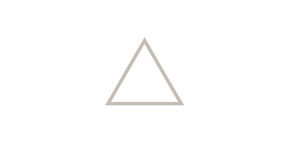
Point> Line> Form
If you connect two points, you get a line. The line consisting of the immensity of points is a bit like a bunch of atoms that form molecules, and they, in turn, form all the objects around you. Then, if you add a third point and connect them, you get a form, in this case a triangle, but as mentioned earlier, with these basic elements you can get almost everything you want.
But for your eyes, these forms do not exist, in fact, until you add something to them ...
Visible color spectrum
The human eye can see more than 10 million different colors from red to purple, and since childhood we all learn to assign certain values or values to certain colors.
For example, imagine traffic lights. These are just colors, but we assimilate that red means stop, green means to go, yellow means to set foot on the rails, because you can do this before red turns on. This shows that we are taking very different actions simply depending on the color, sometimes without even realizing it.
In my opinion, this happens simply because we have learned these things, and not because color has intrinsic meanings from nature. This is confirmed by the fact that these values vary depending on the culture, where and when you grew up.
All this means that you can add value, purpose and tone just by choosing the right color, you just need to make sure that you understand very well who you are designing for.
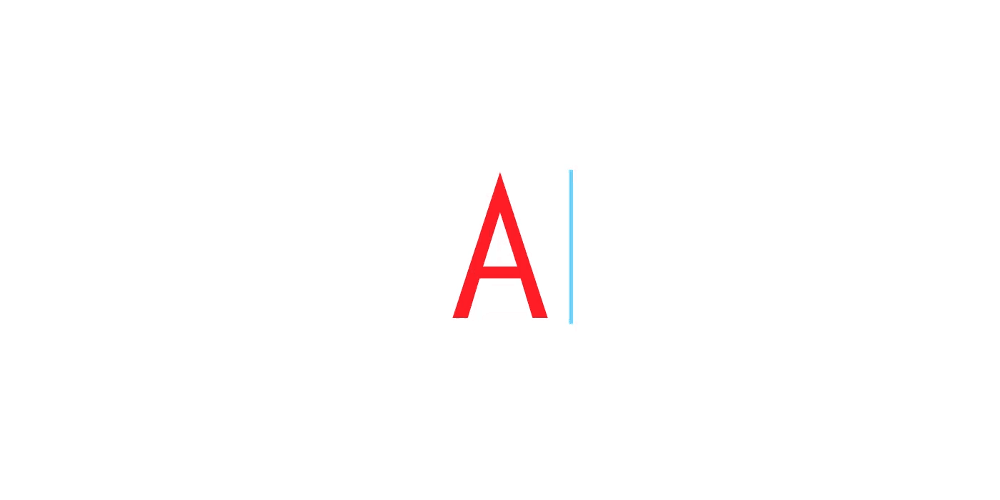
Now that you can see your triangle, how about making it more interesting ...

From triangle to letter A
This is a big deal, and I consider it one of the most important and difficult for a designer to realize everything correctly. It's not just what you write, but how you present it. Typography is what your words will look like.
With the right font, you can take a banal text and make it powerful. But it is not easy. What is easy is to completely blow off a powerful statement simply by choosing the wrong font. Typography, like color, allows you to define a tone.
Most fonts are designed for specific use, you just need to learn them and use them for your own purposes. Some fonts are good for large blocks of text, others for headlines. Some are extremely functional and super-clean, while others are simply made funny or ironic (you know what I mean).
You can choose from thousands of different fonts, but as long as you do not need something fancy or you will create something very specific, I would recommend to always stick to the classics. However, if you feel courage, you can even design your own font, although with competent performance, I consider it one of the most difficult things for a designer. But if you think that you are ready for one task that you cannot forget, then this is ...
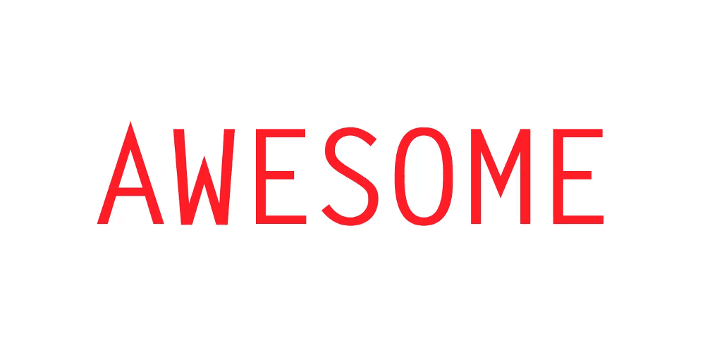
The way that you balance the space will help or spoil the design, which is especially important in typography.
It is necessary to consider how each element / letter corresponds with others, give them exactly as much breathing space as needed. It is usually called negative space (the positive space is the letters themselves).
Adjusting the negative space between characters (aka kerning)
You must accept the negative space as part of your design and also use it. The space can be a powerful tool and will help the viewer get through the design. It can also be a place to rest your eyes.
But use it wisely, too much space — and your design will look unfinished, too little space — and your design will seem too cluttered.
If you learn to find the right balance between positive and negative space, you can create ...
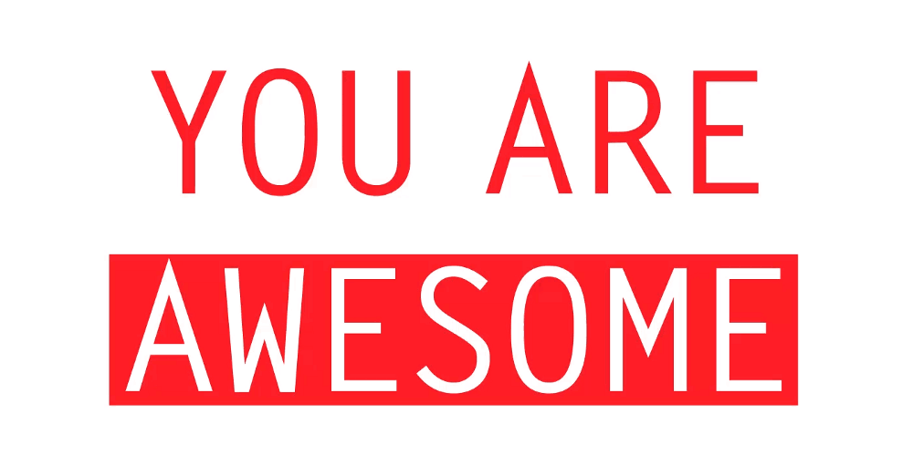
This is when you start turning a bunch of simple elements into something interesting and attractive. Properly balance all the elements of your design, given their visual height. A large black square in the upper right corner will drown the design in that direction. Compensate for this weight or move the square to another location.
Adjust the visual weight of words to create rhythm and contrast
The way you lay out the elements on the page is crucial, because the heavier elements will help create contrast and rhythm, and your viewer's eye will go through the design elegantly and effortlessly.
Something can help your rhythm and balance, and you can play with it too ...
Take the next step, adjusting the scale of words
Scale helps to create not only rhythm, contrast and balance, but also a hierarchy. Usually, not all elements of your design should have the same importance, and one of the best ways to communicate this is size.
Now, this should serve a specific purpose. Do not fall for the “make my logo bigger” approach and forget about the space I mentioned earlier.
For example, take a newspaper page. What is the biggest on the page?
Headings are usually short. Why? So you can quickly run through the page and see if there is something interesting to read. Then we have subtitles that are smaller in font but give more information about the article, and in the end there is an article with a minimum font size, but the most readable large piece of text.
So, we say that size should perform a specific function, and never forget about the person who will consume your design. In the case of a newspaper, it is time to put some order in order ...
It's like a strange satisfaction when you play Tetris and fold the last line that disappears from the screen.
Creating a certain connection between the elements so that they look more balanced and pleasant
They are supposed to be invisible, but you will see them if you open a book or newspaper. One way or another, but (no matter what you design), snapping to the grid structures your design and makes it more pleasant and easy to learn.
Even if you intentionally make a chaotic design, there must be order in this chaos.
Alignment is especially important for text, there are several ways to align it, but in my custom to align it to the left. Of course, it is always important what you create and for whom, but usually people read from left to right and from top to bottom, so the text in the center or on the right is much harder to read.
This is a key concept in photography, but it is also applicable in visual design.
Wherever you use a picture, an illustration or something else, create the right frame - and see the difference.
Reframing the composition to add interest and additional element
Try to look at what's important, scale / frame images so that your object stands out or enhances your message. Here the most important thing is the story, and how to tell it correctly.
After all this, if you think that something interesting is missing, you can play with ...
Test the texture with noise
Personally, I consider textures and patterns as accessories, you are not obliged to use and can live without them, but sometimes they can make your design or add a ring of interest that he lacked with just one fact of their application.
Textures today are not as fashionable as they once were, but with them you can add a new dimension to your design, making it more three-dimensional and tangible.
Textures don't have to be in the composition itself, if you need to print something, choose the right paper, add pieces like chamfer, embossing or UV varnishing - and your design can turn from a banal to something beautiful. But choose one, do not go crazy with a special finish.
Patterns always deal with repetitions and can almost be considered textures, depending on how you use them. I believe that they can be used mainly to introduce rhythm and dynamism into a flat design, as well as a way to compensate for the excess of negative space.
Last but not least, and in reality, what I consider the Holy Grail of visual design, is ...
This is the idea behind your design. What do you mean and what is the hidden meaning behind this surface image.

Bulb of ideas ... cliché, I know :)
This is what makes a great design different from something that you can download from the stock.
Create a design with a thought, with a purpose, and always keep an idea that unites everything. Carefully select the fonts for this purpose, think how every tiny part of your design follows this basic concept. Consistency is the most important thing.
If your concept is strong, then you can protect it and sell the idea to a client / boss or to whom you will show it.
Also competently thought-out design will live for years. Fashionable hipster things are cool and cool, like mustache and plaid shirts, but they have a shelf life. I really think that good design does NOT follow trends, but creates them.
Now you have them, "my" 10 principles for creating good design. Even though I consider # 10 to be the most important, you should pay attention to all other principles and make sure that you have achieved perfection in your art. You may have a good idea, but I think you also need to know how to implement it (or know who can do it for you).
It is said that one cannot judge a book by its cover, but most people in reality do just that. If the content of the book is not well displayed on the cover, then this will definitely affect success.
Okay! It's all.
As a conclusion, I should mention: There are, of course, other things that I take into account in the project / design, such as understanding the audience and what we want to achieve with it, however I did not include them in the list of principles, because I consider these “ restrictions are an important part of the definition of a visual concept. The idea may be great, but if it does not meet the requirements of the project, then sooner or later it will fail.
I hope you find this list useful, even if you all knew it before. I really use this set of principles as intensely as Shtedler pens, and for me it was an interesting exercise to deconstruct my designs into a kind of “building blocks”.
Feel free to leave your feedback, I am always open to a healthy discussion.
Thank you for reading!
For a start, I decided to write about something that is close to me, about visual design (aka graphic design), more specifically about the basic principles, the use of which came with experience, and which I consider most important for the good performance of my work.
I do not want to inflate the article, so I will be brief on each principle. To those who deserve a more detailed presentation, I can devote a full article in the future.
')
So ready? It all starts with ...
# 1 Point, Line, and Shape
These are the basic building blocks of any design, no matter what. With them, you can create anything from simple icons to very complex illustrations, everything is done by a combination of these simple elements.
In geometry, a point is a combination of x and y coordinates, add the z axis - and you are in three-dimensional space, but we confine ourselves to two dimensions in this article.
Point> Line> Form
If you connect two points, you get a line. The line consisting of the immensity of points is a bit like a bunch of atoms that form molecules, and they, in turn, form all the objects around you. Then, if you add a third point and connect them, you get a form, in this case a triangle, but as mentioned earlier, with these basic elements you can get almost everything you want.
But for your eyes, these forms do not exist, in fact, until you add something to them ...
# 2 Color
Visible color spectrum
The human eye can see more than 10 million different colors from red to purple, and since childhood we all learn to assign certain values or values to certain colors.
For example, imagine traffic lights. These are just colors, but we assimilate that red means stop, green means to go, yellow means to set foot on the rails, because you can do this before red turns on. This shows that we are taking very different actions simply depending on the color, sometimes without even realizing it.
In my opinion, this happens simply because we have learned these things, and not because color has intrinsic meanings from nature. This is confirmed by the fact that these values vary depending on the culture, where and when you grew up.
All this means that you can add value, purpose and tone just by choosing the right color, you just need to make sure that you understand very well who you are designing for.
Now that you can see your triangle, how about making it more interesting ...
# 3 Typography
From triangle to letter A
This is a big deal, and I consider it one of the most important and difficult for a designer to realize everything correctly. It's not just what you write, but how you present it. Typography is what your words will look like.
With the right font, you can take a banal text and make it powerful. But it is not easy. What is easy is to completely blow off a powerful statement simply by choosing the wrong font. Typography, like color, allows you to define a tone.
Most fonts are designed for specific use, you just need to learn them and use them for your own purposes. Some fonts are good for large blocks of text, others for headlines. Some are extremely functional and super-clean, while others are simply made funny or ironic (you know what I mean).
You can choose from thousands of different fonts, but as long as you do not need something fancy or you will create something very specific, I would recommend to always stick to the classics. However, if you feel courage, you can even design your own font, although with competent performance, I consider it one of the most difficult things for a designer. But if you think that you are ready for one task that you cannot forget, then this is ...
# 4 Space
The way that you balance the space will help or spoil the design, which is especially important in typography.
It is necessary to consider how each element / letter corresponds with others, give them exactly as much breathing space as needed. It is usually called negative space (the positive space is the letters themselves).
Adjusting the negative space between characters (aka kerning)
You must accept the negative space as part of your design and also use it. The space can be a powerful tool and will help the viewer get through the design. It can also be a place to rest your eyes.
But use it wisely, too much space — and your design will look unfinished, too little space — and your design will seem too cluttered.
If you learn to find the right balance between positive and negative space, you can create ...
# 5 Balance, rhythm and contrast
This is when you start turning a bunch of simple elements into something interesting and attractive. Properly balance all the elements of your design, given their visual height. A large black square in the upper right corner will drown the design in that direction. Compensate for this weight or move the square to another location.
Adjust the visual weight of words to create rhythm and contrast
The way you lay out the elements on the page is crucial, because the heavier elements will help create contrast and rhythm, and your viewer's eye will go through the design elegantly and effortlessly.
Something can help your rhythm and balance, and you can play with it too ...
# 6 Scale
Take the next step, adjusting the scale of words
Scale helps to create not only rhythm, contrast and balance, but also a hierarchy. Usually, not all elements of your design should have the same importance, and one of the best ways to communicate this is size.
Now, this should serve a specific purpose. Do not fall for the “make my logo bigger” approach and forget about the space I mentioned earlier.
For example, take a newspaper page. What is the biggest on the page?
Headings are usually short. Why? So you can quickly run through the page and see if there is something interesting to read. Then we have subtitles that are smaller in font but give more information about the article, and in the end there is an article with a minimum font size, but the most readable large piece of text.
So, we say that size should perform a specific function, and never forget about the person who will consume your design. In the case of a newspaper, it is time to put some order in order ...
# 7 Grid and alignment
It's like a strange satisfaction when you play Tetris and fold the last line that disappears from the screen.
Creating a certain connection between the elements so that they look more balanced and pleasant
They are supposed to be invisible, but you will see them if you open a book or newspaper. One way or another, but (no matter what you design), snapping to the grid structures your design and makes it more pleasant and easy to learn.
Even if you intentionally make a chaotic design, there must be order in this chaos.
Alignment is especially important for text, there are several ways to align it, but in my custom to align it to the left. Of course, it is always important what you create and for whom, but usually people read from left to right and from top to bottom, so the text in the center or on the right is much harder to read.
# 8 Framing
This is a key concept in photography, but it is also applicable in visual design.
Wherever you use a picture, an illustration or something else, create the right frame - and see the difference.
Reframing the composition to add interest and additional element
Try to look at what's important, scale / frame images so that your object stands out or enhances your message. Here the most important thing is the story, and how to tell it correctly.
After all this, if you think that something interesting is missing, you can play with ...
# 9 Textures and Patterns
Test the texture with noise
Personally, I consider textures and patterns as accessories, you are not obliged to use and can live without them, but sometimes they can make your design or add a ring of interest that he lacked with just one fact of their application.
Textures today are not as fashionable as they once were, but with them you can add a new dimension to your design, making it more three-dimensional and tangible.
Textures don't have to be in the composition itself, if you need to print something, choose the right paper, add pieces like chamfer, embossing or UV varnishing - and your design can turn from a banal to something beautiful. But choose one, do not go crazy with a special finish.
Patterns always deal with repetitions and can almost be considered textures, depending on how you use them. I believe that they can be used mainly to introduce rhythm and dynamism into a flat design, as well as a way to compensate for the excess of negative space.
Last but not least, and in reality, what I consider the Holy Grail of visual design, is ...
# 10 Visual concept
This is the idea behind your design. What do you mean and what is the hidden meaning behind this surface image.
Bulb of ideas ... cliché, I know :)
This is what makes a great design different from something that you can download from the stock.
Create a design with a thought, with a purpose, and always keep an idea that unites everything. Carefully select the fonts for this purpose, think how every tiny part of your design follows this basic concept. Consistency is the most important thing.
If your concept is strong, then you can protect it and sell the idea to a client / boss or to whom you will show it.
Also competently thought-out design will live for years. Fashionable hipster things are cool and cool, like mustache and plaid shirts, but they have a shelf life. I really think that good design does NOT follow trends, but creates them.
Now you have them, "my" 10 principles for creating good design. Even though I consider # 10 to be the most important, you should pay attention to all other principles and make sure that you have achieved perfection in your art. You may have a good idea, but I think you also need to know how to implement it (or know who can do it for you).
It is said that one cannot judge a book by its cover, but most people in reality do just that. If the content of the book is not well displayed on the cover, then this will definitely affect success.
Okay! It's all.
As a conclusion, I should mention: There are, of course, other things that I take into account in the project / design, such as understanding the audience and what we want to achieve with it, however I did not include them in the list of principles, because I consider these “ restrictions are an important part of the definition of a visual concept. The idea may be great, but if it does not meet the requirements of the project, then sooner or later it will fail.
I hope you find this list useful, even if you all knew it before. I really use this set of principles as intensely as Shtedler pens, and for me it was an interesting exercise to deconstruct my designs into a kind of “building blocks”.
Feel free to leave your feedback, I am always open to a healthy discussion.
Thank you for reading!
Source: https://habr.com/ru/post/331398/
All Articles