CSS: introduction to the unit of length 'fr'
While everyone is actively sharing their impressions of the CSS grids, I have not heard anyone say so much about the new unit of length in CSS - fr (see the specification ). And now, when browsers are beginning to support it better, I think it's time to take a look at how it can be used in conjunction with this typesetting technique, as this gives us a number of advantages. The main ones are the more understandable and easy-to-maintain code.
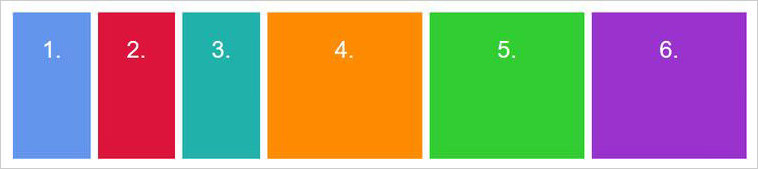
Before we begin, let's see how we usually create grids in CSS. In the example below, we create a grid of four columns with the same width:
')
<div class="grid"> <div class="column"></div> <div class="column"></div> <div class="column"></div> <div class="column"></div> </div> .grid { display: grid; grid-template-columns: repeat(4, 25%); grid-column-gap: 10px; } If you have never used the repeat () function as the value of the grid-template-columns property, let me introduce you to one of the most elegant features of the CSS grid! This is a brief entry. In fact, it allows us to more briefly describe duplicate values. Instead, we could write grid-template-columns: 25% 25% 25% 25%; , but it is more convenient to use repeat () , especially when you define the width through the rather long expression minmax () .
The syntax is as follows:
repeat (the number of columns / rows, the width of the column we need);
But, in fact, there are a couple of problems here.
First, to use this CSS function, we needed to do a little calculation. We had to calculate how much we get if we divide the total width of the grid (100%) by the required number of columns (4). We got 25%. In this example, the calculation is quite simple and does not create problems, but in more complex examples we can completely avoid the need to calculate something and let the browser do it for us. We have a calc () function, so we could write the following: repeat (4, calc (100% / 4) , but even this is a bit strange, and in any case there is another problem ...
The second problem is overflow. Since we set the width for each column to 25% and set the grid-column-gap to 10px, the whole grid becomes wider than 100%. You do not expect this by dialing the above code, but this is how percentages work. In fact, we kind of say here: “you need to set for each column a value of 25% of the width of the viewing area and a distance of 10px between them”. This is not much different from our expectations, but it causes a big problem with the layout.
By chance we created horizontal scrolling:
And this is where the fr unit will help.
The fr unit (“fractional part”) can be used to create grids just like any other unit of length in CSS, like % , px or em . Let's edit our code and try to set a new value:
.grid { display: grid; grid-template-columns: repeat(4, 1fr); grid-column-gap: 10px; } The result will be the same as in the example given earlier, since in this case we give each of the four columns a width equal to one fractional part (which is 1/4 or 25%). But! We got rid of the overflow on the x axis, since if we determine a width of 1fr for each column, these 10px are automatically taken into account and subtracted from the final width of the column.
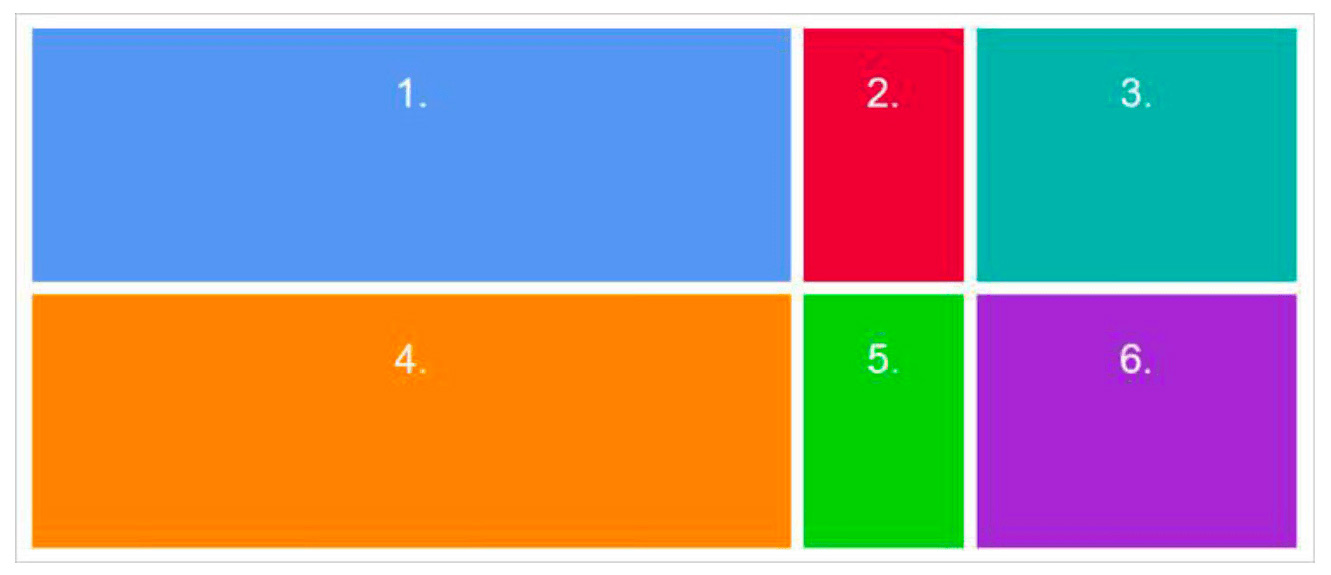
You probably wonder why the hell you need to learn how to use this new CSS unit if you can get by with percentages or pixels? Well, let's look at a more complex example of a CSS grid and find out why using fr is still the best option. In the new example, suppose that we want, after the navigation block on the left, there is a grid of twelve columns, which would look like this:

This is a fairly typical practice for many UIs. Using fr in such cases saves us from having to create a separate grid or fiddle with calc () calculations. After all, if we had not resorted to fr in the example above, we would have to perform the following calculation:
width of each column = ((width of the visible area - width of the navigation bar) / number of columns) * 1%
This, of course, could be cranked, but it is even difficult to look at it without tears. In addition, if we needed to change the width of the navigation unit, we would have to carry out a similar calculation again. Instead, fr offers us a very nice looking and most understandable code:
.grid { display: grid; grid-template-columns: 250px repeat(12, 1fr); grid-column-gap: 10px; } Here we set the first column to a fixed width in pixels, and then create 12 more separate columns. For each of them, a width of one “fractional part of free space” is determined (literal formulation in the specification). But now there is no need for crazy calculations! The code is quite understandable, and if we change the width of the left navigation block, the width of the columns on the right will be automatically adjusted.
We did not have to spend a lot of time and effort to make our interface more user-friendly. We also made our code more understandable for future developers, who are still waiting for a lot of other work.
What are our colleagues sharing
A good result can be achieved using fr along with other units of length. Imagine a fixed sidebar and the main content area that takes up the rest of the space: grid-template-columns: 200px 1fr; . Easy!
Here is a good example of using multiple units with Alligator.io:
.container { /* ... */ grid-template-columns: 1fr 1fr 40px 2fr; grid-template-rows: 100px 200px 100px; /* ... */ } 
Rachel Andrew shares a video about the fr unit:
Anna Monus offers a wonderful article about this unit:
“You can use the fr unit as well as other CSS length units. In the example below, I used a 60% 1fr to 2fr ratio for my grid. ”
Long live unit fr !
Source: https://habr.com/ru/post/331316/
All Articles