Entertaining layout with viewing area units
Viewing area units have been used for several years. They are almost completely supported by the main browsers . Nevertheless, I continue to find new and interesting ways to use them. I thought it would be great to remember the basic things first and then touch on some of my favorite uses for these units.

What are viewport units?
Between 2011 and 2015, in the CSS specifications developed by the W3C, in the 3rd level of the Values and Units CSS module , four new units appeared that are directly related
with viewport options. The new units — vw , vh , vmin , and vmax — work similarly to existing length units, such as px or em , but represent percentages of the current browser viewing area.
- Viewport Width ( vw ) is the percentage of the total width of the viewport. 10vw represents 10% of the current width of the viewing area, say 48px on a 480px widescreen phone. The difference between % and vw is most comparable to the difference between em and rem . The length in % is calculated relative to the width of the current context (container), and the length vw is calculated relative to the total width of the browser's viewport.
- Viewport Height ( vh ) is the percentage of the total height of the viewport. 10vh is 10% of the current viewport height.
- Viewport Minimum ( vmin ) is a percentage of the width or height of the viewport, depending on which of the two is smaller. 10vmin corresponds to 10% of the current width of the viewing area in portrait orientation and 10% of the height of the viewing area in landscape orientation.
- Viewport Maximum ( vmax ) is a percentage of the width or height of the viewport, depending on which of the two is larger. 10vmin will be equal to 10% of the current height of the viewing area in portrait orientation and 10% of the width of the viewing area in landscape orientation. Unfortunately and strange as it may sound, the vmax unit is not yet supported by Internet Explorer and Edge browsers.
While the value of these units depends on the height or width of the viewing area, they can be used everywhere in relation to length, be it font size, margins, indents, shadows, borders, etc., or element positioning. Let's see what we can do with them!
Responsive typography
It has become popular to use viewing area units in responsive typography — to adjust the font size so that it increases and decreases depending on the current size of the viewing area. Using viewing area units to determine font size has an interesting (dangerous) effect. As you can see, fonts scale very quickly — from an unreadable small to very large in a very small range.
html { font-size: 3vw; margin: .5em; } h1 { font-size: 4vmax; } h2 { font-size: 4vmin; } h1, h2 { font-weight: bold; } h1, h2, p { margin: .5em 0; } 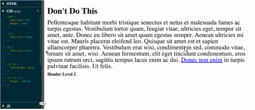
Such sharp scaling is clearly not suitable for everyday use. We need something more subtle - the minimum and maximum values. You also need more control over the ranges of increase in the indicator. Here the calc () function will help us. To determine the base font size, we can use more stable units (say, 16px ). We can also reduce the range of adjusting the value to the size of the viewing area ( 0.5vw ). Thus, the browser will perform the following mathematical calculations: calc (16px + 0.5vw)
By changing the relationship between the base size and the size calculated relative to the parameters of the viewing area, we can change the rate of increase of the latter. Try for headings to determine larger unit values for the viewing area, rather than for the rest of the text, and you will see how much faster their size will increase in comparison with the surrounding text. This allows you to use more dynamic typography on large screens, while at the same time limiting the font size on mobile devices. It does not require any media queries. This method can also be applied to the height of the line , which will allow to adjust the line spacing with a speed different from the speed of font size scaling.
body { // 1px 100px font-size: calc(16px + 1vw); // // 0.1em + 0.5px 100px line-height: calc(1.1em + 0.5vw); } In my opinion, there is no need to complicate more. If we need to limit the upper value for fast-growing headers, we can do this with a single media query for permissions on which their size is already too large:
h1 { font-size: calc(1.2em + 3vw); } @media (min-width: 50em) { h1 { font-size: 50px; } } Then I realized that it would be great if there was such a property as max-font-size .
Our colleagues developed more sophisticated calculations and Sass mixins to determine exact text size scaling ranges through specific media queries. There are several articles on CSS Tricks that explain this method. There are also code snippets to help try it out.
I think in most cases this is unnecessary, but you may have a different opinion.
Fullscreen blocks, hero images and sticky footers
There are a great many variations of the layout in the full height of the window (or implying a height restriction) - from desktop-style interfaces to hero images, wide layouts and sticky footers . The units of the viewing area will help you with all of the above.
In the interface in the full height in the style of the desktop page is often divided into sections, which are scrolled separately. Elements such as the header, footer, side panels, remain in place at any window size. Today it is common practice for many web applications, and vh units make implementing such an interface much easier. The following is an example using the new CSS Grid syntax:
One rule for body - height: 100vh - sets the height of your application equal to the height of the viewport. Make sure that the elements inside body are set to overflow so that their contents are not truncated. The same layout can be achieved using flexbox or floating elements . Note that with full-height layout, some mobile browsers may experience problems. There is a good fix for Safari on iOS , which we use for the most common non-standard cases.
Sticky footers can be created in the same way. All that is needed is to replace the rule for body height: 100vh with min-height: 100vh , and the footer will be fixed at the bottom of the screen until it is moved downward by content.
Use vh units to define the height , min-height or max-height properties of various elements and create full-screen sections, hero images, and more. In the new OddBird redesign, we have limited the height of hero images with the max-height: 55vh rule so that they do not force out the headings from the page. On my own website, I used the max-height: 85vh rule to highlight more images. On other sites I applied a minimum height - min-height: 90vh - to sections.
This example demonstrates immediately both the hero image of the cat, limited by the maximum height, and the section with the minimum height . Using all these tricks, you can maximize control over how the content will fill the browser window and respond to different sizes of the viewing area .
Ratio of width and height for rubber layout
It may also be useful to limit the ratio of the height of the element to its width. This is especially useful for embedded content, such as video. Chris previously wrote about this . In the good old days, we did this with the% indent for the container and absolute positioning for the inner element. Now, in some cases, to achieve the same effect, we can use the units of measurement of the viewing area, and there is no longer any need to create additional containers.
If we want to stretch our video to full screen, we can set its height relative to the width of the viewing area:
/* * */ .full-width { width: 100vw; height: calc(100vw * (9/16)); } It is not necessary to perform such calculations in a browser with support for the calc function. If you use a preprocessor, such as Sass, the same effect can be achieved using a similar calculation: height: 100vw * (9/16) . If you need to limit the maximum width, you can also limit the maximum height:
/* * */ .full-width { width: 100vw; max-width: 30em; height: calc(100vw * (9/16)); max-height: calc(30em * (9/16)); } This example demonstrates both options using custom CSS properties (variables), which allows to give the calculation more semantics. Play around with the numbers, and you will see how the elements are scaled, while maintaining the correct ratio:
Chris goes further in his article and we will follow his lead. What if we need ordinary HTML text content to scale within the established ratio, as often happens, for example, with presentation slides?
We can set values for all font properties and element sizes using the same viewport units as for the container. In this case, I used vmin for everything, so the content will scale with changes in both the height and width of the container:
"Tearing" the container
For many years, we have been using text blocks of limited size for a couple of backgrounds with the entire width. Depending on the markup or CMS, there may be problems. How to get away from the need to limit the contents of the container size, but at the same time to ensure that they fill the browser window exactly the same?
And again, the units of measurement of the viewing area will help. Here is another technique that we used on the new OddBird site, where a static site generator sometimes limits our control over markup. To implement this plan requires only a few lines of code.
.full-width { margin-left: calc(50% - 50vw); margin-right: calc(50% - 50vw); } There are more detailed articles on this technique, both on Cloud Four , and here, on CSS Tricks .
Creative implementation
Of course, if you try to experiment, you can do much more with the units of the viewing area. For example, this scrolling page indicator (created by a certain Mike) is made on pure CSS and using units of the viewing area on the background image:
And what else have you heard about viewing area units or how else did you use them in your work? Try to connect the imagination in your work and show us your results!
Original article: Fun with Viewport Units by Miriam Suzanne
')
Source: https://habr.com/ru/post/331184/
All Articles