AsyncDisplayKit 2.0 (Texture) Tutorial: Automatic Layout

Welcome to the second part of the AsyncDisplayKit (Texture) series!
The AsyncDisplayKit layout system allows you to write an incredibly fast, declarative code.
In addition to quick setup, it automatically adapts to the device on which the application is running. Suppose you are trying to create a node that can be used in the view controller of the application or as a popover in an iPad application. If its layout is correctly created, you can move the node to this new environment without worrying about changing the basic layout code!

In this tutorial, AsyncDisplayKit 2.0, you will return to the CardNode class from the first part and learn about the layout specifications that were used to create it. You will see how easy it is to make layout specifications to get the desired result.
The problem with Auto Layout
I hear you shout: “What's wrong with Auto Layout?!” In Auto Layout, every spaceline you create is represented as an equation in the system of equations. This means that each added constraint increases the calculation time of the constraints exponentially. This calculation is always performed in the main thread.
One of the goals of ASDK design is to adhere to the UIKit API as best you can. Unfortunately, Auto Layout is an opaque system in which there is no way to perform the calculation of the constraints in another stream.
let's start
To get started, download your start project from here . Since you’ll study part of the layout specifications, you should start with a modified version of the finished product from the first tutorial on AsyncDisplayKit 2.0.
Note : Before you start working with the tutorial on AsyncDisplayKit 2.0, read the first part .
Introduction to ASLayoutSpec
Before you begin, I will tell you a little background.
Layout specifications are a generalization of the layout system, which is briefly described in the Building Paper Event . The idea is to unify the calculation and application of the sizes and positions of the node and sub-nodes, and be able to reuse them.
In ASDK 1.9.X, you could create asynchronous layouts, but the layout code was similar to the pre-auto layout in UIKit . The size of the node subnodes could be calculated in the -calculateSizeThatFits: method. These sizes could be cached and then added later in -layout . And the positions of the nodes still had to be calculated using good old mathematics — no one likes to tinker with mathematics.

Layout Specification
In ASDK 2.0, ASDisplayNode subclasses can implement -layoutSpecThatFits:. An object of the ASLayoutSpec class determines the size and position of all subnodes. In doing so, the layout specification also determines the size of the mentioned parent node.
The node will return the layout specification object from -layoutSpecThatFits:. This object will determine the size of the node, as well as the size and position of all its subnodes recursively.
The ThatFits argument is an object of class ASSizeRange . It has two properties of type CGSize (min and max), which determine the smallest and largest dimensions of the node.
ASDK provides many different kinds of specifications. Here are some of them:
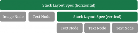
- ASStackLayoutSpec : Allows you to define a vertical or horizontal stack of children. The justifyContent property determines the distance between children in the direction of the stack, and the alignItem s determines their distance along the opposite axis. This specification is configured in the same way as UIKit UIStackView .
- ASOverlayLayoutSpec : Allows you to stretch one element of the layout over another. The object that overlaps it must have an intrinsic content size for this to work.
- ASRelativeLayoutSpec : Places an element in a relative position within its available space. Think of nine sections of nine sliced images . You can place an object in one of these sections.
- ASInsetLayoutSpec : Allows you to indent around an existing object. Do you want classic “iOS 16 pixel indents” around your cell? No problems!
ASLayoutElement protocol
Layout specifications control the layout of one or more children. An element can be a node, such as ASTextNode or ASImageNode . In addition to nodes, a child layout specification template can also be another layout specification.
Hey, how is this possible?
Child elements of the layout specification must comply with the ASLayoutElement protocol. ASLayoutSpec and ASDisplayNode correspond to ASLayoutElement , so both types and their subclasses can be child elements.
This simple concept turns out to be incredibly powerful. One of the most important characteristics of the layout is ASStackLayoutSpec . The ability to place an image and text is one thing, but to place an image and another stack is another!
You are absolutely right. It's time to duel! I mean, write code ...

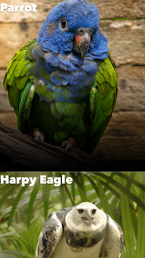
Placing an image of an animal
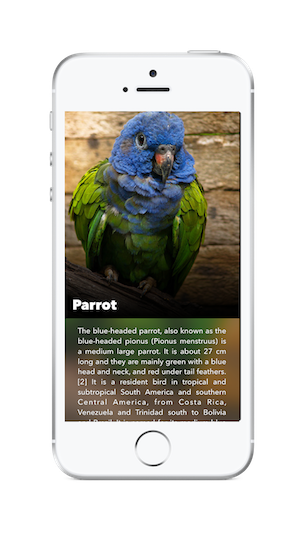
So, you are at work, and your designer sent you a screenshot of what he wants for the new Encyclopedia for Animals application you are working on.
The first thing to do is to split the screen into appropriate layout specifications in order to understand the overall layout. Sometimes this can lead to a stupor, but remember that the power of the layout depends on how easily they can be assembled. Start simple.
Looking ahead, I can only say that the upper and lower halves will work fine on the stack together. Now that you know this, you can place the two halves separately and combine them at the end.
Unzip the startup project and open RainforestStarter.xcworkspace . Go to CardNode.m to the -layoutSpecThatFits: method. Now it simply returns an empty ASLayoutSpec object.
If you compile and run the project, you will see the following:

Well, this is just the beginning. How about showing the image of the animal first?
By default, the network image node has no content and, therefore, does not have its own size. Looking at the screenshot, we can say that the image of the animal should occupy the full width of the screen and 2/3 of the height.
To do this, replace the existing return statement with the following:
//1 CGFloat ratio = constrainedSize.min.height/constrainedSize.min.width; //2 ASRatioLayoutSpec *imageRatioSpec = [ASRatioLayoutSpec ratioLayoutSpecWithRatio:ratio child:self.animalImageNode]; //3 return imageRatioSpec; Consider each numbered comment in turn:
- Calculate Ratio : First, you determine the ratio you want to apply to your image. Ratios are determined by height / width. Here you indicate that the height of this image should be 2/3 of the minimum height of the cell, which is the height of the screen.
- Create Ratio Layout Spec : Then you create a new ASRatioLayoutSpec using the calculated relation and the childImageNode child element.
- Return a Spec : The returned imageRatioSpec determines the height and width of the cell.
Compile and run to see what your layout looks like:
Pretty easy, huh? Since the image is the only element that has a size, the cells are stretched to adjust to it.
Note : constrainedSize passed to the table node cell consists of the minimum (0, 0) and maximum value ( tableNodeWidth, INF ). Therefore, you need to use preferredFrameSize to determine the height of the image. preferredFrameSize was set to AnimalPagerController in Part 1.
Add gradient
Now that you have an image of an animal, the next logical step is to add a gradient node on top of it.
ASOverlayLayoutSpec is just a specification for work.
First add the following line after imageRatioSpec initialization:
ASOverlayLayoutSpec *gradientOverlaySpec = [ASOverlayLayoutSpec overlayLayoutSpecWithChild:imageRatioSpec overlay:self.gradientNode]; When creating your layout specifications, you always get those that contain the rest. It's time for gradientOverlaySpec .
Replace the current return with the following.
return gradientOverlaySpec; Compile and run to see the gradient stretched across each imageNode object.
The gradient for each bird is great!
Add text with animal name
The only thing left to do is add the name of the animal.
Although the task seems simple, there are several requirements to consider:
- The name should be placed on top of the gradient.
- The name should be in the lower left corner of the image of the animal.
- Indent - 16 points on the left and 8 below.
You already know how to place text on top. The time has come to break out of the proven and true specification of the overlay.
Add the following line immediately after gradientOverlaySpec
ASOverlayLayoutSpec *nameOverlaySpec = [ASOverlayLayoutSpec overlayLayoutSpecWithChild:gradientOverlaySpec overlay:self.animalNameTextNode]; In addition, you need to change the return statement to the following:
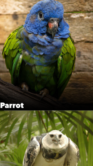
return nameOverlaySpec; Compile and run the application to see the text on the screen:
Not bad. You just need to move this text to the bottom corner.
It is worth mentioning the general case that you come across. You have text on a bird, so the natural desire is to wrap the OverlaySpec into other specifications to place it where you want. As a rule, you need to take a step back and think about what you are trying to express.
In this case, you use nameOverlaySpec to extend anything else on top of existing content.
In fact, you do not want to expand the name of the content. You just want to say the name that it should be in the lower left corner of your free space, and then stretch this layout specification to the available space.
Introduction to ASRelativeLayoutSpec
Actually, you need ASRelativeLayoutSpec .
ASRelativeLayoutSpec takes an ASLayoutElement child object, examines the space in which it is available, and then places this child element according to your instructions.
When determining the relative specification, you can set its verticalPosition and horizontalPosition properties.
These two properties may be as follows:
- ASRelativeLayoutSpecPositionStart
- ASRelativeLayoutSpecPositionCenter
- ASRelativeLayoutSpecPositionEnd
The combination allows you to place the object in one of the corners, edges or in the center of the available space.
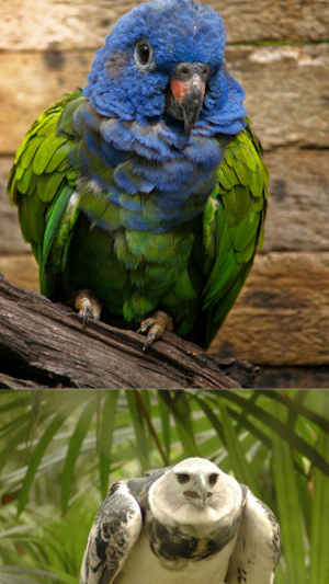
As an exercise: how would you put this frog on the right edge of free space?
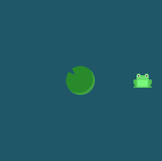
If you said: “Set the verticalPosition to ASRelativeLayoutSpecPositionCenter and horizontalPosition to ASRelativeLayoutSpecPositionEnd ”, then you are right!
Now that you've practiced, the next line should make a little more sense. Add this line right before nameOverlaySpec :
ASRelativeLayoutSpec *relativeSpec = [ASRelativeLayoutSpec relativePositionLayoutSpecWithHorizontalPosition:ASRelativeLayoutSpecPositionStart verticalPosition:ASRelativeLayoutSpecPositionEnd sizingOption:ASRelativeLayoutSpecSizingOptionDefault child:self.animalNameTextNode]; So you set the horizontalPosition of the child to start and the verticalPosition to complete. In frog language, it would look something like this:

Now that you have a relative specification, change the nameOverlaySpec definition to the following:
ASOverlayLayoutSpec *nameOverlaySpec = [ASOverlayLayoutSpec overlayLayoutSpecWithChild:gradientOverlaySpec overlay:relativeSpec]; Compile and run to see what you got:
Good! Only there is one more thing to do in this half of the cell.
Introduction to ASInsetLayoutSpec
The last thing you need to do is put the name of the animal 16 points to the left and 8 points down. To do this, you have ASInsetLayoutSpec .
To add a small indent around any of your objects, simply wrap the object in the insert specification and let the UIEdgeInsets determine what indent you need.
Add the following line after nameOverlaySpec :
ASInsetLayoutSpec *nameInsetSpec = [ASInsetLayoutSpec insetLayoutSpecWithInsets:UIEdgeInsetsMake(0, 16.0, 8.0, 0.0) child:nameOverlaySpec]; Then change the return statement again to return the outermost specification.
return nameInsetSpec; Compile and run.

You do not want the insert to be applied to the entire area covered by the overlay, as it includes the image of your animal.
What you really want is to apply an insert to the relativeSpec space. To fix this, first delete the current nameInsetSpec .
Then add the following new and improved version right before the definition of the nameOverlaySpec :
ASInsetLayoutSpec *nameInsetSpec = [ASInsetLayoutSpec insetLayoutSpecWithInsets:UIEdgeInsetsMake(0, 16.0, 8.0, 0.0) child:relativeSpec]; Now you need nameOverlaySpec to apply a new insert, not relativeSpec . Replace the nameOverlaySpec definition with:
ASOverlayLayoutSpec *nameOverlaySpec = [ASOverlayLayoutSpec overlayLayoutSpecWithChild:gradientOverlaySpec overlay:nameInsetSpec]; Finally, go back to:
return nameOverlaySpec; Now compile and run to see what happened:
Half the work is done!
Bottom half
The second half is a little easier. This is just a description of the animal with an insert around it ... and you already know how to do it.
Add the following line before the return statement to create an insert with the description text.
ASInsetLayoutSpec *descriptionTextInsetSpec = [ASInsetLayoutSpec insetLayoutSpecWithInsets:UIEdgeInsetsMake(16.0, 28.0, 12.0, 28.0) child:self.animalDescriptionTextNode]; If you returned this insert and then compiled and launched the application, you would see the following:
This is exactly what you wanted. Now that we have dealt with both halves, it is quite easy to combine them together.
The internal dimensions of the content
You do not need to worry that the text has the size of the content to fill the space. This is because ASTextNode has its internal content size based on its text and attributes.
The following nodes do not have default size:
- Subclasses of ASDisplayNode
- ASNetworkImageNode and ASMultiplexImageNode
- ASVideoNode and ASVideoPlayerNode
The common thing is that these sites have no initial content and, therefore, there is no way to determine their own size. They must either have preferredFrameSize , or be placed in the layout specification, before they have a specific size to work with.
Introduction to ASStackLayoutSpec
This is the perfect time to use the stack layout specification. You can think of it as a layout specification equivalent to UIStackView , excluding its automatic backward compatibility, which is quite elegant.
Stacks can be defined both vertical and horizontal. And like everything else, layout specifications can accept either nodes or other markup as child elements.
To configure this stack, add these three lines after defining the insert description:
ASStackLayoutSpec *verticalStackSpec = [[ASStackLayoutSpec alloc] init]; verticalStackSpec.direction = ASStackLayoutDirectionVertical; verticalStackSpec.children = @[nameOverlaySpec, descriptionTextInsetSpec]; Here you create a stack, setting its direction to vertical and adding the top half and bottom half as children.
And return the new layout specification again.
return verticalStackSpec; Compile and run. Almost done!

Note : As mentioned earlier, stacks are one of the most important layout specifications. Most layouts can be expressed as stacks or a series of nested stacks.
The nesting of the stacks, each with its own justifyContent and alignItems settings , means that they can be incredibly expressive as well as incredibly frustrating. Do not forget to see the flex box froggy game and Async Display Kit docs for more in-depth study.
Meet ASBackgroundLayoutSpec
Remember the overlay specification? One of the rules is that the object that is superimposed on it must have its own size.
The element at the back determines the size, and the element at the front just stretches over it.
The background specification is exactly the opposite. If you have one element that can define its own size, and the other you want to stretch it, you will need a background specification.
In this case, you need to use the background layout specification to stretch the image of the blurred animal.
To do this, add the following line:
ASBackgroundLayoutSpec *backgroundLayoutSpec = [ASBackgroundLayoutSpec backgroundLayoutSpecWithChild:verticalStackSpec background:self.backgroundImageNode]; And replace the return statement
return backgroundLayoutSpec; Compile and run to see what happened:
The completed project is available here. I repeat that there is also a version for Swift.
Once you understand these concepts, start exploring the documentation. It was just a small overview of what the layout system is capable of.
We hope you like this tutorial AsyncDisplayKit 2.0, and if you have any questions, feel free to leave them in the comments!
PS Special thanks to BeataSunshine and evgen for their help in translating the article.
')
Source: https://habr.com/ru/post/331008/
All Articles