Design as a world language of the 21st century
When a person says that he knows only one language, then in fact he knows them much more. Almost certainly, he understands the simplest sign language, as well as the professional slang of his employees. If he is a music lover, he necessarily understands the special unique language of his favorite music and, in the end, understands the modern digital language of communication with modern interfaces of a smartphone, computer, ATM, laptop.
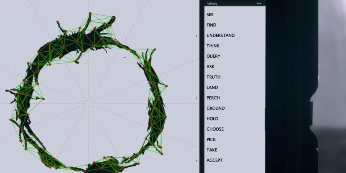
Moreover, it is precisely modern interfaces that, in my opinion, are becoming right now exactly what the Esperanto language could not become at one time - the unified and universal, understandable and unified language of communication between people, nations and ethnic groups.
It is the high-quality interface design, with the help of modern digital technologies, that has all chances to rally the whole of humanity together again, becoming a universal means of communication.
')
As an illustration of the idea of universality of design as a common language of the 21st century, consider a very example of the design of a single mobile application of the airline, which I came across quite by accident.
With the help of this example, I would like to show what exactly relates to the form of a language and its accents, and what constitutes the very essence and meaning of the message; After all, many people initially think that the only requirement for the form is full compliance with the iOS / Material Design guidelines, but in the future we will see that this is not entirely true.
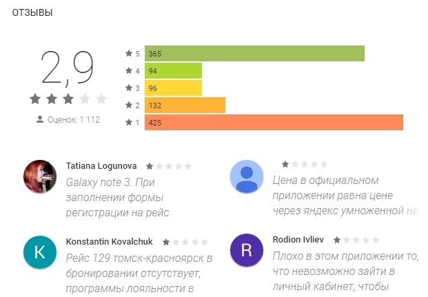
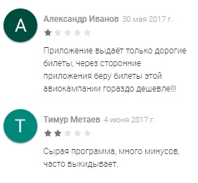
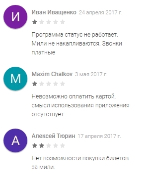
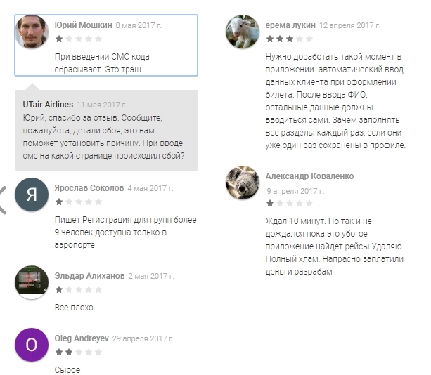
So, opening at random reviews to one of the most visually beautiful applications on Google Play, we see a strange reaction of ordinary people to qualitatively aligned fields and spectacularly rounded buttons. An experienced art director in such cases will certainly declare the underdevelopment of the subtlest exquisite visual taste of ordinary people, but we will try to comprehend that very serious truth from the mouth of the most ordinary people who vote with their own pockets for choosing one or another airline:
Culturally not educated people come again not to admire the quality of design, but to save a few kopecks due to the accumulation of miles:
But the developers certainly tried very hard. First there was the most severe selection for posts with the most difficult test tasks and perfect summaries, then several months of testing and testing, analyzing errors and working out every detail. People didn’t sleep a few nights before the release - and didn’t hear a single word of thanks.
The result was an application created, at first glance, across all material guidelines, but completely without regard for reality. The call for help above on the screenshots, coming from ordinary people, can be uniquely interpreted as a complete misunderstanding of the essence of everything he said through the new global language of communication.
In this case, I do not see this as a special case of bad design, but as the most prominent illustration of the problems of the whole industry, which exists everywhere in almost all existing interfaces. I didn’t set myself the goal of frankly hitting the only company.
I see here a problem common to the whole industry: when the form of presentation, all templates and generally accepted standards focus only on shallow accents, but not on the essence and not on the fundamental principles of design precisely as a single modern language.
Quickly running over the eyes of the real reviews, a rating was compiled of the immediate needs of the target audience, consisting entirely and entirely of the missing functionality, that is, of poorly operating system algorithms.
Having made an analogy with languages, one can say that the foundation of any speech are verbs, that is, actions; and all adjectives “green”, “beautiful”, “rounded” already carry a purely emotional background and do not add anything to the very essence of any utterance.
So, people want to see the following efficiencies in the app:
Let's see if the methods were not so flowery and cumbersome to convey the original message of the owners of the airline to their customers:
check in
I especially want to note that the fundamental problems of design are never limited to only one mobile version or only one of the many screens. Mutual misunderstanding always permeates absolutely all user scripts in any form.
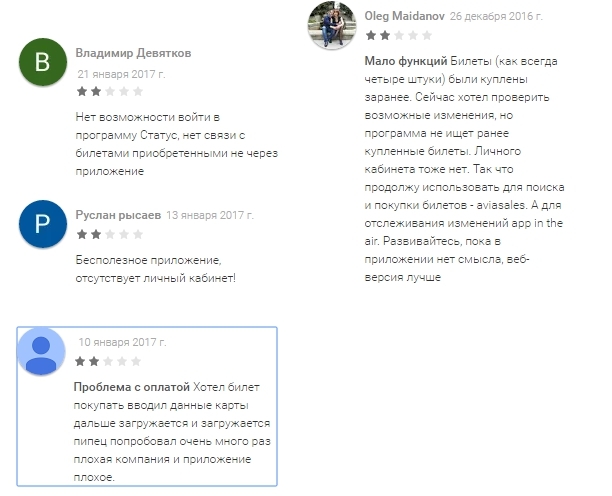
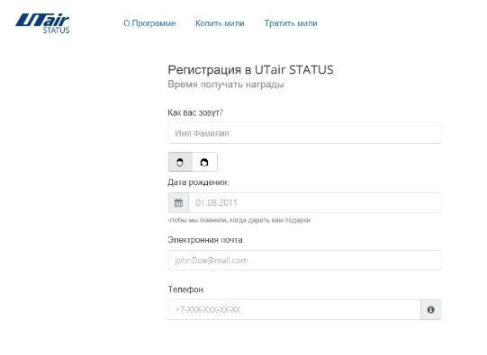
For example, it is strange, but after registering in your account, you need to register again from scratch in the bonus program, these two databases do not communicate with each other! It is the same as in live communication you would need to re-insert the speaker's name at the beginning of each sentence. In natural speech, people quickly eliminate such redundant rules, but in design, the process of getting rid of surplus is always somewhat delayed.
Consider the screen after mail verification:
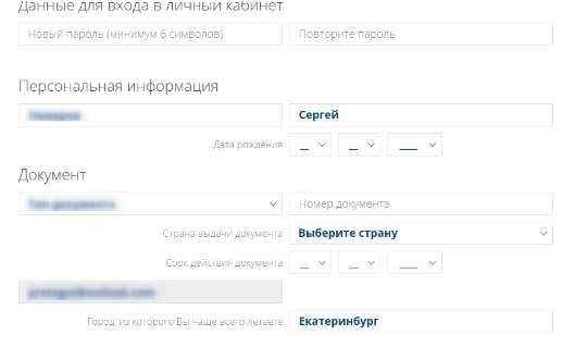
And right there in the next tab of the Personal Cabinet - all over again:
The history of all orders of the user must be stored in the phone's memory and be accessible even in the absence of an Internet connection - and there is not even need to draw anything. Only the correct logic, high-quality algorithms and seamless user flow - without a single extra pixel.
Easier search
Not all airlines have the broadest network of routes, being often localized in several standard directions. Therefore, an attempt to blindly copy the interfaces of large meta-search engines with their infinite number of options in output seems extremely erroneous from the point of view of a small number of company directions.
For example, it turned out that from an application taken for an example, all existing directions can be divided into 3 groups:
a) Siberia
Krasnoyarsk (Emelyanovo)
Irkutsk IKT
New Urengoy (Yagelnaya)
Tyumen (Roshchino) TJM
Mound kro
Ufa UFA
Magnitogorsk MQF
Anadyr DYR
Surgut SGC
b) South
Stavropol STW
Makhachkala MCX
MRV mineral water
Sochi (Adler) AER
Dushanbe DYU
Tashkent TAS
Yerevan (Zvartnots) EVN
Krasnodar (Pashkovskaya) KRR
Rostov-on-Don ROV
c) Center
Moscow (Vnukovo) VKO
Belgorod EGO
Murmansk (Main)
St. Petersburg (Pulkovo) LED
Kazan (Main) KZN
Moreover, from most airports the number of possible flights is extremely limited (except for Vnukovo). Notice how absurdly an attempt to organize a complex search on all flights looks when the maximum number of all possible options is two:
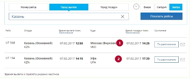
Here, knowing the current location of the user (Kazan) in advance, the “To Moscow” radio buttons would be enough, but when it is turned off, the second, much less popular option “to Ufa” will be used. Everything, the third is not given, and then it would be a simple and understandable language.
Using pre-default values with minimal algorithms, the interface can significantly reduce the number of clicks and elapsed time before getting the first result, while it has the right to look completely arbitrary.
The user, for example, is given a sign with the drag & drop operation, and it could well be entertained by dragging the necessary options to the center of the screen with your finger to generate a ticket. Fortunately, there are not many of these options at all, the use of points here is taken into account, and the additional useful effect from the introduction of gamification in the design is not yet measured. So why not?

The design can be different and even ... any!
Any professional translator using the knowledge of synonyms and being in context can translate any phrase in several ways, adapting the result for the convenience of the customer and the beauty of speech. But often even an experienced web designer will point out no other options for presenting information, learning all patterns, elements and visual solutions once in a lifetime and forever, not hearing current intonations and accents, reducing all creativity to formal filling out typical screen forms.
So, step by step, exploring the current state of affairs and existing problems, several hypotheses about the ways of a possible solution were born:
The first hypothesis suggests that if you consider a permanent and loyal customer brand using a limited set of flights and looking to upgrade their card to Silver, then the key part of the new mobile application could be push notifications.
The case could look like this: specifying the initial city when first registering, and having accumulated the history of favorite flights, each user can even get out of the application to receive instant alerts about:
The trends of the new version of Android seem to be that each person is aware of important events for him even without opening the necessary application ten times a day.

However, I personally cannot believe that all these people around me will be happy to receive more and more notifications and alerts, of which 99% of the total will be useless for them, as people do not fly 5 times a day.
It is just the same as randomly pronouncing all the words known from the language, hoping that once or twice in their life they themselves will form a meaningful sentence for the user.
The application still has to be downloadable and contain a typical set of tools and functions familiar to the user.
However, I will dare to assert that the form itself, the placement of accents and the use of non-standard sounds (images) can be completely unconventional, if, however, it allows you to convey to the person the general meaning of what was said and shown.
The designer of any application in the world has the full moral right to take on an additional challenge to give a person a taste of a new visual language that is extremely far from existing trends, but propagates the idea of high art (for example, in the style of suprematism) when forms become extremely simple. and capacious at the same time.
Here I interpret Suprematism as an expression of the world order through simple forms, as extreme minimalism, simplifying objects of any complexity to the simplest figures and lines.
If at the same time realized binding of a bank card, then why not? At least in the form of A / B testing?
Using this rather atypical form, you can achieve new, previously inaccessible goals - show the entire set of available directions and dates for the user in one window with the help of keywords. Compare with the amount of useful information on the standard screen of the application made for all classic templates:

In the classic application, the first step is only to generate a request to the system, in our version the request is sent at boot, and the first user screen is already the answer, anticipating the user “And what can I do here?”
Since the list of possible flights within the chosen direction is extremely small, he will be able to fit on the screen between Suprematist concepts, incidentally and unobtrusively familiarizing the user with Malevich’s world-famous masterpieces when showing available flights There and Return:

If you do not specify (or erase) the exact date of departure - the system is quite capable of displaying a calendar of low prices with vertical scrolling and the ability to sort by both date and minimum price (within the next week):
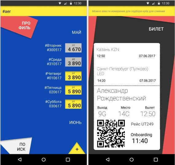
In the current version, so low rated by users, the standard ticket wizard looks very redundant, requiring you to perform as many as 9 steps:
In my opinion, human languages with the standard order of the subject and predicate in the same way deprive people of a certain flexibility in communication, as well as a set of typical steps in the interface.
Ideally, the desired result can be equally achievable after both the first and the hundredth click, and the tags just give the interface this flexibility. A similar list can be used for a list of all your past and future flights:
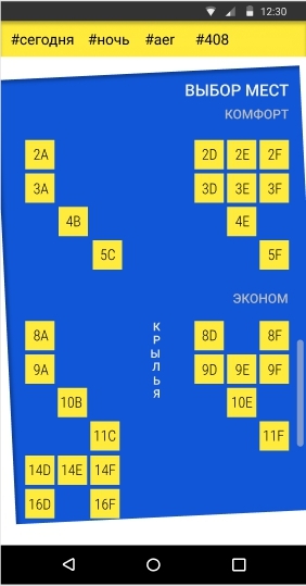
Let's also compare the existing design of the choice of space in the cabin with the ideally suprematic approach to communicating the essence to the user:
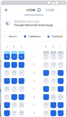
Now the application draws all the places, both occupied and free. Yes, it is noticeable that a lot of work was visually done only to make the labels look like chairs (view from above), and the gender of the potential neighbor was also displayed.
But does a lot of really necessary information contain such a screen? Does the presence of a male neighbor tell us something about his age, weight, political views and readiness to maintain a sweet conversation? Similarly, choosing a place next to a female pictogram, does the airline give us guarantees that it will be a sexy blonde who is just in search of a new tumultuous relationship, and not a coughing old woman?
But if the information is not complete, it does not give any guarantees and does not affect the decision-making scenario in any way - why does it litter the screen?
With a sound reasoning, it turns out that all that a person needs is an opportunity to sit by the window or closer to the aisle to an empty seat - this is where the real, and not invented minimalism in the language of design begins.
findings
But I ask you not to consider my small visual hooliganism a final statement that everything should now be exactly the same as mine, and nothing else. Design, this is not a ritual, not a clear consistent ritual of invoking spirits and not once and for all the postulates cast in granite. The design of the 21st century is a very flexible language capable of delivering the same thought in an infinite number of ways.
The main thing is that the meaning itself should be correct, understandable and acceptable to people, allow them to perform a little less operations, allow a little more to save time and effort, and at the same time not cause a negative of less than three points.
To speak with the user, you first need to functionally, clearly and concisely.
An article that inspired me to this little sketch.
Moreover, it is precisely modern interfaces that, in my opinion, are becoming right now exactly what the Esperanto language could not become at one time - the unified and universal, understandable and unified language of communication between people, nations and ethnic groups.
It is the high-quality interface design, with the help of modern digital technologies, that has all chances to rally the whole of humanity together again, becoming a universal means of communication.
')
As an illustration of the idea of universality of design as a common language of the 21st century, consider a very example of the design of a single mobile application of the airline, which I came across quite by accident.
With the help of this example, I would like to show what exactly relates to the form of a language and its accents, and what constitutes the very essence and meaning of the message; After all, many people initially think that the only requirement for the form is full compliance with the iOS / Material Design guidelines, but in the future we will see that this is not entirely true.
So, opening at random reviews to one of the most visually beautiful applications on Google Play, we see a strange reaction of ordinary people to qualitatively aligned fields and spectacularly rounded buttons. An experienced art director in such cases will certainly declare the underdevelopment of the subtlest exquisite visual taste of ordinary people, but we will try to comprehend that very serious truth from the mouth of the most ordinary people who vote with their own pockets for choosing one or another airline:
Culturally not educated people come again not to admire the quality of design, but to save a few kopecks due to the accumulation of miles:
But the developers certainly tried very hard. First there was the most severe selection for posts with the most difficult test tasks and perfect summaries, then several months of testing and testing, analyzing errors and working out every detail. People didn’t sleep a few nights before the release - and didn’t hear a single word of thanks.
The result was an application created, at first glance, across all material guidelines, but completely without regard for reality. The call for help above on the screenshots, coming from ordinary people, can be uniquely interpreted as a complete misunderstanding of the essence of everything he said through the new global language of communication.
In this case, I do not see this as a special case of bad design, but as the most prominent illustration of the problems of the whole industry, which exists everywhere in almost all existing interfaces. I didn’t set myself the goal of frankly hitting the only company.
I see here a problem common to the whole industry: when the form of presentation, all templates and generally accepted standards focus only on shallow accents, but not on the essence and not on the fundamental principles of design precisely as a single modern language.
Quickly running over the eyes of the real reviews, a rating was compiled of the immediate needs of the target audience, consisting entirely and entirely of the missing functionality, that is, of poorly operating system algorithms.
Having made an analogy with languages, one can say that the foundation of any speech are verbs, that is, actions; and all adjectives “green”, “beautiful”, “rounded” already carry a purely emotional background and do not add anything to the very essence of any utterance.
So, people want to see the following efficiencies in the app:
- Convenient single (pass-through) registration between the site and the application,
- Entering and securing a personal loyalty card in the application,
- convenient Personal Account, taking into account the previously received miles,
- bank card binding,
- pinning a standard residence or even determining the user's current city,
- Facilitation of search due to the demonstration of the directions of flight available to the user in a given region, without going through all the airports existing in the base.
Let's see if the methods were not so flowery and cumbersome to convey the original message of the owners of the airline to their customers:
check in
I especially want to note that the fundamental problems of design are never limited to only one mobile version or only one of the many screens. Mutual misunderstanding always permeates absolutely all user scripts in any form.
For example, it is strange, but after registering in your account, you need to register again from scratch in the bonus program, these two databases do not communicate with each other! It is the same as in live communication you would need to re-insert the speaker's name at the beginning of each sentence. In natural speech, people quickly eliminate such redundant rules, but in design, the process of getting rid of surplus is always somewhat delayed.
Consider the screen after mail verification:
And right there in the next tab of the Personal Cabinet - all over again:
The history of all orders of the user must be stored in the phone's memory and be accessible even in the absence of an Internet connection - and there is not even need to draw anything. Only the correct logic, high-quality algorithms and seamless user flow - without a single extra pixel.
Easier search
Not all airlines have the broadest network of routes, being often localized in several standard directions. Therefore, an attempt to blindly copy the interfaces of large meta-search engines with their infinite number of options in output seems extremely erroneous from the point of view of a small number of company directions.
For example, it turned out that from an application taken for an example, all existing directions can be divided into 3 groups:
a) Siberia
Krasnoyarsk (Emelyanovo)
Irkutsk IKT
New Urengoy (Yagelnaya)
Tyumen (Roshchino) TJM
Mound kro
Ufa UFA
Magnitogorsk MQF
Anadyr DYR
Surgut SGC
b) South
Stavropol STW
Makhachkala MCX
MRV mineral water
Sochi (Adler) AER
Dushanbe DYU
Tashkent TAS
Yerevan (Zvartnots) EVN
Krasnodar (Pashkovskaya) KRR
Rostov-on-Don ROV
c) Center
Moscow (Vnukovo) VKO
Belgorod EGO
Murmansk (Main)
St. Petersburg (Pulkovo) LED
Kazan (Main) KZN
Moreover, from most airports the number of possible flights is extremely limited (except for Vnukovo). Notice how absurdly an attempt to organize a complex search on all flights looks when the maximum number of all possible options is two:
Here, knowing the current location of the user (Kazan) in advance, the “To Moscow” radio buttons would be enough, but when it is turned off, the second, much less popular option “to Ufa” will be used. Everything, the third is not given, and then it would be a simple and understandable language.
Using pre-default values with minimal algorithms, the interface can significantly reduce the number of clicks and elapsed time before getting the first result, while it has the right to look completely arbitrary.
The user, for example, is given a sign with the drag & drop operation, and it could well be entertained by dragging the necessary options to the center of the screen with your finger to generate a ticket. Fortunately, there are not many of these options at all, the use of points here is taken into account, and the additional useful effect from the introduction of gamification in the design is not yet measured. So why not?
The design can be different and even ... any!
Any professional translator using the knowledge of synonyms and being in context can translate any phrase in several ways, adapting the result for the convenience of the customer and the beauty of speech. But often even an experienced web designer will point out no other options for presenting information, learning all patterns, elements and visual solutions once in a lifetime and forever, not hearing current intonations and accents, reducing all creativity to formal filling out typical screen forms.
So, step by step, exploring the current state of affairs and existing problems, several hypotheses about the ways of a possible solution were born:
The first hypothesis suggests that if you consider a permanent and loyal customer brand using a limited set of flights and looking to upgrade their card to Silver, then the key part of the new mobile application could be push notifications.
The case could look like this: specifying the initial city when first registering, and having accumulated the history of favorite flights, each user can even get out of the application to receive instant alerts about:
- The last 5 or less places left to your favorite destination (to Moscow in the morning),
- Changing weather conditions (flight cancellations) on your favorite destination,
- The closest price fluctuations in plus or minus on the favorite direction,
- Choosing a place near your own (with viewing the profile of another user). And the ability to re-select another footprint (for a fee).
The trends of the new version of Android seem to be that each person is aware of important events for him even without opening the necessary application ten times a day.
However, I personally cannot believe that all these people around me will be happy to receive more and more notifications and alerts, of which 99% of the total will be useless for them, as people do not fly 5 times a day.
It is just the same as randomly pronouncing all the words known from the language, hoping that once or twice in their life they themselves will form a meaningful sentence for the user.
The application still has to be downloadable and contain a typical set of tools and functions familiar to the user.
However, I will dare to assert that the form itself, the placement of accents and the use of non-standard sounds (images) can be completely unconventional, if, however, it allows you to convey to the person the general meaning of what was said and shown.
The designer of any application in the world has the full moral right to take on an additional challenge to give a person a taste of a new visual language that is extremely far from existing trends, but propagates the idea of high art (for example, in the style of suprematism) when forms become extremely simple. and capacious at the same time.
Here I interpret Suprematism as an expression of the world order through simple forms, as extreme minimalism, simplifying objects of any complexity to the simplest figures and lines.
If at the same time realized binding of a bank card, then why not? At least in the form of A / B testing?
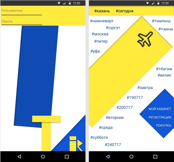
Using this rather atypical form, you can achieve new, previously inaccessible goals - show the entire set of available directions and dates for the user in one window with the help of keywords. Compare with the amount of useful information on the standard screen of the application made for all classic templates:
In the classic application, the first step is only to generate a request to the system, in our version the request is sent at boot, and the first user screen is already the answer, anticipating the user “And what can I do here?”
Since the list of possible flights within the chosen direction is extremely small, he will be able to fit on the screen between Suprematist concepts, incidentally and unobtrusively familiarizing the user with Malevich’s world-famous masterpieces when showing available flights There and Return:
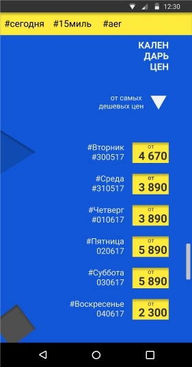
If you do not specify (or erase) the exact date of departure - the system is quite capable of displaying a calendar of low prices with vertical scrolling and the ability to sort by both date and minimum price (within the next week):
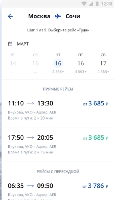
In the current version, so low rated by users, the standard ticket wizard looks very redundant, requiring you to perform as many as 9 steps:
In my opinion, human languages with the standard order of the subject and predicate in the same way deprive people of a certain flexibility in communication, as well as a set of typical steps in the interface.
Ideally, the desired result can be equally achievable after both the first and the hundredth click, and the tags just give the interface this flexibility. A similar list can be used for a list of all your past and future flights:
Let's also compare the existing design of the choice of space in the cabin with the ideally suprematic approach to communicating the essence to the user:
Now the application draws all the places, both occupied and free. Yes, it is noticeable that a lot of work was visually done only to make the labels look like chairs (view from above), and the gender of the potential neighbor was also displayed.
But does a lot of really necessary information contain such a screen? Does the presence of a male neighbor tell us something about his age, weight, political views and readiness to maintain a sweet conversation? Similarly, choosing a place next to a female pictogram, does the airline give us guarantees that it will be a sexy blonde who is just in search of a new tumultuous relationship, and not a coughing old woman?
But if the information is not complete, it does not give any guarantees and does not affect the decision-making scenario in any way - why does it litter the screen?
With a sound reasoning, it turns out that all that a person needs is an opportunity to sit by the window or closer to the aisle to an empty seat - this is where the real, and not invented minimalism in the language of design begins.
findings
But I ask you not to consider my small visual hooliganism a final statement that everything should now be exactly the same as mine, and nothing else. Design, this is not a ritual, not a clear consistent ritual of invoking spirits and not once and for all the postulates cast in granite. The design of the 21st century is a very flexible language capable of delivering the same thought in an infinite number of ways.
The main thing is that the meaning itself should be correct, understandable and acceptable to people, allow them to perform a little less operations, allow a little more to save time and effort, and at the same time not cause a negative of less than three points.
To speak with the user, you first need to functionally, clearly and concisely.
An article that inspired me to this little sketch.
Source: https://habr.com/ru/post/330834/
All Articles