Dark patterns - how malicious interfaces try to attack and deceive
Any purchases are like a hike through a minefield. There is a rather thin border between "not worth mentioning" and "you better not know this before buying." Let's try to find it first empirically. For me personally, this is the obvious “dark pattern”:
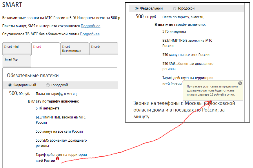
Here it is too:
')

And it doesn’t bother me even the title of the item about the lack of insurance, but the default selected first item. Given that, with their basic sorting logic for raising prices, the first thing to go is a little different - generally free. Moreover, it confuses me that this is offered as a package, and not as a waiver of insurance.
Now let's look at less obvious things.
Here is a wonderful girl Olya sent a picture from a Chinese restaurant in St. Petersburg:

It is probably difficult to call this a dark pattern, because there is no element of maliciousness. Perhaps there is idiocy, but sweet and understandable. No damage on the unconscious.
Here is another option with insurance:

Probably not, this is just a borderline case - because the “insurance policy clearance” check-box stands, but the policy is not selected. As you can see, if I don’t look, an error will be generated, and I’ll have to think about the form. There is no damage on the unconscious.
Go ahead. Here is the form for unsubscribing the mailing service platform. Approximately every thousandth clicks on the "execute" button after he unsubscribes (and informs us about this, that is, in fact there are more errors). Darkpattern, because it was possible to rename the button. At least. Well, the radio button is simply superfluous.

Here I am not allowed to read the fare - a small window and English:

Obvious dark pattern (information is intentionally hidden from me), yes? No, it turned out that they realized the problem and corrected it in the next release.
This is the obvious darker pattern of Aeroflot-Bonus, in order to get the service, you need to subscribe to another:


Banks often sin in the same way (especially many touching stories about credit insurance), but everything is decided by a statement on paper. In particular, by SMS-bank, which sometimes try to bind to the card. Do not impose services in this way. There is a standard, but its execution is usually made painful and degrading human dignity. How to return the goods.
Here is another harsh place where the user's psyche was taken care of in advance:

In this form, one set of addresses will open for selection, if I am heating, and another set - if I have electricity. But, again, it doesn't seem like they hide the addresses. This is not a conscious complication, but simply crooked hands.
But a legally correct and very cool rationale:

Only here the user is no better. He saw "20 GB" in the title without asterisks, and that it was 10 in the afternoon, and 10 in the night - I did not know:

In the real world, darkpattern:

A small print (it is really small) under the cashier pensioners will not see. Moreover, there is a lie on the advertisement - there are goods in the pharmacy that are subject to return. Non-refundable most items. Or product groups, incl. medicines. But not all at once. About it is not even in the asterisk.
Here is another example of a “softly imposed” service:

This is at KFC at the beginning of the automatic donation is included. If you do not say that it is necessary to throw it away, they will not remove it. It is a reasonable assumption that it is more difficult to refuse donations, do not add it voluntarily. But guys, IMHO, have crossed a certain ethical threshold.
Here's a similar moment in sensation: Dropbox opens a warning window about the fact that the place ends:

Hell you close it, only the "Improve" button is visible. In fact, when you hover the mouse cursor, a cross appears:

A similar example in the applications is “Leave a review” and the “Leave” and “Not now” buttons. Without the "Never" button. An even softer example is how the same Acronis uninstaller behaves. He is very demanding of the user's attention, so he considers himself entitled to appear on top of all windows in the system:

But let's look at what may be an obvious “dark pattern.” Is this a CPP ad - is it or not?

The problem is that it is not clear what the "collateral value" is - one gets the feeling that this is the price of the card. It is not clear that it is free. There is no clause (3), which says about getting a pledge back. Since the CPPK doesn’t make much sense to reduce the number of those who drive the electric trains, it’s probably just hand curves. For them, the concept of "security value" is obvious.
Here are realtors hanging ads handwriting. The fact that this is a seal can be guessed by seeing only a sample:

In my opinion, the dark pattern, but legally can not get to the bottom. What they want the font, and such use.
Here is another screen:

There the screen below is a remarkable thing:

The “best” and other superlatives without proof are hurt by the anti-monopoly service. By the way, this is a bright indicator that the company works in the dark - usually this is the first thing they write on a sign or in an advertisement. My simple research showed that at least this is not the best price - either there are not enough essential conditions for a deal like “* for delivery up to 30 minutes”.

So, what we have: a dark pattern is a maliciously distorted interface, when a behavior pattern familiar to the user is used to achieve indirect goals, or when the behavior that is likely for a significant proportion of users is hidden.
Obviously, by “malicious” and “indirect goals” I do not mean a legal definition, but some optimum for users, and I proceed from local ethics. One of the mobile operators, for example, cited a study that auto-renewal of the Internet package (paid) is a service that the vast majority of users would like. Well, I don’t know how for me - I have to ask when connecting or after the first manual extension, and not to impose a service.
We are checking.
Mobile terminal:

Obviously bad pattern - it was necessary to warn about the printer before payment. If I needed this receipt, I would like to know before the start of payment, and not at the end.
This, oddly enough, does not fall under the definition:

The conditions are indicated, about the fact that glasses are made up of lenses and frames, almost everyone knows. A dubious moment, but probably common sense still tells you what the catch is. That is, it is still marked.
Here Tripadiser got me his request to register. If you click "Skip" on top (this button still needs to be found) - there will be such a window:

The dark pattern is not that they snooped a button and made it unlike a button, but that after “skip” you are waiting for the main menu. Instead, they give you a modal window with two options - “later” and “input”. It in itself violates the UX pattern I am used to, plus it does not have a never button.
And finally, the task that puzzled me:

This Bucking offers to subscribe to the newsletter. It is not clear that this is a mailing list by letter per day.
That's about it. And I highly recommend reading the post "Interfaces designed to cheat" in the translation JIghtuse . Just do not forget that by clicking on this link, you consent to the installation of the Amigo browser. Well, my post about the operation of this all in 2014 in grocery retail and not only. Since then, by the way, a lot has changed - milk packages of 850 and 800 ml have appeared.
Immediately I will clarify that all judgments are higher - my personal feelings, and, of course, one can argue with them.
Here it is too:
')
And it doesn’t bother me even the title of the item about the lack of insurance, but the default selected first item. Given that, with their basic sorting logic for raising prices, the first thing to go is a little different - generally free. Moreover, it confuses me that this is offered as a package, and not as a waiver of insurance.
Now let's look at less obvious things.
Here is a wonderful girl Olya sent a picture from a Chinese restaurant in St. Petersburg:
It is probably difficult to call this a dark pattern, because there is no element of maliciousness. Perhaps there is idiocy, but sweet and understandable. No damage on the unconscious.
Here is another option with insurance:
Probably not, this is just a borderline case - because the “insurance policy clearance” check-box stands, but the policy is not selected. As you can see, if I don’t look, an error will be generated, and I’ll have to think about the form. There is no damage on the unconscious.
Go ahead. Here is the form for unsubscribing the mailing service platform. Approximately every thousandth clicks on the "execute" button after he unsubscribes (and informs us about this, that is, in fact there are more errors). Darkpattern, because it was possible to rename the button. At least. Well, the radio button is simply superfluous.
Here I am not allowed to read the fare - a small window and English:
Obvious dark pattern (information is intentionally hidden from me), yes? No, it turned out that they realized the problem and corrected it in the next release.
This is the obvious darker pattern of Aeroflot-Bonus, in order to get the service, you need to subscribe to another:
Banks often sin in the same way (especially many touching stories about credit insurance), but everything is decided by a statement on paper. In particular, by SMS-bank, which sometimes try to bind to the card. Do not impose services in this way. There is a standard, but its execution is usually made painful and degrading human dignity. How to return the goods.
Here is another harsh place where the user's psyche was taken care of in advance:
In this form, one set of addresses will open for selection, if I am heating, and another set - if I have electricity. But, again, it doesn't seem like they hide the addresses. This is not a conscious complication, but simply crooked hands.
But a legally correct and very cool rationale:
Only here the user is no better. He saw "20 GB" in the title without asterisks, and that it was 10 in the afternoon, and 10 in the night - I did not know:
In the real world, darkpattern:
A small print (it is really small) under the cashier pensioners will not see. Moreover, there is a lie on the advertisement - there are goods in the pharmacy that are subject to return. Non-refundable most items. Or product groups, incl. medicines. But not all at once. About it is not even in the asterisk.
Here is another example of a “softly imposed” service:
This is at KFC at the beginning of the automatic donation is included. If you do not say that it is necessary to throw it away, they will not remove it. It is a reasonable assumption that it is more difficult to refuse donations, do not add it voluntarily. But guys, IMHO, have crossed a certain ethical threshold.
Here's a similar moment in sensation: Dropbox opens a warning window about the fact that the place ends:
Hell you close it, only the "Improve" button is visible. In fact, when you hover the mouse cursor, a cross appears:
A similar example in the applications is “Leave a review” and the “Leave” and “Not now” buttons. Without the "Never" button. An even softer example is how the same Acronis uninstaller behaves. He is very demanding of the user's attention, so he considers himself entitled to appear on top of all windows in the system:
But let's look at what may be an obvious “dark pattern.” Is this a CPP ad - is it or not?
The problem is that it is not clear what the "collateral value" is - one gets the feeling that this is the price of the card. It is not clear that it is free. There is no clause (3), which says about getting a pledge back. Since the CPPK doesn’t make much sense to reduce the number of those who drive the electric trains, it’s probably just hand curves. For them, the concept of "security value" is obvious.
Here are realtors hanging ads handwriting. The fact that this is a seal can be guessed by seeing only a sample:
In my opinion, the dark pattern, but legally can not get to the bottom. What they want the font, and such use.
Here is another screen:
There the screen below is a remarkable thing:
The “best” and other superlatives without proof are hurt by the anti-monopoly service. By the way, this is a bright indicator that the company works in the dark - usually this is the first thing they write on a sign or in an advertisement. My simple research showed that at least this is not the best price - either there are not enough essential conditions for a deal like “* for delivery up to 30 minutes”.
So, what we have: a dark pattern is a maliciously distorted interface, when a behavior pattern familiar to the user is used to achieve indirect goals, or when the behavior that is likely for a significant proportion of users is hidden.
Obviously, by “malicious” and “indirect goals” I do not mean a legal definition, but some optimum for users, and I proceed from local ethics. One of the mobile operators, for example, cited a study that auto-renewal of the Internet package (paid) is a service that the vast majority of users would like. Well, I don’t know how for me - I have to ask when connecting or after the first manual extension, and not to impose a service.
We are checking.
Mobile terminal:
Obviously bad pattern - it was necessary to warn about the printer before payment. If I needed this receipt, I would like to know before the start of payment, and not at the end.
This, oddly enough, does not fall under the definition:
The conditions are indicated, about the fact that glasses are made up of lenses and frames, almost everyone knows. A dubious moment, but probably common sense still tells you what the catch is. That is, it is still marked.
Here Tripadiser got me his request to register. If you click "Skip" on top (this button still needs to be found) - there will be such a window:
The dark pattern is not that they snooped a button and made it unlike a button, but that after “skip” you are waiting for the main menu. Instead, they give you a modal window with two options - “later” and “input”. It in itself violates the UX pattern I am used to, plus it does not have a never button.
And finally, the task that puzzled me:
This Bucking offers to subscribe to the newsletter. It is not clear that this is a mailing list by letter per day.
That's about it. And I highly recommend reading the post "Interfaces designed to cheat" in the translation JIghtuse . Just do not forget that by clicking on this link, you consent to the installation of the Amigo browser. Well, my post about the operation of this all in 2014 in grocery retail and not only. Since then, by the way, a lot has changed - milk packages of 850 and 800 ml have appeared.
Immediately I will clarify that all judgments are higher - my personal feelings, and, of course, one can argue with them.
Source: https://habr.com/ru/post/330826/
All Articles